name: Katherine
Project name: MAN IN PAINTING(画中人)
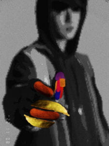
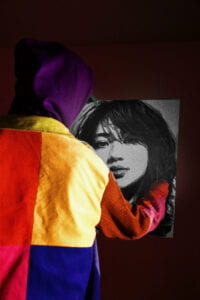
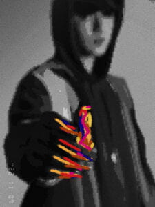
The concept of my diptych is showing 2 characters in comparison. I want to demonstrate a strong contrast using lighting(brightness) and color. In the first photo, I let the colorful character be the one painting the black&white character, which shows the intention of a “color” human painting a digital “non-color” human. In the other photo, I take the photo from the painting characters’ perspective to illustrate the intention from a “black&white” perspective, everything is black&white. The conversation between these 2 photos is obvious and I think the concept is really up to the perspectives of the audience. I also want to show some connections between the digital world and the real world by associating communication.
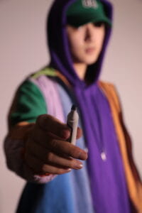
About the detailed process, in editing the first photo I mainly changed the saturation of the whole photo to make the color contrast of the picture more obvious, while in the processing of details, I want to emphasize more on the contrast between black and white and color, so I adjusted the black and white contrast of the black and white portrait by way of local adjustment to make it more obvious. At the same time, in order to reflect the colorful characters in the “painting” of black and white characters, I turned up the local brightness of the brush to highlight. For the second photo, I first turned the whole tone to black and white and added a pixel value effect to make the whole image look like a sketch, to highlight the shift in perspective. At the same time, I added a date icon at the bottom, so that it looks like this picture is numbered by the virtual world. I also made a lot of improvements on the second one. At first, I just changed the second one to a black-and-white sketch and didn’t think about the color communication anymore, but when I talked to my professor and got a peer review, I noticed that the second one did lack some interaction with the first one. So I started thinking about how to add color blocks to the second photo. So I first used a brush with similar clarity to the whole photo to fill in the hands of the portrait figure. Then I came up with a clip art approach, where I cut and paste color blocks from the material to achieve a more harmonious balance
.
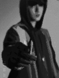
The biggest problem I encountered was that the color saturation I needed for the first image was too high, resulting in the black-and-white portrait in the picture not being visible enough, but rather bluish. So it was really hard to adjust the process, but eventually, I was able to change it to black and white to the maximum extent by making local adjustments step by step.
I think if I had time to improve my project, I would spend more time thinking about the color elements of the second black and white sketch and how it could better echo the first photo.
Final version