Diptych Documentation – Uncanny Duality
Justin Lau – Uncanny Duality
Concept
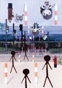
The concept I wanted to express in my diptych is uncanniness, in particular the two ways I noticed that create an uncanny feeling in people. The first is being in a familiar/normal area but it is containing figures that are human-like in shape and/or nature but aren’t human, which is expressed in the bottom half of my diptych which the scene is under normal sunny conditions but has stick figures all over the place. The second cause of uncanniness I noticed is that of familiar/normal area that normally filled with people being completely devote of such, sometimes with human object left behind in the scene. This is express with my top half of my diptych, where the scene is devoid of people except for dolls that seem to be alive. The top half derives from the main image I used to make my diptych, in which I adjusted the lighting settings to make it have a blue tint to emphasize the uncanniness of the area.
Process
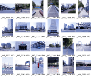
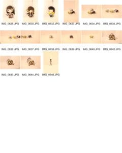
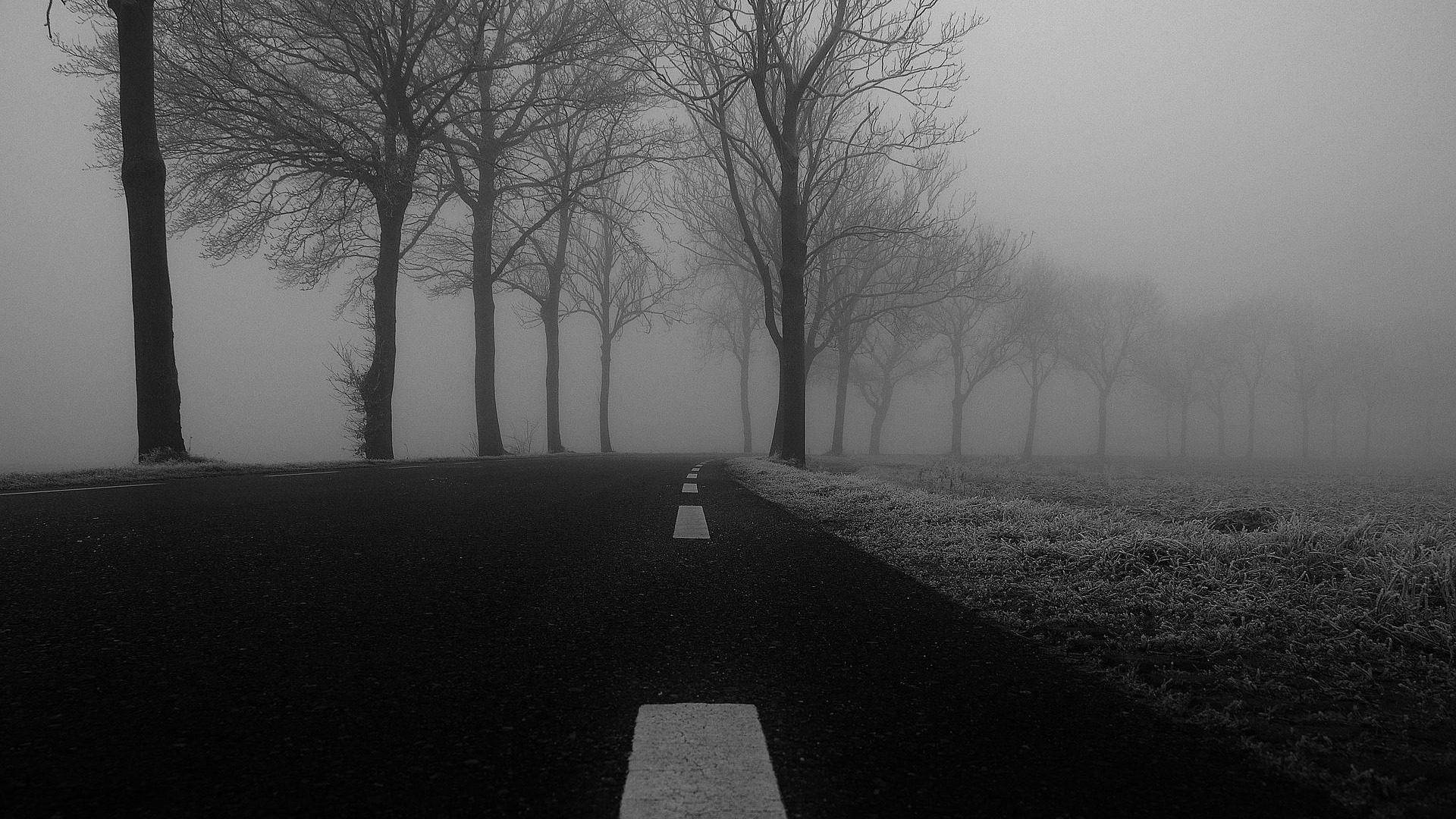
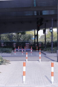
Due to the amount of work I had, I couldn’t take a day trip to other parts of Shanghai. So I resorted to taking pictures of area close to the dorms. I had noticed a lot of these areas usually aren’t filled with people despite the large population of people that live in the dorms and surrounding residences, hence how I came up with my main concept and the pictures that are on the first contact sheet. For the actual image I used, it was of the crosswalk just outside the south entrance of the dorms, in which I waited until all cars and what few people there were to completely leave the scene in order to take the picture. I also adjusted the lighting settings so that there was a blue tint to the image. I also took pictures of dolls I had lying around for the purpose of adding towards the diptych, in which I created a white backdrop and had a yellow light in order to take pictures of them.
For the digital process of my diptych, once more I wanted to convey the concept of the two kinds of uncanny environments, hence the two crosswalks on the top and bottom of my diptych. I used the lasso tool to select part of the original image that contained the highway and sky and remove it completely, to which then I replaced that area with a duplicate of the crosswalk, making the image quite symmetrical which I particularly like to do as I feel it is aesthetically pleasing to look at. I then used the camera raw filter to change the lighting of the bottom crosswalk to make it seem more like it was in actual sunlight in order to emphasize the normality of it. I then added the stick figures to that part of the image by using the lasso tool to remove them from the white background and make many duplicates of it in different sizes to give the crosswalk depth. I did the same for the dolls on the top blue tinted crosswalk, adjusting the coloring to make that of the blue tint present. I also added a bench and fire hydrant to add a bit more into the scene, but I didn’t want it to be too full as to preserve the uncanny feeling. I wanted to keep editing simple in order to do this in fact, as I felt too much editing would hinder the uncanniness of the image.
Conclusion
In conclusion, I am quite satisfied with the final result as I felt like it accomplished in giving the feeling of uncanniness when viewed by others, as noted by the other student and Professor in class. However, if I were given the time and opportunity to improve upon my project, I would definitely try to find a way to adjust the colors of certain bright objects like the pole and fire hydrant in the top half of my diptych as I feel they are heavily constricting in the scene considering that the tint is that of a cool color. Also, I think adding an additional pole that has the crosswalk sign on the oppose site side of the current single one would have benefited in making the image more symmetrical. Otherwise, this was a work I was quite proud of making from the resources I had access to.
Images
Diptych:
Original Main Image Used:
Contact Sheets:
