Sound Visualization Documentation
A. Your Name, Title of Music, Artist Name
Name: Justin Lau,
Title of Song: Domineer
Artist: HOYO-MiX
B. Concept and Design
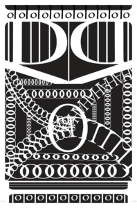
My design has three main parts to it that are supposed to represent the three parts of the song I identified. For the top first part, I used many Ds and Is to create shapes/designs that are supposed to represent the sounds the flutes and other Chinese instruments used to create an elegant and very much classical Chinese music in the first half of the song. The V just below those shapes/designs is supposed to represent the “drop” of the song that transitions the first half to the next half of the song. The second part of my design is supposed to represent the dubstep beats and general “chaos” expressed in the second half of the song, in which I have many chains of Os randomly placed on the design, and mashed together many letters to create a spiraling effect in the center that ties this part of the song together. The last part of my design is on the bottom, which follows a similar pattern to the first part as to represent the last bit of the song that ends with a short tone of classical Chinese music, which also uses the same instruments as in the first part.
I also had the Gestalt Principles in mind when making my design, primarily that of symmetry. For my One Black Square I used symmetry as the main principle as I find using it to be the simplest but most satisfying to design and look at, hence why throughout my design there is a certain symmetry to it. For the middle part however, I tried to apply the concepts of continuation and similarity as well as I wanted to create a design that would be chaotic and have people guessing as to what it could it. I would argue that my design also has good figure as it could be perceived as once single figure, as I found many people saying that they see a face within my design.
C. Process
For my design process, I have always had the thought of making three parts to it in order to represent my song of choice. My initial design was much simpler in that it had only two D facing up and down with the Is filling the space of them, like you can see in my final design. The center, “chaotic” was also much simpler and was more symmetrical, with me neatly forming a spiral. The mid-critique was a valuable experience for me as the main points I got from it was that the use of Ds and Is was very solid and to make the second part less symmetrical as to better represent that part of the song. Hence, I did exactly that, which would eventually lead to the design of the second part in my final design. However, I thought the use of the Ds and Is were also rather simple and wouldn’t well represent those parts of the songs, in which I added more to them that would eventually lead to the designs you see in my final design.
D. Conclusion
Overall, I am quite satisfied with the final design I made, given the amount of time I had to make it. However, if I were to improve it if I was given more time, I would change the font of the V to be more sharp, which was feedback from a classmate of mine, as it would better represent the drop of the song. But sadly at the time I couldn’t find such a font to use as such. The main thing I would have like to change is
the second part of the design, as while I am satisfied with how it is now, I feel it could be a little more random in order to best represent that part of the song. But once more, I am overall satisfied with the final design of my project and also had a lot of fun doing so while listening to one of more liked songs.
E. Image of Project