Visual Metaphor

Concept :
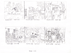
The concept for mine and Emma’s visual metaphor is a representation of the facade presented by the idea of the “American Dream.” We ultimately decided to use the found footage of the “ideal” 1950’s American families, essentially the epitome of how the idea of the “American Dream” came to be, following WWII. This idea of the “American Dream” although advertised  to be something attainable for all, still fell victim to the flawed executive, judicial, and legislative systems of the American government making it something only plausible for white Americans. The metaphor comes into play through the alternation between the protest footage and these clips of what the “American Dream” looked like as a representation of the reality of the struggles black people in America have faced to obtain some facet of the so called American Dream. Not only that but also the metaphor for the facade that this idea of the American Dream puts up when in reality it is all part of a deeply flawed system built off prejudice and racism that the BLM protests aimed to tear down in order for them to be rebuilt.

Process:

  1. We decided to create our own audio on audition from a combination of clips from the song This is America by Childish Gambino, videos from the protests, speeches from the protests, and a small clip from a Martin Luther King Jr speech. After sorting through lots of youtube videos we downloaded the clips and separated the audio. After that, Emma was the one that made the initial edit of the audio clip and after that we bounced ideas off each other for tweaks we could make.
  2. After finalizing the version of the audio we were going to use, we made a google drive folder where we put all of the protest clips as well as various different found footage clips both emma and pulled from youtube and trimmed down to the specific parts we felt best represented the metaphor we were trying to convey. 
  3. The thing I probably struggled with the most was having to format videos that were in various different sizes and orientations into one specific frame size without losing the integrity of the clips themselves. 

Conclusion: 

If I had more time to complete the project I would’ve taken more time to dive deeper looking for found footage to use. I also would’ve liked to have used professional equipment to shoot the protest footage so it seemed more coherent but that wouldn’t have been possible unless there had been a completely perfect situation in which I had used a camera during the actual protests. 

At presentation day:

The main feedback I received was that the vertical display of my video made it feel more modern and maybe slightly less professional than a landscape formatted video would have. Despite this, I think having done the project over I would’ve kept it vertical because of the concept itself. The BLM movement is something that started a little bit less than a decade ago and is continuously changing, now a days the format in which we receive news is through social media videos, posts, tweets, etc. all of which are often formatted vertically so I felt it appropriate to have it vertical in order to fit the theme better. 
Visual Metaphor Proposal

  1.   Project Title: “No Justice, No Peace”  or  “This is America”
  2.    Group Members: Emma Blosser & Gaby Juhala

III.  Concept | Storyline:

       1).  For the narrative portion of our visual metaphor we are going to combine a variety of clips from the protests themselves, news reports on the protests, trial hearings, and speeches. (possibilities linked below) 

       2). Our goal is to convey the message conveyed through the Black Lives Matter movement in America through the voiceovers of multiple speeches, news outlets, and audio clips from the protests themselves etc.

       3). The focus will be on the 2020 BLM protests following the death of George Floyd and Breonna Taylor. The video clips will be from that time period and aid in furthering the narrative catalyzed by the outburst of protests seen in 2020, demonstrating how wide-reaching they were and the deep impact they had on breaking down and rebuilding the deeply flawed justice system in America. 

       4). The style/aesthetic we are going to try and pursue could possibly be in the noir genre of editing because of the fact that it will allow the viewers to focus on the content/message of the photos and video clips themselves rather than the colors which could distract from the overall narrative.

  1. Execution Plan: 

       1). For the Visual Metaphor Project we will strictly be using our cell Phone camera and audio recorder.

       2). The main location for shooting is Portland, Oregon. Portland became known as the hub for the BLM protests in 2020. The videos used were shot from May-July 2020 with both clips from day and night time being included. Showing clips from both day and night allows for the message/narrative of just how widely recognized and impactful the movement was, it didn’t matter the day or time, people were always gathering and showing support for the movement.

       3). Due to the fact that an event like a protest is so unpredictable, the quality of the filming might not be of the highest quality but considering the limitations to filming equipment and inability to meet in person as a pair I believe the content we have does a good job of conveying the narrative we hope to demonstrate through our visual metaphor.

       4). How will you collaborate? How will you divide work? (Gantt Chart)

Task Owner Start Date Due Date Duration PCT of Task Complete
Audition audio editing Emma 04/26 04/30    
Premiere pro photo/video editing  Gaby  04/30 5/5    
Premiere pro combination of audio file and photos/ videos Gaby 04/30 5/5    
Final tweaks/

revisions

Gaby and Emma 5/5  5/12    


Reverse Storyboard

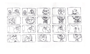
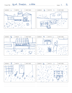
The scene I chose to do for my reverse storyboard is the opening sequence for the movie UP. The camera angles used include an initial establishing shot of both characters from afar, setting up an idea of the scene for the viewer. It goes on to a more medium shot and transitions into a close-up as the focus is shifted to specific details on each character and then returns to a medium shot for a short period of time before going into an extreme close up as the pin is being placed onto the characters body.

https://www.youtube.com/watch?v=8mzsU2O8tuU


Uncertainty of Documentarism

In the text Steyerll talks about the “unbroken belief” of the documentary form being challenged. He doesn’t focus on the truth of the content being produced through documentary but rather how the truth of the content is displayed. In the 8th paragraph Steyerl presents a good example of said “unbroken belief”,  he says “They are perfectly true documents of that general uncertainty…” he goes on to describe how pixels across a screen have come to be seen as expressions of time and connections between images and in turn, questionable. This section of his text does a good job of painting a picture of this idea of documents representing events and phenomena that occur in real life. Despite the documentary’s depiction of real life things, it seems to leave out specific aspects that don’t necessarily connect to said “pixel.” His prominent idea of this unbroken belief is summed up in questioning documentary as to why the main aim changes from presentation of reality to meere commentary.

Additionally, certain films and movies that are based on true stories but constructed through fiction, circle back to Steyerl’s idea of “unbroken belief” in that the “pixels” chosen to be used in connection to the film’s truth are just that, chosen. Although truth allows for these based on true story films to exist it is the embellishment of said “pixels” that follow through with the idea of a shift from presentation to commentary or in this case, fiction.


The significance of the authenticity and representation of the truth in the media I consume on a daily basis is immense. This media greatly influences how I see and perceive the world around me. Unfortunately, the media nowadays is greatly biased and unregulated, meaning it is increasingly difficult to know whether or not the media I am consuming is presenting or commenting on the phenomena occurring. 

I would argue that the role of a live broadcast is to establish a sense of credibility between the producers and the consumers. Although that credibility may be true in some instances it can also be a ploy to get consumers to believe the media they are consuming is 100% credible when in reality it may be altered or manufactured.

Memory Soundscape

 Concept:

The memory I chose to try and convey through my soundscape is that of my first time experiencing sleep paralysis about 4 years ago. Within this sleep paralysis a variety of things occurred, but the main experience I felt was that similar to what I imagined being suffocated or drowned feels like, I would be “drowned” or “suffocated” for a period of time and then released and then the suffocation would occur again and again like a repeating cycle and although it wasn’t actually happening to me, the emotions and sensations certainly felt real. During that experience I felt emotions of anxiety, fear, helplessness, etc. all of which I tried to convey through the combination of sounds in my project. The way in which I constructed my soundscape was arranging the sounds in the same way I experienced them in my sleep paralysis episode, luckily I made a note the day after it happened to me so I had a pretty detailed recount of the exact order of events to base my soundscape off of.

Process:

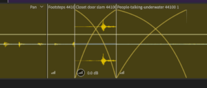
  1.  The sounds I used for this project were all recorded inside my house or at my job. The three most unique sounds recording method wise would probably be the sound that goes from people talking in the background to it sounding underwater. In order to record this sound I put my phone in a ziplock bag and dunked it in my sink which I had filled with water while it was recording. The sound of people in the background is a recording I made while at work just to serve as an obvious differentiation between being above and underwater. The other sound which was an interesting process to record was the gasp for breath in the middle of the people talking, in order to make it sound realistic I dunked my face underwater and recorded the sound as I came up for air, trying to make it as dramatic as possible.
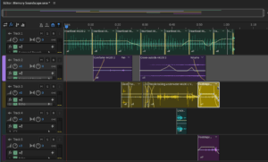
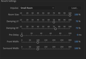
  2. My editing process was not difficult but more so tedious in that it was a lot of trial and error trying to play around with all the various effect combinations and listening to the same clips over and over trying to figure out which effect best conveyed the emotion or experience I wanted to convey. I don’t feel like I had to compromise any part of my memory in order to fit the parameters of the project. After lots of testing out different things, I figured out that for a lot of my sound clips the reverb with different impulses worked quite well to demonstrate what I was envisioning. I also found out whilst editing that I could make anchors along the volume line of clips and adjust the volume levels in that way instead of just through fading in and out, this allowed me to be more precise in specific areas, which added an extra layer of smoothness between sounds. The one part I struggled a bit with was the meshing together of two clips in trying to make them sound like one recording although they were two separate clips. I ended up figuring out how to make them sound the most similar by using echo and making the transition between the two much longer than I had previously done for other clips and it ended up sounding quite smooth.
 

Conclusion:

How would you improve your project if you had more time? If I had more time I think I would probably just play around more with effects and other features we weren’t taught to try and see if there’s anything I could do to make it convey my memory even more accurately. I also probably would make it longer maybe 2-2:30 minutes because I felt like for my memory specifically there was a lot more moments of eerie silence than what one minute allotted.


At presentation day:

The main feedback I received was that the portion of my soundscape during which it seems like I am coming up and gasping for air wasn’t necessary in order to convey the sensation of being drowned, the reason I edited the recording to be that way however was so that it demonstrated exactly how it felt for me in that moment. Momentary relief only to immediately be drowned again in a viciously repeating cycle. I received a lot of positive feedback, mainly that I did a good job of really transporting the listener to my specific memory through my use of various layers and effects making things sound closer, further, closed, and open. After presenting I am pretty happy with the soundscape and other than the things I mentioned above, I don’t think I would change too much else as it seems to be conveying exactly what I hoped it would.


Diptych

Concept:

For the diptych project I went through various concepts, finally landing on an idea hoping to convey a social/political commentary on society’s misknowings of their own government or lack of involvement in politics, specifically pertaining to the younger generations in America. I chose this concept because it is an issue I feel very passionate about and I think it is something that needs to be addressed in order to work towards fixing the many issues plaguing American society, the most prevalent among those being ignorance. 
Process:

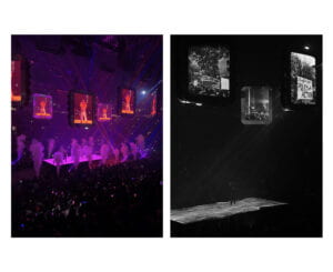
In order to make my concept come to life I used two photographs taken at a concert. One completely unedited, showing the excitement of the crowd, the dozens of pictures being taken of the performer, the flashy and colourful lights, back up dancer, etc. The unedited concert image represents the huge amount of attention placed onto celebrities and mainstream media by young people and demonstrates the level of importance that things such as a concert hold in younger generations lives. The image on the right of diptych is taken from the same concert but is edited in a way that demonstrates how pressing issues regarding politics and governmental action/policy do not receive nearly the same attention or have the amount of importance they should have placed on them by younger people in America. I attempted to demonstrate this by removing all the flashes and phone screens seen in the image to show a lack of interest as well as cut and pasted various photos from protests I have attended into the big screens previously displaying images of the singer. I also cropped out an image of a girl at a BLM protest from 2020 of her standing alone amongst the tear gas, unfaltering in her stance, and holding up a sign and placed her on the stage instead of the singer. Lastly, I decided to make the whole edited side of the diptych black and white because I felt it also translated the idea that many young Americans hold, that of issues regarding anything to do with politics or government as uninteresting and nothing for them to be involved with.

The one thing I wish I could’ve improved upon before submitting the final version was perfecting the color matching between the added photos and the background layer so that it looked even more natural and realistic. It took much longer for me than expected to figure out how to use clipping masks to edit the light and exposure of each but once I did, it made a huge difference and I wish I could’ve played around with that a bit more.

Diptych Concept Assignment

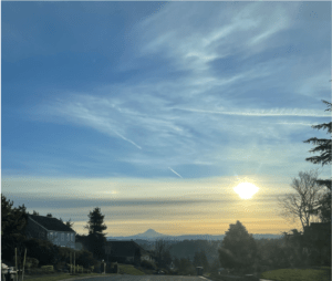
 For the diptych assignment I decided to encompass the theme of nature that is found very prominently in the area that I live, the pacific northwest. I think that choosing this theme will allow me to delve deeper into all the natural beauty that Oregon has to offer. The color scheme I think I will be using will consist of different hues of blues, greens, and pinks (sunrises and sunsets). I intend to capture an image of a view I see quite often of the sun rising over a mountain in oregon called Mt.Hood. I think this will help tell the story of the beauty of the natural world both during the day and night. In regards to composition, I would like to manipulate a photograph for the second part of the diptych to either appear like it is night time or invert the colors in a way that presents a different reality to the one that is naturally there. 

 I think that specifically the knowledge I learned from making alterations to letters and symbols as well as more recently, color theory will be very helpful in creating something that works well together while at the same time, presents a story and has intent behind it.

I will attach below an image I already had of the view I intend on using, although i’m still not 100% set on specifically this view I do want to use the local nature to tell a story through the diptych.


Pioneer Plaque

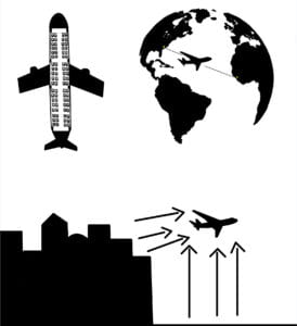
For the pioneer plaque assignment my partner and I chose the modern technology of airplanes and the system of flying/travel as the system to be explained to the aliens through the plaque. I chose to draw in black only as the knowledge about heptapods ability to see color the same way humans do is not something we have knowledge of, so rather than making color a defining factor of the plaque I felt removing it all together would allow for a more straightforward explanation. Starting in the upper righthand corner of the plaque is the sketch demonstrating the function of the system known as flying/travel and how airplanes themselves play a role in that. I created that part of the plaque by finding an image of a globe and copying the outlines of the continents without including an outline of the whole globe itself or country borderlines because I felt that by eliminating the outside border it would better represent a possible way in which the heptapods saw Earth. By not including any of those borders the heptapods would be able to better understand the concept of the plane going from point A to point B as the world is sketched in a way that gives it a three dimensionality while not having borders doesn’t limit it to that plane of view. The sketch in the upper left corner is meant to illustrate the way in which the inside of an airplane looks from above. I included the darker shaded parts to sort of demonstrate how not every part of the plane is used by humans to sit in but rather only the portion with small seats sketched in. I believe that leaving the darker portions in the birds eye view sketch the heptapods will have a better understanding by association to the other two portions of the plaque in which the airplanes are drawn completely in solid black. The sketch on the bottom represents the explanation of the motion of airplanes and the way in which they move, it was a bit more difficult to represent this without sticking to a 2 dimensional plane so to compensate, I decided to draw arrows showing the direction in which the airplane would move as compared to the silhouette of buildings next to it. Although the exact knowledge of what arrows are on a 2D scale might not be something locally familiar to the heptapods, I believe that context clues as well knowledge they have gained from all previous interactions with the linguists/scientists will allow them to grasp the meaning and intention behind it.