All posts by Jenna Sun

Mini Project 1: Drawing With Code

Project Title: growing

Link to Project:

https://editor.p5js.org/jennaasun/sketches/jcVhuNM7F

Brief Description and Concept:

Description

In my work you see a face in front of the sun as a backdrop.  Growing from my eye is a flower; around it are small sprouts of plants yet to grow and bloom. I chose to depict roots below the surface that you can’t see. The repetitive vertical blue lines at the top is rain.

Concept

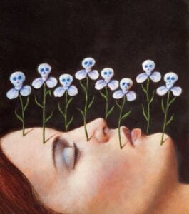
I knew that I wanted to draw a side profile when I first started brainstorming a design. I came across an image online that I used for inspiration, as I felt the perspective would be more interesting than a typical side profile. 
 

Artist: Christian Schloe. Source: Pinterest (Couldn’t find title).
Artist: Rafal Olbinski (couldn’t find title of artwork).
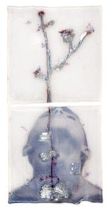
Sibylle Peretti, “I Search In Snow, 2014.”

I also wanted to incorporate the sun as I felt it would be a good starting point for the code, and it also incorporates my last name.  Growth was a theme I wanted to depict here: I felt like creating a self portrait of myself would need to evoke how ephemeral stages of  life is, and how I always feel like/hope I am growing. Originally I wanted the flower to be a tree instead, but I wasn’t sure how to code that. Adding the rain was a last minute decision,  but I like how it is both a source of life for the flowers and can also mean difficult/dark times and how growth persists through that.  I also felt that the color palette would be important to contribute to a harmonious image, so I used the color hex palette website to find specific colors I wanted to use and colors that paired well with each other.

Demo/Visual Documentation:


Final Work


Coding Process

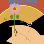
I started by creating a 400 x 300 canvas. For the background color I used a deep rust orange color. The first shapes I coded were 2 ellipses to form the sun. I pulled the color of the inner ellipse from the below work by Josef Albers included in our Intro to p5.js slideshow.
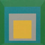
 
Josef Albers, “Homage to the Square: Apparition”, 1959
Code

Next, to begin coding my face, I started with adding one ellipse and one triangle in the color black (0, 0, 0) to form hair. To build my face and neck, I used an ellipse and a rectangle of the same skin color (244, 197, 142). I added the bangs last minute–the code comes after the shapes used for my face, as in this case the shapes forming the bangs had to show up on top of the ellipse used for my face. I initially wanted to use two triangles to form bangs with a middle part, but I was apprehensive about my ability to manipulate the position of the triangles well enough (in relation to the position of the other shapes I already coded). So instead, I used one rectangle for the bangs, and added another triangle of the same skin color I used on top of that rectangle. The effect was that it formed a cutout. 

The eye was what I had the most trouble with, and is the most complex part of my code. I realized that coding curves was much harder than I expected and that I need practice. For the eye  I ended up using the example given in the p5.js reference under “curveTangent(),” as it looked like a closed eye with eyelashes. The code given in the reference is as follows:

noFill();
curve(5, 26, 73, 24, 73, 61, 15, 65);
let steps = 6;
for (let i = 0; i <= steps; i++) {
let t = i / steps;
let x = curvePoint(5, 73, 73, 15, t);
let y = curvePoint(26, 24, 61, 65, t);
//ellipse(x, y, 5, 5);
let tx = curveTangent(5, 73, 73, 15, t);
let ty = curveTangent(26, 24, 61, 65, t);
let a = atan2(ty, tx);
a -= PI / 2.0;
line(x, y, cos(a) * 8 + x, sin(a) * 8 + y);
}

Adjusted code

I adjusted the code to position it over the ellipse that formed the face.  I added 80 (+80) to all x coordinates in the curve to shift it 80 units to the right. Adding 220 (+220) and subtracting 40 (-40) shifted the curve upwards 180 units.

For awhile, I could not get the eye to show up at all. Even after making sure this code block was written after the code for the shapes, to ensure that the eye wasn’t hidden below the face or hair, it wouldn’t show up. I don’t remember exactly how I fixed it, but I know that coding it in black– stroke(0,0,0), was one thing that helped.


The next things I coded were the stems and roots using lines. This was fairly simple, as I could look directly at the x values and y values and manipulate them in the code for the next lines to connect them together. For example, I first coded one long line for one root .

line(162, 225, 314, 225);

This is a horizontal line starting at x-coordinate 162 and extending to x-coordinate 314. To code another root stemming from it, but starting somewhere along this line, I just added to the x1 coordinate. This line was as follows:

line(180, 225, 230, 250);


For the flower, I first coded the petals using 7 ellipses almost stacked on top of each other. Ideally I would’ve liked the flower to be symmetrical, but I didn’t know how to code that. 


Reflection/Lessons Learned

One of the things I challenged myself to do while coding this was to really be attentive and calculate the coordinates of where I wanted a shape, line, or point to be. Before this project, I had the habit of just arbitrarily plugging in random numbers, running it, seeing where it was positioned on the canvas, and adjusting the values I used based on that. With this project, even though it was more time consuming, I took note of the coordinates of each different 2D shape and tried to visualize them on a graph in my head before trying to code. I think physically doing this on paper next time would probably be useful.

I am not entirely satisfied with this work as, one, I realized I didn’t know how to efficiently code anything beyond the primitive shapes–which led to a not very visually interesting or detailed work, and two, I had to use the reference for the eye. I need to learn and practice coding complex and abstract shapes of my own design.

Next time I would add more details to the roots–I ended up stopping because it felt tedious. However  right now it kind of creates the effect of cracks and broken porcelain, which I like too.

Reflection Prompts

  • Did you prefer exploratory programming, or using the reference

I referred to the reference less often than I expected–I explored it but felt that some of the programming was either not applicable to what I was doing or beyond what I understood. It was definitely integral to coding the eye though. What I did do was constantly reference back to the slides that had the code templates for 2d shapes. I think that as I’m just starting to code now, I need some kind of reference more often than not.

  • Why? Could you imagine a situation where you would use the other technique?

I think that to freely explore and code on my own, I’d need to have at least some foundational code memorized first.

  • In which ways (if any) was drawing on a piece of paper (as we did in our exercise) easier than writing the program?

Throughout the entire process of coding, I kept thinking about how I wish I could just hand draw, and how much easier that is. I felt constantly limited by the fact that I couldn’t bring to life the image in my head exactly as it is because I didn’t know how to tell the computer to do so in a way that it will understand. 

  • In which ways (if any) is writing the program easier than drawing on the piece of paper?

Now that I think about it, drawing on a piece of paper is difficult in its own way, as its also fully possible that I can’t produce the image I have in my head–I’m still limited by my drawing and artistic ability.


Sources

Peretti, Sibyl. I search in Snow. 2014. Kiln formed glass, engraved, silvered, painted paper. 10 in. x 20 in. Callan Contemporary, New Orleans. https://www.callancontemporary.com/exhibitions/i-search-in-snow/selected-works?view=slider#8.


Visual Metaphor Proposal

  1.   Project Title: Not decided              
  2. Team Members: Ryan Hiew, Jenna Sun

III.  Concept | Storyline:  Control

       1). What is the piece (article, poem, story) for the narrative voice over?  Or who are you going to interview? 

      Either a self-written narration or a poem that will explore the concepts of what control is, from a holistic perspective.

       2). What’s the story about?  

Where control can come from, how it’s experienced, what the feeling entails, how to deal with it, the consequences of it, etc. 

       3). Which part of the story are you going to focus on? 

Mostly depicting visuals that coincides with our perspectives of the main feeling

       4). What kind of style/aesthetics are you going to pursue?

   Introspective visuals that don’t include direct audio from scenes, mostly focusing on the narration voice over. Transitions from bright to dark lighting. 

  1. Execution Plan: 

       1). What equipment are you going to use when shooting the movie? (cell phone, DSLR camera, sound recorder, stabilizer..)

DSLR camera, cell phone, utilization of a stabilizer to ensure lack of camera movement for certain shots.

       2). Which locations will it be shot at? When is it? Day time/night/unknown? Why?

Lighting/Recording Studio on campus or around the city , probably at night time or on a day with not so good weather to depict the ideas of uncertainty to further convey our potential message


       3). What are some challenges you might encounter and how will you prepare?

Planning for what visuals we want to shoot, because it has to coincide with the overall theme we are trying to depict, and can also be interpreted in many different ways


       4). How will you collaborate? How will you divide work? (Gantt Chart below*)

Work is split 50/50, shooting and editing will be a joint effort


  1.   Storyboard Draft

To be added


Task Owner Start Date Due Date Duration Task Complete Percentage
Get trained in stabilizer Both        
Write script Both   11/28-29    
Record voiceover @ Recording Studio ?   11/29    
Start shooting     11/29-30    


Photo Diptych Concept

When brainstorming for my photo diptych, I initially selected these two sets of photos. Since I wasn’t able to get access to a camera over break, and I felt my phone didn’t present any really good photos, I went with 2 photos I already had. This is just to see the result for now and practice seeing different connections between the two photos.


Photoset A


Photoset B


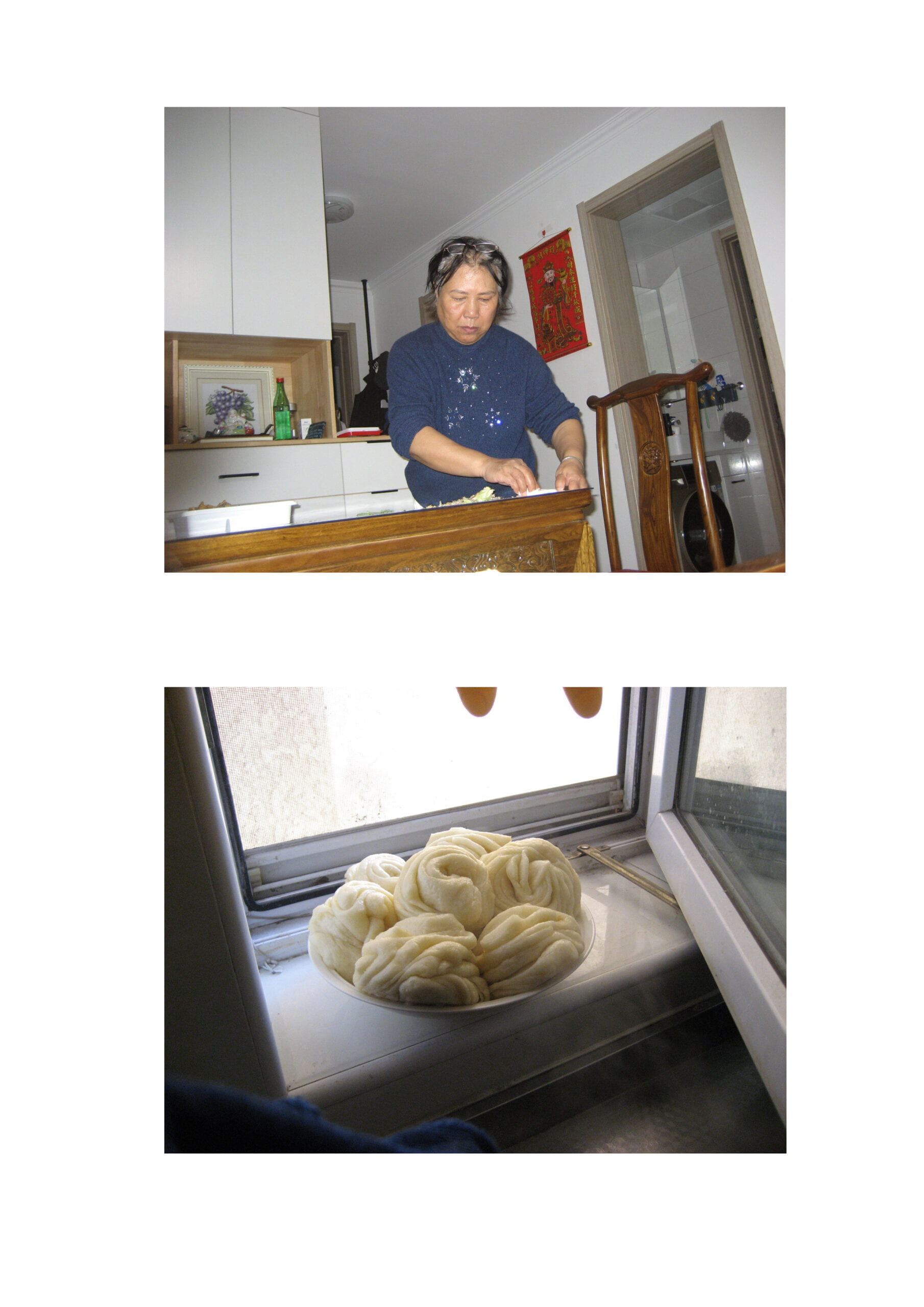
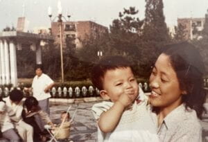
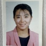
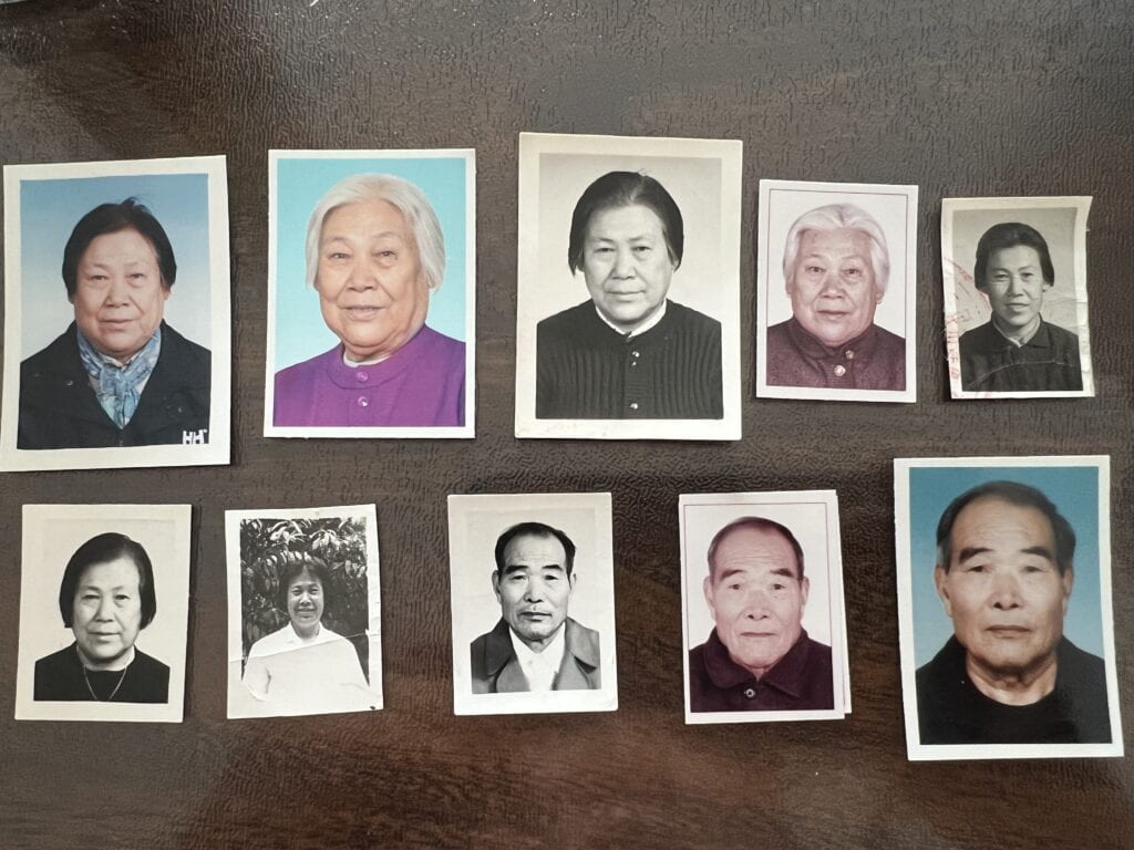
I was interested in exploring the different intentions in which we can approach this project as outlined in the slideshows. While our work all must fulfill the “one cannot exist without the other” standard, we have relative freedom outside of that.  One approach is to tell a story with our diptych. In my case, I think Photoset B does so.  This can also be shown through the artisan vs. the art, the mother vs. the child, the seed + water vs. the plant.  I think this set has the ability to tell a personal story as well as evoke emotions within the viewer and prompt them to think of how they relate.

For Photoset A, I wanted to come from a different perspective. I personally just like the image on the left of the woman in the Guggenheim Museum. The right is a seagull seen from the ferry in New York or Liberty Island, I can’t really recall where exactly. I thought that these two images together work well when in black and white, and depict movement or the act of just being.


What can be added/manipulated


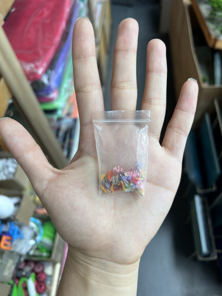
Photoset A: apart from the seagull, I thought this could serve as the second photo. Tiny figurines in the plastic bag–It’s a little more bizarre and abstract. Leaving this in color would provide contrast to the black and white first photo.

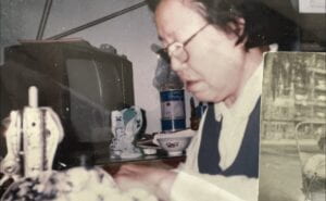
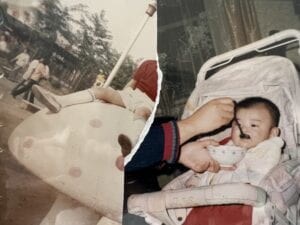
Photoset B: my aunt bears a strong resemblance to my grandma. I would like to do a collage of them and the other women in my life–I think the one of my aunt holding my cousin would be particularly good for this–, however this would be using old photos.  The top two photos are from my family’s album, and I made sure I saved them particularly because of the collage effect they gave.


I’m honestly unsure how else to photoshop them though.


Alternative Ideas

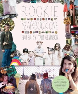
When thinking about my experiences with collages in particular, in high school, I drew a lot of inspiration from Rookie Magazine and printable collage kits you could use to make your own layouts.


I think for my final diptych, I want to practice taking more organize, close-up photos, as opposed to the further away/scenic shots I mostly have. I want to utilize a studio setting to capture similar whimsical, transitory feelings as the magazine.


Reading Response: In Our Own Image by Fred Ritchin

Fred Ritchin writes in In Our Own Image that, as we are entering a markedly different age of photography and our relationship with it, the “fidelity of the mechanical age” is now being replaced by “the fluidity of the digital” as new technology now rounds out our lives . As it relates to photography, the film camera can be left behind as a relic of that rigid, predictable age, while we welcome in post-production, digital re-touching, etc, which are rendered possible by advances on the digital frontier. The “fluidity of the digital” therefore recognizes digital photography specifically as a new medium wholly unique from other mediums of photography and disciplines of art, and also refers to digital technology being intrinsically dynamic and ever-changing, prompting the necessity to be ready to adapt while being conscious with what intention we use it. 

A new “digital photography” now having blossomed, I think Ritchin also means to highlight that the digital age is by nature not rigid or stagnant, which will obviously then affect digital photography and how we view it.  He welcomes photography growing in the first place, writing that it was time. 


Example of digital imaging + the benefits / drawbacks

2012 National Review Cover


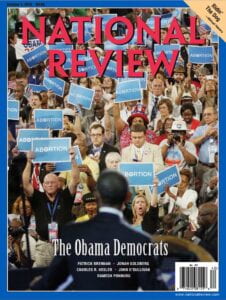
The above is an image of a cover of the National Review in 2012 in which former President Obama is seen speaking at the Democratic National Convention. The crowd is seen holding blue signs reading “ABORTION,” but which originally read “FORWARD.” The National Review admitted they altered the writing.  The motives: likely political or ideological, the implications: many.

This is an example of a milestone we’ve crossed in a new(er) phenomenon: doctoring images. Certainly, doctored images predate the rise of technology. Many can argue that from its inception, photography is, to a degree, altered reality, if one considers even the basic set-up of a picture such as during a photoshoot. Newer services and the streamlining of them however have landed us in an era where anyone can retouch any image to the extreme from the privacy of their own device.

Another example of “the fluidity of the digital” that is the most obvious to me is that mass engagement in digital imaging has led to increased exposure and expectation to involve oneself, if not increasing the value of the actual image. Ritchin touches on this when quoting Doctors Without Borders, writing that “without a photography there is no massacre” (pg 13).  

Film vs. digital photography, and photography vs. other mediums.

I think Ritchin bringing back and picking apart the term “horse-less carriage,” and how by limiting it to our familiarity with an older mode of transportation (horse-drawn carriages), it doesn’t encapsulate the new invention, helped me understand film and digital as two different mediums.  

The author also aptly identifies digital imaging as now being inextricably linked to consumer capitalism and vested interests. On the contrary, something like the radio, has “no vested interest in the presentation of image…commercial interest in making the discussion ‘sexy'” (16). 


Where we stand + to what extent can photography capture reality?

“The photograph is no longer only of the fraction of a second and the particular segment of space, but an authored compendium,” writes Ritchin (21). Rather than trying to imitate analog photography directly, we can make use of the new synergistic opportunities we now have to tell more stories. We also need not abandon photography as we have known it. Whichever way forward, one thing that will facilitate this is having a discussion about what we expect from the photograph.  I always thought about how a picture is worth a thousand words, but I haven’t necessarily considered what is the most objective. Ritchin provokes thought by deeming photography as “quasi-objective and historically reliable” (pg 2), and that the photographer community is “caught in the mindset that anything it produces should be believed,” (18), when it is not the case. As with writers, musicians, and any artist, we have implicit bias, and one could argue that photographer and subject both have less autonomy now. Because of this, it is now important to rediscover what we mean by “writing with light.”


Sources

Ritchin, Fred. “In Our Own Image” Aperture, 1990, pp. 11-20, 125-128

Mallonee, Laura. “Infamously Altered Photos, Before and After Their Edits.” Wired, 29 Jul 2015.


Reading Response- “Story of Your Life”

“Story of Your Life” is a sci-fi novella published in 1998 by author Ted Chiang. Exploring our understanding of language and communication, and how they shape our lives, it follows the story of linguist Louise Banks in her effort to communicate with newly-arrived aliens. 


How do the aliens’ language and communication styles in the story differ from human language (oral, pictographic, phonetic, etc.)?

Humans

  • Oral: humans produce speech with our larynx, however we have a  great variety of languages and dialects, which themselves bear different sentence structures, sounds, grammar, etc. 
  • Written/visual: again, we have varying languages that can be alphabetic or non-alphabetic (ex. Chinese, which is logographic).
  • Visual: we have ASL, which is neither spoken or written

Heptapods:

  • Oral: aka “Heptapod A.” Features nouns with case markers that indicate whether they’re a subject or object.
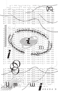
  • Written: aka “Heptapod B.” Appeared at first to be logographic, later better described as semasiographic. Very intriguing as what they produce looks more like mandalas/graphic designs than sentences. Chiang writes, “their script isn’t word-divided; a sentence is written by joining the logograms for the constituent words. They join the logograms by rotating and modifying them” (11).  A noun identifies as a subject or object based on the orientation of its logogram relative to the verb. Has no written punctuation.
  • A powerful quote to me was “for the heptagons, writing and speech may play such different cultural or cognitive roles that using separate languages makes much more sense than using different forms of the same one” (Chiang, 14), when Louise was asked why they bother to use 2 different languages.

Both:When Louise noticed the reuse of specific sounds, she thought it could mean “the heptapod was confirming my utterances as correct, which implied comptaibility between heptapod and human patterns of discourse” (Chiang, 6). 

Heptapod B was stated as reminiscent of “primitive sign systems” (Chiang, 12), and similar to math equations, notations for music and dance


How does the physical structure of our body inform the way we communicate? How about the aliens?

Humans are able to speak by way of our larynx–colloquially called our voice box–which contains our vocal cords. When we speak, we allow air in past our vocal cords, which vibrate and create sound waves. We are further assisted in enunciating by our mouth anatomy, particularly our teeth and tongue. 

It was apparent to Louise, upon first listening to a recording of the aliens , that the aliens feature a vocal tract “substantially different from a human vocal tract” (Chiang, 2). She surmised that they do not possess a larynx. Interestingly though, this did not do much to inform her of what the aliens might look like. Upon getting to see them, she notes that they have an orifice seemingly used for both respiration and speech, which would “vibrate” and produce a “fluttering sound” (Chiang, 6). 

Communication isn’t communication without the ability to receive, interpret, and respond to information we are given, whether it be auditory, visual, or written. The challenge Louise pointed out is that not only does the anatomy that involves speaking vary between us and the aliens, so does our hearing. She comments that establishing communication would be difficult because the sounds the aliens make might be “sounds that the human ear can’t distinguish…it’s possible our ears simply can’t recognize the distinctions they consider meaningful” (Chiang, 3). 

What I also pulled from the story is the following quote, which is Louise’s interpretation of why their written script looks the way it does, and how it can in fact be influenced by the alien’s physical structure: “I wonder if it’s a consequence of their bodies’ radial symmetry…their bodies have no ‘forward’ direction, so maybe their writing doesn’t either” (Chiang, 11). This is interesting as she’s able to envision how this characteristic of their appearance might affect how their written language develops as well.


Works Cited

Chiang, Ted. Story of Your Life.  Tor Books, 1998.

One Black Square

Our first project built off of what we learned about Gestalt principles and had us apply them to two 2d designs.

Gestalt theory states that when humans look at a complex image/design, we’ll attempt to make sense of it by recognizing a pattern or structure. As a principle of perception, it states that we instinctively perceive objects as either figure (the focal point) or ground (the background). Therefore, if a composition is made of many small parts, we’ll try to group them together–the whole is greater than the sum of its parts.

The theory involves closure, proximity, continuity, similarity, and figure and ground. Closure refers to our tendency to see complete figures even when part of the information is missing. Proximity states that things which are closer together will be seen as belonging together. Similarity states that things which share visual characteristics like shape, size, color, value, etc will be seen as belonging together. Continuity refers to our preference for continuous figures. 

These principles provide the foundation for effective design.


Works & Materials

  • 2 large compositions

–> 2 of 13cm x 13cm black squares

–> 29.7cm x 32.5cm white mat board

  • 4 small thumbnail compositions

–> 4 of 5cm x 5cm black squares

–> 29.7cm x 42cm sheet of paper


Brainstorming & Conceptual Design

I had a good amount of trouble coming up with my designs. Looking at others’ work and examples helped me visualize the principles in action, but it made it feel challenging to come up with an original design.

I initially was certain I would have to plan far head–have a clear idea in mind and preferably a sketch of it, but I was able to actually go with new ideas and thoughts I had along the way. 


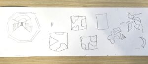
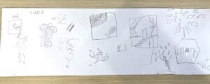
sketches

**INSERT THUMBNAILS

Cutting & Pasting Process

I found that executing my ideas was more difficult that I expected, hence why my first thumbnail was really rough.  Sketching first helped provide a little reference, but cutting the designs out was a lot different from drawing.


Final Composition #1

Composition 1

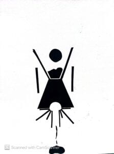
I wasn’t confident about making a more abstract piece first, so for my first work I tried to think of everyday objects for inspiration. I pictured an hourglass as I felt like its simple and symmetrical form would be interesting to manipulate. To change up one’s expectations a little, I pictured sand or whatever inside spilling out/escaping. For the inclusion of the circles, from the beginning I sketched the hourglass with an open top and a ball dropping into it. Originally I wanted to depict a ball or squares bouncing and tumbling, but I had no idea how to visually execute that. I added the half cut circle at the bottom in an attempt to communicate this movement I had in mind through depictions of the ball in different stages (different frames). It also helped with symmetry and reflection. I thought that the circle and sand together looked like the sun over a mountain, so I thought I could also depict a sunrise and sunset. I added rectangles to the half circle to portray sun rays. The two rectangles at the sides of the hourglass  were supposed to be supports/the stand the hourglass is in, but I didn’t want to draw a complete stand and end up closing the top and bottom of the hourglass, so I left it as is.


Final Composition #2

Composition 2

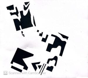
My 2nd work was produced a lot quicker than my first one. I wanted to challenge myself and keep this one more abstract, as I was concerned that with the hourglass and subsequent designs I was trying to visualize, I was playing too safe and sticking to portraying objects as they are. I chose to just use basic shapes, and at first I wanted to produce something that gives the appearance of depth (like a tunnel, staircase, etc), but again I was concerned I wouldn’t be able to execute that properly. 

I cut out 3 squares and then cut more pieces out of them, leaving those pieces next to the squares. 

What I would change with this work is the placement of the cut out pieces. I think the work overall is a little uncentered and appears heavier on the left, when that doesn’t necessarily add anything to the composition. I wish I had some elements out of frame or in the corners, as I feel like works like that are most striking to me.


Recitation Critique

For work 1, I remember that Santiago expressed he thought I made the right choice in not closing off the tops to the hourglass and surrounding the sides of the hourglass with too much else. I agree and feel like I could’ve made the whole design seem to busy and detract from the focal point of the hourglass and the elements inside it. I think Calvin’s input on how he saw the hourglass to be a girl was the most interesting, as it’s something I didn’t consider at all. I think he saw the topmost circle to be a head, and the hourglass to form a body. Not only did he just see this, but the side rectangles gave him the impression of bars, and that the work depicts a girl boxed in/repressed in society.

I was really impressed by everyones’ work and how you can see some of their personalities and thought processes when it came to approaching the question of how to best utilize the one black square we were given in their works. 

Go to more in-class critique notes here.


.


Group Research Project: Report

Step 4 is a reflection on the entire process of the group research project.

Our group

Our group’s idea was inspired by Ursula Le Guin’s short story “The One Who Walk Away From Omelas.” Le Guin’s story is a work of philosophical fiction, wherein the happiness and prosperity of a city is dependent on the subjugation and eternal misery of a single child. The city, Omelas, is a utopia but only only through this condition being fulfilled, and the story explores themes of the self vs the society, sacrifice, that there is no happiness without suffering, and complacency and desensitization. 

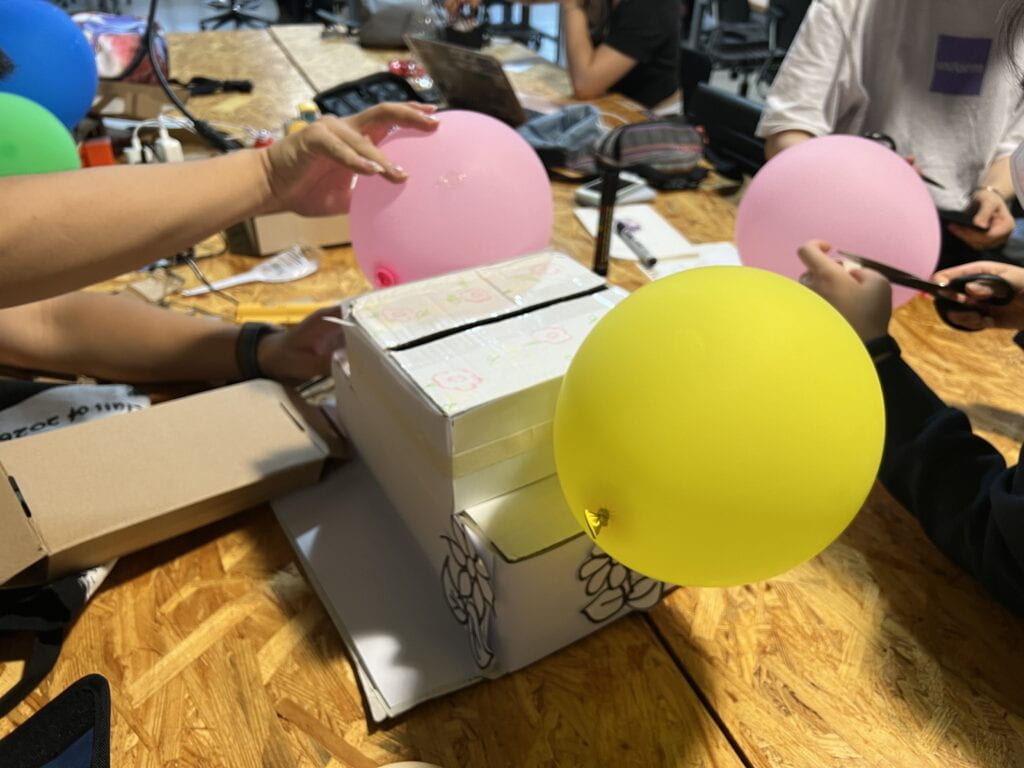
Our device was conceived to be used as an immersive experience, which was physically a box that the user wears as a hat. When worn, the user would sense what the child in the story senses through sight, smell, touch, taste, and hearing. This was shown visually through the contrast of the box’s physical appearance: inside we drew prison bars and illustrations that reflected an environment that was dank and dirty.  On the outside of the box, we had illustrations of flowers, as well as a pop-up of crochet flowers to stuck out, to evoke the perceived beauty of the Omelas. This bundle of crochet flowers was designed to be the more striking part of the box, like a centerpiece. But this centerpiece can only appear when a condition is met- the push flap mechanism in the inside of the box can be activated when the box is worn, which will make the flowers pop out for others to see. When this flap is not pushed up, the flowers are not visible. We played with the concept of vision for this device- a citizen of the Omelas can try on the box to experience the full circumstances of the boy, but they can choose when to remove it and therefore remove themselves from that situation. During the skit, when it was taken off of the boy for a citizen of the Omelas to try on, Harrison covered his eyes, to show that he will never experience the beauty and happiness of the outside of the box. This draws back to the following quote from the story: “…even if the child could be released, it would not get much good of its freedom: a little vague pleasure of warmth and food…but little more. It is too degraded and imbecile to know any real joy. It had been afraid for too long to ever to be free of fear. Its habits are too uncouth for it to respond to humane treatment” (Le Guin). It is thought that the child might be so irrevocably lost, that while he physically might still be able to see, the trauma and underdevelopment of how he ascribes meaning to what he sees nearly blocks that. 

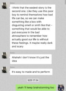
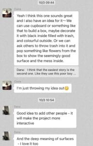
In conceiving the device, Dana was the one who proposed basing it off of the story of the Omelas, with a box that provided a sensory experience. I wanted to note how she had tied in the imagined effect from the beginning, which is that it would not only potentially evoke empathy, but deeper critique and understanding of the child’s life, the world around us, and our lives. Claire also added her thoughts about how we could play with the different surfaces/dimensions and visibility.


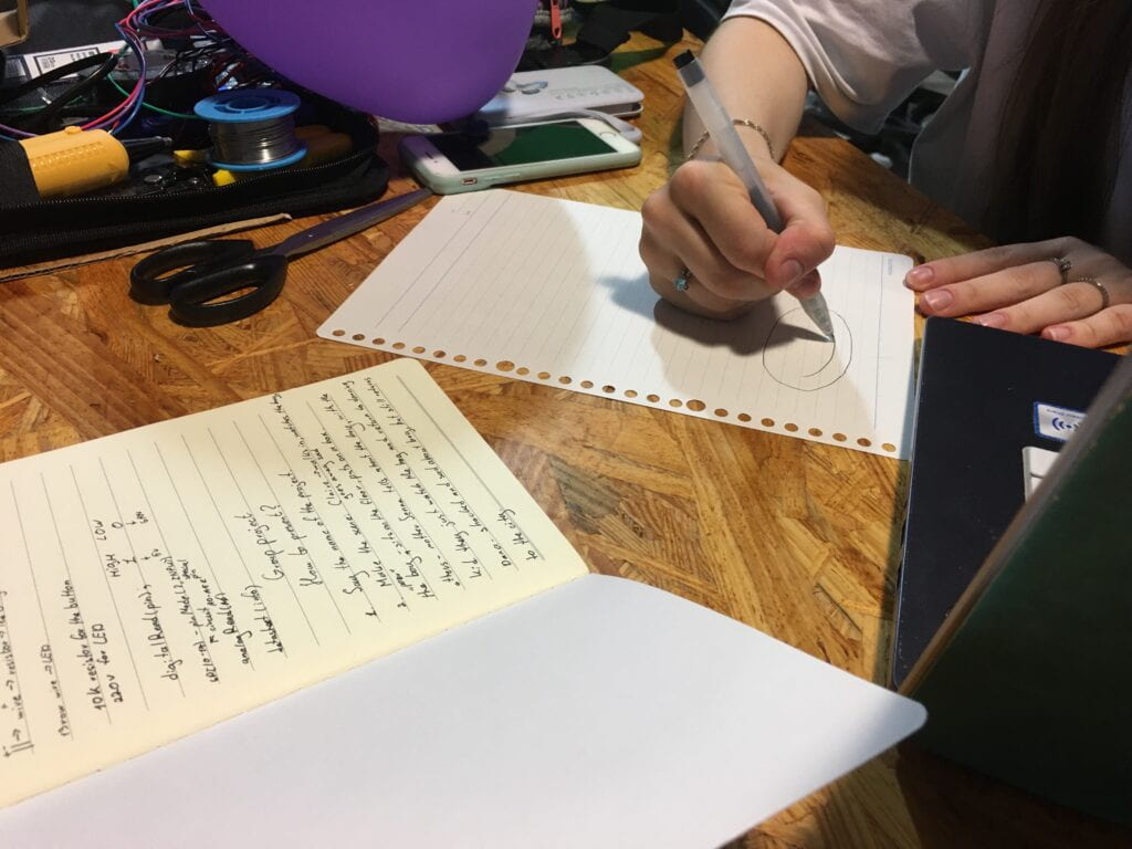
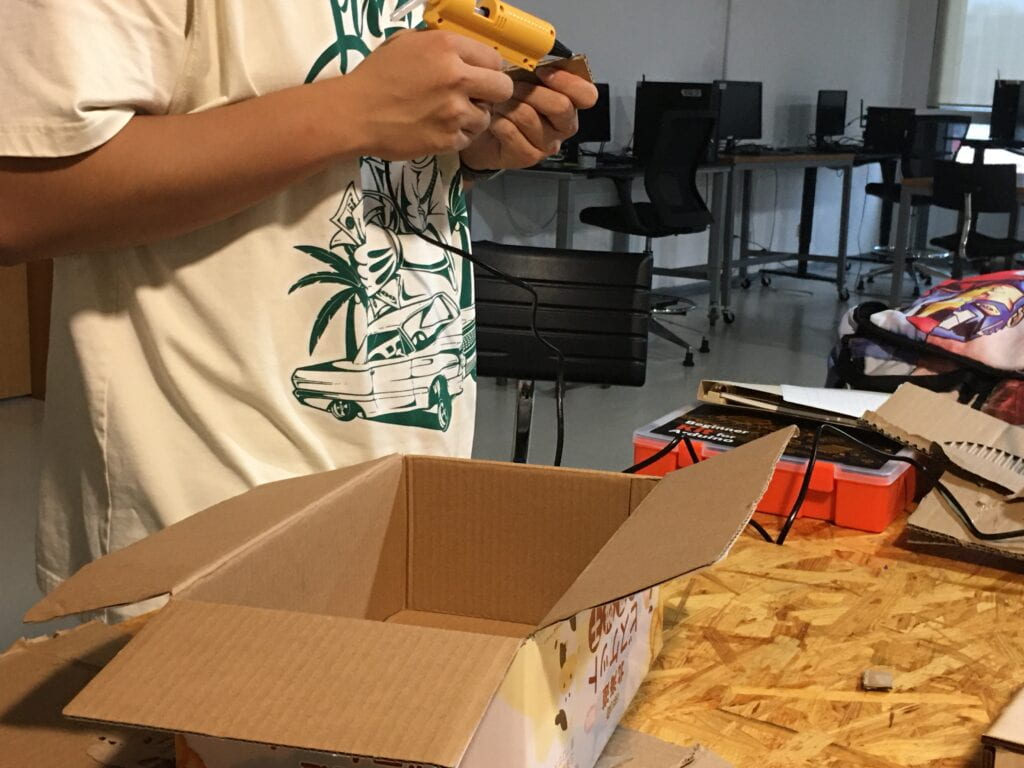
Our group had met twice in the studio to construct the box, and a few times to rehearse. I had arrived to the studio a bit late, and Rachel and Claire were working on the box at the time. It was made from one smaller box stacked on top of a larger one, and we retained the flaps so they could naturally cover the flowers. I made some decorations for the outside. I was concerned that we all were still keeping the interactivity of the artifact in mind, so I was checking in in the beginning and with any additions, how it would be interactive. We struggled a little with the mechanism for the flowers, which we all worked on. The straw I got from the cafe helped keep the bunch upright, while Harrison thought of the cardboard layer that would be pushed up by wearing and naturally drop when no head is there to support it.  We came up with roles and a general script, and thought of other ways we could express elements of the story, like Harrison wearing dark makeup to express filth.

Dana’s notes and the signs she drew

Harrison building the mechanism


During the skit, Harrison was the child, Alaia and I were a married couple with Rachel as our daughter, and Claire and Dana were citizens. Other props we used were balloons and a basket of flowers. We started with putting the box on Harrison’s head (in rehearsals, we had planned this as all of us together to show how we all had a role in the child being like this). Immediately the flower pops up. Alaia and I then said that we were on our anniversary, which was also Rachel’s 8th birthday, an age where she would learn about and see the child. We showed this to her, and returned to dancing after. Dana was next to look at the boy, and she expressed disgust, but still did nothing. Claire was the last, and the only one to physically try on the box, which disgusted her and left her disorientated, finally choosing to leave the Omelas.


Rehearsal

Performance
 
Feedback

Circling back to the project I identified as fulfilling the definition of “interaction” and the project I identified as not fulfilling the definition in the RESEARCH phase of the project, I think our device did not completely meet my definition of interaction. My definition of interaction stemmed from Chris Crawford’s definition and Zach Lieberman’s definition, and involves a device that is one component and actor in a mutual exchange of information through listening, thinking, and speaking, and produces unique and not repeated results with use.  I think it has elements of the second project I wrote about (The Signature Project, meets definition of interaction) as well as the third project (Untitled (drone), does not meet definition of interaction). We as the users would set off new results by wearing the box, but what of those of us (me, Alaia, Dana) that didn’t try it on? The different “results” might be achieved if you consider the different emotions and responses it might evoke in different people. If these different results aren’t clear enough, then does that mean the device is not “listening” in a way that specifically listens to each unique individual that interacts with it?

I think we struggled in fully fleshing out our device and expressing the more abstract aspects of and thoughts behind it (through the functioning of the device, and with provided context before the performance).  While we chose to have the box be the medium to express a larger immersive device, I think it was difficult for it to be perceived as anything more than a box, and we also received questions of why we chose to have it be something you could wear.


Another group

The first group’s artifact caught my attention because their performance was also strong. They conceived of a pair of glasses,  that when worn in certain scenarios, can change how a person responds to what they’re seeing, particularly in terms of empathy and willingness to assist. When I think back to it however, I feel like it would be normal to think of this was a type of mind reading device, but the impression I got was that it was more reactionary. Say if the person on the ground was hurt and frustrated that the person above them refused to lend a hand, they would have that person put on these glasses, which would make them feel more empathetic and help them. Or is it a person’s autonomous choice to wear those glasses? And would that not depend on the person needing to recognize an insufficient level of empathy they are producing? I think it was thanks to their skits within a skit that I got a general gist of the function of the device though, even though I have those clarification questions. I was impressed that they thought of two facets as well– the glasses affecting EQ and IQ. I did note that the design did come off as not very specifically being attributed to any one story. I feel like when thought about in relation to the Omelas story, it’s quite similar to our device.