Our first project built off of what we learned about Gestalt principles and had us apply them to two 2d designs.
Gestalt theory states that when humans look at a complex image/design, we’ll attempt to make sense of it by recognizing a pattern or structure. As a principle of perception, it states that we instinctively perceive objects as either figure (the focal point) or ground (the background). Therefore, if a composition is made of many small parts, we’ll try to group them together–the whole is greater than the sum of its parts.
The theory involves closure, proximity, continuity, similarity, and figure and ground. Closure refers to our tendency to see complete figures even when part of the information is missing. Proximity states that things which are closer together will be seen as belonging together. Similarity states that things which share visual characteristics like shape, size, color, value, etc will be seen as belonging together. Continuity refers to our preference for continuous figures.
These principles provide the foundation for effective design.
Works & Materials
- 2 large compositions
–> 2 of 13cm x 13cm black squares
–> 29.7cm x 32.5cm white mat board
- 4 small thumbnail compositions
–> 4 of 5cm x 5cm black squares
–> 29.7cm x 42cm sheet of paper
Brainstorming & Conceptual Design
I had a good amount of trouble coming up with my designs. Looking at others’ work and examples helped me visualize the principles in action, but it made it feel challenging to come up with an original design.
I initially was certain I would have to plan far head–have a clear idea in mind and preferably a sketch of it, but I was able to actually go with new ideas and thoughts I had along the way.
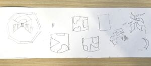

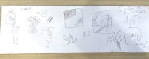
**INSERT THUMBNAILS
Cutting & Pasting Process
I found that executing my ideas was more difficult that I expected, hence why my first thumbnail was really rough. Sketching first helped provide a little reference, but cutting the designs out was a lot different from drawing.
Final Composition #1
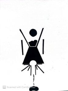
I wasn’t confident about making a more abstract piece first, so for my first work I tried to think of everyday objects for inspiration. I pictured an hourglass as I felt like its simple and symmetrical form would be interesting to manipulate. To change up one’s expectations a little, I pictured sand or whatever inside spilling out/escaping. For the inclusion of the circles, from the beginning I sketched the hourglass with an open top and a ball dropping into it. Originally I wanted to depict a ball or squares bouncing and tumbling, but I had no idea how to visually execute that. I added the half cut circle at the bottom in an attempt to communicate this movement I had in mind through depictions of the ball in different stages (different frames). It also helped with symmetry and reflection. I thought that the circle and sand together looked like the sun over a mountain, so I thought I could also depict a sunrise and sunset. I added rectangles to the half circle to portray sun rays. The two rectangles at the sides of the hourglass were supposed to be supports/the stand the hourglass is in, but I didn’t want to draw a complete stand and end up closing the top and bottom of the hourglass, so I left it as is.
Final Composition #2
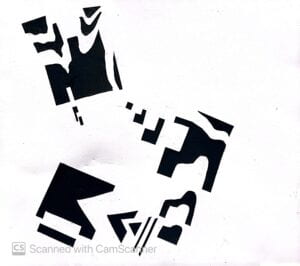
My 2nd work was produced a lot quicker than my first one. I wanted to challenge myself and keep this one more abstract, as I was concerned that with the hourglass and subsequent designs I was trying to visualize, I was playing too safe and sticking to portraying objects as they are. I chose to just use basic shapes, and at first I wanted to produce something that gives the appearance of depth (like a tunnel, staircase, etc), but again I was concerned I wouldn’t be able to execute that properly.
I cut out 3 squares and then cut more pieces out of them, leaving those pieces next to the squares.
What I would change with this work is the placement of the cut out pieces. I think the work overall is a little uncentered and appears heavier on the left, when that doesn’t necessarily add anything to the composition. I wish I had some elements out of frame or in the corners, as I feel like works like that are most striking to me.
Recitation Critique
For work 1, I remember that Santiago expressed he thought I made the right choice in not closing off the tops to the hourglass and surrounding the sides of the hourglass with too much else. I agree and feel like I could’ve made the whole design seem to busy and detract from the focal point of the hourglass and the elements inside it. I think Calvin’s input on how he saw the hourglass to be a girl was the most interesting, as it’s something I didn’t consider at all. I think he saw the topmost circle to be a head, and the hourglass to form a body. Not only did he just see this, but the side rectangles gave him the impression of bars, and that the work depicts a girl boxed in/repressed in society.
I was really impressed by everyones’ work and how you can see some of their personalities and thought processes when it came to approaching the question of how to best utilize the one black square we were given in their works.
Go to more in-class critique notes here.
.
