project title: love with nowhere to go
‘love with nowhere to go’ is a digital interactive story/diary that is one part my personal messages to my extended family in beijing–those who are with me and those who have passed, and one part my recollections of their lives and what i wish to share about them. the goal is to create a space where I can address things that I have left unsaid due to barriers in language, physical distance, and generation, and touch on my experience as part of the Chinese diaspora in general.
1) Process: Design and Composition
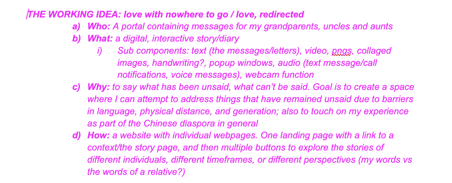
I ended up pursuing one of my ideas from when I first started brainstorming for Project B over spring break, which was to make my website something personal/important to me. Here was my working idea:
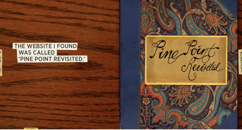
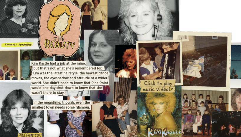
I felt that having the content of the website be something important to me would help with feeling like the project is workable and interesting. My main inspiration was “Pinepoint” by Paul Shoebridge and Michael Simons, which is an interactive documentary website that is also an example of the authors’ personal narratives. It is a recollection and pays homage to their hometown and the family and friends in it utilizing collaged photos, text, video, etc. Here is something I tried to keep in mind as I kept working:

My initial visualization in mind was a kind of map with pinpoints/landmarks that you could drag around and explore, but I wasn’t sure how to approach making this. I first started mapping out on a doc what I wanted to do: including the website structure, user interactions, and components. I knew that I would be incorporating a lot of multimedia. I wanted to make something similarly content-driven like ‘Pinepoint.’ ‘Pinepoint’ features a digital photo album/journal that the user can flip through to continue the narrative and learn about people special to the authors. I decided to have separate pages dedicated to my family members too. I first decided who I wanted to showcase on the website.
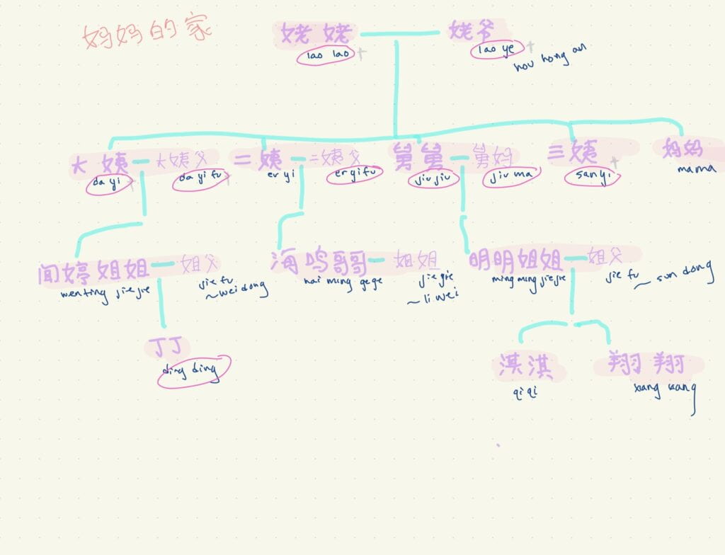
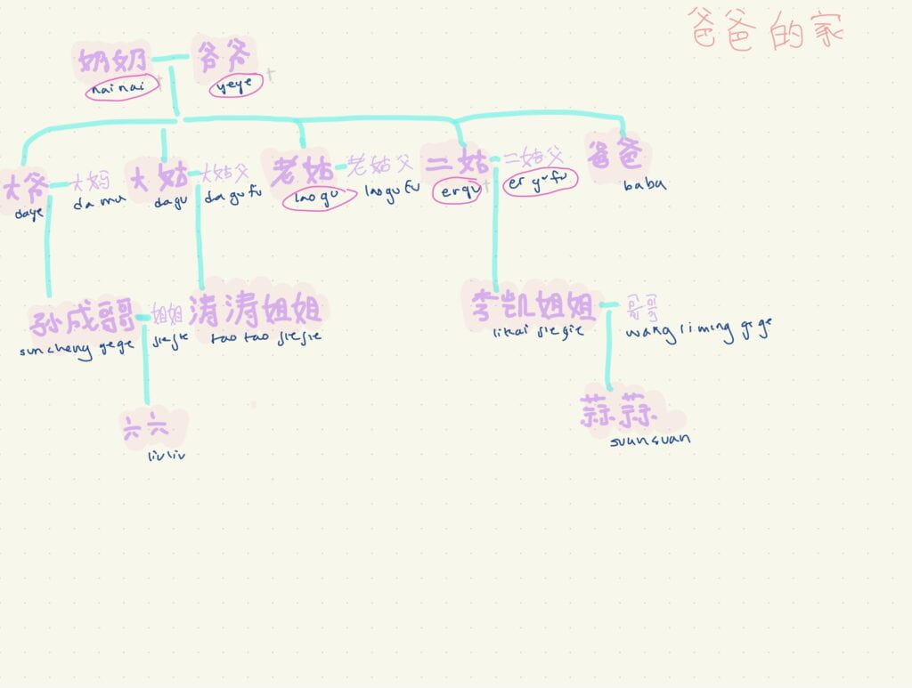
next I would start to write about them while also building the structure for the website. my website uses similar structure and user navigation as ‘Pinepoint,’ except the stories are centered in one narrative hub that the user can navigate back to and between stories.
below is the homepage: each label is a link that you can click on to reach either the page for my mom’s side of the family, my dad’s, or for extra features.

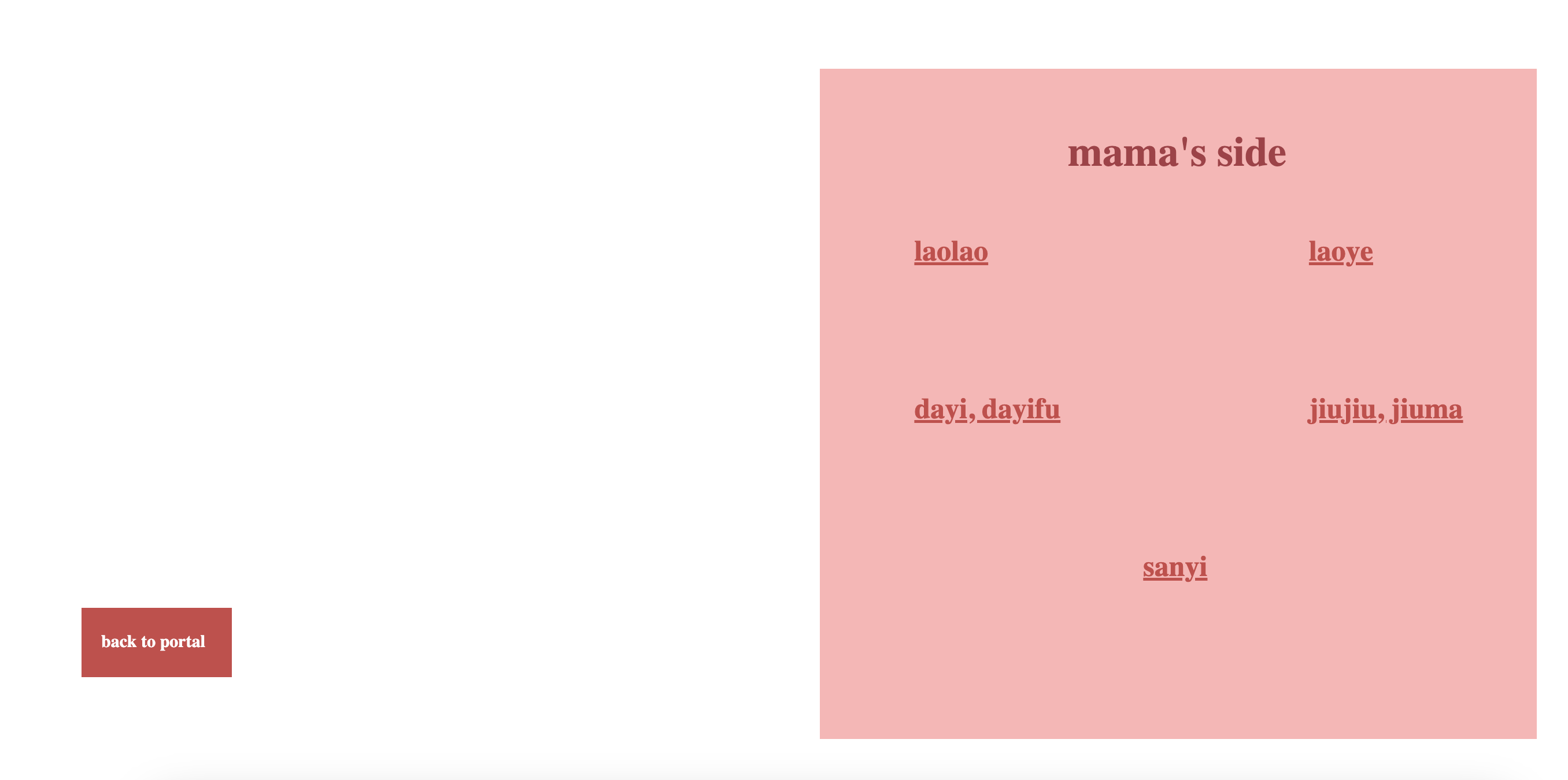
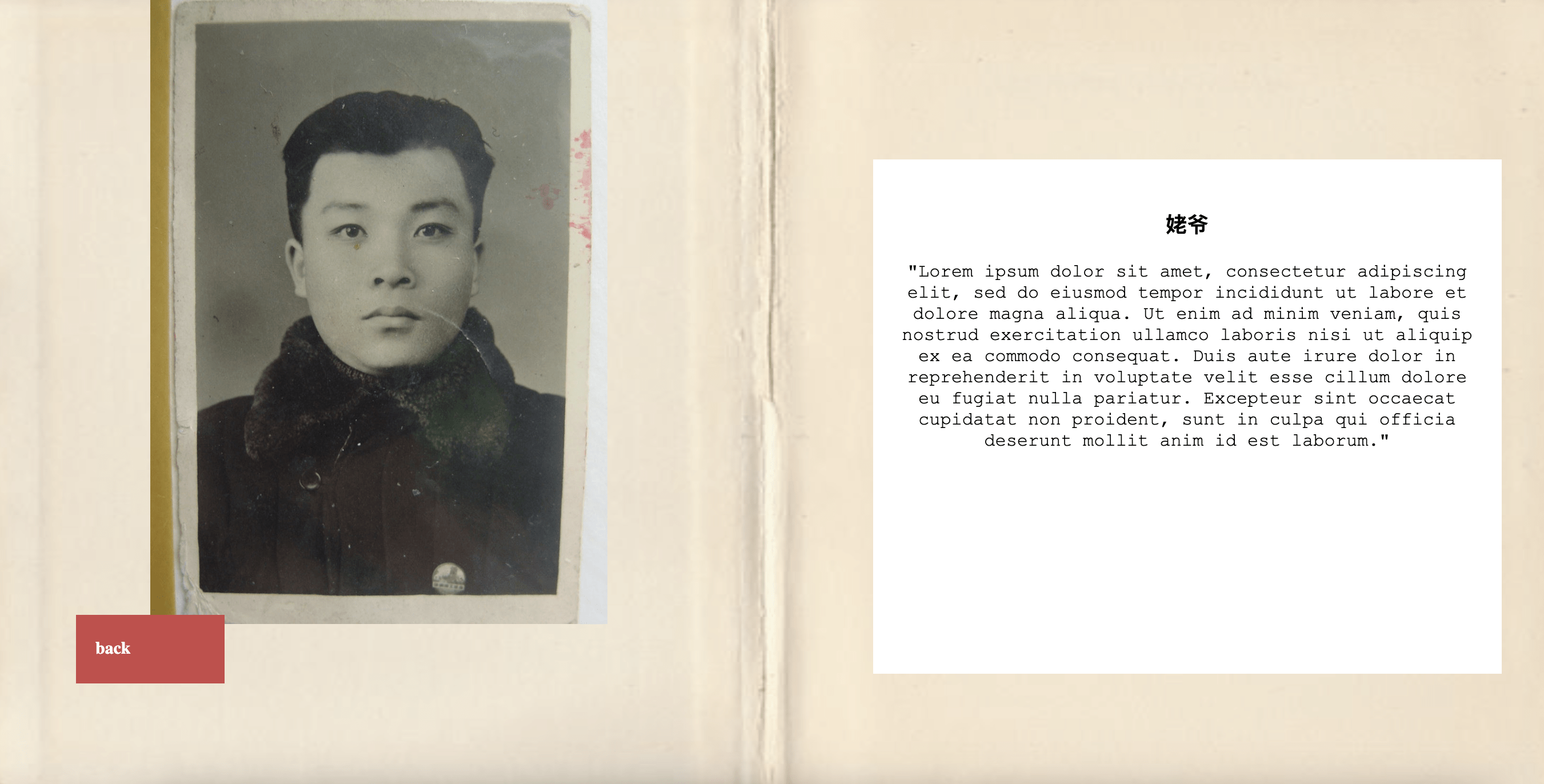
From the initial index.html landing page, my website has a similar start to ‘Pinepoint.’ I drew visual inspiration from it while also trying to incorporate visuals that would nod to Chinese culture as well as the role of the web and the digital world in staying connected.
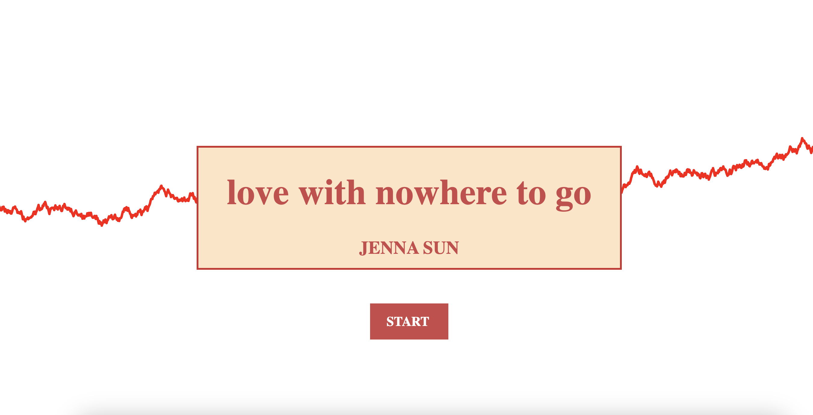
For the landing page I tried to use random walker to make a simple visual like a red thread.
I tried to incorporate some variety by adding different functionalities and user navigation/interaction.
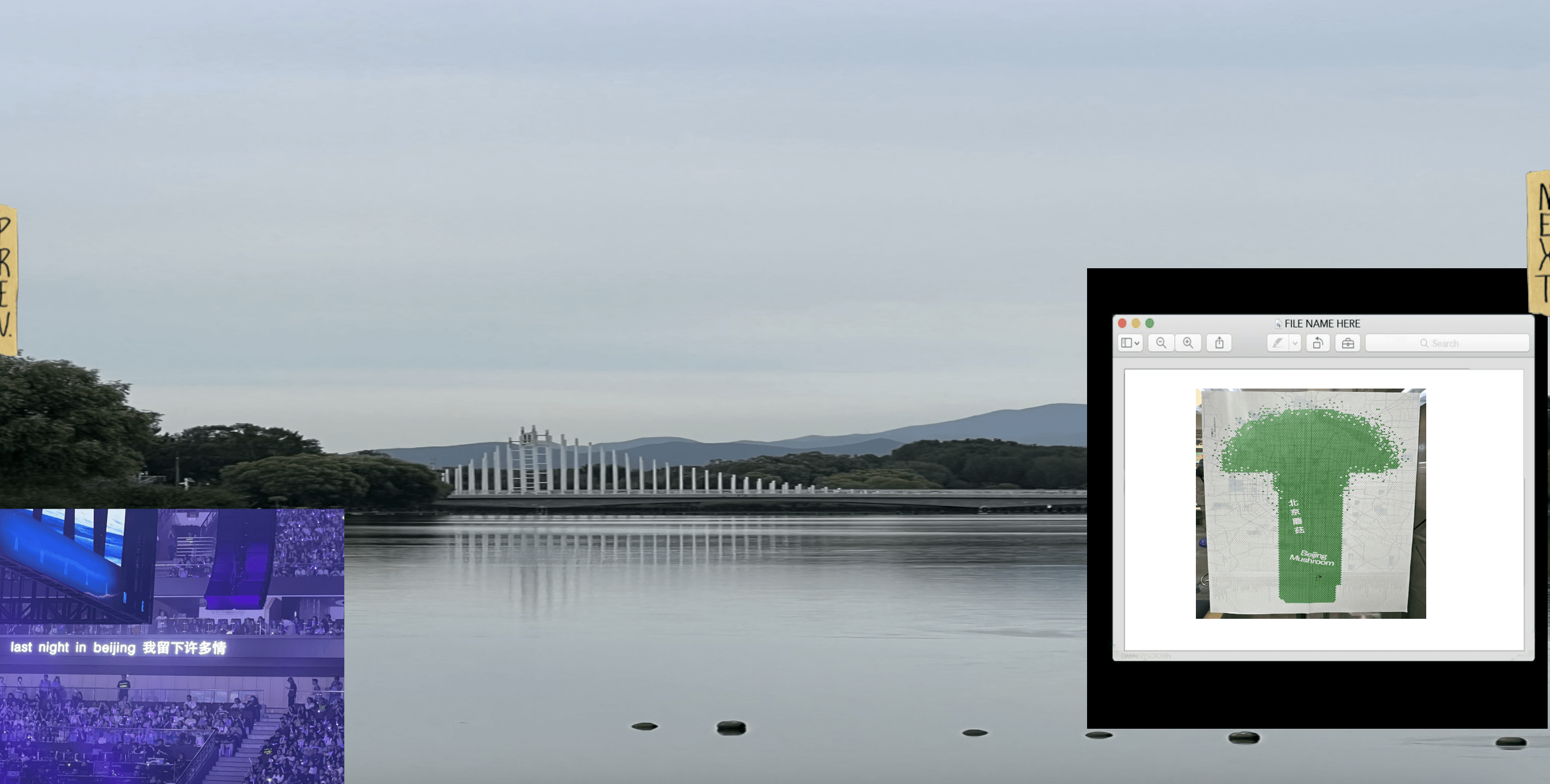
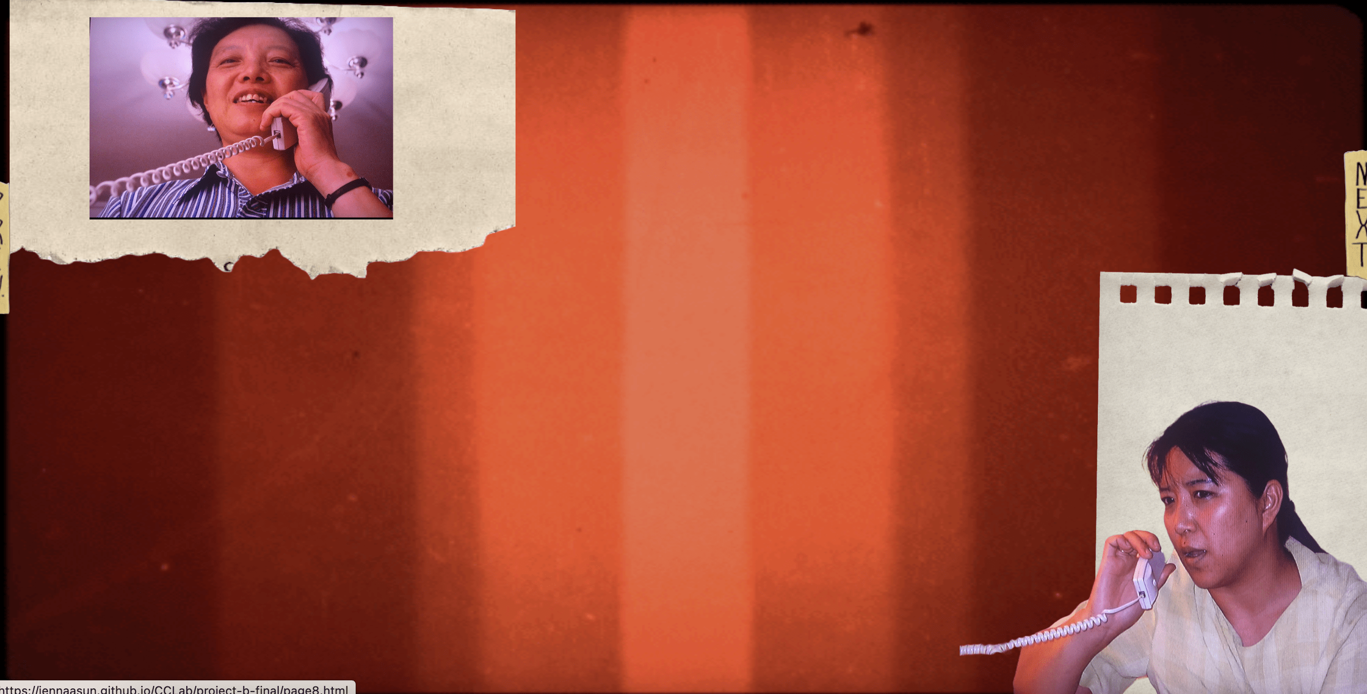
2) Process: Technical
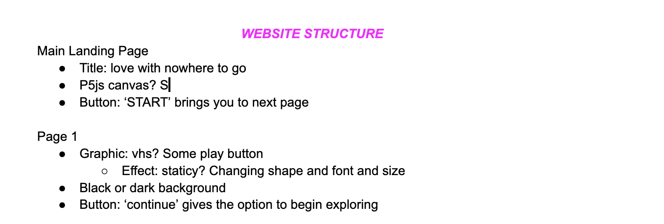
I started out mapping the structure, how many pages I wanted, and what I wanted each page to be. While this helped in making things feel more manageable and remembering exactly what to do, I probably would not appproach it this way again as the amount of pages became unmanageable and I did not develop a way to reorder or change content in a flexible way.
Moon helped me get started with the code by creating boxes that I could organize my content within.
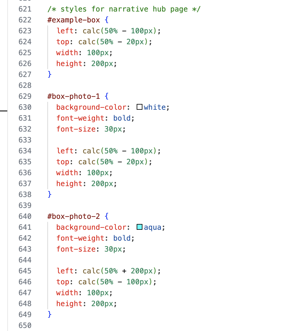
My website has more than 20 pages, and user navigation works by clicking on direct links or links that are attached to an image.

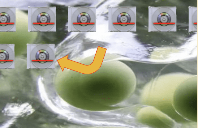
here is a section I couldn’t get to work, I wanted to have a popup image or video in one of these CDs. The furthest I got was getting the popupo window when you clicked on only this cd, but I had issue getting the image to show up
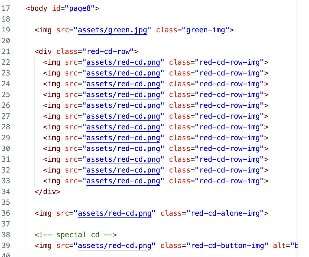

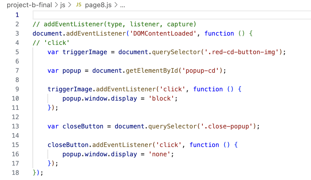
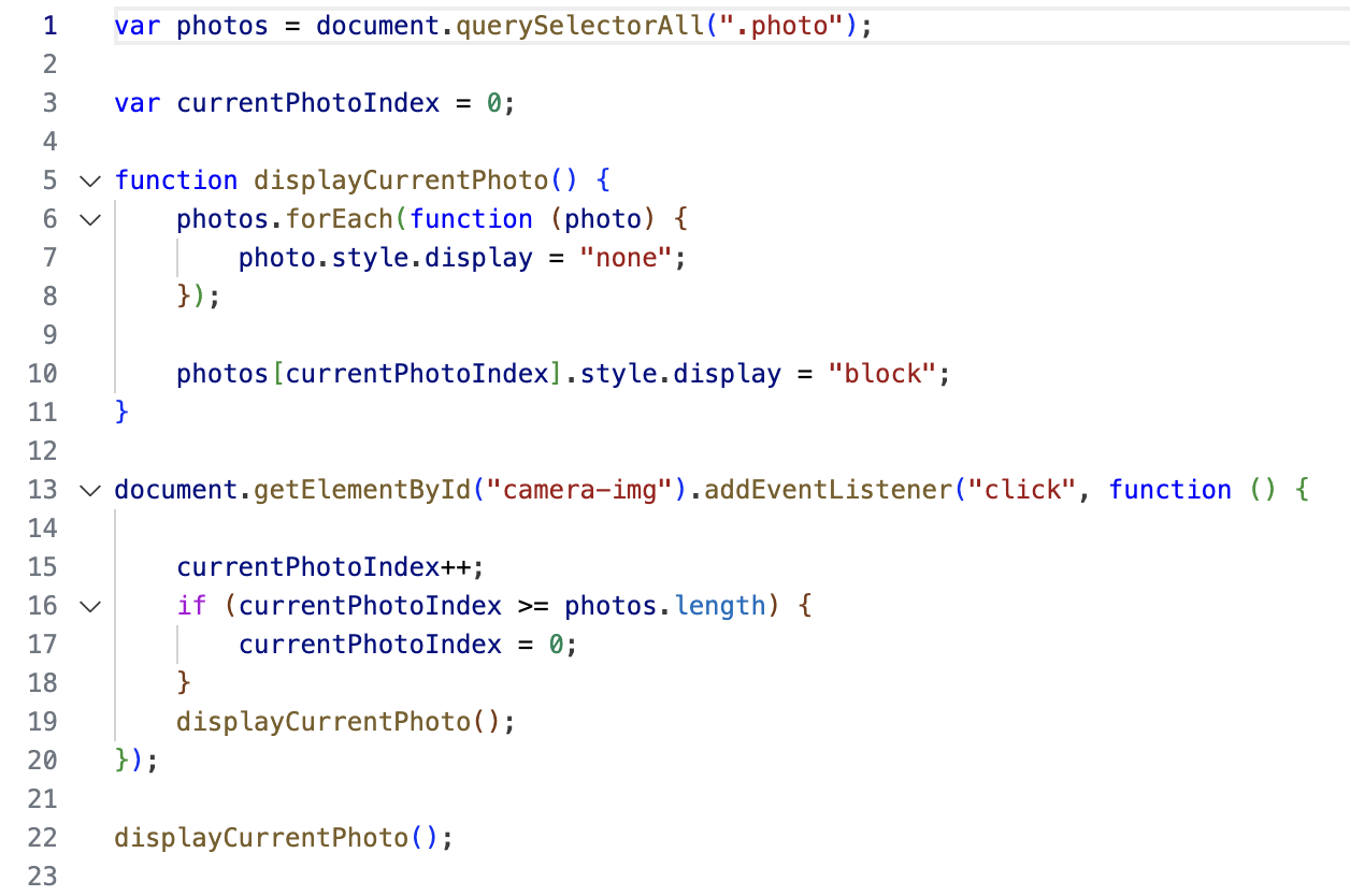
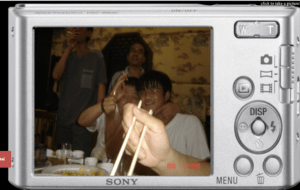
here’s the code behind the digital camera page
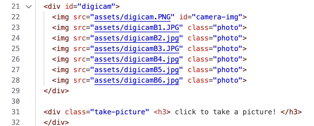
3) Reflection and Future Development
I am not satisfied with this project–it is incomplete. I struggled again with time management and a little burnout towards the end of the semester. I was satisfied and motivated to see that the basic structure of building the website came easily to me even though I expected it to be difficult.
I still struggle with overall good coding practices and structuring the code, especially with naming consistency and readability. I think the code I have is really a mess.
I also ran into a huge issue last minute with the pages and how they linked to each other–I preplanned all the pages by making them all more or less, and when I ended up deciding to omit some of the pages in between, I just ended up manually moving the content around which was extremely confusing.
However I agree that I didn’t really explore the criteria expected for Project B and that I need to move beyond just incorporating multimedia + externally used images to coding more of my own content instead.
Another thing to note is thoughtful design in order to maintain a cohesive theme from conceptualization to creation. I think I could’ve considered feasability of this many pages as well as user friendliness.
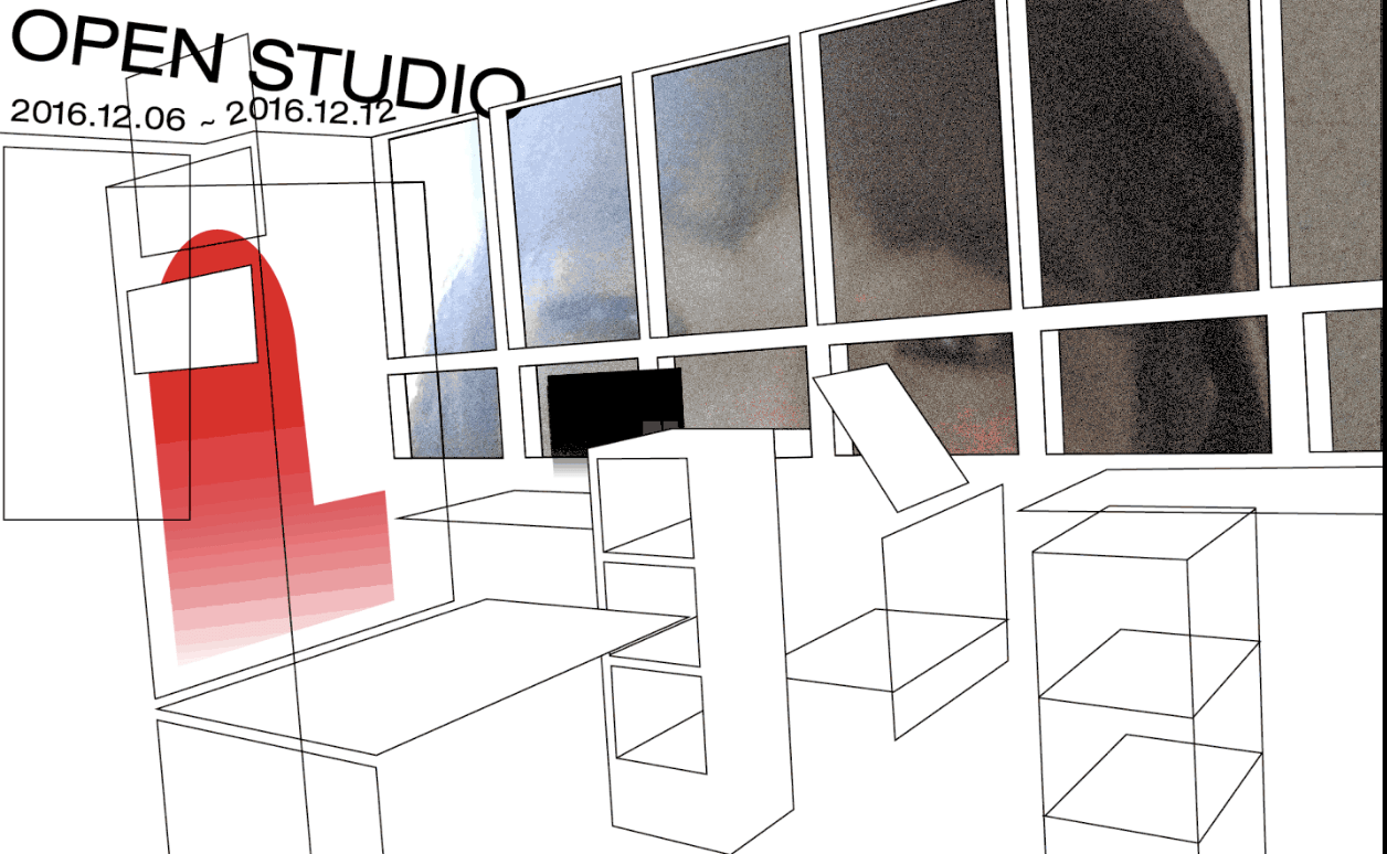
Other elements I wanted to include but did not get to were sound, a “video call” section/simulation using webcam, handwriting, and soundbites and text messages. For example, this use of webcam from yehwan song
4) Credits & References
conceptual inspirations
- ‘Pinepoint’ (2011) by Paul Shoebridge and Michael Simons, link here
- CCLab project by Ambra, link here
- ‘This Side of Rice’ by Jenny Zhang, link here
visual inspirations
- Brutalist Websites
- It’s Nice That
- Xingshan says hi, link here
- SEEN, link here
- ‘seventy states’ (2017) by solange, link here
tutorials/references
- random walker by kevin workman at happycoding, link here
- Color palette on some pages from Nana, link here
project links:
