Yehwan Song’s Work
What is Net Art?
“the term ‘net.art’ is less a coinage than an accident” (art forum)
(inter)net art refers to work that emerged in the 1990s through 2000s that explores the Internet as a new medium of expression. It can look like a collection of images, hyperlinks, text, sounds, etc. This is often interactive and part of a discourse with other works and users. One thing that stuck out to me was how both Art Forum and Net Specific emphasized its inclusivity: the internet as a repose for anyone and everyone. Fakewhale, a media blog, gave more insight into this: net art was a response to a cultural crisis that followed global shifts, like the fall of the USSR and Berlin Wall. “The artists involved grappled with the portrayal of democracy as a capitalist illusion,” and they viewed the internet as something that is supposedly the epitome of democratic equality, but also something that is easily manipulated by commercial interests, producing a web experience that can be highly manufactured and commercialized. This social awareness and reflection has remained central to net art for lots of artists.
Introduction
Artist background
Yehwan Song is a Korean graphic designer, web designer, and web developer. She has lived and worked in both Seoul and New York, but is currently based in NYC.
her work: she designs and develops experimental websites, interactive graphics, physical x digital art, all centered in internet spaces.
her interest: “flipping the general understanding of web design and playing with visual tricks” (girls club).
Work Overview
What are its visual, technical, and material features? Any forms of interaction?
Taking a look at her website shows that net art doesn’t have to exist just on the web. She designs web interfaces, interactive posters, but also tangible art like sculptures. She strives to create new interactions for users, for example, performances. Below are some selected works.
WEBSITES/”narrative architecture”
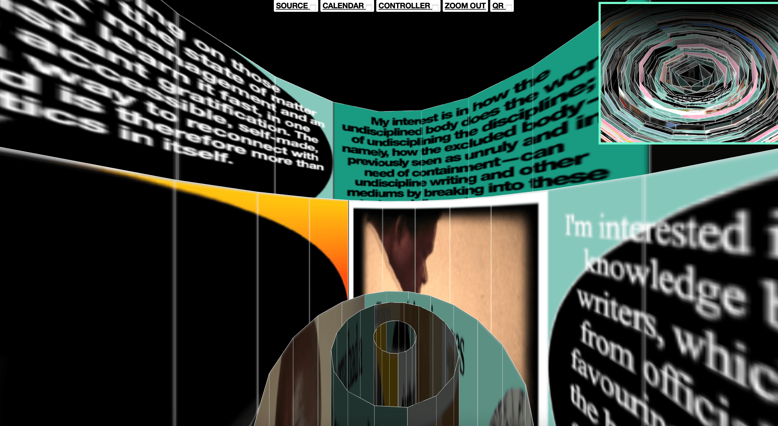
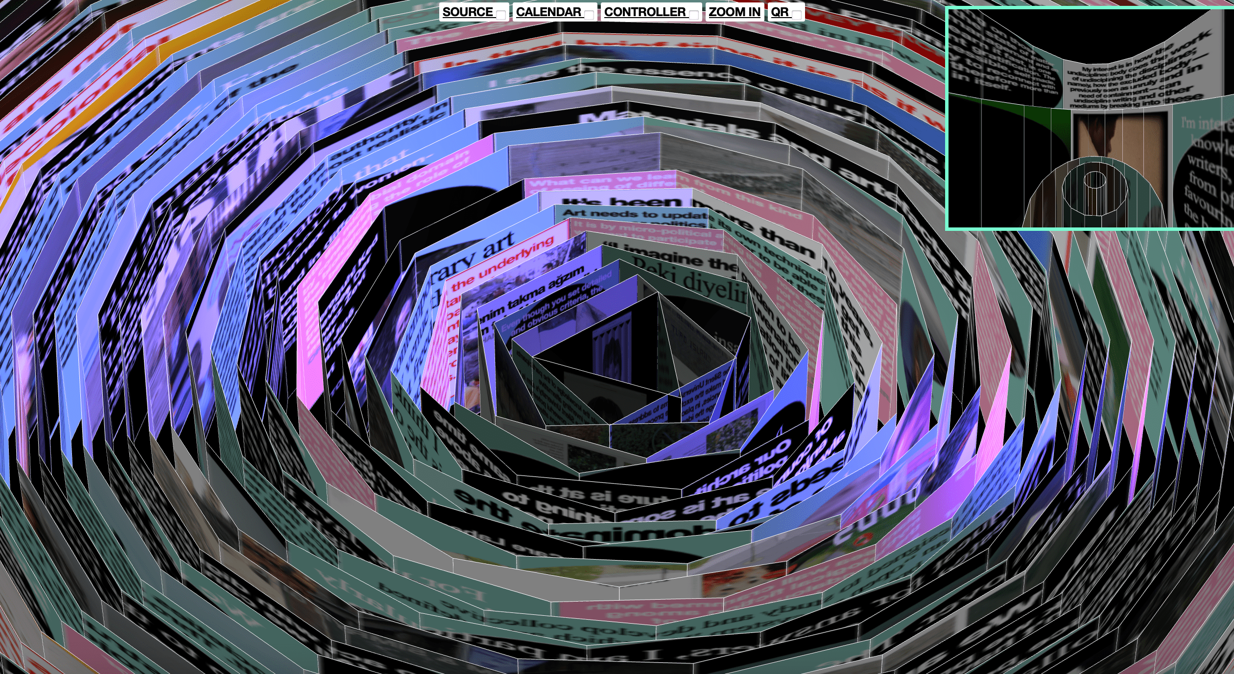
for cascading spiral, Song created her idea of an “internet of villages.” the graphic is a radial design “inspired by spiders’ webs and meteorological charts” that is like a living organism. it refreshed itself daily over the 2 months of the art exhibition and invited the users to explore the narrative.
esh museum is a website built for mobile devices. I really liked this design as you got to travel through a graphic design rendition of the halls of the museum by tapping, and included were photos of the real museum space.
PHYSICAL x DIGITAL
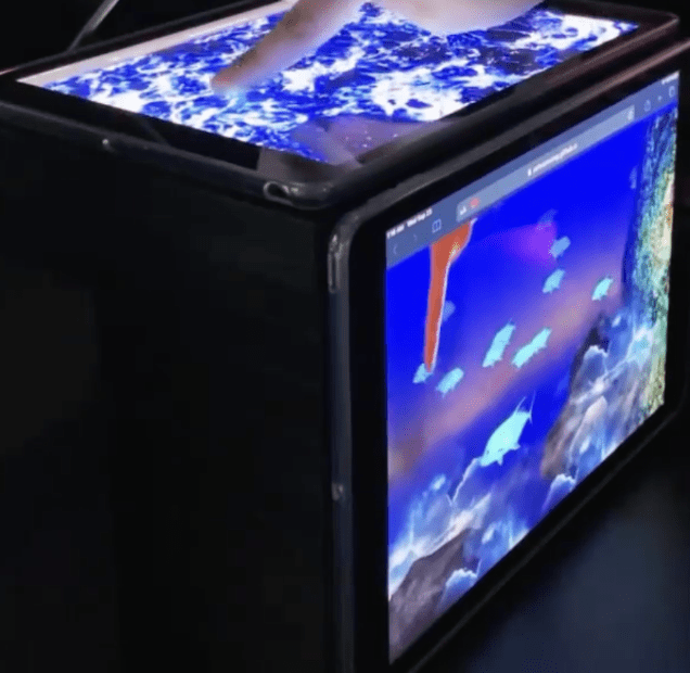

materials are 2 iPads and a webcam. touching the screen on the top iPad is like dipping your finger into a real fish tank.
View this post on Instagram
(Might need to open the Instagram link to see the video). This is really unconventional but pretty cool- it involves a website that receives inputs from raw eggs dropped on the screen, which renders art.
This is a similar concept to cracked eggs–the screen responds to water being poured on it, which renders water droplets.
“the way we touch each other in 2020”
this is another project created for mobile devices and relying on fingers tapping/holding the screen. I assume this emerge during the pandemic:)
INTERACTIVE POSTERS
“Xd workshop poster for team Thursday”
“List Of people who died on the toilet”
Yehwan does other graphic design as well! Here are two interactive posters.
OTHER WEB DESIGN
This design incorporates simple typography and a minimal blue color palette. I really like that you can unfurl the ribbon/banner by enlarging or minimizing the page.
samsara market is a 360 degree website with an interactive panoramic image of the market. I really like how specific people/stands/goods are highlighted with sketches or photos, which you can click on for more details
today I walked simulates walking down a street if you “walk” two fingers down the keyboard.
I really like the graphic design driven nature of this work! I think it reflects what Yehwan said in this article, which describes how she has come to forge together her background in coding and fundamentals graphic design basics. I like the concept of not necessarily scrolling just to get somewhere, but scrolling to see the product you create as you go along.
HIGHLIGHTED SERIES: “anti-user”
I wanted to highlight her “anti-user friendly” series, which explores new interactions between devices and websites.
What is the process by which the work is created, emerges, or evolves?
Yehwan builds web spaces using html, css, and javascript. Some of the work evolves on its own over time thanks to generative elements. She also intertwines online and physical spaces and navigates the area in between. For example, she makes sculptures or physical installations that visualize online spaces, and online spaces that are informed by physical inputs.
As for the meaning, I think it really comes out of user interaction.
What are the artist’s intentions, views, background, methods, and inspirations?
Key words for her work: non-user centric (“anti user friendly”). unconventional. diversity over consistency. variety over efficiency.
Yehwan has reiterated her goal and intentions in many places: “I want to change the way people use websites. I also want to change the web design industry, which is currently highly mass-produced by large companies. I want my independent design practices to change the way people think about websites, and also let them know that websites can be created by individuals..” (girlsclub)
Discussion
How is this topic connected to CCLab and what we learned about net art in the reading? Consider the technological, political, social, geographical context. What’s the significance of the work? What do you interpret to be its intention/message? What impact does/doesn’t it have?
I think Yehwan and her work truly represents everything we’ve read about net art and its characteristics and motivations. She approaches her art with a critical eye.
Her critiques of the web that I identified:
- the web proclaims to be inclusive, but it often isn’t.
- corporations are too focused on efficiency, which results in uniform design that stifles creativity
- she picks apart the “utopia” described in the reading to argue that it masks insecurity and discomfort
- this discomfort stems from placing all users in a monolith and overgeneralizing their behavior
- user experience depends on their background. for ex. some face censorship and a lack of legitimate online rights
how this manifests in her work:
- creates content forward, unconventional websites over conventional, static templates
- work is responsive to the user instead of making the same experience for everyone
One project that I think hits all the points is “(whose) world, (how) wide web” (2024). The installation includes a large keyboard with the English and Korean alphabet, which points to the Korean internet space. She points out loopholes in Korean internet laws, as well as the need for users to constantly switch between language settings to navigate an English-dominated web.
She has been explicitly forward about some of these critiques, especially the influence of corporations. In an interview with girl’s club, when asked “what are the biggest challenges you face in working as a creative,” Yehwan says: “it’s always hard to remain independent when everything is highly controlled and produced by large companies.” She simultaneously critiques these companies while empowering creatives and demonstrating that they can produce great content through coding.
Which features of the internet / web are significant for your Research Subject, and why?
I think a webpage that has a storytelling layout, interactive graphics, and possibly sound/music.
What are the connections with the concepts we are learning in CCLab?
Here are some specific works that are related especially to ideas/techniques we’ve looked at recently!
webcam interaction (first work, second work)
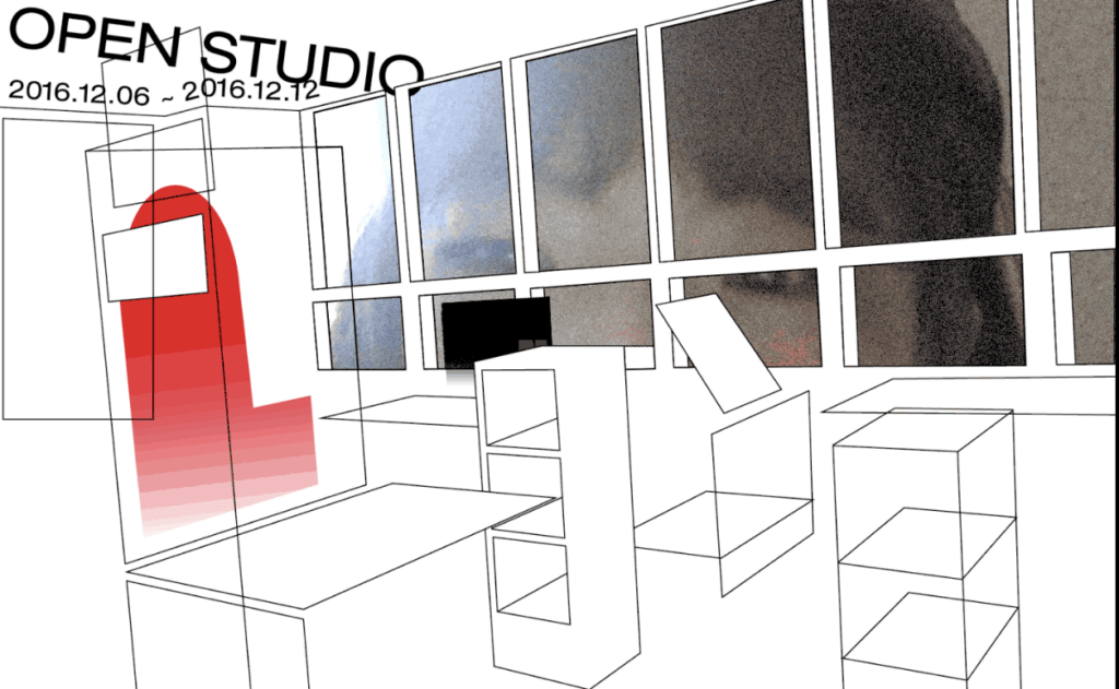
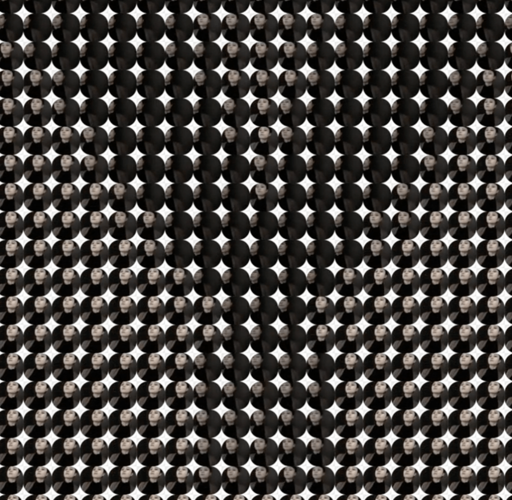
slight variation using classes:
“template and repetition of images”
sound:
keyboard interaction:
What can we learn?
I think Yehwan provides a lot to think about, especially in terms of thinking creatively and being courageous, and pursuing good design over uniformity/conventionality.
Conclusion
Sum up the main points from above, describe your personal point of view, and how the reading and your research topic may impact your ideation process for project B.
I think the reading and review of Yehwan’s work is perfect if our project is going to include a digital and physical (the time capsule) element. I also like how we can follow along with net art’s motivations to consider the question of what message will you send through the internet portal? , which asks us to weigh what we consider important to convey.
Check out Yehwan’s website here.
Checkout Yehwan’s Instagram here.
Sources
https://www.artforum.com/features/web-work-a-history-of-internet-art-2-162477/
https://netspecific.net/en/netspecific/what-is-net-art
https://log.fakewhale.xyz/curation/tracing-the-rise-and-impact-of-net-art/
https://helsinkibiennaali.fi/en/artist/yehwan-song/
https://www.itsnicethat.com/features/ones-to-watch-2020-yehwan-song-digital-240220
https://www.itsnicethat.com/articles/yehwan-song-interactive-digital-graphic-design-030119
https://postdigitalgraphicdesign.com/interview/19/pdgd-itw-yehwansong/
https://www.itsnicethat.com/features/ones-to-watch-2020-yehwan-song-digital-240220
