Colorful Childhood Brushstrokes
Jingchen Gao
I. Concept
The concept I want to convey by the communication between these two images is the relationship between my current pursue in IMA major and my previous learning experiences in painting and photography. I picked the painting tools I used when I was a kid as well as the youth palace where I used to learn painting five years ago as the target objects in this assignment, and I used different drawing techniques as substitute for different parts in the first picture.
Painting meant a lot to me. I had learned painting when I was a little kid, but I had to give it up in my eighth grade due to the pressure from school. Nevertheless, it is my greatest luck to come to NYUSH and pursue an IMA major, where I can start to create something artistic of my own again. Meanwhile, I have also cultivated my interest of photography recently, and in my opinion the two art forms of photography and painting share a lot of similarities. Both of them aim at recording the objects, either with fidelity or with embellishment. Therefore, this theme is the first and only idea that jumped into my mind as soon as I saw the requirements of this assignment. By using this as my content, I am recalling my memories of childhood and relating my previous experiences of drawing with the major that I am pursuing and I love.
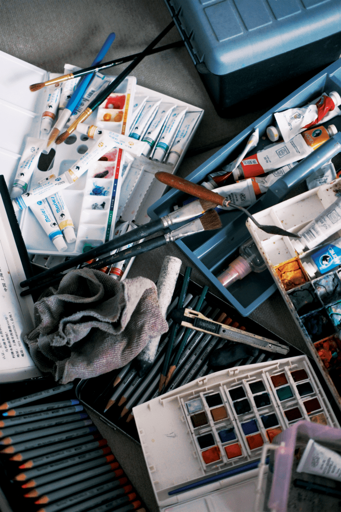
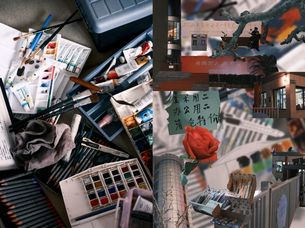
When it comes to the conversation between the two pictures, I intend to make the first one a simple photograph I take of the still objects, while the other a collage of my sketches and paintings and the deformation of the youth palace I used to go to. I would like to utilize various drawing methods to create my own drawings and represent the same composition in the original picture in assorted ways, and add another layer which is a rearrangement of different parts of the construction of the youth palace on top of it. By combining these elements together, I want to convey the idea that I had gained practical drawing skills which will benefit me for the entire life from the youth palace. Although now I don’t continue to learn drawing any longer, both the location and the tools will stay with me forever and will keep guiding me in my future pursuit in Interactive Media Arts. The two pictures will also symbolize the two art forms that I love the most: photography and painting, with the first one displaying the former and the second one representing the latter.
II. Process
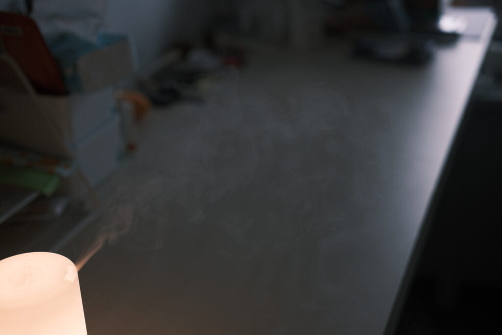
My first step was to make an arrangement of the drawing tools that I brought from home. I opened all the covered containers which had my pencils, paints and brushes in it, took out all the tools and arranged them in my dorm. After that, I took pictures from different angles of this composition. I also took photos of the water spray generated by my humidifier in case I would like to put it in the background of my second image. Finally, I adjusted the hue of the final version of image 1 to make it more visually appealing.
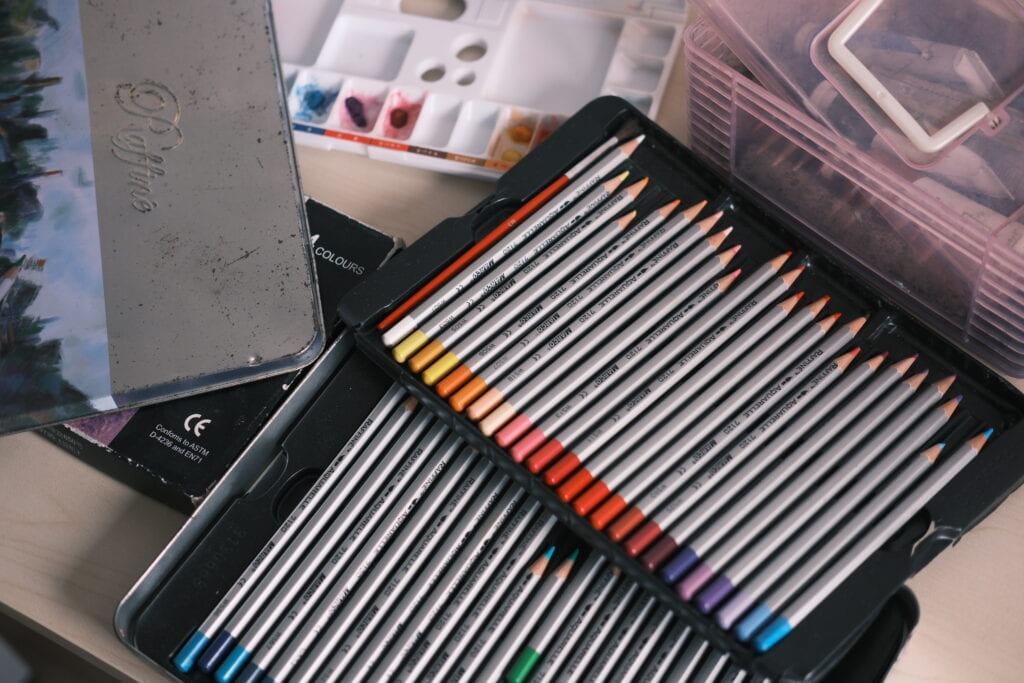
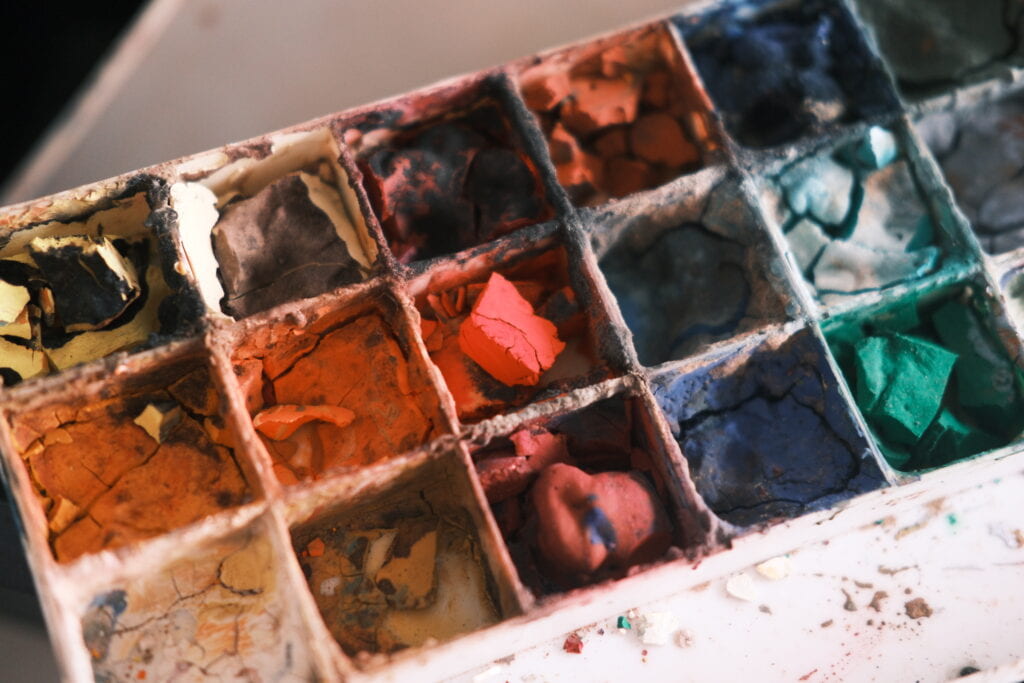
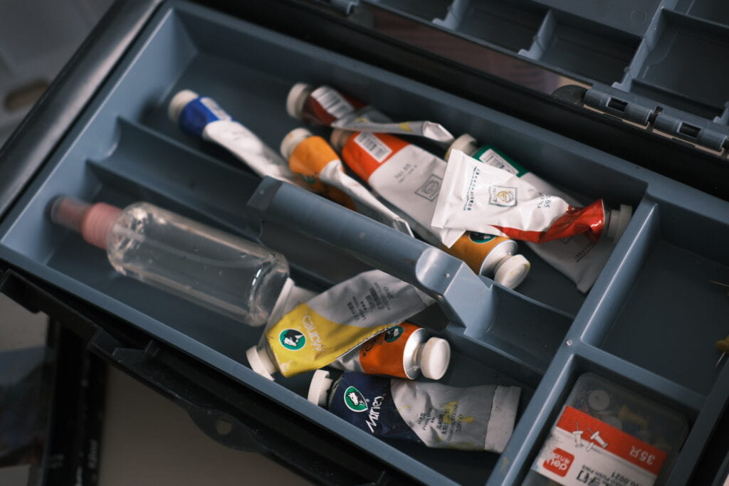

After I had finished creating image 1, I turned to image 2 which requires photo editing and is the most crucial part of this assignment. To get started, I first put my hands on the drawing part which I considered to be the core of this picture. Instead of just taking photos of the drawing tools, this time I opened the dusty containers of my art supplies and started to create drawings by them. I used the tools in specific positions in image 1 to imitate their appearances in my paintings. This was time-consuming, and I stayed up all night just to finish all the sketches, but it was worth it.
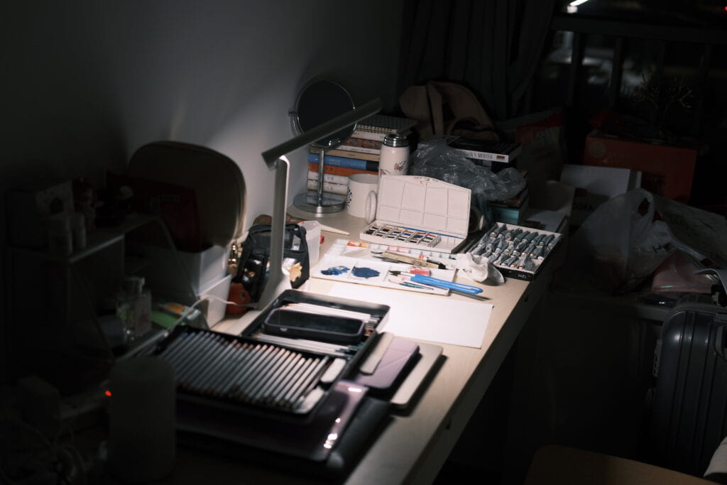
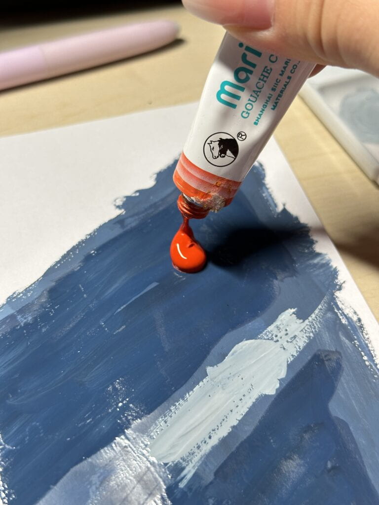
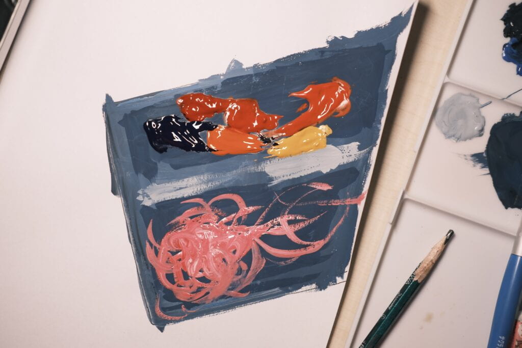
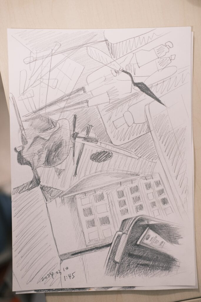
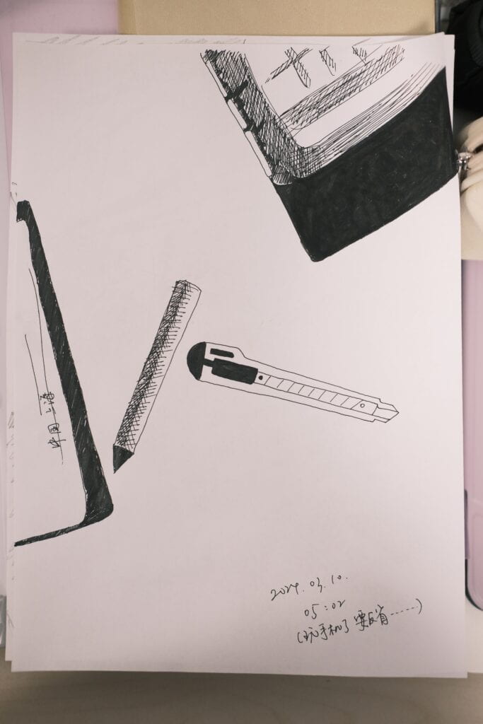
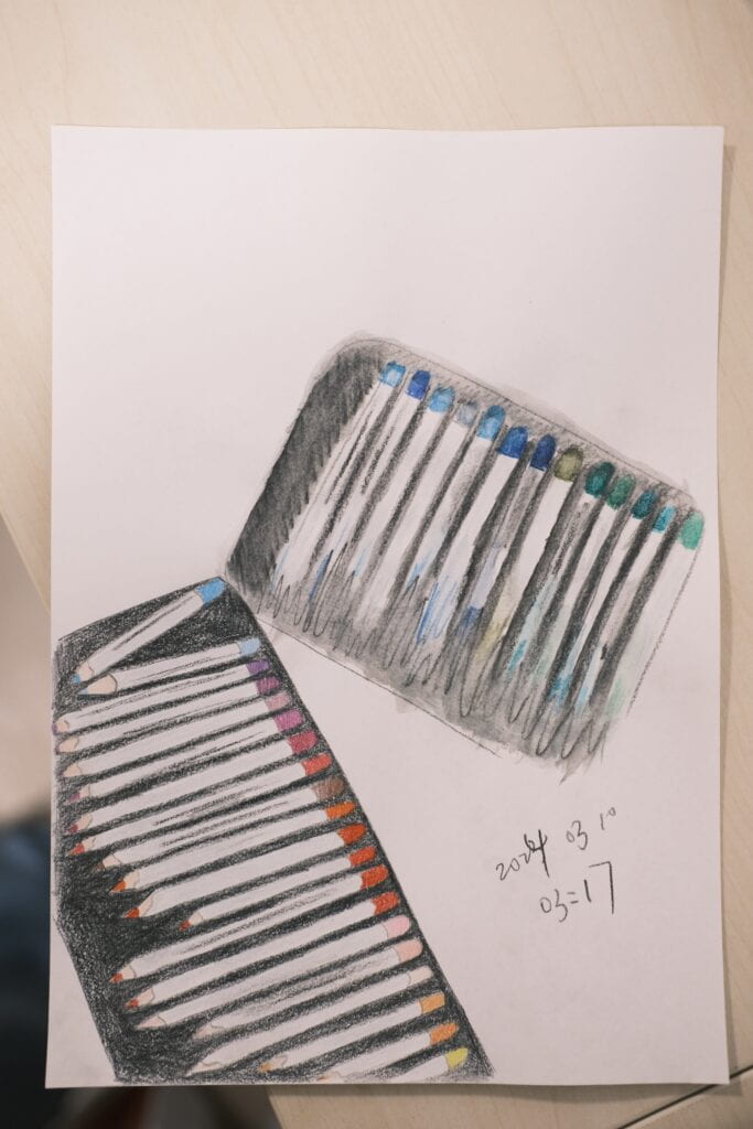
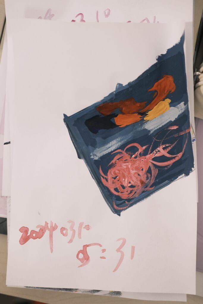
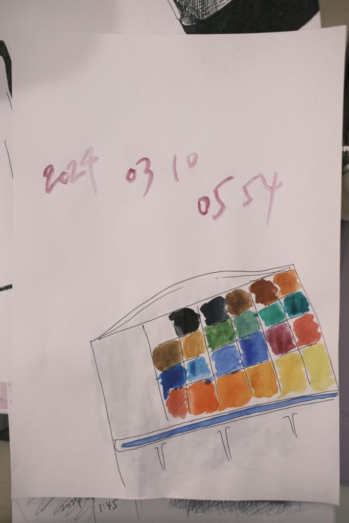
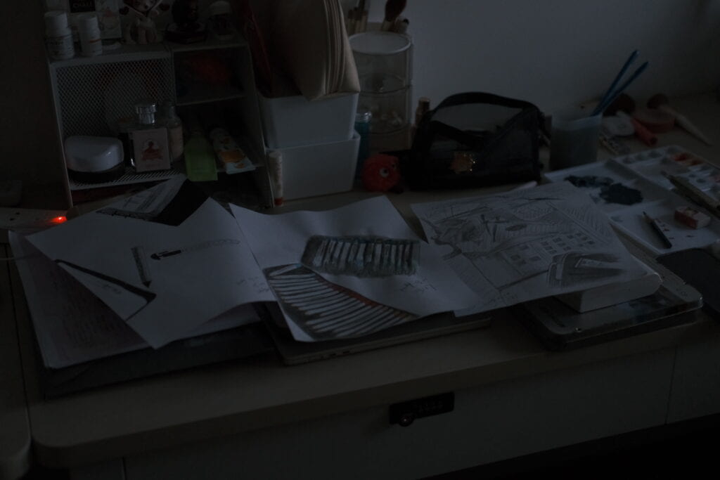
Having finished all my drawings, the next step was to go to People’s Square where I used to learn drawing and find the youth palace that I had been to for years. Therefore, I spent a Friday evening on this mini-trip and took some photos by my camera. Below are two pictures I took that I consider to be the most representative:
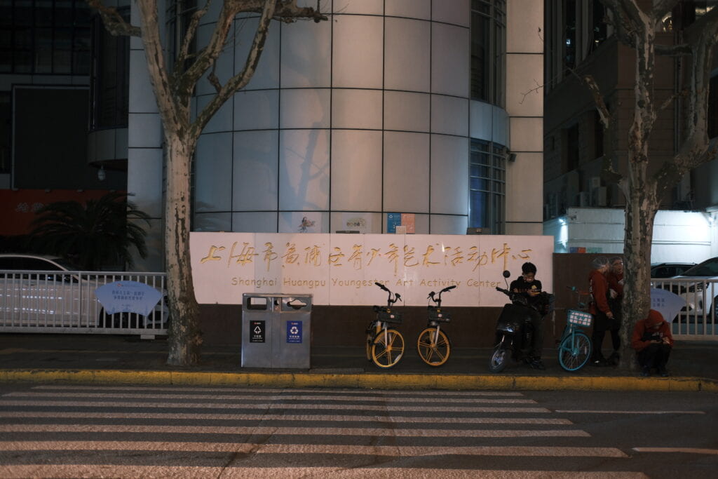
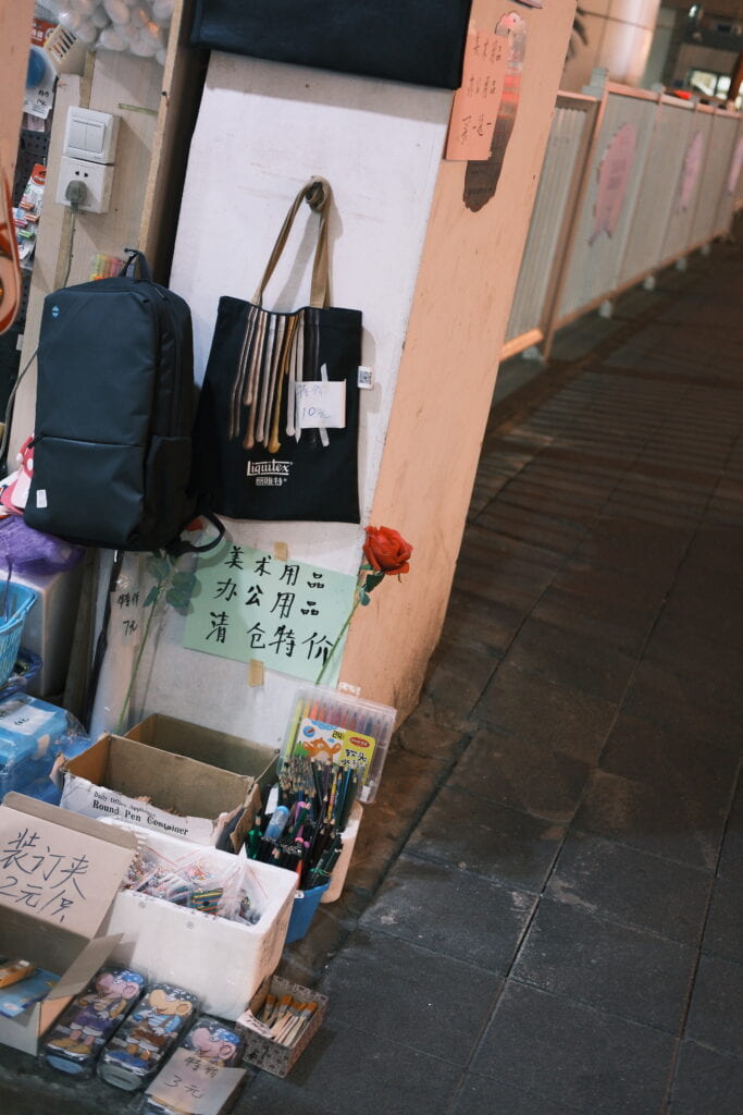
Then it came to the part of Adobe Photoshop which was the most challenging for me. To get started, I first created a new file and put my pencil sketch in the background because it would then benefit me by suggesting where each component should be placed. Then, I utilized the “Magnetic Lasso Tool” which I found the most convenient and made copies of the drawn parts in my previous sketches. When doing this, one thing I found useful was that it would be really helpful if I open a new file and operate on the new components there instead of directly editing it in the original file. This would make the editing process much easier due to the clear background and the convenience of copying and pasting the new component. In this process, two mostly used tools in my case are the crop tool and the magnetic lasso tool, with the former one responsible for cropping images to fit the file size while the latter enabling me to directly choose the components that I needed.
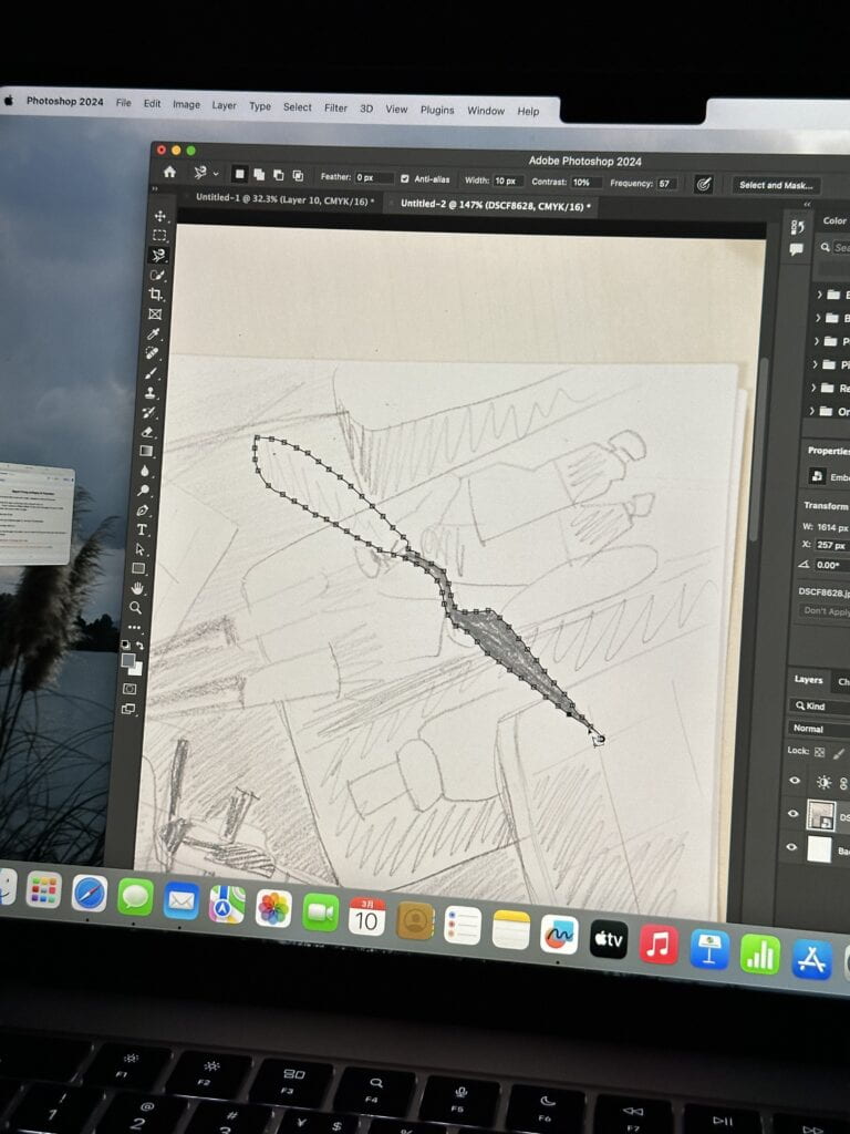
After carrying out this process repeatedly for multiple times, I finally combined the five separate pictures together into one image. For some elements in image 2 I didn’t use the drawings that I made, instead, I just kept their original appearances because I consider this to be more visually appealing (just like the brushes in the middle of the picture below). Here is the collage that I made at this stage:
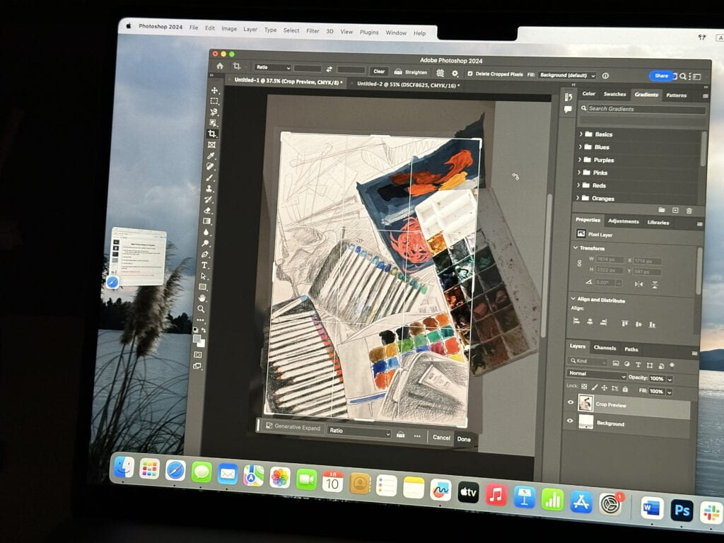
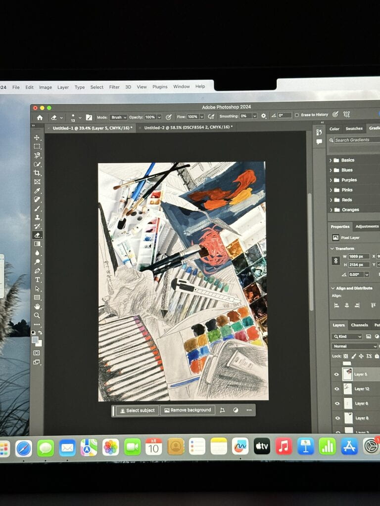
Then, I changed the background to the darker photo of spray that I mentioned before. The reason why I did this was because I thought that it could add another layer to the image at the bottom, thus creating a visual effect of multiple layers. Meanwhile, the shape of the blurry spray can also symbolize the fading of my childhood memory.
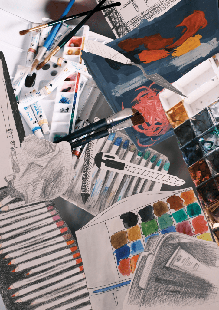
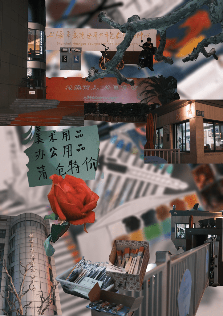
Then, I adjusted the color of the whole picture by adding layers of filters on top of the collage. Having finished this first step, I then entered the second crucial phase of creating image 2: adding another layer of constructions above the original layers. This time I started by blurring the whole image so that my drawings wouldn’t distract people when they see this picture. After that, I continued the steps in the first phase – that is, to use the magnetic lasso tool to select objects in photos and pasting them onto my second picture. When deciding the position of each photo, I arranged them according to my personal likes (although later I realized that I should have done it with more consideration), and below is the result I ultimately reached.
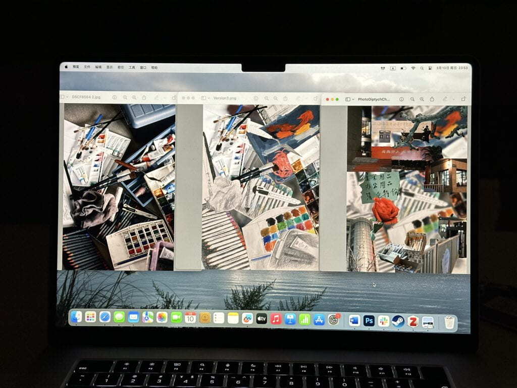

When it comes to the problems I encountered, actually I consider the editing process went on quite smoothly. I had my plan about what to do at each stage, and nothing went wrong during this process. The only thing I consider not that satisfactory is the arrangement of the constructions in the second phase. I felt that I didn’t have sufficient knowledge or experiences in making collages, or maybe I just didn’t take enough consideration before I started to arrange the elements on the second layer (not counting the layer of spray at the bottom). I was not able to come up with a proper solution in the end, and what I did was to arrange the components according to my own aesthetic. That was also pointed out by my professor during my final presentation. He said that the second image of mine is a little messy and suggested that I could be more thoughtful about the designing part. This unordered arrangement can be considered as the compromise I made as well and is definitely something I am going to improve in the future.
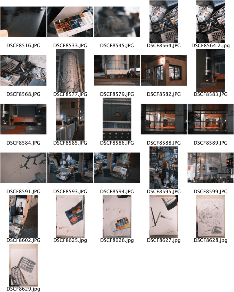
Below is the contact sheet I made for this assignment:

III. Conclusion
In all, I think I have benefited a lot from the learning and making process of this photo diptych assignment. Not only did I learn how to use a camera correctly and gained knowledge in using Adobe Photoshop, but I also got the chance to look back into my memories and utilize the abilities I learned to visualize my past art experiences. Nevertheless, I still think that a lot can be improved. My most significant weakness that I noticed during this process is that I lack the consideration required to design a collage well. In other words, I am (currently) not good at creating the communication between two images. I should have clearer plans about where I should put each component, and make my arrangements more reasonable for people who know nothing about what I was trying to convey. I will try to adjust my methods in photo editing in the future and make the images I create better align with what I want to express.
IV. Image of Diptych
