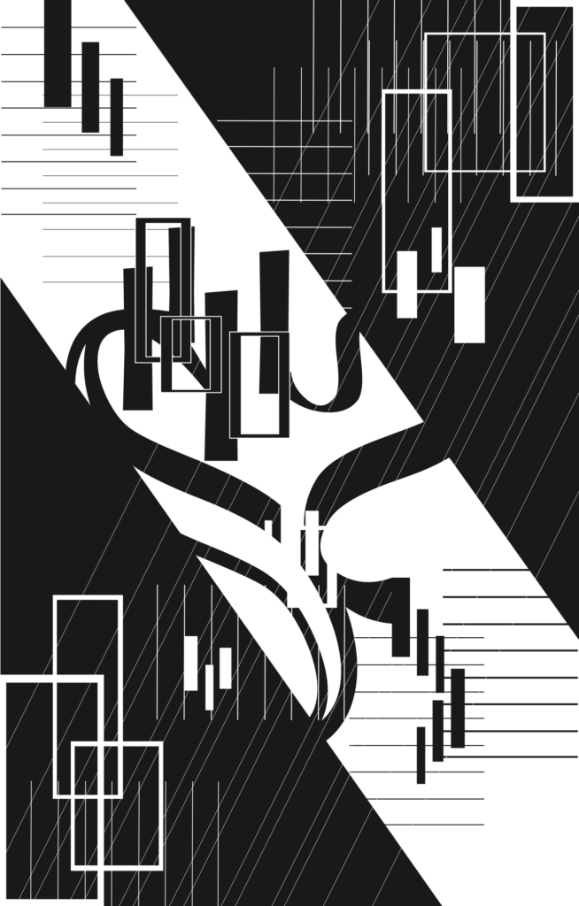
Comptine D’un Autre Été, L’après-Midi
by Yann Tiersen
Jingchen Gao
Here is the video of the music track: https://www.youtube.com/watch?v=znfYwABeSZ0
I. Concept and Design
The purpose of this assignment is to introduce us to the basic ideas in the field of design and push us to make our first attempt to design and create something of our own. Meanwhile, as the topic of this assignment suggests, it also asks us to fully expand our imagination and come up with a carefully considered image that represents our initial feelings when we were exposed to the selected music piece for the first time. I consider this assignment very valuable and I appreciate it not only because I practiced my skill of using Adobe Illustrator during this process, but I also was exposed to the ideas of Gestalt theory for the first time and tried to reach the boundaries of my imagination under the scientific instructions of the art theory. Overall, I learned a lot and I enjoyed the feeling of being a designer very much!
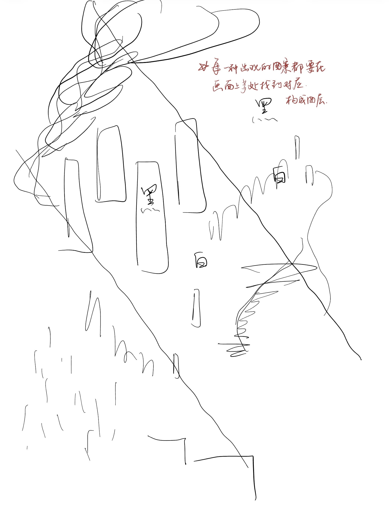
The first step we should make was to pick a music piece. I stuck a bit at this stage, because I had trouble making the final choice on which song to focus on. At first I chose three songs with lyrics and I had already drafted three separate sketches for each of them, but later on I finally decided to pick one piano song without any lyrics and I started to draw the sketch for this song at last. Actually the initial drafting process went very smoothly. Previous to the start of this assignment, I asked my professor what I shall do if I have no inspiration at all about what to draw on the paper. He told me that I could just draw whatever jumps to my mind during the course of me listening to the music piece, and this instruction helped me later on. When listening carefully to the gentle flow of the piano, I started to draw some piano keys as well as some curves on my screen, and the initial version of this project was made. Later on, the idea that the peaceful and loving melody represents the shape of a heart jumped into my mind, and I made some revisions to my draft to include a figure of heart in the middle of the whole image. I also added different sizes of rectangles in the secondary places in my draft since I think they perfectly represents the keys on the piano as well as the silvery sound in the selected piano sound. As for the background, I drew two big black rectangles behind the main elements and made two lines that each comes from different triangles parallel with each other to correspond with the Gestalt theory reminded by my professor. This strategy enables me to create a second layer behind the simple, plain first layer and adds to the visual appeal of the whole design. It also serves as the ground in the image and makes the design solid.
Below are the sketches I created for the other 3 music pieces and the draft of the piano song that I finally selected:
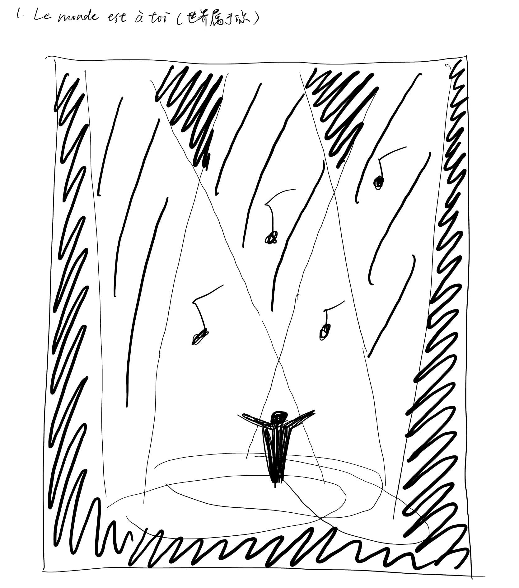
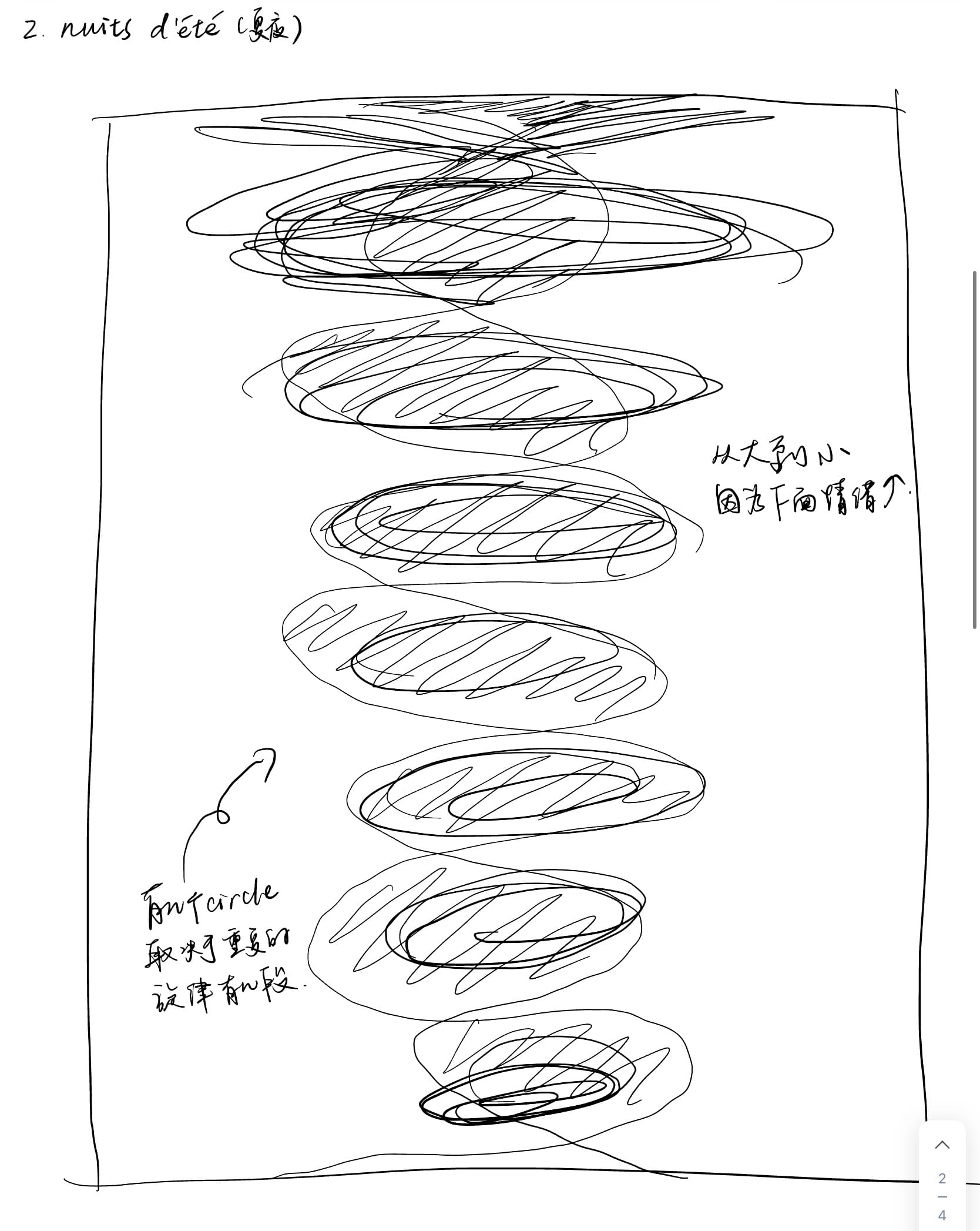
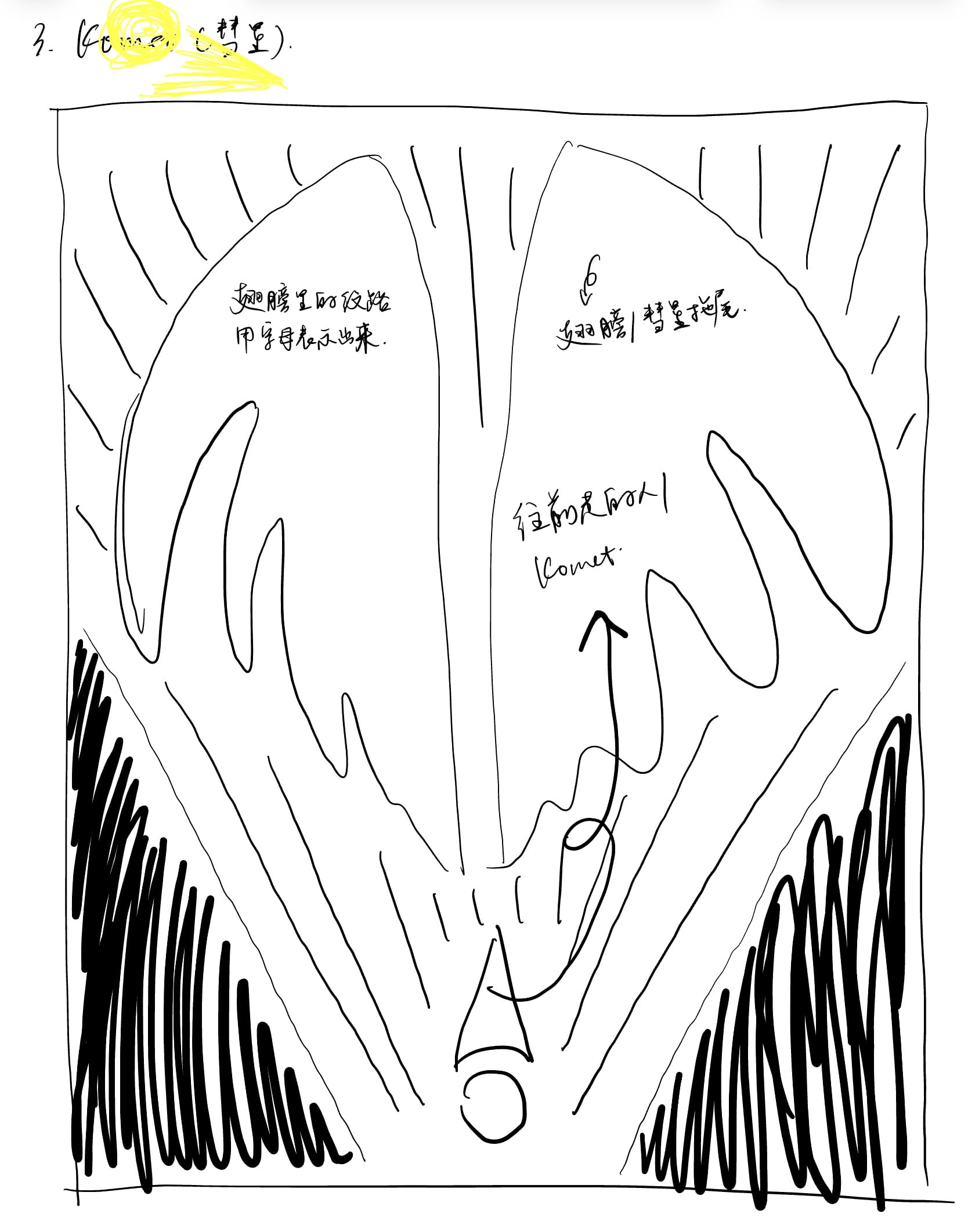
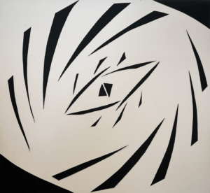
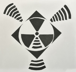
Prior to this project, we also finished another assignment called “One Black Square”. That assignment serves as our first attempt to practice the Gestalt theory and I struggled a lot to finish that assignment. However, it clearly has a profound impact on my process of finishing this project, since there are a lot of unintentional similarities between the One Black Square assignment and this Sound Visualization project. For example, my first design of One Black Square also used two triangles in the corners of the background. Meanwhile, that same picture also possesses a sense of curve in the middle, and I applied the strategy of emptiness in both of my designs in One Black Square. These attempts have definitely affected me a lot when creating my Sound Visualization project, though I may not have recognized it in the first place.
Below are the two designs I created for One Black Square:
As for the design principles that I attempted to explore in this project, the first and most important one in my opinion is similarity. I was reminded multiple times by my professor that every time I want to make the same shape appear again on my canvas, I should make small changes to it so that it still looks harmonious in the whole design but won’t be too repetitive to be boring for the audience. Therefore, I made changes to the piano keys every time I wanted to use that element again, and I also applied that to the stroke and length of the parallel lines in the background as well as the curves in the middle of the picture. I used the principle of proximity as well, and composed a curve-like shape near the bottom part of the design by some small rectangles that are close to each other. The figure/ground element also appeared in the final image since I created various layers that distinguish clearly from each other.
II.Process
In general, the designing process went on rather smoothly. I had already had a general idea of what to do during my drafting process, and what was left undone was only the polish of the details. One special rule for this assignment was that we could only use the variation of letters to create shapes on the canvas. We were not allowed to use extra pictures, neither were we approved to use the letters to form a concrete image. This definitely added to the difficulty of this project, and I had made a lot of changes accordingly.
My first attempt to create the curves was to type a continuous sequence of letters on an invisible curve, which is a new technique I learned during this process. However, I later figured out that no matter how hard I tried and how small I set the size of the letters to be, there were always non-negligible empty spaces between some or every of these letters, and they made the curves broken. Therefore, I tried another method which was to use the “s”s to mimic the curved lines, but then the whole design would look too heavy on the top. Therefore, I finally decided to totally abandon the curves and use straight lines and rectangles (the former came from “l”s and the latter came from “I”s) instead to create this sense of motion. As for other parts, I just selected different fonts of various letters to make subtle differences between each element.
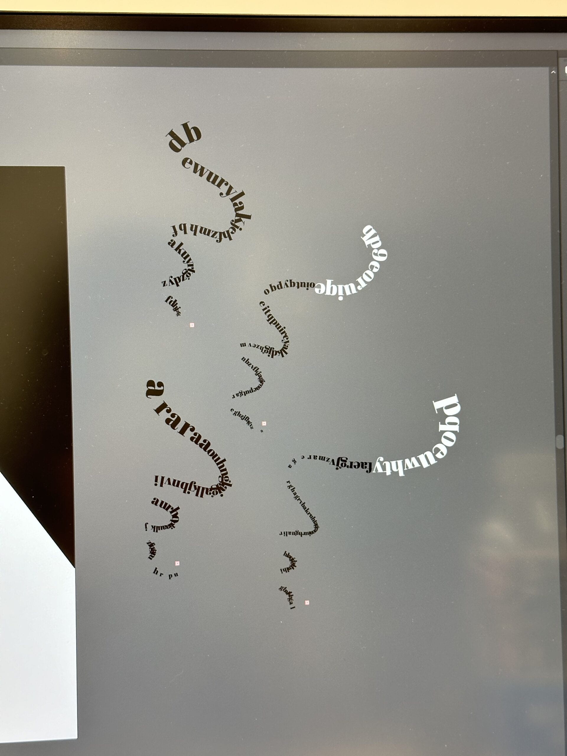
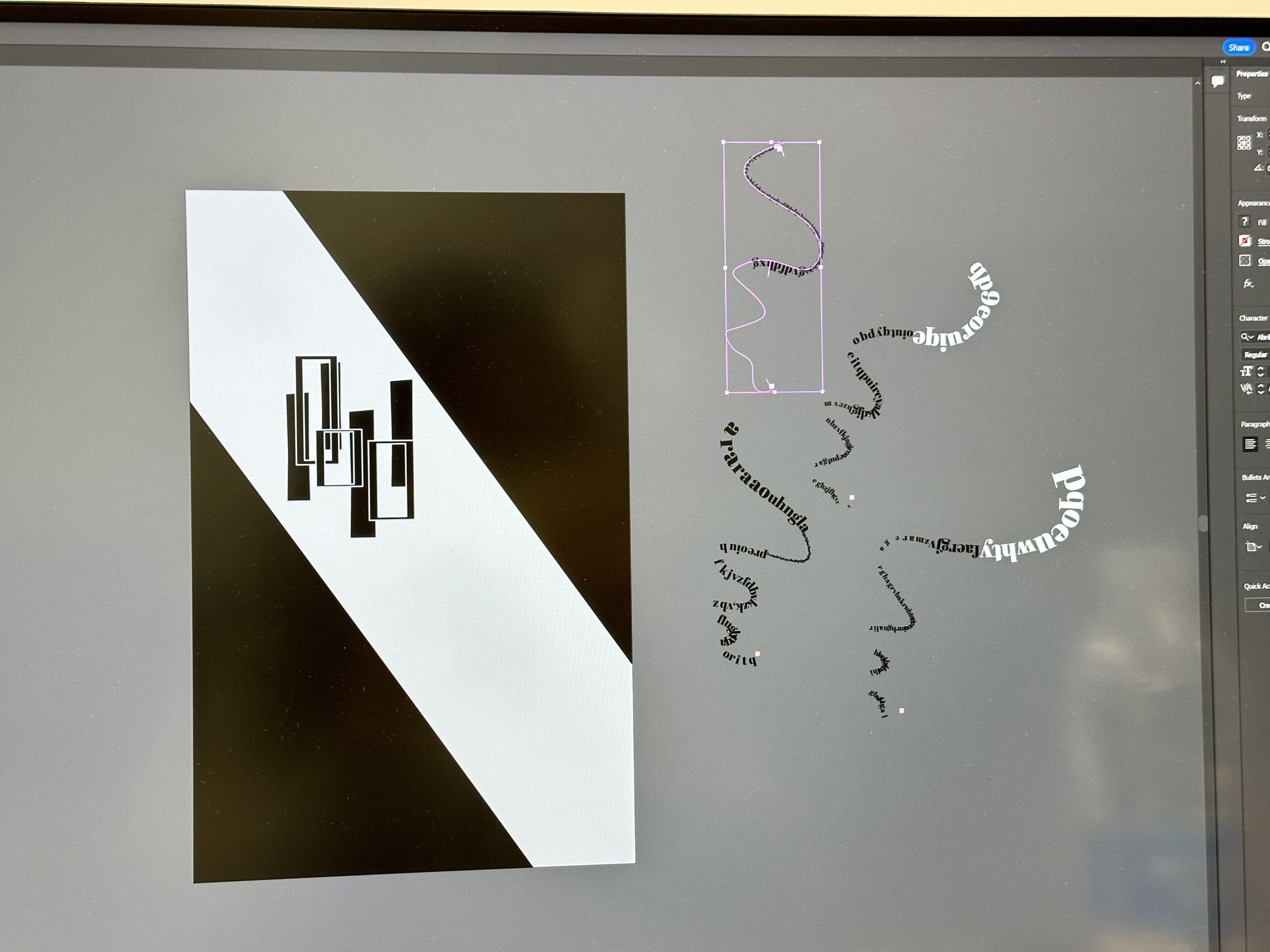
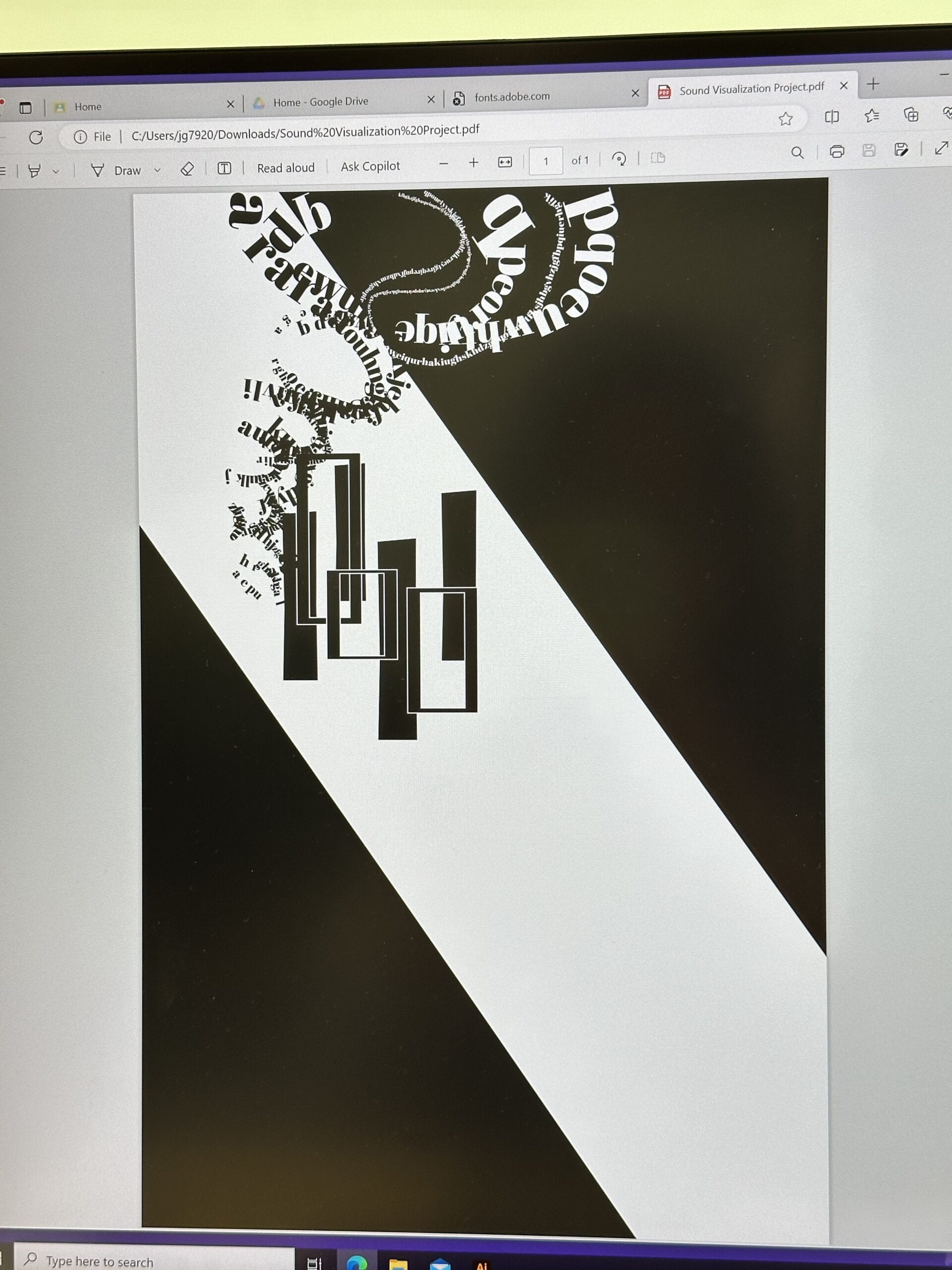
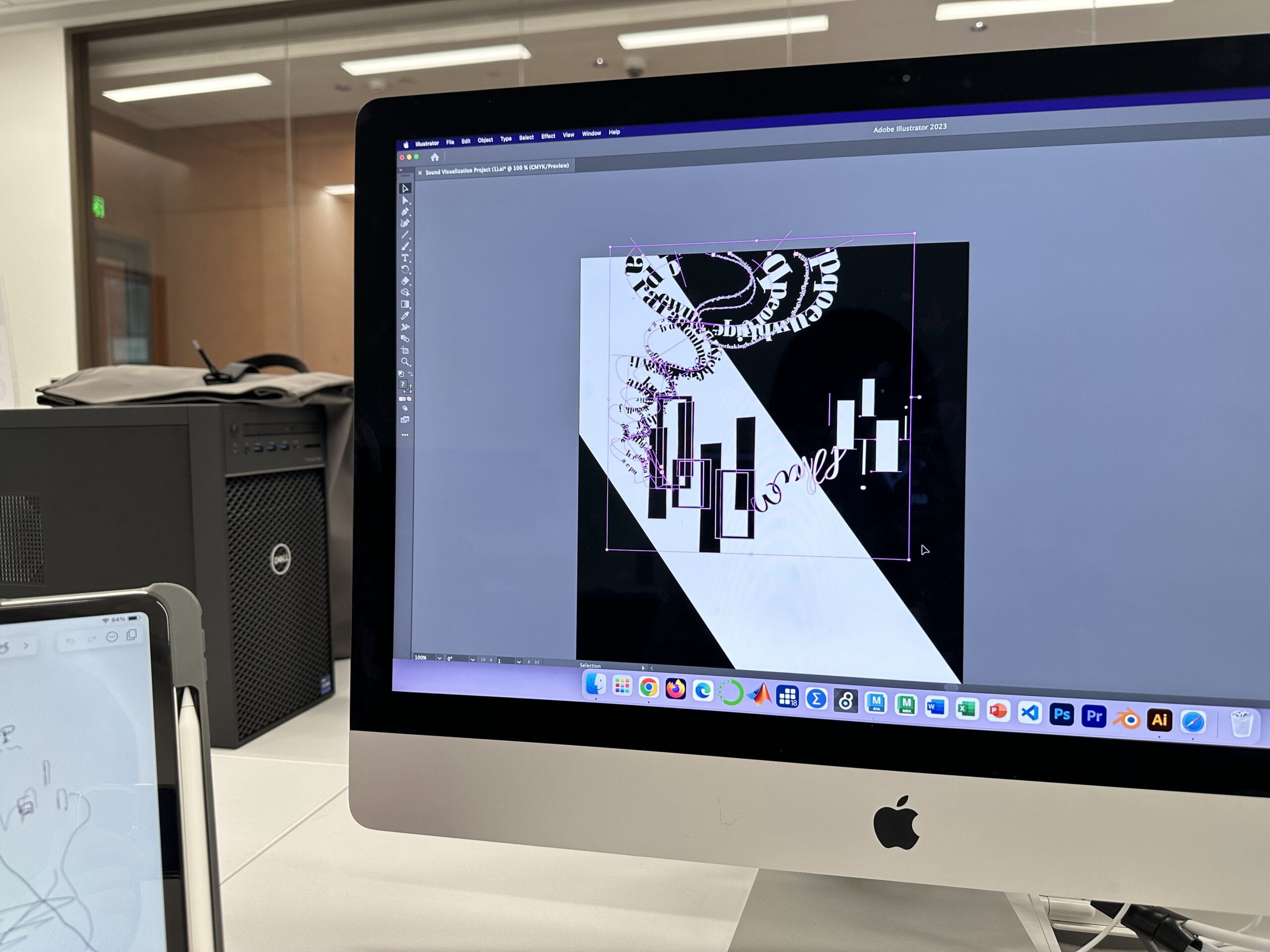
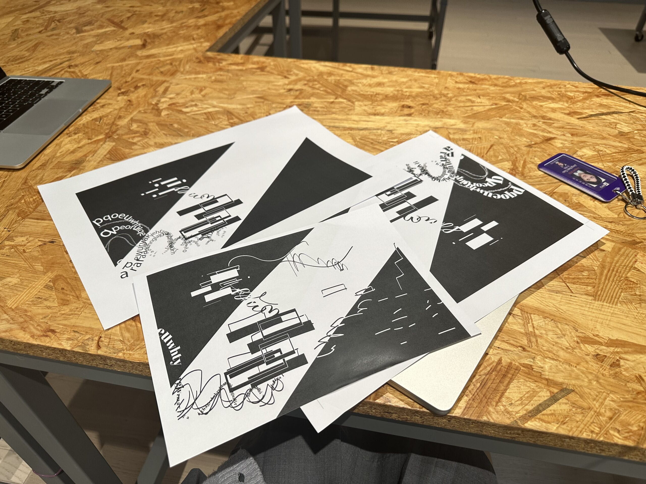
When it comes to failures, I guess the part I mentioned above can be considered my biggest failure during this process. Not only because I totally abandoned my original plan in the end, but I also lacked careful consideration during the designing process. The main body of my design is made of angular rectangles and straight lines, and I should have foreseen how the general image would be destroyed by adding various other letters disorderly. In terms of successes, I think overall my design progressed according to my initial plan, and I didn’t encounter much problem during the whole process. I think the initial draft really helps when creating a design like this.
The mid-critique didn’t change my original plan so much since my professor thought that my design was fine. Nevertheless, he made some suggestions that changed multiple crucial parts of my project.
First of all, he said that instead of keep adding new elements onto my canvas, I should make changes to the original components, since one vital rule in the field of design is that every shape that occurs on the canvas should have various corresponding parts in the image. That was also part of the reason why I changed the curved lines into rectangles and thin, straight lines ultimately since I found the curved lines made up of different letters would destroy the original tone of the picture and they were very hard to echo with. I also added more small black-and-white rectangles to the design to align with this instruction.
Secondly, according to my professor, there should be various layers in the design to avoid flattening. That is the major reason for me to add the two huge black triangles to the top right corner as well as the bottom left corner of the picture to create something that clearly distinguishes from the top layer.
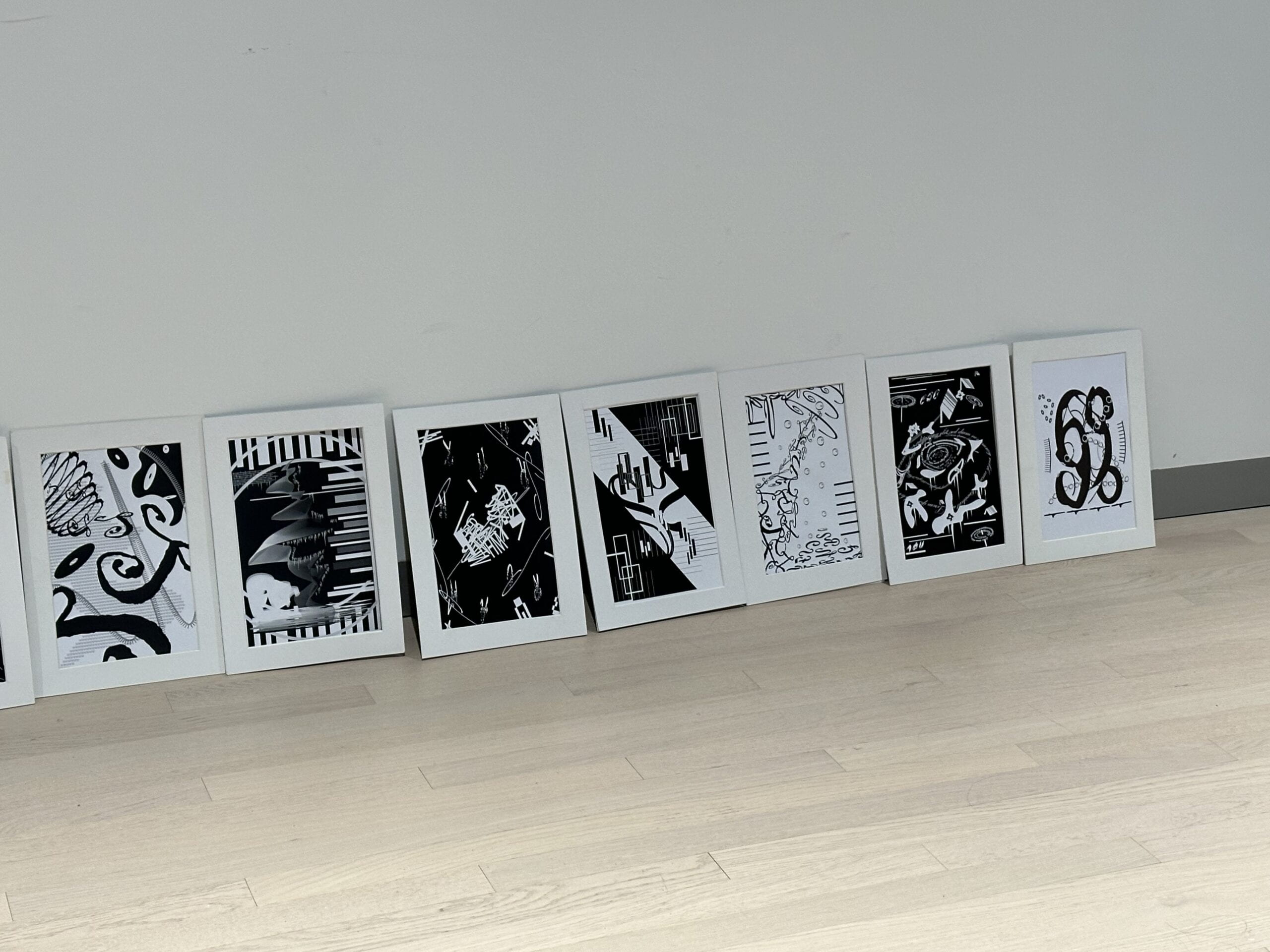
After making revisions to these parts, I finally reached the final version of this project which I consider to be quite satisfactory (mine is in the middle):
III. Conclusion
Overall, I think the working process of this project was very pleasant and I improved my skills of imagination and using Adobe Illustrator at the same time, which is definitely a rewarding experience. However, if I had more time, I would probably add some new elements as well as other layers to my design since I think that my final version is still a bit plain.
In general, I appreciate the chance to work on this project very much!

Leave a Reply