Project Link
Part 1:
Jaidyn Perry – Avatar Builder, An Avatar Drawing Tool
Elevator Pitch:
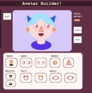
This project allows the user to select from a table of options to build their own avatar. Each option is easily customizable with the color selection tool, and the user can utilize the reset button to start over as many times as they would like.
Abstract:
Art is an important aspect of my life, it is what I do in my free time, how I express myself and what I plan to utilize in my future career. I am mostly a portrait artist, meaning I focus on drawing people and designing characters more than I do landscapes, animals, or still life images. I feel that art, especially portrait art is a way to show others how you see yourself. I also believe it takes a lot of time and practice to develop art. I began drawing when I was 5 years old and am still not entirely happy with how my art is now. Many people are fans of art or want to be able to create art, but do not have the time to learn and develop their art. Thus, I wanted to create a tool for people that are not artists to be able to use to express themselves. The portrait is a bust (shoulders up) so that the design can be easily implemented into a social media profile, another way that people are expressive. This is why I have called the project avatar creator, so that people can use the project to create an image that they use to represent themselves in an avatar. The project currently provides the ability to select any color through the use of a color wheel and eye dropper, as well as providing two design options for eyes, noses, ears, mouths, and hair. With these options it is easy to create a cute avatar big enough to fit into a profile picture or just to share with friends.
![]()

Part 2:
Process: Design and Composition
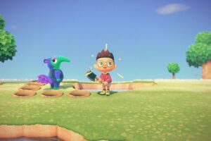
For the visual appearance of the general project layout, I wanted it to look like a generic avatar builder with some of my own details. The buttons change color when hovered over, as well as all of the options updating to reflect the selected color in order to make the selection choices more specific. I also wanted the options themselves to look somewhat similar to the style of animal crossing characters (pictured below), a video game a really enjoy. I was drawn to this style because I wanted to code all of the options instead of them being a png or jpeg, and this style utilizes a lot of shapes.

Process: Technical
As for the technical process of creating this project, I was challenged the most by the buttons. I wanted the buttons to reflect the options they represented, instead of just being the average p5js buttons. I ended up using classes to make this happen. Within the classes I was able to use mouseCheck to track the position of the mouse and update the buttons depending on where the mouse is. Thus, I was able to make the buttons change color with the color of the color picker, as well as change color if hovered over. Compromises I had to make were the issue of options layering over each other instead of being changeable. For example, if you pick the circle nose first, then decide you prefer the triangle nose, instead of just clicking on the triangle nose, you have to redo the entire thing. I did however end up putting in a reset button to somewhat counteract this problem, but I am not sure that is enough. Another technical problem that was difficult for me was when I transferred my sketch form p5js into Visual Studio Code, the p5js buttons that I had created for the background, shirt, and reset as well as the color picker all moved off of the canvas. I was eventually able to figure this out by making the button.parent the same as canvas.parent. CSS in general was a struggle for me, another example being the centering of the canvas without making the title beside it. Because I wanted the canvas to move with the resize of the window, I made it flex, but this also moved the title. This took me a while to figure out, but I ended up just moving the code around and being read in a different order allowed it to work the way I had wanted.
Reflection and Future Development
From the faculty feedback, I think that the biggest issue is the lack of a save button. Since the whole point of the project is to be able to create avatars for social media, there needs to be a way to save the image. In addition to this, I want to also create an undo button so that if the user changes their mind they are easily able to undo their past action. This, I think would be the most challenging. Although, Leon had suggested that I utilize the delete tool in p5js to make this. Another suggestion was to design the three p5js buttons differently to match the rest of the theme. My own personal ideas on development outside of the feedback given to me are mostly to fix the CSS. I think right now it is empty and a little boring. Leon also provided an idea for this that instead of instructions I can use little arrows with the numbers 1,2,3,4 in order to make the instructions take up less space on the page and be a little more streamlined. I think this is a good idea since the project is more or less straightforward. Overall, I think that the feedback given to me by the faculty revolves mostly around the idea of making the project more complete in general. In addition, just continuing to develop more and more options, and maybe in the future creating a screen to select parts and have all the options for that part, eyes for example, show up all at once.