Concept & Story
Circles have long been perceived as an intuitive metaphor in Chinese culture, representing completeness, perfection, moderation, so on and so forth. We aim to visualize this particular shape through various objects, demonstrating its extensibility and conveying its spirits.
The entire story consists of three stages. The first part can be understood as the simplest meaning and creation of circles. All circular objects are those we see on a daily basis.
The climax begins as the calligraphy transfers into a Taoist wielding his sword. And the last stage starts with the overlapping scene of fluid water and circular arches. The music restores calm and the scene is distinguished from the fast-paced and high saturated colors shown previously. Calligraphy will appear upon varied backgrounds to represent the philosophy of Yuan as well as relevant cultural heritages.
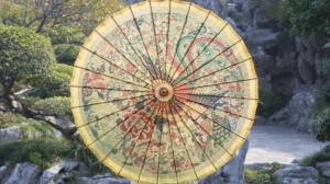
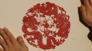
The metaphors we used involve coins, water tanks in temples, circular arches, umbrellas, earrings, lanterns, paper-cutting, as well as the sun. These objects make the concept of “circle” more accessible, particularly in the cultural context of China. Moreover, koi fish was another symbol that penetrated within different scenes. Similar to circles, auspicious aspirations are often attached to them.
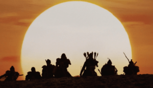
We were motivated to undertake this project shortly after Shelia showed me a breathtaking excerpt from the movie ‘Saving General Yang’ (seven soldiers emerging beyond the horizon on their horses, with a huge ). Not only did it evoke the patriotism deeply rooted in my heart, it also aligned with the visual metaphor theme.
Creation Process & Execution
Prior to shooting scenes, we drafted a storyboard based on the plots that we have conceived. Although it did not completely overlap with the final version, it served as a definite plan to keep us on track.
Before embarking on the project, we found a few shots that Shelia had took at Hanshan temple, Suzhou applicable, so we decided to use them at the beginning of the video. Rest of the settings involved Nanxiang ancient town, Yunxiang temple, and our campus.
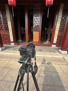
We borrowed a Canon 6D camera and a tripod for filming in order to ensure the quality and stability of the video.
We encountered several challenges through the production process.
When shooting the arch scene, the direction we intended to face was dim in lighting, so the circular outline turned out to be vague no matter how we adjusted our position. Fortunately, it was solved soon after I figured out how to enhance the exposure of the camera. In addition, the hue of our scenes varied to a large extent, so we applied the Lumetri color tool to make further adjustments, ensuring their coherence.
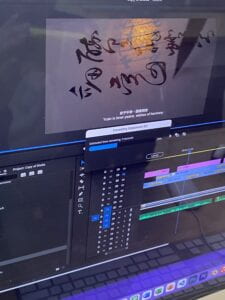
The entire editing process was accompanied by acquiring practical techniques. For instance, we initially cut down video clips into several segments and lowered their opacity one by one to create a smooth transition, but the dissolve tool (under effects— video transitions) made things simpler. Functions such as cropping, ripple editing, time and duration proved to be instrumental as well.
Collaboration
Collaborating with Shelia was undoubtedly a pleasant experience, as we shared similar aesthetics and had our own insights that were complementary.
I took the role of drafting the storyboard, creating the voice over audio script, and assisting in filming and editing.
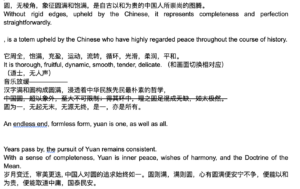
While she arranged the settings of each scene, served as the actress and edited the video. Shelia is a reliable, enthusiastic partner and detail-oriented in particular, as she insisted on optimizing every choice until achieving a satisfying result. Although she took charge of the editing process, I did my best to fully engage in this phase by offering help and making vital decisions together. Thanks to her passion and persistence, or we couldn’t have settled the obstacles and finished this project with great success.
Aesthetics & Results
As our visual metaphor featured in Chinese traditional culture, we focused on colors with high saturation (red and yellow for example).
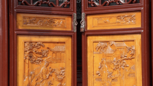
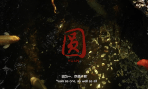
Likewise, most of the circular objects were arranged in the midst of the frame to create a sense of balance and symmetry. The usage of cropping, zooming in and close-up shots fixed the audience’s attention on parts that we intended to consolidate.
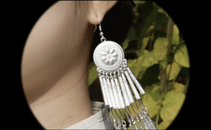
In accordance with the tempo of the background music, scenes shifted constantly while the pace was fast and suspended with abrupt blankness for a few seconds, adhering with the wisdom of less is more.
Final Product
https://drive.google.com/file/d/1G7hMiygEQeym5l6EYX-OoghAJBFHVnON/view?usp=sharing
