Emily Cui_The Uncontaminated
Concept
Wandering on the intricate streets of Beijing, I made an unintentional turn and found myself in a narrow and extended hutong. I thereby made up my mind to look into the uncontaminated.
Hu tongs and courtyards are neighborhoods where local residents in the city center of Beijing used to live. Yet things have been shifting at a rapid speed, and now that the tradition and contemporary are co-existing in this space.
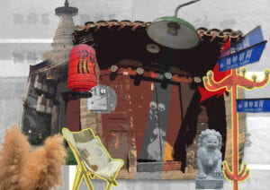
Due to modernization, there have been controversies to demolish and tear down these narrow alleys, the advocates claim that they don’t seem to fit in the big picture of this bustling metropolis. So what I intended to convey was that modern elements can be blended into these structures without discord, enabling hutongs to look more appealing and trendy, in accordance with vibe of the city. In other words, traditional and modern styles can find an equilibrium within hutongs.
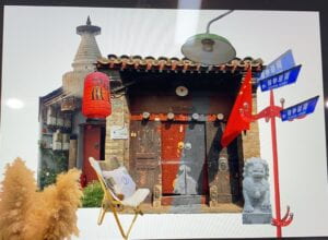
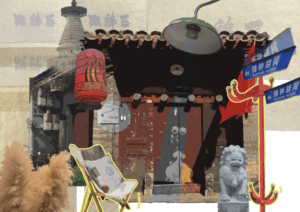
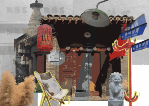
The two images co-exist with each other and demonstrate different time periods. The first architecture is finely polished, while the second one showcases the process of renovation as the main figure looks old. By making a contrast, I intend to convey how traditional architectures undergo renovation in order to adapt to the contemporary society.
Process
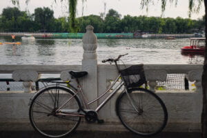
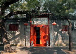
Before embarking on the project, I took pictures of contemporary elements in an exhibition and traditional architectures on Gulou Avenue in Beijing. The process was not as simple as I imaged since I had to choose elements that coordinate with each other despite they were initially from different settings. Additionally, I didn’t have a whole picture of what the diptych project would ultimately be like in my mind, so I took photos aimlessly, expecting that they might fit into a certain spot. Fortunately, I found great inspirations that were relevant with my topic, the sources are as follows.
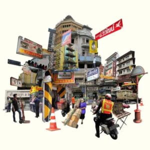
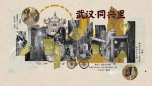
For image1, the process of selecting photos was also frustrating. I had three images from the contact sheet in mind either because of their harmony in color or artistic depth. Eventually, I chose the last one with unique combination of colors and aligns most with the theme.
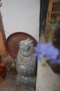
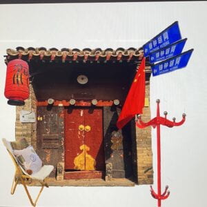
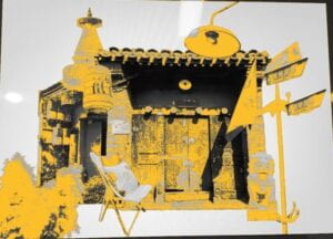
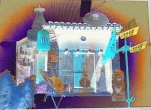
For image2, the manipulation process consisted of several steps:
- Apply higher white balance and decrease color contrast on pictures of historical sites to create a nostalgic and soft atmosphere.
- Used the quick selection tool to cut elements out and rearrange them.
- Add filters to transfer the texture of a realistic photo to something more abstract.
- Outline certain objects in bright yellow to underscore a sense of vitality and modernity.
- Apply black&white contrast in the background to highlight the subject and enhance figure ground relationship.
- Distort the main figures to create something irregular and unexpected.
These are timely documentations I saved during the creation process.
Conclusion
I had the chance to put ideas into practice by making use of the basic functions of Photoshop. Most importantly, by putting random things together, rotating or replicating segments, we can create a space where parallel things from different locations or time periods encounter.
I am overall content with my final diptych project, but if I had the chance to start over again, I wouldn’t arrange these segments in such an orderly way. Instead, I would leave more space for imagination, and mind more of the layout.
Also, I used a different app for inspiration and experimented with some filters that were appealing, but because I wanted to keep the original colors, I didn’t choose to apply them eventually.
Final Contact Sheet
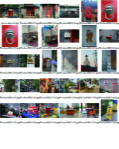
Image of Diptych

