Sound Visualization Documentation
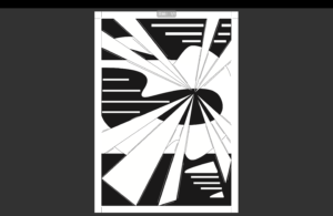
I am Chenhan Xu. Here’s my work of Sound Visualization of music “Sogno di Volare” by Christopher Tin:
And the music is here: https://open.spotify.com/track/1miPwGI7xUKfHj6vIpMfP3?autoplay=true
Concept and Design
From the music. From the progressive harmonies in the lower registers, the elegant violins in the upper registers, and the solemn orchestral group, I felt a strong sense of power. At the same time, the repetition of the melody is a bit cyclical, with ups and downs as if sailing on the sea. It reminds me of Columbus exploring the unknown. The whole piece of music is purposeful and rising, leading up to the climax, which in my imagination is the discovery of an unknown continent, where people from all walks of life come together to fight and write new glories.
Process
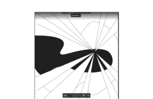
With a rough sense of the music, I began to compose. I started with a rough distortion of the letter c, to make it look more like a wave, and placed it in the center, in the sense of sailing on the sea.
After this, I felt that the power of the wave was relatively not so strong, he was a bit too soft, and I preferred to reflect some graphics full of power in my work. Therefore, I made four straight lines similar to light beams, which converge at a point to the left of the center, which may represent the unknown new continent they discovered. The four rays of light spread out in all directions, and here I think I should borrow a little bit of the style of painting similar to the Sun King, emphasizing a kind of power and dominance. This is my first draft:
After this, I felt that the white and black generics were not evenly distributed, and were a bit too blank in some places, so I wondered what I could do to compensate. Therefore, I placed the letter d in the lower right corner, with a curved graphic to show some rigid-flexible softness, which of course can be interpreted as a boat. At the same time, I added some short dashed lines of the right length next to all the straight lines in an attempt to indicate the sense of speed of these beams. And then it was done!
Conclusion
I think I did a pretty good job on most of this assignment, but there are still some shortcomings. I think I’m not very skillful in using Adobe Illustrator, so some of the details in my assignment may not be handled very well.