Derek Eng – Exploration
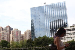
For my diptych I first chose this image:

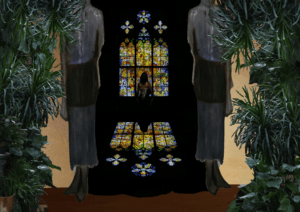
This image features my friend in the foreground and some large buildings in the background along with some trees. I think this image has a strong composition due to the angle of the large building compared with the angle of the girl’s head. Using elements from other photos I took I made this image in photoshop:

The first connection I was going for was the large glass in the back of the photoshop. In the real image, a huge glass building is visible in the background, and in the photoshop a large stained glass window takes up the back of the picture. The second connection I was going for was the most obvious – the same girl is visible in both images. In the first one, she’s facing right, while in the second she’s facing away. I also added a third, hidden connection that the viewer has to closely examine the photoshop to find. In the bottom left, next to the plants is the girl’s phone that can first be seen in her hands in the first image.
For part 1, I went out to a museum and the M50 art district with some friends. I tried to take pictures with interesting compositions or interesting subjects. If I saw something on the street that I thought looked cool, I took a picture of it. I also made sure to use different functions on the camera to take different types of photos. I took some with a low F-stop to blur out the background, and also took photos of moving subjects with fast shutter speed to try to capture them clearly. Overall, the only intentional stating I did was telling my friends to get into frame, but I never intentionally set up a background or other objects within a frame.
For part 2, I knew I wanted to use the picture of the huge stained glass window, but I didn’t know what else to use. Starting from that point, I needed to do some research on how to add the shadow of the window on the ground. Since I wasn’t exactly sure how to make sure it was realistic. But apart from that, I didn’t do any external research for this project. After setting up the stained glass window, I then added the two big gray statues on either side of it. This was done to hide the edge of the stained glass window since it originally had a black background, and I wanted the image to not only be black. Next, I added the plants on the sides of the screen. I ran into a problem cutting them out of another picture since the original image’s background was visible in between the leaves of the plants. To solve this, I had to manually go between each leaf and edit out the background. Because this cost so much time, I only did this for three different groups of plants, then copied, resized, and rotated the groups around the edge to fill out the space. At this point, I felt like the image was giving off a jungle vibe, so I decided that the window was on the inside of a jungle temple, and the outside was the area around the temple. To finalize this idea, I added some walls on each side of the statues, and a dirt ground outside. Finally, I decided to make the connection between the two images stronger by adding the girl (and her shadow on the ground) in the middle of the screen and her phone on the ground outside.
I think that the image could be improved in a few ways. First, I think that the phone is a little too hidden, I could either brighten it and move it in a more obvious position, or simply make it bigger. Since there’s nothing close to it in the image, the sizing of it can change and not significantly affect the proportions of objects in the image. Something else that I would change is the lighting on the inside of the “temple” itself. There’s no distinct difference between the wall and the floor, and it messes with the perspective inside of the temple. In addition, the lighting on the girl implies that there’s a light inside of the temple, coming from behind her, while the light from the window implies it’s coming from her front side. In addition, there’s no light coming in from the main entrance of the temple. It’s a bit unnatural and I’d spend some time touching it up if given the chance. Moreover, I think that the big statues on either side of the entrance are too low resolution so they look out of place. Because of this, I’d consider adding new pillars around the entrance.
Overall, I enjoyed this project, and think that photoshop is a very useful skill to have.
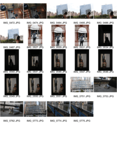
Contact Sheet:
