Derek Eng, G.O.A.T, Polyphia
Concept and Design
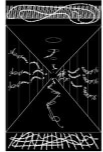
For this project I used the expansion aspect of Gestalt theory, where I implied that there was more outside of the frame by drawing lines that led out of the page. This gave the print more depth. In addition, I used a lot of the splitting theory with the “vertical” lines that intersection the page at regular intervals. I became interested in perspective after seeing the One Black Square designs since I saw some people playing with the concept of depth. In addition, like I previously stated, the idea of expansion (implying the art exists outside of the canvas) also played heavily into my art. When I was designing my poster, I really wanted to convey the feeling of being sucked into a black void, so I made it in a one-point perspective where the focal point is a single black square in the middle of the canvas. Everything else in the drawing is seemingly being pulled into it, which is the feeling that I get from the song.
Process
I started out with the four strong perspective lines that make up the corners of the “hallway” and then drew out the text on the wall that spirals into the center and around the top of the drawing. At this point, I brought it in for critique and was given the feedback to make the drawing have more details since it was a bit bare. This led me to just adding in a multitude of different text elements, my most favorite being the little strings of text that poke out from “holes” in the “ceiling”.
Conclusion
I think if I had more time I would make the text more ornate using a different font and also add more details to the surrounding area that are less repeated, since all the details I added are repeated throughout the whole drawing, it may add more depth to the poster if the details are not regularly repeated.
Image of Project
