- Zinchenko Dana, Two Sides Of The Same World
Concept
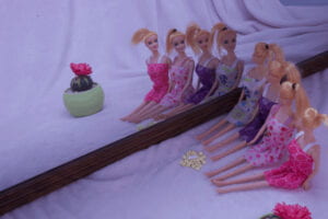
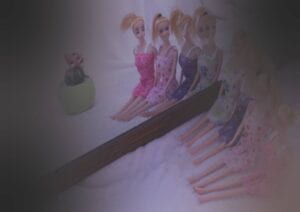
My concept was about schizophrenia. I wanted to show how people who don’t take medication see the world around them during the visual hallucination. I used the personal experience of my friend who is suffering from this disorder. Basically, my pictures have a meaning of how it is important to take medication and also the information that can help to understand what is going on in the heads of people with hallucinations. The first image was a normal world picture – emphasis on cuteness and bright soft colors. The second picture is dark and scary, however, all the changes are not really bright, but the longer you look at the picture – the scarier it becomes. My research was basically a talk (interview) with a person who lives with such a mental disorder + mid-critique from the same person in the process of my work, so the result would look natural.
Process
1)
At first, I got the general idea of what I wanted to do. Then I searched for the ideas online but found nothing really useful. I tried to take some sample pictures of pills and fire, but I didn’t really like them. After I cleared out the concept I started to walk over my room trying to find something small and cute. I found these Barbies from some fair. For me they looked really creepy but funny, so I decided to use them. Then I thought that the picture in the mirror would really suit my idea. I put my mirror next to the window so the lighting would be good, and put some pink fabric (my blanket) as the background and ground. I turned Barbies’ heads towards the mirror at a weird angle so they would look as if they broke a neck or something, but still not really noticeable. I tried to use a big flower and a candle, but it didn’t fit. I changed it to a small cactus and put an artificial flower on top of that, so it would be pink and cute. I also used pills in the frame. I tried a lot of compositions – pills in the center, a circle of Barbies, only their legs, a flower in the background. However, in the end, I picked not the most basic one, but not the most creative one. I used a diagonal, so I will have a 3d picture, but still not too creative as a circle. I think that this decision serves my requests.
2)
At first, I tried to add smoke, but it looked really fake, so I just decided to add a vignette to change the coloring. I did brown corners at first, but then due to the critique of my classmate, I changed the color to black. I think this change worked out right. After that, I added blood from barbies’ eyes. I started by adding blood to each of them but then decided to leave only one bloody face and just deform the others. It made my picture more interesting. Then, I realized that I forgot to add layers, so I spent some time redoing all of it. I added Barbie’s eyes to the cactus and to the face of the first doll( with the clone stamp tool). So, now I have a Barbie with four melting eyes and one Barbie with blood pouring from her eyes. For the third one, I made a hole in her face. I wanted to erase it at all, but it didn’t look natural – photoshop was too obvious, so I just did a hole. And the fourth Barbie received the second head. They really looked creepy, especially because I changed their features only in the mirror, but not in the second part of the picture. I saw this in a horror movie and decided to try it. Also, in the very beginning, I deleted pills from the picture. I had some difficulties with that, but figured everything out later. After that, I thought that the picture was too simple, so I added red words like “kill” and “again” and some signs like someone used blood to draw them. However, I really wanted to stick to my project topic, so I asked my friend with schizophrenia for advice. She said that it’s much better without words. She also gave me advice to keep it simple like it is now because she said that this is exactly how hallucinations look – subtle. They just add some small details to the real world, but sometimes it’s even hard to notice them. That’s why I decided to keep these changes subtle, almost hidden. The next problem that I had was the printing. The printing shop did it not in A4 format, so I found out that I messed up with the format. I stretched my picture and was pretty upset about it. However, after the printing, I saw that it even made my picture better. This stretching sometimes occurs in hallucinations. So in the end I was happy that it worked out in this format and style. It really gave more to my work in terms of the naturality of hallucinations representation. I was really proud when a person with real hallucinations told me that my picture really accurately represents what she sees.
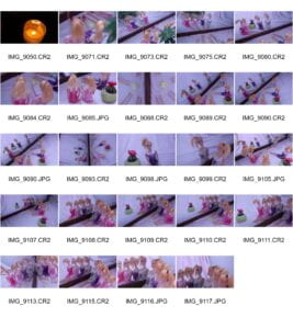
Contact Sheet: 
- Possible Improvements
I really wanted to add some smoke, but wasn’t able to do it naturally, so I would like to try out more strategies and add some smoke to the work. Also, I would love to implement some images from other pictures/files. I saw a lot of people working with that, however didn’t get a chance to try. I think I would be able to add some demon’s faces or horns. I think I could also light up Barbies’ faces a little to emphasize change.
- Image of Diptych
