In Our Own Image Reading Response


Fred Ritchin discusses the idea of the “fluidity of the digital” in the foreword of “In Our Own Image.” Ritchin defines this fluidity as the ease with which digital images can be altered, modified, and distributed. Digital photography allows for ongoing change and permutation, as opposed to traditional photography, which captures a single moment frozen in time. It really gives photographers a lot of new opportunities. 

Instagram can be used as an illustration. Before sharing an image with their followers, users can take a picture, add various effects, change the brightness, and crop the picture. Through this process, the image becomes adaptable and fluid, allowing the photographer to create a particular story or emotion. This digital image modification shows the fluidity that Ritchin refers to.

When one considers how closely photography represents reality, it is obvious that all images, regardless of format, have some element of subjectivity. Despite the fact that photography has been widely accepted as a reliable tool for recording and portraying reality, it is important to understand that the act of framing and taking an image is by itself quite selective. The final image’s perception of reality is influenced by the photographer’s choice of perspective, composition, time, and environment.

Comparing photography to other forms of media, such as text, video, virtual reality, and books, shows how each has distinct advantages and disadvantages when it comes to representing reality. The text provides depth and information, but interpretation and creativity are needed to make the story come to life. Video is more immersive because it records sound and movement, but it is still limited by its selective nature. Although virtual reality strives to be completely immersive, it is still a created world that mimics reality. In contrast, books mainly rely on the reader’s imagination to create mental pictures. 

In conclusion, although it is frequently thought of as an art form capable of portraying truth, photography is actually subjective because of the decisions the photographer makes. Ritchin claimed that the fluidity of digital photography adds a degree of visual modification and change. Photography and other forms of media can be compared to show how each has advantages and disadvantages when it comes to capturing truth. In the end, it is necessary to approach all images—digital or not—critically and to understand their subjectivity and fluidity.

Sound Visualization Documentation


A.    Dana Zinchenko, Disfruto, Carla Morrison

B.      Concept and Design

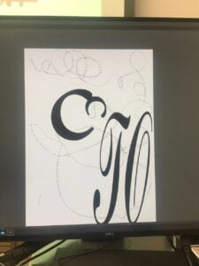
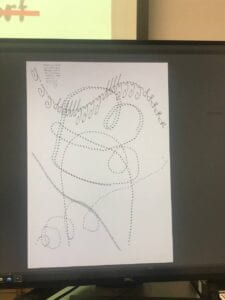
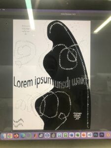
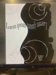
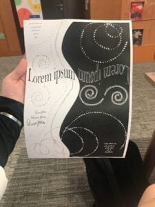
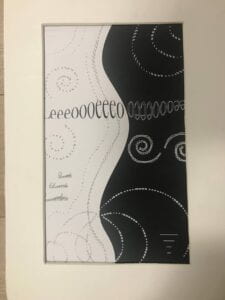
         I wanted my project to have a simple, elegant, and balanced design, with some white space and flowing curves to create a warm atmosphere. This mood of the whole project was chosen to align with the emotions and lyrics of the song.  For the figure/ground relationships, I wanted my image to expand a little outside of the frame.  I have a lot of elements that are “connected” together by the use of proximity (elements that are close to each other are perceived as a group) effect. For example, spirals are going from one to another, however, there is no pictured link between them – the human eye connects them together because of the proximity and closure effect. The closure effect also works here, because people are filling that missing part with their brains as one connected line. It gradually flows from one to another even though there is a space between the two of them. I also used similarity right in the center – I mirrored and turned my central letters to connect them into a wave, however, the main purpose of it was to connect black and white backgrounds. I linked two parts of my image by mirroring that phrase and making it one whole element to create a flowy connection. I used ScriptS font as my main theme because it’s curvy and not that bold – it looks classic, but creative which fits the atmosphere of my song and Spanish phonetics. I also used repetition/similarity in my depictions of small notes – I balanced them to the opposite corners and different colors. One Black Square project influenced my design a lot. I got inspired by the balance of white/black and wanted to try it in this work. I also used similar principles. When I was doing my Black Square I loved repetitions and proximity effect (grouping closely placed objects together), so I tried to explore it deeper in this project. 


C.    Process


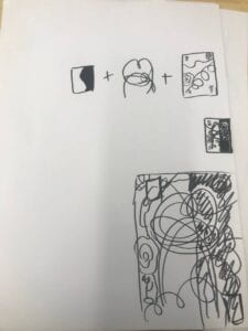
       I started by trying out what the illustrator can do. I tried some functions to get an idea of what I could produce. Then I started to think of my own project.  In the beginning, I wanted to find an idea creatively, so I just played the song and started my free-drawing on a piece of paper. I always use paper drafts at first. It helps me to get the design faster and better. I did a lot of corrections along the way.  I decided to use two background colors and to create a balance between them. I tried to make a silhouette of hugging people, but it was against the rules of the assignment, so I just changed to two parts of the picture. I was drawing curvy lines a lot, however, really often they were not as pretty as I wanted. Later, I discovered the figure “spiral” in settings and used it a couple of times. One of the things that disturbed me was the constant change of a computer. I started at the Windows lab, then went to the Mac lab, and then used library computers – and they all have different available fonts, so I needed to change my fonts every time I changed a computer. Critique influenced my project a lot. First, it made me do it more accurately – better lines and figures. I used all of the advice and it made my work look so much better. The second round of critique (one-on-one talk) made me change my “Lorem Ipsum” to other letters. I found it funny, but useful. Also, I changed my “Spanish” non-words (originally they were supposed to be small romantic notes) to letters “I” placed horizontally, so it would look like lines for the same small notes. This gives the whole picture a feeling of incompleteness and an open ending where people can by themselves think of the content of these notes. I also deleted my white corner – this was one of the best pieces of advice. I love how balanced my picture looks now with half black and white. For the biggest failure, I forgot to add trim marks and did the whole picture in A4 format. So I opened a new document with the right dimensions and redid the whole design. Also, I had trouble with printing. Even though I went to the printing store with my Chinese-speaking friend, we still did not receive the right size. So I went there a second time with the example printed by Professor Danni and they did it right. 


D.  Conclusion


       If I had more time, I would’ve used more techniques of the illustrator. I feel that you can do so many different things in this program and I would like to try them. Because my work consists mostly of self-drawn curves and spirals and different fonts, I used some effects too, but I wanted to try more, to experiment more. I would’ve also changed the font of the spirals in the right center. I would want to try using letters for building different objects or frames.

E.  Process documentation:

  1. Trying out different functions and the first draft: 

2. Idea 

3. First big change of an idea (minus the silhouette)

4. The second big change of the idea (after some critique – deleted white corner and font change)

5. Final on A4

6. After format change 


Communications lab post – Pioneer Plaque


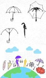
To describe an umbrella to aliens we tried to think how aliens think. But the thing is that we can’t be sure that they even have the same thinking process as human beings. Based on the story, I know that those aliens perceived (better say understood) results easier than the sum of the parts. When scientists tried to explain physics concepts to them it was clearly visible.  That’s why our main focus is to show how to use an umbrella and not how to build it. However, we included technical pictures as well in case it will help them better understand. Those aliens also had a different sense of space. Their bodies have radial symmetry, and their writing is all curvy and nonlinear (the logograms weren’t arranged in rows, or a spiral, or any linear fashion) – that’s why our picture is also not perfectly horizontal, but maybe even messy for the human eye. We purposefully didn’t arrange it – maybe it will make a picture more understandable to aliens. For me, one of the most important parts was to show gravitation. From my general knowledge, I remember that different planets have different gravities (so aliens may even question why we are not falling from the side of the Earth or why our rain is coming towards the center of the planet). So we used a physics symbol of arrows towards the center of the Earth – to show aliens the approximate level of gravitation and its existence here. It explains why human rain is falling the way it is. Maybe aliens don’t even know what the rain is, however, this information was unnecessary for our Plaque. Our main topic is an umbrella and it can protect from many kinds of things. We also used comparison and other easy symbols to show the purpose of an umbrella. Our Pioneer Plaque basically consists of two parts – technical (what does an umbrella consist of, how to make it and how does it work) and our second part showing in practice why humans need umbrellas and how we use them. We also depict the Earth to explain where humans live. One of the parts that I remembered from the real Pioneer Plaque is the depiction of human beings. I consider this really important because aliens have different anatomy and hence different needs. Maybe some of them are even protected from the rain by their own body. We don’t know, so we need to try and show as much as we can. We tried to use emoji to distinguish between a happy human who uses an umbrella and a sad one without it, however, we can’t be sure that aliens will understand it, primarily because they have different faces and because emoji is a part of human literacy and writing system which is also unclear for aliens. That’s why we used color-code to indicate the difference on the level of sensation and perception. Even if aliens perceive colors differently, they will still be able to see that colors differ from each other.