A. Clarissa,
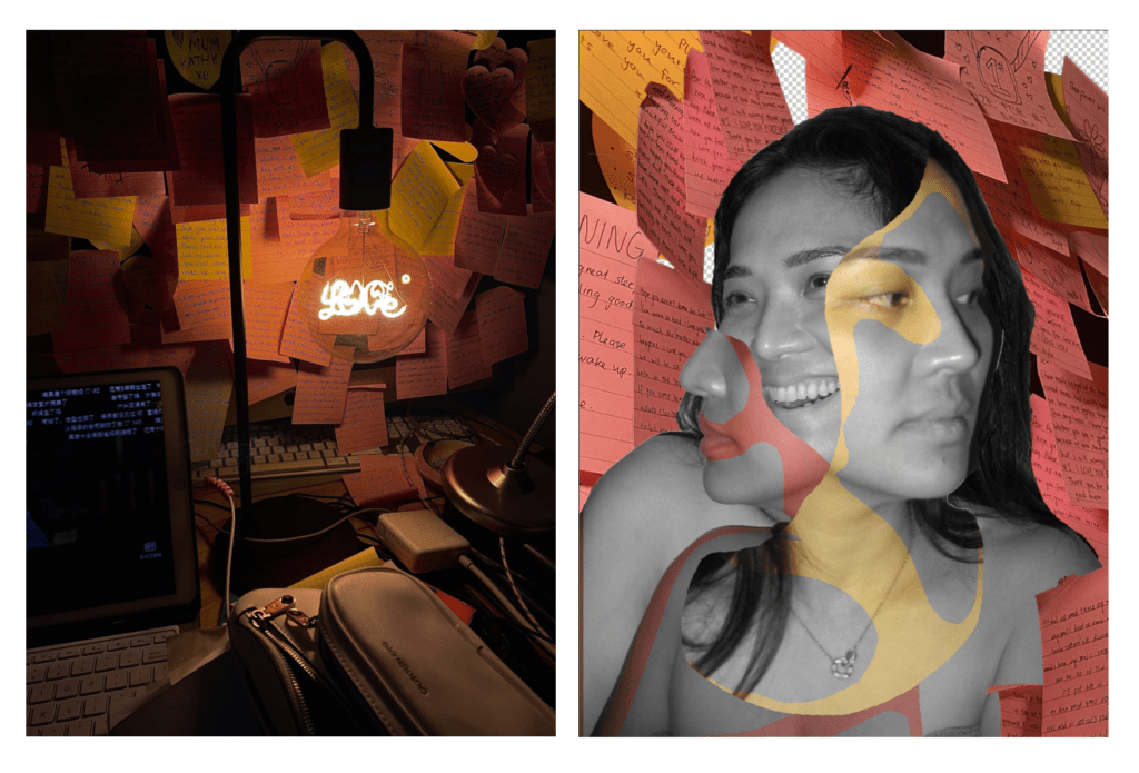
B. Concept: These two mages represent the relationship between the hardships of a working mother and the caring letter written to her by her son. The inspiration was actually from a friend of mine. The setup in the first image was not constructed. In fact, I thought that the realism in the photograph would better represent the contrast of the busy work (in the darker light) and the pink love letter lit by the light. The post-it notes are also stuck onto a laptop instead of a wall. This is symbolic that her son’s words outshine the value of materialistic belongings.
C. Staging and photographing part was was relatively simple. It was based on a pre-existing set so all I had to do is slightly reorganize the items on the desk in order to emphasize the message that I am trying to convey. The digital process in creating the second part was slightly more flexible than part 1. I definitely experimented a lot before I settled on a decent idea. It was quite difficult to figure out all the functions in photoshop. The most time-consuming aspect of it was definitely getting used to the tools and playing around with the images.
D. If I had more time I would definitely focus on the photoshop aspect of the piece. I would try out different compositions and experiment a little more with tools and layering. I would also take some better and more focused pictures in order to give that sharper and more refined final look.

Leave a Reply