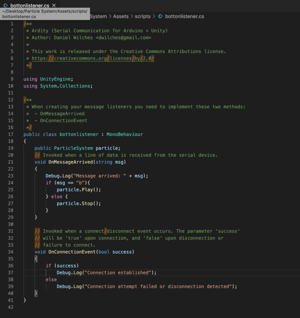
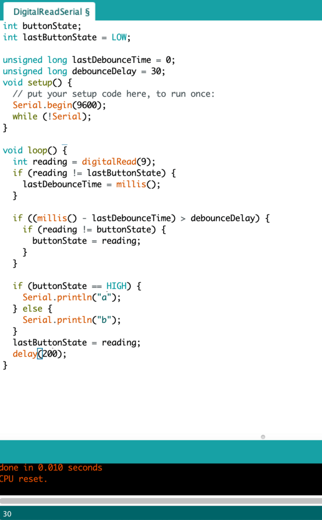
This week I’ve set up a particle system in my unity project which can integrated with Arduino controller to turn it on and turn it off, as above video shows.
Low Res Site
This week I’ve set up a particle system in my unity project which can integrated with Arduino controller to turn it on and turn it off, as above video shows.


The definition of comics: juxtaposed pictures and other images consciously arranged to convey information or stimulate the viewer’s aesthetics of acceptance,it is a continuous art. Comics has been used as a low-level pastime for a long time, thinking that its readers are only children and some adults who have not grown up. In fact, its history can even be traced back to the work murals of ancient Egypt, and modern comics appeared as early as the 20th century. Compared with the movies that appeared in the early 20th century, the difference between comics and movies is not essential. Movies are A picture that continuously appears with a higher frequency is also a continuous art.
The entire picture vocabulary of comics includes: reality, language, and the graphic plane itself. Here, reality refers to the use of various degrees of abstraction icons to allow people to experience the real sensory world, and language expresses non-iconified specifications in the most abstract form. And what the graphic plane expresses is itself. Comics is a single-sensory medium, which only relies on visuals to convey information to the audience. But between the grids, there is no need for any sense organ, instead, all the sense organs are activated. In comics, the content can also be simplified or added. In order to achieve this delicate balance, the author regularly envisions the reader’s experience, and only leaves clues to the reader by not showing specific scenes at all. The cartoonist can trigger any picture in the reader’s imagination.
How do we express time in comics? A silent cell describes a single moment, but in comics, the length of time and dimension is more determined by the content of the frame, rather than the frame itself. Therefore, we will learn to use space to express time in our study, because in the comics world, time and space are the same thing. For example: changing the content, number, spacing, and shape of the grid.
How to show comics? It doesn’t matter which language or images are used interchangeably, it’s important to be able to express clearly. Meanwhile, the following 6 points constitute comic art: concept/purpose, form, style, structure, craftsmanship, and surface. Color is also a major element in comics. Colors make the subject of the depiction become objectified, making it easier to recognize the physical form of objects than black and white paintings, awakening memories, evoking emotions, and serving as an environment. In black and white comics, the concepts behind art can be conveyed more directly, meaning surpasses form, and art is close to language. In flat-color comics, the form itself is more important, and the world becomes a playground of shape and space. And through more expressive colors, comics can become an intoxicating emotional environment through colors.
The combination of all of the above is today’s understanding of comics. However, comics are constantly evolving. When entering the next century, comic artists will pursue more and higher goals.
In Week 3, this time I implement more extra physical interactions that interact with my virtual world’s particle system. This time I am trying to build up a virtual river environment with a little fish via importing external 3D models from stetchfab.
In this week’s system I built, the button and potentiometer can control different rotations of the fish, while a light sensor can control fish moving forward.
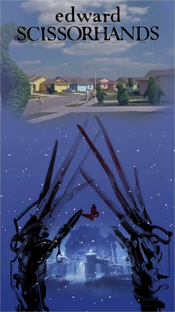
The movie shows the ambivalent mood of Edward. He was born and lives in a lonely castle, he tries to join human’s life, but finally it did not work. So I made a contrast to introduce 2 different parts into my poster to show Edward’s mood, bright sunny human town and dark cold castle with snowing background. These 2 parts also have strong contrasting colors.
In the poster, the scissorhands is Edward and butterfly is the girl Edward falls in love, who is the only element flying into Edward’s world from the human world. So I shows both main elements in the middle of the poster and big size for the scissorhands. The castle where Edward lives have same proportion of poster as human town.
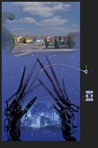
I am going to move 4 elements based on the previous poster, Edward hand, a butterfly, snowing and cloud. Now hands and butterflies are ready, they are simply moving at original position and fly from outside of the poster. I am still working to set the animation of snow and clouds which make the background moving.
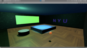
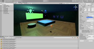
My project is to design a functional room at NYU Shanghai, which can be a theater, boxing room or sports room with all possible entertainment.
In the first week, I have using Unity to set up the room with logo, wall screen, two lights, stages etc, and decorated the objects with different textures, materials and colors.
In the second week, I began to create the interface for my room. I was planning to use the Arduino and Buttons to control the lights in the room. Meanwhile, added a new object basketball which can be controlled move around in the room via the interface.
To achieve the goal, I’ve modified the Arduino code, installed the Ardity package, with the goal of reading the serial vale (a,b) received from my Arduino Nano 33 board and outputting that value to the Unity console.
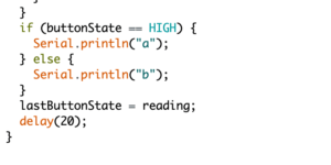
Now if push the button, vale (a) will be sent to Unity, else print (b), and work with small scripts which attached to the Spot and Point Light. It works! Now my button can control my lights in the room
The same process for the ball control also achieved. I will continue to dig deeper to explore more functional.
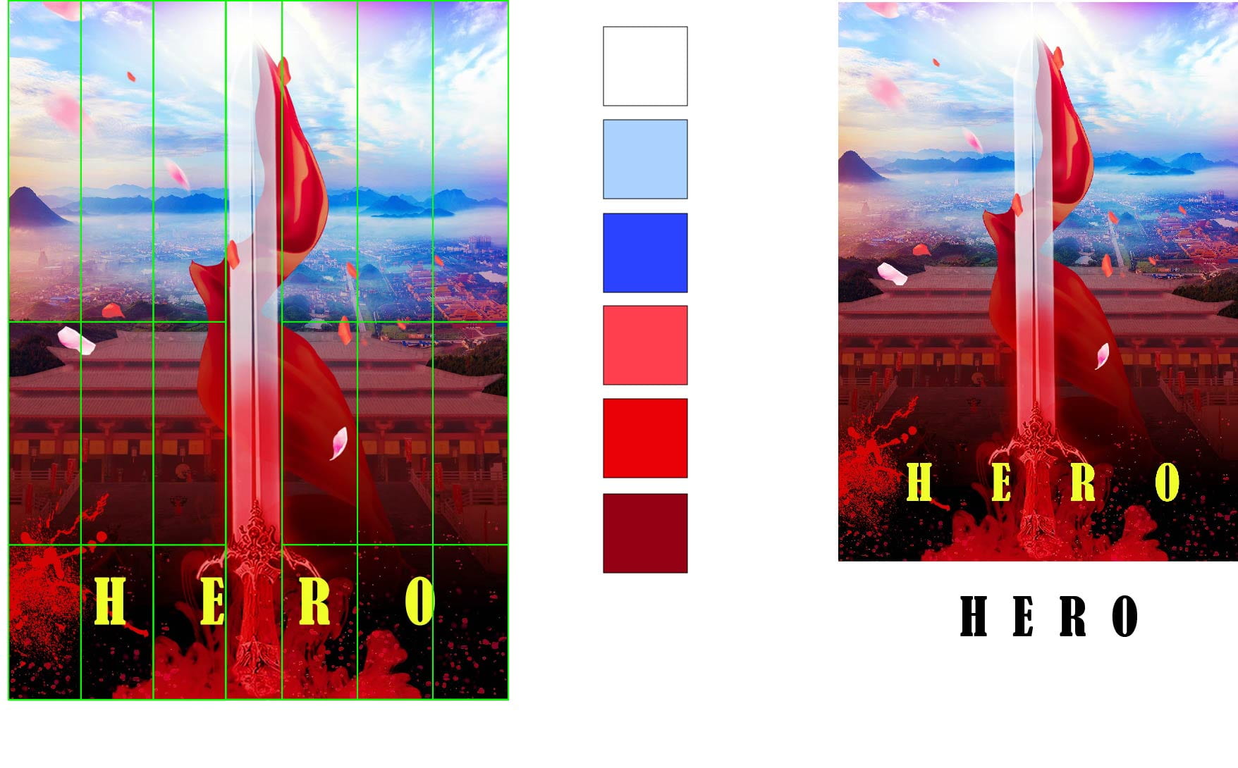
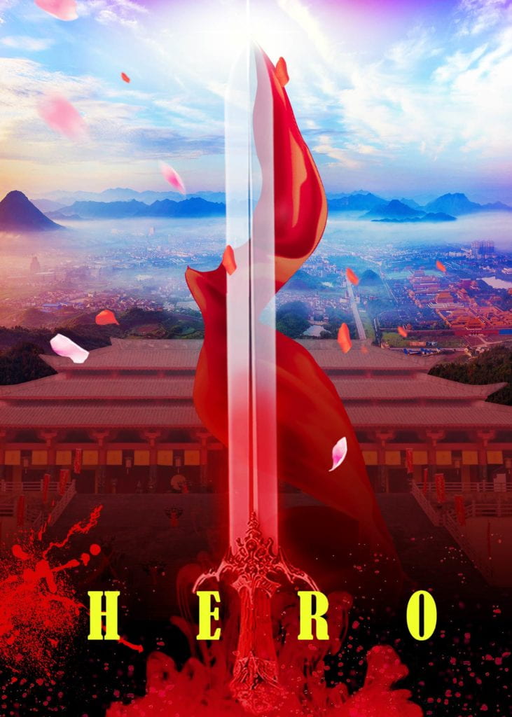
The poster is trying to show the mind changing of assassin Wu Ming: Revenge –> Ambivalence –> Give up
Revenge: this is for his defeated motherland
Ambivalence: He has lost his family, lost his country. But still have much more people will keep their family against war. The king he is going to assassinate who can make the land peacefully.
Give up: He opens his mind and accepts the king.
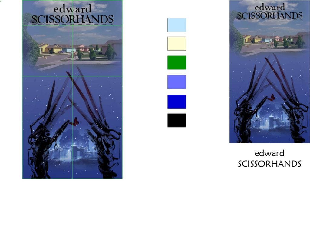 The poster is trying to show the ambivalence of Edward Scissorhands.
He is always in confusion what he exactly is. He joined human’s daily life, he got positive confirmation from people at the beginning, so he thought he was a human.
But why people hate him finally, why he cannot get love from the girl he loves. Is he a monster in people eyes? Eventually, he left the girl in order to protect her. The cold blue color and snowing night comparing to a sunny day in human area is to show ambivalence and worse mood of Edward.
In Week 1-2 Sketch, I made a circle which is followed by mouse moving every time. And circle color will change automatically follow time. At the background, small circles will show randomly and with color changed randomly.