The Thawing Giant-CC-Gottfried Haider
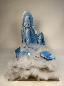
During our project journey, we switched our focus from broad environmental challenges to the engaging story of an iceberg melting. To bring this story to life, we dug into the world of polar bears, hoping to make people fully understand the hardships these amazing creatures confront as their cold surroundings disappear. We wanted visitors to get inside the claws of these bears and feel the difficulties of melting ice firsthand. So we got creative with materials, utilizing cotton to simulate the sea’s surface and create the unsettling sensation of ice melting into fog. We anticipated that this immersive experience would elicit empathy and action, encouraging people to face the realities of climate change and join the fight to safeguard our planet’s valuable ecosystems.

Our understanding of how people would interact with our project heavily informed our design decisions. We wanted customers to actively participate in the experience rather than passively observe it, so we included sensors that were triggered by placing a little polar bear figurine. This hands-on approach aimed to develop a better connection to the issues that polar bears face in the changing Arctic. By dividing the project into interactive portions, each reflecting a different battle, we hoped to convey a more comprehensive grasp of the issues at hand while keeping viewers interested throughout. Furthermore, our decision to replicate melting ice with materials such as cotton gave a tactile element to the experience, increasing its immersion. Through these design considerations, we hoped to inspire empathy and action, urging users to become champions for environmental conservation.
While considering materials for our project, we looked beyond cotton to depict the melting sea surface. We investigated utilizing plastic or resin to produce a more durable and visually appealing picture of melting ice. However, we ultimately decided against this alternative due to environmental considerations. Plastic and resin are not biodegradable and can add to pollution, which contradicts the project’s fundamental theme of environmental conservation. Furthermore, these fabrics may not have captured the transitory aspect of melting ice as well as cotton, which has a natural and organic appearance. As a result, while picking materials, we prioritized environmental sustainability and integrity of representation, which led us to chose cotton above other possibilities.
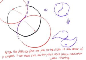
After I drew the design map, we started building. However, the process did not go as well as we expected. I spent a lot of time thinking out how to make our first trap “break” the way we wanted, and then I realized I could use geometry, so I came up with this idea:

It went out rather good, despite the fact that I had to draw circles with my bare hands. This could be our biggest issue besides coding (I’m horrible at geometry!). Coding, on the other hand, is far more intriguing to me than to my partner. Because she knows absolutely nothing about coding, I have to go over what she produced and rectify all of the mistakes, which is more difficult than redoing it myself. I also taught my partner about wiring in case she doesn’t get us all electrified; perhaps that’s why I studied physics in high school (so painstakingly)! However, during the user test, our product simply stopped moving; we are still unsure what caused this, but we all agreed that it was due to a poor wire connection. We later reconnected them and, to some extent, resolved the issue.
This process taught me vital lessons about the iterative nature of refining an idea until it develops into an actual project. When drawing out ideas on paper, they frequently appeared as lofty aspirations that were distant from practical application. However, with effort and a desire to learn from failures, I learned that each setback provided an opportunity for improvement. To ensure the viability of a notion, it was often necessary to start over. This adventure taught me the value of resilience and adaptation, enabling me to turn abstract concepts into tangible reality.
https://drive.google.com/file/d/1V3t6b7_rDPo8b1zYTwA4DzpGNT0Vq9RH/view?usp=drive_link
Restating our project’s goals, we hoped to raise empathy and understanding for environmental conservation, particularly the issues that polar bears face in the changing Arctic. Our project’s outcomes are consistent with our concept of interaction, as they make use of interactive sensors that allow viewers to actively connect with the narrative and immerse themselves in the polar bear’s habitat. However, our findings differ slightly from our definition of interaction in that we could have included more dynamic and responsive features to increase user engagement. Ultimately, our audience responded to our effort with interest and empathy. They interacted with the interactive components, generating various scenarios to get insight into the hardships of polar bears. With more time, we would improve our project by fine-tuning the interactive features to generate more diverse and nuanced replies, resulting in a higher degree of involvement and knowledge. From setbacks and disappointments, we’ve learned the value of adaptation and persistence. Each issue we experienced taught us significant lessons that helped define our approach and develop our project. Our triumphs leave us with a sense of pride in our ability to transmit a meaningful message through inventive storytelling and interactive design, as well as a renewed dedication to pushing the frontiers of creative expression in environmental campaigning.
