Music Poster: Ballade No.2 by Chopin
Poster Creation: Xinyu Liu (Carrot)
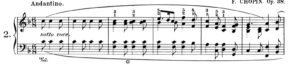
Music: Ballade No.2 in F major by Frederic Chopin, played by Krystian Zimerman
https://www.youtube.com/watch?v=oK2DJwEpFoQ
Concept and Design
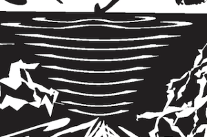
Ballade No.2 is a 7-minute-long composition played by the piano, of which the main theme is contrast (Samson 51). The music is composed of five themes: the first and the third a peaceful melody in F major; the second and the fourth a magnificent and stormy tone in A minor; and the fifth a quiet and sad closing section in A minor. As Samson wrote in “Chopin, the four ballades”, the first theme “conceals its art beneath a deceptively innocent lilting surface” (51). The repetitive but simple notes gave me the feeling of a very light creature skipping on the surface of a still lake, creating ripples that blend in with the peacefulness.
All of a sudden, as the ballade proceeds to the second theme, the creature plunges into the lake, breaking the peacefulness and entering a chaotic and mirky environment beneath the still surface. It swims with all its might, trying to break through the deep darkness.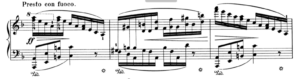
At the end of the second theme, it succeeds, drilling out an exit, or an entrance to a new peacefulness. However, the third theme isn’t as harmonious as the first. The frequent modulations and disharmonious chords represent both the lingering darkness of the second theme and the omen of a disastrous future.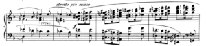
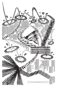
The fourth theme is similar to the second but gives me a more discrete feeling. The tension reaches a climax. The emotions explode.
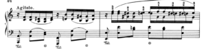
The excitement comes to an unexpected end, followed by a very quiet closing section. The creature finally escapes, exits, and disappears.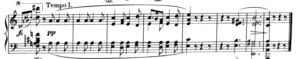
I divided my picture into five parts, of which the area is in accord with the length of each theme in Ballade No.2. The first part begins at the top left corner of the poster. I tried to create a feeling of the light creature bumping on the surface. Beneath the white surface, I use a black background to represent the sharp contrast between the first theme and the second. Also, it conveys the feeling that a storm is hidden behind the peaceful surface. The lightning track that pierces through the darkness represents the track of the creature as well as its struggles. In the third part, I use 3D revolving to create bigger ripples and express the sense of a disharmonious peacefulness. I stained the white background with dots and drops to showcase the omen and the lingering darkness. In the fourth part, instead of creating a continuous track, as I have done in the second, I created a spreading effect with a complicated combination of lines, curves, and circles. I use the black circle to represent the light creature exiting the picture quietly. For the composition as a whole, I use a continuous track of the light creature to express a sense of coherence throughout the piece, and the white/black background to represent the sense of contrast. In the composition, I frequently use closure and similarity and good figure, the Gestalt Principles, to illustrate the pattern with only characters. For example, I use “c”s in decreasing sizes and put them together to create a vortex and indicate the track of the creature in the fourth part, which applies the closure, similarity, and good figure principles.
I practiced these principles a lot in my One Black Square assignment and found that they are very useful when I want to create a pattern using a combination of other patterns. I noticed that when applying these principles, the outlines of patterns are usually white, which reverse the normality in drawing (when sketching, we usually use a pen to draw the solid, black outlines). The practices in One Black Square made me change my old habits and approach a pattern with its shape instead of outlines, which help me a lot when I tried to create black and white contrast in the music poster.
Process
The most significant step I took during the revision is that I deleted small and dense characters and used massive white and massive black to express the contrast. As is shown in the picture below, my first draft was chaotic because I arranged a lot of small characters. I intended to create a sense of coherence using the “type on the curve” and fill the white space with “0”s to create a sense of contrast. However, in the mid-critique, my peers pointed out that the contrast was not obvious because the density of the characters didn’t make up for the white background. What’s more, the sense of coherence is not properly conveyed because of the discrete distribution of “0”s. Therefore, I decided to use a black-and-white background instead of increasing the density of small characters. I also deleted the curves that represent track of the creature. By using closure and good figures principles, I was able to create a better sense of coherence.
Conclusion
In the music poster assignment, I explored three Gestalt Principles: Closure, Similarity, and Good Figures. I also used the negative and positive space to create an interesting visual effect on my chosen music. If I had more time, I will try to apply the other Gestalt Principles. Also, instead of separating the picture into five parts, I may try to create only one center point to avoid the focus problem (as was pointed out by professor Inmi, people may mistake the exit point, which is at the bottom left, for the entrance point). What’s more, I will try to be more abstract and stay away from the narrative style (in the One Black Square, I was too obsessed with the narrative style. In the poster, I tried to make the visualization abstract, but by imagining “a light creature and a lake” and distorting the characters to make a realistic shape, I again fell into the trap of narration). I will try to explore typography without distorting or transforming the characters too much, and experiment with more fonts.
Image of my Poster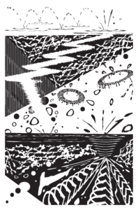 Citation
Samson, J. Chopin: The Four Ballades (Cambridge Music Handbooks). Cambridge: Cambridge University Press, 1992.