The Environmental Monster

By: Ammna Khan and Vilius Schimdt
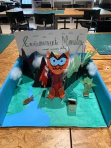
In our prior group project, we focused on sustainable fashion, but for our midterm project, we took inspiration from a pressing social issue related to human impact on the environment. Our concept involved personifying nature’s response to human intervention through the creation of a creature that displayed emotions when its environment was disturbed. Depending on the user’s actions in the environment, the creature would either exhibit happiness or distress. For instance, if the user picked up litter, the creature would express joy, but if the user touched the forest or a tree, the creature would become disturbed. This idea aimed to raise awareness about the consequences of human intervention in natural settings.
Initially, we had considered this project as a security alarm system, where the creature would react to loud noises or sudden movements. However, after discussing the concept with our professor, we realized the need to transform it into a more captivating and distinctive interaction that was intricately tied to the environment.
Our understanding of interaction and its definition was shaped by examining previous projects and interactions. We recognized that effective interaction design must resonate with the user on a deeper level, making them more conscious of the issues at hand. It’s not just about responding to external stimuli like loud noises but creating an emotional connection between the user and the environment. In our project, interaction is not merely a reaction to external factors; it’s about fostering empathy and understanding about the consequences of human actions in nature.
Our project was intended for everyone who disturbs natural ecosystems, including businesses and tourists. We aimed to create an emotional connection and raise awareness about the impact of human disturbances on the environment. By personifying nature’s reaction through the “screaming” monster, we wanted to show how nature’s response could influence human behavior and encourage more environmentally conscious choices. It was a call to action, advocating for nature and shared responsibility in preserving our natural ecosystems. The project served as an educational tool and engaged the community in discussions about environmental protection and sustainability.
While we didn’t physically recreate anything, the concept of the monster was initially inspired by the idea of an environmental security alarm, essentially acting as a guardian of nature. It symbolized our project’s mission to protect and draw attention to the environment.
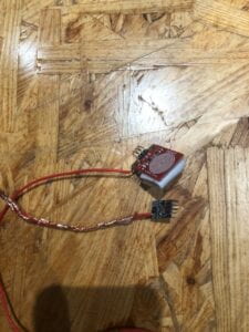
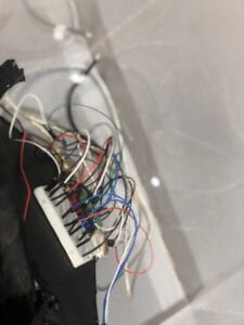
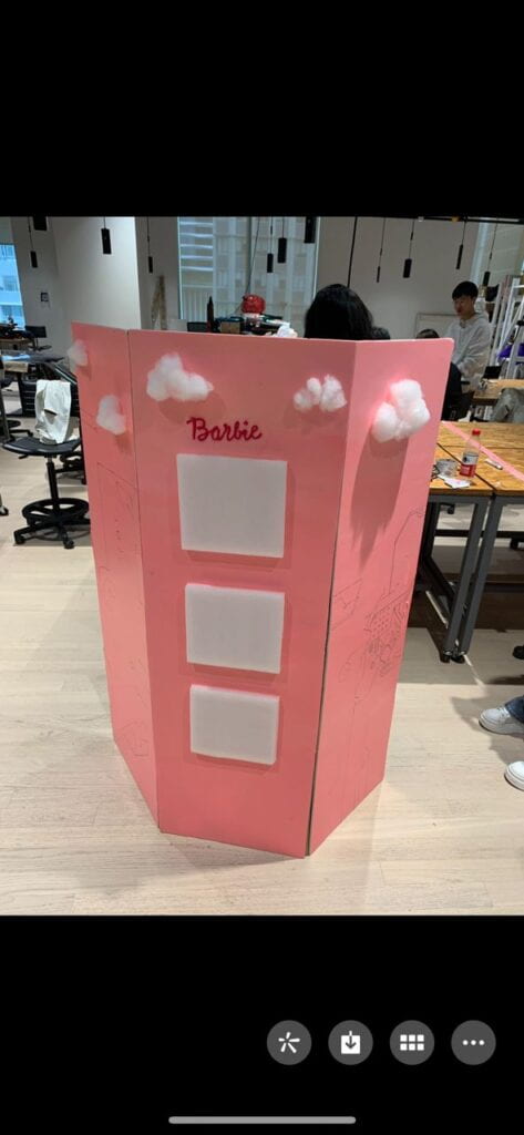
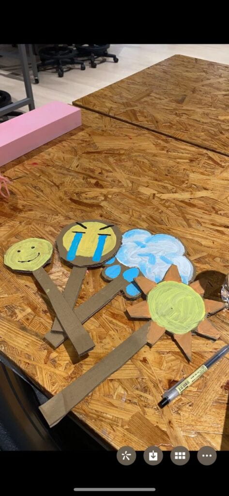
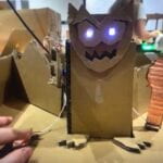
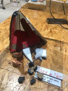
To ensure a clear user experience, we concealed the fish and tree elements, incorporating blinking LED lights to guide users toward the monster. When users inquired, we explained the concept of disturbing the monster, enhancing user engagement. After user testing, we enriched the interaction by introducing more sounds and reactions based on user feedback. Our project featured cardboard initially for the design of the monster , but we switched to paper cups for improved design and stability. Magnetic touch sensors facilitated the movement of the monster’s arm, while buzzers created the screaming sound, and LED lights illuminated the monster’s eyes. Our material choices prioritized stability, user-friendliness, and durability. We didn’t reject any material options, but we abandoned the security alarm concept due to its complexity and time constraints.
In our production process, there were several significant steps, both successful and challenging:
Division of Work: My partner and I efficiently divided the work based on our strengths. Vilius focused on coding, while I was responsible for setting up the prototype. This division allowed us to play to our individual skills and complete the project on time.
Collaboration and Communication: During the development process, we maintained constant communication through WeChat calls, discussing the design, strategies, and any challenges we encountered. We scheduled joint work sessions and ensured that if one person was unavailable, the other would proceed with their part of the project.
User Testing Sessio: During the user testing session, we observed how participants interacted with our project. This invaluable feedback revealed areas that needed improvement.The need for designing better, adding more elements such as mvement fun reactions such as a sound, hiding the fish and the trees to engage the uers were few suggestions we implemented. Users were sometimes confused about the project’s purpose, which led us to make changes to enhance clarity and engagement.

Adaptations and Effectiveness: In response to user feedback, we added more sounds and reactions to the monster, making the interaction more interesting and informative. These adaptations proved to be effective, as they addressed the confusion that some users initially experienced and made the project more engaging.
Justification of Production Choices: Our production choices were influenced by our desire to create an engaging and effective interaction that raised awareness about environmental issues. We selected sensors that aligned with our project goals and incorporated design elements to ensure stability and durability. The division of roles allowed us to leverage our strengths and complete the project efficiently.
Personal Contributions: My contributions included conceptualizing the project, designing the interaction, and selecting appropriate sensors. While I assisted with coding, Vilius played a more prominent role in this aspect, utilizing class materials and support from LAs. Our collaborative approach allowed us to make the most of our individual strengths and complete the project successfully.
int tree = 9;
int fish = 12;
int treestate;
float angriness = 0.0;
float happiness = 0.0;
const int buzzerPin = 5;
int SENSOR_PIN = 2;
int sensorVal;
#include <Servo.h>
Servo myservo;
int pos = 0;
#include <FastLED.h>
#define NUM_LEDS 60 // How many leds on your strip?
#define DATA_PIN 3
CRGB leds[NUM_LEDS];
void setup() {
// put your setup code here, to run once:
Serial.begin(9600);
pinMode(tree, INPUT);
pinMode(fish, INPUT);
FastLED.addLeds<NEOPIXEL, DATA_PIN>(leds, NUM_LEDS);
FastLED.setBrightness(50);
myservo.attach(8);
pinMode(SENSOR_PIN, INPUT);
}
void loop() {
treestate = digitalRead(tree);
int fishstate = digitalRead(fish);
sensorVal = digitalRead(SENSOR_PIN);
Serial.print("Button: ");
Serial.println(sensorVal);
if (treestate == 1 || fishstate == 1) {
// making me angry
angriness = angriness + 0.05;
if (angriness > 1.0) {
angriness = 1.0;
tone(buzzerPin, 200, 500);
delay(100);
for (pos = 0; pos <= 90; pos += 1) { // goes from 0 degrees to 180 degrees
// in steps of 1 degree
myservo.write(pos); // tell servo to go to position in variable 'pos'
delay(3); // waits 15 ms for the servo to reach the position
}
for (pos = 90; pos >= 0; pos -= 1) { // goes from 180 degrees to 0 degrees
myservo.write(pos); // tell servo to go to position in variable 'pos'
delay(3); // waits 15 ms for the servo to reach the position
}
}
} else {
angriness = angriness - 0.01;
if (angriness < 0.0) {
angriness = 0.0;
}
}
if (sensorVal == 0) {
// making me happy
happiness = happiness + 0.03;
if (happiness > 1.0) {
happiness = 1.0;
for (pos = 0; pos <= 45; pos += 1) { // goes from 0 degrees to 180 degrees
// in steps of 1 degree
myservo.write(pos); // tell servo to go to position in variable 'pos'
delay(15); // waits 15 ms for the servo to reach the position
}
for (pos = 45; pos >= 0; pos -= 1) { // goes from 180 degrees to 0 degrees
myservo.write(pos); // tell servo to go to position in variable 'pos'
delay(15); // waits 15 ms for the servo to reach the position
}
}
} else {
happiness = happiness - 0.07;
if (happiness < 0.0) {
happiness = 0.0;
}
}
// XXX: look into .lerp8()
leds[0] = CRGB(255 - (happiness * 255), 255 - (angriness * 255), 255 - (angriness * 255));
leds[2] = CRGB(255 - (happiness * 255), 255 - (angriness * 255), 255 - (angriness * 255));
FastLED.show();
//Serial.print("Angry: ");
//Serial.println(angriness);
Serial.print("Happy:");
Serial.println(happiness);
delay(50);
}
Project Goals: Our project aimed to raise environmental awareness, create engagement, and inspire users to be more environmentally conscious.
Alignment with Interaction Definition: Our results were aligned with our interaction definition as users were drawn in by blinking LED lights, prompting inquiries about the hidden elements and fostering an emotional connection with the environment.
Misalignment with Interaction Definition: However, our project could have better aligned with our interaction definition by simplifying the user journey and enhancing initial clarity.
Audience Interaction: Our audience effectively interacted with the project as intended, with users engaging inquisitively and exploring the concept of disturbing the monster.
Improvement with More Time: With additional time, we would streamline user onboarding for enhanced clarity and incorporate more interactive elements like more sensors and make another arm of the monster stop the twitching and use sensor in the cloud t link it wwith air pollution.We would also add more happiness elements like if litter is thrown into the bin or if vegetation is planted.
Learnings from Setbacks and Failures: Setbacks emphasized the importance of clear user guidance and simplicity, while feedback highlighted the critical role of simplicity in conveying the project’s message.
Takeaways from Accomplishments: Our accomplishments underlined the potential of emotionally engaging interactions to raise awareness and inspire change, showcasing the transformative capacity of well-crafted interactive experiences in shaping user attitudes toward critical social and environmental issues.
F. APPENDIX
All documentation you wish to include but was not closely related to your reflection should go in this section. All the images, the full code, circuit diagrams, materials list, video(s) of your project should be in their corresponding section when they are relevant. For example: a series of sketches you made while refining your idea should be in the CONCEPT section, where you explain how you refined your idea; an excerpt of the code should be in the PRODUCTION section, clarifying an experiment you tried, a full video of an user interacting with your project should be in your CONCLUSIONS section, etc.
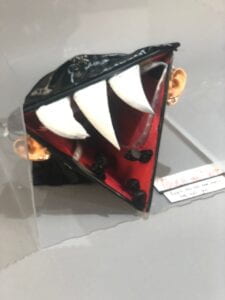 In this project, I fused, technology, and art to craft an immersive experience. Utilizing Neopixels for LED visuals, real-time music analysis, and user interaction, the suspended monster-like creature engages users at eye level. This installation, triggered by touch and sound, aims to raise awareness about mental health.
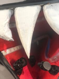
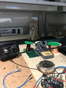
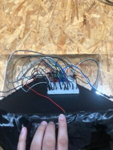
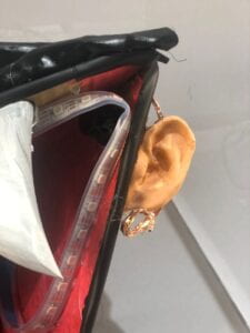
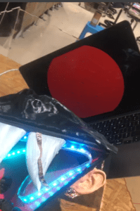 Afterward, I sautered the touch sensors into the ears to give them an earring-like functionality.Following that, I laser cut a box to house the entire installation. To enhance the aesthetics, I concealed the wires by wrapping them with a black cloth and painted the inside of the box for a visually appealing finish.

 Thank you to my professor and the LAs for all the support and guidance.