Sound Visualization Documentation
Yuke Zhang (Alina)
Seven by Taylor Swift
Concept and design
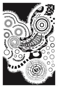
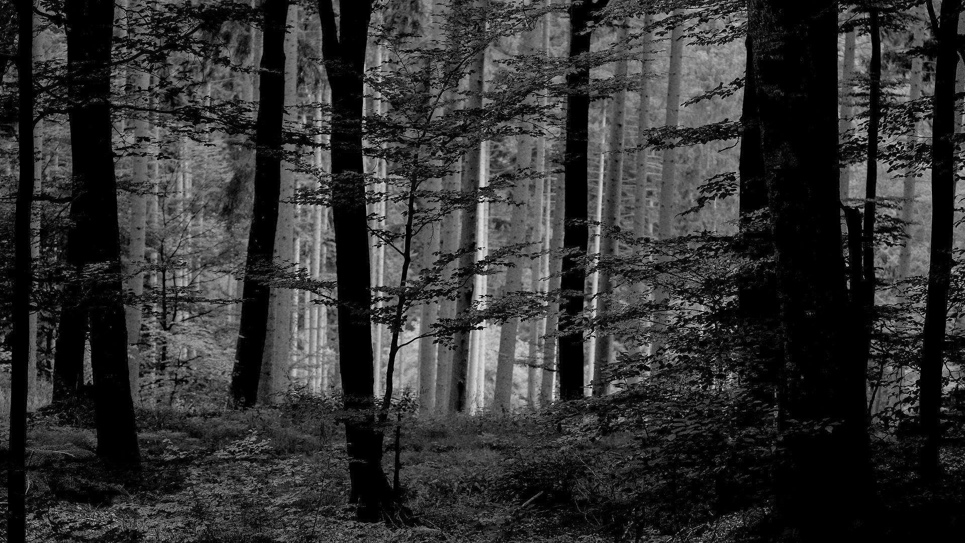
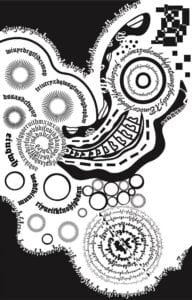
After seeing the assignment Sound Visualization, the first album that came into my mind is Folklore by Taylor Swift, because the folk songs contain so many stories and express strong emotions, which are the essential things I want to show in my artwork. However, I hesitated when deciding which song was better for me to choose. Finally, I have chosen Seven because it is a plotless song so that the audience can feel more about the atmosphere and the emotions behind it. I try to express the song by showing a calm and peaceful feeling, in which the audience feels like they are wandering in a forest or walking along a country road. Listening to the sound by nature, the piece of artwork creates a kind of feeling of a summer night breeze wrapped in a sweet memory.
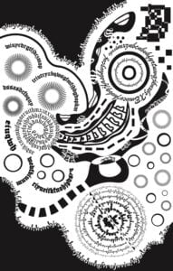
When it comes to the reflection with previous learning Gestalt theory, I used lots of shapes that look like circles to express this kind of tranquil atmosphere instead of using sharp shapes. The similarity between these “circles” formed the whole image as you can see. However, at the same time, to avoid lots of the same designs, I used closure made from stars to cover some images, and I used the letters and “O”s to make up the circles as well.
Process
First, I planned to create three circles, in which every circle consisted of different elements. Then I tried to use lines or tracks to connect each circle. However, in the Work In Progress Critique, the professor told me that it was better to use the shapes indirectly and cover shapes with words.
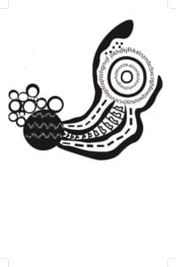
As a result, I changed the left circle into a spiral with an ancient character format and filled the thick black tracks with some white letters in a special format, which met the requirement as well as looked full of rhythm. Besides, I changed the format of the characters on the right circle, making it more like a movable piece of music. It took me quite a long time to design the third circle on the bottom. The result was that different sizes of words were composed into shapes and images, changing from large to small. To make it more elaborate, I created a white line with small black triangles filled in it.
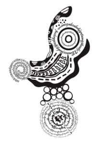
During the last part of my design, I filled the image with a large amount of black colors to balance the white and the black. In addition, I used the letters on the edge of the black area, which emphasized the contrast of the colors. Last, as for the “o”, I tried to make them as bubbles, creating an ethereal conception. However, I was confused about the position of those bubbles, so I moved them twice or three times. In the end, they were in a good position in my final project.
Conclusion
If had more time to focus on my Sound Visualization, I would change the squares on the top of the right side, since it is too sharp and and the parts of the artwork are not in harmony with the whole image. What’s more, I would reconsider the fillers in the blanks between the black tracks because triangles are quite simple.
As for the artwork Sound Visualization, I spent 10 hours and I was devoted to making it, releasing all my emotions and imagination to create the delicate atmosphere in Seven by Taylor Swift. Even though I know that I didn’t have much experience in designing and creating, I have put so much effort into this project. Hope you all can feel the gentle melody and imagine that you’re strolling on a sidewalk near the river, with the sun falling down the horizon at a slow pace.
Image of Project
