Concept & Story
Please enjoy Oltremare by Ludovico Einaudi while reading this documentation:
Our visual metaphor Still I Rise originated from a famous poem by Maya Angelou, a black female poet. In this project, we’d like to express a kind of feminism through the continuous and step-by-step rise of women, regardless of the repression and judgment from society, especially the ones from men.
The inspiration comes from a Youtube video of Maya Angelou reciting her poem Still I Rise. The confidence and freedom in her tone and movements inspired us and makes us evaluate the content of the poem. It turns out that the poem is very suitable for a visual metaphor. In the original poem, Maya uses syntax, and tones to express the determination of black women. Each paragraph is a rise that integrates the rise of objects, and the spirit of black women. For our own project, we broaden the scale of rise to the target the entire female population, and use different kinds of rising stuff, including abstract ones and the ones related to women’s daily routine and female bodies. We specifically focus on the movement of these things, physically but also implicitly showing the confident, mature, and brave rising of women.
We first decided to choose a poem as the voiceover of the project. When we read about Still I Rise, we were inspired to use different objects or scenes to represent and symbolize the process of rising. Although the poem contains both the rise of females and the black community, after consideration, we thought that feminism is broad enough but still more focused than the original poem, therefore we focused on the rise of females. After several attempts at reading aloud, we preferred to present a confident, calm image that has risen firmly as opposed to a more aggressive, angry feminism that is still struggling to rise.
Since we are both women, we wanted to present a different image than the cliché of women fighting against oppression, or the call for women to rise up against it. We want to show a woman who has successfully risen with confidence in the new era. In the face of ridicule, we laugh it off, because we already have the confidence to rise, and no longer need the approval of others. In the face of oppression, we also have the strength to rise, no matter how difficult the circumstances are. Through this project, we want to answer the question of how feminism in the new era should be: calm, firm, and confident.
Creation Process & Execution
- Storyboard
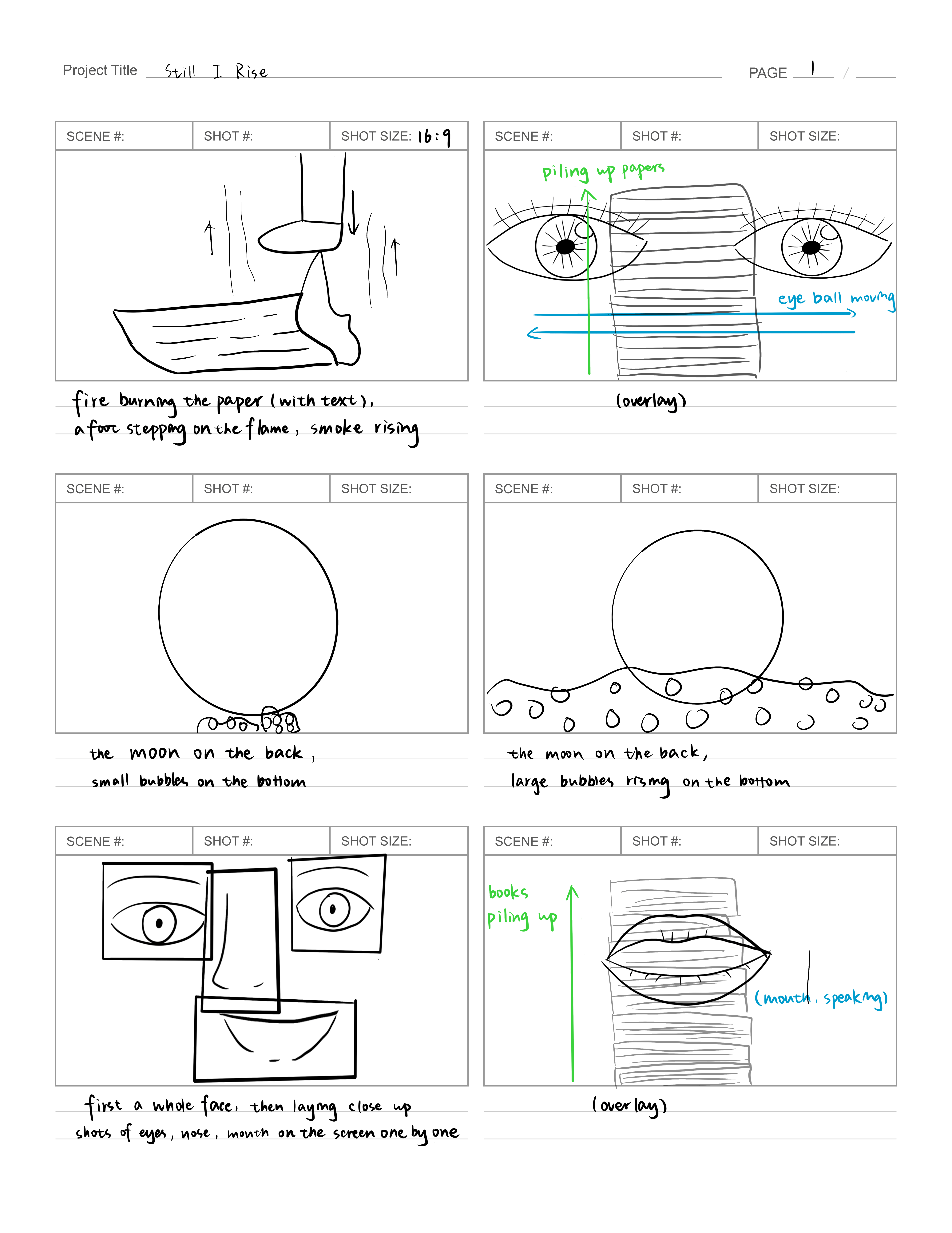
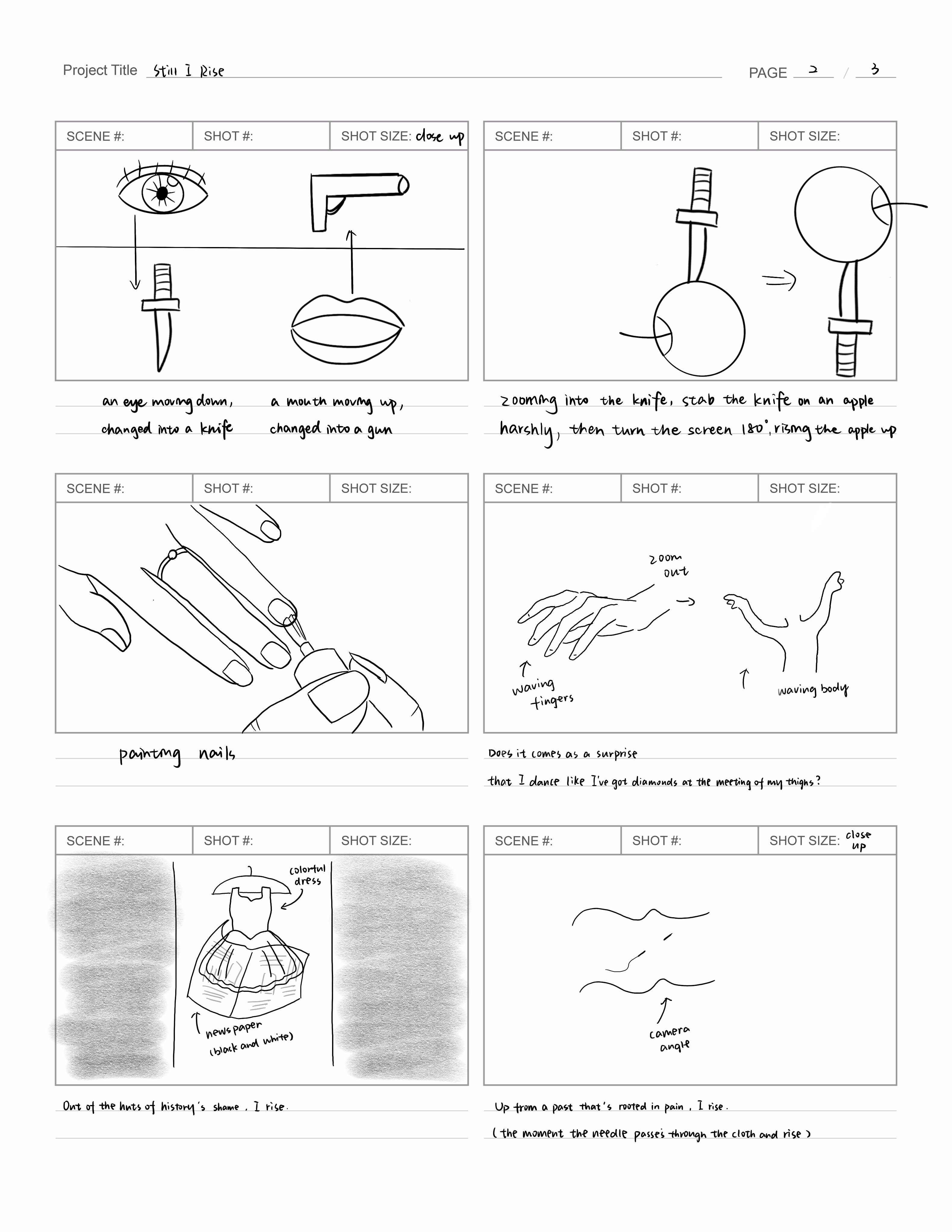
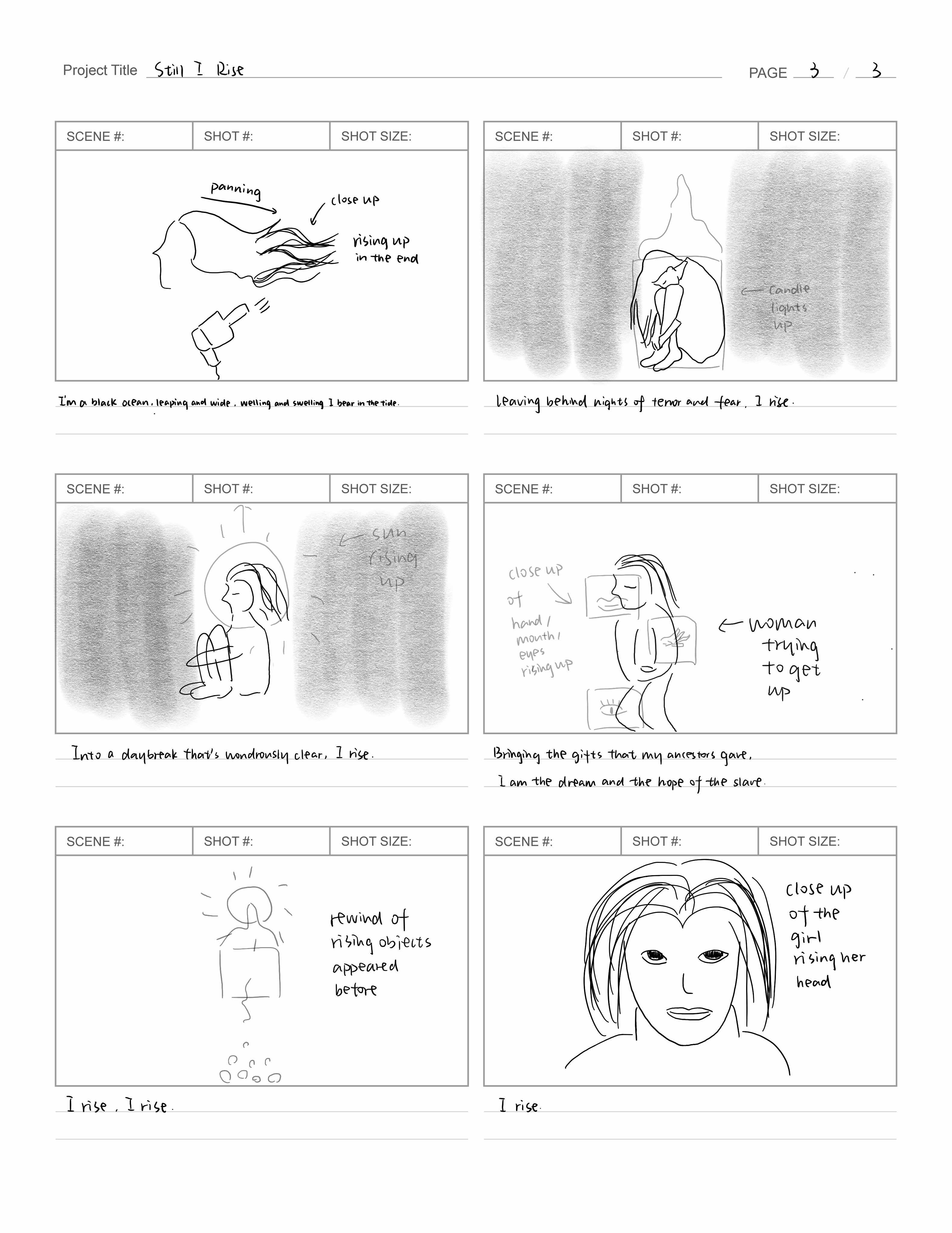
Before the shooting, we brainstormed together. We created a Google doc and divided the sentences into scenes, and wrote the possibilities of what could be included in each of them. As for the storyboard, we not only sketched the content of them but also indicated the technique of shooting and the effect that we want to achieve after the editing. The camera angle, the movement of objects and people, and the layout on the screen, like Juxtaposition, stop motion, and overlaying of scenes. Our storyboard visualizes our ideas to make the procedure afterward achievable and manageable, helps us stick to some of the ideas we think of in the process of shooting, and also re-examine and re-design some of them during shooting.
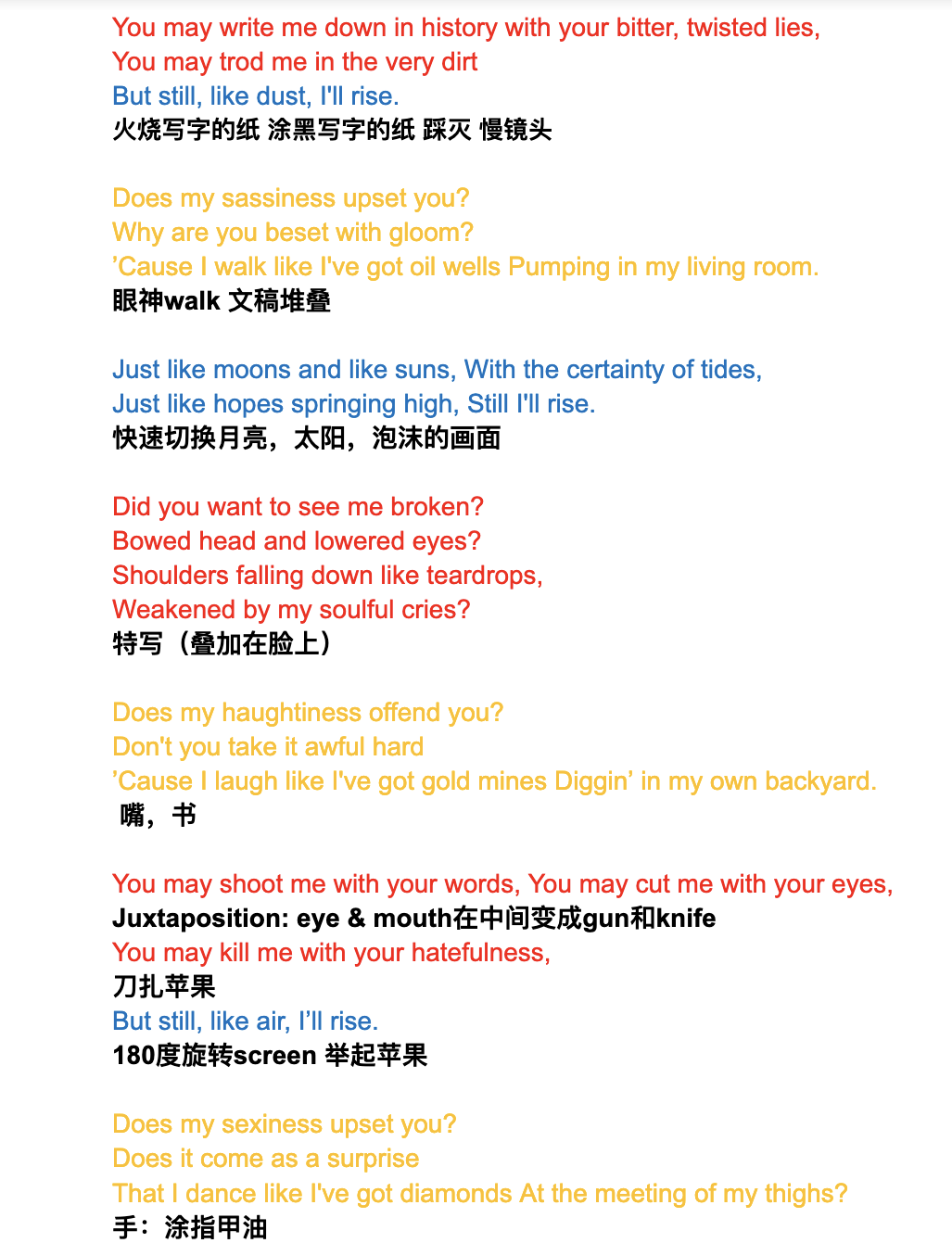
- Shooting:
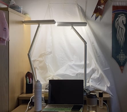
Since we are still under lockdown, the setting of the shooting background is very limited. Many of the scenes we want to create are close-up shots, we’d like to make the background as clean as possible. We mainly shot the objects, including the apple, dress, knife, and candle on our desk with a white cloth over it. As for shooting for the body parts, including lips, hands, eyes, hair, face, and a women’s whole body were mainly done in front of the white wall in our room and common room. The brightness, angle, and saturation of lighting were manipulated with our lamp, the headlight, and the flashlight of our phones. Shots of the objects were aimed to be clean and bright, thus we used front lighting a lot to let the audience see the details clearly.
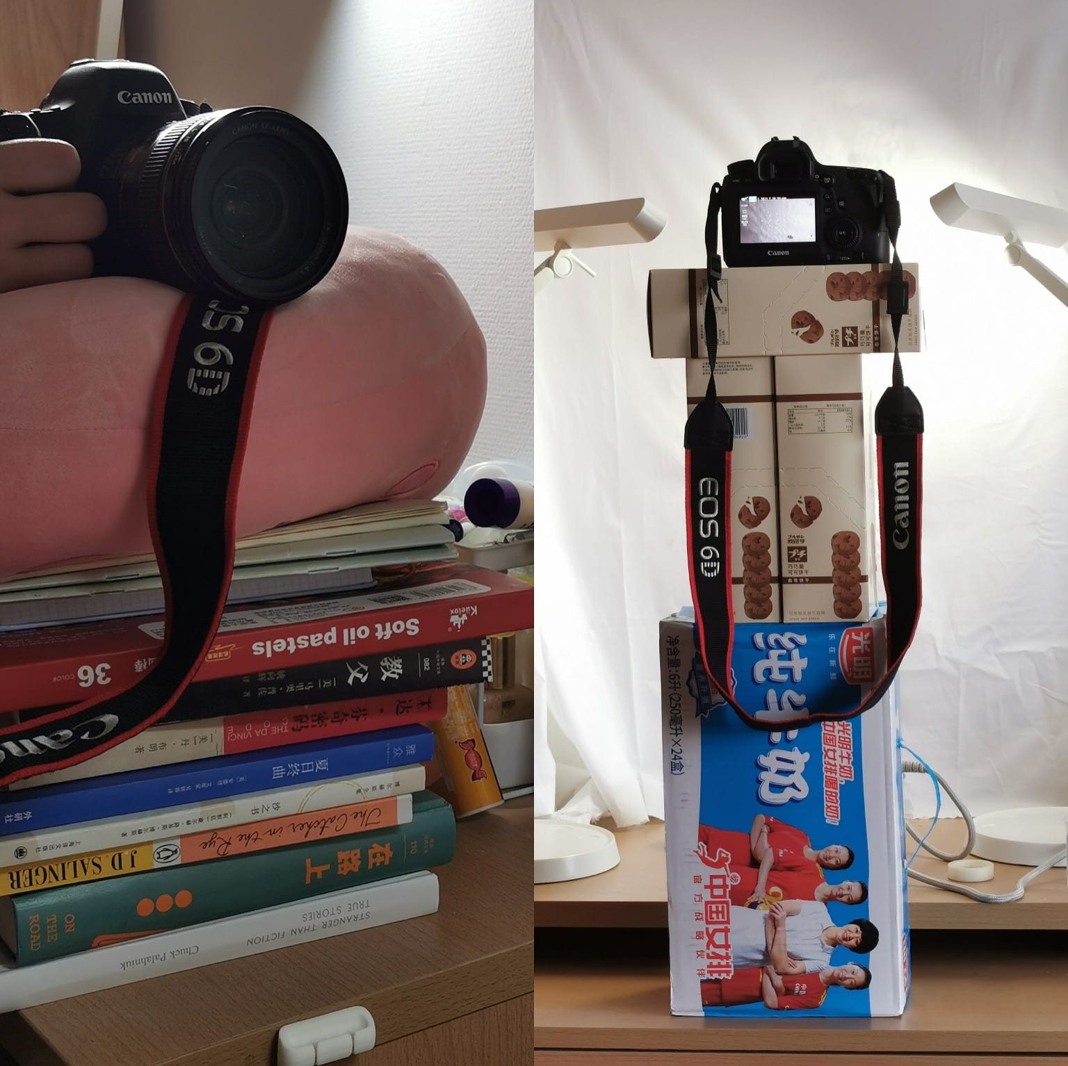
During the process of shooting, we found it very challenging to stabilize the camera without any stabilizer and tripod assisting. However, we managed to make it with the stuff in our room. To shoot a stable shot at a high level, we laid our milk box, our cushion, and books together to put our camera on it.
We chose to use the female eyes and mouth to correspond to the part of the poem that embodies female pride, in order to point out the female theme in the very beginning and to use the slightly exaggerated makeup of these two parts to show the confidence of women in showing their bodies to the other. Not only that, similar to the use of women’s hands and hair later in the video, this is the focus of the “rise” of the parts of a woman’s body to symbolize the overall rise of women.
Meanwhile, we chose the rising of the books to relate to the voiceover part of women’s wealth. We interpreted the richness as the achievement of women and expressed it in the form of spiritual richness with the visual image of rising.
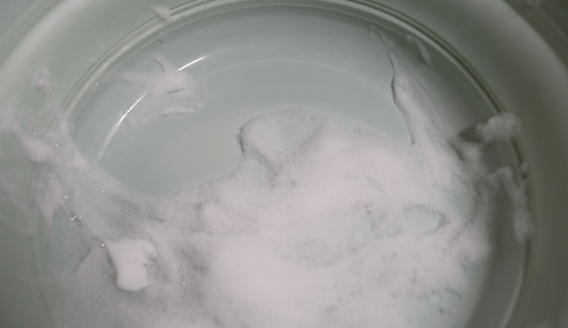
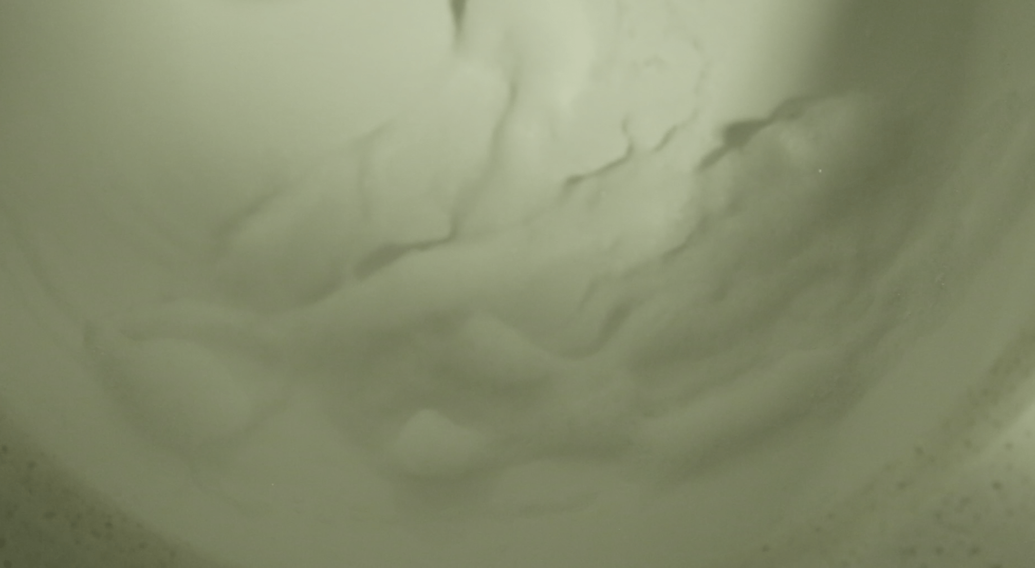
Our first struggle comes with the scene of the bubbles, which we wanted to imply the rising of the tides. We tried with three different scenes but then realized that the overall shape of the other two scenes is round, which leads to the fact that the center of the picture drives too much attention, weakening the feeling of rising. So we chose to use a completely vertical rising image in the end.
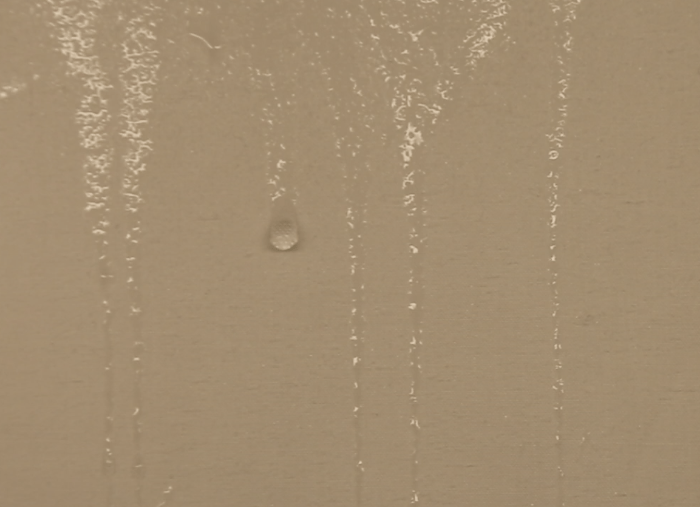
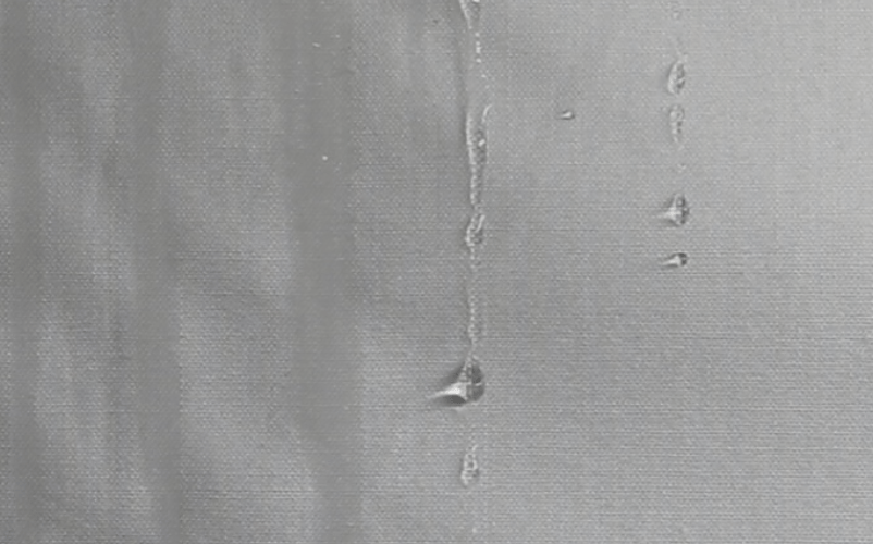
Then we encountered the problem of shooting the scene of dropping water. Firstly, the water drops were not that visually obvious. With the suggestion of professor Ian, we used a side-light source to emphasize the transparency of water drops. Secondly, we had a hard time reaching enough to get the water to drip down. We tried using sprays, and showerheads and the results were not very satisfying. Finally, we used a dropper to drip the water so that we could fully control the position and speed of the water droplets.
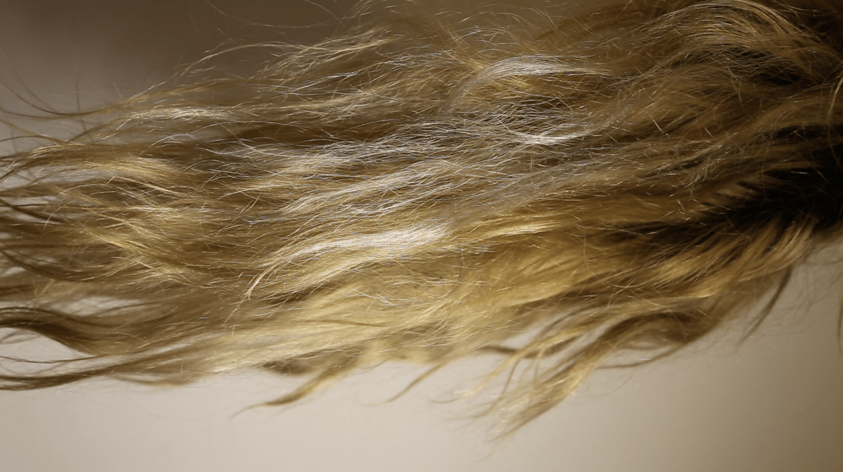
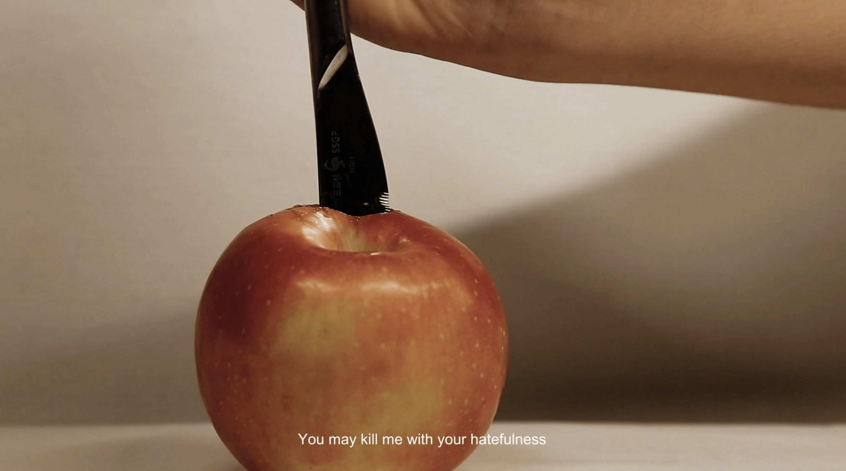
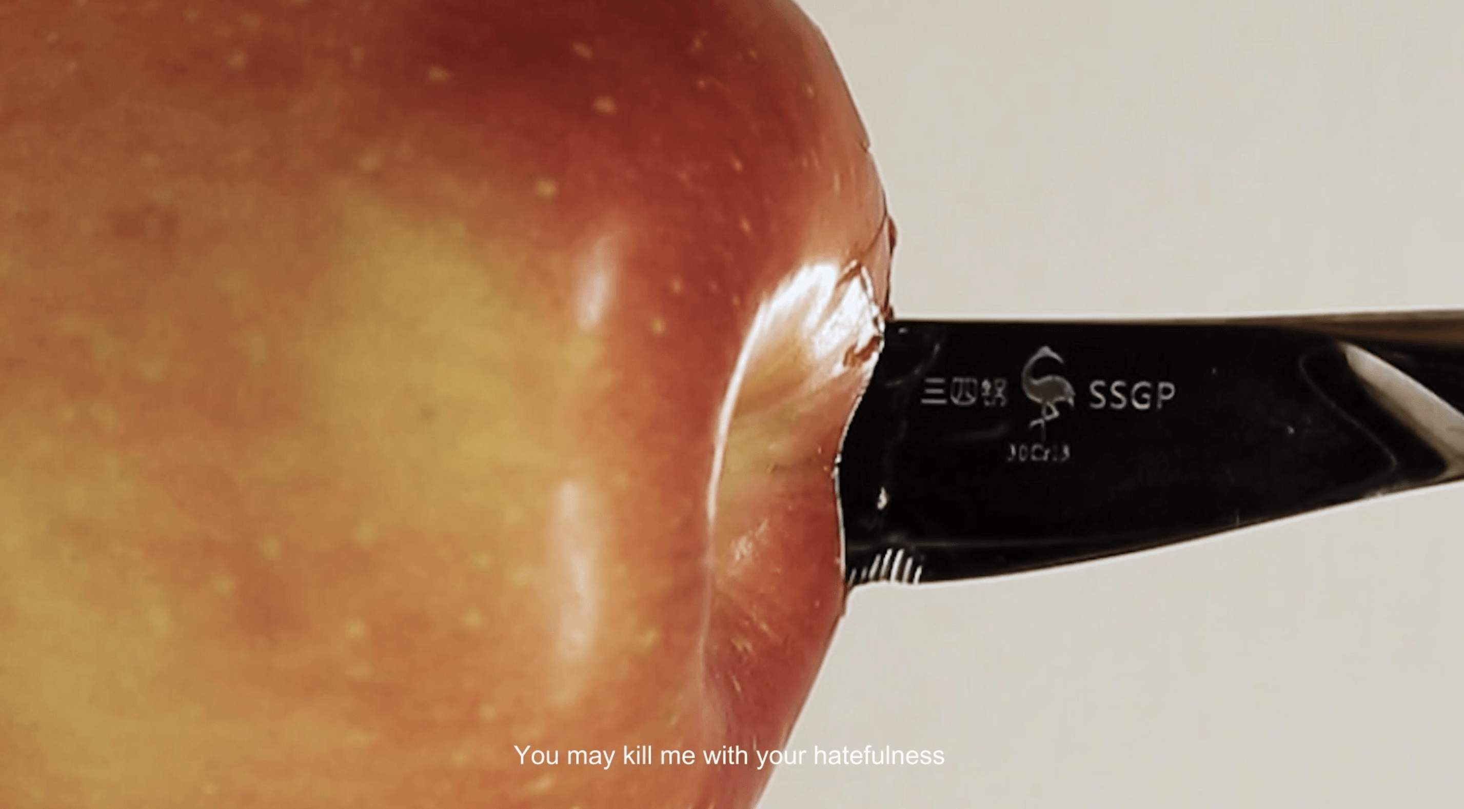
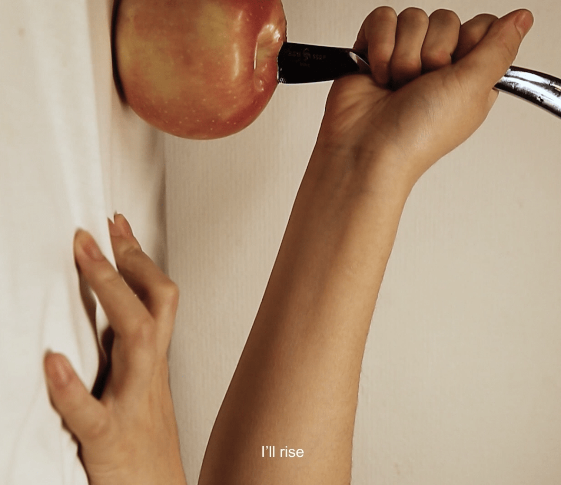
The apple scene, the hair scene, and the last scene about the rise of a woman were the ones we found quite challenging to shoot and direct. In the apple scene, we’d like to integrate the two lines “you may kill me with your hatefulness” and “but still like air, I’ll rise” to create a plot reversal. It means that even though the social standards may not be kind to women, women still rise from hatefulness, judgment, and criticism. Therefore, we first took a close-up shot at a knife stabbing into an apple and zoomed out to include the climbing-up of a person. It was difficult that we needed to adjust the shooting distance and focal length to put everything together in a single shot. The hair scene was to mimic the waves of the “black ocean,” but it turned out that it was challenging for us to create such an effect with a hairdryer. And when shooting the hair, the camera was easy to lose focus, therefore, we shot it at a distance, reframed it overlayed two shots of hair with different levels of opacity.
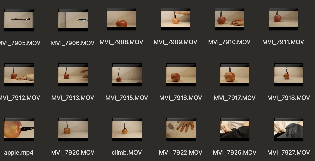
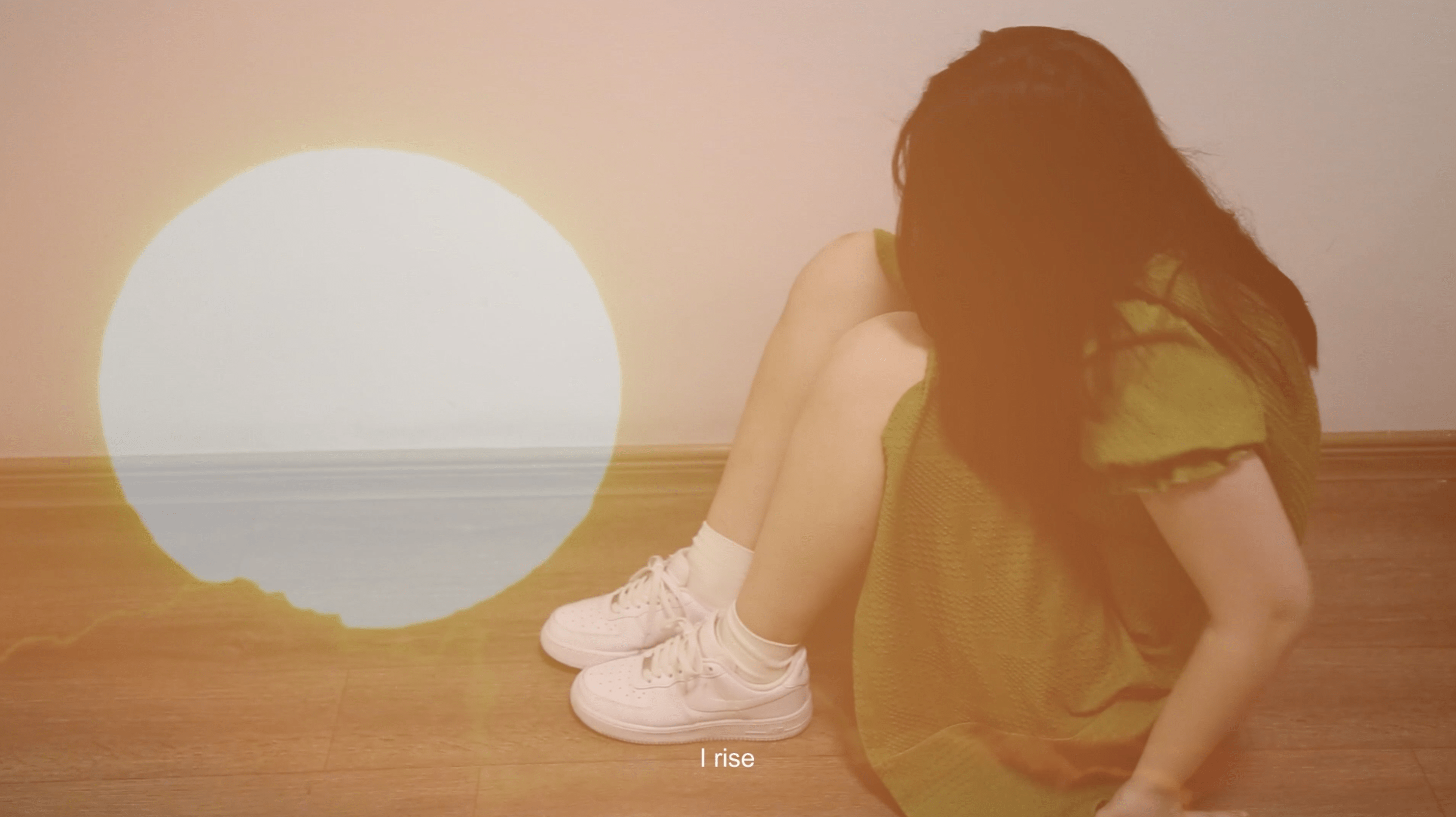
To perfect our clip, we did this by taking multiple attempts, asking for Professor Ian’s suggestions,s and choosing the best one to overcome these difficulties. However, for the last shot of the rise of a woman, we let the camera be a bit overhead initially but Professor Ian suggested that we could use tilting for the camera angle. However, after re-shot it and the rough cut we decided to keep the original version of this shot. Because we wanted the very last scene of the video to be the head-up of the women, the transition between the last two clips would not be smooth if we used tilting (it would be a transition from a low angle to an eye-level shot).
- Editing:
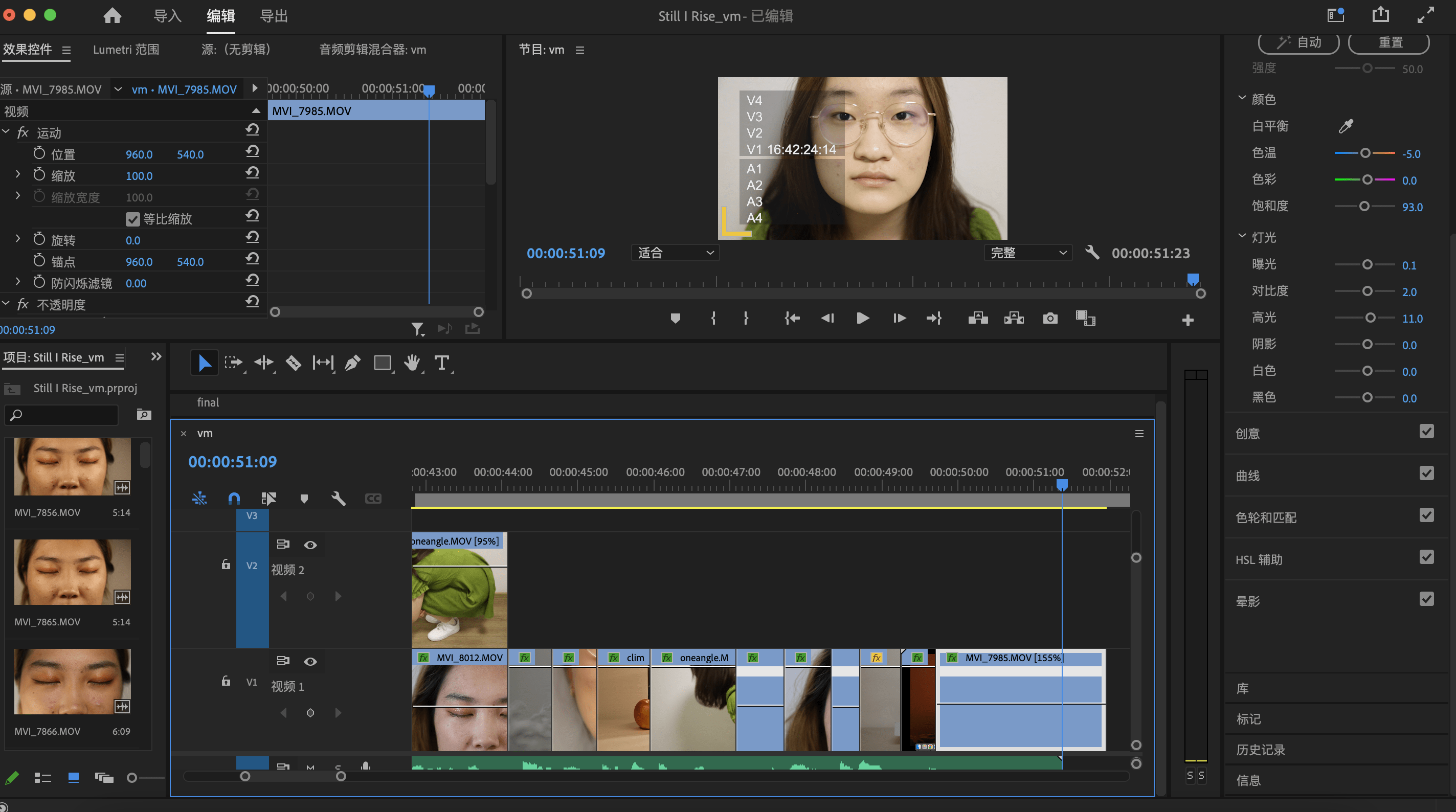
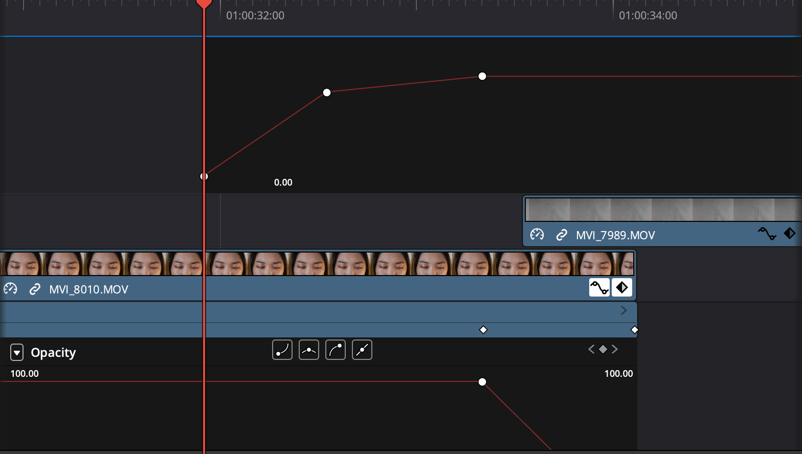
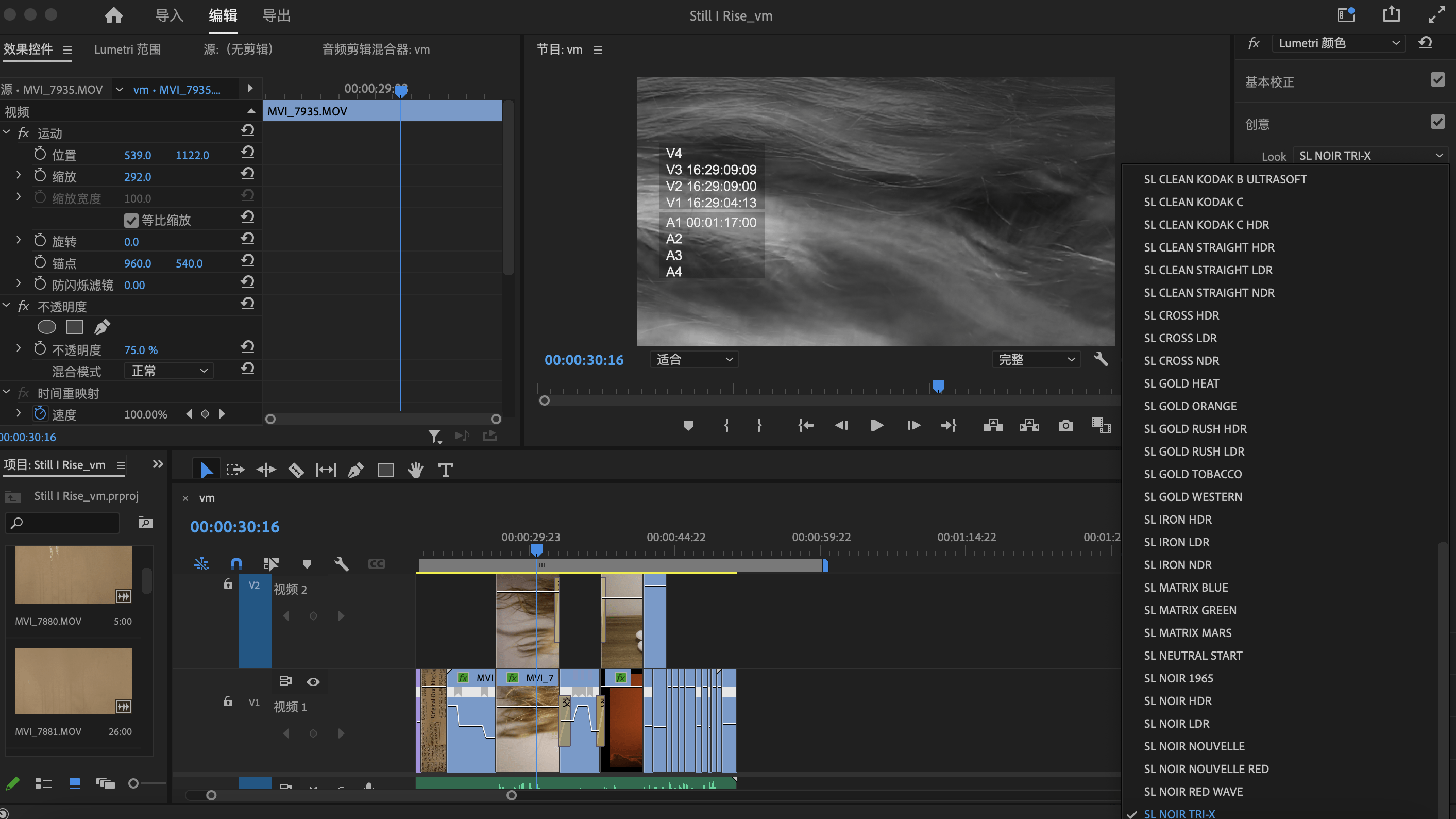
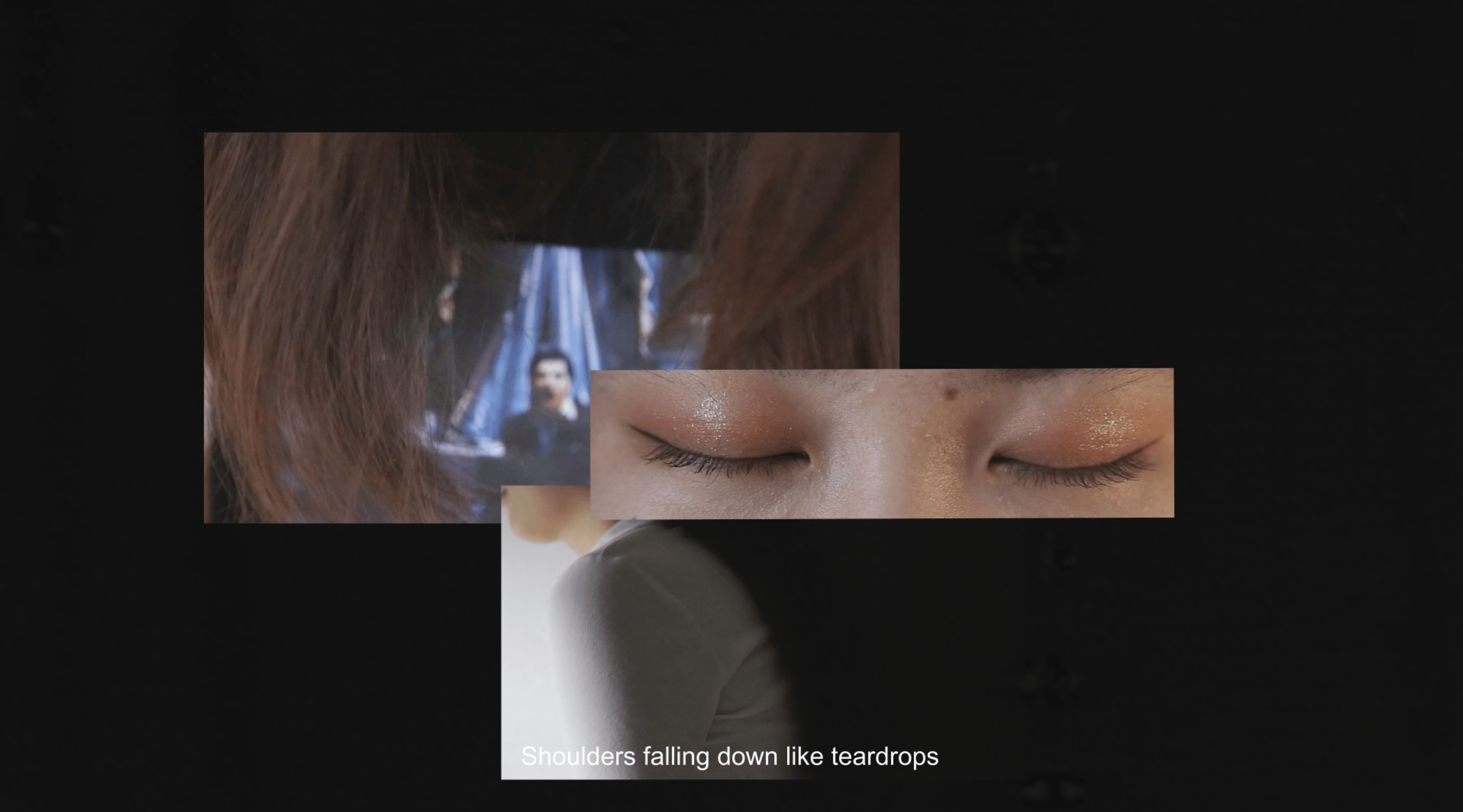
As for editing, we mainly spent most of our efforts on color adjustments for the consistent feeling of our video, including exposure, color temperature, saturation, contrast, highlight, and shadow. We used keyframes for the movement of frames to create the split-screen, matching the pace of the video. And also, to integrate the objects and people, we adjusted the opacity of the scene to put them together in one frame.
For instance, we made areas that were too dark (like the bubbles) brighter and areas that were too warmly lit cooler.
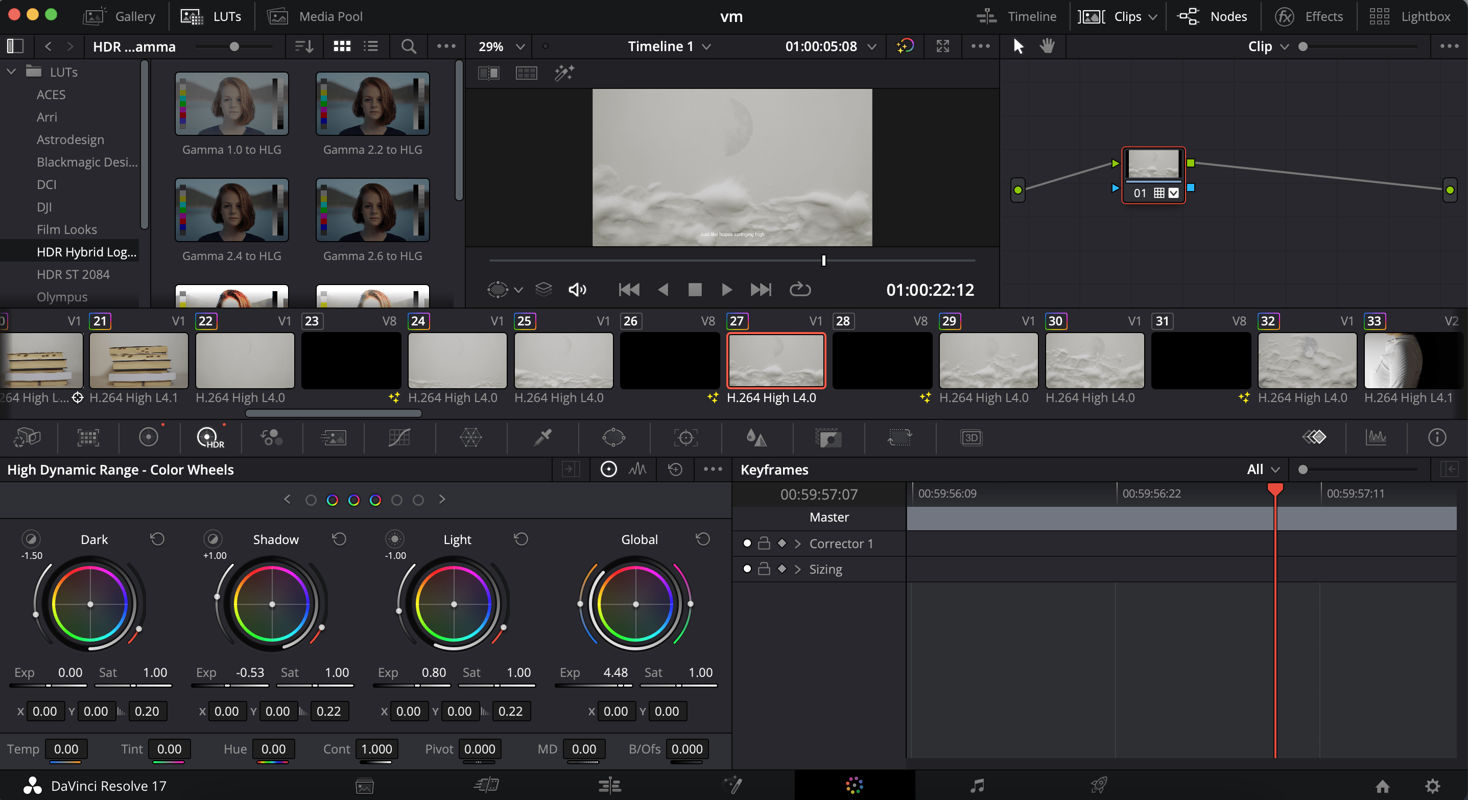
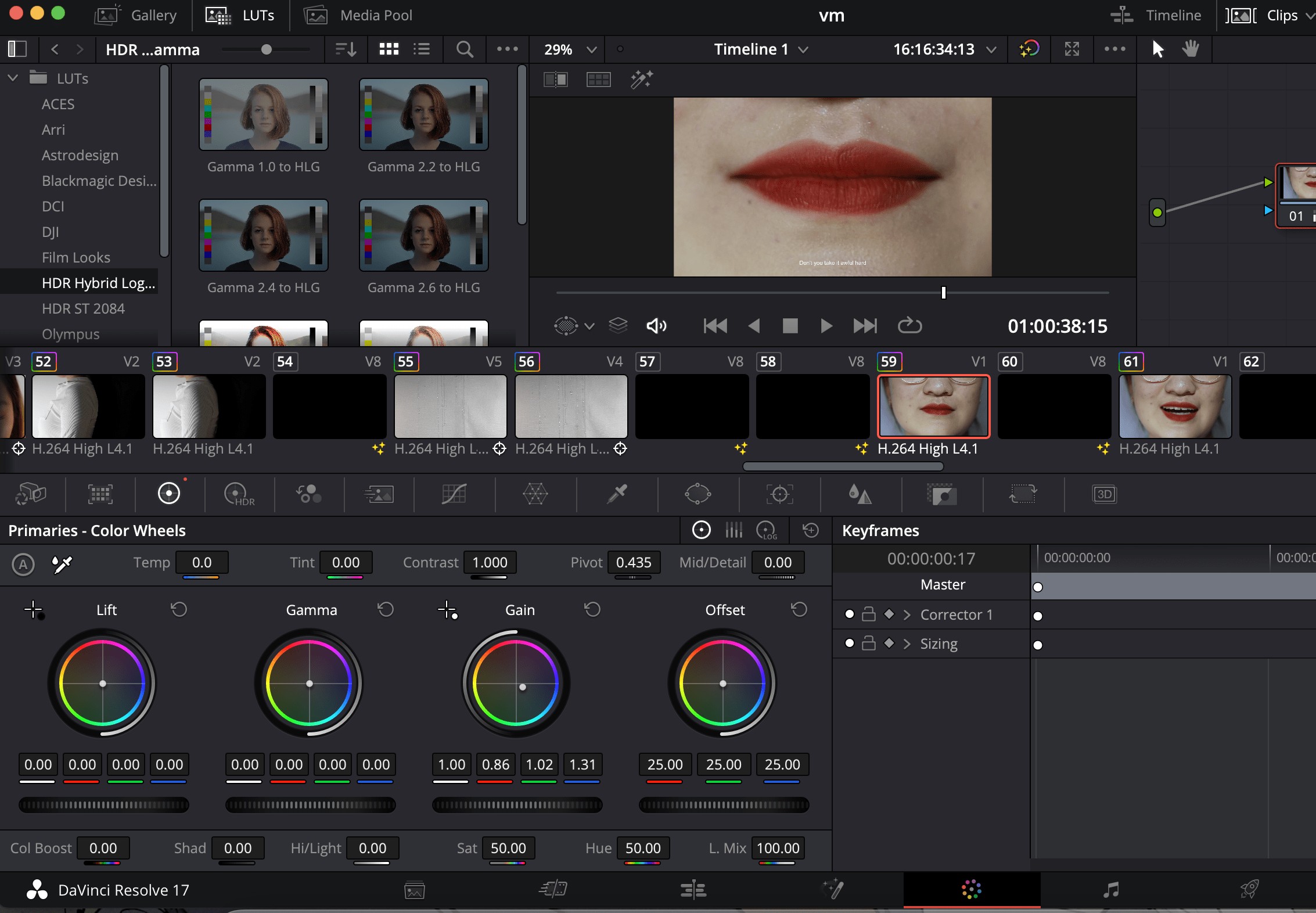
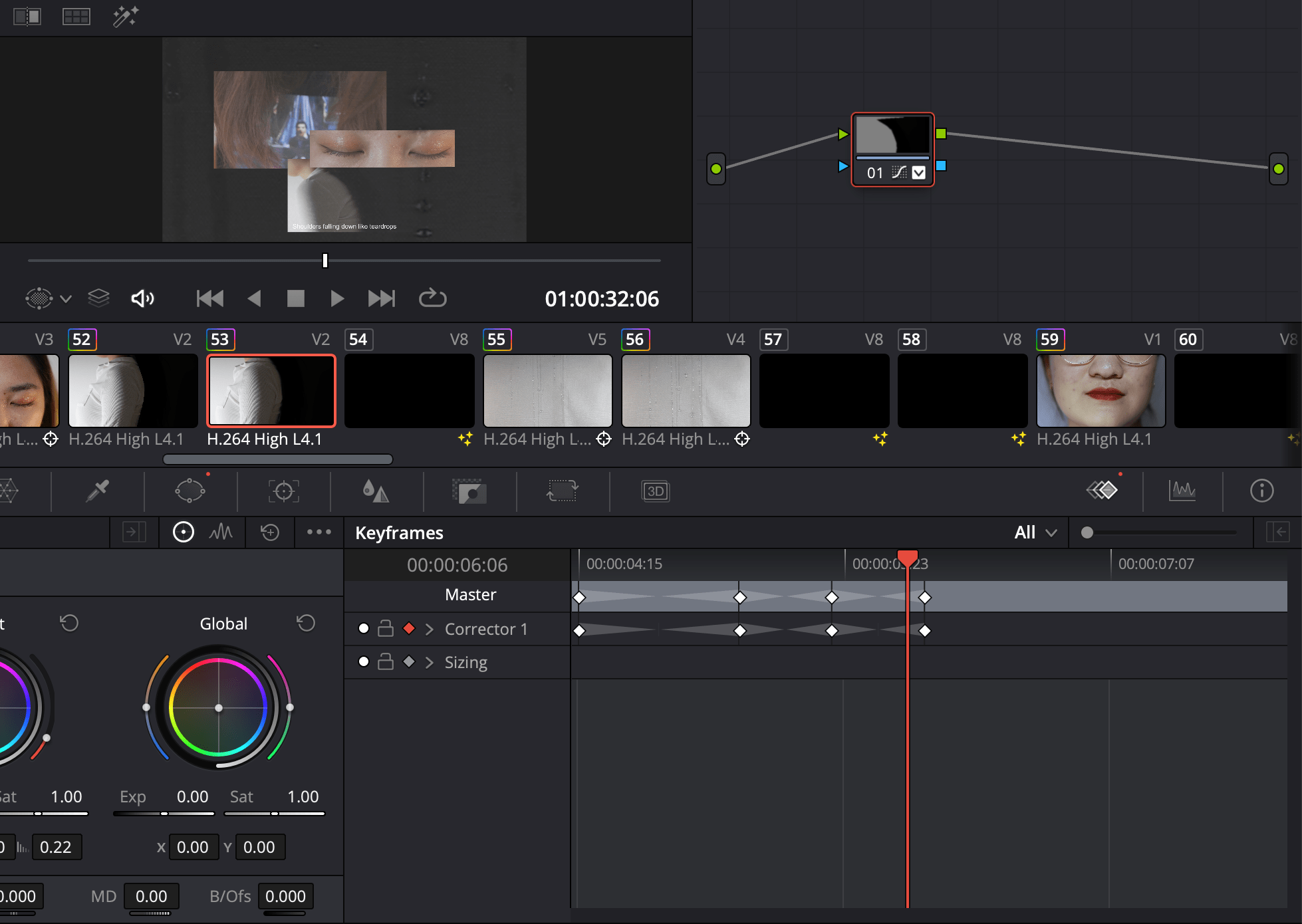
For the shoulder scene, in order to make the part behind the shoulder full black, we used the brush mode mask to draw the mask along the shoulder, and use keyframes to make the position of the mask change with the movement of the shoulder. We also used keyframes to adjust the opacity in order to switch the scene more naturally.
Collaboration
My partner and I worked together almost the entire time. We chose the voiceover script, finalized the theme, discussed the tone of the voiceover, set up the scene, and shot together. Most of the time, my partner and I are one person responsible for acting in front of the camera while one person is responsible for shooting behind the camera. The actor has to control the accuracy, emotion, and magnitude of the action, while the shooter has to control the stability, lighting, and some camera movements. So every scene is a joint effort of two people. For the editing part, I was responsible for the first half, and part of the second half of the material selection. My partner also lent her excellent acting and recitation skills to our project.
It is also because we were almost all involved in the whole process, so we all have a clear and accurate understanding of each scene element, which leads to more control over the elements of the scenes. It also makes the communication between the scenes more smooth.
Working with my partner, I felt like I was working more efficiently. We shot all the scenes in one day and reshoot the unsatisfactory scenes in another half day. My partner would draw the storyboard and then shoot the scenes from the storyboard one by one. I think it is because she has a clear goal and is not afraid of hardship that she can achieve such high efficiency. This is something I should learn from.
Aesthetics & Results
- Camera language
Most of our camera angles are close-ups from the front. Close-ups from the front present the effect of clean background and clear, recognizable changes in the scene, which better shows our calm and firm tone while the process of rising is also highly visualized.
We switched camera angles when shooting the parts where women were hurt. For instance, when shooting the lowered shoulder, we chose a side camera angle for the shoulder because we wanted to show the low slump of the shoulder more clearly. Not only that, inspired by professor Ian, we chose a camera movement that follows the girl with her head down when shooting the lowered head scene, which leads the audience to look down the picture, that is, the eyes and shoulders that will be lowered next. And the original scene of the camera moved down to the image of Tony Montana holding a gun on the clothes of the girl, that is, a typical American dream of the male image that takes women as their controlled property, to indicate the harm suffered by women.
Another scene with a huge camera angle change is the apple scene. It starts with a middle close up, that is, to show the process of the apple being pierced by a knife, symbolizing the heart of the woman being pierced. Afterward, the scene is brought closer to becoming an extreme close-up, allowing the audience to bring in more of the apple’s perspective, which is the wounded woman’s perspective. Later, through editing, it becomes a vertical angle, and the scene is pulled away to medium size, with the hand climbing up from the bottom and grabbing the knife on the apple, which draws the audience’s attention to the hand and the knife. By shifting the camera’s angle, we incorporate the narrative into it. In the beginning, the focus is on the apple and we emphasize the process of being hurt. Then, the focus shifts to the hand and we show the process of rising. It also highlights our main theme that even though women are hurt, they still have the ability to turn the knife that hurts them into help for them to climb up.
While we found that there are still possibilities to improve after our final presentation when Tiger and Professor Ian suggested that the turning angle of the apple may be too dramatic and inconsistent with the whole video. We can improve that through redo the change of angle during the shooting to match the scale of the frame, or we can think of other scenes that can also be rotated so that this scene may not be too standing out.
When shooting the scene the girl physically rises up. At the beginning is a high angle shot, with a top-down male perspective to show the girl’s weak, fragile, decrepit female image. The camera moves with the girl, and finally, the girl and the camera reach the same height, symbolizing that through the rise, women reach equal status with men.
At the end when the girl looks up, we chose a slightly overhead camera angle, wishing to show that even nowadays, there are still some gender inequalities in society. But even so, we used medium close up, so that the audience can clearly observe the girl’s firm, calm and generous expression, to reflect the confidence of rising within women.
- color
First, we specially designed the transition from black to white. The very first introduction is in black, and the ending reference is in white, while the transitions of the two parts are also black at the beginning and white at the end. That is, we let the whole film shift from black to white, symbolizing the rise of women.
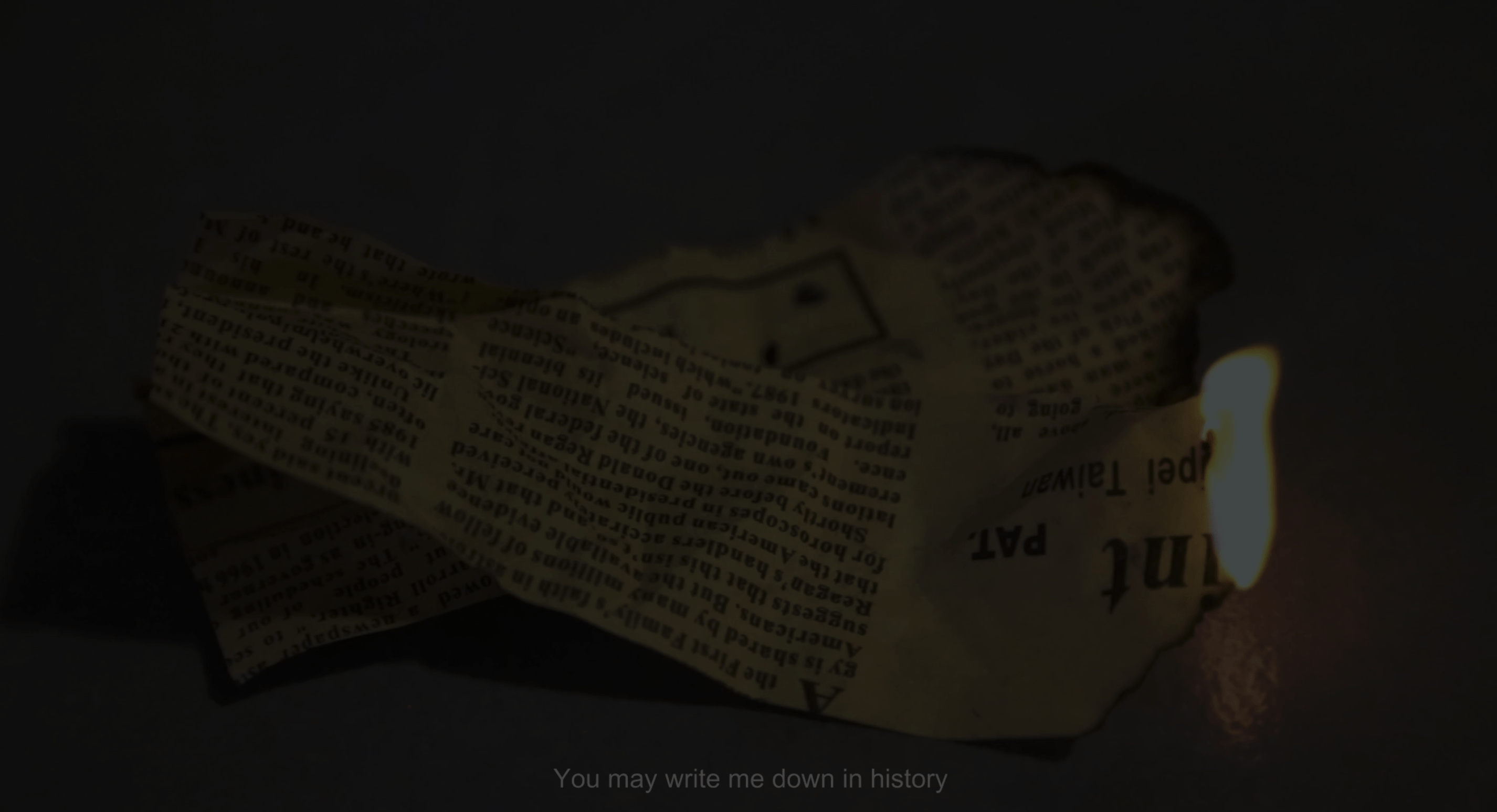
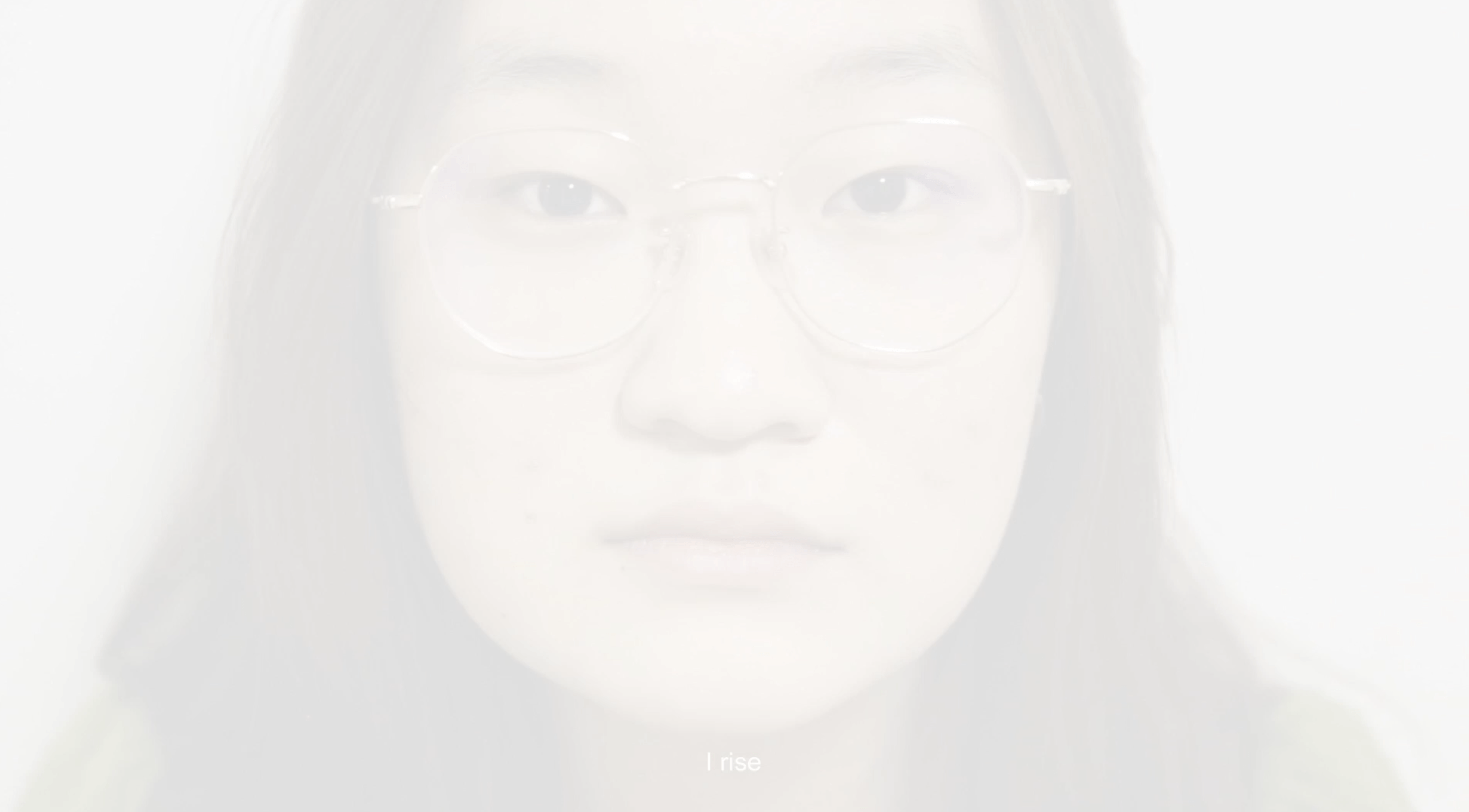
While editing the scene of the lowed shoulder, we made the part behind the shoulder to be purely black. When the shoulder is lowered, the black part increase while the white part decrease, showing the oppression.
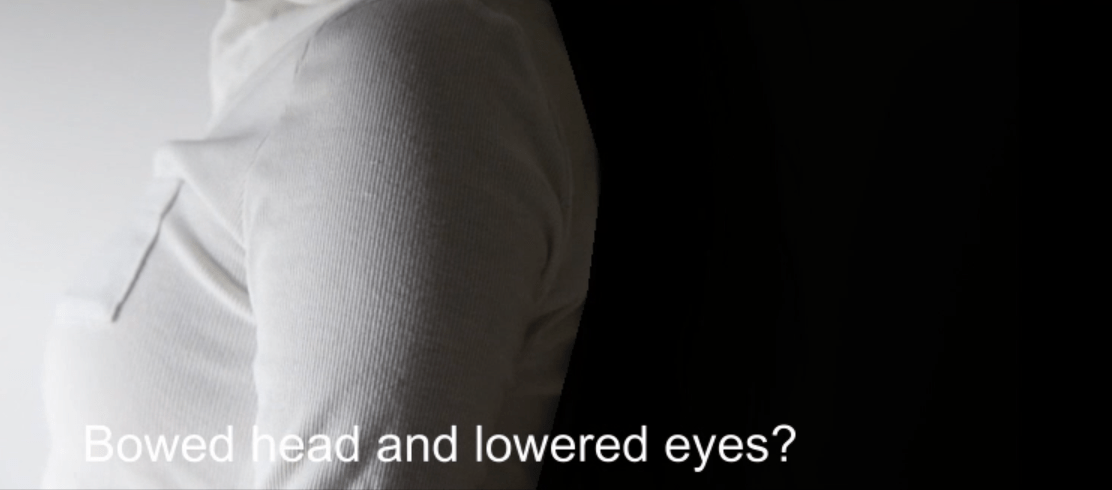
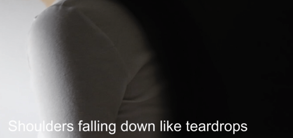
Our color design mainly focuses on the comparison between the repressions and the rises. The repressing part about “Bowed head, lowered eyes, shoulders falling down like teardrops” is the number of colors in this scene is few, cold, and of low saturation. A less colorful composition can bring the audiences a gloomy and blue feeling to empathize with the women on screen.
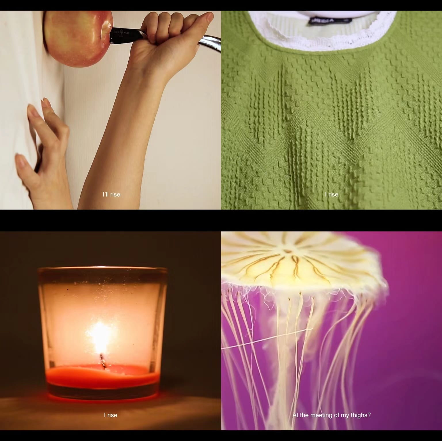
The second half of the video is quite different from the previous depressing part. The background of the jellyfish scene, the green dress, the light of the candle, and the sunlight are all brighter, warmer, and colorful so that the audiences’ feelings can also be motivated, moving along with the visual rises in the video.
- Tone
To be consistent with the pace of emotional changes in the video, the pace of the video also changes from a steady pace to a faster pace.
Since we want to show the calmness and confidence in female power, we use a determined and calm tone in the voiceover and a piano solo as our background music. It shows that she is a woman who already experienced a lot, including social disapproval, and others’ judgment about her success physically and mentally. However, she still manages to set aside unfair treatment and overcomes the obstacles along her path. Especially at the very end of the video, the last scene is slow-paced, contrary to the fast rewinding of the rising scenes before, and the music also fades out at the end. It is as if a rising woman is able to realize herself no matter what how others’ judgment.
