Aislynn Li
The plastic tragedy plus stick to the duck
Concept
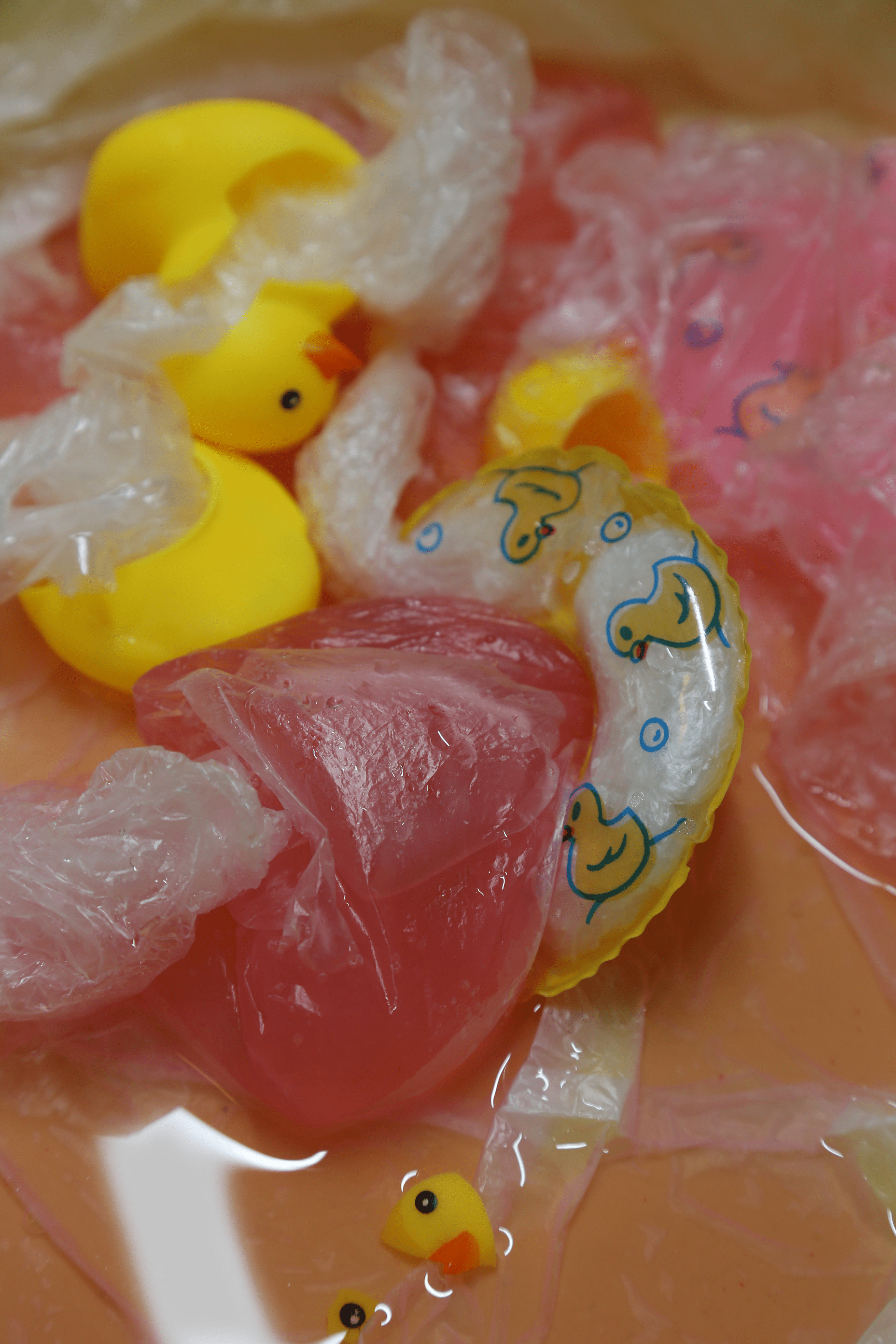
For my first image, it mainly pursues to express the feeling of a duck’s lost paradise. The duck’s body are torn apart and plastic emerge from it, and heart-like plastic is drill out of the swim ring painted with ducks. While the second image being the interpretation of the first.
The first expression is that the world is full of plastic. Plastic is full of the first image, even including the background. I want to emphasize it more in the second picture. Therefore, I let the duck swim in a sea of plastic under the plastic sky.
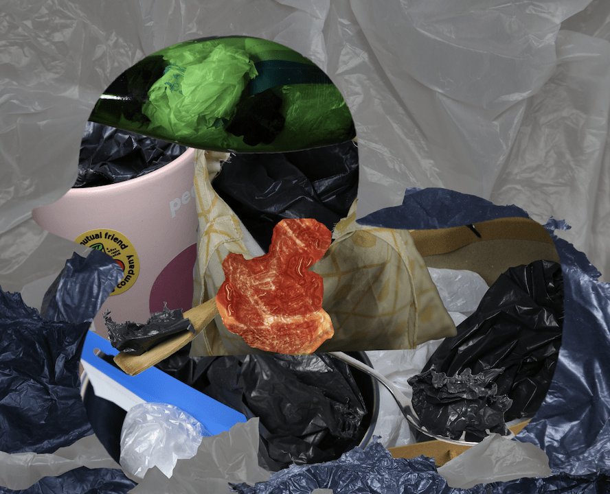
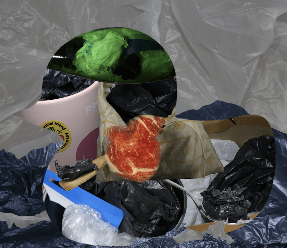
The second thing I want to express is the paradoxical nature of ducks. The duck in the second picture is made up of many substitutes of plastic, such as cloth bags, ceramic cups, glass bottles, and stainless steel spoons. It shows the duck’s initial purpose of completely eliminating plastic and replacing it. But the things these substitutes carry are all plastic, showing the failure of the goal which results in a broken scene in image 1.
And then I try to explain the reason of the failure, also the nature of the plastic heart in the first image, by showing the heart of the duck in the second image. The heart of the duck appears to be red and flesh, but it has actually been wrapped in plastic. Therefore, it shows that the duck has been trapped by the plastic, and the pink plastic bag in image 1 is the plastic heart that was drilled from the duck’s body. The duck and plastic is one and the same.
It also symbolizes that there are some seemingly environmentally friendly behavior, or ideas for the sake of environmental protection, which may not be environmentally friendly in practice. There are things where our ideals and our actions may run counter to each other.
I also tried to bring out more of this sense of irony. For example, the duck in image 1 is broken and the composition is messy, while the duck in image 2 is complete and the composition is clear. In the broken figure, the color used is a warm color like pink and yellow. While in the complete figure is instead more black, white and red which are such depressing colors. Even the lovely image of the duck itself and the actual tragedy presented produced an exciting contrast.
Process
(1) part I
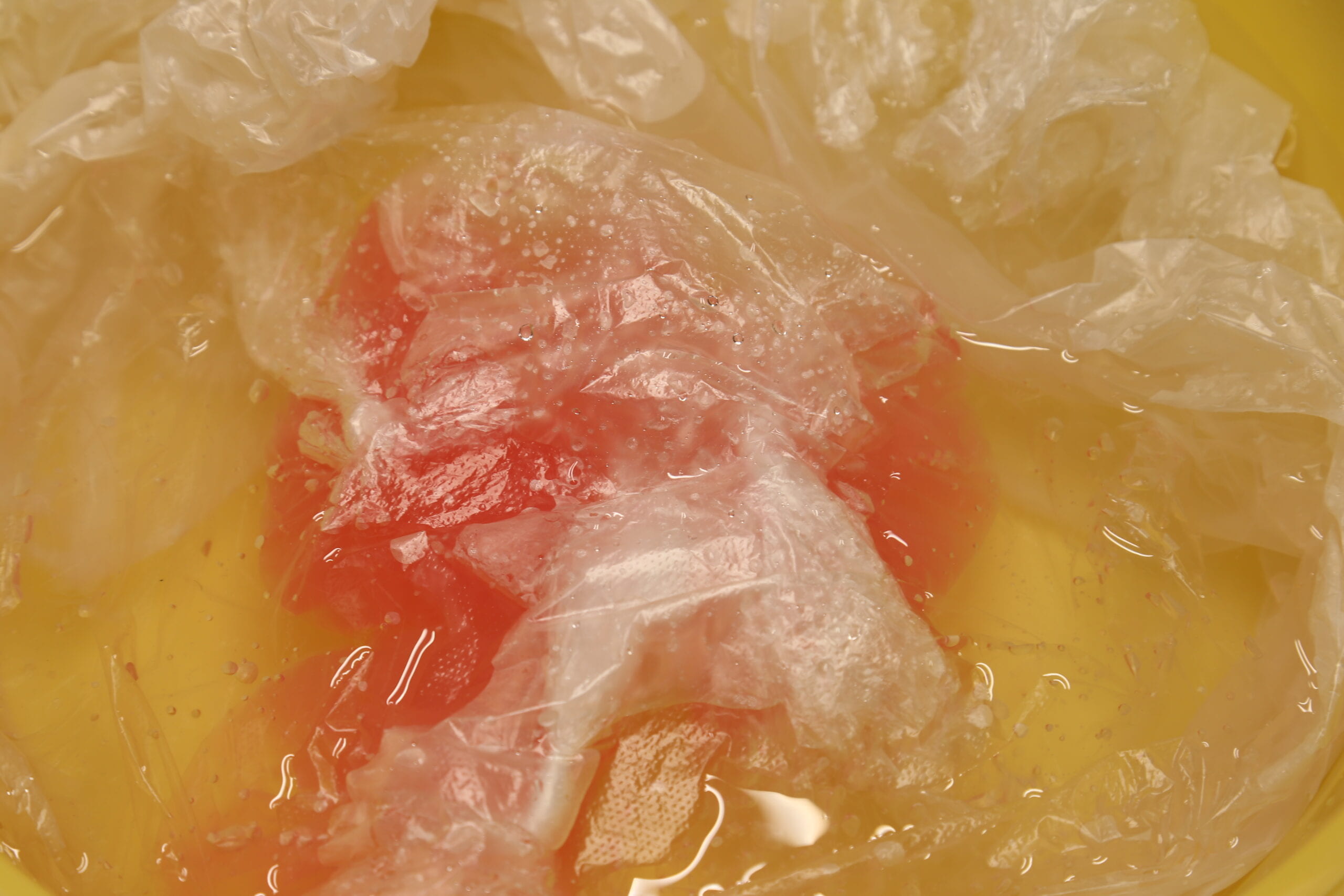
At the very beginning, I wanted to reflect the feeling of plastic bags being put into coffins alive, that is, to reflect the non-degradability of plastic. But the photo was too abstract because there was only plastic bags. In the process, I took a picture like this that looks like a plastic heart:
Coupled with professor Ian’s suggestion, I decided to add some live animals to the mix, and toy ducks were the first thing that came to mind.
In order to still reflect the depressing feeling of plastic, I cut open the duck and inserted the plastic into the duck’s body, creating a feeling that the plastic had torn the duck’s body apart and struggling out of it.
To enrich the layers, I stuffed a duck’s head and swimming ring into a plastic bag, so that the audience can only faintly see the duck. It also reflects a feeling of the duck being suffocated by the plastic.
I also wrapped the “plastic heart” in the swim ring, representing both a plastic heart bound by the swim ring, also the plastic heart coming out of the swim ring. And I filled the swim ring with plastic, showing that the plastic has taken over the ring.
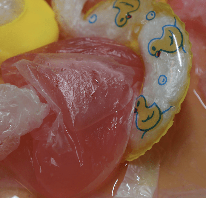
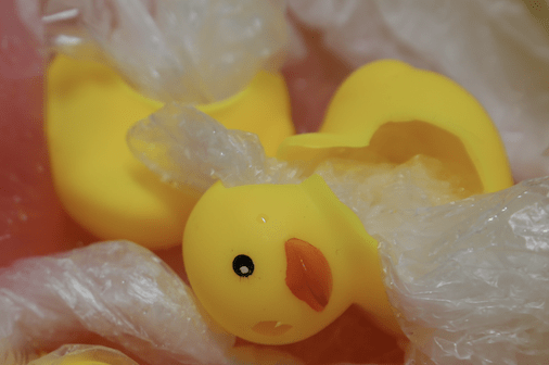
Finally, for a sense of harmony in the picture and to have a point of attraction, I placed a small broken duck’s face and eye at the bottom.
Here’s the final picture:
(2) part II
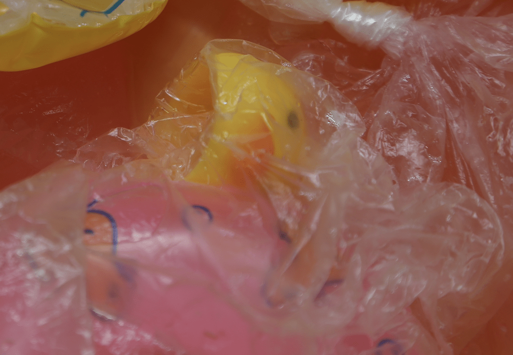
I started with the conceptual diagram of using plastic substitutes to exactly replicate the composition of the first picture, such as a bowl instead of a swimming ring position.
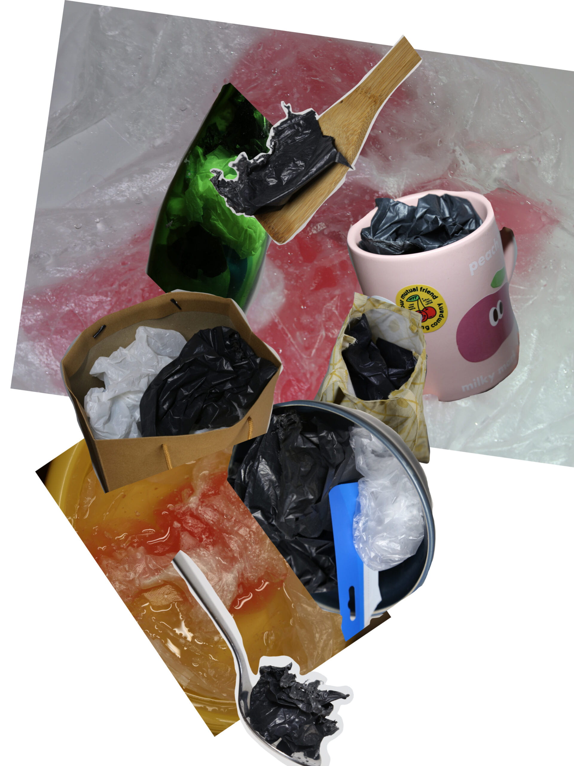
But because the composition of the first picture is not simple and clear, it is difficult to see the correspondence between the two. So I decided to use plastic substitutes to make a big duck and let it swim in a sea of plastic.
I first laid out the alternatives, trying to make each part visible as to the type of alternative and to see that it was loaded with plastic. Then I used the duck as a mask over the top.
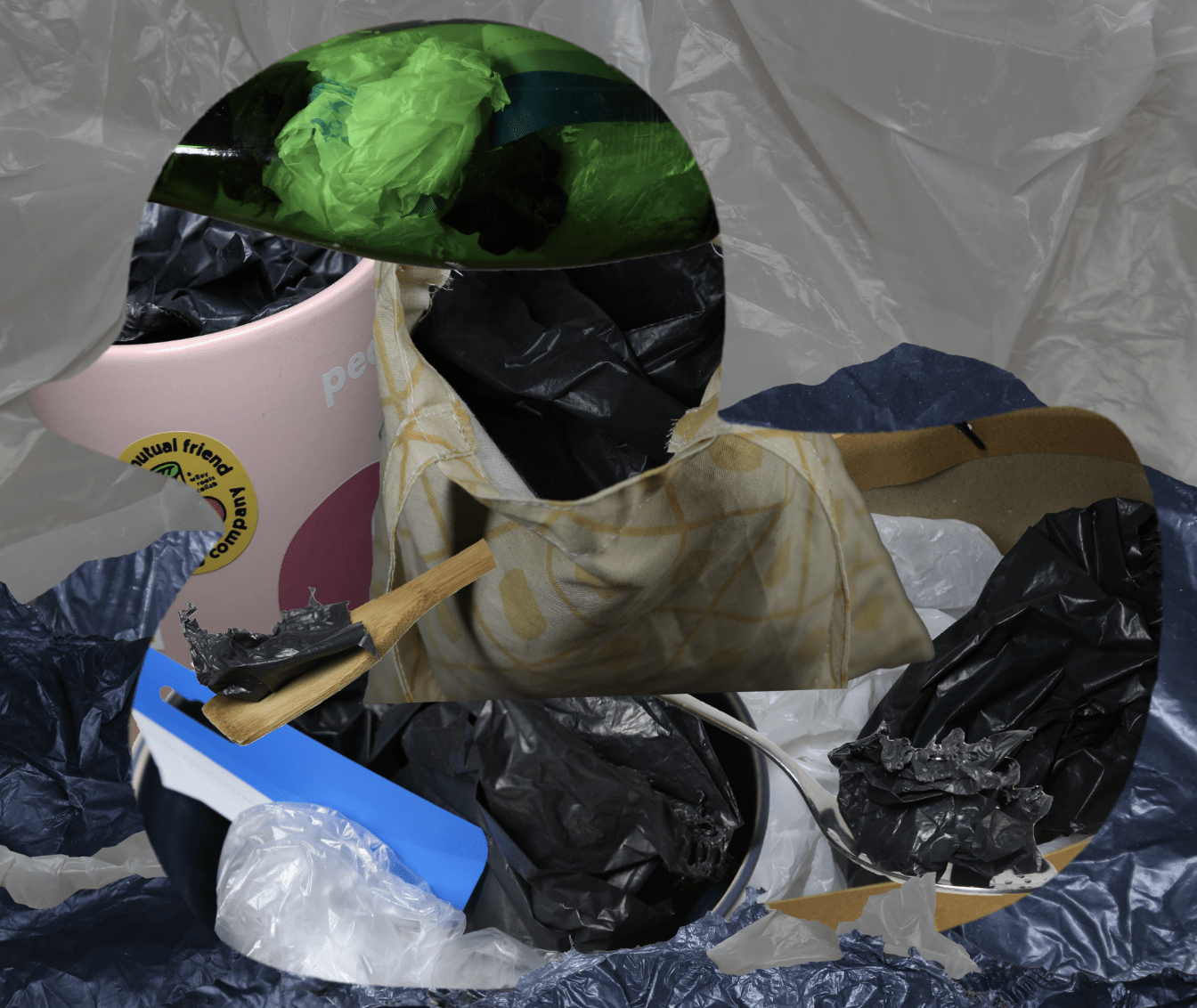
Next, I cut out the heart-shaped plastic and used it as a mask, filling it with flesh, in order to bring out the qualities of the heart more. But I still wanted to show that the heart was wrapped in a layer of plastic, so I used a plastic filter.
But the heart was too abrupt and didn’t blend well with the duck. So I increased the feather value of the pen when cropping the image and adjusted the color to highlight the red, which also corresponds to the other low-saturated part of the image.
Next, I spelled out the waves with black plastic and white plastic. But there was too much white plastic that draw too much attention. And if there is no white plastic at all, it is a bit monotonous. Therefore, I changed the white waves to smaller versions.
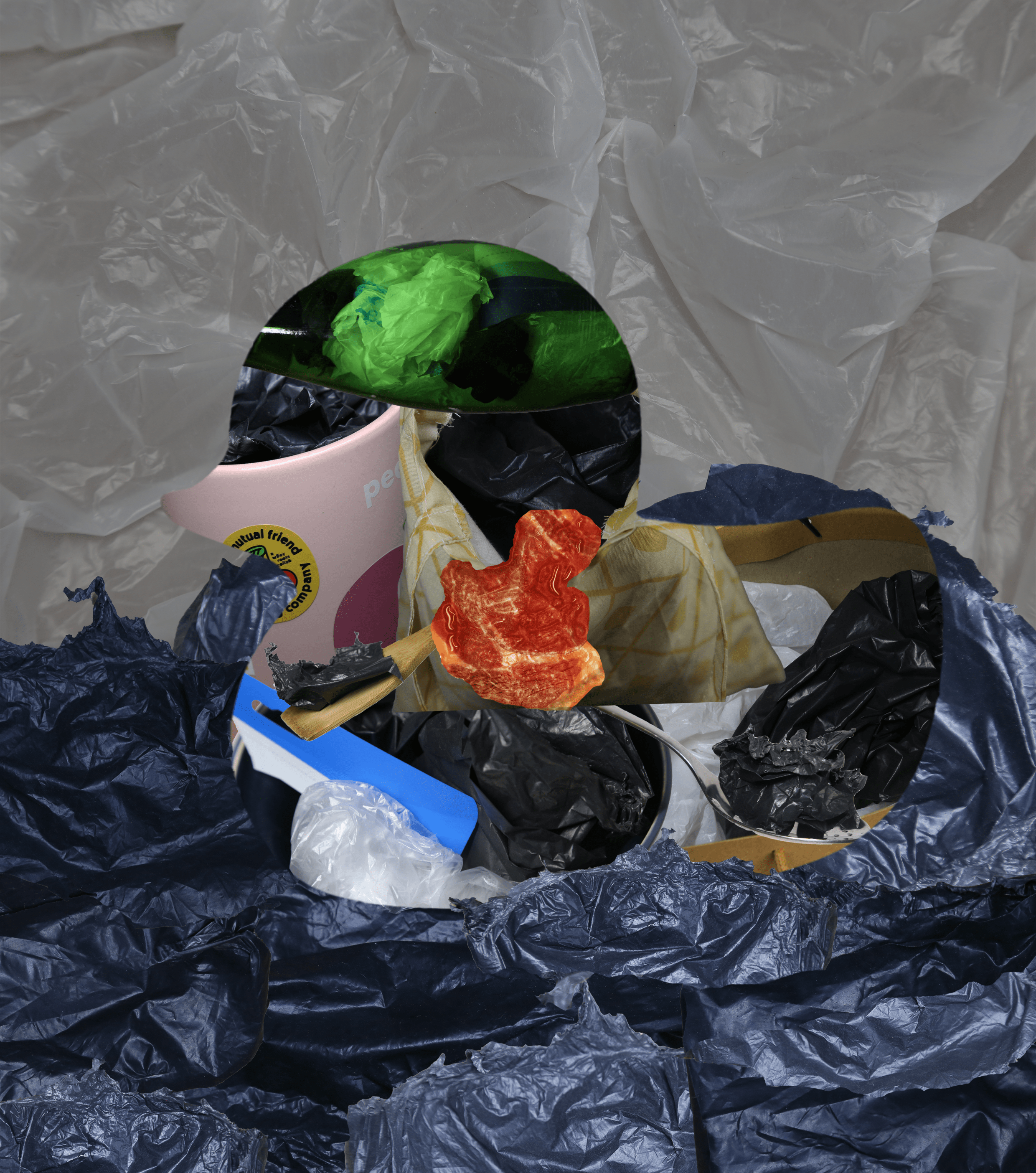
I also tried adding a layer of swim ring made entirely of plastic, but it would be too disorienting and not know what to focus on. And it would make it difficult for the viewer to see the heart and the body composition of the duck. So I removed this part.
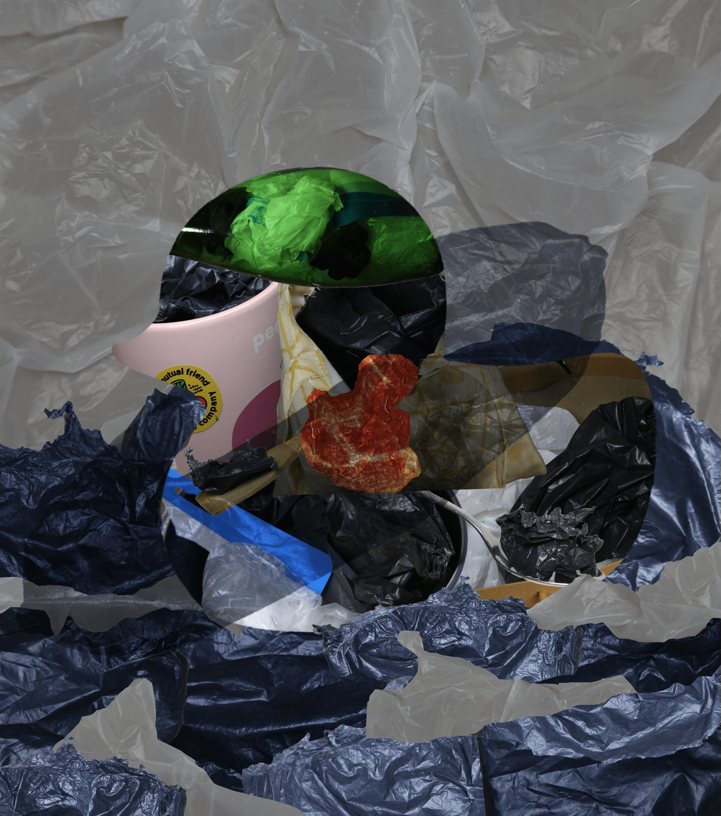
For the first image, I also modified the intensity of the vertical highlight so that it doesn’t draw too much attention to itself.
Conclusion
If I had more time, I might have tried harder to bring out the plasticity of the duck’s heart, and its association with the pink plastic bag in the first picture.
I would also adjust the colors of the two images to make the first image brighter and the second less saturated, reflecting a greater sense of contrast. And I will adjust the colors of the parts of the second picture to make them more unified.
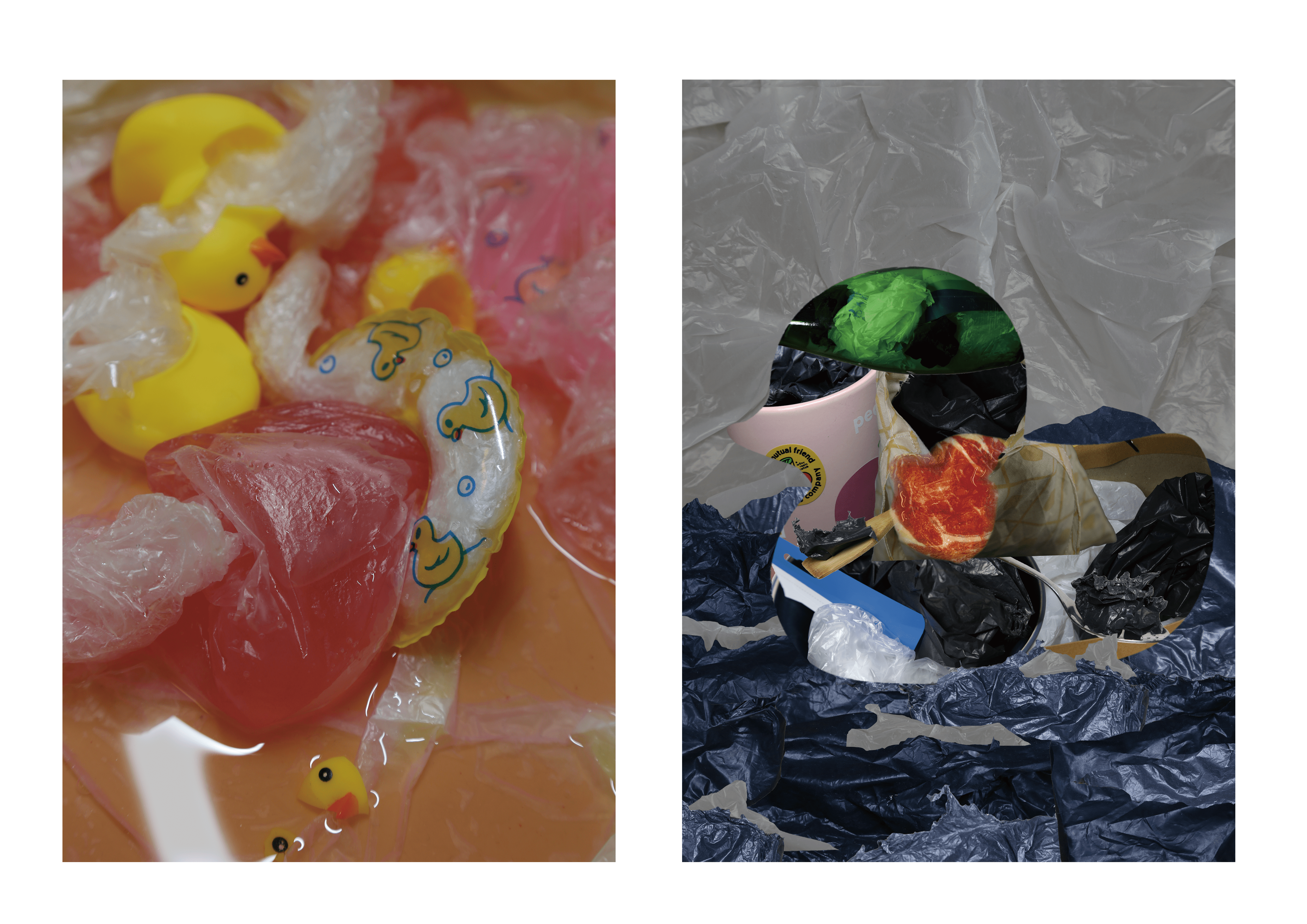
Image of Diptych
Diptych:
contact sheet: