Aislynn Li
For Blue Skies by Strays Don’t Sleep(Matthew Ryan)
Concept
This song gives me a mixed feeling. On one hand, because it is slowly stirring up emotions by repeating the cycle over and over again, it has a sense of drowning, sinking, or diving into the ocean. But meanwhile, as it keeps repeating “I’ll forgive you”, there is a slowly rising, relieved feeling.
Therefore, I tried to build a scene of the ocean, or a feeling of an ocean, which had both the diving part and upward part. And I wanted to constitute an interwoven sense of complex dynamics and communications.
Design
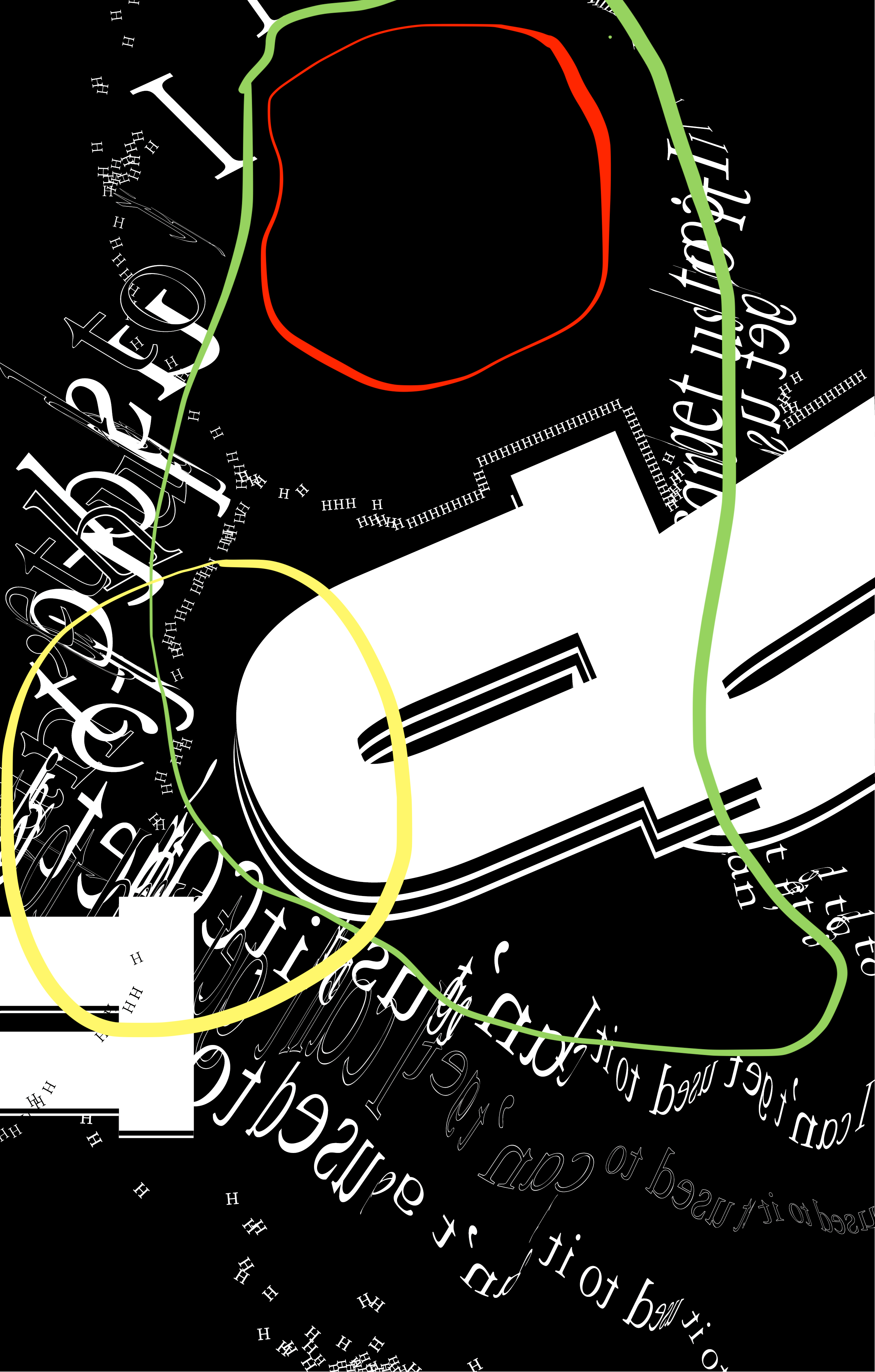
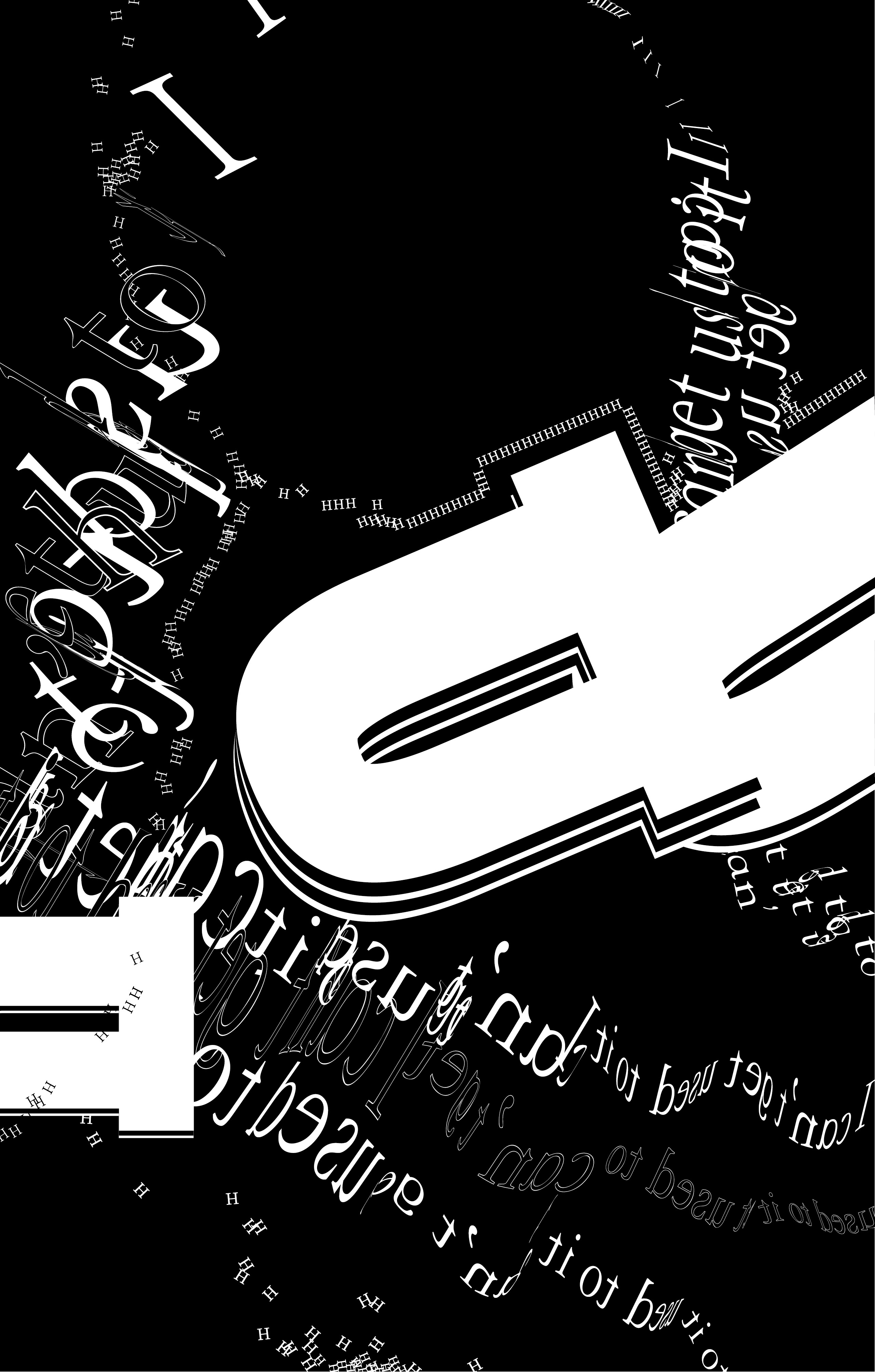
My work consists of three elements: small H, large U, and twisted characters which are “I can’t get used to it”. The large U mainly represented the diving part, while the twisted characters show the feeling of relief and rising. But it is not that obvious since the rising feeling is also not that obvious in the song. Finally, the small H part symbolizes the bubbles at the bottom of the sea, which also shows the idea of following both, while oscillating between them.
I tried to use more Gestalt theory in this piece. The small Hs and the twisted characters can be clearly seen as lines. And they are recognized as lines precisely by using similarity and proximity principles.Since I wanted to create the interactions of the lines, I also used continuation on the right side of the work for the twisted characters and the small Hs. The use of black letters and white edges is also an application of closure, in order to balance with the white parts and to create a more intertwined feeling.
Overall, the difference between figure and ground is also clear. I try to use different figure types so that the points, lines, and faces are occupied. This way when different elements are close together, for example when lines and faces (twisted lines and big U’s) are together, the faces look more like ground to the lines, which adds to the richness of the work.
One black square made me realize that when an element, or principal, is used only once, it may be more abrupt in the picture, like an accident. For instance, the white line on the right side of the following picture is like an accident but not an intentional event.
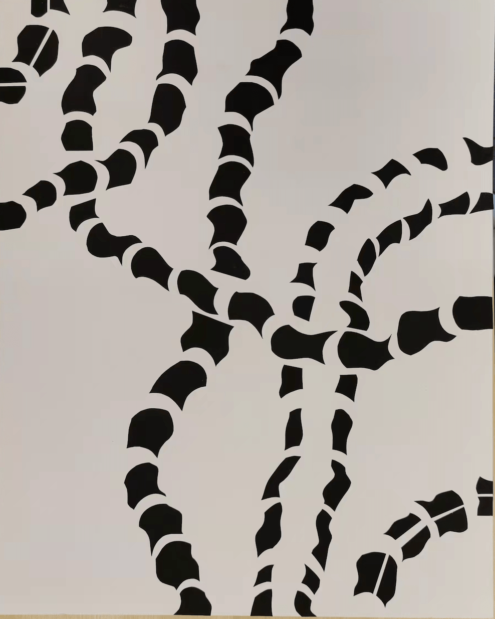
But when an element or principle is used multiple times in different parts of the picture, it brings balance to the picture. In this case, I tried to make each element and principle appear repeatedly, echoing each other in different parts of the picture.
Not only that, but the following piece also made me realize that there should not be too many different elements and different movements in one picture. There should be more interactions within each of them, otherwise, the picture will lose its focus.
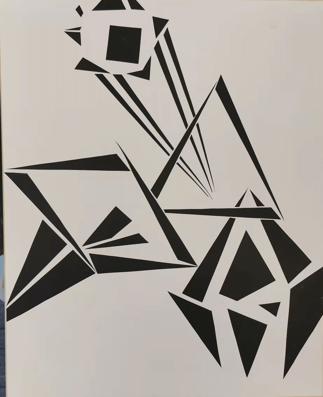
Therefore, I limited my work to three elements and let the different elements all communicate. In the picture below, the different elements form a red circle, which also symbolizes the interaction of different ideas or notes. The twisted words themselves form a green circle, which interacts and flows with the space outside the picture. Finally, in the yellow area on the left, the dense distribution of the three elements creates a sense of conflict and becomes a focus of attention.
Process
Before the mid-critique, my project is shown in the following picture:
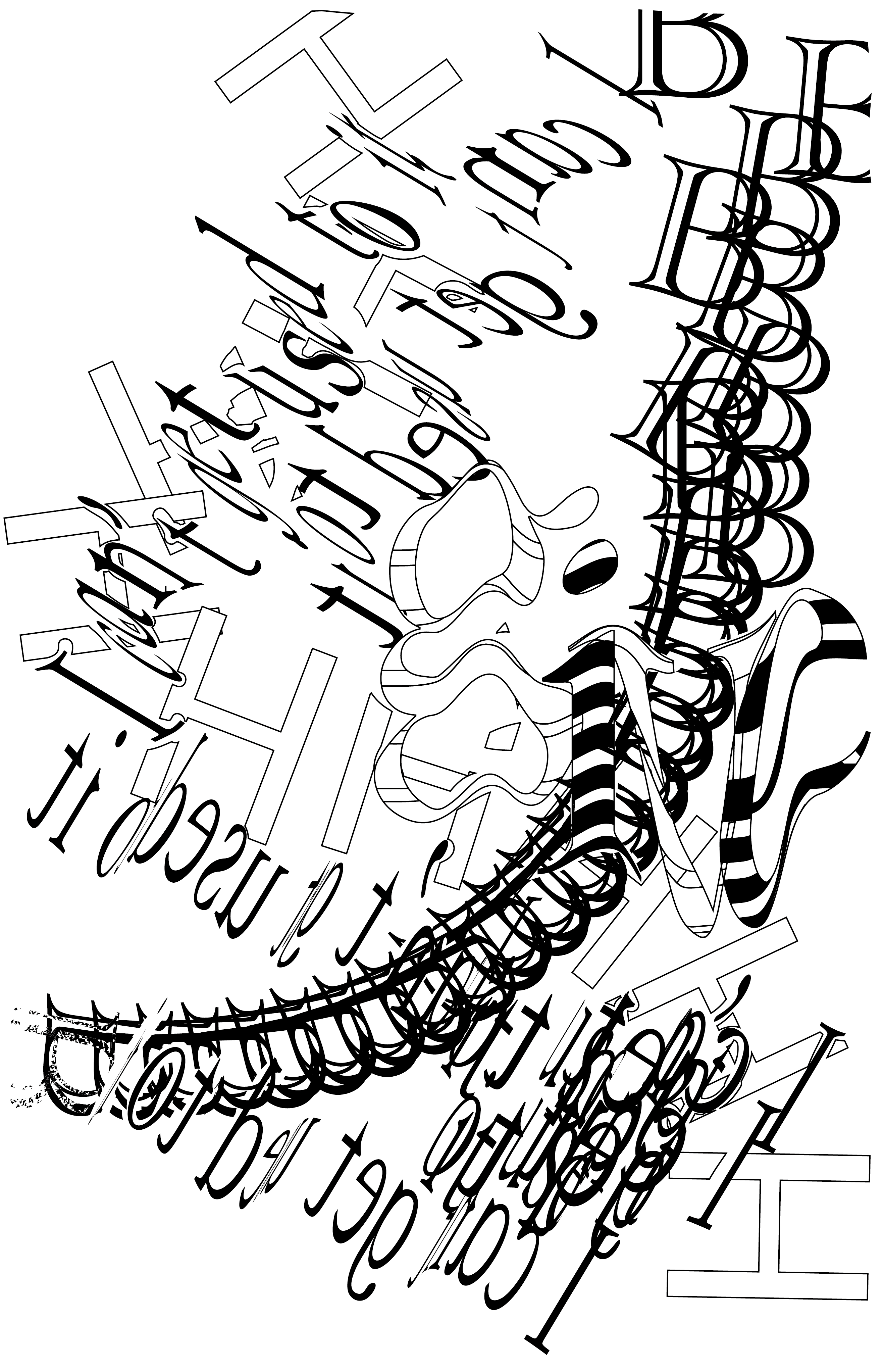
At that stage my thoughts were quite confused, still trying out different word patterns, and the whole picture was more like a “practice field”. After critique, I realized that I was using too many different types of elements, which made it difficult to distinguish the figure and ground. So I decided to keep only my favorite distorted typeface and continue to work on it. Professor Ian also suggested that I could try a black background for a different visual effect, which I also found to be very helpful.
I really liked the feeling of the interweaving of the broken H and the twisted characters, but this would make the picture too messy and the two lines would not be easy to distinguish. Then I realized that maybe by making the H smaller, the difference between the two would be more obvious and easier to distinguish, so I shrunk the H.
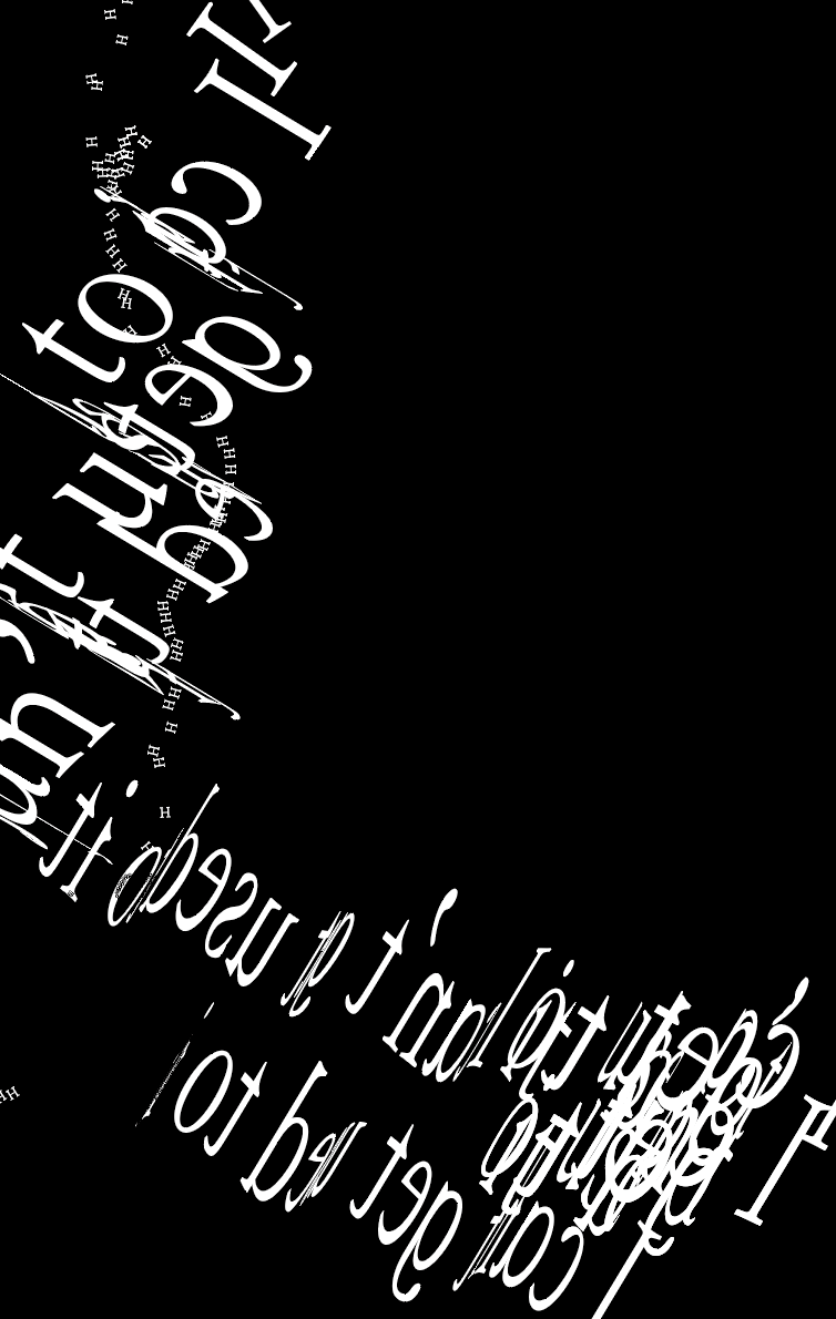
Immediately afterward it occurred to me that if there would be more contrast when the H was shrunk, perhaps zooming in on another character would have another effect. It could also shape the difference between points, lines, and faces. To have some directionality, I chose the character U.
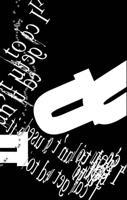
On the one hand, the picture is too empty, on the other hand, I wanted to use the contrast of black and white to enrich the picture. What’s more, I also wanted to add some three-dimensional feeling. So I made the following attempt.
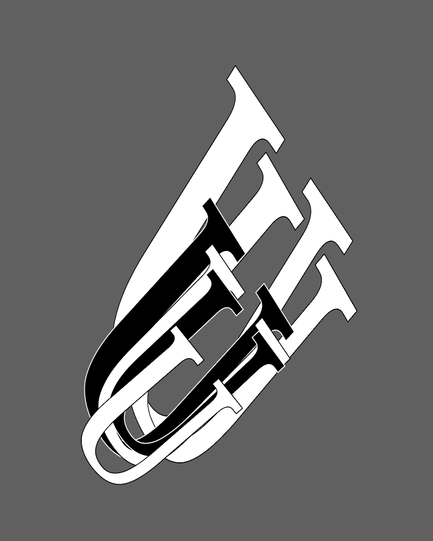
The picture was indeed richer, but it was messed up, losing the focus point and the originally formed face. So I made the following improvements.
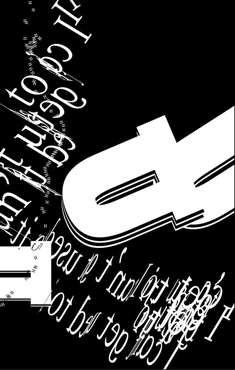
However, the picture was still a bit empty, so I tried to add other elements and found that it would only get messier.
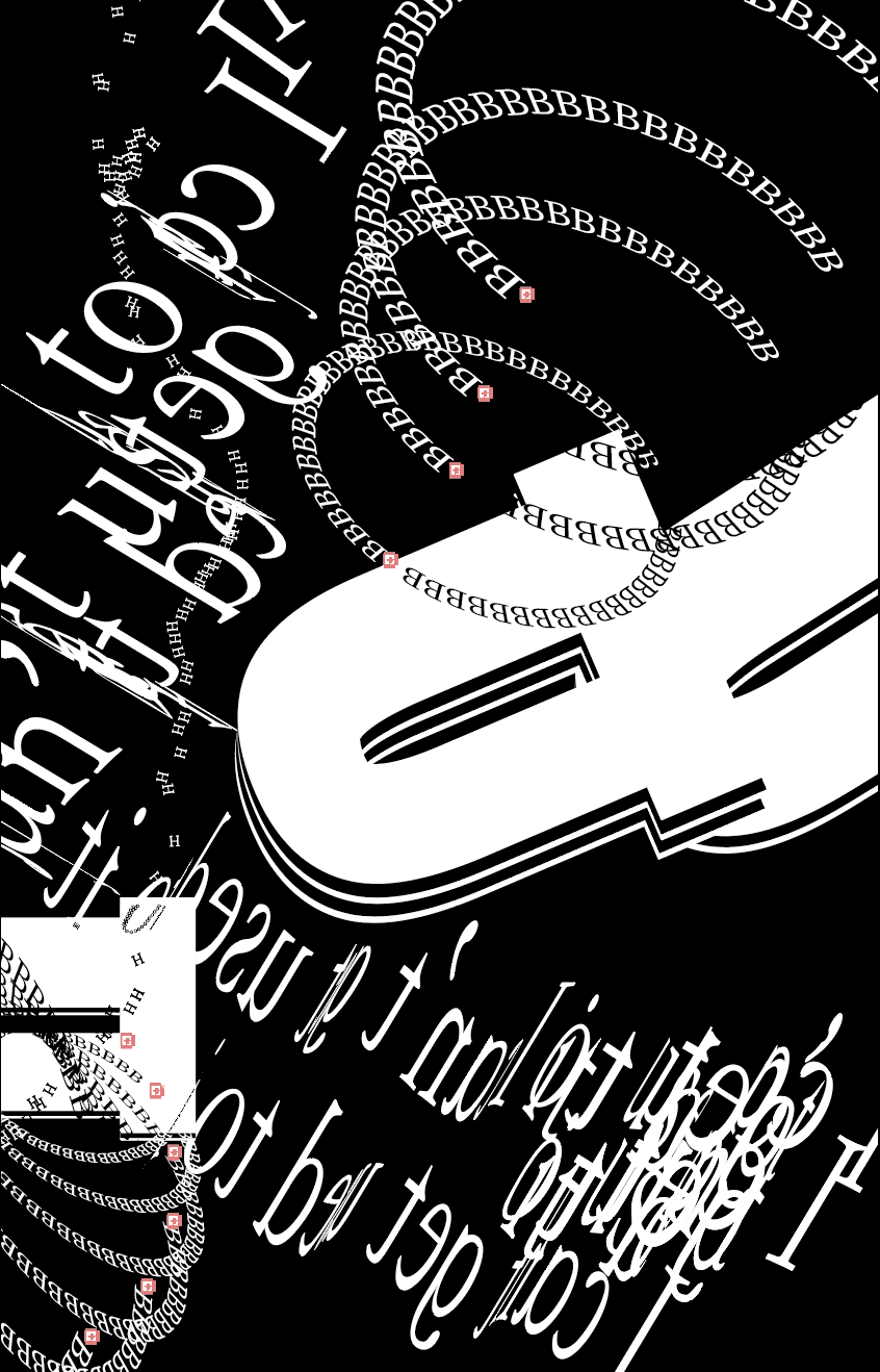
Therefore, I decided to stick to the three elements.
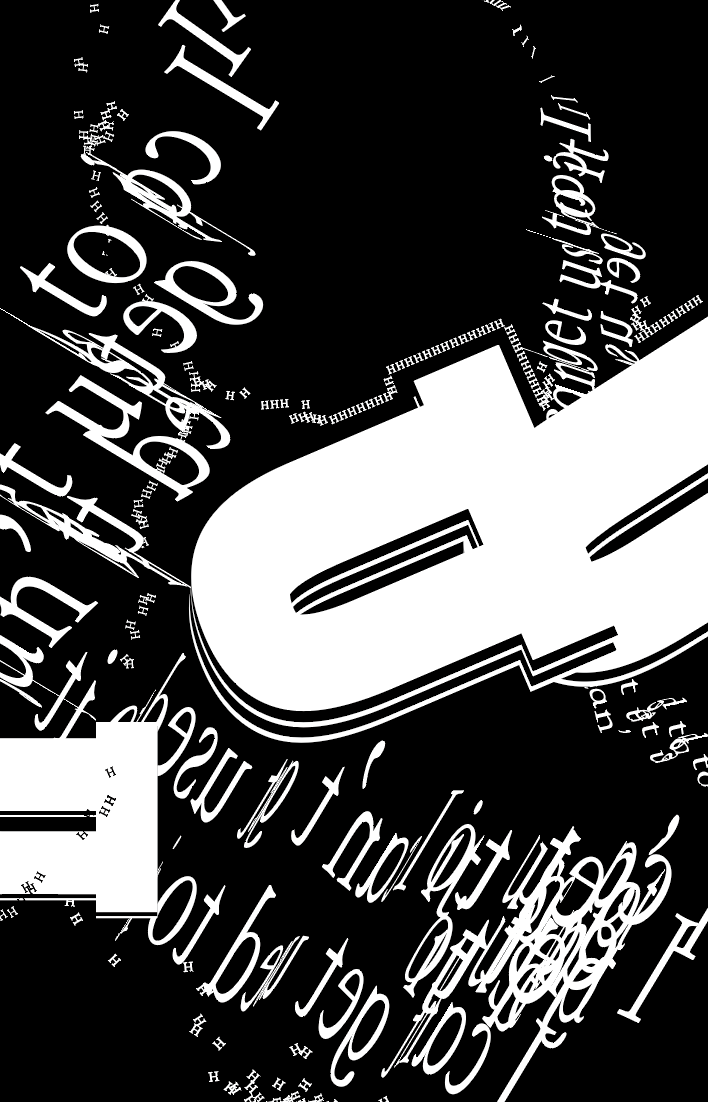
However, the distorted characters in the lower right corner remain messy and make the whole picture unclearly focused. So in the end, at the suggestion of Professor Ian, I changed the bottom right corner to three clearer lines and used the closure principle to differentiate and add a sense of contrast.
Conclusion
I am very pleased with the dynamics and the relationship between the dots, lines, and faces throughout the picture. I especially like the circle made up of three elements at the top, which has a sense of communication.
If I had more time, I would adjust the bottom right corner more clearly and there would be a process of change from much more smaller to more larger. This would provide a stronger contrast with the other parts.
Image
PDF:https://drive.google.com/drive/folders/1lvQbxl7oRG_CwK8jIiVwsgl7jWHEfkql