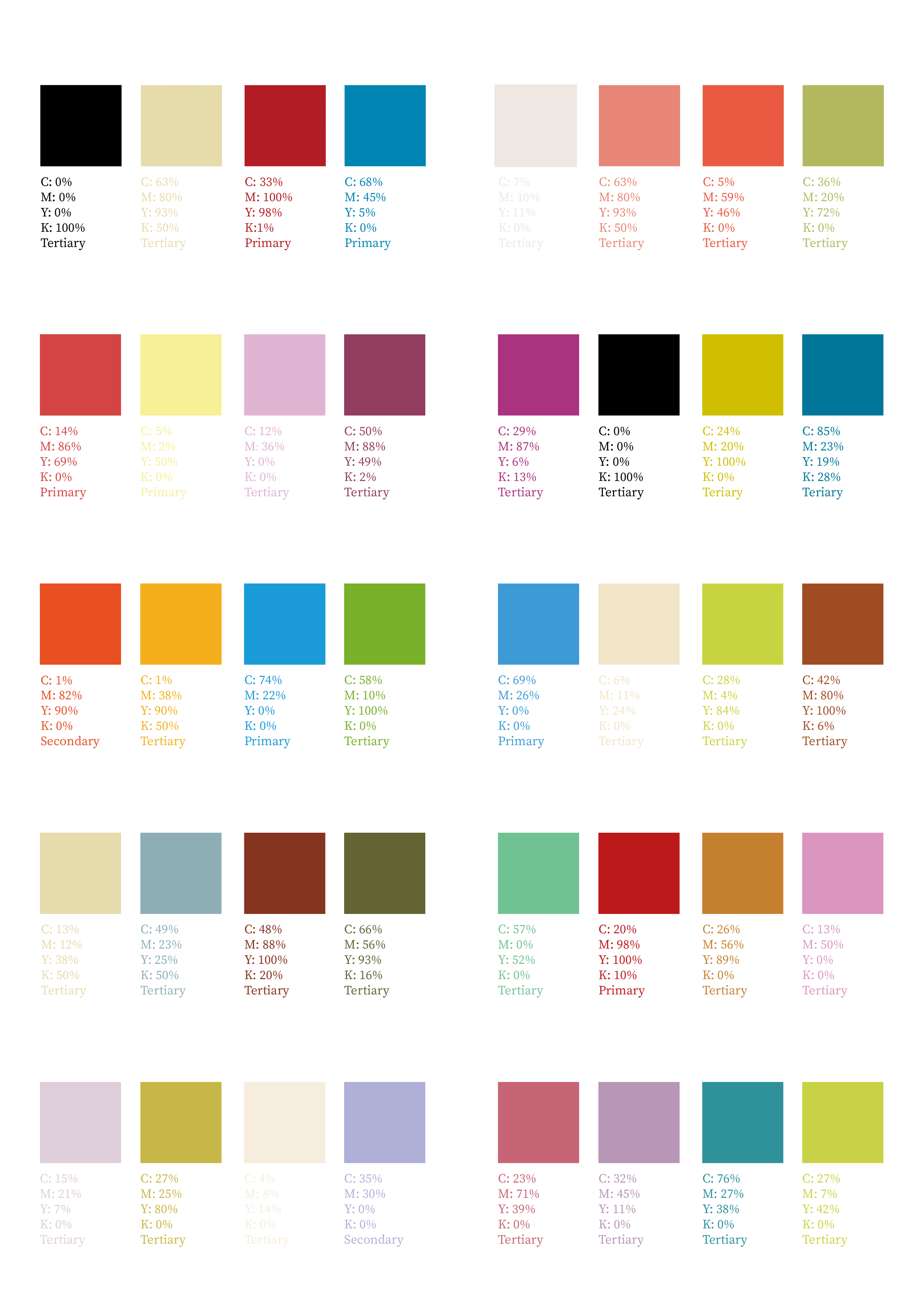
Here are my color schemes:

To shape the visual impact, most of them use the opposite color. There are two opposite colors, each in two shades(Right 5). There are some that use a transition color in between the opposite colors(Right 4).
To increase the contrast, I also use a gradient color plus an opposite color (Right 1). What’s more, I use multiple contrast colors like one primary and tertiary colors close to opposite primary(Right 2).
Next, I try to use two close colors, such as close primary or primary and secondary, and then an opposite primary to reach similarity and contrast(Left 1, Left 2). I also find that close tertiary may also show similarity(Right 3).
In addition, I try to use close secondary+tertiary and the opposite colors of primary and tertiary to create both contrast and harmony (Left 3).
There are others, inspired by movies, so the colors are more harmonious and unified(Left 4, Left 5).