Sudden: A Story About Facing Deadly Threat
by Aislynn Li
2021
Sudden is an interactive article. It is a four-page story about “you” who suddenly encounters a shooting during a trip and has an open-ended ending. Users can “hover” to read parts of the story and participate in the storyline by clicking, dragging the mouse, and answering questions. There are some sudden sound effects and images in the story, which are designed to give the user a sense of fright from the sudden threat. The story wants to express two ideas. The first point is that something horrible or significant may just come out of nowhere. It has no warning. Seconds before you may be doing a very small and normal thing, such as opening an umbrella. Seconds later it comes. The second point is to reveal the mental state of facing the sudden threat of death. This may answer people’s curiosity or relieve them of the psychological burden of the deceased. Humans are surprisingly adaptable, even to death.
Elevator Pitch
Sudden is an interactive story about facing sudden death. This story, through interaction, is designed to bring the immersive experience in the face of a suddenly approaching deadly threat.
Images
Chatting with friends
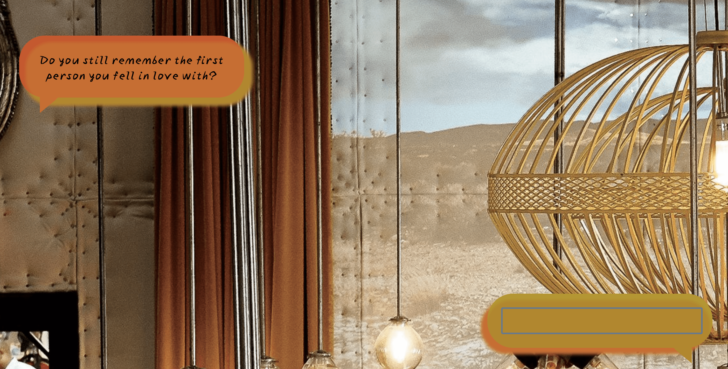
The memory
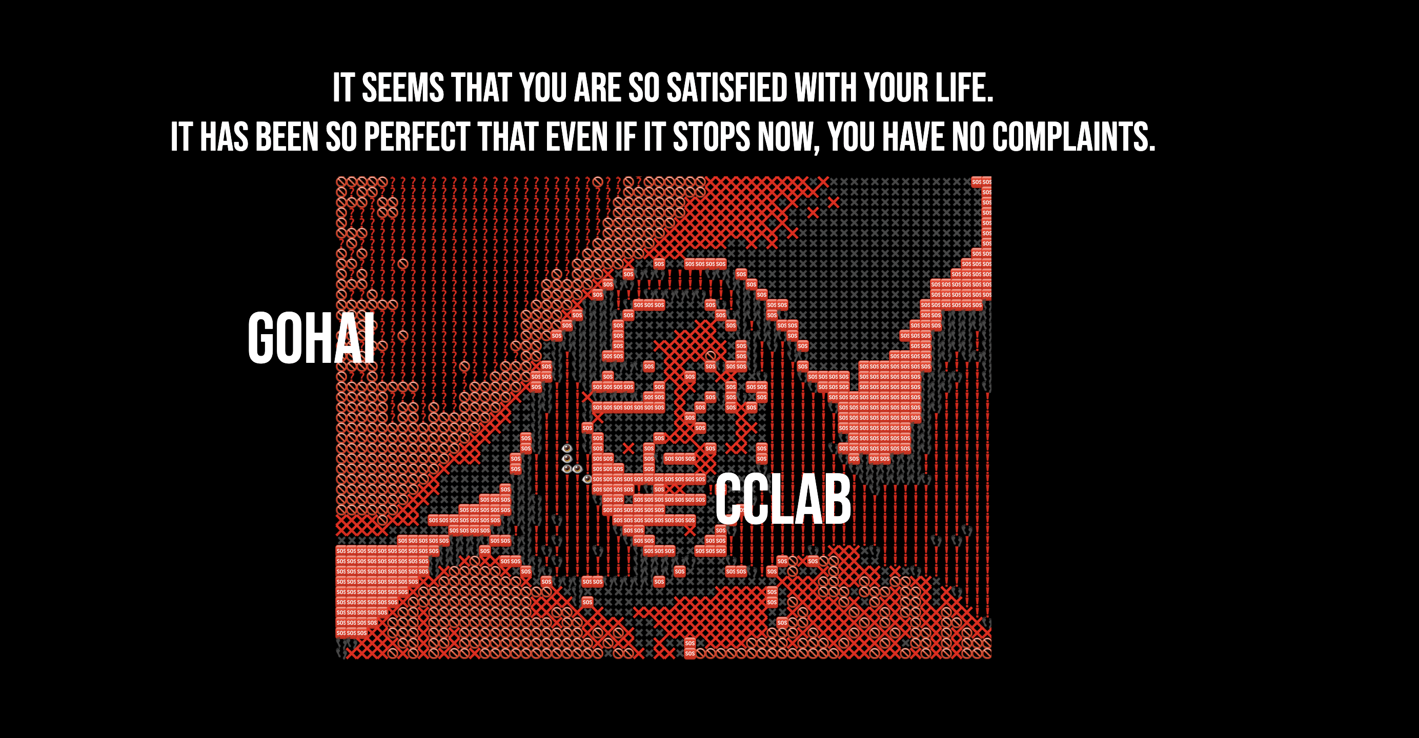
Reflection:
Design and Composition
The story is an adapted (simplified) version of my experience and feelings of the 2016 Munich shooting. In the storyline, I chose to stay in the “accepting death” part because of the limited time, which also gives the story an open ending. In order to get the maximum immersion, I try to let the user generate the necessary interaction in each part, that is, the only way to advance the plot is through interaction.
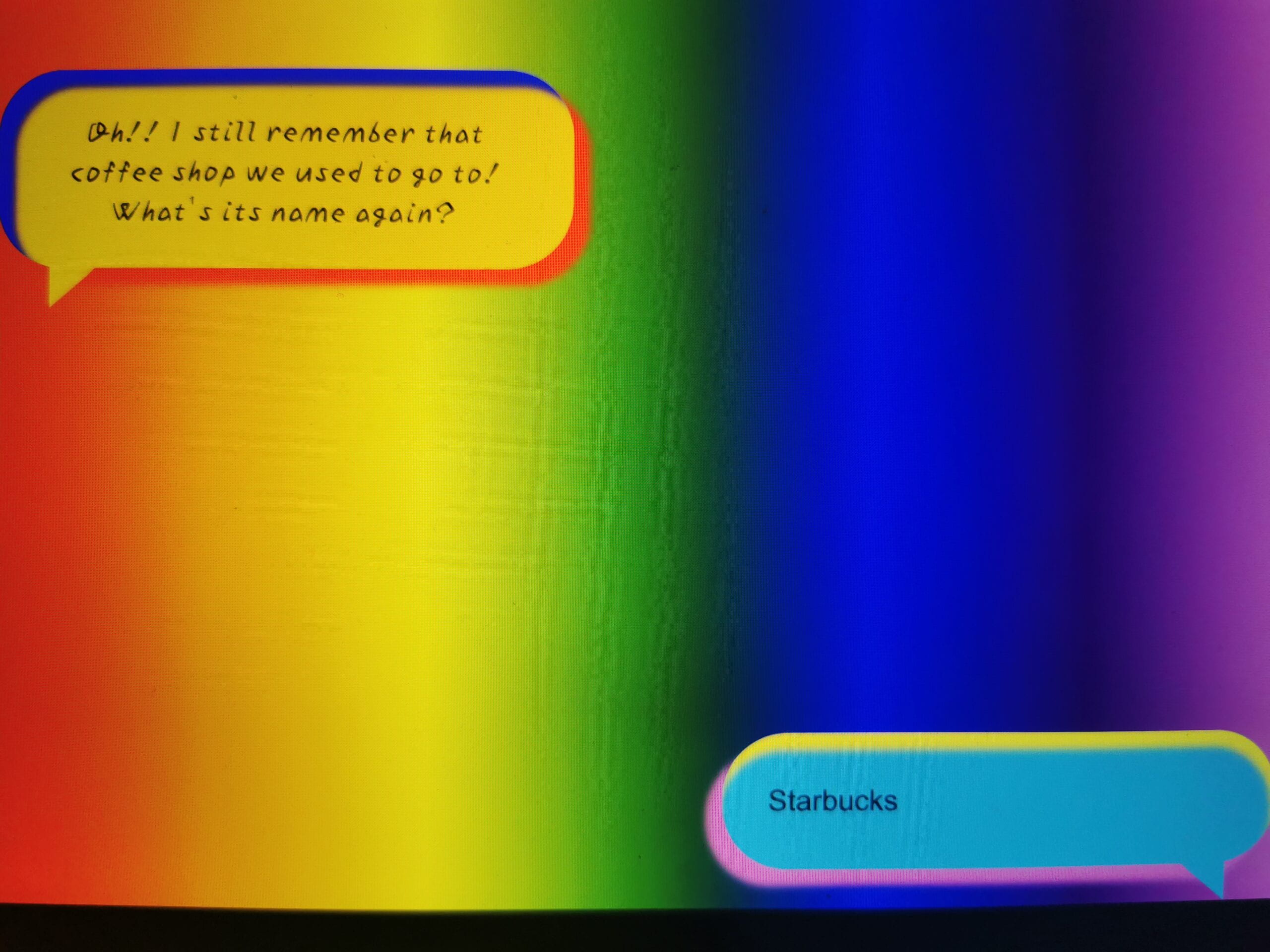
The first page started out in rainbow colors because I wanted to have a happy, dreamy feeling to contrast with the back. But people thought the immersion feeling was weak in this way, so I chose to change to a restaurant background picture. Here’s the former effect:
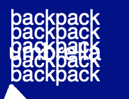
The second page started out with an all-text version, mainly because it was easy and I really had a bond with text. But this would make it more confusing cause and there was no uniformity with the rest of the section, so I ended up choosing to draw with p5js. And this way I can also draw the umbrella that can be opened. Here’s the former effect:
The part where the scary pictures appear was going to be made into pop-up windows, but technically I never got it to work. Then I thought making it a pop-up image would have the same effect. So they are pop-up images now.
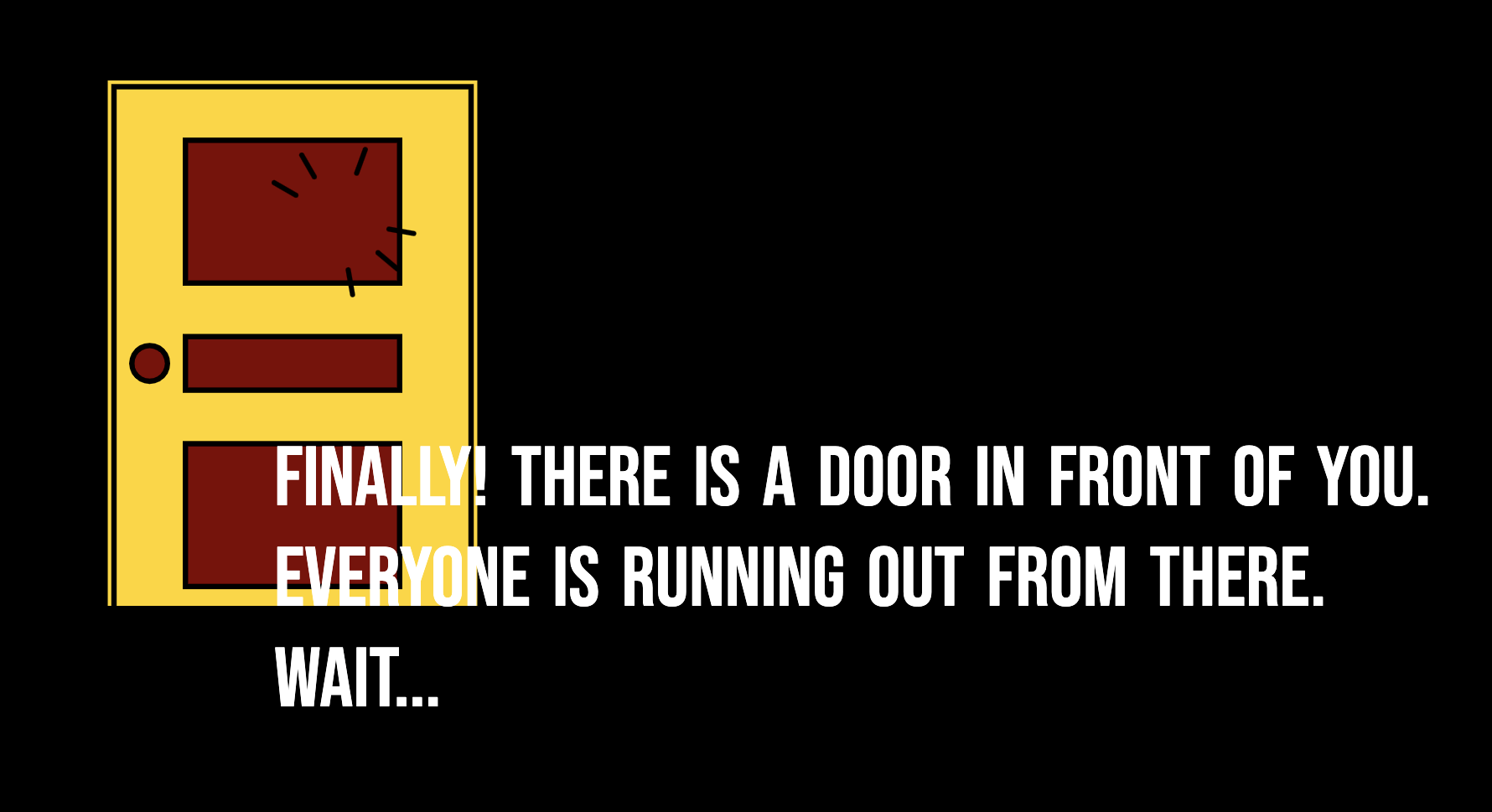
The part about the door was not there at the beginning. I would have liked to just make it a sound effect, and then the user would need to listen to the conversation to continue the action. Inspired by Professor Haider, I made it into an interactive door. Here’s the effect now:
Technical
First Page:
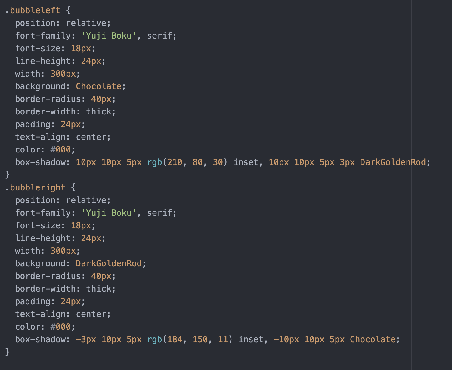
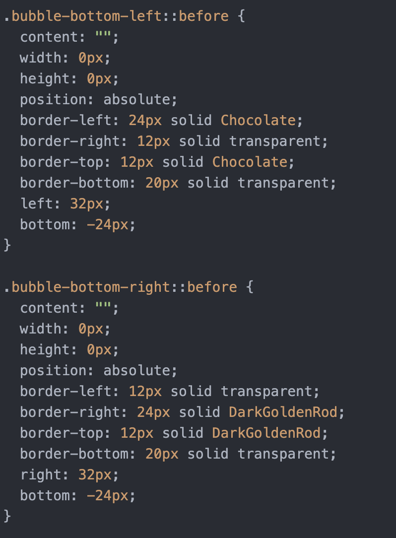
The first problem I encountered was drawing chat bubbles. Professor Haider gave me the suggestion to use a background image, but I found that the size of the background image was difficult to adjust, and the image always showed incomplete. Finally, I chose to draw the chat bubbles with CSS.
Here’s my CSS:
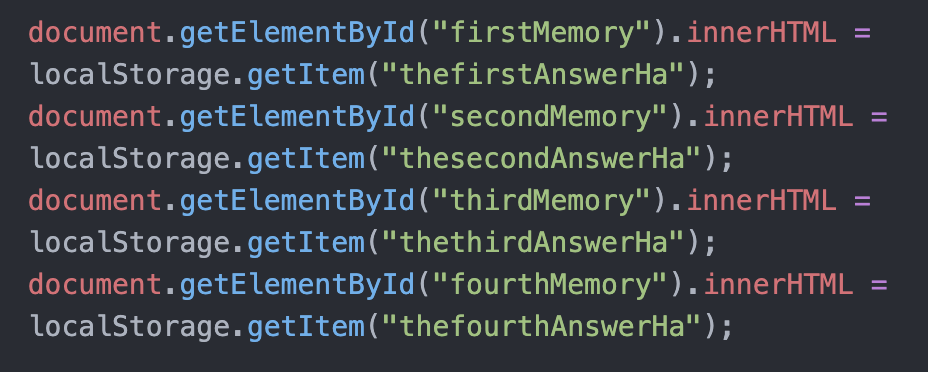
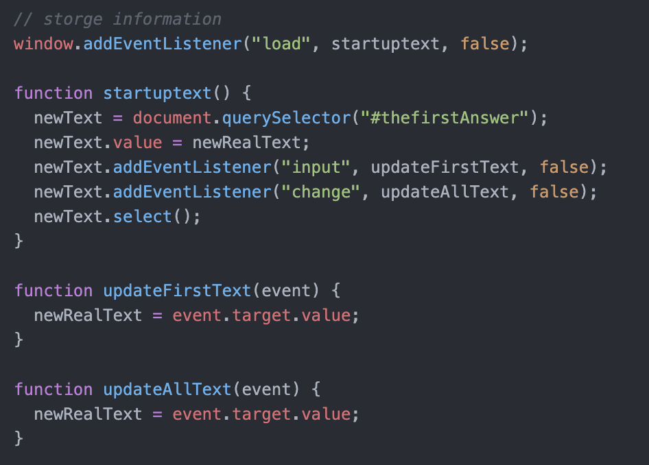
The second problem is how to store the fetched information across different html pages. I found that there is a localStorage feature.
Here’s my code:

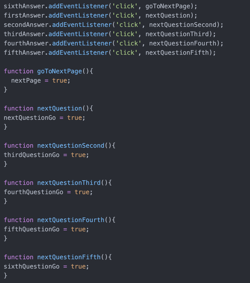
I made the text box sliding effect by changing the position and opacity. The click function and variables work together to ensure that the user answers the question.
Here’s my code:
Second Page:
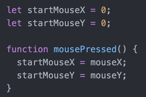
The first problem is to draw the umbrella that can be opened. I first tried to use map to make the umbrella open, but I found it hard to come up with by users. Then, I wanted the umbrella to open as long as the mouse move up. Thanks to Professor Haider, I was able to do this by comparing the previous Y coordinates with the current Y coordinates. And I changed the values of variables to “open” the umbrella.
Here’s my code:
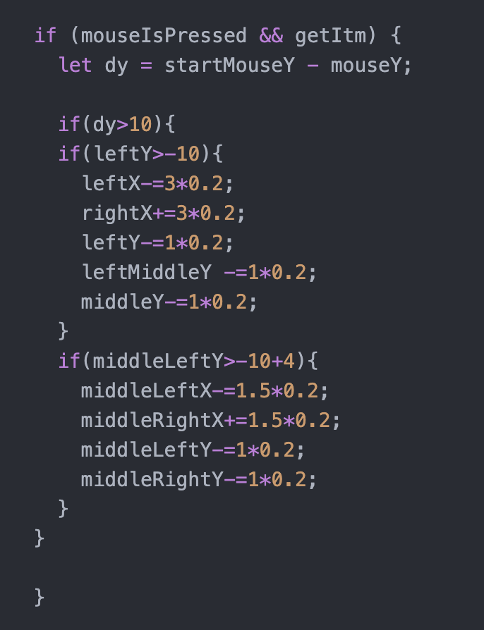
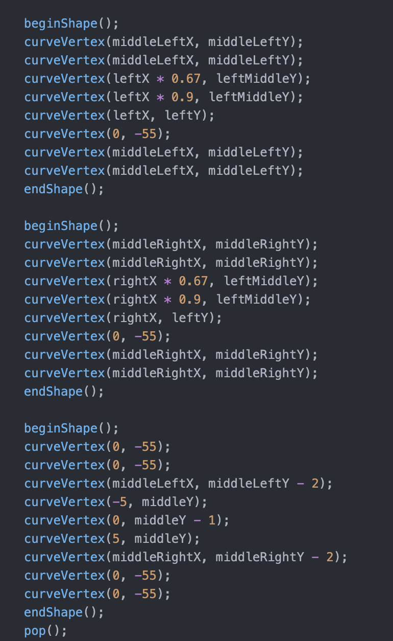
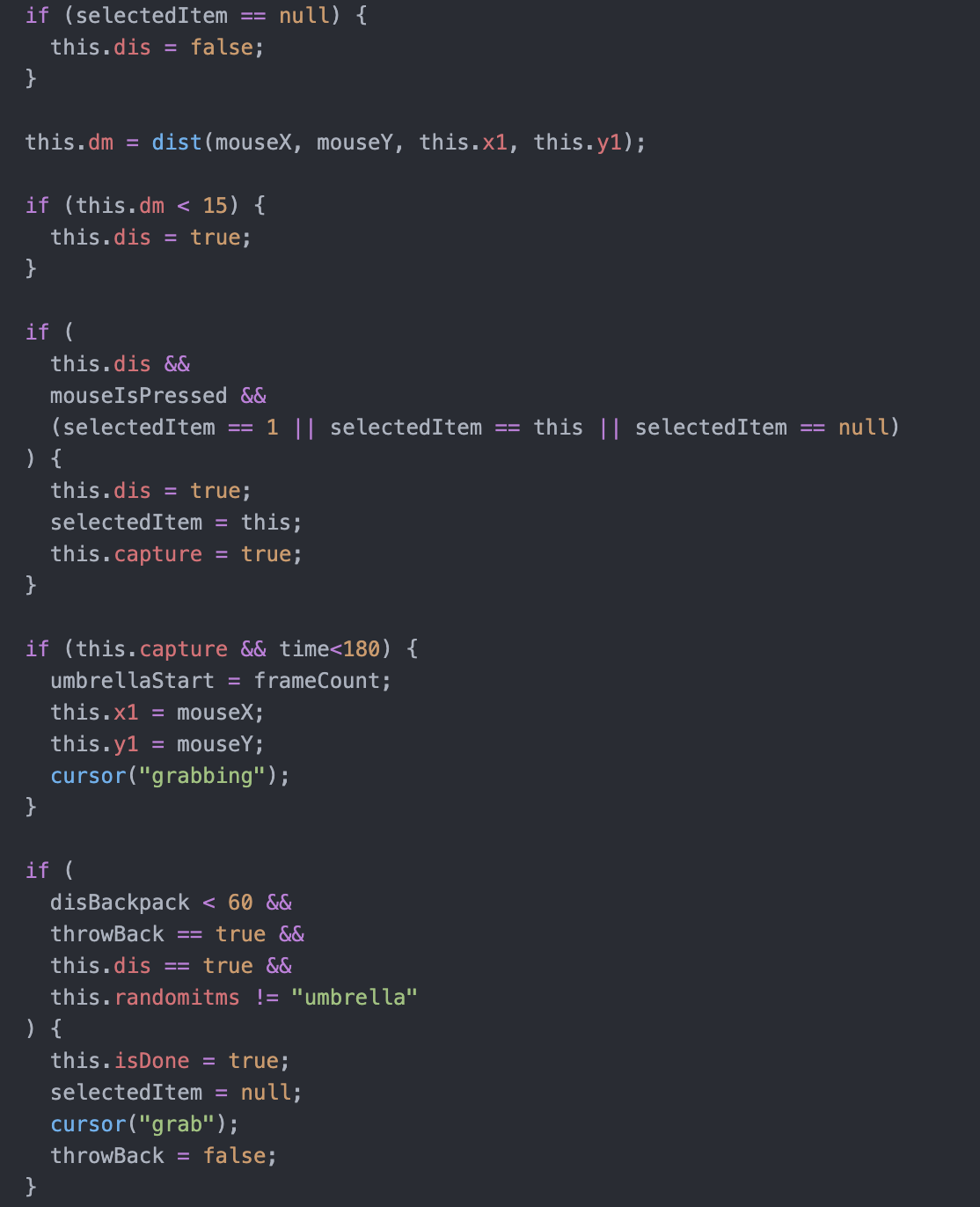
Here’s the code of grabbing the umbrella, it’s very similar to which in the J planet:
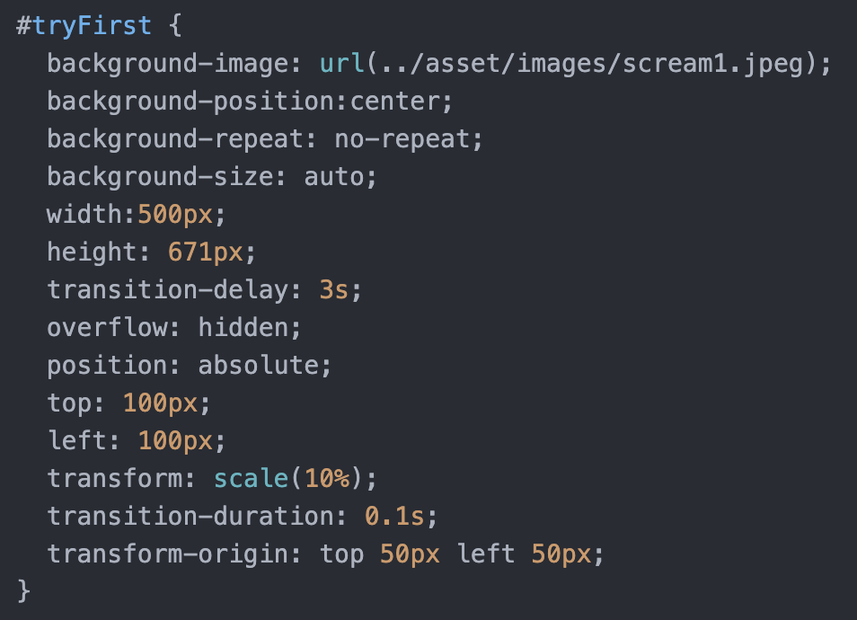
Next, I create the pop-up effect by changing the visibility and scale of the image. Here is my CSS and code:
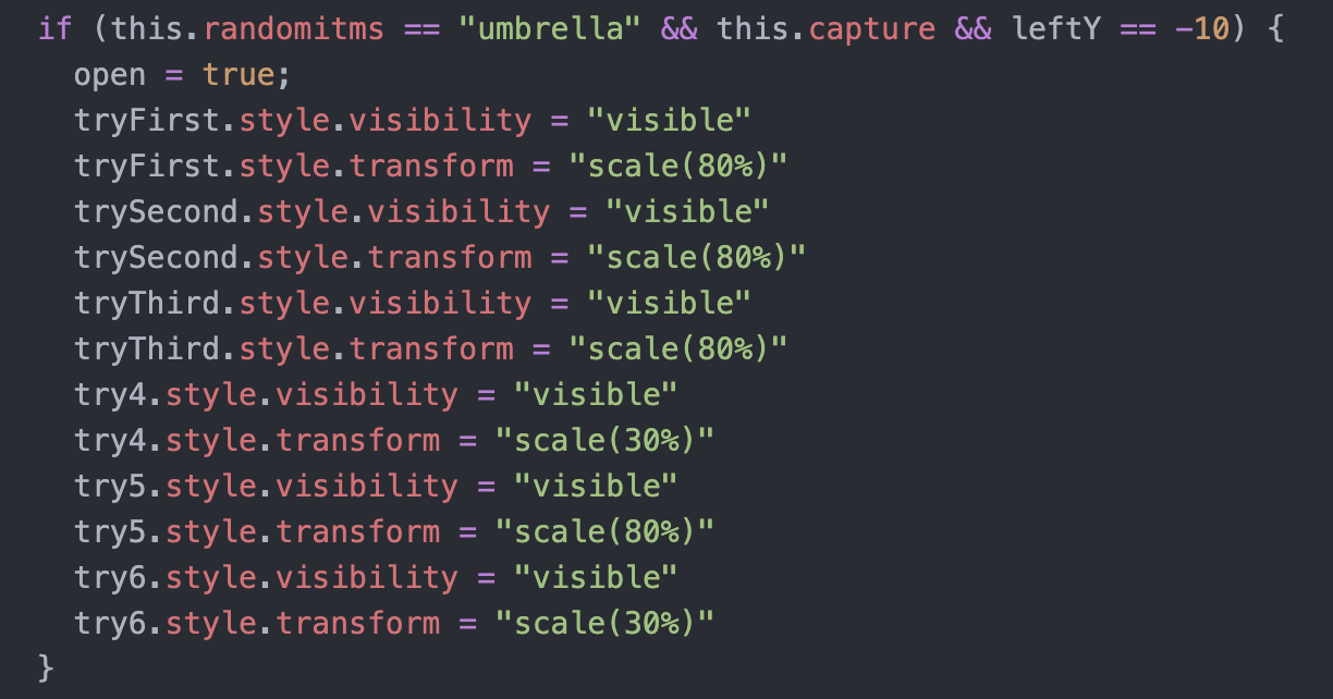
But I don’t know how to get rid of the pictures. Thanks again to Professor Haider, who taught me how to select elements by class, use this to select the image, and use a click function to change the display to get rid of the image.
Here’s my code:


Third Page:
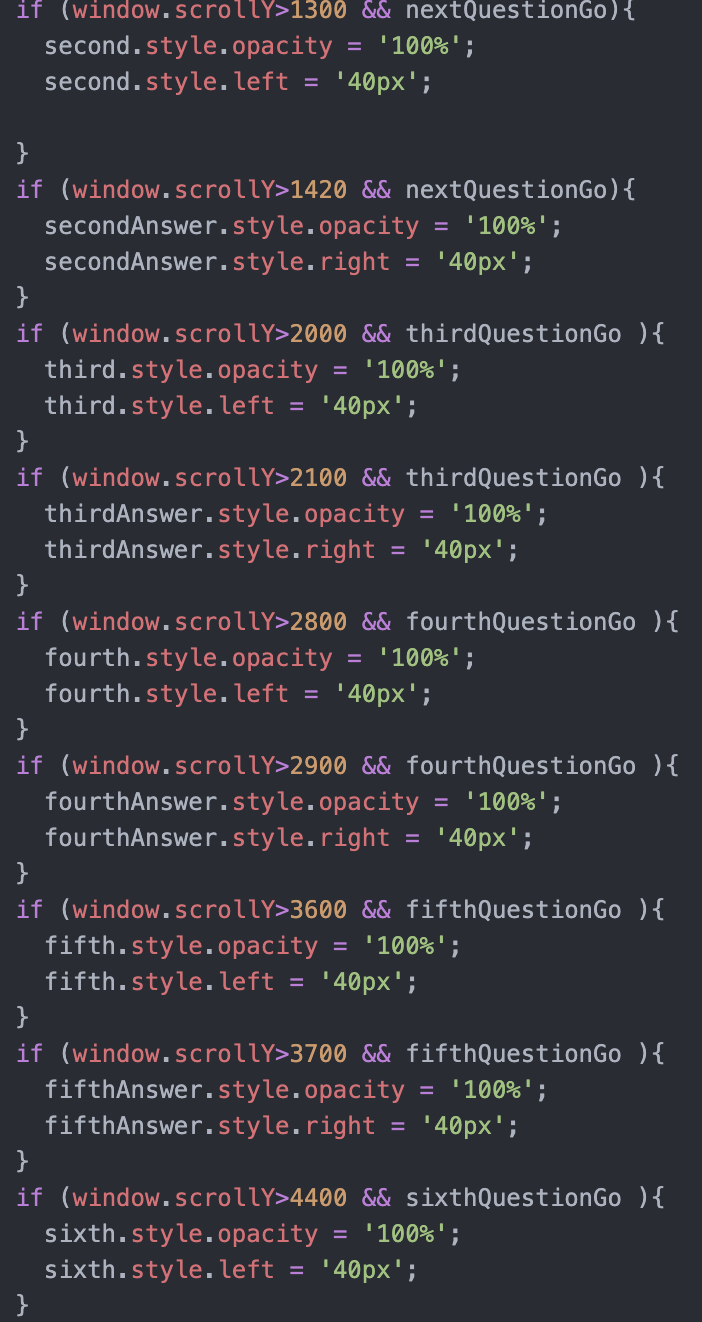
I control the effect of the text appearing and going down stairs by scrollY.
Here is my code:
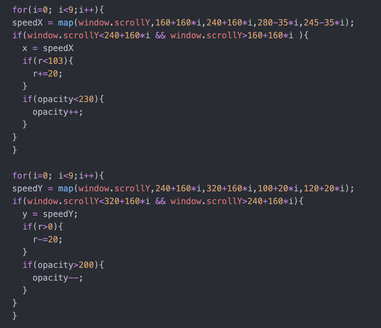
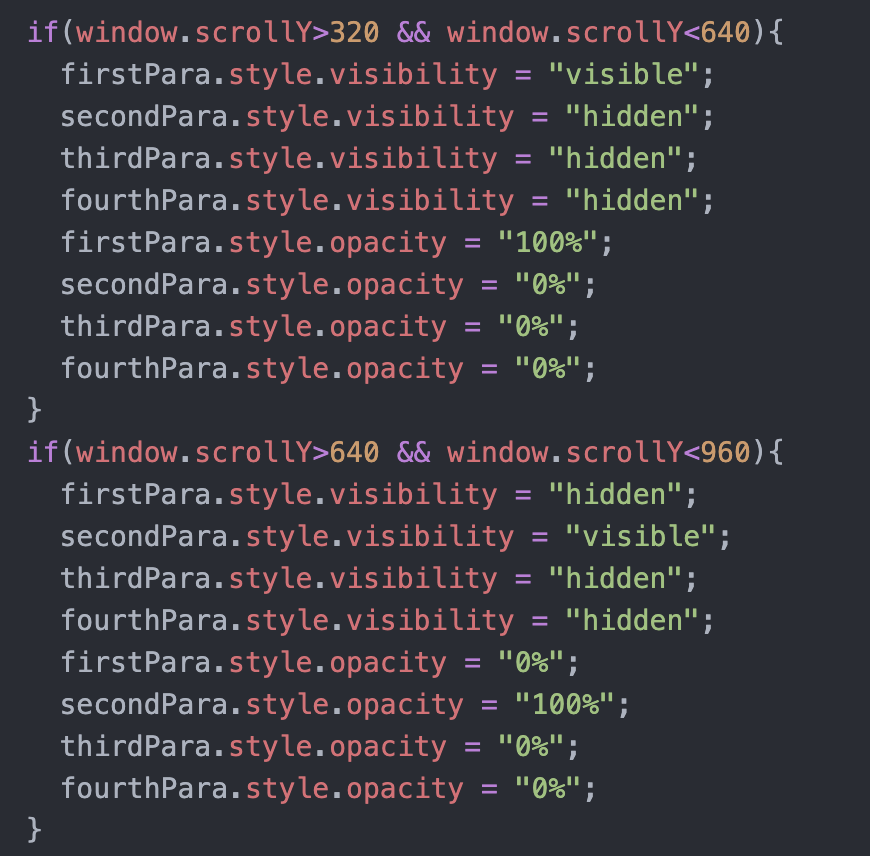
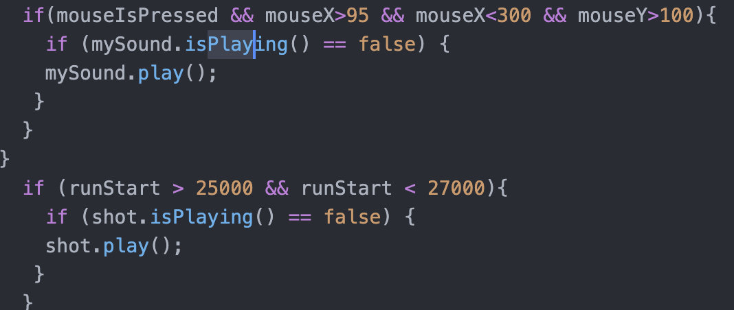
What gives me more headache is the control of the sound effects. How to make the sound effects not to play repeatedly. I set the time variable and let the sound effect play when the time variable is in a certain interval. so that it won’t repeat.
Here’s my code:
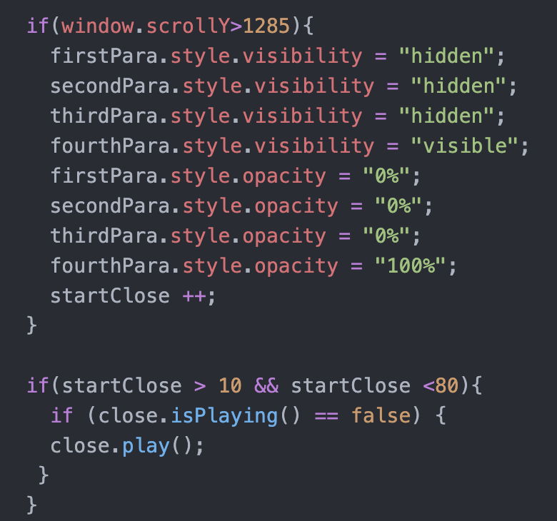
Fourth Page:
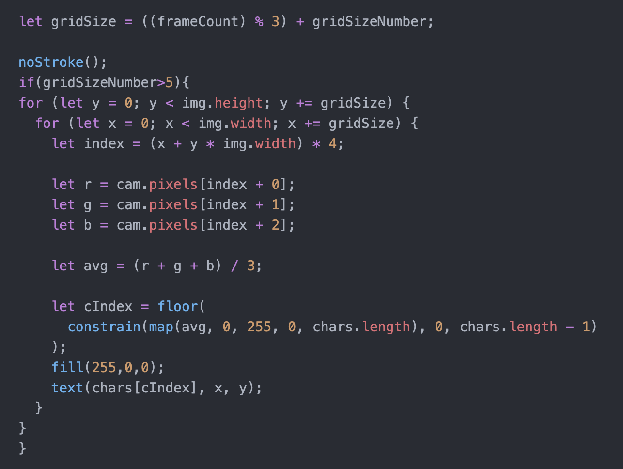
With each click, I changed the size of gridSizeNumber to make the visual effect clearer. And for click control, I tried to use mousePressed at first, but I found that it would keep counting if keep pressing. My solution was that I made a div and made it exactly the same size at the canvas position and kept track of its clicks.
Here’s my code:
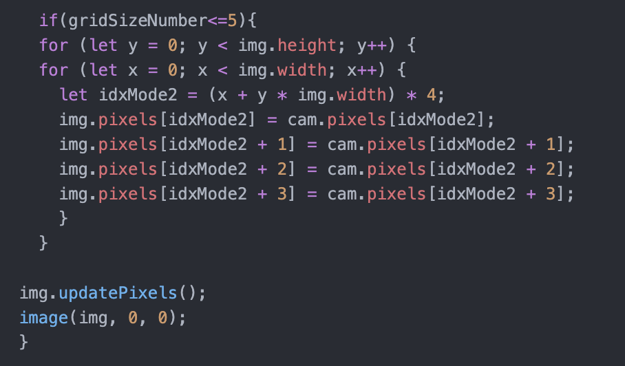
When the number of clicks reached four, I let the screen return to normal, indicating mental calm.
Here’s my code:

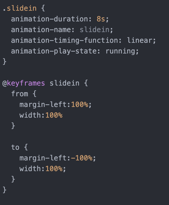
Here’s the CSS of slide in effect:
Reflection and Future Development
The work as a whole is complete and interactive. For the proposal, it is relatively simple, and even cut some of the plots, but the general immersion effect has been achieved.
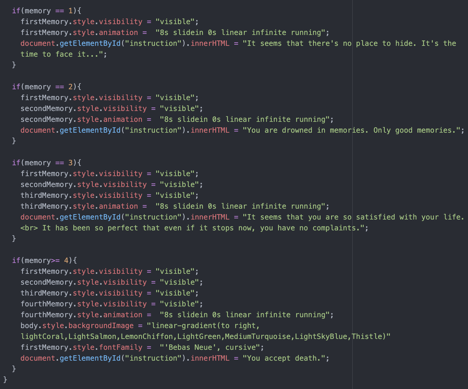
The most satisfying part for me is that the memories collected at the beginning can appear later. In the beginning, when I discussed with professor Haider, we thought this part might be technically complicated and could be considered for deletion. But on the one hand, I think that if it does not appear, the first page of the conversation is not very meaningful. On the other hand, I also think it would be more immersive to use the user’s own memories to flash, rather than the memories I wrote. So I’m happy with this effect now. The second satisfying part is the two frightening effects. One is the appearance of the pictures and the other is the appearance of the gunshot. When testing with my friend, I found both effects to be very effective.
But because so few memories are collected, there is no feeling of flashback. And it may be too oral, leading to a funny effect. This is something that needs to be optimized. What’s more, during the presentation I found that some computers have no enter key, and scrollY is not a stable control because of the screen size and other issues, which are in need of improvement.
The feedback from the class and guests is very helpful.
First, they pointed out that the “hover” approach and the action of scroll down are hard to think of and follow without instruction. Carina Zhang suggested that I could use some flashing stars to attract users to click, which I think is a very interesting way to instruct.
Second, they pointed out the inconsistency of the overall style. First of all, for the font, I used two fonts. For the first page I used handwriting, and for the other pages I used a more formal font in all caps. My intention was to change the mental state before and after the shooting, so I switched from happy handwriting to a serious font. But it may still create a sense of inconsistency. The second is the overall drawing style and color, especially the contrast between the very distinct and simple p5js and realistic pictures. This is also something that I have been struggling to unify from the beginning to the end. But I need the realistic painting style to bring enough immersion and impact. And I also need p5js to complete the interaction. So it is difficult for me to do unity. If I had more time, I could take pictures or paint by myself to unify the overall style.
Third, the sound effect didn’t work when I present because I forgot to click. Professor Haider suggested that it could be put together into one page so that the previous action would ensure that the user had clicked on it. I hadn’t considered it before because I didn’t want the user to feel like they could go back, but Professor Haider said I could make the previous part disappear after the interaction. Therefore, I think this is a very good way out and worth trying.