Project title: Liability
Project link: https://drive.google.com/drive/folders/1lu_Li_SNSpqAVWOn3NqtGODiM4yG58DS?usp=sharing
This project (website) is a presentation of the lyrics of the song “Liability” by Lorde. I think it’s a song that is filled with strong emotions, and the emotions are increasing by degrees. And I tried to represent the various stages of emotional change through this website as follows:
First Page:
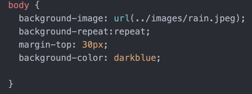
First I chose a rainy picture as the background image (thanks to Professor Haider) to create a sad and messy atmosphere at the beginning:
In the first verse, I made the words different sizes, slanted them, and added a varying number of spaces ( thanks to Professor Haider). I also chose blue to make the words blend better with the background. By doing this, I hope to create a sense of chaos and brokenness, so that the user can directly feel the pain of the singer’s broken heart by her boyfriend.
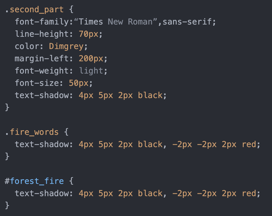
For the second verse, I chose “Times New Roman”, a more regular font, as if the singer had been comforted and calmed down again. But I added shading to make the words clearer on the one hand, and to reflect the effect of double vision on the other. This double vision effect is not only suggesting that this “normal” is actually an illusion but also echoing the truth after this part, showing that the “the girl” is actually the singer herself.
Here’s the process of adding shades:
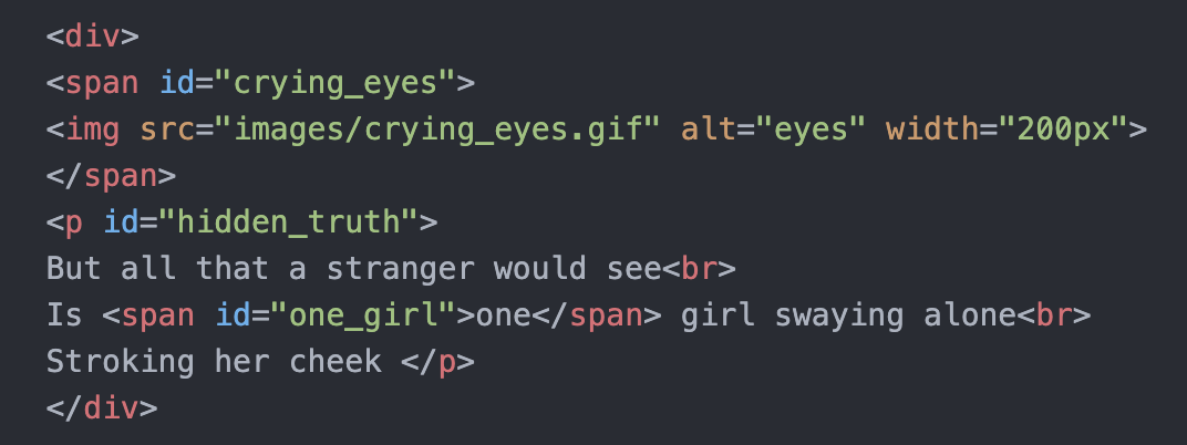
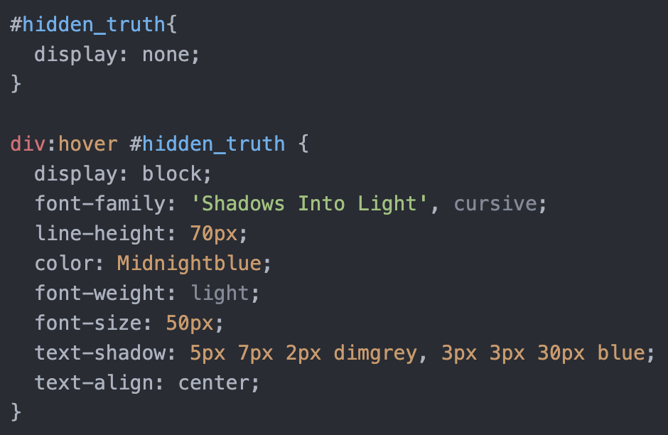
Finally, I hid the “truth” part of the lyrics, that the singer was actually alone, to give the user a process of discovery. I learned this part in w3schools.com:
Second Page:
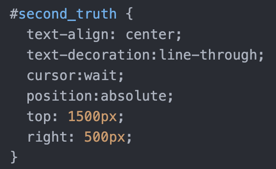
On the second page, I have divided the lyrics into two parts, on the umbrella and under the umbrella. The umbrella is like the body of the singer. On the umbrella are the words that people say to her, and under the umbrella are the words that she thinks. The part under the umbrella istext-decoration: line-through; to show the sense of “my existence is erased” and “no one cares me”. I also used cursor:none; on the “on the umbrella part” to make the users feel like they can’t reach others, as if the bridge between us and others is broken.
I used position:absolute; to let the words appear on the image (thanks to Professor Haider):
Third Page:
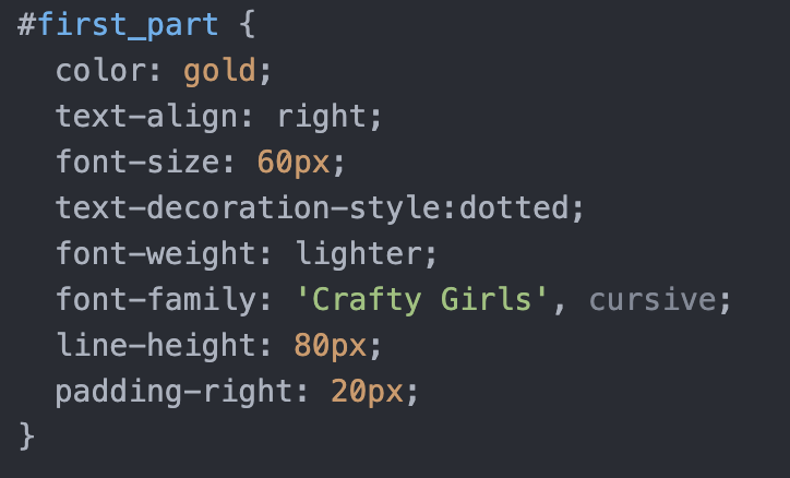
I chose a childish-looking font and warm colors (orange, yellow) to give a warm feeling. Thus constructing the contrast in the lyrics: all the happiness and companionship that I once had is fake or has gone, in fact, everyone is just playing with me and all the good memories are just memories. Therefore, when the reality was revealed, I switched back to a white font, showing a feeling of having heartbroken.
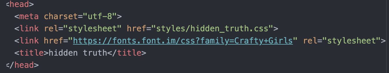
Here is the process of adding font, which I learned from slide 9.2b:
In the second part, I made the lines very widely spaced, thus making each sentence seem very long. Because the vocals in this part of the song are a bit gritty, I wanted to emphasize each sentence by making it appears longer. This also makes “eating me alive” appear more abruptly. For the last line, I made the font smaller and the letter spacing larger to create a sense of impending disappearance.
Fourth Page
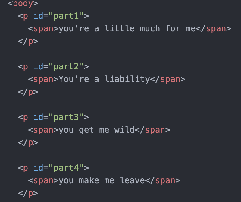
This page is a bit like an inner monologue of the singer. So I used a font that looks like it’s dripping blood and had the lyrics loop back and forth as if the words were circulating in the singer’s head all the time. I also learned animation from w3schools.com. It didn’t work at first, and I found out it was because I didn’t add keyframes. I used “delay” to let the lines appear one by one.
Here’s the process:
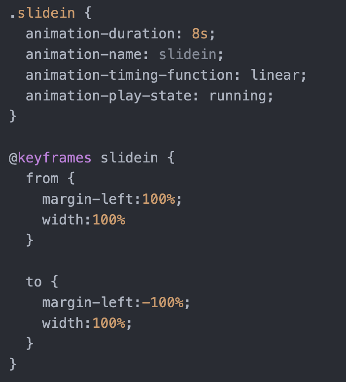
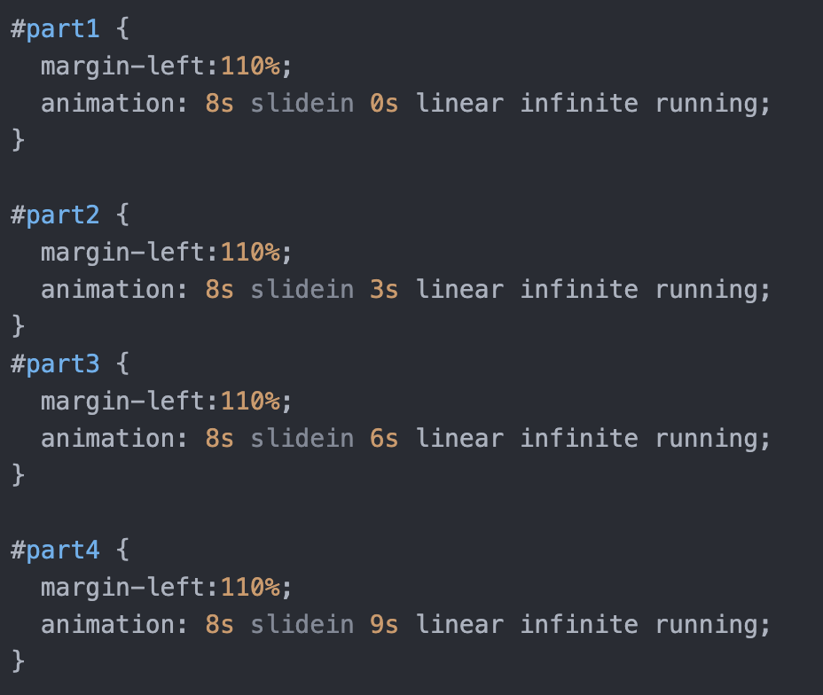
But I noticed that when the second half of a sentence shouldn’t be on the screen yet, it appeared on the next line. Thanks to Professor Haider, who taught me that I should use different <p> to divide each part instead of using <span>:
I let each of the first three pages have an element that could come to the fourth page, representing that this is a cage that has always existed inside the singer. On the first page, when the mouse went to the umbrella, I chose cursor:not-allowed; to indicate that the umbrella was not allowed to ward off gossip. On the second page, I chose cursor:wait; to indicate that the singer was in a constant state of waiting and not getting a response when interacting with others. On the third page, I chose cursor: zoom-in; to zoom in on the pain of the singer. And the fourth page, when the mouse moves to the repeated lines is cursor: grab;, indicates that the singer has been grasping but never grasp. Finally, the water drop (rain or tears) that can go back, I used cursor: none; to reflect a feeling of being trapped.
End of Page
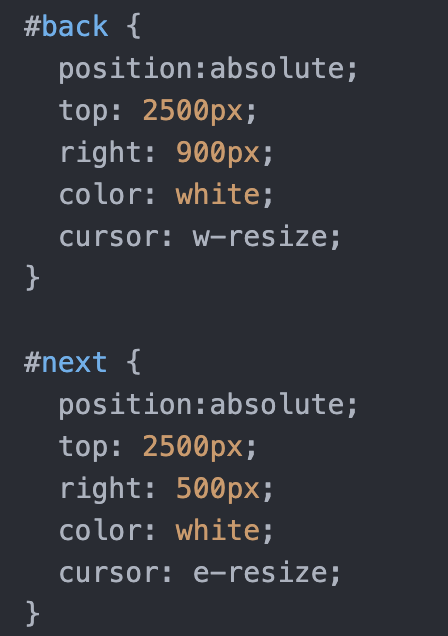
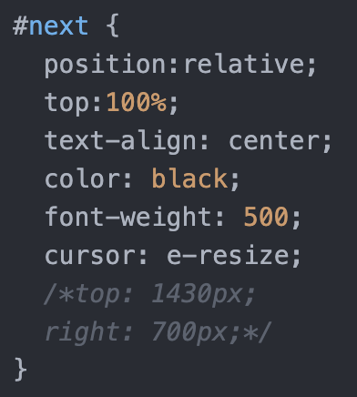
I used back and next to allow the user to go through the pages. Again, I used position:absolute; to adjust the position of keywords:
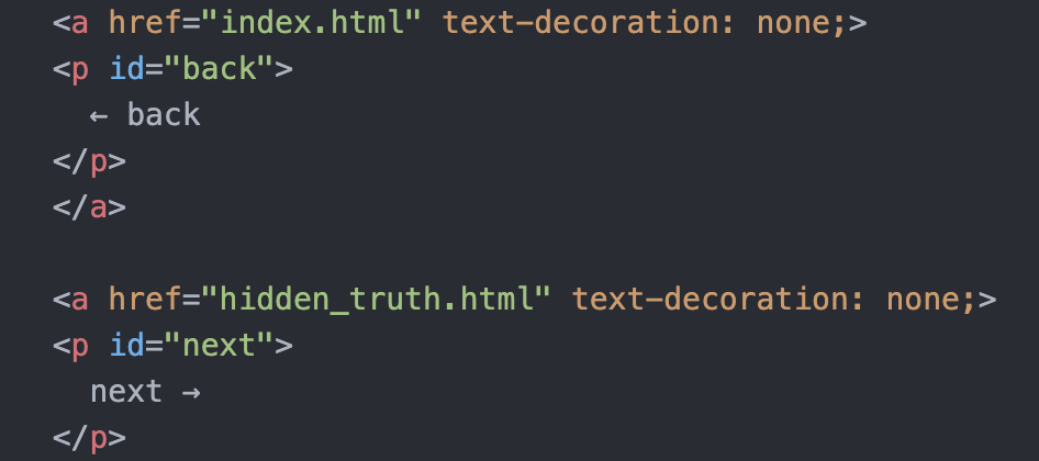
But for the first page, I have the hidden part, so if I still use position:absolute;, the position of “next” when my hidden part appears would be wrong. So, I changed into position:relative;:
Reflection
1.
When I want to add a specific effect to a certain part, I would use Classes or IDs. Classes are usually when I need to adjust more than one part, such as all theparagraphs. IDs are usually used in <span> or in a separate paragraph of a sentence.
2.
First of all, it is not that convenient to adjust the position of each part, which requires constant calculation of values and cannot be directly dragged. The second is that its effect affects the whole line at a time, but sometimes I need it to recognize only the place where the image/word appears.
3.
I can know which html file and which css file are linked together by file name and folder. I can also quickly locate the name of the page or image I want to connect when I need to connect them by link. This way I don’t find it difficult even when there are many pages or images.
4.
Editing and styling a text in the text editor, I can modify the data directly in the boxes it gives me, while writing html is built from scratch. The advantage of the text editor is that it’s super easy and convenient. I can directly tell my needs and it will automatically meet them. But I can only adjust what it allows me to adjust, which shows the advantage of writing html: I have much more flexibility to adjust the text.