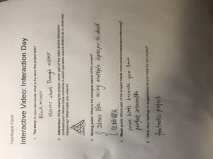
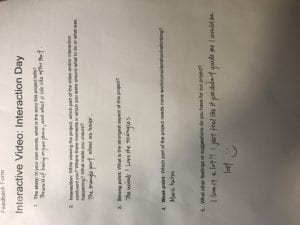
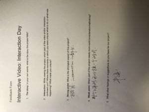
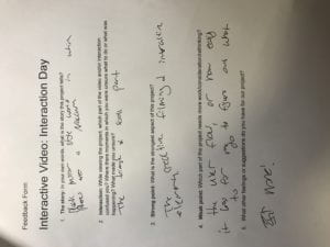
We had the user test on Monday’s class. We went around the tables to get first-hand user experience of each other’s projects and give suggestions for each other to improve their ways of interaction in the project. I was quite happy to see that our project received good feedback. Because we couldn’t involve any human figure in our shoot, our story-line is a little blurry. It was more of a work of symbolism rather than a whole story but has its beginning, climb-up, and climate nevertheless. The main aspect we could improve is to hint more about the way of interaction especially on the page of the interactive triangle. Another thing is our soundtrack hasn’t been added, and we’d like it to be unique and distinctive, something that fits our theme. My groupmates and I are working on it right now and have made good progress. I am looking forward to the presentation day to come and show our complete project to the class.
The following is some advice we received from other groups.


