Announcing the Theory aQWERTYon

A few years ago, the NYU Music Experience Design Lab launched a web application called the aQWERTYon. The name is short for “QWERTY accordion,” because the idea is to make the computer keyboard as accessible for novice musicians as the chord buttons on an accordion. The aQWERTYon maps scales to the keyboard so that there are no “wrong notes,” and so that each column of keys plays a chord. Yesterday, we launched a new version of the app, the Theory aQWERTYon. It visualizes the notes you’re playing on the chromatic circle in real time. Click the image to try it! (Be sure to whitelist it on your ad blocker or it won’t work.)

Theory aQWERTYon

In addition to playing the built-in instruments, you can also use the aQWERTYon as a MIDI controller for any DAW or notation program via the IAC bus (Windows users will need to install MidiOX.) Turn the aQWERTYon’s volume to zero if you’re doing this.

The color scheme on the pitch wheel is intended to give you some visual cues about how each scale is going to sound. Green notes are “bright”–i.e., major, natural, sharp, or augmented. Blue notes are “dark”–i.e., minor, flat, or diminished. Purple notes are neither bright nor dark, i.e. perfect fourths, fifths and octaves. Grey notes are outside the selected scale. Finally, orange notes are the ones that are currently being played. If you play two notes at a time, they will be connected by an orange line. If you play three or more notes at a time, they will form an orange shape. These geometric visualizations are meant to support and complement your aural understanding of intervals and chords, the way that they do with rhythms on the Groove Pizza.

This idea has been in the pipeline for a while, but the impetus to finally push it to completion was my Fundamentals of Western Music class at the New School. I have been drawing scales and chords on the chromatic circle by hand for a long time, and I wanted to be able to produce them automatically. You can read about the design process here, and read about the pitch wheel specifically here.

Eventually we would like the aQWERTYon to show other real-time information as well: notes on the staff, chord symbols, and the like. We want to do for the web browser what Samuel Halligan’s pop-up piano does for Ableton Live Suite: turn it into a visual and aural Rosetta stone that translates in real time between different visual and aural representations of music.

If you use the aQWERTYon in your classroom, or for your own personal exploration (and we hope you do), please let us know!

The Groove Pizzeria

For his NYU music technology masters thesis, Tyler Bisson created a web app called Groove Pizzeria, a polyrhythmic/polymetric extension of the Groove Pizza. Click the image to try it for yourself.

<img data-attachment-id="18497" data-permalink="http://www.ethanhein.com/wp/2019/the-groove-pizzeria/groove-pizzaria/#main" data-orig-file="https://i2.wp.com/www.ethanhein.com/wp/wp-content/uploads/2019/05/Groove-Pizzaria.png?fit=2529%2C1458" data-orig-size="2529,1458" data-comments-opened="1" data-image-meta="{"aperture":"0","credit":"","camera":"","caption":"","created_timestamp":"0","copyright":"","focal_length":"0","iso":"0","shutter_speed":"0","title":"","orientation":"0"}" data-image-title="Groove Pizzeria" data-image-description="

Groove Pizzeria

” data-medium-file=”https://i2.wp.com/www.ethanhein.com/wp/wp-content/uploads/2019/05/Groove-Pizzaria.png?fit=300%2C173″ data-large-file=”https://i2.wp.com/www.ethanhein.com/wp/wp-content/uploads/2019/05/Groove-Pizzaria.png?fit=680%2C392″ class=”alignnone size-large wp-image-18497″ src=”https://i2.wp.com/www.ethanhein.com/wp/wp-content/uploads/2019/05/Groove-Pizzaria.png?resize=680%2C392″ alt=”” width=”680″ height=”392″ data-recalc-dims=”1″ />

Note that the Groove Pizzeria is still a prototype, and it doesn’t yet have the full feature set that the Groove Pizza does. As of this writing, there are no presets, no saving, no exporting of audio or MIDI, and no changing drum kits. You can record the Groove Pizzeria’s output using Audio Hijack, however.

Like the Groove Pizza, the Groove Pizzeria is based on the idea of the rhythm necklace, a circular representation of musical rhythm. The Groove Pizza is a set of three concentric rhythm necklaces, each of which controls one drum sound, e.g. kick, snare and hi-hat. The Groove Pizzeria gives you two sets of concentric rhythm necklaces, each of which can have its own time duration and subdivisions. This means that you can use the Groove Pizzeria to make polyrhythm and polymeter.

The words “polyrhythm” and “polymeter” are frequently used interchangeably, but they are not the same thing. Tyler’s thesis contains the clearest definition of the terms that I know of, which I paraphrase here.

  • Polyrhythm is two or more concurrent loops of equal duration. Each loop consists of a set of evenly-spaced subdivisions or rhythmic onsets. The loops contain different numbers of onsets, meaning that the subdivisions of each loop are not same length. Finally, the ratio of the number of onsets in each loop is not a whole number (otherwise one loop would just be an even subdivision of the other). When people talk about 4:3 or 5:2 polyrhythm, this is what they mean. In Western music, polyrhythms usually only occur for short time spans in the form of tuplets, but in West African drumming, polyrhythms are a core structural feature. 
  • Polymeter is two or more concurrent loops of different duration. The onsets in each loop have the same duration, but each loop has a different number of onsets. This is much more common in Western music than polyrhythm. In Western music, you mostly see polymeter over short time spans in the form of hemiola or syncopation.

With these two definitions in mind, let’s take a look at the Groove Pizzeria interface. For each loop, you can control both the number of subdivisions (the number of onsets) in each loop and the length (duration) of each subdivision. The basic time unit in the Groove Pizzeria is one sixteenth note. Each of the “teeth” on the outer radius of each circle represents the duration of one sixteenth note. If you change the Time Units setting, you make the sixteenth notes shorter, and the radius of the circle gets smaller to preserve the cumulative distances between each tooth of the loop. The easiest way to understand the difference is just to draw some rhythm patterns on the grid, play with the sliders, and see what happens. Notice that the Groove Pizzeria visualizes the compound pattern formed by the two loops in the top left corner of the screen.

Here’s a 5:4 polyrhythm created by taking two loops that are the same length and dividing them into five and four steps respectively:

Simple 5 against 4 polyrhythm on the Groove Pizzeria

If you want a 5:4 polymeter rather than a polyrhythm, then you will need to adjust the number of time units in each loop as well. (The patterns aren’t perfectly symmetric so you can hear where they start and end.)

Simple 5 against 4 polymeter

Here’s a less exotic sound, a 4:3 polymeter, also known as hemiola. On the left is a 4/4 hip-hop pattern. On the right, I made a 12-beat-long pattern that repeats four times in the same amount of time as it takes the hip-hip pattern to repeat three times.

4 vs 3 polymeter, also known as hemiola

Here’s a less familiar sound, an 11:5 polyrhythm. On the left, I made the closest thing to a hip-hop pattern that’s possible in 11/8 time, and on the right I made a simple quintuplet pattern. This will probably sound weird to you at first, but if you listen to it for a while, it will eventually start to make a wonky kind of sense.

11 against 5 polyrhythm

How about some real-world examples? Genuine polyrhythm is unusual in popular music, but it’s not unheard of. James Blake uses a quintuplet hi-hat pattern in his song “Unluck.”

Here’s my Groove Pizzeria representation of this beat. On the left is the kick and snare playing a straight quarter note pattern in 4/4, and on the right is the hi-hat pattern (though it’s not playing back on a hi-hat sound.)

Hip-hop producers sometimes use polyrhythms to create specific varieties of swing. On drum machines, swing (sometimes called shuffle) shortens and lengthens each alternate beat. At zero swing, also known as 1:1 swing, the beats within each pair are the same length. At maximum swing, the first beat in each pair will be twice as long as the second beat in the pair. This is known as 2:1 swing, sometimes called “triplet swing” because it’s as if the first beat is two triplets long, while the second is one triplet long. In real life, you usually want your swing setting somewhere between these two extremes. (Click here for a more detailed explanation of swing.)

One way to get a swing ratio in between 1:1 and 2:1 is to use a quintuplet grid. If you think of the first three quintuplets in each group as being one “beat” in a pair and the last two as being the “beat” in the pair, you get the equivalent of 5:3 swing. Slynk explains how to set this up in Ableton:

Here’s a neo soul groove I made using pentuplet swing:

Neo soul pentuplet swing groove

For an even narrower swing ratio, you can use septuplet swing. It’s the same idea, except now you’re grouping together the first four septuplets into one “beat” in the pair, and the last three septuplets into the other “beat”. This gives you a 4:3 swing ratio. This is pretty close to no swing at all, but it’s noticeably “off,” in a way that gives you a nice J Dilla “drunken drummer” feel. Slynk explains again:

Here’s a neo soul groove I made using septuplet swing:

Neo soul septuplet swing groove

Beyond complex rhythms, the Groove Pizzeria can teach another useful musical concept called event fusion. When a rhythm gets fast enough, you stop hearing individual beats and start to hear a continuous thrum. The transition happens at around twenty beats per second. If you play the rhythm even faster, the thrum becomes a steady pitch, and the higher the tempo, the faster the pitch. Here’s how you can experiment with event fusion yourself. First, put a clap on every sixteenth note. Next, reduce the number of time units to a small number (5 is fine) and set the tempo to 300 bpm. Now reduce the number of steps. Listen for the point when the claps fuse into a single tone. You can control the pitch of this tone by changing the number of steps.

Event fusion at extreme tempo

If you think of more interesting music learning or creation applications for the Groove Pizzeria, please let me know. Happy drumming!

Samuel Halligan’s awesome Pop-Up Piano for Ableton Live

I recently met a gentleman named Samuel Halligan, who, among other things, makes music education utilities using Max For Live. One of them is called Pop-Up Piano. If you use Max or Ableton and you could use some help learning music theory, you should go and download it immediately. It’s a Max For Live Device that you can place on any MIDI track in Ableton, or just open as a Max standalone. The concept is simple: as you play notes on a MIDI controller, the Pop Up Piano shows you their names, and notates them on the staff. You can also set a particular key and scale, and then the Pop Up Piano will show you whether the notes you’re playing fall within that scale. In the image below, I’m holding down the notes C and E-flat, the second and fourth notes in the B-flat harmonic minor scale.

Pop-Up Piano

Samuel made this thing to help pianists navigate the Ableton Push. But I could see this being useful for any musician. I’m going to use it in my intro-level music theory course that I’m teaching at the New School this fall. I’d be interested to hear from any theory pedagogues out there how you would structure lessons or assignments around this tool.

I’ve done some work around music theory visualization with the NYU MusEDLab. My fondest wish would be to combine the visualization scheme of the Scale Wheel, the immediacy and physical playability of the aQWERTYon, and the music-theoretic depth of the Pop-Up Piano.

Scale Wheel - Bb harmonic minor

In a perfect world, this combination of instrument and music-theoretic Rosetta stone would exist both as a web app and as a DAW-native plugin. Samuel is working on adding more note representations to the Pop-Up Piano, including guitar tab, so that’s awesome. What do you say, developers? Let’s make this happen!

Chord pizzas

The Groove Pizza uses geometry to help visualize rhythms. The MusEDLab is planning to create a similar tool for visualizing music theory by merging the aQWERTYon with the Scale Wheel. When you put the twelve pitch classes in a circle, you can connect the dots between different notes in a chord or scale to form shapes. My hypothesis is that seeing these shapes along with hearing the notes will help people learn music theory more easily. In this post, I’ll talk through some concept images.

First, let’s look at two different ways to represent the pitch classes on a circle. On the left is the chromatic circle, showing the notes in the order of pitch height (the way they are on a piano keyboard.) On the right is the circle of fifths. These two circles have an interesting relationship: the circle of fifths is the involute of the chromatic circle. Notice that C, D, E, G-flat, A-flat and B-flat are in the same places on both circles, while the other six notes trade places across the circle. Pretty cool!

The chromatic circle and the circle of fifths

The colors represent the harmonic function of each note relative to the root C. Purple notes are perfect (neither major nor minor.) Green notes are major or natural. Blue notes are minor or flatted. You could technically think of, say, B-flat as being the sharp sixth rather than the flat seventh, but that usage is rare in real life. G-flat is a special case–it’s equally likely to be the sharp fourth or flat fifth. I represented this ambiguity by making it blue-green. (We could make it blue if we knew it was flat fifth from Locrian mode, or green if it was the sharp fourth from Lydian mode.)

Once the Scale Wheel and aQWERTYon get combined, then whenever you play more than one note at a time, they will be connected on the circle. Here are some common chord progressions, and what their shapes can tell us about how they function. First, let’s look at the I-vi-ii-V jazz turnaround in C major.

Major scale chords

Seeing things on the circle really helps you understand the voice leading. You can see how the notes move very little from one chord to the next. To get from Cmaj7 to Am7, you just move the B to A while keeping the other three notes the same. To get from Am7 to Dm7, you move the G to F and the E to D while keeping the other two notes the same. To get from Dm7 to G7, you move the A to G and the C to B while keeping the other two notes the same. Finally, to get from G7 back to Cmaj7, you move the D to C and the F to E while keeping the other two notes the same. In general, any chord you can produce by moving the notes as little as possible from the current chord is likely to sound smooth and logical.

The pitch circle doesn’t represent musical “real life” perfectly–while pitch classes are circular, actual notes belong to specific octaves. That makes the voice leading harder to figure out, because you will need to introduce some jumps or additional chord voices to make it work. That said, thinking in terms of pitch class rather than pitch makes it easier to learn the concept; then you can work out the logistics of voice leading actual pitches from a place of understanding.

Next, let’s look at the Mixolydian mode I-bVII-IV-I turnaround that’s ubiquitous in rock, e.g. the “na na na” section in the Beatles’ “Hey Jude.”

Mixoydian mode chords

The circle of fifths view is more clear here. Getting from the Bb to the F is just a matter of rotating the little triangle clockwise by one slot. If you voice the C7 chord like a jazz musician and leave out the G, then the voice leading in this progression becomes exquisitely clear and simple.

Finally, here’s a more exotic-sounding progression from Phrygian dominant, the I-bvii you hear in Middle Eastern and Jewish music like “Hava Nagilah.”

Phrygian dominant mode chords

Seeing these chords on the circle of fifths is not very enlightening–while Western functional harmony keeps things close together on the circle of fifths, non-Western harmony jumps around a lot more. But on the chromatic circle, you can see exactly what’s happening: To get from C7 to Bb-7, B-flat stays the same, but all the other notes move one scale degree clockwise. To get from Bb-7 back to C7, B-flat stays the same while the other notes move one scale degree counterclockwise. This is very close to the way I conceptualize this progression in my head. It’s like the notes in Bb-7 are lifting or pulling away from their homes in C7, and when you release them, they snap back into place. You could also think of this progression as being iv-V7 in the key of F minor, in which case the Bb-7 is acting more like C7sus(b9 #5). Here the suspension metaphor makes even more sense.

Beyond the fact that it looks cool, seeing geometric representations of music gives you insight into why it works the way it does. The main insight you get from the circles is that perfect symmetry is boring. On the Groove Pizza, squares and equilateral triangles produce steady isochronous rhythms, like the four on the floor kick drum pattern. These rhythms are musical, but they’re boring, because they’re perfectly predictable. The more exciting rhythms come from shapes that don’t evenly fit the metrical grid. On a sixteen-step grid, pentagons produce clave patterns, while hexagons make habanera and tresillo.

The same concept applies to the pitch wheel. A square on the pitch wheel is a diminished seventh chord; an equilateral triangle is an augmented triad; and a hexagon is a whole tone scale. (Interestingly, this is true both on the chromatic circle and the circle of fifths.) These sounds are fine for occasional use or special effects, but they get tedious very quickly if you repeat them too much. By contrast, the harmonic devices we use most commonly, like major and minor triads and seventh chords, are uneven and asymmetrical. The same uneven seven-sided figure produces the major scale and its modes on the pitch wheel, and the “standard bell pattern” on the Groove Pizza. Food (ha) for thought.

The aQWERTYon pitch wheels and the future of music theory visualization

The MusEDLab will soon be launching a revamped version of the aQWERTYon with some enhancements to its visual design, including a new scale picker. Beyond our desire to make our stuff look cooler, the scale picker represents a challenge that we’ve struggled with since the earliest days of aQW development. On the one hand, we want to offer users a wide variety of intriguing and exotic scales to play with. On the other hand, our audience of beginner and intermediate musicians is likely to be horrified by a list of terms like “Lydian dominant mode.” I recently had the idea to represent all the scales as colorful icons, like so:

Read more about the rationale and process behind this change here. In this post, I’ll explain what the icons mean, and how they can someday become the basis for a set of new interactive music theory visualizations.

Musical pitches rise and fall linearly, but pitch class is circular. When you go up or down the chromatic scale, the note names “wrap around” every twelve notes. This naming convention reflects the fact that we hear notes an octave apart as being “the same”, probably because they share so many overtones. (Non-human primates hear octaves as being equivalent too.)

chromatic circle

The note names and numbers are all based on the C major scale, which is Western music’s “default setting.” The scale notes C, D, E, F, G, A and B (the white keys on the piano) are the “normal” notes. (Why do they start on C and not A? I have no idea.) You get D-flat, E-flat, G-flat, A-flat and B-flat (the black keys on the piano) by lowering (flatting) their corresponding white key notes. Alternately, you can get the black key notes by raising or sharping the white key notes, in which case they’ll be called C-sharp, D-sharp, F-sharp, G-sharp, and A-sharp. (Let’s just briefly acknowledge that the imagery of the “normal” white and “deviant” black keys is just one of many ways that Western musical culture is super racist, and move on.)

You can represent any scale on the chromatic circle just by “switching” notes on and off. For example, if you activate the notes C, D, E-flat, F, G, A-flat and B, you get C harmonic minor. (Alternatively, you could just deactivate D-flat, E, G-flat, A, and B-flat.) Here’s how the scale looks when you write it this way:

C harmonic minor - monochrome

This is how I conceive scales in my head, as a pattern of activated and deactivated chromatic scale notes. As a guitarist, it’s the most intuitive way to think about them, because each box on the circular grid corresponds to a fret, so you can read the fingering pattern right off the circle. When I think “harmonic minor,” I don’t think of note names, I think “pattern of notes and gaps with one unusually wide gap.”

Another beauty of the circle view is that you can get the other eleven harmonic minor scales just by rotating the note names while keeping the pattern of activated/deactivated notes the same. If I want E-flat harmonic minor, I just have to grab the outer ring and rotate it counterclockwise a few notches:

E-flat harmonic minor

My next thought was to color-code the scale tones to give an indication of their sound and function:

C harmonic minor scale necklace

Here’s how the color scheme works:

  • Green – major, natural, sharp, augmented
  • Blue – minor, flat, diminished
  • Purple – perfect (neither major nor minor)
  • Grey – not in the scale

Scales with more green in them sound “happier” or brighter. Scales with more blue sound “sadder” or darker. Scales with a mixture of blue and green (like harmonic minor) will have a more complex and ambiguous feeling.

My ambition with the pitch wheels is not just to make the aQWERTYon’s scale menu more visually appealing. I’d eventually like to have it be an interactive way to visualize chords too. Followers of this blog will notice a strong similarity between the circular scale and the rhythm necklaces that inspired the Groove Pizza. Just like symmetries and patterns on the rhythm necklace can tell you a lot about how beats work, so too can symmetries and patterns on the scale necklace can tell you how harmony works. So here’s my dream for the aQWERTYon’s future theory visualization interface. If you load the app and set it to C harmonic minor, here’s how it would look. To the right is a staff notation view with the appropriate key signature.

When you play a note, it would change color on the keyboard and the wheel, and appear on the staff. The app would also tell you which scale degree it is (in this case, seven.)

If you play two notes simultaneously, in this case the third and seventh notes in C Mixolydian mode, the app would draw a line between the two notes on the circle:

If you play three notes at a time, like the first, fourth and fifth notes in C Lydian, you’d get a triangle.

If your three notes spell out a chord, like the second, fourth and sixth notes in C Phrygian mode, the app would recognize it and shows the chord symbol on the staff.

The pattern continues if you play four notes at a time:

Or five notes at a time:

By rotating the outer ring of the pitch wheel, you could change the root of the scale, like I showed above with C harmonic minor. And if you rotated the inner ring, showing the scale degrees, you could get different modes of the scale. Modes are one of the most difficult concepts in music theory. That is, they’re difficult until you learn to imagine them as rotations of the scale necklace, at which point they become nothing harder than a memorization exercise.

I’m designing this system to be used with the aQWERTYon, but there’s no reason it couldn’t take ordinary MIDI input as well. Wouldn’t it be nice to have this in a window in your DAW or notation program?

Music theory is hard. There’s a whole Twitter account devoted to retweeting students’ complaints about it. Some of this difficulty is due to the intrinsic complexity of modern harmony. But a lot of it is due to terminology and notation. Our naming system for notes and chords is a set of historically contingent kludges. No rational person would design it this way from the ground up. Thanks to path dependency, we’re stuck with it, much like we’re stuck with English grammar and the QWERTY keyboard layout. Fortunately, technology gives us a lot of new ways to make all the arcana more accessible, by showing multiple representations simultaneously and by making those representations discoverable through playful tinkering.

Do you find this idea exciting? Would you like it to be functioning software, and not just a bunch of flat images I laboriously made by hand? Help the MusEDLab find a partner to fund the developer and designer time. A grant or gift would work, and we’d also be open to exploring a commercial partnership. The aQW has been a labor of volunteer love for the lab so far, and it’s already one of the best music theory pedagogy tools on the internet. But development would go a lot faster if we could fund it properly. If you have ideas, please be in touch!

Update: Will Kuhn’s response to this post.

Deconstructing the bassline in Herbie Hancock’s “Chameleon”

If you have even a passing interest in funk, you will want to familiarize yourself with Herbie Hancock’s “Chameleon.” And if you are preoccupied and dedicated to the preservation of the movement of the hips, then the bassline needs to be a cornerstone of your practice.

Chameleon - circular bass

Here’s a transcription I did in Noteflight – huge props to them for recently introducing sixteenth note swing.

And here’s how it looks in the MIDI piano roll:

The “Chameleon” bassline packs an incredible amount of music into just two bars. To understand how it’s put together, it’s helpful to take a look at the scale that Herbie built the tune around, the B-flat Dorian mode. Click the image below to play it on the aQWERTYon. I recommend doing some jamming with it over the song before you move on.

B-flat Dorian

Fun fact: this scale contains the same pitches as A-flat major. If you find that fact confusing, then feel free to ignore it. You can learn more about scales and modes in my Soundfly course.

The chord progression

The opening section of “Chameleon” is an endless loop of two chords, B♭-7 and E♭7. You build both of them using the notes in B-flat Dorian. To make B♭-7, start on the root of the scale, B-flat. Skip over the second scale degree to land on the third, D-flat. Skip over the fourth scale degree to land on the fifth, F. Then skip over the sixth to land on the seventh, A-flat. If you want to add extensions to the chord, just keep skipping scale degrees, like so:

B-flat Dorian mode chords

To make E♭7, you’re going to use the same seven pitches in the same order, but you’re going to treat E-flat as home base rather than B-flat. You could think of this new scale as being E-flat Mixolydian, or B-flat Dorian starting on E-flat; they’re perfectly interchangeable. Click to play E-flat Mixolydian on the aQWERTYon. You build your E♭7 chord like so:

B-flat Dorian mode chords on E-flat

Once you’ve got the sound of B♭-7 and E♭7 in your head, let’s try an extremely simplified version of the bassline.

Chord roots only

At the most basic level, the “Chameleon” bassline exists to spell out the chord progression in a rhythmically interesting way. (This is what all basslines do.) Here’s a version of the bassline that removes all of the notes except the ones on the first beat of each bar. They play the roots of the chords, B-flat and E-flat.

That’s boring, but effective. You can never go wrong playing chord roots on the downbeat.

Simple arpeggios

Next, we’ll hear a bassline that plays all of the notes in B♭-7 and E♭7 one at a time. When you play chords in this way, they’re called arpeggios.

The actual arpeggios

The real “Chameleon” bassline plays partial arpeggios–they don’t have all of the notes from each chord. Also, the rhythm is a complicated and interesting one.

Below, you can explore the rhythm in the Groove Pizza. The orange triangle shows the rhythm of the arpeggio notes, played on the snare. The yellow quadrilateral shows the rhythm of the walkups, played on the kick–we’ll get to those below.

The snare rhythm has a hit every three sixteenth notes. It’s a figure known in Afro-Latin music as tresillo, which you hear absolutely everywhere in all styles of American popular and vernacular music. Tresillo also forms the front half of the equally ubiquitous son clave. (By the way, you can also use the Groove Pizza to experiment with the “Chameleon” drum pattern.)

As for the pitches: Instead of going root-third-fifth-seventh, the bassline plays partial arpeggios. The figure over B♭-7 is just the root, seventh and root again, while the one over E♭7 is the root, fifth and seventh.

Adding the walkups

Now let’s forget about the arpeggios for a minute and go back to just playing the chord roots on the downbeats. The bassline walks up to each of these notes via the chromatic scale, that is, every pitch on the piano keyboard.

Chromatic walkups are a great way to introduce some hip dissonance into your basslines, because they can include notes that aren’t in the underlying scale. In “Chameleon” the walkups include A natural and D natural. Both of these notes sound really weird if you sustain them over B-flat Dorian, but in the context of the walkup they sound perfectly fine.

Putting it all together

The full bassline consists of the broken arpeggios anticipated by the walkups.

If you’re a guitarist or bassist, you can play this without even shifting position. Use your index on the third fret, your middle on the fourth fret, your ring on the fifth fret, and your pinkie on the sixth fret.

              .          . .
G|----------.-3----------3-6--|
D|----------6-----------------|
A|---------------3-4-5-6------|
E|--3-4-5-6-------------------|

If you’ve got this under your fingers, maybe you’d like to figure out the various keyboard and horn parts. They aren’t difficult, but you’ll need one more scale, the B-flat blues scale. Click the image to jam with it over the song and experience how great it sounds.

B-flat blues

There you have it, one of the cornerstones of funk. Good luck getting it out of your head!

Freedom ’90

Since George Michael died, I’ve been enjoying all of his hits, but none of them more than this one. Listening to it now, it’s painfully obvious how much it’s about George Michael’s struggles with his sexual orientation. I wonder whether he was being deliberately coy in the lyrics, or if he just wasn’t yet fully in touch with his identity. Being gay in the eighties must have been a nightmare.

This is the funkiest song that George Michael ever wrote, which is saying something. Was he the funkiest white British guy in history? Quite possibly. 

The beat

There are five layers to the drum pattern: a simple closed hi-hat from a drum machine, some programmed bongos and congas, a sampled tambourine playing lightly swung sixteenth notes, and finally, once the full groove kicks in, the good old Funky Drummer break. I include a Noteflight transcription of all that stuff below, but don’t listen to it, it sounds comically awful.

George Michael uses the Funky Drummer break on at least two of the songs on Listen Without Prejudice Vol 1. Hear him discuss the break and how it informed his writing process in this must-watch 1990 documentary.

The intro and choruses

Harmonically, this is a boilerplate C Mixolydian progression: the chords built on the first, seventh and fourth degrees of the scale. You can hear the same progression in uncountably many classic rock songs.

C Mixolydian chords

For a more detailed explanation of this scale and others like it, check out Theory For Producers.

The rhythm is what makes this groove so fresh. It’s an Afro-Cuban pattern full of syncopation and hemiola. Here’s an abstraction of it on the Groove Pizza. If you know the correct name of this rhythm, please tell me in the comments!

The verses

There’s a switch to plain vanilla C major, the chords built on the fifth, fourth and root of the scale.

C major chords

Like the chorus, this is standard issue pop/rock harmonically speaking, but it also gets its life from a funky Latin rhythm. It’s a kind of clave pattern, five hits spread more or less evenly across the sixteen sixteenth notes in the bar. Here it is on the Groove Pizza.

The prechorus and bridge

This section unexpectedly jumps over to C minor, and now things get harmonically interesting. The chords are built around a descending chromatic bassline: C, B, B-flat, A. It’s a simple idea but with complicated implications, because it implies four chords built on three different scales between them. First, we have the tonic triad in C natural minor, no big deal there. Next comes the V chord in C harmonic minor. Then we’re back to C natural minor, but with the seventh in the bass. Finally, we go to the IV chord in C Dorian mode. Really, all that we’re doing is stretching C natural minor to accommodate a couple of new notes, B natural in the second chord, and A natural in the fourth one.

C minor - descending chromatic bassline

The rhythm here is similar but not identical to the clave-like pattern in the verse–the final chord stab is a sixteenth note earlier. See and hear it on the Groove Pizza.

I don’t have the time to transcribe the whole bassline, but it’s absurdly tight and soulful. The album credits list bass played both by Deon Estus and by George Michael himself. Whichever one of them laid this down, they nailed it.

Song structure

“Freedom ’90” has an exceedingly peculiar structure for a mainstream pop song. The first chorus doesn’t hit until almost two minutes in, which is an eternity–most pop songs are practically over that that point. The graphic below shows the song segments as I marked them in Ableton.

Freedom '90 structure

The song begins with a four bar instrumental intro, nothing remarkable about that. But then it immediately moves into an eight bar section that I have trouble classifying. It’s the spot that would normally be occupied by verse one, but this part uses the chorus harmony and is different from the other verses. I labeled it “intro verse” for lack of a better term. (Update: upon listening again, I realized that this section is the backing vocals from the back half of the chorus. Clever, George Michael!) Then there’s an eight bar instrumental break, before the song has really even started. George Michael brings you on board with this unconventional sequence because it’s all so catchy, but it’s definitely strange.

Finally, twenty bars in, the song settles into a more traditional verse-prechorus-chorus loop. The verses are long, sixteen bars. The prechorus is eight bars, and the chorus is sixteen. You could think of the chorus as being two eight bar sections, the part that goes “All we have to do…” and the part that goes “Freedom…” but I hear it as all one big section.

After two verse-prechorus-chorus units, there’s a four bar breakdown on the prechorus chord progression. This leads into sixteen bar bridge, still following the prechorus form. Finally, the song ends with a climactic third chorus, which repeats and fades out as an outtro. All told, the song is over six minutes. That’s enough time (and musical information) for two songs by a lesser artist.

A word about dynamics: just from looking at the audio waveform, you can see that “Freedom ’90” has very little contrast in loudness and fullness over its duration. It starts sparse, but once the Funky Drummer loop kicks in at measure 13, the sound stays constantly big and full until the breakdown and bridge. These sections are a little emptier without the busy piano part. The final chorus is a little bigger than the rest of the song because there are more vocals layered in, but that still isn’t a lot of contrast. I guess George Michael decided that the groove was so hot, why mess with it by introducing contrast for the sake of contrast? He was right to feel that way.

Careless Whisper

 The infamous saxophone riff in “Careless Whisper” is one of the most infectious earworms in musical history. Love it or hate it, there is no getting it out of your head. In honor of the late George Michael, let’s take a look at what makes it work.
careless-whisper-midi


Play the riff yourself using your computer keyboard!

Press these keys to get the riff:Careless Whisper aQW score
So why is the riff so impossible to forget? Its melodic structure certainly jumps right out at you. The first three phrases are descending lines spelling out chords using similar rhythms. The fourth phrase is an ascending line running up a scale, using a very different rhythm.

First let’s take a closer look at those rhythms. The first three phrases are heavily syncopated. After the downbeats, every single note in each pattern falls on a weak beat. The fourth phrase is less syncopated; it’s a predictable pattern of eighth notes. But because your ear has become used to the pattern of the first three phrases, the straighter rhythm in the fourth one feels more “syncopated” because it defies your expectation.

Now let’s consider the harmonic content. The left diagram below shows the D natural minor scale on the chromatic circle. The right diagram shows it on the circle of fifths. Scale tones have a white background, while non-scale tones are greyed out.

Three of the four phrases in the “Careless Whisper” riff are arpeggios, the notes from a chord played one at a time. Here’s how you make the chords.

  • Take the D natural minor scale. Start on the root (D). Skip the second (E) and land on the third (F). Skip the fourth (G) and land on the fifth (A). Skip the sixth (B-flat) and land on the seventh (C). Finally, skip the root (D) and land on the ninth (E). These pitches – D, F, A, C, and E – make a D minor 9 (Dm9) chord. Now look at the first bar of the sax riff. All the pitches in D minor 9 are there except for C.
  • If you do the same process, but starting on G, you get the pitches G, B-flat, D, F, A, C, which make up a G minor 11 chord. The second phrase has most of those pitches.
  • Do the same process starting on B-flat, and you get B-flat, D, F, and A, making a B-flat major 7 (B♭maj7) chord. The third phrase has all of these pitches.

Careless Whisper D natural minor scale chords

The fourth phrase is different from the others. Rather than outlining an arpeggio, it runs up the D natural minor scale from A to A. This sequence of pitches (A, B-flat, C, D, E, F, G, A) is also known as the A Phrygian mode. The half-step interval between A and B-flat gives Phrygian its exotic quality.

This riff certainly is catchy. It’s also notoriously corny, and to many people’s ears, quite annoying. Why? Some of it is the timbre. The use of unrestrainedly passionate alto sax through heavy reverb was briefly in vogue in the 1980s, and then fell permanently out of style. To my ears, though, the real problem is the chord progression. In D minor, both Gm11 and B♭maj7 are subdominants, and functionally they’re interchangeable. Jazz musicians like me hear them as being essentially the same chord. It would be hipper to replace the Gm with G7, or the B♭maj7 with B♭7. The A minor in the last bar is weak too; it would be more satisfying to replace the C with C-sharp, to make D harmonic minor. But your mileage may vary.

Enjoy my mashup of this track with “Calabria 2007” by Enur featuring Natasja.

Designing a more welcoming aQWERTYon experience

This post documents my final project for User Experience Design with June Ahn

The best aQWERTYon screencap

Overview of the problem

The aQWERTYon is a web-based music performance and theory learning interface designed by the NYU Music Experience Design Lab. The name is a play on “QWERTY accordion.” The aQWERTYon invites novices to improvise and compose using a variety of scales and chords normally available only to advanced musicians. Notes map onto the computer keyboard such that the rows play scales and the columns play chords. The user can not play any wrong notes, which encourages free and playful exploration. The aQWERTYon has a variety of instrument sounds to choose from, and it can also act as a standard MIDI controller for digital audio workstations (DAWs) like GarageBand, Logic, and Ableton Live. As of this writing, there have been aQWERTYon 32,000 sessions.

One of our core design principles is to work within our users’ real-world technological limitations. We build tools in the browser so they will be platform-independent and accessible anywhere where there is internet access. Our aim with the aQWERTYon was to find the musical possibilities in a typical computer with no additional software or hardware. That question led us to investigate ways of turning the standard QWERTY keyboard into a beginner-friendly instrument.

While the aQWERTYon has been an effective tool in classrooms and online, it has some design deficiencies as well. It is difficult for unassisted users to figure out what the app is for. While its functionality is easily discovered through trial and error, its musical applications are less self-explanatory. Some of this is due to the intrinsic complexity of music theory and all the daunting terminology that comes with it. But some of it is the lack of context and guidance we provide to new users.

The conjecture

This assignment coincided with discussions already taking place in the lab around redesigning the aQW. Many of those focused on a particular element of the user interface, the scale picker.

aQWERTYon scale picker

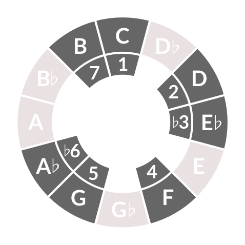
The user has a variety of scales to choose from, ranging from the familiar to the exotic. However, these scales all have impenetrable names. How are music theory novices supposed to make sense of names like harmonic minor or Lydian mode? How would they know to choose one scale or another? We debated the least off-putting way of presenting these choices: should we represent them graphically? Associate each one with a well-known piece of music? Or just list them alphabetically? I proposed a system of graphical icons showing the notes comprising each scale. While novices will find them no more intelligible than the names, the hope is that they would be sufficiently visually appealing to invite users to explore them by ear.

aQW scale picker interactive wireframe

Conversations with June helped me understand that there are some broader and more profound user experience problems to solve before users ever get to the scale picker. What is the experience of simply landing on the app for the first time? How do people know what to do? From this conversation came the germ of a new idea, a landing page offering a tutorial or introduction. We want users to have a feeling of discovery, a musical “aha moment”, the chance to be a musical insider. The best way to do that seemed to be to give users a playlist of preset songs to jam with.

User characteristics and personas

There are three major user groups for the aQWERTYon, who I will describe as students, teachers, and explorers.

Students and teachers

Students use the aQW in a guided and structured setting: a classroom, a private lesson, or an online tutorial. There are several distinct user personas: elementary, middle and high school students, both mainstream and with special needs; college students; and online learners, mostly adults. Each student persona has its corresponding teacher persona. For example, I use the aQW with my music technology students at Montclair State University and NYU, and with some private students.

The aQW’s biggest fan is MusEDLab partner Matt McLean, who teaches at the Little Red Schoolhouse and runs a nonprofit organization called the Young Composers and Improvisors Workshop. Matt uses the aQW to teach composition in both settings, in person and online. He has documented his students’ use of the aQW extensively. Some examples:

Explorers

I use the term explorers to describe people who use the aQW without any outside guidance. Explorers do not fit into specific demographic groups, but they center around two broad, overlapping personas: bedroom producers and music theory autodidacts. Explorers may find the aQW via a link, a social media posting, or a Google search. We know little about these users beyond what is captured by Google Analytics. However, we can make some assumptions based on our known referral sources. For example, this blog is a significant driver of traffic to the aQW. I have numerous posts on music theory and composition that link to the aQW so that readers can explore the concepts for themselves. My blog readership includes other music educators and some professional musicians, but the majority are amateur musicians and very enthusiastic listeners. These are exactly the users we are trying to serve: people who want to learn about music independently, either for creative purposes or to simply satisfy curiosity.

While I am a music educator, I have spent most of my life as a self-taught bedroom producer, so I identify naturally with the explorers. I have created several original pieces of music with the aQW, both for user testing purposes and to show its creative potential. While I have an extensive music theory background, I am a rudimentary keyboard player at best. This has limited my electronic music creation to drawing in the MIDI piano roll with the mouse pointer, since I can not perform my ideas on a piano-style controller. The aQW suits my needs perfectly, since I can set it to any scale I want and shred fearlessly. Here is an unedited improvisation I performed using a synthesizer instrument I created in Ableton Live:

My hope is that more would-be explorers feel invited to use the aQW for similar creative purposes in their own performance and composition.

Tasks and Scenarios

It is possible to configure the aQWERTYon via URL parameters to set the key and scale, and to hide components of the user interface. When teachers create exercises or assignments, they can link or embed the aQW with its settings locked to keep students from getting lost or confused. However, this does not necessarily invite the user to explore or experiment. Here is an example of an aQW preset to accompany a Beyoncé song. This preset might be used for a variety of pedagogical tasks, including learning some or all of the melody, creating a new countermelody, or improvising a solo. The harmonic major scale is not one that is usually taught, but it a useful way to blend major and minor tonalities. Students might try using more standard scales like major or harmonic minor, and listen for ways that they clash with Beyoncé’s song.

Tasks and scenarios for explorers might include creating a melody, bassline or chords for an original piece of music. For example, a self-taught dance music producer might feel limited by the scales that are easiest to play on a piano-style keyboard (major, natural minor, pentatonics) and be in search of richer and more exotic sounds. This producer might play their track in progress and improvise on top using different scale settings.

One of the users I tested with suggested an alternative explorer use case. He is an enthusiastic amateur composer and arranger, who is trying to arrange choral versions of pop and rock songs. He is a guitarist who has little formal music theory knowledge. He might use the aQW to try out harmonic ideas by ear, write down note names that form pleasing combinations, and then transfer them to the guitar or piano-based MIDI controller.

Understanding the problem

In the age of the computer and the internet, many aspects of music performance, composition and production are easy to self-teach. However, music theory remains an obstacle for many bedroom producers and pop musicians (not to mention schooled musicians!) There are so many chords and scales and rules and technical vocabulary, all of which have to be applied in all twelve keys. To make matters worse, terminology hangs around long after its historical context has disappeared. We no longer know what the Greek modes sound like, but we use their names to describe modern scales. C-sharp and D-flat were different pitches in historical tuning systems, but now both names describe the same pitch. The harmonic and melodic minor scales are named after a stylistic rule for writing melodies that was abandoned hundreds of years ago. And so on.

Most existing theory resources draw on the Western classical tradition, using examples and conventions from a repertoire most contemporary musicians and listeners find unfamiliar. Furthermore, these resources presume the ability to read standard music notation. Web resources that do address popular music are usually confusing and riddled with errors. I have worked with Soundfly to fill this vacuum by creating high-quality online courses aimed at popular musicians. Even with the best teaching resources, though, theory remains daunting. Exploring different chords and scales on an instrument requires significant technical mastery, and many musicians give up before ever reaching that point.

The aQW is intended to ease music theory learning by making scales and chords easy to discover even by complete novices. Our expectation is that after explorers are able to try theory ideas out in a low-pressure and creative setting, they will be motivated to put them to work playing instruments, composing or producing. Alternatively, users can simply perform and compose directly with the aQW itself.

Social and technical context

Most computer-based melody input systems are modeled on the piano. This is most obvious for hardware, since nearly all MIDI controllers take the form of literal piano keyboards. It is also true for software, which takes the piano keyboard as the primary visualization scheme for pitch. For example, the MIDI editor in every DAW displays pitches on a “piano roll”.

Some DAWs include a “musical typing” feature that maps the piano layout to the QWERTY keyboard, as an expediency for users who either lack MIDI hardware controllers, or who do not have them on hand. Apple’s GarageBand uses the ASDFG row of the keyboard for the white keys and the QWERTY row for the black keys. They use the other rows for such useful controls as pitch bend, modulation, sustain, octave shifting and simple velocity control.

GarageBand musical typing

Useful and expedient though it is, Musical Typing has some grave shortcomings as a user interface. It presumes familiarity with the piano keyboard, but is not very playable for users do who possess that familiarity. The piano layout makes a poor fit for the grid of computer keys. For example, there is no black key on the piano between the notes E and F, but the QWERTY keyboard gives no visual reminder of that fact, so it is necessary to just remember it. Unfortunately, the “missing” black key between E and F happens to be the letter R, which is GarageBand’s keyboard shortcut for recording. While hunting for E-flat or F-sharp, users are prone to accidentally start recording over their work. I have been using GarageBand for seven years and still do this routinely.

Ableton’s Push controller represents an interesting break with MIDI controller orthodoxy. It is a grid of 64 touch pads surrounded by various buttons, knobs and sliders.

Ableton Push

The pads were designed to trigger samples and loops like a typical drum machine, but Ableton also includes a melody mode for the Push. By default, it maps notes to the grid in rows staggered by fourths, which makes the layout identical to the bottom four strings of the guitar. This is quite a gift for guitarists like me, since I can use my familiar chord and scale fingerings, rather than hunting and pecking for them on the piano. Furthermore, the Push can be set so that the pads play only the notes within a particular scale, giving a “no wrong notes” experience similar to the aQWERTYon. Delightful though this mode is, however, it is imperfect. Root notes of the scale are colored blue, and other notes are colored white. While this makes the roots easy to distinguish, it is not so easy to visually differentiate the other pitches.

Touchscreen devices like the iPhone and iPad open up additional new possibilities for melodic interfaces. Many mobile apps continue to use the piano keyboard for note input, but some take advantage of the touchscreen’s unique affordances. One such is Thumbjam, which enables the user to divide the screen into slices of arbitrary thickness that can map to any arbitrary combination of notes.

Thumbjam

The app offers hundreds of preset scales to choose from. The user may have a small range of notes, each of which is large and easy to distinguish, or a huge range of notes, each of which occupies a narrow strip of screen area. Furthermore, the screen can be split to hold four different scales, played from four different instruments. While all of this configurability is liberating, it is also overwhelming. Also, the scales are one-dimensional lines; there is no easy way to play chords and arpeggios.

Evaluation criteria

Is the aQW’s potential obvious enough to draw in explorers and educators? Will it be adopted as a tool for self-teaching? Does it invite playful exploration and experimentation? Is it satisfying for real-world musical usage? Is the UI self-explanatory, or at least discoverable? Is the music theory content discoverable? Have we identified the right user persona(s)? Is the aQW really a tool for beginners? Or is it an intermediate music theory learning tool? Or an advanced composition tool? Is the approach of a “playlist” of example songs the right one? Which songs, artists and genres should we include on the landing page? How many presets should we include? Should we limit it to a few, or should we offer a large, searchable database? And how do we deal with the fact that many songs require multiple scales to play?

Proposed solution

I tested several interactive wireframes of this landing page concept. Click the image to try it yourself:

aQWERTYon landing page interactive wireframe

The first wireframe had nine preset songs. I wanted to offer reasonable musical diversity without overwhelming the user. The tenth slot linked to the “classic” aQW, where users are free to select their own video, scale, root, and so on. I chose songs that appealed to me (and presumably other adult explorers), along with some current pop songs familiar to younger users. I wanted to balance the choices by race, gender, era, and genre. I was also bound by a musical constraint: all songs need to be playable using a single scale in a single key. The initial preset list was:

  • Adele – “Send My Love (To Your New Lover)”
  • Mary J Blige – “Family Affair”
  • Miles Davis – “Sssh/Peaceful”
  • Missy Elliott – “Get Ur Freak On”
  • Björk – “All Is Full Of Love”
  • Michael Jackson – “Don’t Stop ’Til You Get Enough”
  • Katy Perry – “Teenage Dream”
  • AC/DC – “Back In Black”
  • Daft Punk – “Get Lucky”

After a few test sessions, it became apparent that no one was clicking Mary J Blige. Also, the list did not include any current hip-hop. I therefore replaced her with Chance The Rapper. I initially offered a few sentences of instruction, but feedback from my MusEDLab colleagues encouraged me to reduce the prompt down to just a few words: “Pick a song, type, jam.”

Further testing showed that while adults are willing to try out any song, familiar or not, children and teens are much choosier. Therefore, I added two more presets, “Hotline Bling” by Drake and “Formation” by Beyoncé. The latter song proved problematic, however, because its instrumental backing is so sparse and minimal that it is difficult to hear how other notes might fit into it. I ultimately swapped it for “Single Ladies.” I had rejected this song initially, because it uses the idiosyncratic harmonic major scale. However, I came to see this quirk as a positive bonus–since one of our goals is to encourage users to explore new sounds and concepts, a well-known and well-loved song using an unusual scale is a rare gift.

User testing protocol

I used a think-aloud protocol, asking testers to narrate their thought processes as they explored the app. I recorded the one-on-one sessions using Screenflow. When testing with groups of kids, this was impractical, so instead I took notes during and after each session. For each user, I opened the interactive wireframe, and told them, “This is a web based application for playing music with your computer keyboard. I’m going to ask you to tell me what you see on the screen, what you think it does, and what you think will happen when you click things.” I did not offer any other explanation or context, because I wanted to see whether the landing page was self-explanatory and discoverable. I conducted informal interviews with users during and after the sessions as well.

User testing results

I tested with ten adults and around forty kids. The adults ranged in age from early twenties to fifties. All were musicians, at varying levels of ability and training, mostly enthusiastic amateurs. Sessions lasted for twenty or thirty minutes. There were two groups of kids: a small group of eighth graders at the Little Red Schoolhouse, and a large group of fourth graders from PS 3 who were visiting NYU. These testing sessions were shorter, ten to fifteen minutes each.

User testing the aQWERTYon with fourth graders

Discovering melodies

It is possible to play the aQW by clicking the notes onscreen using the mouse, though this method is slow and difficult. Nevertheless, a number of the younger testers did this, even after I suggested that it would be easier on the keyboard.

An adult tester with some keyboard and guitar experience told me, “This is great, it’s making me play patterns that I normally don’t play.” He was playing on top of the Miles Davis track, and he was quickly able to figure out a few riffs from Miles’ trumpet solo.

Discovering chords

Several testers systematically identified chords by playing alternating notes within a row, while others discovered them by holding down random groups of keys. None of the testers discovered that they could easily play chords using columns of keys until I prompted them to do so. One even asked, “Is there a relationship between keys if I play them vertically? I don’t know enough about music to know that.” After I suggested he try the columns, he said, “If I didn’t know [by ear] how chords worked, I’d miss the beauty of this.” He compared the aQW to GarageBand’s musical typing: “This is not that. This is a whole new thing. This is chord oriented. As a guitarist, I appreciate that.” The message is clear: we need to make the chords more obvious, or more actively assist users in finding them.

Other theory issues

For the most part, testers were content to play the scales they were given, though some of the more expert musicians changed the scales before even listening to the presets. However, not everyone realized that the presets were set to match the song. A few asked me: “How do I know what key this song is in?” We could probably state explicitly that the presets line up automatically.

In general, adult testers found the value of the aQW as a theory learning tool to be immediately apparent. One told me: “If I had this when I was a kid, I would have studied music a lot. I used to hate music theory. I learned a lot of stuff, but the learning process was awful… Your kids’ generation will learn music like this (snaps fingers).”

Sounds

The aQW comes with a large collection of SoundFonts, and users of all ages enjoyed auditioning them, sometimes for long periods of time. Sometimes they apologized for how fascinating they found the sounds to be. But it is remarkable to have access to so many instrument timbres so effortlessly. Computers turn us all into potential orchestrators, arrangers, and sound designers.

Screen layout

The more design-oriented testers appreciated the sparseness and minimalism of the graphics, finding them calming and easy to understand.

Several testers complained that the video window takes up too much screen real estate, and is placed too prominently. Two commented that videos showing live performers, like “Back In Back,” were valuable because that helped with timekeeping and inspiration. Otherwise, however, testers found the videos to either be of little value or actively distracting. One suggested having the videos hidden or minimized by default, with the option to click to expand them. Others requested that the video be below the keyboard and other crucial controls. Also, the eighth graders reported that some of the video content was distracting because of its content, for example the partying shown in “Teenage Dream.” Unsuitable content will be an ongoing issue using many of the pop songs that kids like.

Technical browser issues

Having the aQWERTYon run in the browser has significant benefits, but a few limitations as well. Because the URL updates every time the parameters change, clicking the browser’s Back button does not produce the expected behavior–it might take ten or fifteen clicks to actually return to a previous page. I changed the links in later versions so each one opens the aQW in a new tab so the landing page would always be available. However, web audio is very memory-intensive, and the aQW will function slowly or not at all if it is open in more than one tab simultaneously.

Song choices

The best mix of presets is always going to depend on the specific demographics of any given group of users. However, the assortment I arrived at was satisfying enough for the groups I tested with. Miles Davis and Björk do not have the wide appeal of Daft Punk or Michael Jackson, but their presence was very gratifying for the more hipster-ish testers. I was extremely impressed that an eighth grader selected the Miles song, though this kid turns out to be the son of a Very Famous Musician and is not typical.

Recording functionality

Testers repeatedly requested the ability to record their playing. The aQW did start out with a very primitive recording feature, but it will require some development to make it usable. The question is always, how much functionality is enough? Should users be able to overdub? If so, how many tracks? Is simple recording enough, or would users need to able to mix, edit, and select takes?

One reason that recording has been a low development priority is that users can easily record their performances via MIDI into any DAW or notation program. The aQW behaves as if it were a standard MIDI controller plugged into the computer. With so many excellent DAWs in the world, it seems less urgent for us to replicate their functionality. However, there is one major limitation of recording this way: it captures the notes being played, but not the sounds. Instead, the DAW plays back the MIDI using whatever software instruments it has available. Users who are attached to a specific SoundFont cannot record them unless they use a workaround like Soundflower. This issue will require more discussion and design work.

New conjectures and future work

One of my most significant user testers for the landing page wireframe was Kevin Irlen, the MusEDLab’s chief software architect and main developer of the aQW itself. He found the landing page concept sufficiently inspiring that he created a more sophisticated version of it, the app sequencer:

aQWERTYon app sequencer v1

We can add presets to the app sequencer using a simple web form, which is a significant improvement over the tedious process of creating my wireframes by hand. The sequencer pulls images automatically from YouTube, another major labor-saver. Kevin also added a comment field, which gives additional opportunity to give prompts and instructions. Each sequencer preset generates a unique URL, making it possible to generate any number of different landing pages. We will be able to create custom landing pages focusing on different artists, genres or themes.

Songs beyond the presets

Testing with the fourth graders showed that we will need to design a better system for users who want to play over songs that we do not include among the presets. That tutorial needs to instruct users how to locate YouTube URLs, and more dauntingly, how to identify keys and scales. I propose an overlay or popup:

Keyfinding

Testing with fourth graders also showed that helping novice users with keyfinding may not be as challenging as I had feared. The aQW defaults to the D minor pentatonic scale, and that scale turns out to fit fairly well over most current pop songs. If it doesn’t, some other minor pentatonic scale is very likely to work. This is due to a music-theoretical quirk of the pentatonic scale: it happens to share pitches with many other commonly-used scales and chords. As long as the root is somewhere within the key, the minor pentatonic will sound fine. For example, in C major:

  • C minor pentatonic sounds like C blues
  • D minor pentatonic sounds like Csus4
  • E minor pentatonic sounds like Cmaj7
  • F minor pentatonic sounds like C natural minor
  • G minor pentatonic sounds like C7sus4
  • A minor pentatonic is the same as C major pentatonic
  • B minor pentatonic sounds like C Lydian mode


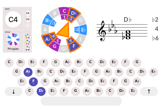
We are planning to revamp the root picker to show both a larger piano keyboard and a pitch wheel. We also plan to add more dynamic visualization options for notes as they are played, including a staff notation view, the chromatic circle, and the circle of fifths. The aQW leaves several keys on the keyboard unused, and we could use them for additional controls. For example, we might use the Control key to make note velocities louder, and Option to make them quieter. The arrow keys might be used to cycle through the scale menu and to shift the root.

Built-in theory pedagogy

There is a great deal of opportunity to build more theory pedagogy on top of the aQW, and to include more of it within the app itself. We might encourage chord playing by automatically showing chord labels at the top of each column. We might include popups or links next to each scale giving some explanation of why they sound the way they do, and to give some suggested musical uses. One user proposes a game mode for more advanced users, where the scale is set to chromatic and players must identify the “wrong” or outside notes. Another proposes a mode similar to Hooktheory, where users could sequence chord progressions to play on top of.

Rhythmic assistance

A few testers requested some kind of help or guidance with timekeeping. One suggested a graphical score in the style of Guitar Hero, or a “follow the bouncing ball” rhythm visualization. Another pointed out that an obvious solution would be to incorporate the Groove Pizza, perhaps in miniature form in a corner of the screen. Synchronizing all of this to YouTube videos would need to be done by hand, so far as I know, but perhaps an automated solution exists. Beat detection is certainly an easier MIR challenge than key or chord detection. If we were able to automatically sync to the tempo of a song, we could add the DJ functionality requested by one tester, letting users add cue points, loop certain sections, and slow them down.

Odds and ends

One eighth grader suggested that we make aQW accounts with “musical passwords.”

An adult tester referred to the landing page as the “Choose Your Own Adventure screen.” The idea of musical adventure is exactly the feeling I was hoping for.

In addition to notes on the staff, one tester requested a spectrum visualizer. This is perhaps an esoteric request, but real-time spectrograms are quite intuitive and might be useful.

Finally, one tester made a comment that was striking in its broader implications for music education: “I’m not very musical, I don’t really play an instrument, so these kinds of tricks are helpful for me. It didn’t take me long to figure out how the notes are arranged.” This person is a highly expert producer, beatmaker and live performer using Ableton Live. I asked how he came to this expertise, and he said he felt compelled to learn it to compensate for his lack of “musicianship”. It makes me sad that such a sophisticated musician does not realize that his skills “count”. In empowering music learners with the aQW, I also hope we are able to help computer musicians value themselves.

Visualizing trap beats with the Groove Pizza

In a previous post, I used the Groove Pizza to visualize some classic hip-hop beats. But the kids are all about trap beats right now, which work differently from the funk-based boom-bap of my era.

IT'S A TRAP

From the dawn of jazz until about 1960, African-American popular music was based on an eighth note pulse. The advent of funk brought with it a shift to the sixteenth note pulse. Now we’re undergoing another shift, as Southern hip-hop is moving the rest of popular music over to a 32nd note pulse. The tempos have been slowing down as the beat subdivisions get finer. This may all seem like meaningless abstraction, but the consequences become real if you want to program beats of your own.

Back in the 90s, the template for a hip-hop beat looked like a planet of 16th notes orbited by kicks and snares. Click the image below to hear a simple “planet funk” pattern in the Groove Pizza. Each slice of the pizza is a sixteenth note, and the whole pizza is one bar long.

Planet Funk - 16th notes

(Music readers can also view it in Noteflight.)

You can hear the sixteenth note hi-hat pulse clearly in “So Fresh So Clean” by OutKast.

So Fresh So Clean

View in Noteflight

Trap beats have the same basic skeleton as older hip-hop styles: a kick on beat one, snares on beats two and four, and hi-hats on some or all of the beats making up the underlying pulse. However, in trap, that pulse is twice as fast as in 90s hip-hop, 32nd notes rather than sixteenths. This poses an immediate practical problem: a lot of drum machines don’t support such a fine grid resolution. For example, the interface of the ubiquitous TR-808 is sixteen buttons, one for each sixteenth note. On the computer, it’s less of an issue because you can set the grid resolution to be whatever you want, but even so, 32nd notes are a hassle. So what do you do?

The trap producer’s workaround is to double the song tempo, thereby turning sixteenths into effective 32nds. To get a trap beat at 70 beats per minute, you set the tempo to 140. Your 808 grid becomes half a bar of 32nd notes, rather than a full bar of sixteenths. And instead of putting your snares on beats two and four, you put them on beat three.

Here’s a generic trap beat I made. Each pizza slice is a 32nd note, and the whole pizza is half a bar.

View in Noteflight

Trap beats don’t use swing. Instead, they create rhythmic interest through syncopation, accenting unexpected weak beats. On the Groove Pizza, the weak beats are the ones in between the north, south, east and west. Afro-Cuban music is a good source of syncopated patterns. The snare pattern in the last quarter of my beat is a rotation of son clave, and the kick pattern is somewhat clave-like as well.

It's A Trap - last bar

Now let’s take a look at two real-life trap beats. First, there’s the inescapable “Trap Queen” by Fetty Wap.

Here’s a simplified version of the beat. (“Trap Queen” uses a few 64th notes on the hi-hat, which you can’t yet do on the Groove Pizza.)

Trap Queen simplified

View in Noteflight

The beat has an appealing symmetry. In each half bar, both the kick and snare each play a strong beat and a weak beat. The hi-hat pattern is mostly sixteenth notes, with just a few thirty-second notes as embellishments. The location of those embellishments changes from one half-bar to the next. It’s a simple technique, and it’s effective.

My other real-world example is “Panda” by Desiigner.

Here’s the beat on the GP, once again simplified a bit.

View in Noteflight

Unlike my generic trap beat, “Panda” doesn’t have any hi-hats on the 32nd notes at all. It feels more like an old-school sixteenth note pulse at a very slow tempo. The really “trappy” part comes at the very end, with a quick pair of kick drums on the last two 32nd notes. While the lawn-sprinkler effect of doubletime hi-hats has become a cliche, doubletime kick rolls are still startlingly fresh (at least to my ears.)

To make authentic trap beats, you’ll need a more full-featured tool than the Groove Pizza. For one thing, you need 64th notes and triplets. Also, trap isn’t just about the placement of the drum hits, it’s about specific sounds. In addition to closed hi-hats, you  need open hi-hats and crash cymbals. You want more than one snare or handclap, and maybe multiple kicks too. And you’d want to be able to alter the pitch of your drums too. The best resource to learn more, as always, is the music itself.