Affordances and Constraints

Note-taking for User Experience Design with June Ahn

Don Norman discusses affordances and constraints in The Design of Everyday Things, Chapter Four: Knowing What To Do.

Don Norman - The Design of Everyday Things

User experience design is easy in situations where there’s only one thing that the user can possibly do. But as the possibilities multiply, so do the challenges. We can deal with new things using information from our prior experiences, or by being instructed. The best-designed things include the instructions for their own use, like video games whose first level act as tutorials, or doors with handles that communicate how you should operate them by their shape and placement.

We use affordances and constraints to learn how things work. Affordances suggest the range of possibilities, and constraints limit the alternatives. Constraints include:

  • Physical limitations. Door keys can only be inserted into keyholes vertically, but you can still insert the key upside down. Car keys work in both orientations.
  • Semantic constraints. We know that red lights mean stop and green lights mean go, so we infer that a red light means a device is off or inoperative, and a green light means it’s on or ready to function. We have a slow cooker that uses lights in the opposite way and it screws me up every time.
  • Cultural constraints. Otherwise known as conventions. (Not sure how these are different from semantic constraints.) Somehow we all know without being told that we’re supposed to face forward in the elevator. Google Glass was an epic failure because its early adopters ran into the cultural constraint of people not liking to be photographed without consent.
  • Logical constraints. The arrangement of knobs controlling your stove burners should match the arrangement of the burners themselves.

The absence of constraints makes things confusing. Norman gives examples of how much designers love rows of identical switches which give no clues as to their function. Distinguishing the switches by shape, size, or grouping might not look as elegant, but would make it easier to remember which one does what thing.

Helpful designs use visibility (making the relevant parts visible) and feedback (giving actions an immediate and obvious effect.) Everyone hates the power buttons on iMacs because they’re hidden on the back, flush with the case. Feedback is an important way to help us distinguish the functional parts from the decorative ones. Propellerheads Reason is an annoying program because its skeuomorphic design puts as many decorative elements on the screen as functional ones. Ableton Live is easier to use because everything on the screen is functional.

When you can’t make things visible, you can give feedback via sound. Pressing a Mac’s power button doesn’t immediately cause the screen to light up, but that’s okay, because it plays the famous startup sound. Norman’s examples of low-tech sound feedback include the “zzz” sound of a functioning zipper, a tea kettle’s whistle, and the various sounds that machines make when they have mechanical problems. The problem with sound as feedback is that it can be intrusive and annoying.

The term “affordance” is the source for a lot of confusion. Norman tries to clarify it in his article “Affordance, Conventions and Design.” He makes a distinction between real and perceived affordances. Anything that appears on a computer screen is a perceived affordance. The real affordances of a computer are its physical components: the screen itself, the keyboard, the trackpad. The MusEDLab was motivated to create the aQWERTYon by considering the computer’s real affordances for music making. Most software design ignores the real affordances and only considers the perceived ones.

Designers of graphical user interfaces rely entirely on conceptual models and cultural conventions. (Consider how many programs use a graphic of a floppy disk as a Save icon, and now compare to the last time you saw an actual floppy disk.) For Norman, graphics are perceived affordances by definition.

Joanna McGrenere and Wayne Ho try to nail the concept down harder in “Affordances: Clarifying and Evolving a Concept.” The term was coined by the perceptual psychologist James J. Gibson in his book The Ecological Approach to Visual Perception. For Gibson, affordances exist independent of the actor’s ability to perceive them, and don’t depend on the actor’s experiences and culture. For Norman, affordances can include both perceived and actual properties, which to me makes more sense. If you can’t figure out that an affordance exists, then what does it matter if it exists or not?

Norman collapses two distinct aspects of design: an object’s utility of an object and the way that users learn or discover that utility. But are designing affordances and designing the information about the affordances the same thing? McGrenere and Ho say no, that it’s the difference between usefulness versus usability. They complain that the HCI community has focused on usability at the expense of usefulness. Norman says that a scrollbar is a learned convention, not a real affordance. McGrenere and Ho disagree, because the scrollbar affords scrolling in a way that’s built into the software, making it every bit as much a real affordance as if it were a physical thing. The learned convention is the visual representation of the scrollbar, not the basic fact of it.

The best reason to distinguish affordances from their communication or representation is that sometimes the communication gets in the way of the affordance itself. For example, novice software users need graphical user interfaces, while advanced users prefer text commands and keyboard shortcuts. A beginner needs to see all the available commands, while a pro prefers to keep the screen free of unnecessary clutter. Ableton Live is a notoriously beginner-unfriendly program because it prioritizes visual economy and minimalism over user handholding. A number of basic functions are either invisible or so tiny as to be effectively invisible. Apple’s GarageBand welcomes beginners with photorealistic depictions of everything, but its lack of keyboard shortcuts makes it feel like wearing oven mitts for expert users. For McGrenere and Ho, the same feature of one of these programs can be an affordance or anti-affordance depending on the user.

Design for Real Life – QWERTYBeats research

Writing assignment for Design For The Real World with Claire Kearney-Volpe and Diana Castro – research about a new rhythm interface for blind and low-vision novice musicians

Definition

I propose a new web-based accessible rhythm instrument called QWERTYBeats.Traditional instruments are highly accessible to blind and low-vision musicians. Electronic music production tools are not. I look at the history of accessible instruments and software interfaces, give an overview of current electronic music hardware and software, and discuss the design considerations underlying my project.
QWERTYBeats logo

Historical overview

Acoustic instruments give rich auditory and haptic feedback, and pose little obstacle to blind musicians. We need look no further for proof than the long history of iconic blind musicians like Ray Charles and Stevie Wonder. Even sighted instrumentalists rarely look at their instruments once they have attained a sufficient level of proficiency. Music notation is not accessible, but Braille notation has existed since the language’s inception. Also, a great many musicians both blind and sighted play entirely by ear anyway.

Most of the academic literature around accessibility issues in music education focuses on wider adoption of and support for Braille notation. See, for example, Rush, T. W. (2015). Incorporating Assistive Technology for Students with Visual Impairments into the Music Classroom. Music Educators Journal, 102(2), 78–83. For electronic music, notation is rarely if ever a factor.

Electronic instruments pose some new accessibility challenges. They may use graphical interfaces with nested menus, complex banks of knobs and patch cables, and other visual control surfaces. Feedback may be given entirely with LED lights and small text labels. Nevertheless, blind users can master these devices with sufficient practice, memorization and assistance. For example, Stevie Wonder has incorporated synthesizers and drum machines in most of his best-known recordings.

Most electronic music creation is currently done not with instruments, but rather using specialized software applications called digital audio workstations (DAWs). Keyboards and other controllers are mostly used to access features of the software, rather than as standalone instruments. The most commonly-used DAWs include Avid Pro Tools, Apple Logic, Ableton Live, and Steinberg Cubase. Mobile DAWs are more limited than their desktop counterparts, but are nevertheless becoming robust music creation tools in their own right. Examples include Apple GarageBand and Steinberg Cubasis. Notated music is commonly composed using score editing software like Sibelius and Finale, whose functionality increasingly overlaps with DAWs, especially in regard to MIDI sequencing.

DAWs and notation editors pose steep accessibility challenges due to their graphical and spatial interfaces, not to mention their sheer complexity. In class, we were given a presentation by Leona Godin, a blind musician who records and edits audio using Pro Tools by means of VoiceOver. While it must have taken a heroic effort on her part to learn the program, Leona demonstrates that it is possible. However, some DAWs pose insurmountable problems even to very determined blind users because they do not use standard operating system elements, making them inaccessible via screen readers.

Technological interventions

There are no mass-market electronic interfaces specifically geared toward blind or low-vision users. In this section, I discuss one product frequently hailed for its “accessibility” in the colloquial rather than blindess-specific sense, along with some more experimental and academic designs.

Ableton Push

Push layout for IMPACT Faculty Showcase

Ableton Live has become the DAW of choice for electronic music producers. Low-vision users can zoom in to the interface and modify the color scheme. However, Live is inaccessible via screen readers.

In recent years, Ableton has introduced a hardware controller, the Push, which is designed to make the software experience more tactile and instrument-like. The Push combines an eight by eight grid of LED-lit touch pads with banks of knobs, buttons and touch strips. It makes it possible to create, perform and record a piece of music from scratch without looking at the computer screen. In addition to drum programming and sampler performance, the Push also has an innovative melodic mode which maps scales onto the grid in such a way that users can not play a wrong note. Other comparable products exist; see, for example, the Native Instruments Maschine.

There are many pad-based drum machines and samplers. Live’s main differentiator is its Session view, where the pads launch clips: segments of audio or MIDI that can vary in length from a single drum hit to the length of an entire song. Clip launching is tempo-synced, so when you trigger a clip, playback is delayed until the start of the next measure (or whatever the quantization interval is.) Clip launching is a forgiving and beginner-friendly performance method, because it removes the possibility of playing something out of rhythm. Like other DAWs, Live also gives rhythmic scaffolding in its software instruments by means of arpeggiators, delay and other tempo-synced features.

The Push is a remarkable interface, but it has some shortcomings for blind users. First of all, it is expensive, $800 for the entry-level version and $1400 for the full-featured software suite. Much of its feedback is visual, in the form of LED screens and color-coded lighting on the pads. It switches between multiple modes which can be challenging to distinguish even for sighted users. And, like the software it accompanies, the Push is highly complex, with a steep learning curve unsuited to novice users, blind or sighted.

The aQWERTYon

Most DAWs enable users to perform MIDI instruments on the QWERTY keyboard. The most familiar example is the Musical Typing feature in Apple GarageBand.
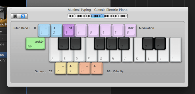
GarageBand musical typing

Musical Typing makes it possible to play software instruments without an external MIDI controller, which is convenient and useful. However, its layout counterintuively follows the piano keyboard, which is an awkward fit for the computer keyboard. There is no easy way to distinguish the black and white keys, and even expert users find themselves inadvertantly hitting the keyboard shortcut for recording while hunting for F-sharp.

The aQWERTYon is a web interface developed by the NYU Music Experience Design Lab specifically intended to address the shortcomings of Musical Typing.

aQWERTYon screencap

Rather than emulating the piano keyboard, the aQWERTYon draws its inspiration from the chord buttons of an accordion. It fills the entire keyboard with harmonically related notes in a way that supports discovery by naive users. Specifically, it maps scales across the rows of keys, staggered by intervals such that each column forms a chord within the scale. Root notes and scales can be set from pulldown menus within the interface, or preset using URL parameters. It can be played as a standalone instrument, or as a MIDI controller in conjunction with a DAW. Here is a playlist of music I created using the aQWERTYon and GarageBand or Ableton Live:

The aQWERTYon is a completely tactile experience. Sighted users can carefully match keys to note names using the screen, but more typically approach the instrument by feel, seeking out patterns on the keyboard by ear. A blind user would need assistance loading the aQWERTYon initially and setting the scale and root note parameters, but otherwise, it is perfectly accessible. The present project was motivated in large part by a desire to make exploration of rhythm as playful and intuitive as the aQWERTYon makes exploring chords and scales.

Soundplant

The QWERTY keyboard can be turned into a simple drum machine quite easily using a free program called Soundplant. The user simply drags audio files onto a graphical key to have it triggered by that physical key. I was able to create a TR-808 kit in a matter of minutes:

Soundplant with 808 samples

After it is set up and configured, Soundplant can be as effortlessly accessible as the aQWERTYon. However, it does not give the user any rhythmic assistance. Drumming in perfect time is an advanced musical skill, and playing drum machine samples out of time is not much more satisfying than banging on a metal bowl with a spoon out of time. An ideal drum interface would offer beginners some of the rhythmic scaffolding and support that Ableton provides via Session view, arpeggiators, and the like.

The Groove Pizza

Drum machines and their software counterparts offer an alternative form of rhythmic scaffolding. The user sequences patterns in a time-unit box system or piano roll, and the computer performs those patterns flawlessly. The MusEDLab‘s Groove Pizza app is a web-based drum sequencer that wraps the time-unit box system into a circle.

Groove Pizza - Bembe

The Groove Pizza was designed to make drum programming more intuitive by visualizing the symmetries and patterns inherent in musical-sounding rhythms. However, it is totally unsuitable for blind or low-vision users. Interaction is only possible through the mouse pointer or touch, and there are no standard user interface elements that can be parsed by screen readers.

Before ever considering designing for the blind, the MusEDLab had already considered the Groove Pizza’s limitations for younger children and users with special needs: there is no “live performance” mode, and there is always some delay in feedback between making a change in the drum pattern and hearing the result. We have been considering ways to make a rhythm interface that is more immediate, performance-oriented and tactile. One possible direction would be to create a hardware version of the Groove Pizza; indeed, one of the earliest prototypes was a hardware version built by Adam November out of a pizza box. However, hardware design is vastly more complex and difficult than software, so for the time being, software promises more immediate results.

Haenselmann-Lemelson-Effelsberg MIDI sequencer

This experimental interface is described in Haenselmann, T., Lemelson, H., & Effelsberg, W. (2011). A zero-vision music recording paradigm for visually impaired people. Multimedia Tools and Applications, 5, 1–19.

Haenselmann-Lemelson-Effelsberg MIDI sequencer

The authors create a new mode for a standard MIDI keyboard that maps piano keys to DAW functions like playback, quantization, track selection, and so on. They also add “earcons” (auditory icons) to give sonic feedback when particular functions have been activated that normally only give graphical feedback. For example, one earcon sounds when recording is enabled; another sounds for regular playback. This interface sounds promising, but there are significant obstacles to its adoption. While the authors have released the source code as a free download, that requires a would-be user to be able to compile and run it. This is presuming that they could access the code in the first place; the download link given in the paper is inactive. It is an all-too-common fate of academic projects to never get widespread usage. By posting our projects on the web, the MusEDLab hopes to avoid this outcome.

Statement

Music education philosophy

My project is animated by a constructivist philosophy of music education, which operates by the following axiomatic assumptions:

  • Learning by doing is better than learning by being told.
  • Learning is not something done to you, but rather something done by you.
  • You do not get ideas; you make ideas. You are not a container that gets filled with knowledge and new ideas by the world around you; rather, you actively construct knowledge and ideas out of the materials at hand, building on top of your existing mental structures and models.
  • The most effective learning experiences grow out of the active construction of all types of things, particularly things that are personally or socially meaningful, that you develop through interactions with others, and that support thinking about your own thinking.

If an activity’s challenge level is beyond than your ability, you experience anxiety. If your ability at the activity far exceeds the challenge, the result is boredom. Flow happens when challenge and ability are well-balanced, as seen in this diagram adapted from Csikszentmihalyi.

Flow

Music students face significant obstacles to flow at the left side of the Ability axis. Most instruments require extensive practice before it is possible to make anything that resembles “real” music. Electronic music presents an opportunity here, because even a complete novice can produce music with a high degree of polish quickly. It is empowering to use technologies that make it impossible to do anything wrong; it frees you to begin exploring what you find to sound right. Beginners can be scaffolded in their pitch explorations with MIDI scale filters, Auto-Tune, and the configurable software keyboards in apps like Thumbjam and Animoog. Rhythmic scaffolding is more rare, but it can be had via Ableton’s quantized clip launcher, by MIDI arpeggiators, and using the Note Repeat feature on many drum machines.

QWERTYBeats proposal

My project takes drum machine Note Repeat as its jumping off point. When Note Repeat is activated, holding down a drum pad triggers the corresponding sound at a particular rhythmic interval: quarter notes, eighth notes, and so on. On the Ableton Push, Note Repeat automatically syncs to the global tempo, making it effortless to produce musically satisfying rhythms. However, this mode has a major shortcoming: it applies globally to all of the drum pads. To my knowledge, no drum machine makes it possible to simultaneously have, say, the snare drum playing every dotted eighth note while the hi-hat plays every sixteenth note.

I propose a web application called QWERTYBeats that maps drums to the computer keyboard as follows:

  • Each row of the keyboard triggers a different drum/beatbox sound (e.g. kick, snare, closed hi-hat, open hi-hat).
  • Each column retriggers the sample at a different rhythmic interval (e.g. quarter note, dotted eighth note).
  • Circles dynamically divide into “pie slices” to show rhythmic values.

The rhythm values are shown below by column, with descriptions followed by the time interval as shown as a fraction of the tempo in beats per minute.

  1. quarter note (1)
  2. dotted eighth note (3/4)
  3. quarter note triplet (2/3)
  4. eighth note (1/2)
  5. dotted sixteenth note (3/8)
  6. eighth note triplet (1/3)
  7. sixteenth note (1/4)
  8. dotted thirty-second note (3/16)
  9. sixteenth note triplet (1/6)
  10. thirty-second note (1/8)

By simply holding down different combinations of keys, users can attain complex syncopations and polyrhythms. If the app is synced to the tempo of a DAW or music playback, the user can perform good-sounding rhythms over any song that is personally meaningful to them.

The column layout leaves some unused keys in the upper right corner of the keyboard: “-“, “=”, “[“, “]”, “”, etc. These can be reserved for setting the tempo and other UI elements.

The app defaults to Perform Mode, but clicking Make New Kit opens Sampler mode, where users can import or record their own drum sounds:

  • Keyboard shortcuts enable the user to select a sound, audition it, record, set start and end point, and set its volume level.
  • A login/password system enables users to save kits to the cloud where they can be accessed from any computer. Kits get unique URL identifiers, so users can also share them via email or social media.

It is my goal to make the app accessible to users with the widest possible diversity of abilities.

  • The entire layout will use plain text, CSS and JavaScript to support screen readers.
  • All user interface elements can be accessed via the keyboard: tab to change the keyboard focus, menu selections and parameter changes via the up and down arrows, and so on.

Perform Mode:

QWERTYBeats concept images - Perform mode

Sampler Mode:

sampler-mode

Mobile version

The present thought is to divide up the screen into a grid mirroring the layout of the QWERTY keyboard. User testing will determine whether this will produce a satisfying experience.

QWERTYDrum - mobile

Prototype

I created a prototype of the app using Ableton Live’s Session View.

QWERTYBeats - Ableton prototype

Here is a sample performance:

There is not much literature examining the impact of drum programming and other electronic rhythm sequencing on students’ subsequent ability to play acoustic drums, or to keep time more accurately in general. I can report anecdotally that my own time spent sequencing and programming drums improved my drumming and timekeeping enormously (and mostly inadvertently.) I will continue to seek further support for the hypothesis that electronically assisted rhythm creation builds unassisted rhythmic ability. In the meantime, I am eager to prototype and test QWERTYBeats.

Rohan lays beats

The Ed Sullivan Fellows program is an initiative by the NYU MusEDLab connecting up-and-coming hip-hop musicians to mentors, studio time, and creative and technical guidance. Our session this past Saturday got off to an intense start, talking about the role of young musicians of color in a world of the police brutality and Black Lives Matter. The Fellows are looking to Kendrick Lamar and Chance The Rapper to speak social and emotional truths through music. It’s a brave and difficult job they’ve taken on.

Eventually, we moved from heavy conversation into working on the Fellows’ projects, which this week involved branding and image. I was at kind of a loose end in this context, so I set up the MusEDLab’s Push controller and started playing around with it. Rohan, one of the Fellows, immediately gravitated to it, and understandably so.

Indigo lays beats

Rohan tried out a few drum sounds, then some synths. He quickly discovered a four-bar synth loop that he wanted to build a track around. He didn’t have any Ableton experience, however, so I volunteered to be his co-producer and operate the software for him.

We worked out some drum parts, first with a hi-hat and snare from the Amen break, and then a kick, clap and more hi-hats from Ableton’s C78 factory instrument. For bass, Rohan wanted that classic booming hip-hop sound you hear coming from car stereos in Brooklyn. He spotted the Hip-Hop Sub among the presets. We fiddled with it and he continued to be unsatisfied until I finally just put a brutal compressor on it, and then we got the sound he was hearing in his head.

While we were working, I had my computer connected to a Bluetooth speaker that was causing some weird and annoying system behavior. At one point, iTunes launched itself and started playing a random song under Rohan’s track, “I Can’t Realize You Love Me” by Duke Ellington and His Orchestra, featuring The Harlem Footwarmers and Sid Garry.

Rohan liked the combination of his beat and the Ellington song, so I sampled the opening four bars and added them to the mix. It took me several tries to match the keys, and I still don’t think I really nailed it, but the hip-hop kids have broad tolerance for chord clash, and Rohan was undisturbed.

Once we had the loops assembled, we started figuring out an arrangement. It took me a minute to figure out that when Rohan refers to a “bar,” he means a four-measure phrase. He’s essentially conflating hypermeasures with measures. I posted about it on Twitter later and got some interesting responses.

In a Direct Message, Latinfiddler also pointed out that Latin music calls two measures a “bar” because that’s the length of one cycle of the clave.

Thinking about it further, there’s yet another reason to conflate measures with hypermeasures, which is the broader cut-time shift taking place in hip-hop. All of the young hip-hop beatmakers I’ve observed lately work at half the base tempo of their DAW session. Rohan, being no exception, had the session tempo set to 125 bpm, but programmed a beat with an implied tempo of 62.5 bpm. He and his cohort put their backbeats on beat three, not beats two and four, so they have a base grid of thirty-second notes rather than sixteenth notes. A similar shift took place in the early 1960s when the swung eighth notes of jazz rhythm gave way to the swung sixteenth notes of funk.

Here’s Rohan’s track as of the end of our session:

By the time we were done working, the rest of the Fellows had gathered around and started freestyling. The next step is to record them rapping and singing on top. We also need to find someone to mix it properly. I understand aspects of hip-hop very well, but I mix amateurishly at best.

All the way around, I feel like a learn a ton about music whenever I work with young hip-hop musicians. They approach the placement of sounds in the meter in ways that would never occur to me. I’m delighted to be able to support them technically in realizing their ideas, it’s a privilege for me.

Milo meets Beethoven

For his birthday, Milo got a book called Welcome to the Symphony by Carolyn Sloan. We finally got around to showing it to him recently, and now he’s totally obsessed.

Welcome To The Symphony by Carolyn Sloan

The book has buttons along the side which you can press to hear little audio samples. They include each orchestra instrument playing a short Beethoven riff. All of the string instruments play the same “bum-bum-bum-BUMMM” so you can compare the sounds easily. All the winds play a different little phrase, and the brass another. The book itself is fine and all, but the thing that really hooked Milo is triggering the riffs one after another, Ableton-style, and singing merrily along.

Milo got primed to enjoy this book by two coincidental things. One is that in his preschool, they’ve been listening to Peter and the Wolf a lot, dancing to it, acting it out, etc. They use a YouTube video that shows both the story and the instruments side by side, so Milo has very clear ideas of what the oboe, clarinet, etc all look like and sound like. When he saw them in the orchestra book, he recognized them all immediately.

The other thing is this weird computer animated cartoon called Taratabong, which is about anthropomorphic musical instruments. Milo has been watching it on YouTube a bunch, to the point of wanting me to pretend to be different characters and “talk” to him (which is an entertaining challenge for me–how do you have a conversation as a snare drum?) So Milo also recognizes different instruments in the orchestra book as Taratabong characters.

Milo has now voluntarily watched a YouTube video of the entire first movement of Beethoven’s Fifth conducted by Leonard Bernstein, several times. That’s like nine minutes of classical music, which for a three-year-old is equivalent to nine hours. He sings along to all the riffs he recognized, announces each instrument as he sees it, and tells me about how Leonard Bernstein is Grandfather from Peter and the Wolf. I want to emphasize that we haven’t pushed him into any of this. If you read this blog, you know that I’m an outspoken anti-fan of Beethoven. We just put this stuff under Milo’s nose, and if he hadn’t been interested, we wouldn’t have pushed it.

The classical music tribe expresses continual anguish about how hard it is to draw people into the music. Having inadvertently created a budding Beethoven lover, I have a few insights to offer. Milo got connected to the music through multiple media simultaneously, in multiple settings. He was exposed initially in the context of stories about animals and cartoon characters. That exposure happened in the context of acting and dancing, not passive sitting or being lectured to. And when he did start listening, it was via playback devices that he controls completely: YouTube Kids on the iPad, and the buttons on the book.

Of all these different music experiences, the Ableton-like sample triggering is the one that has most seized Milo’s enthusiasm. Sometimes he wants to read the book and play the sounds when the text indicates. Sometimes he wants to systematically listen through each sound, singing along and acting out the instruments. Sometimes he just jams out, playing the excerpts in different orders and in different rhythms. I suspect he’d be even happier if he could get the sounds to loop. He wants to sing along, but the little phrases are half over before he can even get oriented. If the phrases looped in a musical-sounding way, I bet he would dig in much deeper.

This is not Milo’s first experience triggering sample playback. Before he even turned two, we spent a lot of time playing around with an APC 40.

APC40

Milo adores the lights and colors, and instantly grasped how the volume faders work. In general, though, the APC experience was too complicated for him. It was too easy to make it stop working, to lose the connection between button pushes and the music changing, and to generally get lost in the interface. (I have some of those same problems!) The orchestra book has the advantage of being vastly simpler and more predictable.

There’s a page in the book that shows Beethoven with quill pen, writing the music. (Milo is continually disappointed not to see Beethoven himself in any of the performance videos.) Interestingly, Milo has started using the phrase “writing music” as a synonym for “playing music”, either from an instrument or from iTunes. He seems not to know or care about the distinction between playing back pre-recorded music and creating new music. This conflation of writing and playing music was likely helped by the time Milo has spent with the aQWERTYon, an interface developed by the NYU MusEDLab for performing music on the computer keyboard.

aQWERTYon screencap

Milo isn’t extremely interested in the musical aspect of the aQWERTYon. He calls it “ABCs” and is mostly interested in using it to type his favorite letters. He also enjoys singing the alphabet song while playing semi-randomly along.

The MusEDLab’s work is motivated by the fact that computers make it enormously easier for total novices to participate actively in music. If Beethoven symphonies can be played with as toys, participated in as games, and connected to meaningful stories and activities, then it’s inevitable that kids are going to want to get involved. If I had experienced Beethoven as raw material for my own expression, I’d probably feel quite differently about him.

Inside the aQWERTYon

The MusEDLab and Soundfly just launched Theory For Producers, an interactive music theory course. The centerpiece of the interactive component is a MusEDLab tool called the aQWERTYon. You can try it by clicking the image below.

aQWERTYon screencap

In this post, I’ll talk about why and how we developed the aQWERTYon.

One of our core design principles is to work within our users’ real-world technological limitations. We build tools in the browser so they’ll be platform-independent and accessible anywhere there’s internet access (and where there isn’t internet access, we’ve developed the “MusEDLab in a box.”) We want to find out what musical possibilities there are in a typical computer with no additional software or hardware. That question led us to investigate ways of turning the standard QWERTY keyboard into a beginner-friendly instrument. We were inspired in part by GarageBand’s Musical Typing feature.

GarageBand musical typing

If you don’t have a MIDI controller, Apple thoughtfully made it possible for you to use your computer keyboard to play GarageBand’s many software instruments. You get an octave and a half of piano, plus other useful controls: pitch bend, modulation, sustain, octave shifting and simple velocity control. Many DAWs offer something similar, but Apple’s system is the most sophisticated I’ve seen.

Handy though it is, Musical Typing has some problems as a user interface. The biggest one is the poor fit between the piano keyboard layout and the grid of computer keys. Typing the letter A plays the note C. The rest of that row is the white keys, and the one above it is the black keys. You can play the chromatic scale by alternating A row, Q row, A row, Q row. That basic pattern is easy enough to figure out. However, you quickly get into trouble, because there’s no black key between E and F. The QWERTY keyboard gives no visual reminder of that fact, so you just have to remember it. Unfortunately, the “missing” black key happens to be the letter R, which is GarageBand’s keyboard shortcut for recording. So what inevitably happens is that you’re hunting for E-flat or F-sharp and you accidentally start recording over whatever you were doing. I’ve been using the program for years and still do this routinely.

Rather than recreating the piano keyboard on the computer, we drew on a different metaphor: the accordion.

The accordion: the user interface metaphor of the future!

We wanted to have chords and scales arranged in an easily discoverable way, like the way you can easily figure out the chord buttons on the accordion’s left hand. The QWERTY keyboard is really a staggered grid four keys tall and between ten and thirteen keys wide, plus assorted modifier and function keys. We decided to use the columns for chords and the rows for scales.

For the diatonic scales and modes, the layout is simple. The bottom row gives the notes in the scale starting on 1^. The second row has the same scale shifted over to start on 3^. The third row starts the scale on 5^, and the top row starts on 1^ an octave up. If this sounds confusing when you read it, try playing it, your ears will immediately pick up the pattern. Notes in the same column form the diatonic chords, with their roman numerals conveniently matching the number keys. There are no wrong notes, so even just mashing keys at random will sound at least okay. Typing your name usually sounds pretty cool, and picking out melodies is a piece of cake. Playing diagonal columns, like Z-S-E-4, gives you chords voiced in fourths. The same layout approach works great for any seven-note scale: all of the diatonic modes, plus the modes of harmonic and melodic minor.

Pentatonics work pretty much the same way as seven-note scales, except that the columns stack in fourths rather than fifths. The octatonic and diminished scales lay out easily as well. The real layout challenge lay in one strange but crucial exception: the blues scale. Unlike other scales, you can’t just stagger the blues scale pitches in thirds to get meaningful chords. The melodic and harmonic components of blues are more or less unrelated to each other. Our original idea was to put the blues scale on the bottom row of keys, and then use the others to spell out satisfying chords on top. That made it extremely awkward to play melodies, however, since the keys don’t form an intelligible pattern of intervals. Our compromise was to create two different blues modes: one with the chords, for harmony exploration, and one just repeating the blues scale in octaves for melodic purposes. Maybe a better solution exists, but we haven’t figured it out yet.

When you select a different root, all the pitches in the chords and scales are automatically changed as well. Even if the aQWERTYon had no other features or interactivity, this would still make it an invaluable music theory tool. But root selection raises a bigger question: what do you do about all the real-world music that uses more than one scale or mode? Totally uniform modality is unusual, even in simple pop songs. You can access notes outside the currently selected scale by pressing the shift keys, which transposes the entire keyboard up or down a half step. But what would be really great is if we could get the scale settings to change dynamically. Wouldn’t it be great if you were listening to a jazz tune, and the scale was always set to match whatever chord was going by at that moment? You could blow over complex changes effortlessly. We’ve discussed manually placing markers in YouTube videos that tell the aQWERTYon when to change its settings, but that would be labor-intensive. We’re hoping to discover an algorithmic method for placing markers automatically.

The other big design challenge we face is how to present all the different scale choices in a way that doesn’t overwhelm our core audience of non-expert users. One solution would just be to limit the scale choices. We already do that in the Soundfly course, in effect; when you land on a lesson, the embedded aQWERTYon is preset to the appropriate scale and key, and the user doesn’t even see the menus. But we’d like people to be able to explore the rich sonic diversity of the various scales without confronting them with technical Greek terms like “Lydian dominant”. Right now, the scales are categorized as Major, Minor and Other, but those terms aren’t meaningful to beginners. We’ve been discussing how we could organize the scales by mood or feeling, maybe from “brightest” to “darkest.” But how do you assign a mood to a scale? Do we just do it arbitrarily ourselves? Crowdsource mood tags? Find some objective sorting method that maps onto most listeners’ subjective associations? Some combination of the above? It’s an active area of research for us.

This issue of categorizing scales by mood has relevance for the original use case we imagined for the aQWERTYon: teaching film scoring. The idea behind the integrated video window was that you would load a video clip, set a mode, and then improvise some music that fit the emotional vibe of that clip. The idea of playing along with YouTube videos of songs came later. One could teach more general open-ended composition with the aQWERTYon, and in fact our friend Matt McLean is doing exactly that. But we’re attracted to film scoring as a gateway because it’s a more narrowly defined problem. Instead of just “write some music”, the challenge is “write some music with a particular feeling to it that fits into a scene of a particular length.

Would you like to help us test and improve the aQWERTYon, or to design curricula around it? Would you like to help fund our programmers and designers? Please get in touch.