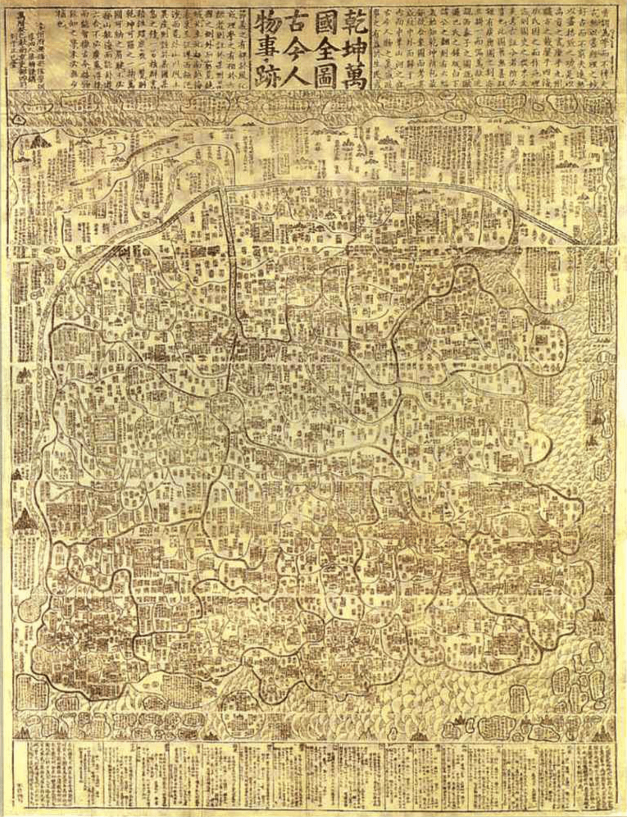
In The Agency of Mapping: Speculation, Critique and Invention, James Corner argues that maps are both analogous and abstract. Their surfaces namely “reflect the actual ground conditions”, while its abstractness refers to “a process of selection, omission, isolation, distance and codification” under the surfaces. When looking at a contemporary world map, I seldom consider mapping as a creative activity, yet when reviewing the history of the plotting of world map, we can learn about the political, cultural landscape and technology development at certain times. In the Qiankun Universal Geographic Map from Ming Dynasty, China was placed on the center, with other known countries designed as small surrounding islands without considering their acutal location and size. It is regarded as a typical traditional Chinese world map which mirrors the Sinocentrism of the ancient people. Such spatial hierarchies and narrow-minded world view may mainly result from a lack of transnational communication and active diplomacy.

Qiankun Universal Geographic Map
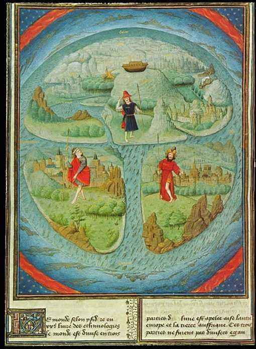
This phenomenon is not singular, but for diverse reasons. Earlier, 7th-century scholar Isidore of Seville created a T-O map where lands are divided into three continents——Europe, Asia, and Africa by T-sized seas with Jerusalem located in the middle, and this entity is encircled by O-sized ocean. The three continents refer to three sons of Noah: Europe for Japheth, Asia for Shem, and Africa for Ham, whose offspring dwell on the corresponding continent. Rather than an actual world map, T-O map served more as a religious symbol that was largely consistent with the description of the world in the Bible and the Christian doctrines. It significantly projects how the church educated the mass to see the world, with an implication that the religious institutions monopolized the transmission of knowledge and made the world map a mean of ruling. Instead of a scientific object, these maps are seen, as Corner claims, “fictional” where artists possess power for construing and constructing worlds.

A typical T-O Map
Entailing processes of observing, collecting, extracting, and depicting, maps are “never neutral, passive, or without consequence”. Not only could others reveal new realities from these existing pictures, plotters themselves intend to unfold phenomena presently invisible. One remarkable example of scientific mapping happened when an outbreak of cholera killed thousands of people in London in 1831. A doctor called John Snow mapped the locations of the victims’ homes and found out the origin of the disease at a certain public water pump. Though Snow failed to convince other contemporaries, his finding greatly wrecked the mainstream miasma theory and was later proved true.
Yet the success of Snow largely shadowed the contribution of his fellow Henry Wentworth Acland, who mapped the city of Oxford for a similar motivation but drew a wrong conclusion that supported the miasma theory. ( Read here: https://blogs.scientificamerican.com/observations/the-topography-of-disease/) Acland’s method is seemingly more rigorous than Snow’s. He not only gathered more samples of victims but also considered multiple potential disease factors including climate, elevation, and point sources of the contamination. However, his research still failed, for all these variations were unable to precisely explain the rise and fall of the number of new cholera cases. This case further suggests that mapping out everything we have observed is never the whole picture. Successful mapping needs both a clear intention and potentials to “drawing out credible and latent relationships that can be seen amongst the various extracts within the site”. It goes beyond simple representation and requires us to pull out different factors in the landscape and figure out those that really determine before we start reorganizing them into a creative picture.
Leave a Reply