In The Agency of Mapping: Speculation, Critique, and Invention, James Corner redefines the purpose and potential of mapping. By quoting Gilles Deleuze and Felix Guattari’s declaration of “make a map not a tracing”, Corner emphasizes mapping as a creative instrument that “construe and construct” our living spaces rather than a passive technique of endless data accumulation. “Mapping is perhaps the most formative and creative act of any design process”, he articulates, “firstly disclosing and then staging the conditions for the emergence of new realities.”
With the rapid development of real-time data and geolocation technology, the interactive mapping technique evolves and starts to shape and represent our living spaces in various forms. Generally, a geospatial platform brings data streams into a sophisticated mapping environment. Then, vendors start to provide big data technology that accesses and ingests high-velocity and high-volume real-time data for mapping and analysis. Unlike static maps, interactive maps have the advantage of several features designed to improve the display of a large amount of complex data. It utilizes the GIS (Global Information System) to show pinpoint data on a map and works in a system of layers (combines different levels of geographical information). The visualization and management of interactive maps give new insights and comparisons in different angles of our living spaces from a “formative and creative” way. Here are two typical cases of how interactive maps shapes our living spaces:
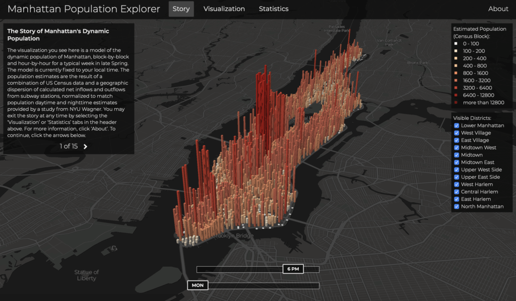
As one of the densest areas in the world, Manhattan has two million residents, and nearly an additional amount of two million people pours into the city during workdays. To show how this population pulses for a day, data visualization designer and researcher Justin Fung created the interactive Manhattan Population Explorer. By utilizing and integrating data from the 2010 census, the MTA’s turnstile database, and a population study from NYU Wagner, Justin drew the block-by-block estimates for Manhattan’s population which were reflected in the map’s depiction of hourly changes throughout the week. The map is constituting of bars that look like skyscrapers that reveal the population of a specific area. The color of the bars indicates the density of the population. The interactive map has another name: the invisible heartbeat of New York City. When users set the buttons of “time” and “days” to a typical moment of a week, the map shows the heartbeat of that period of time. If you drag the time button from midnight to daytime, you will feel the awaken of the city. Designer Fung once said in an interview, “when I look the visualization, I do see an organic, breathing being that is the sum of all of us, a beautiful, humbling thing…”

Please click here to view the whole interactive project.
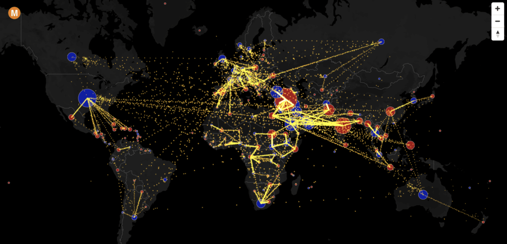
Another interactive map shows the estimated net migration between global countries from 2010 to 2015. NYC-based entrepreneur and data visualization designer Max Galka found that people have lots of conversations about international issues turned to the subject of immigration no matter what the original context might have been (such as topics like terrorism or the refugee crisis). But the debate on immigration was always lacking in factual information. Galka inspired by the predicament and created the interactive map to show the immigration flow and focusing on answering questions like, “how many migrants are there? Where are they coming from? And where are they going?”

Please click here to view the whole interactive project.
(Hover over the circles to see the net migration totals – blue circles have positive net immigration with people coming, and red circles are negative with people leaving. Each yellow dot represents 1,000 people. Clicking on data points will filter migration in or out of a specific country.)
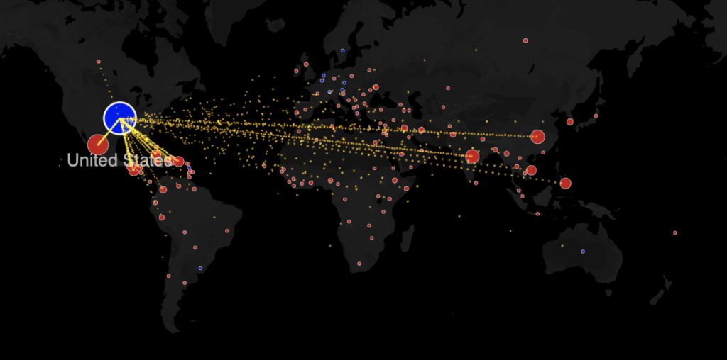
According to the afore-mentioned mapping projects, we could easily demonstrate that interactive maps are powerful tools for the presentation of our living spaces. It should also be stressed that the flexibility of choosing which layers of information to display on an interactive map, further allows for the isolation and examination of individual variables, and intelligently “unfolds new realities out of existing constraints”. For instance, in the Manhattan Population Explorer, we could not only select the “time” of the map but also the “visible district” of it. It allows us to isolate one typical area and make clear examines of its variables. In the Immigration Map, we could also click on certain countries to have a closer glance at the immigration flows of the typical country (see the picture below). In conclusion, the nature and distribution of a problem are made clearer by the use of different map layers and different interactive ways (scroll to zoom, filters, panels, etc.) to give new insights and comparisons. The charm of maps echoes what James Corner describes in his article, “mapping is not only a creative tool to unleash our imagination, but also a means to better understand spaces, cultures, and societies.”

Leave a Reply