Created with Mat Olson
It’s time to have your morning tea and get your daily life balance advice from Zach the Life Influencer.
Try out the full Zack the Life Influencer Adobe Aero experience on your own mobile device [link] (must have Adobe Aero installed).
Written by Mat Olson
Zach the Life Influencer: the Process
Tired all the time? Feeling stressed out, spread thin, unhappy? Maybe what you need are a handful of tips on how to live a better life, all delivered by a cool social media influencer who seems to have no problems in their life at all.
Enter Zach.
For this Hypercinema project, our two person group–Mary Mark and Mat Olson–began with an idea of the animated look and feel we wanted the central character to have, then worked backwards from those touchstones to define who it is that’d actually be starring in this AR overlay. Here’s Mary on who Zach is:
Zach is a life balance influencer who feeds his followers inspirational quotes. His strategy for acquiring influencers is strictly based on clickability and likes, with things like ‘10 hacks to improve your life’. He chooses quotes that draw in the biggest audience thinking very little about their content. However, when Zach tries to follow-his own advice, he crumbles, as much of his advice is in opposition with itself. Zach starts with a big ego which is crushed under the ‘life balance’ expectations.
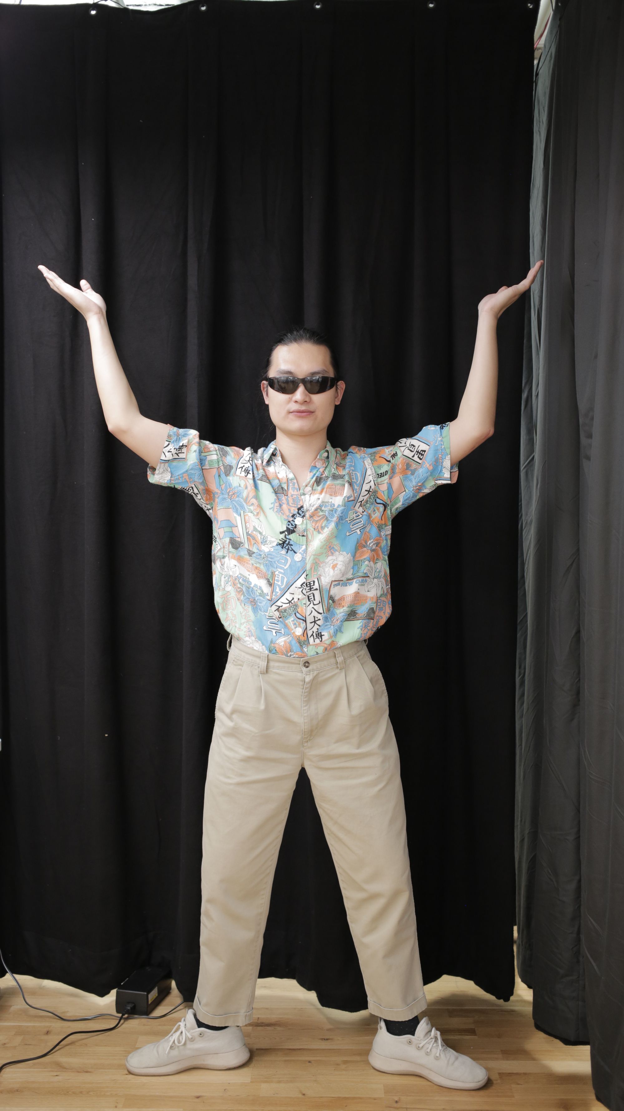
This idea of Zach collapsing under the accumulated weight of all his overused mottos came about as we explored the possibilities and constraints of animating a 2D cut-out marionette puppet. We began with a test puppet made from photos of Mat split into layers for each limb and joint we wanted to control and contort. Rather than have a flexible puppet with stretchy mesh-enabled movements, we wanted to stick to the constraints at these joints, which generally make for more unnatural and painful movements as you exaggerate them further.

The most absurd, precarious positions we put our test puppet into led to our desire to create some tension in the piece: we wanted our character to gradually contort into these increasingly difficult poses, then release that tension with a collapse at the end. In our ideation from there, we batted around a few ideas. Maybe this character was a dancer, overexerting themselves between poses. Maybe the character is a person struggling to keep up with the demands of life.
Tweaking that idea gave us Zach. Instead of a character struggling under abstract visual or textual representations of hardships, we made the character a person who can’t hold up the weight of pithy advice meant to help live a better life–someone who projects a sort of blandly aspirational confidence, but who ultimately fails at holding up all their simplistic and occasionally contradictory advice.
The capture and animation process
We enlisted fellow ITP ‘24 student Josh Zhong to become our model for Zach. Mat took the photographs on the week of Halloween using a Canon EOS R5 and a tripod borrowed from the ER–we learned from the test puppet that photos at smartphone resolutions were not as nice to work with when isolating the model from the background.
It should be noted that Josh was a total pro. He helped with checkout from the ER, had no problem keeping the awkward pose with his legs turned out to the sides, and took direction for Zach’s progression of pained facial expressions with ease.

With photos in hand, we began to split up the work of making the puppet and getting animation-ready. Those steps proceeded roughly as follows:
- Mat cut the main photo of Josh along with all his facial expressions out from the background using Photoshop
- Mary divided those photos into separate layers for each joint and extended elements where necessary (e.g. lengthening the neck to give us more leeway in animation)
- Mat rigged up a skeleton with the Duik Bassel plugin (this video tutorial from Jake In Motion was most helpful) to aide in animation
- Mary began learning the ins and outs of working with Aero sequences
Duik’s built-in IK controllers were really helpful in reducing the overall complexity of animating Zach’s movements, freeing us from having to keyframe almost every joint with each movement. Still, it wasn’t without its own weird limitations, and the rigging step had to be repeated a few times since changing the dimensions of the composition would irreversibly alter the relationships between joints in the puppet.
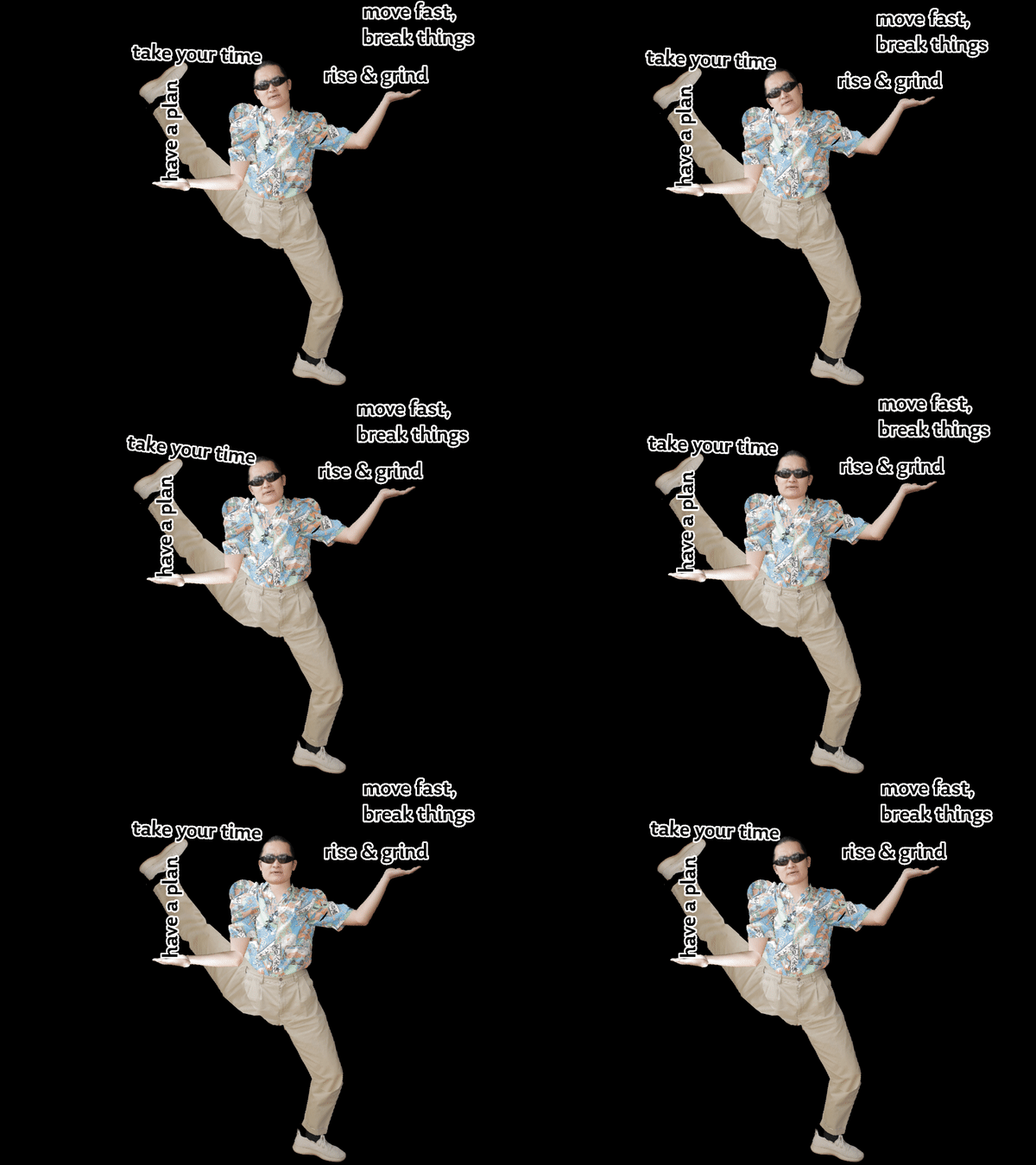
The storyboard of Zach’s arc from confident to crumpled mess is all Mary. The list of Zach’s tips was initially devised by Mat, pulling inspiration from various online articles about cliched advice.
Our interaction pattern for the animation is pretty straightforward: tapping through it, it tells a story with a beginning, middle, and an end (one that hopefully feels pretty final, given how defeated Zach looks).
Diagramming it with text, it flows like so:
-
- Load the AR overlay
- Tap to advance through the introductory screen
- Aero swaps the intro screen for part 1 of the animation
- Part 1 plays (Zach effortlessly holds two pieces of advice)
- Tap to advance to part 2
- Aero swaps parts 1 and 2
- Part 2 plays (Zach’s ok, but has to use his foot)
- Tap to advance to part 3
- Aero swaps parts 2 and 3
- Part 3 plays (Zach clearly begins to struggle)
- Tap to advance to part 4
- Aero swaps part 3 and 4
- Part 4 plays (Zach collapses)
At each of the stages after these 4 parts play, we originally wanted to include an idle animation that would loop between discrete parts. We split the 8 tips across 4 sections of animation for this reason: we’d essentially have 7 section of animation, 4 main parts and 3 idle loops. Making an idle loop between each of the 8 steps would’ve meant making more than twice as many chunks of animation as we ultimately did.
We ended up deciding against using the idle animations for a couple reasons: for one, they’re a little too animated. If someone is going through the character overlay slowly, it might take them a while to realize that they’ve entered an idle loop and should tap again to advance the animation. Also, in some limited testing with other ITP students, some just wanted to keep tapping through, which would mean the idle animations would likely not be seen.

Some more explicit on-screen controls might be a way of solving this tapping behavior problem and could justify adding idle animations back in; if there was a big button, for instance, that users would need to press in order to drop the next piece of advice on Zach.
Then again, adding more mechanical controls to this piece could detract from the feel of it. Zach is a character inspired by the kinds of people who might actually go around calling themselves life influencers, figures who exist in the public eye largely by way of videos housed in Story carousels and algorithmically managed feeds. This is a guy whose content you might otherwise be compelled to tap or swipe through in a hurry–now he’s in your physical space, and in this more immediate context, we present a physical metaphor for how trying to follow all kinds of vapid life advice might pan out. If a guy like this was really real, not a character we made up, a weird AR puppet, or a persona crafted to rack up followers to sell ads against, what good would the kind of advice he peddles really be to him?
Original post –11/10/22