In the beginning, I do not have much thought. I just want to try perspective to create a strong visual impact because the piece of music gave me power.
At first, I tried the fisheye lens. But it turns out that I was unable to make it because of the limit of my skill and the typeface I was using. I felt a little upset because it almost cost me all morning.
So I tried a simpler one. My drafts are attached here.
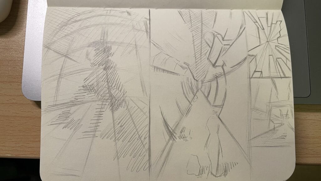
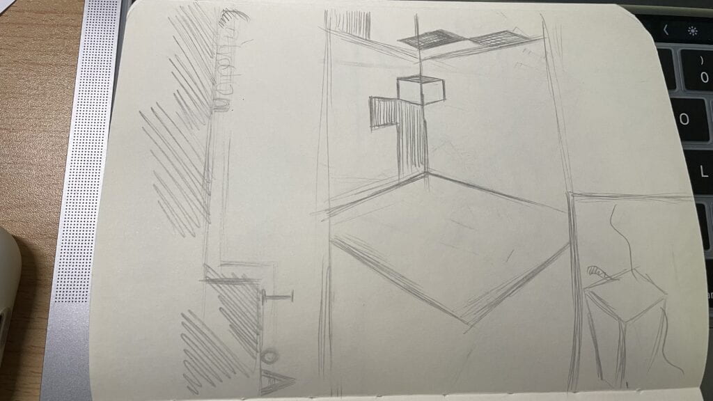
After sticking to it for one day, I was not that satisfied with the first version. 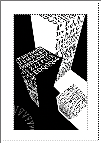
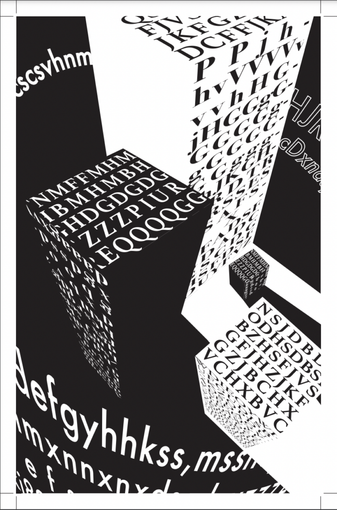
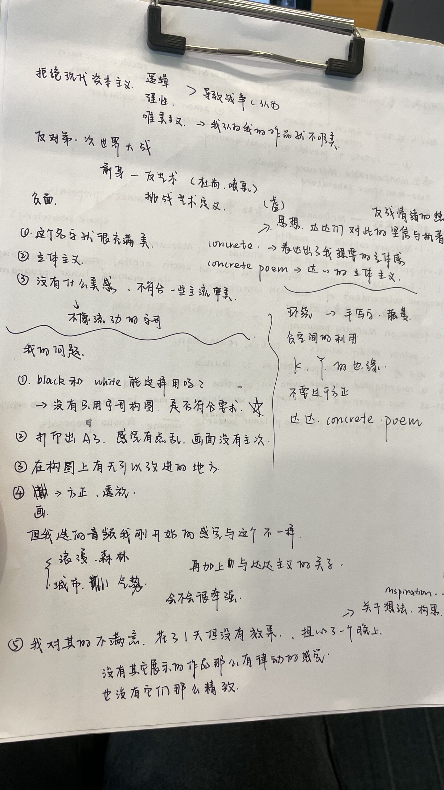
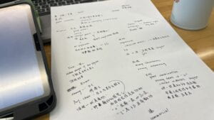
Although the perspective was fine, I still felt something is missing. Thus, I decided to seek some suggestions from my professor. Our communication went quite well and I was very grateful for the ideas and materials Prof. Chen provided. Three main pieces of suggestions are as follows. First, the typefaces with serifs can create less power than the ones without serifs. Second, the professor suggested that I could search more about the concrete poem from Dada. Third, I need to use those empty spaces more intelligently. Here are my notes.
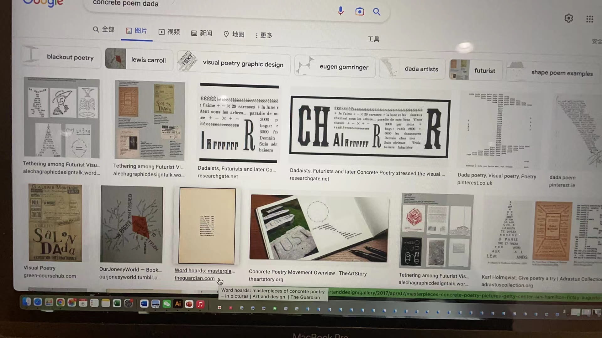
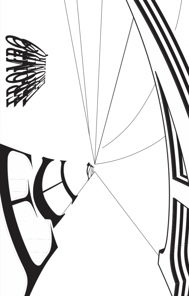
Then it was time to make some changes! I used the typeface without serif and varied their size to create a dynamic sense (because of the music is also like a song from nature). Meanwhile, the surrounding fonts seemed too simple, so I replaced them with letters imitating the vines.
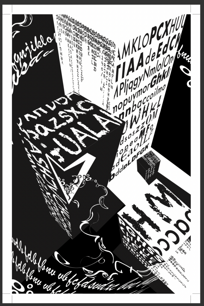
To use the empty spaces more efficiently, I chose to change the surrounding litter into the straight lines. In that case, the work seemed less chaotic, and more contrast was created.
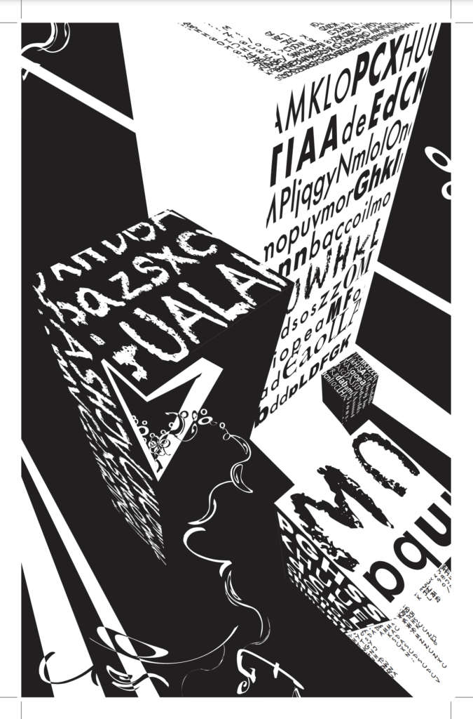
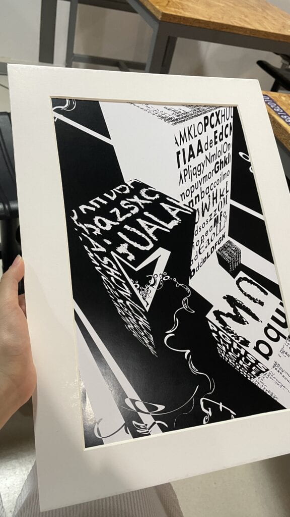
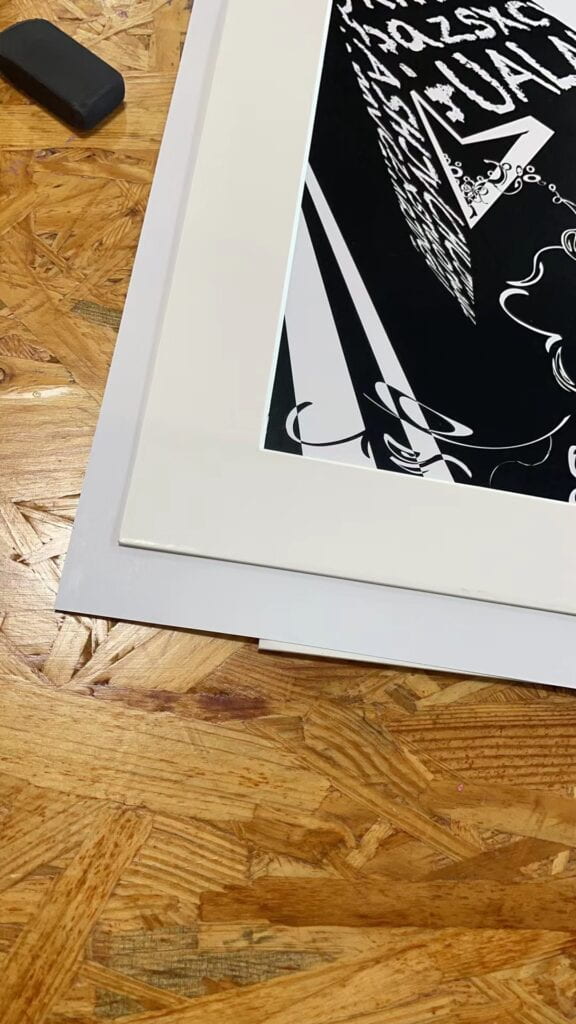
The mounting also cost me a lot of time! I practiced a lot to make the perfect cut. But I am satisfied with the final work! Also, I was very grateful for the suggestions from professors and classmates in the class. I did appreciate the layers one professor taught. I also took notes while listening to other students’ presentations. They did a great job!