Meghan Doyle
MA Student, The Institute of Fine Arts, New York University
![]()
Caught: Revisiting Ed Ruscha’s Falling But Frozen (1962)
In his own words, Ed Ruscha’s primary artistic interest is the “attention and time given to a subject that doesn’t need attention and time.”[1] As the building blocks of culture, the endless permutations of the Latin alphabet bank called ‘words’ comprise every code–social, ontological, moral, legal, or otherwise–by which linguistic beings abide. The word operates in relation to others, yet languishes on its own, unmoored from meaning and vulnerable to myriad interpretations. This “little warrior,”[2] then, is ripe for Ruscha’s timely, if ambivalent, rescue, plucked from the verbal cacophony of letters and “elevat[ed]…to a see-able status.”[3]
The literature on Ruscha’s romance with language amounts to several volumes; the textual evidence for the affair spans his vast oeuvre. In squaring Ruscha with Pop, however, his deployment of words as found subjects with nuanced histories remains under-interrogated. Lisa Turvey (née Pasquariello) devotes significant energy to the words Ruscha selects in a 2005 essay where she argues for the artist’s interest in the “substance of his subjects,”[4] summing material and word so that each becomes greater than its parts. Ruscha’s words are deliberate weapons, sharpened by their pictorial, rather than verbal, contexts. From whence does this arsenal derive? Ruscha keeps a diary, in which he scrawls overheard exchanges that excite him. A few examples:
“It’s your baby. You rock it.”[5]
“What are you doing, training for a race?” “No, racing for a train.”[6]
Yve-Alain Bois confirms, “[Ruscha’s words] are scoriae that catch his eye on billboards or his ear on the radio while he is driving,” and continues with an allusion to a favorite aphorism of Ruscha: “they are the waste that he retrieves.”[7] This dedicated listening is the artist’s unique talent. Through such tuning in, Ruscha captures the complex connotations of American culture’s linguistic cast-offs, especially those abuzz during the capitalist-crazed Pop years, to transmute vernacular expression into conceptually rich investigations of the arbitrary link between sign and signified, image and word. Nowhere is this more prevalent than in Falling But Frozen (1962; fig. 1), one of three Ruschas shown in California curator Walter Hopps’s landmark exhibition focused on West Coast Pop the same year.
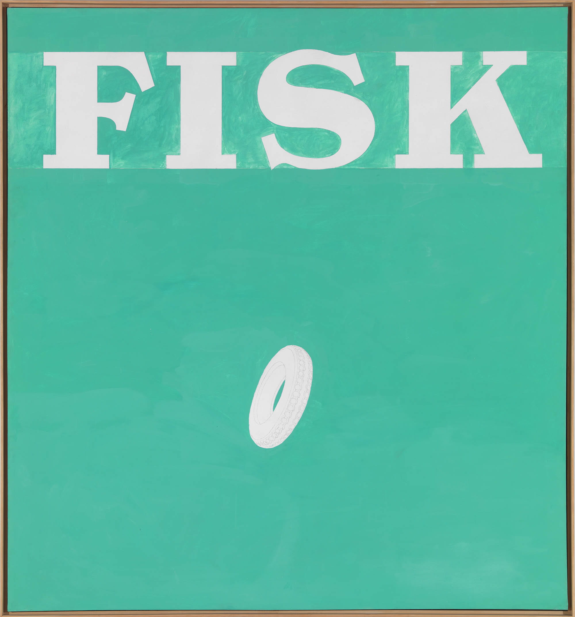
Fig. 1. Ed Ruscha, Falling But Frozen, oil and pencil on canvas, 71 1/8 x 67 1/4 in. (180.7 x 170.8 cm.), 1962. Photo: Robert McKeever, Gagosian Gallery.
Hopps’s New Painting of Common Objects at the Pasadena Art Museum proved a fulcrum event for the crystallization of American Pop, setting in dialogue for the first time the work of Andy Warhol, Roy Lichtenstein, and Jim Dine with that of Ruscha, Wayne Thiebaud, Joe Goode, and others. The former trio represents a small sample of the New York vanguard that was, in those early days, turning away from traditional art materials, like oil and graphite, toward the more quotidian trappings of the supermarket aisle to both celebrate and critique the newly rampant American consumerism facilitated by a post-World War II economic boom. Though avant-garde sensibilities on the East Coast had been trending away from the emotion-ridden Abstract Expressionism of the fifties for a few years, following a similar movement in Europe, gallerist Sidney Janis did not mount his category-defining International Exhibition of the New Realists until the end of 1962, and then with minimal West Coast representation. Thus, Hopps’s prescient pairings of artists, all in the nascent years of their careers, were the first, if only by a few months, to affirm Pop’s burgeoning efficacy. Artists across the country came to the same conclusions at the same moment, yet in various visual manifestations and relative isolation from one another to underscore a pressurized American zeitgeist exploding onto canvas. Tellingly, Hopps tapped twenty-four-year-old Ruscha, an Oklahoma City transplant and recent graduate of Los Angeles’s progressive Chouinard Art Institute, to design the exhibition poster–a striking yellow backdrop for bold black text over and underneath the crimson title (fig. 2). In a spontaneous act of artistic distancing encouraged by Hopps, Ruscha recalls “dictating the text over the telephone to a commercial printer, with the instruction ‘Make it loud!’”[8] From the beginning, then, Ruscha sought to cause an audible splash in the picture pool in his pursuit of “visual noise.”[9] While his Pasadena show conspirators homed in on the seen vestiges of post-war commerce–stamps for Warhol, hairspray for Lichtenstein, milk bottles for Goode–Ruscha took as his ‘common object’ the spoken brand name, with the referenced product added as a downsized iconic complement to stoke semiotic tension.
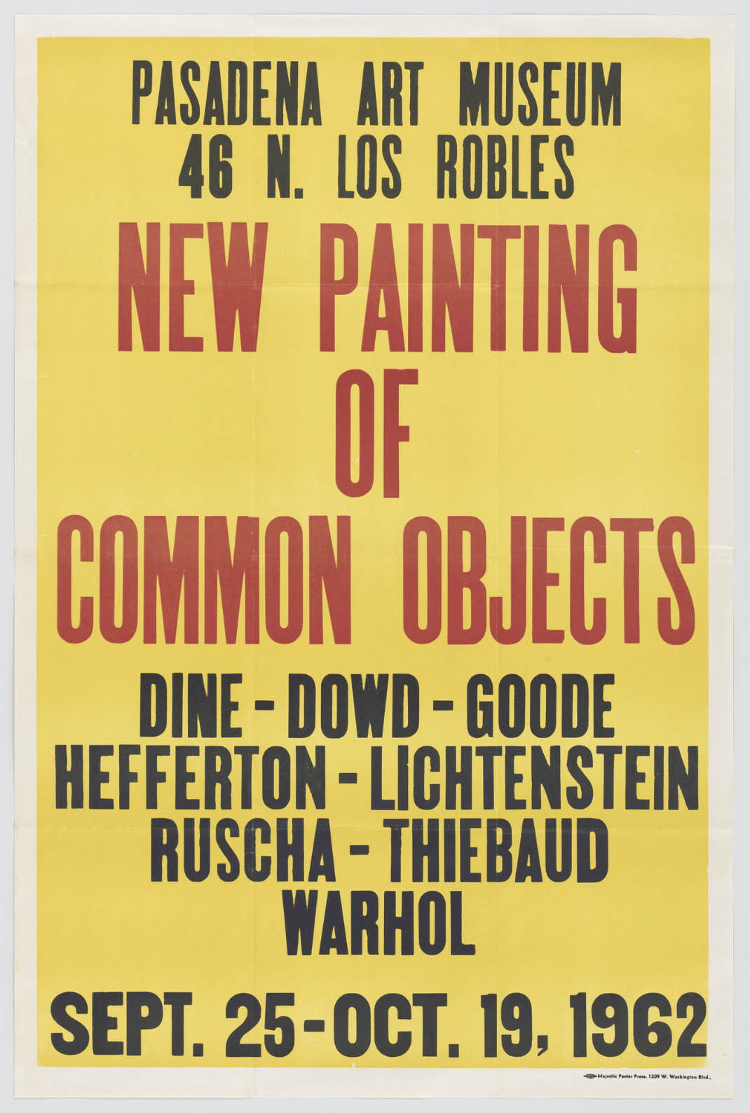
Fig. 2. Ed Ruscha, New Painting of Common Objects, letterpress on paper, 40 x 26 1/8 in. (101.6 x 66.3 cm.), unknown edition, 1962. The Museum of Modern Art, New York.
In Falling But Frozen (1962), stencil-like graphite lines delineate a brushy rectangle that confines the letters ‘F’, ‘I’, ‘S’, and ‘K’ to the upper register. Sanctified in compositional space, the letters recall the advertising layout process, which depends on the page edges to guide spacing. Notwithstanding Ruscha’s formulaic 67-inch-wide canvas,[10] the alphabetical elements are exempt from obedience to proportion, since letters are inherently without predetermined scale: they “exist in…this anonymous world of no-size.”[11] Thus, Ruscha defines his own textbox, according to the physical limitations of his chosen support. In preliminary notes for another 1962 painting with the same feature, Ruscha writes, “this area is like a draft of hot or cold air,” and then refers to the remaining canvas partitions above and below the textbox as “a big room” (fig. 3).[12] If the graphic area is the unwanted breeze invading the domestic image space through a shattered windowpane, then Ruscha’s language paintings are themselves shiver inducers within the history of pictures, cutting through convention to confuse semantics with aesthetics.
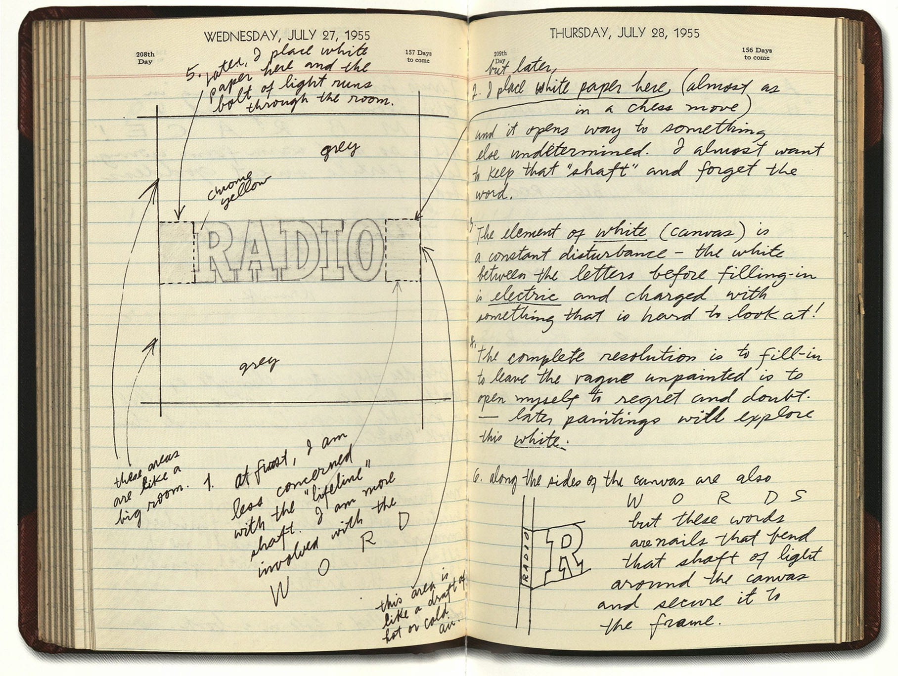
Fig. 3. Ed Ruscha, studio notebook entry, 1962. Illustrated in Edward Ruscha: Catalogue Raisonné of the Paintings, Volume One: 1958-1970, ed. Pat Poncy (New York: Gagosian Gallery, 2003), 58-59.
Taken together, the capital letters read ‘FISK’ and mimic the distinct typography of the American tire company that prospered during the early twentieth century, before the Great Depression forced a restructuring and sale in 1940.[13] The acquiring corporation retained the brand name, partly due to the effective advertising imagery Fisk employed throughout its independent existence (figs. 4-5).[14] At its savviest, Fisk featured a yawning, pajama-clad child, a dripping candle in one hand and a massive tire slung over the shoulder in lieu of a blanket, with the unforgettable slogan: “Time to Re-Tire? (Buy Fisk).” The conflation of ‘tire’ as automobile part and ‘tire’ as nearing exhaustion cast Fisk not only in a mechanical role, but also in a therapeutic one–consumers trusted Fisk to both protect their families’ commutes and provide respite from burning the midnight oil by burning rubber instead. This found wordplay likely appealed to Ruscha for its cleverness, enhanced by the accompanying imagery.
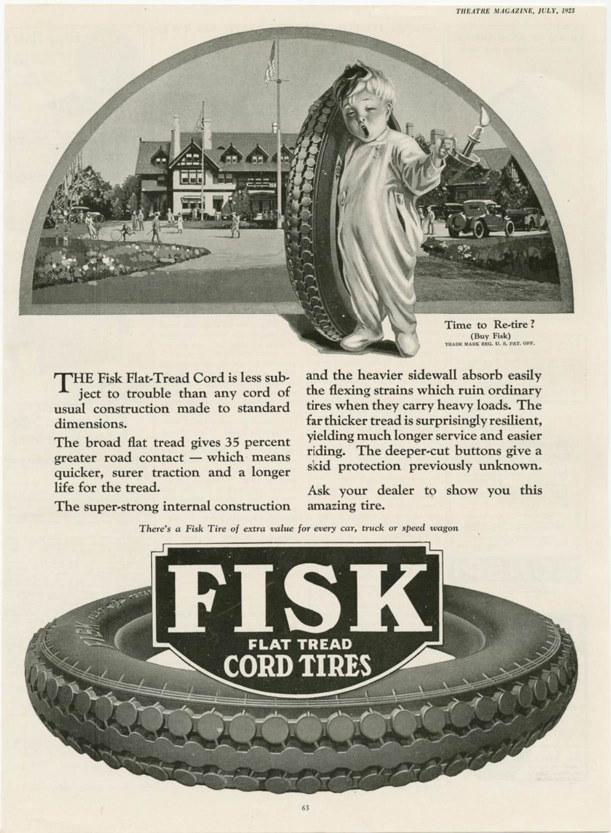
Fig. 4. Fisk Rubber Co. advertisement, Theatre Magazine, July 1923, p. 63.
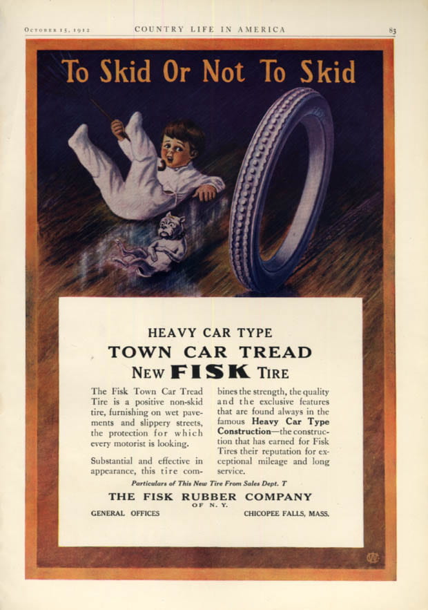
Fig. 5. Fisk Rubber Co. advertisement, Country Life in America, October 15, 1912, p. 83.
More ad-akin than Ruscha’s lone words, Falling But Frozen includes the object of its word’s affection, which, contrary to the letters crowning it, possesses indisputable dimension. Whereas elsewhere Ruscha commits to faithful reproduction of objects in “actual size,” here he sketches the tire roughly three times smaller than what would suit a standard vehicle.[15] Ironically, the vernacular elements, typically free from defined size, strictly adhere to Ruscha’s arbitrary scale, while the banal element that relies on a specific size for its purpose shrivels to an equally arbitrary inconsequence. In such diminution, Ruscha’s tire wobbles between function and failure, while its angular perspective implies multi-directional motion. In falling sideways to the unseen ground, the wheel escapes its duty to go seamlessly round and round; in falling vertically to the lower edge of the canvas, it references the infinite virtual space beyond the picture plane. The meticulous tread is rendered both useless, as Fisk’s one-time runaway success tumbles off-course, and diagrammatic, as a mere “exposition of relations of forces” bereft of force itself.[16] Enacting the artist’s penchant for verbiage, a gentle mental pivot recasts the tire icon as the letter ‘O,’ whose smaller size relative to the other letters insinuates depth–‘O’ falls into the turquoise void behind the picture plane, parroting the shape of a screaming human mouth, frozen in fear.
These aesthetic choices assume renewed ambiguity insofar as Fisk’s product facilitated a crucial facet of Ruscha’s Los Angeles circuit: the car. A broader discussion of West Coast car culture aside, Ruscha’s personal engagement with the automobile, evidenced by his road trip from Oklahoma, horizontal documentaries of California boulevards, and early photography, suggests his awareness of the relevance of Fisk’s industry (fig. 6). Ruscha understood his own car as “a rite of passage…a vehicle to take me places I would dream about.”[17] Bordering on mystical terms, Ruscha’s description sublimates the personal transportation device into divine apparatus; the driver’s seat becomes the portal to a fantasy world. The wheel undergirds the whole endeavor by operating in a quartet to cart the body around; without four rotund tires, the car cannot ride swiftly off down Sunset, regardless of the engine’s desperate rev. Worse, a limping, clunky machine frustrates fulfillment, falling flat on the road to satisfaction.
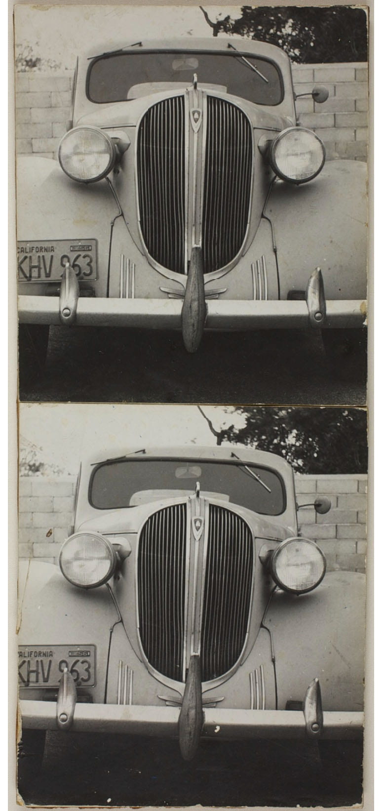
Fig. 6. Ed Ruscha, Joe’s Car #2, diptych–gelatin silver print, 18 15/16 x 10 11/16 in. (48 x 27 cm.), 1960. The Art Institute of Chicago.
And where exactly lies this lost road? The painting’s palette evokes a sun-lashed, chlorine-saturated, Southern California backyard pool, a color to which David Hockney, another West Coast transplant, would succumb over a decade later in his paper pulp pictures (fig. 7). Suspended in an aquatic daydream, the tire balloons into a windswept inner tube, evicted from all-wheel-drive terrain, while ‘F’, ‘I’, ‘S’, and ‘K’ bob around in anticipation of Ruscha’s liquid word series (1967-69; fig. 8). Bois appropriates the thermodynamic concept of entropy to illustrate the lifespan of one of Ruscha’s oozing, bubbly words, ever melting back into primeval obscurity.[18] Here, the typographically sound letters threaten to obliterate not their individual appearances, but the tentative link binding them together in sequence, thus probing the solidity of ‘FISK’ as a carrier of meaning. Indeed, “as Bois has stressed, Ruscha is no Cratylist–that is, he hardly believes that signs are grounded in the appearance of referents–and yet, as with his onomatopoeic words, he plays on our old belief in such worldly grounding, only then to disturb it, and in doing so to produce more ‘huh?’”[19] These layered histories–of a once thriving, now failing company with a witty slogan, malleable logo, and symbolic product–relay a cautionary tale of bygone corporate deterioration; yet, the resonances chime only upon deeper inquiry into the presented word, which itself is in danger of disintegrating. Lifted from the nostalgic annals of American commercial history, Ruscha’s text both embodies the Pop concern for capitalist critique, by castrating the independent Western spirit and relegating it to submissive impotence, and speculates on the arbitrary connection between image and word, product and brand.
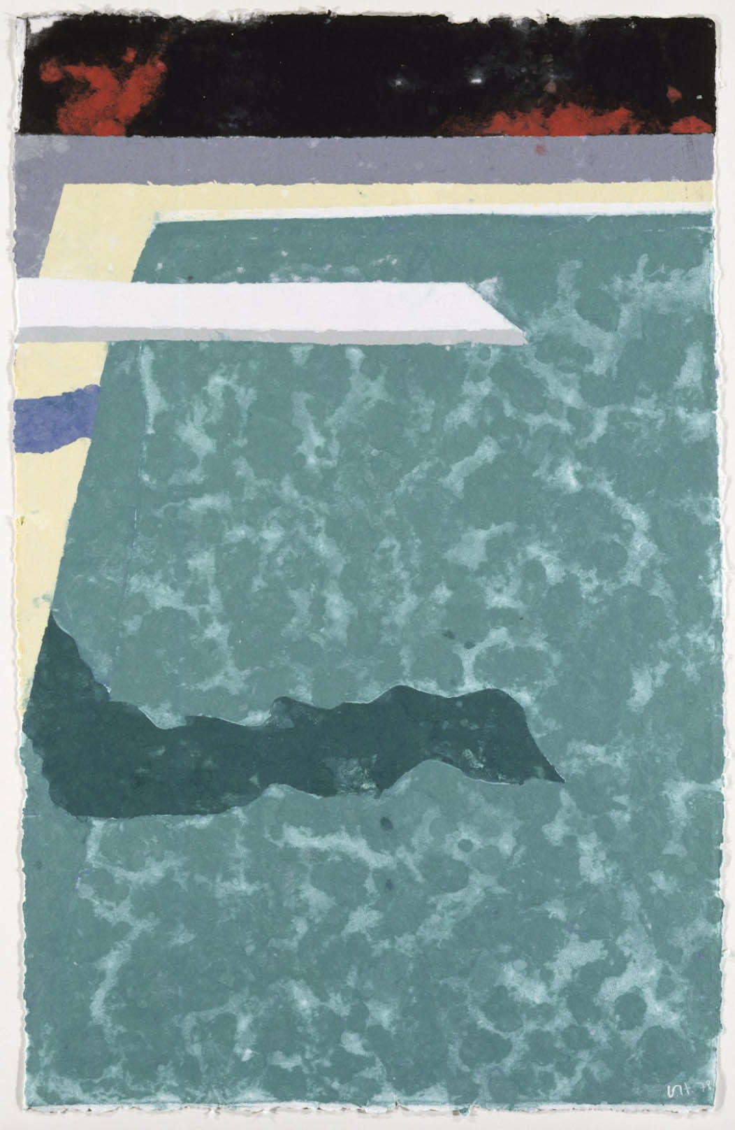
Fig. 7. David Hockney, Green Pool with Diving Board and Shadow (Paper Pool 3), colored and pressed paper pulp, 50 1/2 x 31 7/8 in. (128.3 x 81 cm.), 1978. Walker Art Center, Minneapolis.
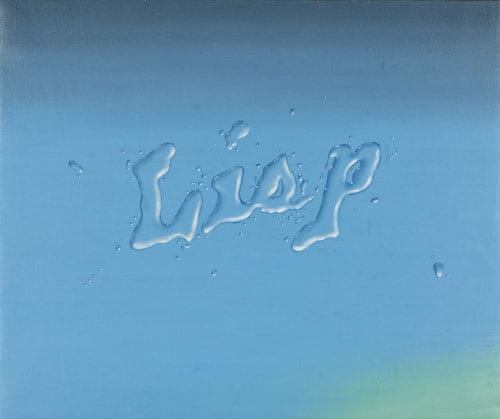
Fig. 8. Ed Ruscha, Lisp, oil on canvas, 24 1/2 x 28 1/2 in. (62.2 x 72.4 cm.), 1968. Nora Eccles Harrison Museum of Art, Utah State University.
While Ruscha often remains equivocal on interpretation, he has rarely been anything but straightforward when speaking of Jasper Johns’s influence. Ruscha enunciates his debt to the older painter, along with Robert Rauschenberg, in markedly acoustic language, attuned to the works’ subtle aural aspects: “It was a voice from nowhere…the kind of odd vocabulary they used…–it was like music that you’ve never heard before, so mysterious and sweet.”[20] In his essay on Johns’s early painted words, Harry Cooper spends considerable time on the enigmatic The (1957; fig. 9).[21] If ever there was precedent for Ruscha’s taking note of the overlooked, it was Johns’s activation of that three-letter word found at least one hundred times in this paper already, yet ever without a point of its own. Cooper describes Johns’s austere composition in a comment that could aptly apply to a Ruscha: “The word is presented in splendid isolation, as it rarely is, as if to arrest our attention on a workhorse of the language, a monosyllable that we take for granted, a word that is always upstaged by the one that follows it.”[22] In the related footnote, Cooper questions whether Johns intended the article to appear as an object in space or actually convey meaning, and distinguishes between “citing the word” and “using it.”[23] Paired with an object that clarifies its meaning, ‘FISK’ is arguably in use, a title more than a picture, whereas Johns camouflages ‘THE’ within abysmal space, more optical citation than caption.
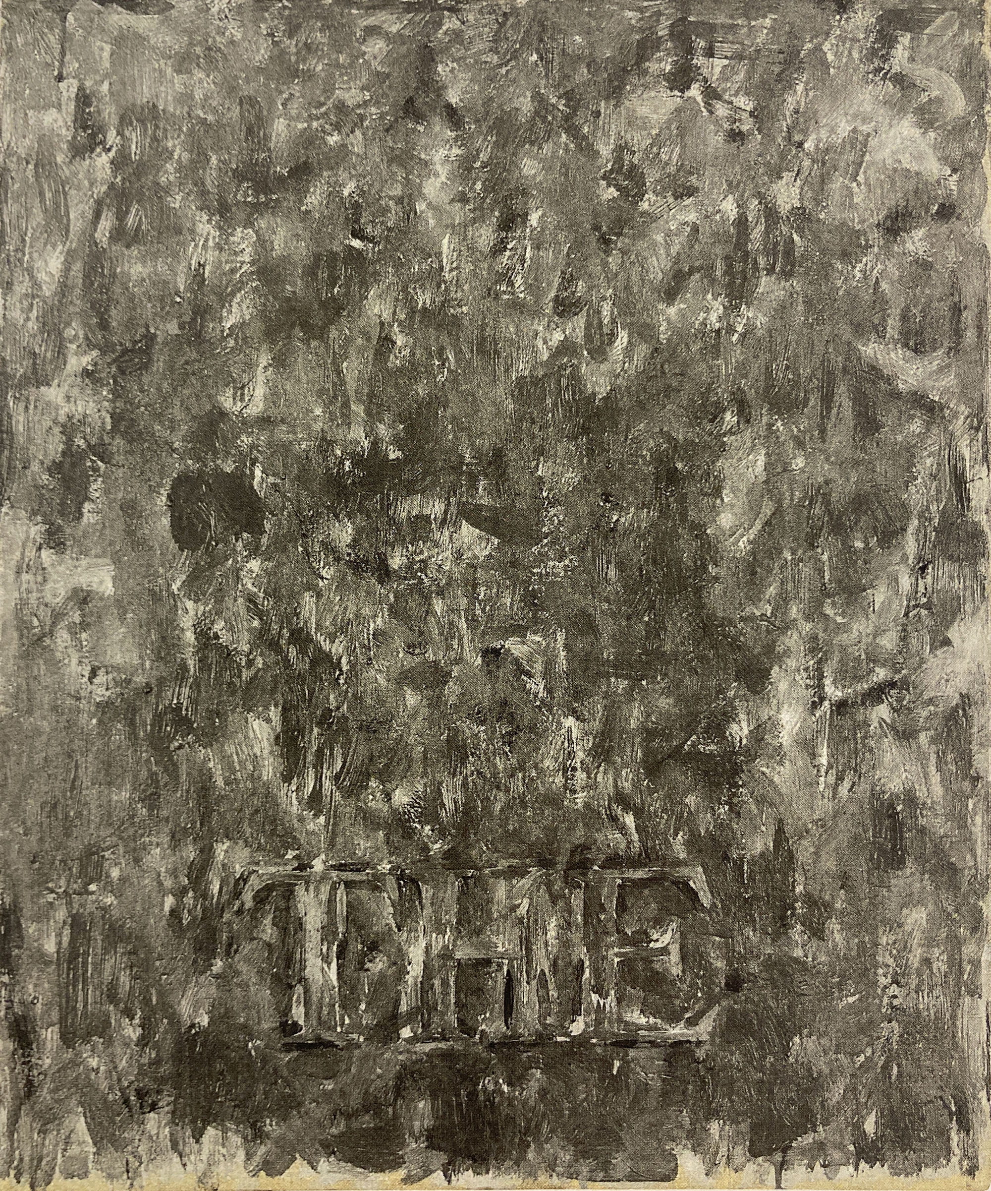
9. Jasper Johns, The, encaustic on canvas, 24 x 20 in. (61 x 50.8 cm.), 1957. Private collection.
Unlike Johns’s work, however, Ruscha’s does not take the title its surface implies–or at least not always. The catalogue raisonné publishes the present painting as Falling, But Frozen (Fisk). The editor, Pat Poncy, also reports the presence of an artist inscription: “titled and dated ‘Falling But Frozen 1962’ verso upper left in pencil; titled and dated ‘Falling But Frozen July 1962’ verso on horizontal crossbar.”[24] Despite evidence twice-over from the artist’s hand as to the correct title, Poncy inserts a comma and a parenthetical into the official record. (Subsequent publications of the work primarily follow the artist’s notation, while a 2001 auction appearance elided the comma but kept the parenthetical.) Curiously, Poncy exercises similar editorial control in the publication of Box Smashed Flat (Vicksburg) (1960-61; fig. 10), one of the other two pictures included in the 1962 show, whose crossbar inscription reportedly reads “Package Smashed Flat”; ‘Vicksburg’ is only visible on the recto lower register and nowhere on the verso.[25] The third painting in the show, Actual Size (1962; fig. 11), features the brand name ‘SPAM’ twice–once on its own in the upper register, and again on its product label zooming through the lower–yet Poncy refrains from any parenthetical at all.[26] The assigned title is less discernible, scribbled into the falling Spam can’s backdraft.
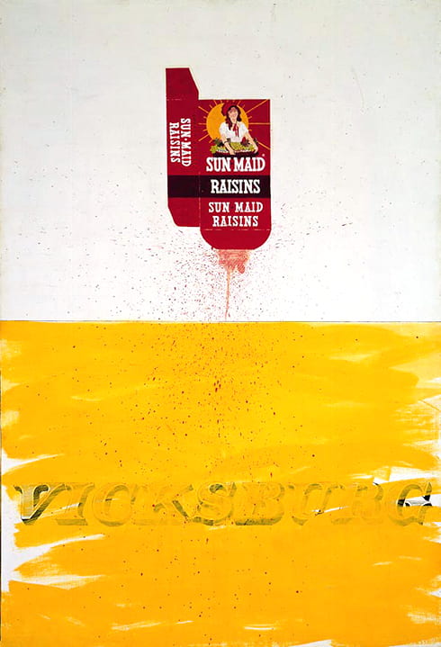
Fig. 10. Ed Ruscha, Box Smashed Flat (Vicksburg), oil and ink on canvas, 70 x 48 in. (177.8 x 121.9 cm.), 1960-61. Museum Ludwig, Cologne.
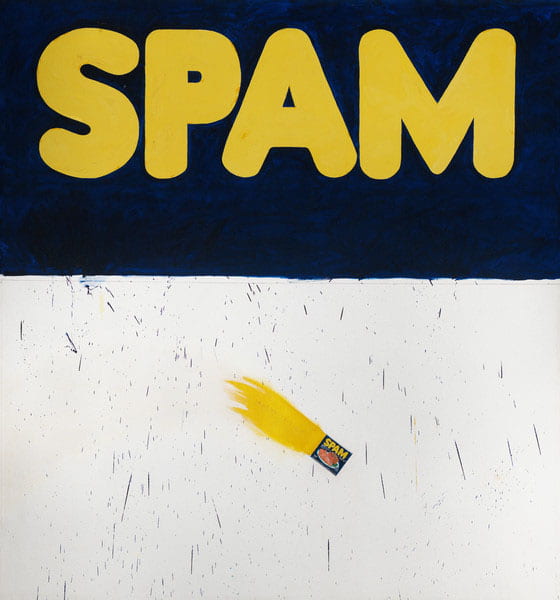
Fig. 11. Ed Ruscha, Actual Size, oil on canvas, 71 3/4 x 67 in. (182.2 x 170.2 cm.), 1962. Los Angeles County Museum of Art.
Though the semantics vex, clarity on how best to refer to these works directs how to see the relationships therein, as suggested both by Cooper’s similar quandary with Johns, and, the scrupulous attention to naming conventions from scholars like Stephen Bann and John Fisher.[27] Per E. H. Gombrich: “Unlike images, language can make that vital distinction…between universals and particulars…language can specify, images cannot.”[28] But what does the painting’s title specify precisely, other than an ambiguous contradiction? For an object can only be simultaneously falling and frozen within the virtual space of the canvas– never in the physical world. Within the picture plane, ‘FISK’ specifies a type of tire, rather than a universal symbol of mobility; if ‘FISK’ is also part of the title, then it doubly describes the thing frozen in its fall. However, if the name of the painting excludes the presented word, then it and its shaped parts become formal elements equivalent to the schematic tire–‘F’, ‘I’, ‘S’, and ‘K’ also fall subject to Ruscha’s impossible gravity. In fact, the depiction of the letters and the tire with graphite and negative space, rather than the vibrant, tactile oil of the foreground, reinforces their status as literally empty shapes, both formally and conceptually. Only together do the five uncolored elements encode meaning–at the level of signifier, they comprise an inventory of common objects (one tire, four letters); at the level of signified, a recognizable brand.
In her discussion of the Pasadena Ruschas, Pasquariello asserts that “the full eclipse of the commodity by the commodity name that was coming to characterize post-war American consumerism and advertising is not depicted,” claiming instead that the presence of a referent object prohibits the complete subsumption of product into brand.[29] However, the very bastardization of those objects–the functionless tire, structure-less raisin carton, and anchor-less Spam can–actually strengthens the increasing reliance on text alone to communicate operative value, underscored by Ruscha’s imminent elision of the object from his practice entirely. And if the brand is rapidly overtaking the product to the extent of wholesale substitution, then, in Falling But Frozen, Ruscha crafts a verbal/visual redundancy–Fisk is the tire, the tire is Fisk. Contrary to the other two Pasadena pictures, Ruscha places the brand proximate to the object but does not emblazon it. In doing so, he tests the strength of the arbitrary union between definition and defined, and finds that, even separated, the precariously connected sign and signified retain synonymy in the conditioned mind of the beholder.
Brand identification with the object of its production appeals to the base, visual part of the brain and thus resurrects the earliest iterations of language: pictograms and hieroglyphs or ideas represented by schematically mimetic signs. By returning to simple visuals, this semiotic method circumvents the ability to reason in the abstract that an objective, independent alphabet makes possible, as Marshall McLuhan and R. K. Logan contend, thereby wresting rational power from the seer (or consumer).[30] Everything an image of a tire could communicate to a mobile society is now inscribed in those four, meaningless letters; inversely, those letters are no longer meaningless when paired with a visual cue. Michel Foucault rightly predicted that “a day will come when, by means of similitude relayed indefinitely along the length of a series, the image itself, along with the name it bears, will lose its identity.”[31] The critical distance between text and image thus collapsed, the contemporary viewer re-enters a pictures-ruled realm, delivered there by language.
If language is the linchpin, then articulation is key. Cooper’s struggle to gain purchase on pronunciation in Johns’s painting exemplifies a crucial point–any aural effect of a pictured word necessarily relies on the thinking spectator’s participation. Indeed, “we cannot look at [the] without resolving those three letters into a word, without reading them, which means we must decide how to read them.”[32] Cooper’s repetition of the first person plural pronoun emphasizes the cooperative engagement an image of language requires. The framework for representation is shared vocabulary–to understand, we translate. In the act of translation inheres a performative aspect, whether the mental substitution of one signifier for another, or the verbal ‘sounding out’ of the text. Ruscha exerts a similar participatory imperative over his viewer, which subsequently elicits auditory free associations. Mistaking ‘FISK’ for ‘disk,’ ‘risk,’ or ‘fist,’ for example, inevitably alters the reading of the tire and thereby indulges the constant specter of slippage between word and meaning. Thus, Ruscha’s intense scrutiny, beyond shining light on the frequently overshadowed, also exposes the precariousness of language–a simple sonic change morphs a forceful icon of American economic domination (‘FISK’) into the enemy of its stability and, ultimately, the arbiter of its destruction (‘risk’). Put another way by critic Dave Hickey, we are always just one letter away from writing (with) ‘worms’ instead of ‘words.’[33] In his juxtaposition of a linguistic artifact from expended culture with the deflated symbol it once encoded, Ruscha challenges the arbitrary link between sign and signified. His skewed scale, playful palette, and mismatched materials further this ambiguous relationship and confound a traditional reading of Falling But Frozen as just another product of perfunctory Pop.
With one turn of the wheel, Ruscha sets in motion a spiraling vortex of associations; he allows each element of his design enough space for isolated analysis before slamming them back together in a synthesis of formal pictorial strategy and mass media subversion. For an artist with an overflowing shelf of his own books, it is remarkable how all the words seem to have fled the bindings for the canvas. As if witnessing this exodus, Ruscha admits a predatory instinct: “Words have temperatures to me…[u]sually I catch them before they get too hot.”[34] Attracted to the warm wordy flesh of an omnivorous Anglophone society, Ruscha finds himself caught up in a collective web of signs and signifiers, catching linguistic shreds as they fall from lips, and capturing conversations to freeze them in time and space. Thus, Ruscha’s common objects are ever falling from consciousness, but forever frozen in memory–caught on canvas, where the artist indiscriminately dismembers otherwise blissfully oblivious verbal/visual constructions.
Bibliography
“A Conversation Between Walter Hopps and Edward Ruscha, who have known each other since the early 1960s, took place on September 26, 1992.” In Edward Ruscha: Romance with Liquids, 97-108. New York: Gagosian Gallery and Rizzoli International Publications, Inc., 1993.
Bann, Stephen. “The mythical conception is the name: Titles and names in modern and post-modern painting.” Word & Image 1, no. 2 (Spring 1985): 176-89.
Blistène, Bernard. “Conversation with Ed Ruscha.” In Leave Any Information at the Signal:
Writings, Interviews, Bits, Pages by Ed Ruscha, edited by Alexandra Schwartz, 300-08. Cambridge and London: The MIT Press, 2002.
Bois, Yve-Alain. “Intelligence Generator.” In Edward Ruscha: Catalogue Raisonné of the Paintings, Volume One: 1958-1970, edited by Pat Poncy, 5-13. New York: Gagosian Gallery, 2003.
–––––––. “Thermometers Should Last Forever.” OCTOBER 111 (Winter 2005): 60-80.
Cooper, Harry. “Speak, Painting: Word and Device in Early Johns.” OCTOBER 127 (Winter 2009): 49-76.
Coplans, John. “Letters: Common Denominator.” Artforum 41, no. 5 (January 2003): 8.
Deleuze, Gilles. “Foucault: Lecture 13, 25 February 1986.” Edited by Charles J. Stivale and translated by Christopher Penfield. Purdue University Research Repository. doi:10.4231/R7G15Z2Q.
Failing, Patricia. “Ed Ruscha, Young Artist: Dead Serious About Being Nonsensical.” In Leave
Any Information at the Signal: Writings, Interviews, Bits, Pages by Ed Ruscha, edited by Alexandra Schwartz, 225-37. Cambridge and London: The MIT Press, 2002.
Fisher, John. “Entitling.” Critical Inquiry 11, no. 2 (December 1984): 286-98.
Foster, Hal. “Ed Ruscha, or the Deadpan Image.” In The First Pop Age: Painting and
Subjectivity in the Art of Hamilton, Lichtenstein, Warhol, Richter, and Ruscha, 210-47. Princeton and Oxford: Princeton University Press, 2012.
Foucault, Michel. This Is Not a Pipe. Translated and edited by James Harkness. Berkeley: University of California Press, 1983.
Gombrich, E. H. “Image and Word in Twentieth-Century Art.” Word & Image 1, no. 3 (Summer 1985): 213-41.
Hickey, Dave. “Wacky Molière Lines: A Listener’s Guide to Ed-werd Rew-shay.” Parkett 18 (December 1988): 28-47.
Karlstrom, Paul. “Interview with Edward Ruscha in His Western Avenue, Hollywood Studio.” In
Leave Any Information at the Signal: Writings, Interviews, Bits, Pages by Ed Ruscha, edited by Alexandra Schwartz, 92-209. Cambridge and London: The MIT Press, 2002.
McLuhan, Marshall, and R. K. Logan. “Alphabet, Mother of Invention.” ETC: A Review of
General Semantics 34, no. 4 (December 1977): 373-83.
Medrano-Bigas, Pau. “Fisk Tires and the Sleepy Boy.” In The Forgotten Years of Bibendum,
Michelin’s American Period in Milltown: Design, Illustration and Advertising by Pioneer Tire Companies (1900-1930), 1897-980. Doctoral dissertation. University of Barcelona, 2015 [English translation, 2018].
Pasquariello, Lisa. “Ed Ruscha and the Language That He Used.” OCTOBER 111 (Winter 2005): 81-106.
Pindell, Howardena. “Words with Ruscha.” In Leave Any Information at the Signal: Writings, Interviews, Bits, Pages by Ed Ruscha, edited by Alexandra Schwartz, 55-63. Cambridge and London: The MIT Press, 2002.
Poncy, Pat, ed. Edward Ruscha: Catalogue Raisonné of the Paintings, Volume One: 1958-1970. New York: Gagosian Gallery, 2003.
Richards, Mary. Ed Ruscha. London: Tate Publishing, 2008.
Schwartz, Alexandra, ed. Leave Any Information at the Signal: Writings, Interviews, Bits, Pages by Ed Ruscha. Cambridge and London: The MIT Press, 2002.
“Stockholders Vote Fisk Rubber Sale.” New York Times, December 30, 1939.
“Street Talk with Ed Ruscha: Venice, California, November 11, 2009.” In Ed Ruscha: Road.
Tested, edited by Michael Auping, 47-53. Modern Art Museum of Fort Worth and Ostfildern: Hatje Cantz, 2011.
Endnotes
[1] Ed Ruscha in Paul Karlstrom, “Interview with Edward Ruscha in His Western Avenue, Hollywood Studio,” California Oral History Project, Archives of American Art, Smithsonian Institution, October 29, 1980; March 25, 1981; July 16, 1981; October 2, 1981; reprinted in Leave Any Information at the Signal: Writings, Interviews, Bits, Pages by Ed Ruscha, ed. Alexandra Schwartz (Cambridge and London: The MIT Press, 2002), 189.
[2] Ruscha in Karlstrom, “Interview”; reprinted in Leave Any Information at the Signal, 153.
[3] Ruscha in Karlstrom, “Interview”; reprinted in Leave Any Information at the Signal, 190.
[4] Lisa Pasquariello, “Ed Ruscha and the Language That He Used,” OCTOBER 111 (Winter 2005): 82.
[5] Ruscha in Howardena Pindell, “Words with Ruscha,” The Print Collector’s Newsletter 3, no. 6 (January-February 1973): 125-28; reprinted in Leave Any Information at the Signal, 56.
[6] Ruscha in Karlstrom, “Interview”; reprinted in Leave Any Information at the Signal, 103.
[7] Yve-Alain Bois, “Intelligence Generator,” in Edward Ruscha: Catalogue Raisonné of the Paintings, Volume One: 1958-1970, ed. Pat Poncy (New York: Gagosian Gallery, 2003), 10.
[8] Mary Richards, Ed Ruscha (London: Tate Publishing, 2008), 15; “A Conversation Between Walter Hopps and Edward Ruscha, who have known each other since the early 1960s, took place on September 26, 1992,” in Edward Ruscha: Romance with Liquids (New York: Gagosian Gallery and Rizzoli International Publications, Inc., 1993), 98-99. A separate firsthand account has Hopps dictating the direction (John Coplans, “Letters: Common Denominator,” Artforum 41, no. 5 (January 2003): 8).
[9] Ruscha in Bernard Blistène, “Conversation with Ed Ruscha,” in Edward Ruscha: Paintings/Schilderijen (Rotterdam: Museum Boymans-van Beuningen, 1990), 126-40; reprinted in Leave Any Information at the Signal, 301.
[10] Poncy, Catalogue Raisonné, 62.
[11] Ruscha in Patricia Failing, “Ed Ruscha, Young Artist: Dead Serious About Being Nonsensical,” ArtNews 81, no. 4 (April 1982): 74-81; reprinted in Leave Any Information at the Signal, 231.
[12] Ruscha, “Studio notebook entry, 1962,” in Poncy, Catalogue Raisonné, 58-59. The notes reference Radio (1962).
[13] “Stockholders Vote Fisk Rubber Sale,” New York Times, December 30, 1939, B19.
[14] For a robust history of the Fisk Rubber Co. and its imagery, see Pau Medrano-Bigas, “Fisk Tires and the Sleepy Boy,” The Forgotten Years of Bibendum, Michelin’s American Period in Milltown: Design, Illustration and Advertising by Pioneer Tire Companies (1900-1930) (Doctoral diss., University of Barcelona, 2015 [English translation, 2018]), 1897-980.
[15] “If I do a painting of a pencil or magazine or fly or pills, I feel some sort of responsibility to paint them natural size – I get out the ruler” (Ruscha in Failing, “Ed Ruscha, Young Artist”; reprinted in Leave Any Information at the Signal, 231).
[16] Gilles Deleuze, “Foucault: Lecture 13, 25 February 1986,” ed. Charles J. Stivale and trans. Christopher Penfield, Purdue University Research Repository, doi:10.4231/R7G15Z2Q.
[17] Ruscha in “Street Talk with Ed Ruscha: Venice, California, November 11, 2009” in Ed Ruscha: Road Tested, ed. Michael Auping (Modern Art Museum of Fort Worth and Ostfildern: Hatje Cantz, 2011), 47.
[18] Yve-Alain Bois, “Thermometers Should Last Forever,” in Romance with Liquids, 8-38; reprinted in OCTOBER 111 (Winter 2005), 60-80.
[19] Hal Foster, “Ed Ruscha, or the Deadpan Image,” in The First Pop Age: Painting and Subjectivity in the Art of Hamilton, Lichtenstein, Warhol, Richter, and Ruscha (Princeton and Oxford: Princeton University Press, 2012), 216.
[20] Ruscha in Karlstrom, “Interview”; reprinted in Leave Any Information at the Signal, 116-17.
[21] Harry Cooper, “Speak, Painting: Word and Device in Early Johns,” OCTOBER 127 (Winter 2009): 64-67.
[22] Cooper, “Speak, Painting,” 65.
[23] Cooper, “Speak, Painting,” 65n25.
[24] Poncy, Catalogue Raisonné, 62.
[25] Poncy, Catalogue Raisonné, 40, emphasis added.
[26] Poncy, Catalogue Raisonné, 66.
[27] Stephen Bann, “The mythical conception is the name: Titles and names in modern and post-modern painting,” Word & Image 1, no. 2 (Spring 1985): 176-89; John Fisher, “Entitling,” Critical Inquiry 11, no. 2 (December 1984): 286-98. The latter’s elegant statement on titles pertains well to Ruscha: “…they tell us how to look at a work, how to listen” (Fisher, “Entitling,” 292).
[28] E. H. Gombrich, “Image and Word in Twentieth-Century Art,” Word & Image 1, no. 3 (Summer 1985): 220.
[29] Pasquariello, “Ed Ruscha,” 94, emphasis added.
[30] Marshall McLuhan and R. K. Logan, “Alphabet, Mother of Invention,” ETC: A Review of General Semantics 34, no. 4 (December 1977): 373-83.
[31] Michel Foucault, This Is Not a Pipe, trans. and ed. James Harkness (Berkeley: University of California Press, 1983), 54.
[32] Cooper, “Speak, Painting,” 65.
[33] This comment reformulates Pasquariello’s reading of Hickey’s analysis of Ruscha’s bird paintings, in which Hickey confesses a hunch that “the early bird paintings [are] the product of some rhyming slang, like ‘birds + worms = words,’ creating not real birds but birds as words who ‘sign’ rather than ‘sing’…” (Dave Hickey, “Wacky Molière Lines: A Listener’s Guide to Ed-werd Rew-shay,” Parkett 18 (December 1988): 33; Pasquariello, “Ed Ruscha,” 104).
[34] Ruscha in Pindell, “Words with Ruscha”; reprinted in Leave Any Information at the Signal, 57, emphasis added.
Author Bio
Meghan Doyle is a second-year Master’s student at the Institute of Fine Arts, where she focuses on the collage aesthetic in artist collectives of the post-war United States and, more broadly, the embodied experience of the group exhibition space. Meghan graduated summa cum laude from Pepperdine University in 2018, with BAs in Art History and Italian, where she worked at the Weisman Museum of Art and contributed research to a recently published textbook on global art history. She has also held positions at the British Museum, the Tel Aviv Museum of Art and in Christie’s Post-War and Contemporary Art department, where she played a pivotal role in bringing digital art to the forefront.
