![]()
![]()
The Institute of Fine Arts, New York University
Artist Bruce Conner is perhaps best known as an early West Coast maker of assemblage. Of the innumerable assemblages Conner created between 1958 and 1964, nearly all of them contain nylon stockings as a central material. While Conner’s use of nylon in his assemblage works has been well documented—the material is so ubiquitous as to be impossible to ignore—the literature has failed to account for the history of nylon itself and the way this history informed Conner’s use of the material.
An early discovery of the petrochemical industry, which would come to dominate and define American consumer life, nylon was closely tied to World War II in both its early manufacturing and marketing. From its inception in the early 1930’s, nylon was viewed as an important competitor with the Japanese silk industry. This took on greater significance with the outbreak of the Second World War, during which all nylon production was diverted to war-related manufacturing. Nylon was and remained, however, a material for women’s stockings, and it was marketed in this way throughout the war despite widespread shortages of nylon hosiery. The shortages caused dramatic consumer dissatisfaction and constant media coverage. In other words, nylon was more than a material or a commodity—it was a sustained subject within the American imagination at midcentury.
Applying an interdisciplinary combination of textile history and art history, this paper uses the history of nylon’s discovery, manufacture, and marketing as a frame for understanding Bruce Conner’s consistent use of the material in his sculpture. The paper first establishes the close relationship between nylon and World War II, then suggests several instances in which Conner alludes to that history both verbally and in the work itself. The paper uses the history of nylon and its close connection to war-related manufacturing to expand on prior scholarship that has aligned Conner’s use of the material with sex and violence. Additionally, it offers a possible link between Conner’s assemblages and other works from his oeuvre that more explicitly engage the history and legacy of World War II and its connections to Cold War politics.
![]()
An oblong assemblage hangs from a strap of frayed burlap. It measures nearly two and a half feet long and over ten inches wide. Rusted nails puncture the periphery of the upper left-hand corner, leading the eye to a smattering of silver and purple sequins. Beneath this pierced and embellished exterior, several layers of nylon stockings obscure and reveal a black-and-white photograph of a woman. Her back faces us, her head turned to the right in profile. Her body is bare apart from a black garter belt and matching hosiery. Nails cut through her nylon shield, impaling and violating her body. Below and beside her image, feathers, fabric, shells, string, red rubber tubing, and loose tobacco threaten to break through the nylon encasement. A razor blade hovers menacingly in the mass. An image of a skull peaks through the feathers, a symbol of death. The work is Bruce Conner’s BLACK DAHLIA (Fig. 1). Named for one of the most infamous American murders to occur in the years immediately following World War II, the assemblage evinces Conner’s use of nylon as a veiling layer, a psychosexual motif, and an allusion to the ties between postwar commodities and militarized violence.
Just four year after making BLACK DAHLIA, Conner abandoned assemblage. A creative chameleon with an aversion to being pinned down, the artist left assemblage behind partially in response to his increasingly common definition by critics as the “nylon-stocking artist.”[i] Indeed, nylon stockings are a unifying material across almost all of the innumerable assemblages the artist made between 1958 and 1964. Yet, despite the specificity and ubiquity of the textile in Conner’s work from the period, few historians have dedicated more than a few paragraphs to his use of it. This is curious considering the fiber’s omnipresence, the entanglement of its invention and early marketing with the Second World War, and its continued media prominence in the postwar period. Nylon was more than a material. It was a phenomenon; one whose manufacture and media presence were deeply entrenched in the war effort. Given Conner’s well-documented antiwar stance, and his artistic engagement with World War II through other means and media, it is somewhat surprising that the literature has failed to examine the artist’s use of nylon in relation to its history. This paper will do precisely that, first sketching the history of the textile’s emergence and mass media coverage, and then addressing evidence for Conner’s awareness of this history and its appearance in particular assemblages.
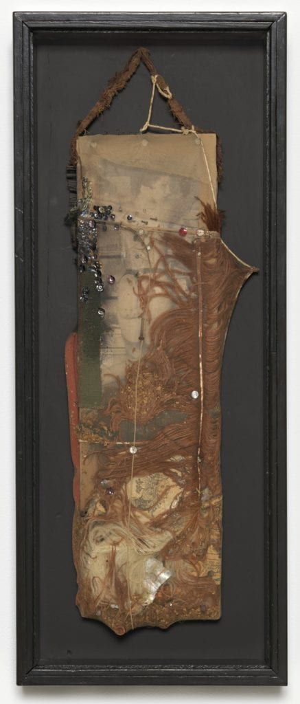
Fig. 1 Bruce Conner, BLACK DAHLIA, 1960, photomechanical reproductions, feather, fabrics, rubber tubing, razor blade, nails, tobacco, sequins, string, shell, and paint encased in nylon stocking over wood, 26 3/4 x 10 3/4 x 2 ¾ in. (67.9 x 27.3 x 7 cm), Museum of Modern Art, New York.
Before we can account for Conner’s use of nylon, it is necessary to outline the material’s invention as both a fiber and a commodity. Nylon was discovered through a series of experiments conducted by the DuPont Company between 1928 and 1930.[ii] Almost immediately, as Susan Smulyan notes, DuPont directed the new material toward the manufacture of stockings, rather than “toothbrushes or synthetic wool or any number of other possibilities” the fiber presented.[iii] This decision had nationalist overtones: nylon offered an American alternative to Japanese-imported silk, and as a result, was positioned by the company and the press not only as silk’s new rival, “but as an anti-Japanese commodity.”[iv] Beginning with its first public appearance at the 1939 New York World’s Fair, nylon made headlines as a “Major Blow to Japan’s Silk Trade.”[v] This characterization gained even greater significance once World War II began.
In 1941, a year after nylons became available to the public, the United States placed an embargo on silk, seized all existing supplies from private manufacturers, and diverted them to wartime production.[vi] Six months later, all nylon was similarly redirected toward the manufacture of parachutes, munitions containers, and other military requirements.[vii] But first, to symbolize the United States’ economic independence from Japan, an American flag was woven in nylon and raised at the White House.[viii]
While nylon proved a boon to the United States war effort, its redirection resulted in widespread shortages of stockings throughout the country. In response, DuPont, along with help from the government and the press, promoted nylon’s strength, emphasized its importance to the war, and commended women’s contribution.[ix] This appeal to patriotic sacrifice caught on. As Susannah Handley chronicles, “Newspapers reported stories of girls ‘Sending Their Nylons off to War,’ carried photographs of leggy women taking their stockings off ‘for Uncle Sam,’ and described how it would take 4,000 pairs to make bomber tires.”[x] Amid this performance of patriotism, the demand for nylons persisted, and a black market emerged on which they were sold for as much as ten or twelve dollars per pair.[xi]
Even after the war’s end, DuPont repeatedly failed to satisfy the appetite for nylon stockings, resulting in widespread “nylon riots.”[xii] These so-called “riots,” in which women waited in line for many hours to buy a few pairs of stockings, made newspaper headlines for months beginning in September 1945.[xiii] The press coverage portrayed women as hysterical, violent, and unruly.[xiv] It also continued to linguistically link nylon to war with titles like, “Women Risk Life and Limb in Bitter Battle for Nylons,” and “Nylon Sale and No Casualties.”[xv] Thus, from its earliest inception through the postwar period, nylon and its market were intimately intertwined with the Second World War. And this connection was broadcast on a national scale. As Handley argues, “The scarcity of nylon stockings had turned them into symbols of luxury, and the passion with which they were pursued could almost be likened to the Beatlemania of the next generation.”[xvi] In other words, nylons were more than a commodity. They were a media-fueled sensation.
By the 1950s, nylon had come to symbolize “a new way of life, the future, the spirit of America and its mythical modernity.”[xvii] As the first fully synthetic fiber, nylon exemplified the new American normal, in which conspicuous consumption was made easier by cheaply manufactured chemical materials. It also served as a crucial precursor to many of the plastics that became ubiquitous in the fifties and sixties, which were critical to developments in Pop and Minimalism.[xviii] But unlike the Pop artists, who immortalized this unprecedented consumption with slick renderings of freshly-bought items—Andy Warhol’s Campbell’s Soup Cans come to mind—Conner used nylon to reveal the dark underbelly and broken promises of America’s new consumer culture.
Although Conner never explicitly referenced the above history, there are several instances where his comments indicate a coded consciousness of the craze for nylon and its association with war. One such instance occurs in the artist’s discussion of BLACK DAHLIA. Conner asserted that one of the themes of the work was, “the characteristics of femininity, which many times men turn into weapons…to attack the woman.”[xix] He continued, “Women wear all this armor that is incontrovertibly transformed into weapons against them.”[xx] This can be read as a general commentary on the sexism of American society, which simultaneously sexualizes women and then blames them for it. However, Conner’s language is a bit more specific. He is interested particularly in the garments and accessories women wear to perform their femininity, which he defines as “armor” that men convert “into weapons.” As apparel meant to confer modesty on the wearer, which is nonetheless eroticized, nylon stockings exemplify this conflict. Yet nylons were also literally transformed into weapons. As we have seen, DuPont originally developed nylon as a material for hose, but during World War II it was diverted to make tank tires, containers for explosives, and other wartime necessities. During the war, this diversion was used to advertise nylon’s strength with the promise that pantyhose would be available once the conflict concluded. When the war ended and manufacturers failed to meet the consumer demand this advertising had stoked, the consumer herself was chastised for her purportedly unreasonable expectations.[xxi] During these years of scarcity, women who went to buy nylons were caricatured in the media as crazed, frivolous fools.[xxii] Thus, a garment worn to protect women from accusations of immodesty was “transformed into [a] weapon against them.” Though this extrapolation may seem a stretch, that Conner would refer specifically to the worn characteristics of femininity in relation to BLACK DAHLIA is strange and significant. For in the violent crime to which the work’s title refers, Elizabeth Short’s body was discovered naked and mutilated, brutally stripped of its gendered attire.[xxiii]
Another instance in which Conner alludes to the militarized and gendered history of nylon comes from a 1963 student publication issued in conjunction with the University of Chicago art festival. In it, Conner published a joke plea, stating:
I am turning to nylon stocking assembling and would appreciate small dignified announcement in school paper that I have a nylon stocking fetish and place a dignified receptacle for contribution at the exhibit of my work. It is very difficult to obtain them by legal sources. … I will also hope (but not request openly) to get brassieres, panties, dirty photos, jewelry, feathers, psyloceben [sic], smoke writers in the sky, lamp posts.[xxiv]
This passage is crucial for several reasons. First, it indicates that Conner actively sought out the nylons he used, rather than finding them in secondhand shops or among the detritus of San Francisco’s Western Addition neighborhood, where he sourced most of the materials in his assemblages. This demonstrates that nylons held a singular importance for the artist that necessitated hunting them down rather than finding them organically. Conner’s solicitation for donations also mirrors the news reports that lauded women for donating their stockings to the war effort.
Second, on the surface Conner’s statement passes as a self-deprecating jab that apologizes for his use of hosiery, which during the early sixties would have been considered indecent. However, Conner is employing two definitions of “fetish” at once. In the first case, the term refers to an object of sexual fixation—usually a clothing item or body part—whose imagined or real presence is necessary for an individual to reach climax. Freud argued that fetishism compensates for the fear of castration, which arises when a little boy discovers that his mother lacks a penis. To assimilate this traumatic realization, the boy develops the fetish, which serves as a “substitute” for the mother’s missing phallus.[xxv] In the Freudian interpretation, then, the eroticism of the fetish is entangled with the threat of violence, an implication that maps onto the news reports suggesting that the demand for nylons amounted to a risk of “life and limb.” Beneath these sexual overtones, Conner’s statement also employs the understanding of the fetish as, “an object of irrational reverence or obsessive devotion,” to use the Merriam-Webster definition. In this way, Conner covertly references the consumerist furor that led to the so-called “nylon riots,” which turned stockings into an object of such profound desire that the frenzy at their sales frequently made headlines. This reading is confirmed by what Conner says next: “It is very difficult to obtain them by legal sources.” This refers to the black market for nylons that emerged during World War II. Yet, the temporal distance between the war and 1963, when Conner published this passage, allowed this sly reference to read instead as an insinuation that Conner had to resort to theft to satisfy his “fetish”. Conner therefore concealed his secondary meaning through sexual innuendo, which was reinforced by the materials he lists “but [does] not request openly.”
The polysemic, cryptic language Conner uses in each of these examples fits comfortably within the artist’s career-long resistance to easy definition, both in terms of his art and his artistic identity. As Laura Hoptman and others have identified, Conner engaged in “a lifelong struggle against being defined by technique, tendency, medium, or…reception.”[xxvi] Assemblage was only the first of several artistic media that the artist adopted and then abandoned; among the others were painting and photography. Conner was also deeply ambivalent about what he disparagingly referred to as “the art bizness,” which encompassed not only the art market, but also the institutional network of museums, image circulation, and press that kept the market afloat.[xxvii] A persistent prankster who was distrustful of language over vision, it follows that Conner would describe his assemblages in such oblique terms.[xxviii]
Just as he resisted easy categorization as an artist, he also encouraged complex and evolving understandings of his work. In 2005, Conner said of his assemblages, “I chose not to put the work into a box or a frame where it couldn’t be changed. I expected it to change. I never considered it to be ‘finished’. I put a date on it when I put it up on the wall, but that was all the date meant to me.”[xxix] This indicates that Conner hoped for physical interventions in his work and welcomed the possibility that the content might change as well. He was staunchly resistant to the idea that there exists one concrete truth, a point he made clear in an interview with Peter Boswell in 1986: “A rewarding experience for me is a narrative structure where you are not told what to think and what to do. Otherwise, that’s what you get in jail. That’s what you get with government. And when you get it in art, it can put you to sleep.”[xxx] It is clear, then, that he would not have entered anything into the public record that he felt was too specific or prescriptive. After all, one of the strengths of his assemblages is their visual complexity, which breeds multivalent meanings.
With that in mind, I do not intend to argue that Conner’s use of nylon is always in reference to the history outlined above. He used it in many ways across hundreds of artworks. Nonetheless, it offers a compelling and heretofore unexamined means for better understanding one aspect of his assemblages. Specifically, the history of nylon and its close connection to war-related manufacturing might bolster and expand prior scholarship that has more impressionistically aligned Conner’s use of the material with sex and violence. Additionally, it offers a link between Conner’s nylon-shrouded assemblages and other works he made throughout his life that more explicitly engage the history and legacy of World War II, and its connections to Cold War politics.
For instance, in 1959 and 1960, Conner made several works with military references in their titles, all of which contain stretched, wadded, or running nylon: RAT WAR UNIFORM, RAT SECRET WEAPON, MEDICAL CORPS FOR RAT WAR, RAT USO, RAT HAND GRENADE (all 1959), and GENERIC RAT HAND GRENADE (1960).[xxxi] The “rat” in all of these is a reference to Conner’s Rat Bastard Protective Association, a coalition of artists that he loosely assembled into a club sometime around 1957–58 (the exact date is unknown).[xxxii] The group’s name derived from the Scavenger’s Protective Association—San Francisco’s garbage collectors—with whom Conner felt an affinity due to their shared collection of detritus.[xxxiii] The artist once likened his use of nylon to the burlap bags that hung from the garbage collectors’ trucks as they hauled the trash away. [xxxiv] “Rat Bastard” came from an insult that Conner’s friend and fellow member Michael McClure heard while working at a local gym.[xxxv] In its appropriation of a slur, the name indicated a shared sense of alienation on the part of the members.[xxxvi]
John Bowles first suggested, and Anastasia Aukeman supports, the idea that these militant Rat Bastard-related titles indicated Conner’s desire to create “an army of Rat Bastards.”[xxxvii] This is an oddly straightforward reading, which neglects the fact that Conner was vehemently and vocally antimilitary. As Conner himself said, throughout the late fifties, he was anxiously aware that he was draft age.[xxxviii] He viewed the draft as “the worst violation [he] could imagine,” and moved to San Francisco from his hometown of Wichita, Kansas, in part because he felt it offered better odds of gaining military exemption.[xxxix] Thus, to assume that Conner’s use of war-related language in his titles indicated that the artist was harboring a hope of martial insurrection seems off the mark. Instead, it seems possible that through these titles, Conner was referring to the nylon in these early assemblages. In particular, RAT WAR UNIFORM might be understood as linguistically combining nylon’s status as garment and wartime aid, while RAT SECRET WEAPON could refer to the profound importance nylon played in military manufacturing.
This reading is reinforced when understood in relation to other assemblages Conner made the same year. Rachel Federman suggests that beginning in 1959, Conner made several works incorporating black wax that expressed “his profound disillusionment with U.S. foreign and domestic policy during the Cold War, and with the nuclear arms race in particular.”[xl] Numerous nylon works from the same year suggest a similar, though veiled critique.
Specifically, Conner created a suite of spider-themed works that are worth exploring in more depth: SPIDER LADY, SPIDER LADY NEST, SPIDER LADY HOUSE, SPIDER LADY DUNGEON, and ARACHNE (all 1959). Aukeman proposes that these works explore “hidden or repressed sexual fantasies.”[xli] However, given their distinctly abstract rendering and lack of sexual imagery in comparison with Conner’s other assemblages, there is room for a more nuanced assessment.
ARACHNE (Fig. 2), for instance, is a large-scale assemblage measuring approximately five feet high by four feet wide, with a depth of four inches. The work is shrouded in nylon cobwebs, the stockings pulled taut to the point of breaking, creating stiff arabesques that run over the surface of the work. Beneath this top screen of ripping and running nylon, still more nylon is wadded up, knotted, and balled. The accumulation of sheer layers simultaneously holds the work together and hides it from view, concealing a doll’s head, beads, and bits of newsprint trapped like insects beneath. The effect is one of bodily, bandaged accumulation, intestinal tubes and nodules of nylon suspended on the work’s painted collage support. In the top center of the composition, a cavernous abyss is rendered in dripping black paint, obscured by overlapping lines of nylon and wire.
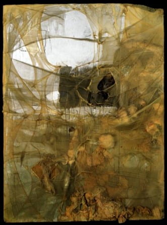
Fig. 2 Bruce Conner, ARACHNE, 1959, mixed media: nylon stockings, collage, cardboard, 65 3/4 x 48 3/4 x 4 1/4 in. (167.0 x 123.8 x 10.7 cm), Smithsonian American Art Museum, Washington D.C.
As Aukeman points out, the title of the work refers to the Greek myth of Arachne, a mortal weaver of such tremendous skill that she enraged the goddess Athena, who retaliated by ripping Arachne’s tapestry from her loom and turning her into a spider.[xlii] Aukeman ponders whether Conner identified with Arachne or Athena,[xliii] but I would suggest that the artist invoked the myth as myth, rather than psychologically aligning himself with one of its protagonists. The spider woman offers ambiguous symbolism as a skilled weaver, a maternal protectress, and an entrapping temptress. As we have seen, seduction and the threat of corporal harm are interwoven within fetishism, and Conner was quick to acknowledge the fetishistic quality of nylon stockings. This characteristic is visually expressed through bulbous nylon appendages that cover the surface of ARACHNE, conjuring Freud’s assertion that the fetish is a substitute for the mother’s missing phallus. The artist visualizes the menace of castration and death Arachne poses as both mother and seductress through splatters of red pigment that lend the masses of nylon a bloody bandage-like effect. But Arachne is also a woman imprisoned within a spider’s body, making her both the trapper and the trapped. In this way, she exemplifies Conner’s assertion that feminine accessories like nylon stockings captured women within a contradictory expectation of allure and modesty, an objectifying force that fed postwar consumerism and gendered violence alike.
Kevin Hatch argues that ARACHNE annihilates the subjecthood of the viewer: “its nylon strands veil nothing but its own voided core,” offering “no place for the observer whatsoever, no escape, no refuge.”[xliv] As a dangerous, seductive woman, we might say that Arachne is the agent of this obliteration, luring innocents to her web. Yet this threat of destruction and death has another layer of meaning within the context of the myth. The tale of Arachne is a cautionary one, a warning that humans should not claim the power of gods, lest they be punished for their hubris. In Conner’s formulation, the stretched, wrapped, and ripped nylon in the work is Arachne’s web, which was once a beautiful tapestry, but due to the arrogance of its weaver has become abject and ruined, breeding only darkness and decimation. In this respect, the work might be understood in relation to Conner’s lifelong fascination and abhorrence toward the nuclear bomb and the arms race of the Cold War, which represented such an unprecedented and devastating assertion of dominion over nature and human life as to be almost biblical in proportion. As a child, Conner watched documentation of the July 25, 1946, submarine bomb test conducted at Bikini Atoll.[xlv] The footage left a profound impression on the artist and remained an object of fascination and fear that Conner repeatedly used in his work. Most notably, it appears in his 1976 film CROSSROADS, “which consists entirely of declassified government footage of the underwater Bikini test explosion.”[xlvi]
Beyond its marketing and manufacturing associations with World War II, nylon has an eerie connection to the development of the atomic bomb. DuPont, the same petrochemical company that invented the textile, was a major player in the Manhattan Project, developing the plutonium that was a key ingredient in the bomb dropped on Nagasaki.[xlvii] Whether Conner was aware of this connection is hard to know. If he was, he never stated it outright in the myriad interviews he gave throughout his career. Nevertheless, it confirms a thematic thread that ran through the heart of so much of his oeuvre: the simultaneous seduction and repulsion he felt in response to atomic warfare.
At the very least, Conner’s use of nylon might be interpreted as a nod to the fragility of life during the Cold War era, when the possibility of an impending nuclear attack never felt far away. Describing the first time he took the hallucinogenic drug peyote, Conner said,
I experienced myself as this very tenuously held-together construction—the tendons and muscles and organs loosely hanging around inside—and it seemed like at any moment disaster could strike and you could fall apart…. you were just held together by this thin skin and strings of flesh. And shortly after that I started working on a number of named pieces, but the first one was Snore, which has all these organ-like lumps of things.[xlviii]
SNORE (Fig. 3) is composed almost entirely of nylon; its delicate fibers bunched into pendulous blobs that are held inside stretched layers of stringy nylon skin. In this way, SNORE isolates another crucial aspect the Conner’s use of nylon that so many scholars have hedged toward but never stated. In its closeness to the body, its fleshy tones, and its elasticity, nylon acts as a kind of second skin, albeit one that is far from universal in its limited range of pale hues. Nonetheless, Conner exploited this quality in many of his assemblages, lending them a corporal presence. Conner often emphasized the gendered nature of this surrogate skin by incorporating costume jewelry and other feminine “masks,” as he called them.[xlix] But without these, the effect is simply bodily, allowing Conner to create works like SNORE. The assemblage’s title is at once comic and foreboding, for the body is most vulnerable in sleep. Towards the top of the work, a metal can with a black mouth gapes at the viewer. Conner’s title implies slumber, but the abstracted figure could just as easily be screaming.
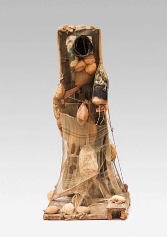
Fig. 3 Bruce Conner, SNORE, 1960, wood, nylon, and metal, 36 1/2 x 17 1/2 x 21 1/2 in. (92.7 x 44.5 x 54.6 cm), Fine Arts Museums of San Francisco, San Francisco, CA.
The corporeality Conner could conjure with nylon was apparent to him from the very first work he defined as an assemblage, RATBASTARD (Fig. 4). The artist described the piece as a “wounded” painting covered with nylon stockings, affixed with “a picture of a cadaver on an operating table…with wire and wood representing bones and structure.”[l] For Conner, the work took on its own “persona.”[li] In this description, the wounded painting and the injured body become one and the same, as the work’s various bodily features—nylon skin, wood bones—combine to create a figure. However, the specter of American violence and militarism was always present too, as evinced in RATBASTARD’s slashed canvas and corpse, as well as nails and bloody brown paint stains that appear around the periphery of the work (Fig. 5).
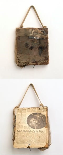
Figs. 4 & 5 Bruce Conner, RATBASTARD, (recto and verso), 1958, wood, canvas, nylon, newspaper, photographic reproduction, wire, oil paint, nails, bead chain, etc., 16-1/2 x 9-1/4 x 2-3/4 inches, Walker Art Center, Minneapolis, MN.
The alignment of nylon with United States military manufacturing, and the visual parallel Conner drew between the material and violence provide a potential answer to a question that has not yet been posed in the literature. Namely, why Conner almost entirely stopped using nylon when he moved to Mexico City with his wife Jean in 1961. Of the many assemblages Conner made while the couple was living there between 1961 and 1962, only a few incorporate the material at all. Of course, this was partially due to the difference in available tools, and the couple’s lack of a social network in Mexico. Conner found that the people of Mexico did not discard their belongings as readily as Americans, making the refuse he was accustomed to using scarcer.[lii] Additionally, their short-term stay likely prevented the artist from sourcing nylons from friends or acquaintances.
Nonetheless, there was also a thematic reason for Conner’s shift in materials. In a letter to Museum of Modern Art curator William Seitz, Conner wrote of his time in Mexico, “It is difficult for me to understand USA violence here…I feel I have left most all the oppressive scene behind me.”[liii] Given the myriad connections between “USA violence” and Conner’s use of nylon outlined above, this statement is a compelling argument for the artist’s sudden stop in its use. This reading is bolstered by the fact that shortly after the artist returned to the United States in 1963, he submitted his coded request for nylon donations at the University of Chicago.
One year later, in 1964, Conner ceased making assemblages altogether. This was partially due to the increasing institutionalization and popularity the form had gained in the preceding years. William Seitz, the same curator Conner wrote to from Mexico, had organized the landmark exhibition The Art of Assemblage at the Museum of Modern Art in 1961. The show gave a name, historical lineage, and establishment approval to a style that only a few years earlier had seemed marginal. For Conner, the increasing attention being paid to assemblage and the resultant notice his own work was generating threatened stale convention. As Peter Boswell discerned, Conner “resented the pressure to continue in the same mold. But…he [was also] tired of the static nature of what had become, in just a few years, ‘conventional assemblage making.’”[liv] Aukeman notes that one of the reasons Conner was initially attracted to assemblage was that it lacked a name or style, and as such, was free from tradition or established norms.[lv] Once recognition and labeling took hold, Conner jettisoned the form that had brought him fame for fear of being pigeonholed.
But Conner also grew tired of the object-ness of his assemblages. He began to see in them, “an unnecessary gross attachment to property and objects,” in which he was “entrapped” due to his need to preserve and store them.[lvi] Work that was once outside and critical of the capitalist system due to its discarded materiality began to feel corrupted by commerce. “I see a continuing campaign,” Conner said, “on the part of controllers of art to turn these things into commodities, to define what individuals are doing with their hands so that they conform to a political, social, and economic agenda that pertains to the establishment, finance, and the art world.”[lvii] Conner refused to participate in that process, and so, famously, he “stopped gluing big chunks of the world in place.”[lviii]
Conner’s final assemblage, LOOKING GLASS (Fig. 6), can be understood as a virulent critique of American consumer culture, the commodification of femininity, and in turn, the commodification of women themselves. A confrontational final opus measuring five by four feet, the work reaches out toward the viewer with mannequin arms, conjuring a fortuneteller figure. Her head is not a woman’s but a blowfish, its spikes poking through layers of suffocating nylon, its lips gasping for breath. She emerges from layers of feminine accouterment: nylons, lingerie, fringe, feathers, fake flowers, costume jewelry, a high-heeled shoe, and a beaded purse. Conner once called accessories of this sort “demonic devices” that do not represent women, but instead constitute objects of martyrdom akin to “the chains and the locks and the crowns of thorns.”[lix] And indeed, the figure in LOOKING GLASS is bound to them with rope that wraps around her wrist and cuts across her throat.
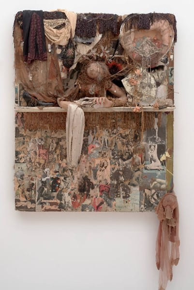
Fig. 6 Bruce Conner, LOOKING GLASS, 1964, mixed media on Masonite, 60 1/2 x 48 x 14 1/2 in. (153.67 x 121.92 x 36.83 cm), San Francisco Museum of Modern Art, San Francisco, CA.
Below the ledge on which she rests, the bottom half of the work is covered in ripped and stapled pornography. Hundreds of nude women populate this portion of the piece, revealing an subterranean world where objects of desire are no longer the commodities above, but women themselves. In the lower right corner, a cascading conglomeration of nylons connects the two spheres of the work, making clear that they are one and the same. As an object of both sexual and consumer fetishism, nylon stockings eliminate the difference between them, revealing American consumption as the burden borne and worn by women. In keeping with Conner’s earlier work, there is an inherent violence to this wearing and bearing, exemplified by the layers of nylon that seem to strangle and blind the blowfish face above. In this way, nylon becomes a metonym for the entanglement of consumerism with gendered subjugation and state brutality. Shards of broken mirror and the work’s title make clear that this is not Conner’s personal psychosexual fantasy, but a reflection of us all. LOOKING GLASS is the barbarism of American consumerism and sexism staring you in the face. For though the blowfish is blinded, just above it, a woman’s eyes peer out beneath layers of fringe and flowers.
Knowledge of nylon’s early history is crucial to the analysis above. Without it, LOOKING GLASS reads as an overblown fetish itself, its accumulation of sexual imagery and objects serving merely to reinforce their venereal charge. With it, the work becomes a broader meditation on the ills of American production and consumption, whether of objects, images, or ideology. Nylon, through its manufacture and marketing, was key to the production of all three. As such, it was a complex material that Conner mined in myriad ways.
Its erotic and gendered associations could be mobilized to great effect, but this was far from the only meaning Conner unraveled from the fiber. Its interwoven history with World War II in its production and publicity, as well as its resultant status as an overvalued luxury good, proved equally fruitful for the artist. Resolutely antiwar, Conner used nylon to create concealed allegories relating to the ruin of human invention by military conflict, and the fragility of human life in the age of nuclear weapons. Nylon’s corporal qualities allowed Conner to create pseudo figures with the fiber, conjuring polyp-like protrusions, entrails, and skin-like encasings. He also never lost sight of the material’s status as both a sexual and consumer fetish.
Nylon was perhaps the quintessential American commodity at midcentury. It represented the country’s nationalist economic agenda, served as a crucial weapon during the Second World War, and was critical to the chemical engineering developments that engendered rampant postwar consumerism. In all of these ways, it provided the perfect material means for Conner to question American consumption, Cold War politics, patriarchal gender constructions, and violence writ large. However, nylon’s greatest potential lay in its flimsy and flexible materiality, for unlike a Campbell’s soup can or a Brillo box, which cannot escape their concrete commodity status, nylon stockings are more surface than object. As such, they allowed Conner to achieve the kind of narrative multiplicity and ambiguity for which he strove in all his artwork.
[i] Peter Boswell, “Bruce Conner: The Theater of Light and Shadow,” in 2000 BC: the Bruce Conner story Part II, ed. Peter Boswell, Bruce Jenkins, and Joan Rothfuss (Minneapolis: Walker Art Center, 1999), 44.
[ii] Susan Smulyan, “The Magic of Nylon: The Struggle Over Gender and Consumption,” in Popular Ideologies, (Philadelphia: University of Pennsylvania Press, 2007), 41.
[iii] Smulyan, “The Magic of Nylon,” 47–8.
[iv] Smulyan, 44; Susannah Handley, “‘N’ Day: The Dawn of Nylon,” in Nylon: The Story of a Fashion Revolution: a celebration of design from art silk to nylon and thinking fibres, (Baltimore: Johns Hopkins University Press, 1999), 35.
[v] “$10,000,000 Plant to Make Synthetic Yarn: Major Blow to Japan’s Silk Trade Seen,” New York Times, Oct. 21, 1938.
[vi] Smulyan, “The Magic of Nylon,” 55.
[vii] Smulyan, 55.
[viii] Handley, “‘N’ Day,” 48.
[ix] Smulyan, “The Magic of Nylon,” 56.
[x] Handley, “‘N’ Day,” 48.
[xi] Handley, 48.
[xii] Handley, 50; Smulyan, “The Magic of Nylon,” 58.
[xiii] Handley, “‘N’ Day,” 50.
[xiv] Smulyan, “The Magic of Nylon,” 61–2.
[xv] Handley, “‘N’ Day,” 50.
[xvi] Handley, 50.
[xvii] Pap Ndiaye, Nylon and Bombs: DuPont and the March of Modern America, (Baltimore: Johns Hopkins University Press, 2007), 2.
[xviii] Ndiaye, Nylon and Bombs, 2; Handley, “‘N’ Day,” 40.
[xix] Bruce Conner and John Yau, “Folded Mirror: Excerpts of an Interview with Bruce Conner,” On Paper 2, no. 5 (May–June 1998), 34.
[xx] Conner and Yau, “Folded Mirror,” 34.
[xxi] Smulyan, “The Magic of Nylon,” 61–62.
[xxii] Smulyan, 70.
[xxiii] Greil Marcus, “Bruce Conner’s Black Dahlia,” in Bruce Conner: It’s All True, ed. Rudolf Frieling and Gary Garrels (San Francisco: San Francisco Museum of Modern Art, 2016), 79.
[xxiv] Bruce Conner quoted in Rebecca Solnit, Secret Exhibition: Six California Artists of the Cold War Period, (San Francisco: City Lights Books, 1990), 63.
[xxv] Sigmund Freud, “Fetishism,” in The Standard Edition of the Complete Psychological Works of Sigmund Freud, Vol. 21, trans. and ed. James Strachey, et al, (London: Hogarth Press, 1961), 152–157.
[xxvi] Laura Hoptman, “Beyond Compare: Bruce Conner’s Assemblage Moment, 1958-64,” in It’s All True, ed. Rudolf Frieling and Gary Garrels (San Francisco: San Francisco Museum of Modern Art, 2016), 283.
[xxvii] Hoptman, “Beyond Compare,” 282.
[xxviii] Greil Marcus, “Bruce Conner: The Gnostic Strain,” Artforum 31, no. 4 (Dec. 1992), 75.
[xxix] Hans Ulrich Obrist and Gunnar B. Kvaran, “Interview: Bruce Conner.” Domus, no. 885 (Oct. 2005), 23.
[xxx] Bruce Conner in discussion with Peter Boswell, February 11, 1986, quoted in Boswell, “Bruce Conner: The Theater,” 31.
[xxxi] Anastasia Aukeman, Welcome to Painterland: Bruce Conner and the Rat Bastard Protective Association, (Berkeley: University of California Press, 2016), 138. I cite this list because it seems that these works are no longer extant except in their printed descriptions.
[xxxii] Aukeman, Welcome to Painterland, 138.
[xxxiii] Solnit, Secret Exhibition, 71; Kevin Hatch, “‘It has to do with the theater’: Bruce Conner’s Ratbastards,” October 127, (Winter 2009), 117.
[xxxiv] Aukeman, Welcome to Painterland, 138.
[xxxv] Solnit, Secret Exhibition, 61.
[xxxvi] Hatch, “It has to do,” 117.
[xxxvii] Aukeman, Welcome to Painterland, 138.
[xxxviii] Solnit, Secret Exhibition, 64.
[xxxix] Bruce Conner quoted in Solnit, Secret Exhibition, 64; Rachel Federman, “Bruce Conner: fifty years in show business,” in Bruce Conner: It’s All True, ed. Rudolf Frieling and Gary Garrels (San Francisco: San Francisco Museum of Modern Art, 2016), 29.
[xl] Federman, “Bruce Conner,” 83.
[xli] Aukeman, Welcome to Painterland, 138.
[xlii] Aukeman, 142.
[xliii] Aukeman, 142.
[xliv] Hatch, “It has to do,” 132.
[xlv] Federman, “Bruce Conner,” 83.
[xlvi] Federman, 83.
[xlvii] Ndiaye, Nylon and Bombs, 2 and 143.
[xlviii] Solnit, Secret Exhibition, 62–3.
[xlix] Solnit, 65.
[l] Marc Selwyn, “Marilyn and the spaghetti theory,” Flash Art 24, no. 154 (Jan.–Feb. 1991), 94.
[li] Selwyn, “Marilyn and the spaghetti theory,” 94.
[lii] Federman, “Bruce Conner,” 86.
[liii] Letter from Bruce Conner to William Seitz, undated (probably Dec 1961) BCP quoted in Federman, “Bruce Conner,” 86.
[liv] Boswell, “Bruce Conner: The Theater,” 44.
[lv] Aukeman, Welcome to Painterland, 188.
[lvi] Selwyn, “Marilyn and the spaghetti theory,” 94.
[lvii] Selwyn, 97.
[lviii] Obrist and Kvaran, “Interview: Bruce Conner,” 23.
[lix] Solnit, Secret Exhibition, 65.
Charlotte Kinberger is a master’s candidate at the Institute of Fine Arts, NYU, focusing on modern and contemporary art. Her research interests include revisionist histories of Modernism, “Craft” and “Folk” art, textile and costume history, and feminist and critical race theory. She studied Art History and Material Culture at Sarah Lawrence College and the University of Oxford and has held internship positions at the Whitney Museum of American Art and the Pitt Rivers Museum, Oxford. More recently, she has served as the Gallery Manager at James Fuentes, New York, and the Assistant Director at Altman Siegel Gallery, San Francisco.
The Institute of Fine Arts, New York University
The Description de l’Égypte is an encyclopedia of the findings of Napoleon’s army in Egypt during their 1798–1801 invasion and occupation. In this paper, I compare the original drawings produced in Egypt with the final prints and the ancient monuments. After careful consideration of the artist materials used to create the Description, this study reveals instances in which the savants and the engravers exerted creative agency over the content, composition, and style of the printed images. I argue that these examples highlight the imperial narrative of the work and its Orientalist underpinnings while also serving to discredit French claims of objectivity in representation.
![]()
The Description de l’Égypte, ou, Receuil des observations et des recherches qui ont été faites en Égypte pendant l’expédition de l’armée française is a 24-volume encyclopedia that details the scientific findings of Napoleon Bonaparte (1769–1821) and his army during the 1798-1801 French invasion, occupation, and exploration of Egypt. The Commission des Sciences et des Arts d’Égypte accompanied the army with the mission of documenting and disseminating information relevant to Napoleon’s political and military campaigns. The Commission, known collectively as the savants, consisted of 150 engineers, artists, scientists, and architects. During the occupation, the savants produced detailed notes, sketches, and maps of Egyptian monuments which would form the intellectual basis of the Description de l’Égypte.
In 1801, when Napoleon’s generals capitulated to Admiral Nelson and abandoned Egypt, the British took possession of the antiquities gathered by the French, most notably the Rosetta Stone. However, the French were permitted to keep their notes, sketches, and other papers. In 1802, Napoleon declared that the findings of his army would be published at the government’s expense as a massive, multi-volume illustrated book. The Description de l’Égypte is divided into three sections: antiquities, natural history, and the modern state. The complete set consists of nine volumes of text, fourteen volumes of prints, and the Explication des planches – a text directory to the plates. Although 1,000 engravings were proposed, only 837 engravings were produced in total. The French government sub-contracted the production of the plates to five printmakers in Paris.[i] The ten volumes of explanatory text were published by the Imprimerie Impériale (later the Imprimerie Nationale). The first volume was available to subscribers in 1809 and the final volume was published in 1829.
The Description de l’Égypte, considered to be the first major text in Egyptology, is believed to have influenced the trajectory of the discipline even before the translation of the hieroglyphs by Jean-François Champollion in 1822. However, historians David Prochaska and Anne Godlewska argue that the Description de l’Égypte reveals more about its French authors than it does about Egypt. Prochaska reads the plates as examples of cultural orientalism in both the political and intellectual realm.[ii] He concludes that the knowledge-gathering activities of the savants actively supported Napoleon’s military and imperial ambitions. Godlewska examines the maps of the Description and identifies the goals of the cartography within the ideology of empire.[iii] She notes how the French believed that the monuments of ancient Egypt were a testament to singular strength of the pharaoh, a leadership model Napoleon sought to emulate. She observes that the French chose to record elements that highlight civic strength, yet ignored those that show ruin, neglect, and vestiges of Mamluk rule in Egypt.
In the Preface to the Description, Joseph Fourier, a mathematician and the first editor of the Description, poetically links conceptions of empirical truth with the art of engraving. Godlewska writes that for Fourier: “truth was largely assumed to be synonymous with science…[Fourier] makes it clear that the mission of the text is scientific representation. If something could be represented with precision, detail, or accuracy it clearly had the value of truth. The ultimate in truth was reproducibility.”[iv]
Fourier’s position is grounded in the Enlightenment notion that truth could be conveyed by representation and images. The engravings of the Description, based on the drawings produced in Egypt by the savants, led them to claim scientific objectivity.
While the Description de l’Égypte is a masterpiece because of its scale, the technical supremacy of its engravings, and its overall beauty as a work of art, it cannot be read as an objective representation of Egypt during the French invasion. I suggest the artistic techniques used to translate stone monument to print reveal the culturally constructed biases of its authors. The choices made by the savants and the engravers were motivated by the imperial narrative predominant in Napoleon-era France. These examples demonstrate how the engravers actively contributed to the content and composition of the prints. As a result, any study of the Description is incomplete without acknowledging the interventions and hidden intentions of the authors.
In this paper I consult the preliminary drawings sketched by the savants in Egypt. Of the 816 drawings held and digitized by the Bibliothèque nationale de France (BnF), this article examines 10 drawings and their related prints. The study is limited to just three sites – Philae, Medinet Habu, and Karnak. Philae, the first site presented in the Description, is notable for scholars as an early document of its pre-flood condition. The site suffered from frequent flooding since the construction of the Aswan Low Dam in 1902. The Philae temple complex was dismantled and relocated to a neighboring island prior to the construction of the Aswan High Dam in 1970. Medinet Habu and Karnak were selected because the sites have been well-documented by archeologists. The Oriental Institute of the University of Chicago recorded and published the reliefs at Medinet Habu and Karnak as part of their epigraphic survey of Egyptian monuments.
Several institutions have digitized their sets of the Description de l’Égypte. In this paper, I consult the high-resolution tiff images of the prints from the New York Public Library. The original drawings are held in the BnF and are available to view online. Although I have viewed several volumes of the Description de l’Égypte in person at The Explorer’s Club in New York City, in this article my primary method of studying the prints and drawings was by viewing the digital downloads in Adobe Photoshop using the zoom tool for magnification. As a result, I cannot comment on the effects of the various papers used for the prints and drawings, nor can I make any claims about the scale of the drawings in comparison to the printed images. However, the digital nature of my investigation has allowed a sustained examination of the drawings and prints under intense magnification and a direct side-by-side comparison that would not have been otherwise possible in the reading room.
As prints are not objective, I suggest that engraving should be understood as a fundamentally interpretive medium. The technical process of engraving reduces drawings to patterns of lines and dots. These lines suggest shape, shading, value, and color. A substantial amount of translation was required by both the savant and engraver to represent three-dimensional stone carvings on a two-dimensional sheet of paper. Therefore, it is useful to begin this discussion by examining the various media used to create the images within the Description.
Many of the drawings produced by the savants in Egypt were made with crayon noir. In contemporary French, crayon translates to pencil. However, in the late eighteenth-century, crayon denoted the invention of Nicolas-Jacques Conté (1755–1805), the scientist and inventor best known for inventing fabricated graphite, called the conte crayon. He was also an early member of Napoleon’s scientific commission in Egypt. Previously, graphite had been manufactured by the English, by using mined plumbago to create a drawing medium. In contrast, Conté combined clay, powdered graphite, and lampblack to produce graphite rods. He was issued a patent for his invention in 1795 and manufactured the rods in several levels of hardness and blackness.[v] Conte crayons were quickly adopted by artists, writers, and those engaged in technical drawing.[vi] Conte crayons were preferred by technicians because they were manufactured to be consistent and permanent. English pencils made with mined leads could be erased from paper with breadcrumbs whereas the conte crayon could not. In this way, in the words of Richard Taws, “…Conté’s pencils stopped time. Their marks were indelible, as permanent as an engraving.”[vii]
Some of the prints in the Description show the savants at work recording the monuments. The savants are depicted facing the monument with their drawing board, often wearing a top hat and coat. This type of human staffage was frequently used in architectural drawings to provide both scale and context to the monuments. For example, in plate 67 (Fig. 1) there is a savant sketching the temple of El-Kab holding a double ended porte-crayon in his hand. In the eighteenth-century, graphite rods were not encased in wood (the form of the modern-day pencil). Rather, the rods were held in a device called a porte-crayon. The claw grips at either end of the device held an un-encased piece of crayon. These vises were made from wood and later metal.[viii]
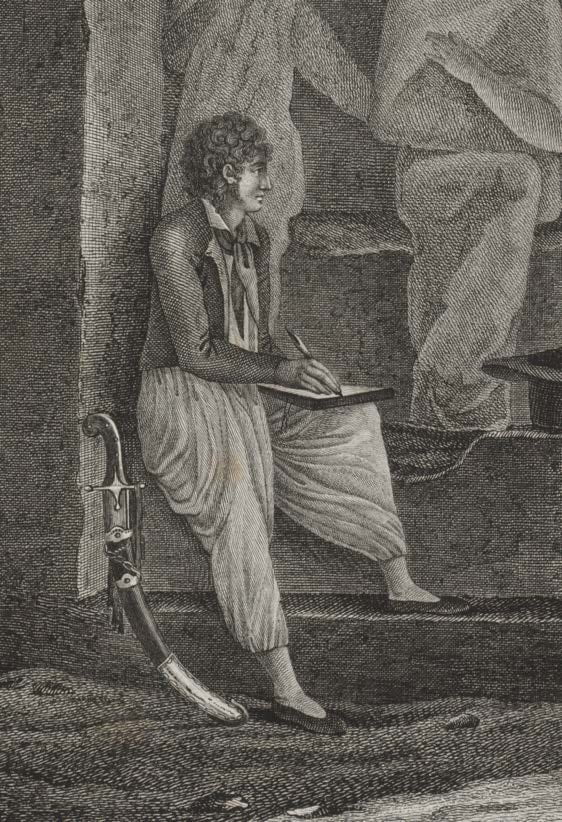
Fig. 1 Description de l’Égypte, Plate 67. Vol. I, 1809, engraving on paper, 70 x 51 cm. New York Public Library, New York, NY.
Gilbert-Joseph-Gaspard de Chabrol de Volvic (1773–1843), a civil engineer, used crayon almost exclusively for his drawings. Chabrol, a graduate of the École polytechnique and a member of Napoleon’s team, designed bridges and roads to transport military equipment and personnel.[ix] Chabrol would have been trained in the principles of descriptive geometry at the École polytechnique. Descriptive geometry was developed in the eighteenth-century by Gaspard Monge, a founder of the École polytechnique. Descriptive geometry claims to be equal part art and science, applying mathematical rigor to the practice of drawing.[x] This method for rendering three-dimensions in only two was adopted by architects, surveyors, and engineers to record objects and buildings on paper with detail and precision. In this manner, descriptive geometry was deemed the most truthful method of representation because the “…association with measurement mathematics and observational instrumentation … lent [the images] apparent objectivity.”[xi]
Chabrol’s training in descriptive geometry is apparent when examining one of several sketches of wall relief from Philae (Fig. 2). His system for creating tonal effects is schematic and simple; it communicates depth with flat layers of highlight, mid-tone, and shadow. Chabrol used the side of a pencil to create an overall mid-tone, almost like a ground, on the paper. Highlights were subtracted by erasing the mid-tone and shadows were rendered by additional shading in pencil. Chabrol does not include additional shading to define the musculature of the figures. This drawing is reproduced in Plate 22 of Volume I of the Description, along with other small reliefs sketched by Chabrol (Fig. 3). The engraving was meant to be understood as a perfect reproduction of the drawing, which in turn was a perfect reproduction of the carving. In the early modern period, engraving was considered a mimetic method of reproduction. Engraving was understood by some as a reproductive technology, rather than an artistic medium. Indeed, the Printmaking Bible states, “…the stylized nature of the prints reduced the art of engraving to one of reproduction rather than that of a medium capable of creative or original design.”[xii] The engraver is not an artist, but rather a craftsman or artisan. Image quality is measured by technical excellence.[xiii] Additionally, in the nineteenth and twentieth centuries, engraving was sometimes regarded as merely mechanical and uninventive.
![Fig. 2 Chabrol de Volvic, [Ile de Philae] : [bas-reliefs du temple de l'ouest], 1798-1809, crayon noir et plume, 27.8 x 44.2 cm. Bibliothèque nationale de France. Paris, France.](https://bpb-us-e1.wpmucdn.com/wp.nyu.edu/dist/1/12638/files/2021/06/Fig.-2-1024x694.jpg)
Fig. 2 Chabrol de Volvic, [Ile de Philae] : [bas-reliefs du temple de l’ouest], 1798-1809, crayon noir et plume, 27.8 x 44.2 cm. Bibliothèque nationale de France. Paris, France.
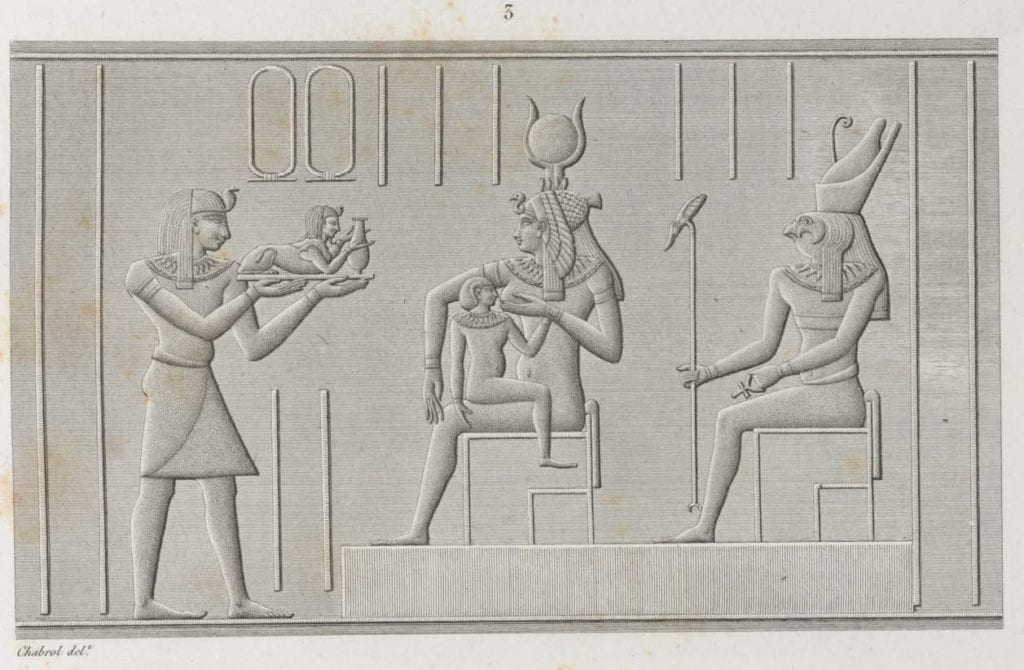
Fig. 3 Description de l’Égypte, Plate 22. Vol. I, 1809, engraving on paper, 70 x 51 cm. New York Public Library, New York, NY.
For example, the engraving of Chabrol’s drawing reproduces the tonal effects of the conte crayon in two ways. The figures are rendered with stipple engraving. To create this effect, the engraver would use a burin to gouge out a pattern of dots to create passages of tone. By increasing the density of dots, the engraver could suggest an increase in value. Parallel lines imitate the flat wall. Stipple and line are used together, even though Chabrol’s shaded mid-tone does not graphically differentiate a change in the surface of the stone carving.
In the engraving, the wall may have been rendered exclusively in lines because it created less work for the engraver. Conté developed an engraving machine that could render perfectly straight lines that were spaced at regular distances. His machine reduced the work of eight months to just two or three days.[xv] This technique was especially effective for depicting the vast cloudless Egyptian sky. Richard Taws writes that “the uncannily serene visual effect [the engravers] created, generated a strangeness all their own.”[xvi] The regular lines appeared highly mechanical to Western viewers. The perfectly straight lines of the wall suggest a perfectly smooth, flat stone surface. However, in reality, the sandstone surfaces of Philae were damaged from frequent flooding. Ultimately, the overall effect of the parallel lines is one that separates the wall relief from its context as part of an ancient monument.
Other savants received their artistic training outside of the École polytechnique, such as Charles Louis Balzac (1752–1820), an architect and artist. As a painter, Balzac exhibited at salons during the French Revolution.[xvii] Balzac primarily used lavis d’encre, or ink wash, for his drawings. In contrast to crayon, which is a dry medium, ink is a wet medium. Ink is a fluid suspension of fine particles in water and a binding medium. Inks are generally applied with a nibbed pen but can be thinned with water and applied with a brush, known as wash. Balzac also used aquarelle, or watercolor. Watercolor is a paint medium of pigment powder, water, and a gum binder. It is applied as transparent washes with soft sable brushes. As a result of using wet media in his works, Balzac’s style is distinctly more painterly than that of Chabrol, as seen in his relief from Philae (Fig. 4). Although Balzac used the same general principles of highlight, mid-tone, and shadow as Chabrol, Balzac applied darker washes to accentuate subtleties of the stone surface and the musculature of the figure. The final engraving (Fig. 5) uses the same convention of stipple for the figures and line for the walls as seen above. Where Balzac has rendered shadow, the stippling is denser. In this manner, the engravings neither imitate the drawing media nor differentiate wet or dry application.
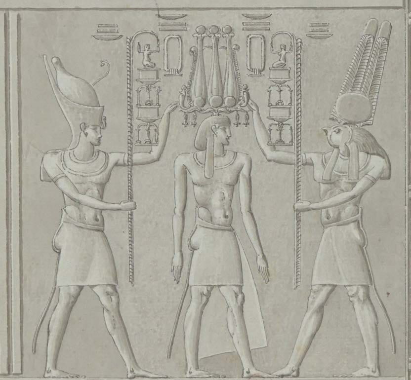
Fig. 4 Charles-Louis Balzac, [Ile de Philae] : [bas-relief du Grand temple], 1798-1809, aquarelle,
lavis d’encre et plume, 15.6 x 20.1 cm. Bibliothèque nationale de France. Paris, France.
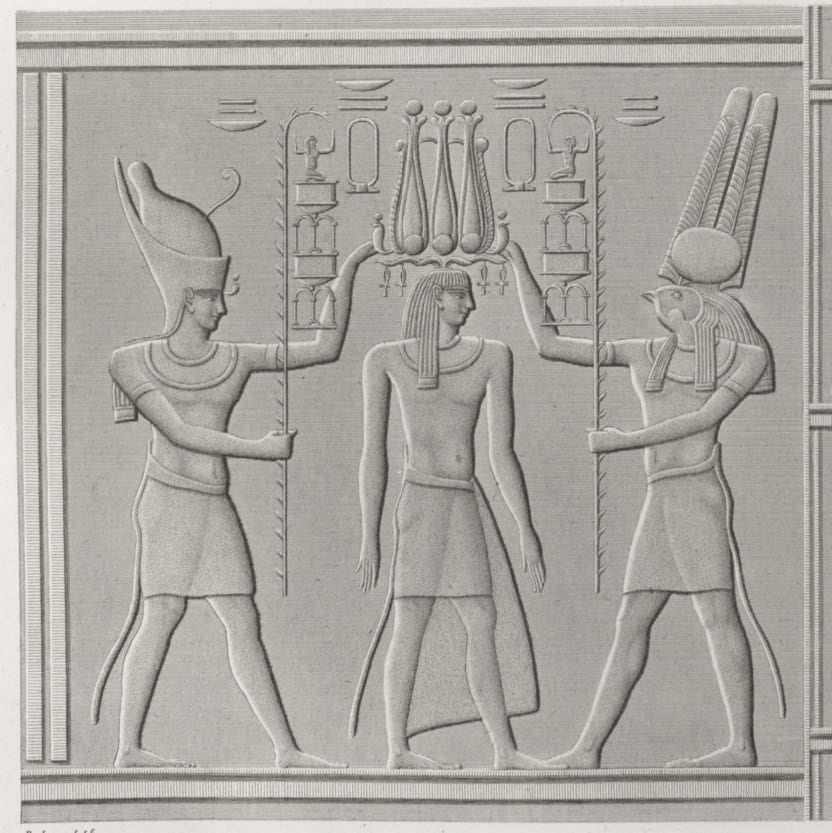
Fig. 5 Description de l’Égypte, Plate 12. Vol. I, 1809, engraving on paper, 70 x 51 cm. New York Public Library, New York, NY.
One of the most obvious changes between Balzac’s drawings and the final engravings concerns facial details. Unlike Chabrol who meticulously rendered the faces in sharp pencil, Balzac used ink and wash to casually suggest features. The eyes are reduced to lines; nostrils and lips are omitted. Yet, the final engravings include facial details not depicted in Balzac’s original sketches. The faces are styled to resemble those drawn by Chabrol. As seen previously, Chabrol paid particular attention to the finest of details, especially in the faces and headgear. His high level of detail was retained almost exactly in the engravings.
In another sketch by Balzac of Philae (Fig. 6), small figures are rendered with thick brushed lines and as such, the facial features are vague. Wash is used to render the shadow of eye sockets and the area under the cheekbone. However, as above, the engravers extrapolated from the sketches and included simple facial details, such as rounded noses and smiles with upward turned lips (Fig. 7). Very little of Balzac’s shading technique of the figures is retained in the engravings. Unlike the previous reliefs, the engravers used parallel lines to render both figure and wall.
![Fig. 6 Charles-Louis Balzac, [Ile de Philae] : [bas-reliefs de l'édifice de l'ouest], 1798-1809, aquarelle, lavis d'encre et plume, 21.4 x 27.1 cm. Bibliothèque nationale de France. Paris, France.](https://bpb-us-e1.wpmucdn.com/wp.nyu.edu/dist/1/12638/files/2021/06/Fig.-6-1024x678.jpg)
Fig. 6 Charles-Louis Balzac, [Ile de Philae] : [bas-reliefs de l’édifice de l’ouest], 1798-1809, aquarelle, lavis d’encre et plume, 21.4 x 27.1 cm. Bibliothèque nationale de France. Paris, France.
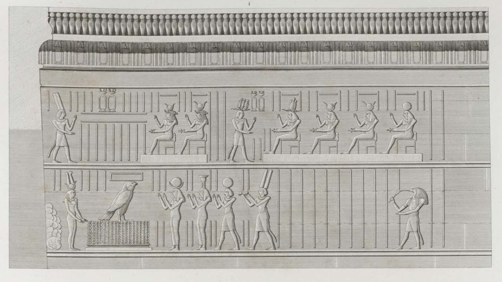
Fig. 7 Description de l’Égypte, Plate 19. Vol. I, 1809, engraving on paper, 70 x 51 cm. New York
Public Library, New York, NY.
More than 400 printmakers were employed over the course of the twenty-year production of the work. At the bottom of each print, the author of the drawing is acknowledged as well as an engraver. However, each print produced for the Description was the result of many hands, with each member of the printshop contributing a particular skill or area of expertise. There was a need to maintain consistency in all the images, especially considering that five different print shops were tasked with producing the plates. The regularizing of the features was likely part of a conscious effort to create a unified style that could be replicated over the course of many years and many volumes.
Descriptive geometry was designed to render Western architectural styles. As a result, it is limited in its ability to express Eastern styles and features. Jean-Baptiste Prosper Jollois (1776–1842) and Édouard de Villiers du Terrage (1780–1855), both civil engineers at the École polytechnique, produced this measured drawing of the first pylon of the Isle of Philae (Fig. 8). At first glance, both the preliminary drawing and the engraving (Fig. 9) suggest that the wall carvings are rendered bas-relief. A controlled combination of stipple, line, and shading were employed to show the dimensional differences of the wall surface. However, this photograph (Fig. 10) reveals that the carvings on the pylon are, in fact, sunk relief rather than bas-relief. With sunk relief carving, the wall surface is left flat and the area around the forms is removed. The forms within the carved area are rendered in low relief, the highest point of which never goes beyond the plane of the wall surface. Sunk relief creates strong shadows around the figures depending on the time of day and angle of the viewer, as seen in the photograph. The style is mostly limited to Egyptian art, so the Western system of descriptive geometry lacked graphic conventions for adequately expressing the peculiarities of sunk relief. This salient feature of Egyptian sculpture was, in a sense, lost in translation.
![Fig. 8 Jollois et de Villiers, [Ile de Philae] : [dessin], 1798-1809, lavis d'encre et crayon. No dimensions provided. Bibliothèque nationale de France. Paris, France.](https://bpb-us-e1.wpmucdn.com/wp.nyu.edu/dist/1/12638/files/2021/06/Fig.-8.jpg)
Fig. 8 Jollois et de Villiers, [Ile de Philae] : [dessin], 1798-1809, lavis d’encre et crayon. No dimensions provided. Bibliothèque nationale de France. Paris, France.
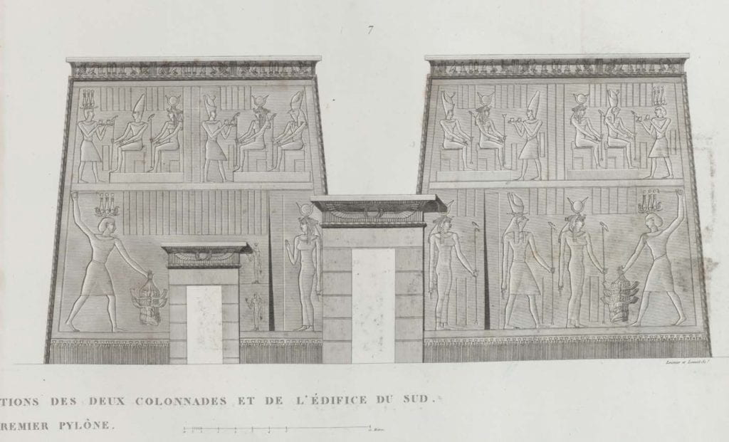
Fig. 9 Description de l’Égypte, Plate 6. Vol. I, 1809, engraving on paper, 70 x 51 cm. New York Public Library, New York, NY.
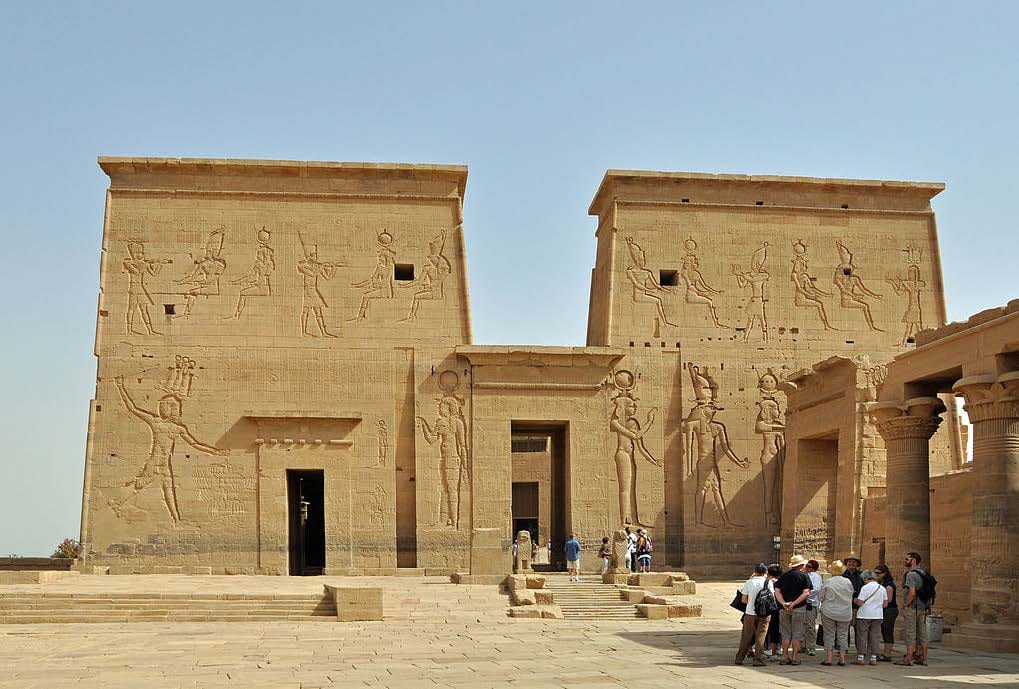
Fig. 10 Ryckaert, Marc, Aswan (Egypt): Philae Temple – first pylon, 2012, digital photograph. Wikimedia Commons. <https://commons.wikimedia.org/wiki/File:Philae_Temple_R02.jpg>
Jollois and de Villiers misrepresented the first pylon in their drawing in more consequential ways. Most notably, the photograph shows a smaller structure, known as the Gate of Ptolemy II, that blocks the full view of the relief. Several figures’ gestures have been altered. For example, the two servants on the left side of the pylon are carved with open, flat palms. However, in the drawing, these same figures have their fists closed around small bottles. In the engraving, the servants have open palms, but are carrying the small bottles. On the right side of the pylon, one of the servants has crossed arms. In both the drawing and the engraving, the figures’ arms are uncrossed. These examples are minor instances of a phenomenon that is quite common throughout the Description de l’Égypte; the savants were not always diligent about transcribing exactly what they saw.
Plate 17 (Fig. 11) and its corresponding drawing (Fig. 12) depicting the second pylon at Philae differs from the monument (Fig. 13) so substantially, one must question if this drawing was produced in the presence of the monument or instead from a less-than-perfect memory. The figures in the upper frieze are substantially smaller on the monument than as depicted in the drawing, although the gestures and dress are accurate. The entryway of the drawing has an ornamental lintel which is not a feature of the actual monument. These alterations only make sense after examining the backside of the first pylon (Fig. 14). The proportion of the figures in the upper frieze and the entryway more closely resemble the first pylon than the second. One could speculate that this drawing is a patchwork of several different sketches made at Philae that were combined inaccurately to create a complete view of the pylon for publication.
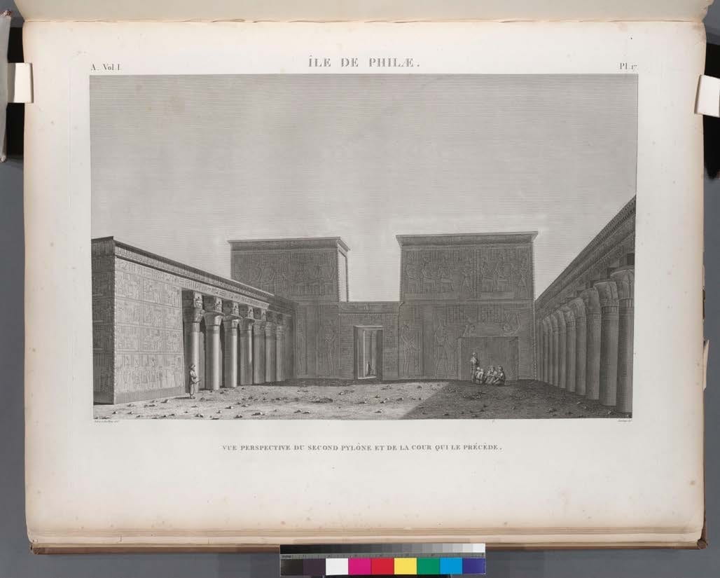
Fig. 11 Description de l’Égypte, Plate 17. Vol. I, 1809, engraving on paper, 70 x 51 cm. New York Public Library, New York, NY.
![Fig. 12 Jollois et de Villiers, [Ile de Philae] : [vue perspective du second pilône et de la cour], 1798- 1809, lavis d'encre, plume et crayon. 25.5 x 45 cm. Bibliothèque nationale de France. Paris, France.](https://bpb-us-e1.wpmucdn.com/wp.nyu.edu/dist/1/12638/files/2021/06/Fig.-12.jpg)
Fig. 12 Jollois et de Villiers, [Ile de Philae] : [vue perspective du second pilône et de la cour], 1798- 1809, lavis d’encre, plume et crayon. 25.5 x 45 cm. Bibliothèque nationale de France. Paris, France.
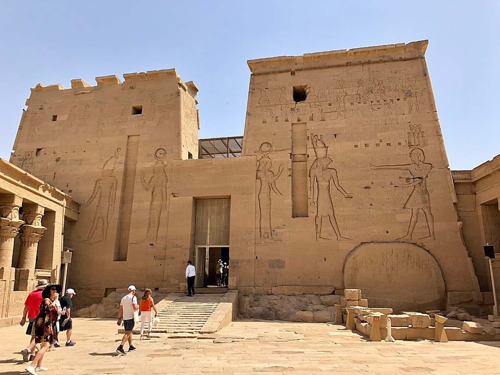
Fig. 13 LeMay, Warren, Temple of Isis, Philae Temple Complex, Agilkia Island, Aswan, AG, EGY, 2019, digital photograph. Wikimedia Commons. <https://commons.wikimedia.org/wiki/File:Temple_of_Isis,_Philae_Temple_Complex,_Agilkia_Island,_Aswan,_AG,_EGY_(48027128182).jpg>
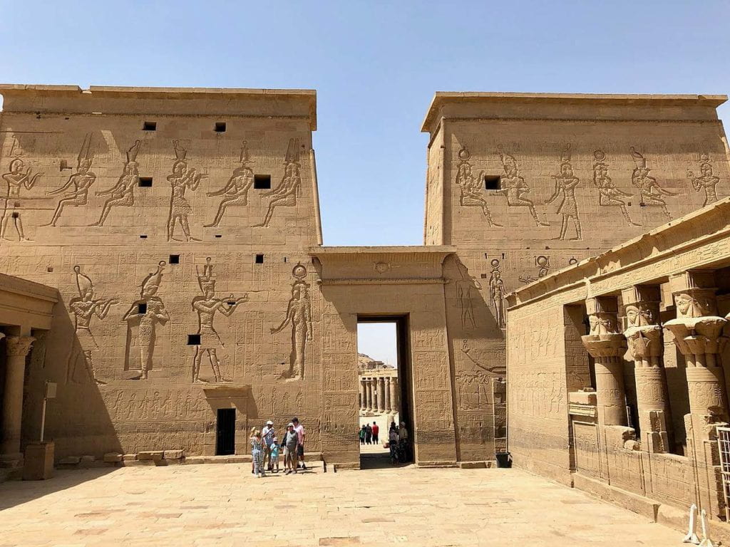
Fig. 14 LeMay, Warren, Temple of Isis, Philae Temple Complex, Agilkia Island, Aswan, AG, EGY, 2019, digital photograph. Wikimedia Commons. <https://commons.wikimedia.org/wiki/File:Temple_of_Isis,_Philae_Temple_Complex,_Agilkia_Island,_Aswan,_AG,_EGY_(48026992296).jpg>
Generally, the sketch and the engraving are in line with one another. The architectural features, columns, and capitals are captured by the print in detail. The sky consists of perfectly straight, parallel lines — a product of Conté’s engraving machine. Where Jollois and de Villiers use watercolor wash for tone and value, the engravers use crosshatched perpendicular lines. However, Plate 17 from Philae deviates from the original sketch in two ways that clearly demonstrate the influence of the engraver on the content of the final image. The print depicts relief around the central portico that is not included in the drawing. There is also an additional wall relief on the left side of the image that is not depicted in the sketch, nor on the monument. The engravers likely added these reliefs to fill empty space and to increase the size of the printed image so that it filled the whole page. Figure 15, a detail of Plate 17, shows this relief on the wall extension supplied by the engravers. The engraver recycled this image from a sketch from Philae made by Chabrol (Fig. 16).
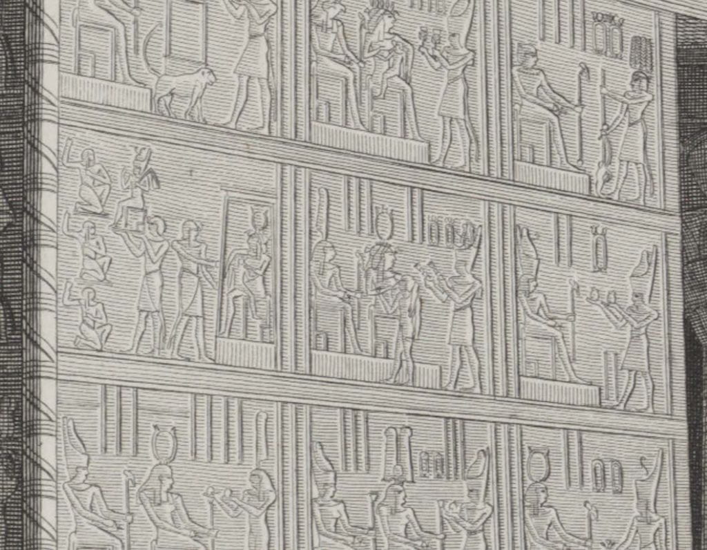
Fig. 15 Description de l’Égypte, Plate 17. Vol. I, 1809, engraving on paper, 70 x 51 cm. New York Public Library, New York, NY.
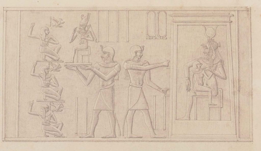
Fig. 16 Chabrol de Volvic, [Ile de Philae] : [bas-reliefs du temple de l’ouest], 1798-1809, crayon noir et plume. 27.8 x 44.2 cm. Bibliothèque nationale de France. Paris, France.
Linda Nochlin in her essay “The Imaginary Orient” discusses the use of authenticating details by Orientalist artists. Nochlin states that “the major function of gratuitous, accurate details … is to announce ‘we are the real.’ They are signifiers of the category of the real, there to give credibility to the ‘realness’ of the work as a whole, to authenticate the total visual field as a simple, artless reflection.”[xx] I suggest that much like how the Orientalist painter Lawrence Alma-Tadema included objects from the Egyptian galleries of the British Museum in his paintings, the engravers of the Description included reliefs from elsewhere in the work to add “realness” to what is in reality pure creation.
In fact, many prints are a collage of several sketches, often produced by different savants. Plate 17 from Volume III is a landscape scene of Karnak (Fig. 17). In the foreground of the print (Fig. 18), a savant is seen sketching next to a female sprawled seductively on the sand holding onto the reins of the horse. Of this vignette, Godlewska writes, “Here fantasy, the erotic and the exotic are all combined to relieve any tedium attached to antiquities. It also suggests, however, something of the complex motivations and emotions associated with the conquest of Egypt.”[xxi] Godlewska attributes the female odalisque to André Dutertre, the savant responsible for the drawing. However, these figures are not in Dutertre’s original drawing (Fig. 19); they had been copied from a sketch by François-Charles Cécile (1766–1840), a mechanical engineer (Fig. 20). This sketch has no context, and it is not clear if it was drawn at Karnak. Yet, it was included in the scene to add visual interest to the landscape while also maintaining the illusion of ‘the real.’
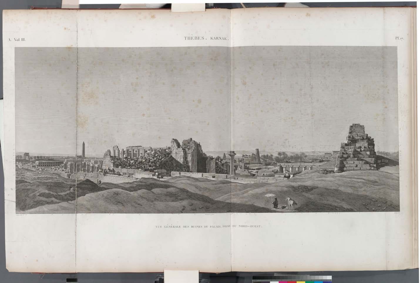
Fig. 17 Description de l’Égypte, Plate 17. Vol. III, 1812, engraving on paper, 70 x 51 cm. New York Public Library, New York, NY.
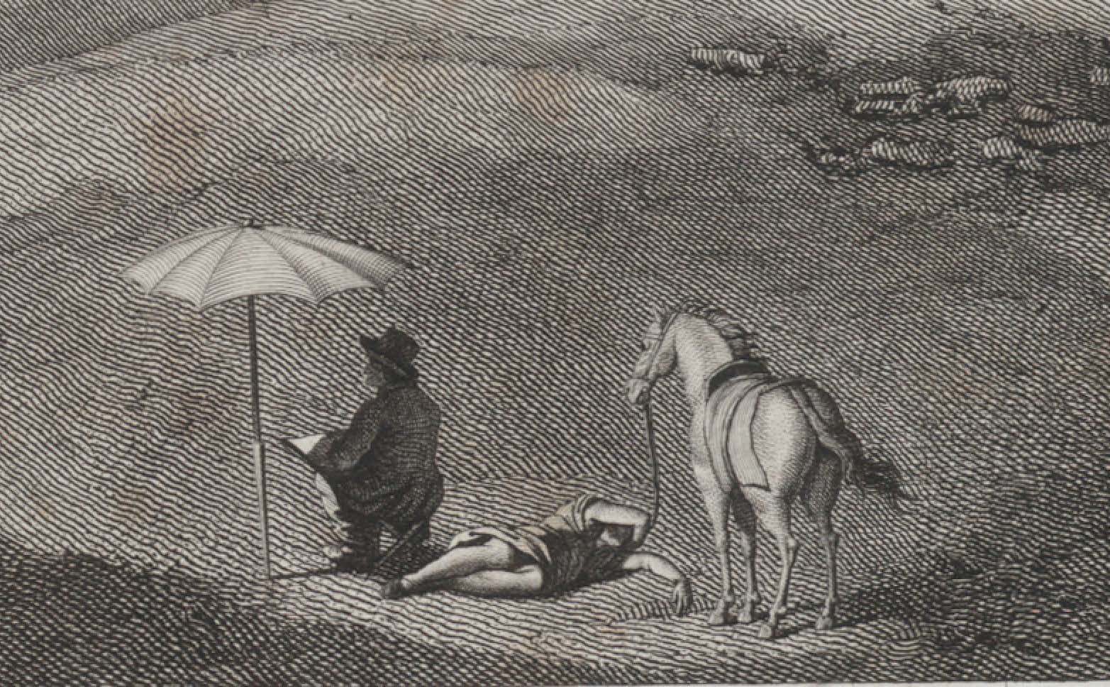
Fig. 18 Description de l’Égypte, Plate 17. Vol. III, 1812, engraving on paper, 70 x 51 cm. New York Public Library, New York, NY.
![Fig. 19 Dutertre, [Karnak] : [vue générale des ruines du palais, prise du nord-ouest], 1798-1809, lavis d'encre, plume et crayon. 37.1 x 57.8 cm. Bibliothèque nationale de France. Paris, France.](https://bpb-us-e1.wpmucdn.com/wp.nyu.edu/dist/1/12638/files/2021/06/Fig.-19-1024x397.jpg)
Fig. 19 Dutertre, [Karnak] : [vue générale des ruines du palais, prise du nord-ouest], 1798-1809, lavis d’encre, plume et crayon. 37.1 x 57.8 cm. Bibliothèque nationale de France. Paris, France.
![Fig. 20 Cécile, [Dessinateur à l’ombre d’un parasol], 1798-1809, lavis d'encre et plume. 11.3 x 11.9 cm. Bibliothèque nationale de France. Paris, France.](https://bpb-us-e1.wpmucdn.com/wp.nyu.edu/dist/1/12638/files/2021/06/Fig.-20-967x1024.jpg)
Fig. 20 Cécile, [Dessinateur à l’ombre d’un parasol], 1798-1809, lavis d’encre et plume. 11.3 x 11.9 cm. Bibliothèque nationale de France. Paris, France.
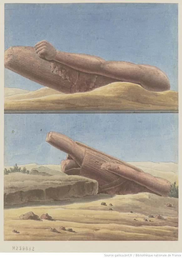
Fig. 21 Charles-Louis Balzac, [Karnak] : [fragments de colosses trouvés dans l’enceinte sud], 1798- 1809, aquarelle et plume. 27.5 x 20 cm. Bibliothèque nationale de France. Paris, France.
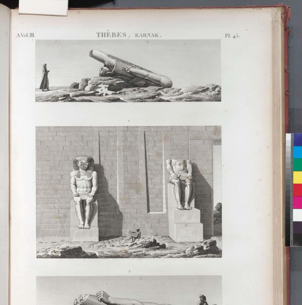
Fig. 22 Description de l’Égypte, Plate 45. Vol. III, 1812, engraving on paper, 70 x 51 cm. New York Public Library, New York, NY.
The creative agency of the engravers is most evident in the scenic depiction of the inner court of the temple at Médinet Habou. Plate 14 (Fig. 23) was engraved by Reville, based on a drawing by Balzac. The drawing (Fig. 24) is markedly different from the print. Several key architectural features have been reversed as well as the position of the figures in the foreground. In the engraving, the two columns have switched sides as well as the statues flanking the entrance to the second court. The pair of savants has changed positions with the seated savant. The fragments of statuary on the ground have shifted in relation to the figures. A possible explanation for these adjustments is that intaglio images print in reverse. When preparing the plate, the engraver draws the images in reverse so that the printed image is in the correct orientation. This engraver may have neglected to take this into consideration when transferring the drawing to the plate, due to inexperience or for another technical reason. Yet, the midground temple scenery from the drawing was not reversed accordingly in the print. The left side of the drawings does not correspond to the right side of the print and vice versa. In fact, close examination reveals that the architectural features of the temple do not follow Balzac’s record. One can interpret these adjustments as an attempt to compress the drawing, which is wider than the printed image. The drawing was compressed by the engravers to make the most use of the available space on the printed page.
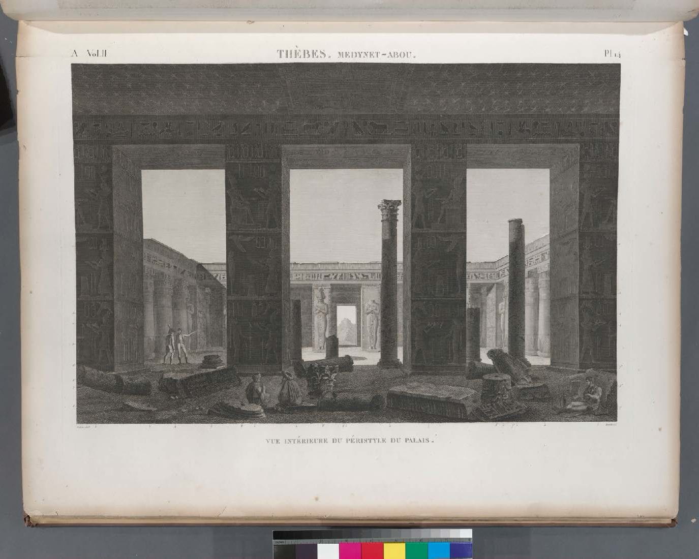
Fig. 23 Description de l’Égypte, Plate 14. Vol. II, 1812, engraving on paper, 70 x 51 cm. New York Public Library, New York, NY.
![Fig. 24 Balzac, [Médinet Habou] : [vue intérieure du péristyle du palais], 1798-1809, lavis d'encre, plume et crayon. 37.1 x 57.8 cm. Bibliothèque nationale de France. Paris, France.](https://bpb-us-e1.wpmucdn.com/wp.nyu.edu/dist/1/12638/files/2021/06/Fig.-24-1024x714.jpg)
Fig. 24 Balzac, [Médinet Habou] : [vue intérieure du péristyle du palais], 1798-1809, lavis d’encre, plume et crayon. 37.1 x 57.8 cm. Bibliothèque nationale de France. Paris, France.
![Fig. 25 Jollois et de Villiers, [Médinet Habou] : [vue intérieure du péristyle du palais], 1798-1809, lavis d'encre, plume et crayon. 37.1 x 57.8 cm. Bibliothèque nationale de France. Paris, France.](https://bpb-us-e1.wpmucdn.com/wp.nyu.edu/dist/1/12638/files/2021/06/Fig.-25.jpg)
Fig. 25 Jollois et de Villiers, [Médinet Habou] : [vue intérieure du péristyle du palais], 1798-1809, lavis d’encre, plume et crayon. 37.1 x 57.8 cm. Bibliothèque nationale de France. Paris, France.
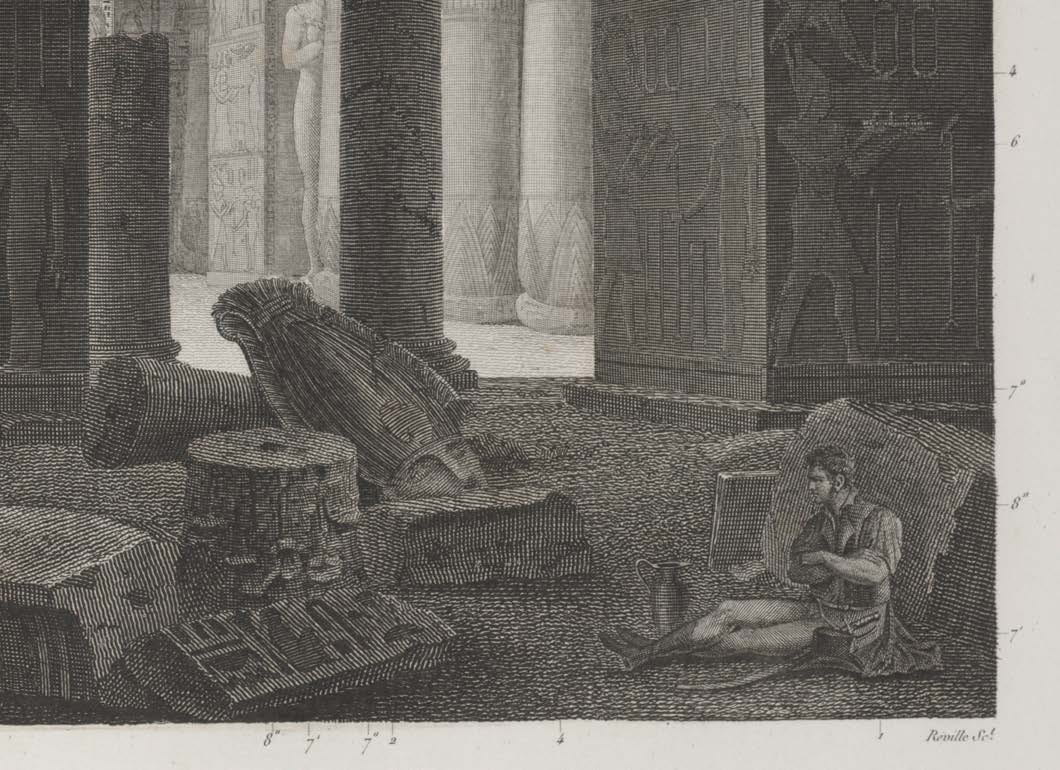
Fig. 26 Description de l’Égypte, Plate 14. Vol. II, 1812, engraving on paper, 70 x 51 cm. New York Public Library, New York, NY.
![Fig. 27 Jollois et de Villiers, [Médinet Habou] : [vue intérieure du péristyle du palais], 1798-1809, lavis d'encre, plume et crayon. 37.1 x 57.8 cm. Bibliothèque nationale de France. Paris, France.](https://bpb-us-e1.wpmucdn.com/wp.nyu.edu/dist/1/12638/files/2021/06/Fig.-27.jpg)
Fig. 27 Jollois et de Villiers, [Médinet Habou] : [vue intérieure du péristyle du palais], 1798-1809, lavis d’encre, plume et crayon. 37.1 x 57.8 cm. Bibliothèque nationale de France. Paris, France.
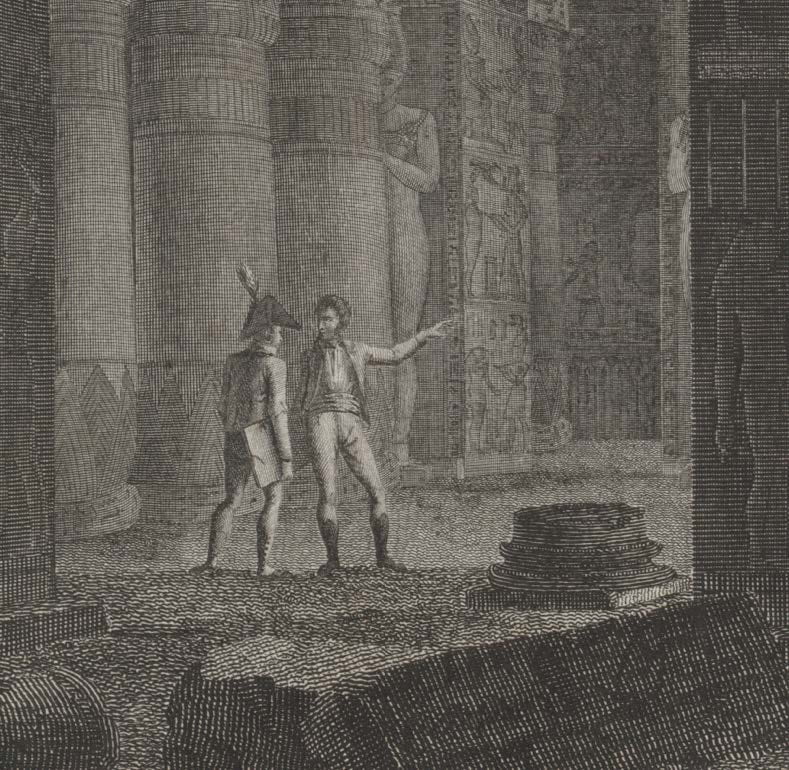
Fig. 28 Description de l’Égypte, Plate 14. Vol. II, 1812, engraving on paper, 70 x 51 cm. New York Public Library, New York, NY.
The Egyptian figures have also been altered for the engraving. In the drawing (Fig. 29), both men are bearded and wear trousers, a long-sleeved shirt, and a vest. The figure on the right wears a turban and smokes a long pipe. The figure on the left wears a Western style hat with a wide round brim, suggesting that he may in fact be French. In the engraving (Fig. 30), both men wear traditional Muslim garments, consisting of billowing tunics and turbans. Prochaska notes that nowhere in the Description are French and Egyptian figures shown interacting. He also notes that they are most often placed in different quadrants of the scenes. If they are depicted in proximity to one another, the Egyptian is acting in service to the French invaders. The prevailing French narrative of conquest is supported by such encounters between East and West.
![Fig. 29 Jollois et de Villiers, [Médinet Habou] : [vue intérieure du péristyle du palais], 1798-1809, lavis d'encre, plume et crayon. 37.1 x 57.8 cm. Bibliothèque nationale de France. Paris, France.](https://bpb-us-e1.wpmucdn.com/wp.nyu.edu/dist/1/12638/files/2021/06/Fig.-29.jpg)
Fig. 29 Jollois et de Villiers, [Médinet Habou] : [vue intérieure du péristyle du palais], 1798-1809, lavis d’encre, plume et crayon. 37.1 x 57.8 cm. Bibliothèque nationale de France. Paris, France.
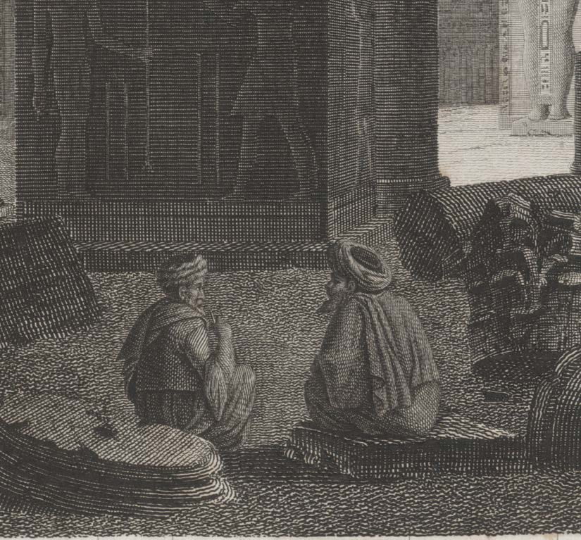
Fig. 30 Description de l’Égypte, Plate 14. Vol. II, 1812, engraving on paper, 70 x 51 cm. New York Public Library, New York, NY.
Though presented as a complete and unified work, the Description is the creation many groups of authors, savants, and engravers alike, over a period of decades and separated by thousands of miles. The network of print workshops struggled with the challenge of depicting hundreds of ancient Egyptian monuments in a medium designed to convey traditional Western architecture to a European public wholly unfamiliar with such non-Western styles and principles. The awesome scope of the project inevitably resulted in accuracies and interpretive license. Yet, these images continue to influence study of ancient Egypt in both their print and digital forms. The Description is a testament to a historiographic moment in the development of Egyptology and a massive artistic and logistical accomplishment. The legacy of the Description de l’Égypte endures, as its images continue to spark delight and inspire awe.
[i] Michael Albin, “Napoleon’s Description de L’Egypte: Problems of Corporate Authorship.” Publishing History 8 (January 1, 1980), 65–85.
[ii] David Prochaska, “Art of Colonialism, Colonialism of Art: The Description de l’Égypte (1809–1828).” L’Esprit Créateur 34, no. 2 (1994), 69–91.
[iii] Anne Godlewska, “Map, Text and Image. The Mentality of Enlightened Conquerors: A New Look at the Description de l’Egypte.” Transactions of the Institute of British Geographers 20, no. 1 (1995), 5.
[iv] Godlewska, “Map, Text and Image,” 9.
[v] Henry Petroski. The Pencil: A History of Design and Circumstance. 1st ed. (New York: Knopf: Distributed by Random House, 1990), 70.
[vi] Richard Taws, “Conté’s Machines: Drawing, Atmosphere, Erasure,” Oxford Art Journal 39, no. 2 (August 2016), 252–254.
[vii] Ibid, 256.
[viii] Ibid, 256.
[ix] Fernand Emile Beaucour, Yves Laissus, and Chantel Orgogozo, The Discovery of Egypt (Paris: Flammarion, 1993), 140.
[x] Godlewska, “Map, Text and Image,” 11.
[xi] Ibid, 17.
[xii] Ann D’Arcy Hughes and Hebe Vernon-Morris, The Printmaking Bible: The Complete Guide to Materials and Techniques (San Francisco: Chronicle Books, 2008), 82.
[xiii] Bamber Gascoigne, How to Identify Prints: A Complete Guide to Manual and Mechanical
Processes from Woodcut to Inkjet, 2nd ed (New York, N.Y: Thames & Hudson, 2004), 9b.
[xiv] Gascoigne, How to Identify Prints, 9a.
[xv] Taws, “Conté’s Machines,” 256.
[xvi] Ibid, 259.
[xvii] Beaucour et al., 146.
[xviii] Charles Coulston Gillispie, “Notes,” 2.
[xix] Rebecca Zorach, Paper Museums: The Reproductive Print in Europe, 1500–1800. (Chicago: David and Alfred Smart Museum of Art, University of Chicago, 2005), 16.
[xx] Linda Nochlin, “The Imaginary Orient,” in The Politics of Vision: Essays on Nineteenth-Century Art and Society (New York: Harper & Row, 1989), 38.
[xxi] Ibid, 22.
[xxii] Prochaska, The Pencil, 84.
Katherine Parks is a book conservator in New York. She was the Andrew W. Mellon Fellow in Library & Archive Conservation at the Conservation Center of the Institute of Fine Arts at New York University where she received her MA in Art History and MS in Conservation in 2020. She has held positions at the Library of Congress, Columbia University Libraries, and will be joining Cornell University Library as the Conservator for Rare and Distinctive Collections in the fall of 2021.
The Institute of Fine Arts, New York University; Palmer School of Library & Information Science, Long Island University
This paper examines imagery of transparency in the convent of Katharinenthal, discussing a sculpture of the Visitation carved for the convent around 1310-20, and the Katharinenthal Sister Book. The sculpture is unusual in its use of two rock-crystal cabochons to represent the pregnancies of the Virgin Mary and her relative, Elizabeth. The Sister Book records a chronicle of the founding of the convent, as well as vitae memorializing the lives of deceased sisters and describing their religious visions, several of which feature a motif of transparency. Multiple sisters are recorded as becoming “as clear as crystal,” while another sister beholds a vision of “the wall of the refectory appear[ing] as though it were glass.”
In both the Visitation sculpture and the Sister Book, the symbolism of transparency represents a contradiction: the revelation of an interior space—either the interior of the body or of the convent—simultaneously evokes longing, and the frustration of longing. The transparent material allows ocular penetration, but constructs an impenetrable barrier. In the case of the Visitation group, some of this frustration is allayed through active engagement with the sculpture.
The paper concludes that the paradox of simultaneous visibility and inaccessibility exemplifies the importance of enclosure as a construction of identity for the sisters of Katharinenthal, fundamentally differentiating those within from those without.
![]()
When viewing a sculpture of the Visitation from the convent of Katharinenthal, now in the collection of the Metropolitan Museum of Art, the eye is drawn towards two rock-crystal cabochons inset into the abdomens of the figures.[i] The transparency of the rock crystal permits the gaze to pass through and reveal an interior space within the bodies of the two women. Transparency seems to have been of general interest to the sisters at Katharinenthal, as it also recurs in the text of the Katharinenthal Schwesternbücher, or Sister Book.[ii]
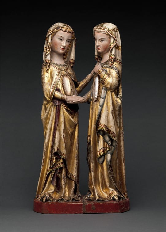
Fig 1 The Visitation, attr. Master Heinrich of Constance, ca. 1310-20, walnut, paint, gilding, rock-crystal cabochons inset in gilt-silver mounts, 23 ¼ x 11 ⅞ x 7 ¼ in., New York: Metropolitan Museum of Art, 17.190.724. Photographed by the Metropolitan Museum of Art, New York.
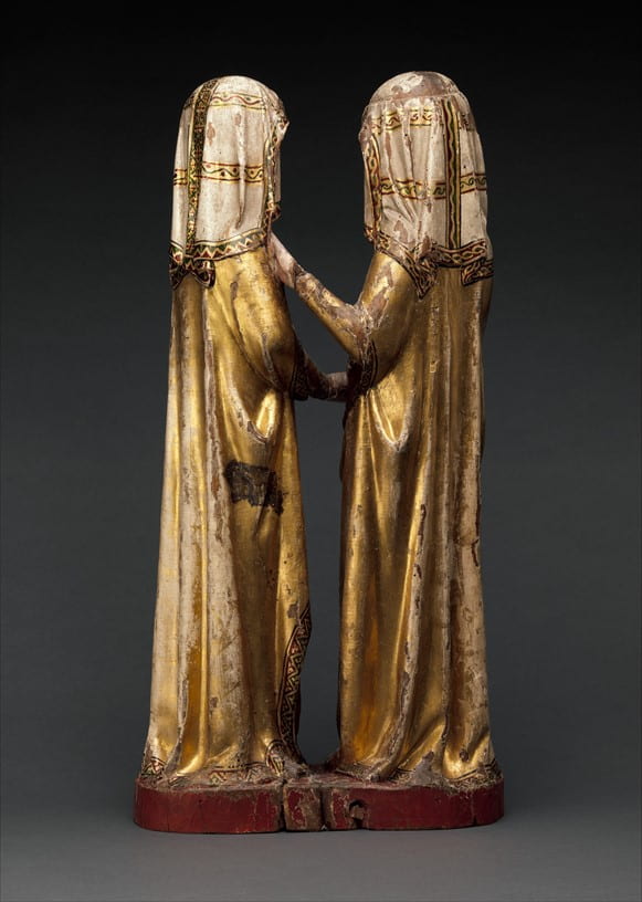
Fig. 2 Rear view of The Visitation, attr. Master Heinrich of Constance, ca. 1310-20, walnut, paint, gilding, rock-crystal cabochons inset in gilt-silver mounts, 23 ¼ x 11 ⅞ x 7 ¼ in., New York: Metropolitan Museum of Art, 17.190.724. Photographed by the Metropolitan Museum of Art, New York.
The Sister Book, written by the nuns themselves, recorded mystical visions and miracles. While the oldest extant manuscript of the Sister Book dates to the fifteenth century, the sisters memorialized in the text likely lived between around 1245 and 1345.[iii] Several of the visions describe the sisters’ bodies or the walls of the convent turning transparent, likened to crystal or glass. In both the Visitation and the Sister Book, the motif of transparency creates a contradiction: the revelation of an interior space—either the interior of the body or of the convent—simultaneously evokes longing, and the frustration of longing. Transparency allows one to see into an interior space, but does not allow one to go into that space. The aim of this paper is to investigate the ways in which habitual visualization of transparency, with all its associated contradictions, informed the construction and reinforcement of an identity shared between the sisters at Katharinenthal. Contemplation of the Visitation sculpture and close reading of the Sister Book can lead us to an understanding of what the sisters valued as a community, and how those values were embodied by recurring imagery of transparency.
According to a chronicle of the convent’s founding included in the Sister Book, the convent of Katharinenthal originated in 1242 when a small community of women moved to a site on the bank of the Rhine near Diessenhofen in what is now Northern Switzerland. Soon after, in 1245, Katharinenthal was incorporated into the Dominican order, and by 1280, the community of sisters at Katharinenthal totaled around one hundred fifty. Katharinenthal was a part of a larger community of Dominican women’s houses in the area, and its Sister Book likely circulated to nearby convents to be read and copied as a part of the broader culture of exchange between Dominican convents. The Katherinenthal Sister Book is one of nine known Sister Books from the region.[iv]
Around 1310, Katharinenthal commissioned Master Heinrich of Constance to carve the Visitation sculpture for display in the convent, showing the Virgin Mary and her relative, Elizabeth, when both are pregnant—Mary with Christ and Elizabeth with John the Baptist. The composition, made of walnut with polychromy and gilding, centers on its two distinctive rock-crystal cabochons, inset into the figures’ abdomens to represent their pregnancies. Both women stand up straight, sheathed in gilded gowns and veils. The women’s faces, hands, and rock-crystal cabochons stand out starkly against the enveloping folds of drapery obscuring the rest of their bodies. They tilt their heads toward each other and reach their arms across the divide between them, grasping one pair of hands near Mary’s stomach and both resting their other hands—not quite touching—on Elizabeth’s chest. These two bodily links between the women create a visual circuit, connecting their bodies across the chasm of empty space between them. The viewer’s eye follows this circuit from one woman to the other and back again, looping continuously. This visual cycling draws an emphatic circle around the rock-crystal cabochons, underlining their significance.
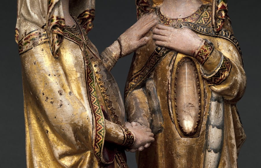
Fig. 3 Detail of The Visitation, attr. Master Heinrich of Constance, ca. 1310-20, walnut, paint, gilding, rock-crystal cabochons inset in gilt-silver mounts, 23 ¼ x 11 ⅞ x 7 ¼ in., New York: Metropolitan Museum of Art, 17.190.724. Photographed by the Metropolitan Museum of Art, New York.
To a medieval viewer, rock crystal held connotations of purity due to its paradoxical nature as simultaneously solid and transparent.[v] This association makes rock crystal an appropriate material to depict the quintessentially pure body of Mary and, by extension, Elizabeth. But beyond this superficial feature of the material, what meaning can be gleaned from the use of rock crystal in the Visitation group? To answer that question, we can consider instances of transparency in the Katharinenthal Sister Book, to investigate how the metaphor of transparency was otherwise understood in context.
Transparency, of the body and of the walls of the convent itself, is a recurring motif in the Katharinenthal Sister Book. In one entry, a sister named Anne von Ramswag is recorded as becoming “as clear as crystal” before “a glow of light emerged from within her.”[vi] Similarly, a second sister, Mechthild von Eschenz, is recorded as becoming “as clear as a crystal, so that [a companion] saw straight through her.”[vii] On both occasions, the sisters’ bodies are endowed with the material properties of crystal, and therefore are associated with purity, clarity, and revelation. When the bodies of these sisters transfigure into transparency, they adopt the same paradox of the rock-crystal cabochons in the Visitation group as simultaneously solid and transparent—physically inaccessible, but available for ocular consumption.
In the text of the Sister Book, the miracle of transparency is linked to the virtue of obedience. In one of the entries describing the spontaneous transparency of a sister, she is asked what she was thinking at the time she became transparent. She responds, “I was thinking then that obedience is better than any other thing that I could wish to do.”[viii] This emphasis on obedience as a central tenet in the convent can be linked to the cultural moment within which the Katharinenthal Sister Book was compiled, read, and copied.[ix] Observant reforms in the area were gaining momentum, with the goal of returning to a strict adherence of original rubrics of piety. Convents were observed, evaluated, and validated by ecclesiastical authorities based on their cooperation with reforms. The Sister Book, which was copied and circulated between nearby convents in addition to being read by sisters within the convent, served as a defense of collective values, protecting Katharinenthal from outside criticism by reinforcing its identity as a community committed to obedience.[x]
This awareness of external surveillance is emblematic of how the sisters at Katharinenthal were embroiled in a culture of constant witnessing and being witnessed, both on the macro level, with the convent considered as a single unit, and on the personal level, between individual sisters. The recording of miracles in the Sister Book is illustrative of the reciprocal relationship between witness and witnessed, and shows how the sisters themselves co-constitute the identity of Katharinenthal. Their witnessing and documentation of each other’s visionary experiences assimilates those experiences into the shared body of the community.
It may seem that the visions collected in the Sister Book, focused as they are on individual experiences of mysticism, implicitly refute the idea that they define a shared identity. The experience of a vision is typically understood as a personal event that cannot be mutually experienced by the other members of a group. Since the visionary’s private reception of their vision excludes the remainder of the community, there is a dissonance between the subsuming pull of community and the isolation of the individual. However, the Sister Book, rather than merely exemplifying individuals, also assimilates their experiences into the identity of the collective. When these individual experiences are collected in the Sister Book, they are made available for the entire community to read and participate in, so the book itself becomes a conduit to transform individual visions into a shared experience.
The act of witnessing between sisters is an essential aspect of the Sister Book. The entries in the Sister Book are not told from a first-person perspective, but instead related by secondary sisters. Although these witnessing sisters cannot partake in the vision itself, they can perceive the physical effects of miracles experienced by their visionary sisters, such as turning transparent, glowing, or levitating. There is a recurring relationship between the sister whose body becomes the site of a miracle, and the sister who witnesses that bodily miracle. Essential to this relationship is the lack of self-awareness in the first sister. The state of transparency is not something the sisters are able to identify in themselves; they can only witness it in another.
The Visitation Group similarly expresses this relationship between witness and witnessed. The relationship between the two sculpted figures is one of equal exchange; each witnesses and is witnessed simultaneously as they pass their gaze back and forth. Neither figure casts any direct attention towards her own translucent stomach; instead, the two symbiotically witness each other. Their experience of the miraculous is mediated through a cyclical exchange of witnessing. Compounding this idea of mutuality, the figures’ faces resemble each other—similar narrow eyes, flushed cheeks, arching eyebrows, sloping noses, and mouths turned up at the corners—as if the viewer has caught one of them reaching out to touch a mirror. The exchange of grasp between the two figures complicates this mirroring of the body. When encountering a second self in the mirror, one can only reach so far before being abruptly halted by the mirror’s surface. While one can lightly graze fingertips or palms with one’s mirror-double, there can be no grasping of the hands as there is in the Visitation. Further, in a mirror-double, one can only meet like to like—hand to hand, cheek to cheek. Mary and Elizabeth transcend this limitation of mirroring by reaching their arms across the line-of-symmetry boundary, and entangling their extremities with one another.
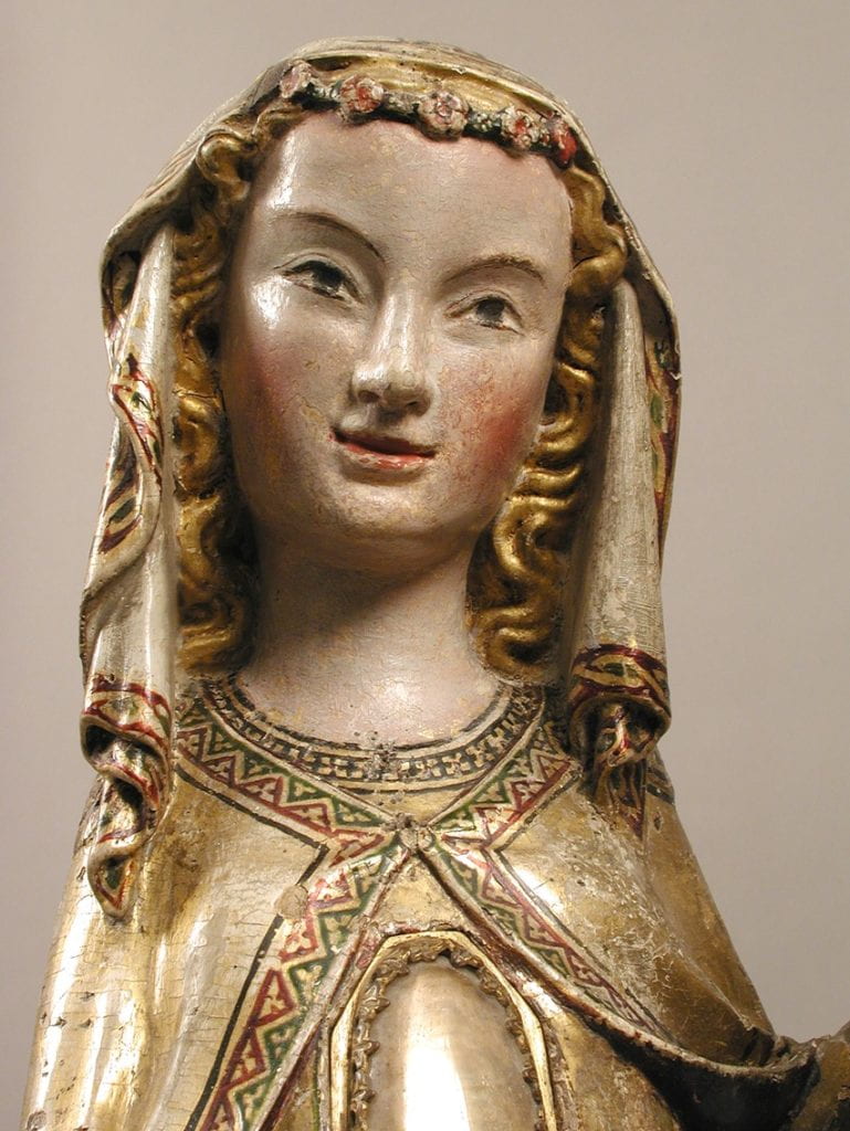
Fig. 4 Detail of The Visitation, attr. Master Heinrich of Constance, ca. 1310-20, walnut, paint, gilding, rock-crystal cabochons inset in gilt-silver mounts, 23 ¼ x 11 ⅞ x 7 ¼ in., New York: Metropolitan Museum of Art, 17.190.724. Photographed by the Metropolitan Museum of Art, New York.
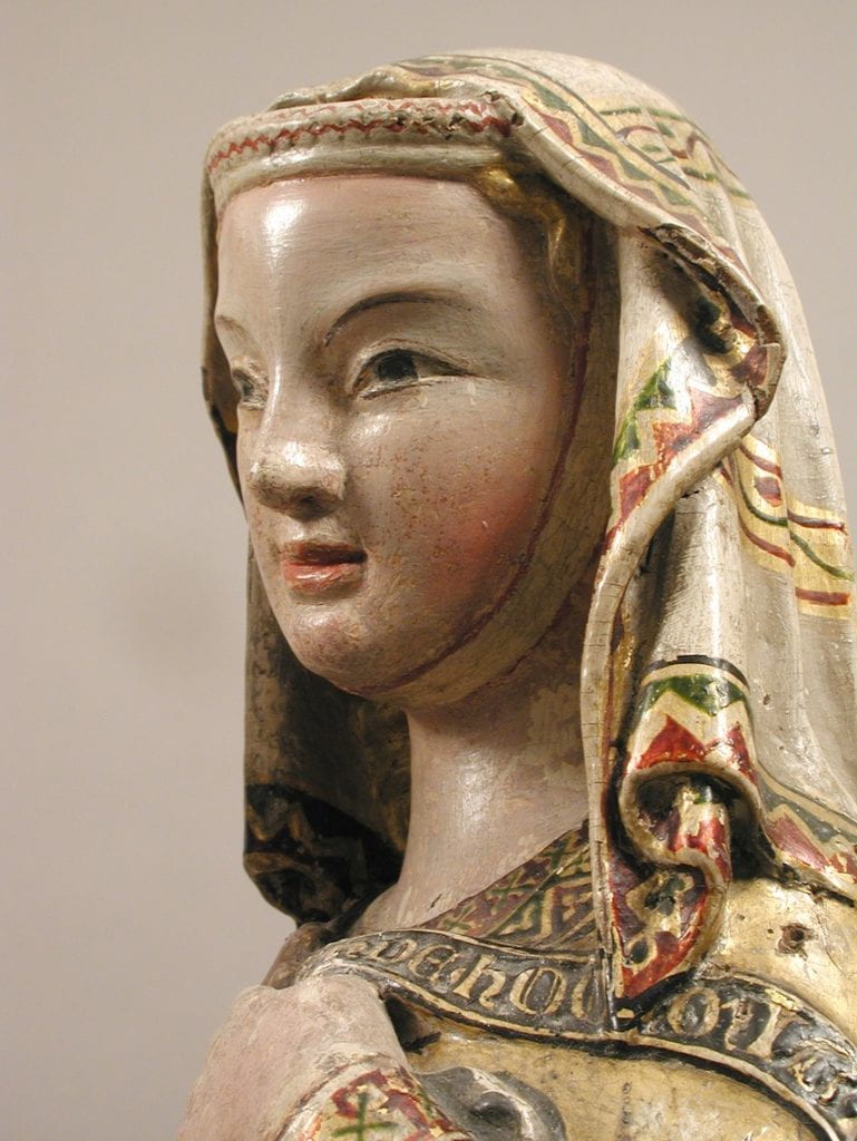
Fig. 5 Detail of The Visitation, attr. Master Heinrich of Constance, ca. 1310-20, walnut, paint, gilding, rock-crystal cabochons inset in gilt-silver mounts, 23 ¼ x 11 ⅞ x 7 ¼ in., New York: Metropolitan Museum of Art, 17.190.724. Photographed by the Metropolitan Museum of Art, New York.
In the case of the Sister Book, the witnessing sisters provide verbalization of miraculous events, making them concrete and consumable. This central relationship between witness and witnessed in the Sister Book necessitates that the miracle of one sister must be externalized. What may have been initiated by an internal experience must be made visible to the witnessing sister in order to be recordable in the Sister Book. The witnessed must exhibit their experience visibly, while the witness bears the weight of the experience and catalogues it after the fact; neither witness nor witnessed is a passive role.
By bearing witness to and documenting another sister’s vision, the sisters who wrote these entries integrate the experiences of individual sisters into the communal mythos of the convent. The sisters documenting these visions, transcribing what they see into the pages of the Sister Book, are often unnamed, and so are identified only as anonymous adherents to the collective body, rather than being identified individually. In the text, witnessing sisters remain a ghostly “I,” written in different hands, simultaneously singular and collective, gesturing to the broader, shared “we” of the convent that absorbs the bodily miracles of the sisters into its identity. Of course, the notion of a collective “I” is inherently contradictory, and this contradiction points to the core tension between self and group in the construction of identity within the context of a medieval convent.
The identity of the convent, in addition to being expressed through this collaborative process of collection and assimilation, is written into the Sister Book in the form of the origin chronicle of the convent, which describes the circumstances of the convent’s founding. This chronicle develops and reiterates the mythos of the convent as a collective. By documenting the establishment of the convent, the Sister Book constructs a stabilizing narrative that yokes each of the individual sisters to their identity as a group, thus bonding their self-identification to the definition of the social body. Recording this origin story in the Sister Book monumentalizes the incorporation of the convent as a sanctioned group. The importance placed on this moment of formation shows an inherent valuation of the convent as a group, a collective assembled due to shared identity. The sharing of characteristics, then, is salient to the definition of the identity of the community. The predominant shared characteristic of the sisters of Katharinenthal is their identity as enclosed women.
This method of constructing a social identity is predicated on the sisters’ formal inclusion in a community, and is therefore also predicated on the existence of those who are excluded from that same community. An extended entry from the Sister Book exemplifies this dialectic of within and without, and can further elucidate the nature of the identity shared between the sisters at Katharinenthal. It reads:
There was a sister called holy Berta von Herten. Once, the holy Sister Berta desired to be at her sister Gůt’s place in the forest. And one time when she was at her prayers after mass in the refectory, she saw our Lord sitting across from her, and His face glowed as brightly as the sun, and then our Lord beckoned to her with His hand. Then she went to our Lord and fell before His feet. Then our Lord took her head and laid it in His lap and treated her very tenderly and dearly. Then she saw that the wall of the refectory appeared as though it were glass, and on the other side of the glass was a pitiful, meager person who acted as though her heart were truly going to break because she wished to come through the glass to our Lord. But she could not come through the glass. So spoke our Lord: “Would you like to know, dear daughter of mine, who that person is?” So she said: “Yes Lord, with all my heart.” So He said to her: “That is Gůt in the forest. And the glass that you see that is between me and her is her own will not to live in obedience. And because of this, she can never come as close to me as you can, living in obedience.[xi]
Transparency in this entry is a complicated site of identity construction, concisely dividing the community inside the convent from those outside of it, and yet allowing each side visual access to the other. The directional current of longing in this passage initially flows from where Berta resides, within the convent, to Gůt’s unenclosed life outside the walls.
When the wall of the refectory is turned transparent “as though it were glass,” the women’s gazes are now able to traverse the walls dividing them so each can witness the other’s circumstances with full clarity, even as the boundaries of the convent walls remain impenetrable. The previous object of Berta’s desire, to live unenclosed in the forest as Gůt does, is revealed as a “pitiful, meager” prospect. Gůt, able to view the interior of the convent, witnesses Christ’s presence and closeness with enclosed women such as Berta, recognizes what she lacks, and feels the ache of a desire to access the inaccessible. As the transparent wall creates longing in Gůt, the knowledge Berta gains through witnessing that same transparency frees her of her previously held desire.
When Christ speaks to Berta, he says, “the glass that you see that is between me and [Gůt] is her own will not to live in obedience. And because of this, she can never come as close to me as you can, living in obedience.” The boundary between the two women, then, is more than the physical partition of the convent’s walls. It is representative of a fundamental difference between the women, constructed by their conflicting definitions of self through their opposing relations to a collective. Berta, living within the convent, absorbs and is absorbed by the identity of the group; Gůt, living without community, is not fixed into a stable, shared identity, and so is coded by the text as living disobediently, thus deserving of her deeply felt pain, which comes as a direct consequence of her divergence from the convent’s rule of enclosure. As demonstrated in the entry of the Sister Book in which a sister states that her bodily transparency is prompted by a meditation on the pleasure of obeying, obedience is a core value of the sisters of Katharinenthal, so the disobedience of Gůt is an affront to the collective.
Themes encountered in the Sister Book, including transparency, as well as longing and frustration of desire, are also useful to contemplate alongside the rock-crystal cabochons in the Visitation Group. The transparency of the rock crystal contrasts with the opacity of the walnut that comprises the majority of the sculpture. Even the effect of the gilding applied on much of the surface, despite its reflective properties, differs from the effect of the rock crystal. Light falling on the sculpture brightens the gilt wood and glints off it, while the rock-crystal cabochons, due to their transparency, possess an interior space that is made more or less visible depending on the play of light.
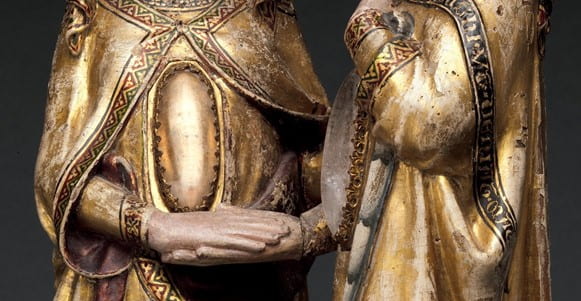
Fig. 6 Detail of The Visitation, attr. Master Heinrich of Constance, ca. 1310-20, walnut, paint, gilding, rock-crystal cabochons inset in gilt-silver mounts, 23 ¼ x 11 ⅞ x 7 ¼ in., New York: Metropolitan Museum of Art, 17.190.724. Photographed by the Metropolitan Museum of Art, New York.
So how do our considerations of transparency throughout the Sister Book clarify the centralization of rock crystal in the Visitation Group? Since the rock-crystal cabochons are a critical element of the composition of this Visitation, the question first arises: for what reason would the convent specifically commission a representation of the Visitation with rock crystal employed to indicate the figures’ pregnancies? A common hypothesis is that images of Christ and John the Baptist may have been originally installed beneath the rock-crystal cabochons, which would explain a practical impetus for using rock crystal to allow glimpses of the images. The many Gothic reliquaries made out of transparent rock crystal—to allow for an unfettered view of the precious relics inside—evidence a precedent for using rock crystal to grant visual access to a significant object within.[xii] If present, these embedded images would have likely been painted on small pieces of parchment and affixed to the interior walls of Mary and Elizabeth’s stomachs with tiny metal pegs, evidenced by pinholes left in the sculpture.[xiii] However, these pinholes could be a later addition, so it remains uncertain whether such images were ever present, and if so, what they looked like.
This lack of certainty introduces a methodological issue when thinking about this sculpture. How can one discuss the sculpture’s reception within Katharinenthal if one does not know how the sculpture originally appeared? From our consideration of how transparency operates in the text of the Sister Book, it becomes apparent that the transparency of rock crystal can be read as significant in and of itself, rather than simply as a means of revealing images beneath. Therefore, we do not need to become needlessly entangled in wondering whether these images did, in fact, exist; we can instead consider what the rock-crystal cabochons themselves may have communicated to the sisters of Katharinenthal. In particular, how might this instance of transparency have initiated desire and longing, as it does in the Sister Book?
The crystals, catching the light with the viewer’s every move, entice the viewer to peek into the interiors of Mary and Elizabeth’s bodies. Unable to access that interior space further, the viewer is necessarily relegated to the liminal space of the threshold. Arrested here, at the visual entryway to divinity, the viewer is left with unresolved desire that can only be worked through by engaging in speculation and imagination. The transparency of the rock crystals acts as an exhortation to the viewer to imagine what is contained within the bodies of Mary and Elizabeth. Rather than emphasizing the presence or absence of pictorial representations of the infants, the primary phenomenon of viewing the sculpture instead becomes a speculative effort to imagine the interior of the figures’ bodies, and what lies within them. In other words, the viewer, through extended looking at the tangible image of the Visitation, would have been prompted by the crystals to also ruminate on imagined images.
Instead of relying wholly on what is visible, the sisters of Katharinenthal would have referred to their pre-existing knowledge to guide their engagement with the sculpture. The Visitation episode, as described in the Bible, would have been known by most fourteenth-century viewers, and would have been particularly familiar to the sisters—the primary audience for the sculpture. The Bible passage describing the Visitation reads:
And [Mary] entered into the house of Zachary, and saluted Elizabeth.
And it came to pass, that when Elizabeth heard the salutation of Mary, the infant leaped in her womb. And Elizabeth was filled with the Holy Ghost:
And she cried out with a loud voice, and said: Blessed art thou among women, and blessed is the fruit of thy womb.
And whence is this to me, that the mother of my Lord should come to me?
For behold as soon as the voice of thy salutation sounded in my ears, the infant in my womb leaped for joy.[xiv]
In the Katharinenthal Visitation group, Elizabeth holds a narrow scroll in her left hand, quoting her canonical greeting to Mary: “And whence is this to me, that the mother of my Lord should come to me?”[xv] This direct reference to the Biblical source, a lingual linkage between sculpture and scripture, mnemonically prompts the viewer to construct and animate the rest of the scene mentally. The informed viewer, guided by the text intimately known to them, is able to watch and recite along as Mary salutes Elizabeth; Elizabeth fills with the Holy Ghost and becomes pregnant, and the infants in the women’s wombs leap for joy.
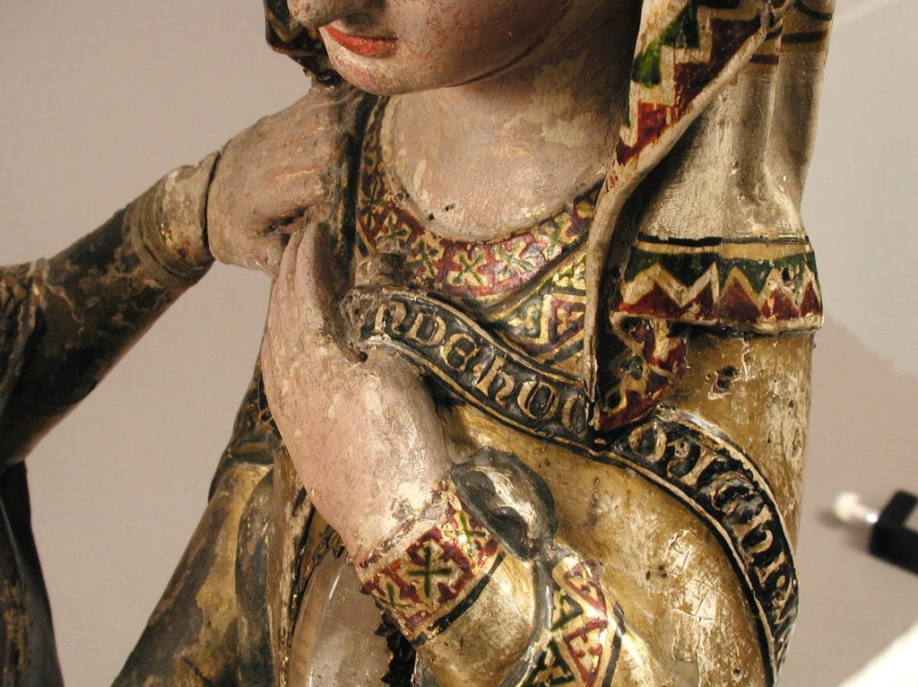
Fig. 7 Detail of The Visitation, attr. Master Heinrich of Constance, ca. 1310-20, walnut, paint, gilding, rock-crystal cabochons inset in gilt-silver mounts, 23 ¼ x 11 ⅞ x 7 ¼ in., New York: Metropolitan Museum of Art, 17.190.724. Photographed by the Metropolitan Museum of Art, New York.
As the scene plays out, and the emphasis moves from Mary and Elizabeth’s meeting to the movement of their infants within their bodies, the desire of the viewer to gain access to that interior space intensifies. Despite the transparency of the rock crystal, the illusion that the interior is wholly visible to the viewer is ultimately subverted as the viewer moves around the sculpture. The rock crystals are not perfectly transparent, so they frustrate the viewer’s desire to fully access the interior of Mary and Elizabeth’s bodies. Encountering the cabochons from different angles and peering into the roundness of the rock crystals, the viewer’s penetrative gaze is sometimes able to pass smoothly into the pocket of the body, but is sometimes obstructed by imperfections in the stone. The materiality of the rock-crystal cabochons creates a desire to view the interior of the body, and then swiftly foils the fulfillment of that desire. In this way, the sculpture is a fantasy of revelation, but gratification of this fantasy is limited.
By ‘fantasy of revelation,’ I mean to speak both of fantasy in the sense of a daydream based on desires, and the root meaning of the word from the Greek phantazesthai, literally translated as ‘picture to oneself.’ For the sisters of Katharinenthal, contemplation of the Visitation group would have been a dual experience: a looping cycle of desire and frustration, and a process of ‘picturing to oneself.’ The desire stirred in the viewer by the sculpture comes from the transparency of the rock-crystal cabochons, and their associated contradiction of visibility versus inaccessibility.
This cycle of desire can be further contextualized by returning to the case of Berta’s vision in the Sister Book. As we observed in earlier discussion of this vision, when the convent walls become transparent, Gůt, living alone in the forest, is able to witness the intense closeness that enclosed women, such as Berta, can achieve with Christ. Aware of her own limitations, Gůt desires nothing more than to come through the convent walls, tantalizingly see-through, and enjoy the same religious benefits. However, despite the transparency of the convent walls, they remain as solid as ever, so the satiation of Gůt’s desire remains impossible to attain. Instead, halted outside the walls, Gůt is trapped in a constant state of frustrated want. The desire itself stems from her ability to view the interior of the convent, while the frustration of that desire is due to the solidity of the constructions that relegate her firmly to the opposite side of the glass.
The Visitation group operates in a similar way. The direct opposition between inside and outside—seemingly a rigid binary—is complicated by the translucency of the rock-crystal cabochons, which allow the viewer a paradoxical vision of inside and outside apprehended simultaneously. The rock-crystal cabochons become sites of contact between the interior and the exterior. Due to the contradictory nature of rock crystal as both transparent and solid, the interiors of Mary and Elizabeth’s bodies are visually accessible from the exterior, but remain physically separated. The viewer, able to see through the bodies of Mary and Elizabeth, desires full access to the miraculous pregnancies of the women, and so desires to see, and consequently apprehend, the infant contained within the mother. The absence of the infants frustrates this desire. As the viewer continues to contemplate the sculpture, the same desire to fully access the interior of the holy body and to witness the godhead within wells up once again, before once again being frustrated. As in Berta’s vision, the transparency of a boundary between interior and exterior inspires longing and ignites a fantasy, in the sense of a daydream based on desires, of resolving that longing.
While Gůt is unable to halt her endless cycling between desire and frustration, the spontaneous transparency of the convent walls conversely allows Berta to reach some conclusion to her longing. In her vision, the resolution to her desire only comes from the banishment of that same desire. When Christ shows Berta the undesirability of Gůt’s circumstances, Berta is able to recognize the value of her own community. With this revelation, Berta no longer desires to leave the convent, and is instead devoid of longing. This metaphorical emptying enables Berta to live obediently according to Christ’s instructions, and, by extension, the guidelines of the Dominican order.
Similarly, the viewer of the Visitation is able to satisfy their longing to fully access the interior of the Marian body, and halt the endless cycle of desire begetting frustration, by engaging with the sculpture imaginatively. The mnemonic function of the sculpture, particularly the lingual mnemonic of the verbal greeting on the scroll held by Elizabeth, initiates a speculative completion of the sculpture, animating the remainder of the scene. In this way, the viewers create a fantasy for themselves in the sense of the Greek phantazesthai, or ‘picture to oneself.’
To sum up, the instances of transparency represented at Katharinenthal, both materially in the Visitation sculpture and in the text of the Sister Book, forms an intriguing network suggesting the sisters’ complex understanding of transparency as a concept representing intersections between obedience, desire, and community. In the entries of the two sisters who spontaneously become ‘as clear as crystal,’ transparency of the body is a metaphor for purity of spirit. Virtues, particularly obedience, are externalized and embodied. In the context of the Observant reforms, with external evaluation directed at the convent, there was a particular necessity for sisters to render their virtues as visible, and therefore verifiable, phenomena. In the vision of the sister Berta, when the convent walls become transparent, the paradox of simultaneous visibility and inaccessibility creates tension and longing between those on opposite sides of the walls. This exemplifies the importance of enclosure as a construction of identity, that fundamentally differentiates those within from those without. This construction of alterity through opposition, exemplified in the case of the transparent glass walls of Berta’s vision, also inspires dynamics of longing between those within and those without. By allowing for ocular penetration and simultaneously remaining impenetrable, transparency in both the Visitation group and the Sister Book is the source both of desire itself and the frustration of that desire. By considering the theme of transparency in its multiple contexts and the significance it could have had for the sisters of Katharinenthal, it becomes possible to begin imagining the shared identity the sisters constructed, and by what means.
[i] The Visitation, attrib. to Master Heinrich of Constance, ca. 1310-20, walnut, polychromy, gilding, rock crystal cabochons inset in gilt-silver mounts, 23 1/4 × 11 7/8 × 7 1/4 in. New York: Metropolitan Museum of Art 17.190.724. From the Dominican convent of Katharinenthal, near Diessenhofen, Switzerland; gift of J. Pierpont Morgan, 1917. See: William D. Wixom, “Medieval Sculpture at the Metropolitan 800 to 1400,” The Metropolitan Museum of Art Bulletin 62, no. 4 (2005): 47.
[ii] The oldest extant manuscript dates to ca. 1424 and is held at Frauenfeld, Kantonsbibliothek Thurgau, MS Y 74. Other copies, dating from between ca. 1450 and ca. 1500, are held in St. Gallen, Stiftsbibliothek, Cod. 603; Nuremberg, Stadtbibliothek, Cod. Cent. V, 10a; and Überlingen, Leopold-Sophien-Bibliothek, MS 22. For manuscript history, see Ruth Meyer, Das “St. Katharinentaler Schwesternbuch”: Untersuchung, Edition, Kommentar. Münchener Texte Und Untersuchungen Zur Deutschen Literatur Des Mittelalters (Tübingen: Niemeyer, 1995), 6-21, 37-8, 42-53. See also: Gertrud Jaron Lewis, By Women, for Women, About Women: The Sister-Books of Fourteenth-Century Germany (Toronto: Pontifical Institute of Mediaeval Studies), 1996, 28-29, 286-7. See also Amiri Ayanna, “Bodies of Crystal, Houses of Glass: Observing Reform and Improving Piety in the St. Katharinental Sister Book,” The Journal of Medieval Religious Cultures 43, no. 1 (2017): 24–57.
[iii] Amiri Ayanna, “Selections from the St. Katharinental Sister Book,” Asymptote (January 2016).
[iv] The other known sister books from the region originate from Adelhausen, Diessenhofen, Engelthal, Gotteszell, Kirchberg, Oetenbach, Töss, Unterlinden, and Weiler. See: Gertrud Jaron Lewis, Bibliographie zur deutschen Frauenmystik des Mittelalters (Berlin: Erich Schmidt Verlag, 1989), 296–316.
[v] See: Brigitte Buettner, “From Bones to Stones: Reflections on Jeweled Reliquaries,” in Reliquiare Im Mittelalter (Berlin: Akademie Verlag, 2011), 50. See also: Jung, “Crystalline Wombs and Pregnant Hearts,” 225.
[vi] Translation by Jacqueline E. Jung, “Crystalline Wombs and Pregnant Hearts: The Exuberant Bodies of the Katharinenthal Visitation Group,” in History in the Comic Mode: Medieval Communities and the Matter of Person, edited by Rachel Fulton and Bruce W. Holsinger (New York: Columbia University Press, 2007), 231.
[vii] Ibid.
[viii] Translation by Amiri Ayanna, “Bodies of Crystal, Houses of Glass: Observing Reform and Improving Piety in the St. Katharinental Sister Book,” 35.
[ix] See: Caroline Walker Bynum, “Patterns of Female Piety,” edited by Jeffrey F. Hamburger, The Visual and the Visionary: Art and Female Spirituality in Late Medieval Germany, New York: Zone Books, 1998, 181.
[x] See: Ayanna, “Bodies of Crystal, Houses of Glass,” 25-6. Ayanna writes that the Katharinenthal Sister Book “manuscripts also contain other writings, including sister books of other houses, evidencing programs of interconvent exchange.”
[xi] Translation by Amiri Ayanna, “Selections from the St. Katharinental Sister Book,” Asymptote (January 2016). See Jung, “Crystalline Wombs and Pregnant Hearts,” 233.
[xii] See: Clare Kilgore, Viewing Heaven: Rock Crystal, Reliquaries, and Transparency in Fourteenth-Century Aachen,” (master’s thesis, University of Nebraska, 2017).
[xiii] Wixom, “Medieval Sculpture at the Metropolitan 800 to 1400,” 47.
[xiv] The Douay-Rheims Bible, Luke 1, 1:40-44. “Et intravit in domum Zacchariae et salutavit Elisabeth/et factum est ut audivit salutationem Mariae Elisabeth exultavit infans in utero eius et repleta est Spiritu Sancto Elisabeth/et exclamavit voce magna et dixit benedicta tu inter mulieres et benedictus fructus ventris tui/et unde hoc mihi ut veniat mater Domini mei ad me/ecce enim ut facta est vox salutationis tuae in auribus meis exultavit in gaudio infans in utero meo.”
[xv] Wixom, “Medieval Sculpture at the Metropolitan 800 to 1400,” 47.
Frances Lilliston is a dual degree student, pursuing an MA in art history at the Institute of Fine Arts, NYU and an MLIS at the Palmer School of Library & Information Science, LIU. Originally from Seattle, WA, Lilliston completed her BA in Studio Art and Art History at the Evergreen State College in 2017.
Courtauld Institute of Art, London
This paper examines how the artist and the calligrapher in sixteenth and seventeenth century Iran were closely related through the expectations weighted on them by their contemporaries. Conceptions of virtues and good character were commented upon while assessing both calligraphers’ and artists’ works. On a conceptual level, the ‘theory of the two qalams’ (pens) aimed at equalizing the art of painting to the art of calligraphy. On the visual level, drawings could be executed with calligraphic lines, which can be seen in the works of renowned artists like Reżā ‘Abbāsi (c. 1565-1635) and Mu’īn Muṣavvir (active c. 1635-1697).
Moreover, both calligraphic verses and drawings began to be conceived not as parts of books but as single-sheet works of art, which were then collected and bound into albums (sing. muraqqa‘). In these albums, master librarians, or private collectors, assembled both arts into groups, collating them in dialogue with one another by juxtaposing calligraphy with drawings/paintings, but also by creating composite pages on which word and image coexisted.
In addition, theories of vision and perception (which centered on the physical act of seeing) developed by the polymaths Ibn Sīnā (980-1037, also known as Avicenna) and al-Ḥasan Ibn al-Ḥaytham (c. 965-1040, also known as Alhazen), whose writings circulated well into the seventeenth century, offer another possible viewpoint to parallel artists’ and calligraphers’ practice. Through an important sixteenth-century calligraphic treatise, it is possible to remark on how theories of perception were part of the common cultural understanding of calligraphic productions. Particularly important was the concept of ‘creative imagination’ (that is related to one’s ability to imagine), which was at the basis of the calligrapher’s creative act when producing ‘soul-ravishing’ works of art. Through contemporary treatises on the arts, a similar background is metaphorically applied to the practice of artists, thereby, theories of perception and imagination can offer new insights on the contemporary reception of both calligraphers’ and artists’ works.
![]()
On the creamy white background of a page, black ink strokes delineate a man stripped to his waist looking to his right with a focused expression (fig. 1).[i] He is holding a scarf, slung over his shoulder, which highlights his muscular body in contrast to the soft and light fabric. This drawing, that has been titled Wrestler, is considered the ‘key’ to the period Aqa Reżā (c. 1565-1635), the renowned painter, spent away from the court, showing his interest in wrestling and the ongoing change in his style.[ii] In the artwork, the lines start to be sinuous but never break completely, showing the transition towards his more expressive use of thickening and thinning line strokes.[iii]
Fig. 1: Reżā ‘Abbāsi, Wrestler, c. 1607-1609. Black ink on cream paper, 13.7 x 6.2 cm. © L.A. Memorial Institute for Islamic Art, Jerusalem.
It is regarding this period, distanced from the Safavid court (the Safavid dynasty ruled Iran in 1501-1722), that the historian Qāżī Ahmad Qūmī (d. May-June 1606)[iv] writes: “Vicissitudes [of fate] have totally altered Aqa Reżā’s nature. The company of hapless people and libertines is spoiling his disposition.”[v] The author of the famous treatise on the arts, the Gulestān-i Hunar (Rose-garden of Art, 1596-7), is among a cohort of writers – historians, court librarians, courtiers, among others – to have indicated some of their insights into the criteria for artistic judgment in late sixteenth-century Safavid Iran.[vi] Also, the historian Iskandar Beg Munshī (1561/2-1633/4)[vii], in his chronicles on the reign of Shāh ‘Abbās I (r. 1587-1626, the fifth ruler of the Safavid dynasty)[viii], indicates how moral judgments on the character of artists and calligraphers were closely intertwined with aesthetics, writing that: “Aqa Reżā, was a skilled portrait painter, but it is well known that, in recent times, he stupidly abandoned this art in which he had so much skill and took up wrestling, forsaking his talented artist friends.”[ix] Wrestling and the company of uncouth people lacked, in the eyes of the court historian and scholar, virtues befitting the great artist and adversely, he says, induced unwelcome change in Reżā’s style.
This article will analyze the newly established importance of artists compared to calligraphers in the late sixteenth- and early seventeenth-centuries in Iran. First, contemporary writings on the moral values of artists and calligraphers will be analyzed, then the similarities of the visual qualities of the lines in drawings and calligraphic pieces will be addressed, developing on the growing self-consciousness of the artist and the popularizing of the muraqqa’ (album). Finally, it will be argued that theories of perception and imagination can be lenses through which the art of painting/drawing and calligraphy are closely relatable as causes of the ‘ravishing’ of the viewer’s soul.
Persian drawings of the seventeenth century were usually executed with ink on paper; without the addition of bright colors, the idiosyncratic character of the line becomes revelatory of the artist’s expression.[x] This was analyzed as a way to show the artist’s moral character, considered by connoisseurs and collectors to be ‘visible’ through the gesture of the hand in the artworks. In treatises on art and calligraphy, contemporary writers judged both the calligrapher and the artist on their moral values, expressed in their everyday actions. That the artist’s character was subject to moral judgment is indeed a new phenomenon, at least as far as historical evidence reveals. Moral character, as a condition affecting artistic production, is the inspiration of this article as it investigates the potentiality of relating calligraphy and drawing through the analysis of the line and the movement of brush and ink on paper. This issue of morality regarding Safavid artists, were they spiritually wholesome, has never been studied in scholarship.[xi]
It was prince Sām Mīrzā’s (1517-1566), son of Shāh Ismā’īl I, in his biography of poets, the Tuḥfa-yi sāmī (Sam’s Gift, c. 1560-1561), who defined the arts of calligraphy and poetry as funūn-i fażā’il, or arts of virtue/excellence;[xii] hence the title of this article. The writer, however, also included artists in the description of cultured personalities.[xiii] I will argue that this conception of virtue, often applied to poetry and calligraphy, was also considered fitting the arts of painting, and drawing, in particular. As contemporary texts show, the artist was expected to be spiritually steadfast, as a matter of moral authority that legitimated the work of the hand; this had a direct impact on the appreciation of their artworks.
Scholarship is rich in its analysis of the arts of calligraphy and drawing but has not, as yet, considered the potential visual and conceptual links between the two. Nor have scholars drawn parallels, through an understanding of the two practices, between the figure of the calligrapher and the artist. Rather, studies center on one or the other of these arts, with few exceptions that often deal with art treatises that concern both. For example, Yves Porter discusses the ‘theory of the two qalams (pens)’ and argues that Safavid writers, drawing on an earlier literary tradition, attempted to link calligraphy and painting to give more legitimacy to the latter.[xiv] ‘Abdi Beg Shīrāzī (c. 1515-1581), a poet, historian and administrator, in his Āyn-i Iskandarī (Rules of Alexander, c. 1543) developed the ‘theory of the two qalams’ that made the art of depiction emanate directly from God; just as the art of calligraphy was considered noble because it captured His direct revelations.[xv] The two qalams (the reed pen and the hair brush) both originated from and were used by God in the creation of the world. By the seventeenth century, it is possible to claim that this theory was widespread.
Moreover, David Roxburgh in his book devoted to album prefaces, indicates that painting and allied practices of the arts of the book acquired new visibility, and contemporary writers could shape aesthetics and define canons of art through their writings.[xvi] Roxburgh, however, limits his research to album prefaces, a previously neglected category of sources, leaving behind the other more widely studied important treatises on the arts.[xvii] Qāżī Ahmad’s treatise on the arts of painting and calligraphy fell outside the boundaries of his research. In this article, I will pull together a number of these historical sources on the arts of writing and painting including Qāżī Ahmad’s treatise, to argue that the position of the artist and the calligrapher were closely related and that artists’ moral character, as much as aesthetic judgments, were often determined on shared assumptions and applied to both practices.
The calligrapher was entitled to write the Word of God, as the Qur’an was dictated to the Prophet Muhammad (c. 570- 632) directly in the Arabic language. The art of calligraphy was, and still is in some ways, the most venerated art, and the calligrapher had to be spiritually steadfast to practice it. Their moral integrity was essential to the success of their writing.[xviii] At the beginning of the sixteenth century, treatises on the life and works of calligraphers and painters started to envisage ways of comparing the two arts through the use of witty metaphors, for example comparing the album pages (both written and painted) to the ‘album of the celestial sphere’ (muraqqa’-i sipihr) created by God.[xix] These claimed that both calligraphy and painting/drawing derived their authority from the twofold potential invested in the pen created by God.
In Islamic practice, it is understood that to become a calligrapher, both mind and spirit need to be trained to the forms of the script and the purity of heart. Adjectives used to describe calligraphy in fifteenth- to seventeenth-century texts are highly suggestive: pure/clear (sāf),[xx] solid/firm (mustahkam),[xxi] clean/pure (pākīza),[xxii] sweet/delicate (shīrīn).[xxiii] Similar adjectives are used for the calligraphers themselves. Dūst Muhammad, distinguished artist and calligrapher (active c. 1510-1564), writes of the purity (safā) and clarity (tīzī) of Mālik Daylamī’s pen (active sixteenth century)[xxiv] and that Maulānā Sultan Muhammad Nur (c. 1472-1536) was an accomplished and pure (pākīzagī) scribe, who was devoted (vara’) and pious (taqvī) in his entire life.[xxv] Qāżī Ahmad remarks that the calligrapher Sayyid Haydar “was possessed and used to be rapt with ecstasy,” while his colleague Maulānā Ma’ruf Khattāt-i Baghdādi “was a man of noble nature and complete self-control (khwīstan-dār).”[xxvi] In addition, Qāżī Ahmad quotes in his treatise a long epistle by the preeminent calligrapher Maulānā Sultān ‘Alī (d. 1520) whose ending contains specific guidance on the habits and behavior of the calligrapher.[xxvii] Among these are the ascetic life devoted to the labour of the pen, and also exhortations to eschew lies and calumny, evil practices and intrigues: “he who knows the soul, knows that purity of writing proceeds from purity of heart.”[xxviii] In this way, the heart and writing of the calligrapher are inextricably entwined.
In the seventeenth century, the morality of artists as well became a matter of debate for commentators. Iskandar Beg and Qāżī Ahmad commented that Reżā and the painter Sadiqi Beg (1533-1610), were well known for their bad temper and acrimonious character.[xxix] Qāżī Ahmad also remarks that refinement of thought and deep meditation contributed to prince Sultān Ibrāhīm-Mirzā’s (1540-1577) great success in painting and decorating;[xxx] Aqā Mirak (active c. 1520-1575) was a clever and talented painter, and a sage; and similarly, Maulānā Qadimī, a portraitist of the Royal Library (c. 1510-1560), had a dervish or humble character (abdāl).[xxxi] In the Khvāndāmīr/Amini preface, the legendary painter Behzād (c. 1450-1535) is praised as an artist: “felicitous in his works/ excellent in character, praiseworthy in his manners,” and on his moral dispositions, he says: “pure in his beliefs, traverser of the paths of love and affection.”[xxxii]
As should be expected, historians and commentators carried their own biases, at times omitting some features of the character of the artists they spoke about. For example, as Abolala Soudavar has noted, Qāżī Ahmad’s information on Behzād was drawn from Budaq Munshī’s Qazvini (active c. 1536-1549) Javāhir al-Akhbār (Jewels of Chronicles), completed in 1576-77, a couple of decades earlier than the former’s Gulestān-i Hunar.[xxxiii] Qazvini, prince Bahram Mīrzā’s (1517-1549) personal secretary, wrote that Behzād kept on drinking notwithstanding Shāh Tahmāsb’s ban against wine. Qāżī Ahmad, however, omits this side of Behzād’s character and focuses exclusively on his positive qualities and unblemished character. Instances like these undermine the reliability of writers’ judgements.[xxxiv] Nevertheless, as much as calligraphers’ works were perceived as a reflection of their own nature and personality, the artist’s character was also commented upon and discussed in similar terms.
As much as calligraphers signed their works, artists in this period signed their artworks, with increased frequency, and left personalized marks on them, ranging from a couple of lines on the conditions of the making of the work, to their dedications as gifts.
Reżā popularized the fluid calligraphic line as the norm in Safavid single-page drawings. A brilliant example of his draughtsmanship is The Cloth Merchant (fig. 2). Here the cloth is the true protagonist: it wraps dramatically around the body of the merchant, whose face is barely visible as the delicate thin lines of his beard contrast with the thick and rather plastic rendering of his turban and clothes. Similarly, his hands, thin and soft, timidly appear from under the boldly rendered sleeves and the richly wrinkled sash that he is carefully holding.
Fig. 2: Reżā ‘Abbāsi, The Cloth Merchant, mid-seventeenth century, Isfahan. Ink on paper, 171. x 11.5 cm. (The Freer Gallery of Art, Washington, D.C.)
This employment of the pen or brush (both identified as qalam in historical texts) creates the drawing’s texture and conveys to the viewer a sense of plasticity in a solely graphic manner. These strokes led scholars to define them as “calligraphic” due to their visual resemblance to the characteristic thickening and thinning lines of calligraphic letters.[xxxv] As Lamia Balafrej has argued for Timurid drawings, the aesthetic of the line is at the basis of both painting and calligraphy.[xxxvi] The calligraphic lines create a visual understanding of volumes rendered through graphic dexterity, particularly on the merchant’s knees and back, where the density of the lines is on the opposite spectrum of the thin and softly-rendered beard. He is holding the cloth to display it, and before him lay the implements for writing: two pens, an inkwell, paper sheets, a makta (the pen-rest used for the trimming of the pen), and scissors. These objects point to the business activities of the merchant, while hinting at the practice of the calligrapher, whose art is based on the line to form beautiful letters.
The line itself is central to both The Cloth Merchant and another anonymous drawing, Young Man Sewing (fig. 3). It depicts a youth sewing on the support of his right knee, holding the cloth with his hand. Unlike Reżā’s artwork, this drawing has been pounced for transfer, further highlighting why the lines in both drawings are so different yet central to their composition. Reżā’s gestural line displays the mastery of the great artist, while the careful and precise line of the unknown drawing reveals its use in the workshop. Little pinholes outline the figure, which were then covered in charcoal when placed onto the new surface. This way, the pounced holes would leave a mark on the new surface, without irreversibly damaging the original.[xxxvii] Tellingly, the thick calligraphic lines present a double set of pinholes, unlike the thinner outlines. This highlights the importance of the line itself, as it was not only the outline that had to be transferred, but also the particular gesture of the qalam, a point never noted by scholars.
Fig. 3: Unknown, Young Man Sewing, first half of the seventeenth century. Ink on paper, 12.4 x 7.6 cm. (The Metropolitan Museum of Art, New York.)
The calligraphic lines are more than just the sign of the artist’s draughtsmanship and design. Indeed, artists in the fifteenth and sixteenth centuries started to leave on their artworks more insights into their personality and individual expression, mostly through written notes, alongside the signature and date. Reżā’s drawing of The Mashhad Pilgrim depicts a man who has just removed his turban to scratch his head (fig. 4). The beautifully written note by his side states: “It was made in the presence of friends in the daūlat-khāna in the holy (city of) Mashhad at the end of Friday 10th Muharram, 1007 (13th August 1598) by Reżā; especially (for) Mirza Khajeghi”.[xxxviii] The city of Mashhad is the site of the tomb of Imam Reżā (766-818), the eighth Shi’ite Imam, and numerous pilgrims travelled to the sacred site in the holy month of Muharram. Reżā made this drawing in the presence of friends naming one of them, Mirza Khajeghi.[xxxix] These details seem to point to a spontaneity of the drawing, as if completed ‘on the spot’ at the sight of this pilgrim’s discomfort. The quality of the line is also at its most heightened expressive level, particularly on the sash and the turban of the pilgrim. The nasta’līq script on the side mirrors the thickening and thinning of the lines present in the drawing as well.
Fig. 4: Reżā ‘Abbāsi, The Mashhad Pilgrim, 10th Muharram 1007/13th August 1598, Mashhad. Ink on paper, 11.7 x 7.1 cm. (The Freer Gallery of Art, Washington, D.C.)
A similar play of text and image is found in Mu’īn Muṣavvir’s (active c. 1635-1697) drawing The Lovers (fig. 5). Mu’īn was Reżā’s student and implemented the style of his master’s calligraphic line. The man on the right is looking in the distance, while the woman appears to be looking lovingly towards him. The strands and curls of hair are rendered with swirling lines, deeply calligraphic in their contours, and are positioned in close proximity to the text, placed at the top of the page and around the man’s head. The text reads: “11 Muharram 1052 (9th April 1642) the composition was conceived in the lane of … weavers.”[xl] Like The Mashhad Pilgrim, this drawing was done, or at least started in an informal setting, outside the court ketabkhāna (library-cum-scriptorium). The out-of-office statement suggests that the drawing was made ‘on the spot’ when Mu’īn could capture the ‘likeness’ of the man.[xli]
Fig. 5: Mu’īn Muṣavvir, Lovers, 1642, Isfahan. Ink and colour on paper, 13.2 x 6.9 cm. (The Freer Gallery of Art, Washington, D.C.)
Extraordinary evidence of Mu’īn’s personal impressions on contemporary events is developed in Tiger attacking a Youth (fig. 6). In the drawing, a large tiger rests its feet on top of a man, whose face is covered by the animal’s jaws. Seven people attempt to refrain the animal, two of them rush onto the scene from an open gate on the left. The long inscription reads:
“It was Monday, the day of the Feast of the blessed Ramadan, of the year 1082, when the ambassador of Bukhara had brought a tiger with a rhinoceros as gifts for His most exalted Majesty, Shāh Suleyman. At the Darvaza-Dawlat, the above-mentioned tiger jumped up suddenly and tore off half the face of a grocer’s assistant, fifteen or sixteen years of age. And he died within the hour. We heard about the grocer but we did not see him. (This) was drawn in memory of it.”[xlii]
Fig. 6: Mu’īn Muṣavvir, Tiger attacking a Youth, 8th February 1672/ 8 Shawwal 1082, Isfahan. Ink and watercolour on paper, 14.1 x 21.1 cm. (Museum of Fine Arts, Boston)
The script further details the terrible conditions affecting Isfahan, with heavy snowfall, hunger, and lack of firewood. The personal character of this drawing offers an insight into Mu’īn’s life and work conditions, but also hints at his own personality. Furthermore, the drawing is rendered in Mu’īn’s characteristic calligraphic gesture, particularly in his depiction of the tiger, whose leg and jaws are delineated with textured lines.
The beautifully written words in Tiger Attacking a Youth work hand-in-hand with the image and its meaning, however there are numerous examples of composite pages, in which words and image are put into dialogue by the collector or librarian who assembled the sheet. This newly reassembled relationship usually problematizes the relation between words and image as visible in Reżā’s and Mir ‘Alī al-Katib’s page (fig. 7).[xliii] Reżā’s drawing takes center stage, representing what has been labelled as the Youth and Old man, while the bolder black calligraphy on gold ground, which occupies two thirds of the page, is by the renowned calligrapher Mir ‘Ali (d. c. 1545) and is taken from a copy of the Qur’an.[xliv] Framing the whole composition, small calligraphic fragments from the Sharafnāma (Book of Honours) by the famous poet Niẓāmi (d. 1209) describe a dispute on the art of drawing between people from China and Rum.[xlv] Reżā’s artwork might be labelled as a drawing, because of the scant use of color, or as an unfinished painting, as the pink youth’s face and hand, in addition to the sashes and the white and red buttons of the youth’s dress, suggest a possible chromatic conception of the piece. The particularity of this work rests on the golden line, nearly invisible today but still characterized by Reżā’s calligraphic strokes, that draws the outlines of the two figures, and the hands, sashes and head of the older man. Reżā’s line stands in stark contrast with the beautiful black calligraphic script of Mir ‘Alī, which is perfectly highlighted on the golden ground. This extremely evocative album folio seems to place at its center Reżā’s work, but its quasi-invisibility blurs the boundaries between drawing and painting, as much as between the framing device and the center.
Fig. 7: Reżā ‘Abbāsi (artist) and Mir Alī al-Kātib (calligrapher), Youth and Old man, 1590s, Isfahan. Ink, opaque watercolour and gold on paper, 46.1 x 30.5 cm.
(The Arthur M. Sackler Gallery of Art, Washington, D.C.)
As these examples demonstrate, the qalam of the artist and the calligrapher are intertwined and play on layers of associations between word and image. A particularly striking composition is a single-page painting by Muhammad Qasim (active up to 1659/1660), a contemporary artist and follower of the style of Reżā. A poet and a calligrapher, in one of his single-page paintings, Youth Holding a Letter (fig. 8), the artist addresses, with a purposefully composed poem, a Khan in order “to be referred to for a service.”[xlvi] A refined youth, dressed according to high fashion of the time, holds up a letter, as if inviting the viewer to read it. The painting was meant as a gift, and indeed as a plea as he writes, “a drawing as a letter of appeal,” both showing his skill in painting and his wit in composing verses.[xlvii] He is not only the painter, but also the calligrapher, whose writing style is of high quality. He signs his work at the top of the letter, stating his authorship as a painter: “by the painter” (lī-muṣavvira’), which confirms that he composed the poem, wrote the text and painted the whole sheet.[xlviii] Muhammad Qasim appears self-conscious of the multiple skills in which he excelled: poetry, calligraphy and painting. He employed them all in this artwork, as a disguised petition for commissions from a high-ranking patron.[xlix]
Fig. 8: Muhammad Qasim, Youth holding a Letter, c. 1650. Ink, opaque watercolour and gold on paper, 21.4 x 10.3 cm. © The Aga Khan Museum, Toronto.
The calligraphic line of drawings, inscriptions and paintings underline that its own textural and visual characteristics were of paramount importance to both artists and calligraphers as a mode of personal and individual expression. Balafrej defines it as aesthetics of taḥrīr (outline, writing), as the visual qualities of lines were praised both in writing and in drawing/painting.[l]
Connections between Sufism (a historical mystical branch of Islam) and calligraphy were well-established in both conceptual and spiritual literature of the time, and these appear intertwined in Composite album folio: Dancing Sufis, Cluster of Primrose and Calligraphic Panels (fig. 9).[li] Just as the Sufis dance in circle, the eyes of the viewer move around the page as if forming a circle too, alternately invited to read the calligraphy of the love poem on the left, copied by Shāh Mahmud al-Nishāpuri (d. c. 1564-65), or the text on the upper right, which is taken from a sixteenth-century manuscript of the Gulestān (Rose-garden) by the celebrated poet Sa’dī (c. 1213-1292). Then, one looks at the line drawing of the Sufis’ dances, attributed to Master Muhammadi of Herāt (active c. 1560-91), and at the primrose watercolor by Ustad Murad (active in the seventeent century) and the illumination, all in a continuous swirl on this rich album page. The beautiful calligraphic lines of Sa’dī’s text extend letters such as the ‘p’ پ , the ’t’ ت , and the ‘b’ ب, that make them resemble some of the wide open arms of the dancers depicted in the nearby drawing (fig. 10).
Fig. 9: Muhammad Ustad Murad (artist) and Shah Mahmud al-Nishapuri (calligrapher), Composite album folio: Dancing Sufis, Cluster of primrose and calligraphic panels, c. 1575, Qazvin. Ink, colour and gold on paper, 45 x 30.3 cm.
(The Freer Gallery of Art, Washington, D.C.)
Fig. 10 Detail of Fig. 9.
Calligraphy could lead the Sufi mystic to divine rapture, as much as the dancing practices depicted in the drawing led to a similar mystical state.[lii] According to Bābā Shāh Isfahānī’s treatise, a prominent calligrapher of the time (d. c. 1588), Ādāb al-mashq (Manners of Practice, seventeenth century), calligraphy is a practice of contemplation of the divine, requiring a visionary method of concentration.[liii] In the treatise, the master calligrapher not only needs moderation and balance of the soul (safa) to express the divine beauty with pen and ink, but also to exert authority (sha’n), that is the specification of the divine beauty into form.[liv] Calligraphy then becomes an interior contemplation, and the calligrapher shifts from writing to the mirroring of the invisible divine nature that passes through the Arabic letters.[lv] Bābā Shāh calls the last stage of a calligrapher’s quest for mastery the “imaginative practice”: through the power of his purified imagination, the calligrapher writes new compositions as they originate in his intellect.[lvi]
Imagination, in this way of thinking, is conceptualized as an intermediate world of super-sensory sensibility, in between the visible world and God’s abode.[lvii] This realm is accessible to the mystic through spiritual contemplation and is where theophanies occur.[lviii] This is why it is also named as ‘Creative’ Imagination (hadrat al-khayāl) as it manifests the invisible world to the person that usually sees its exterior manifestations. Through this powerful tool, the mystic sees letters in their spiritual entity and contemplates through them the beauty of God. This is possible because God created the pen and the script, and considering that the Qur’an is the direct, unmediated word of God, the manifestation of the divine essence passes through those very letters.
The act of seeing in Safavid culture was grounded in a rich literature compiled by astronomers and optic scientists. It circulated widely in the writings of poets and commentaries on their original work.[lix] The two most influential treatises were the ones of the polymath Ibn Sīnā (980-1037, also known as Avicenna) and the mathematician, astronomer and physicist al-Ḥasan Ibn al-Ḥaytham (c. 965-1040, also known as Alhazen). The act of perceiving, in Safavid culture, was based on the transferal of the forms seen in the outside world into the imagination.[lx] According to Ibn Sīnā, the image is impressed on the crystalline humor of the eye, which is polished like a mirror, then, it is transferred on the composite sense (al-hiss al-mushtarik). From there, it is transmitted to the imagination (khiyāl) for storage.[lxi] The artist would then relay out of the body these “impressed” images during creative depiction.[lxii]
This process is similar to Bābā Shāh’s conception of the stages followed by the calligrapher to create a new masterfully conceived artwork. His ‘imaginative practice’ is based on the idea that the eyes see the calligraphic form and store them in the imagination for future usage. This conception of sight is referred back to in Dūst Muhammad’s metaphors of “mirror of the mind,” “tablet of vision” and “eye of imagination,” as Roxburgh remarks.[lxiii] In addition, Shams al-Dīn Muhammad, in his preface to an album for Shāh Ismā’īl II (written before 1577), singles out the artist Maulānā Kepek because “the beautiful peri and the gorgeous houri manifested on the tablet of the painter’s mind and the page of the designer’s imagination are not reflected in anyone else’s mind”.[lxiv] The artist’s designs are praised in this passage for their conception inside his imagination. Kepek’s portraits were not “reflected,” as in seen, in anyone else’s mind.
From these writings we can understand that everyone can study and store the images seen in their imagination, but not everyone can understand their ultimate form, what Ibn al- Ḥaytham in his theory of optics (Kitāb al-Manāẓir, c. 1011-1021) defines as the ‘ultimate sensation’.[lxv] Al- Ḥaytham pushes Ibn Sīnā’s theory further by writing that the ultimate sensation takes place only in the brain. His process underlines that the image is not simply stored in the brain, but it is first “sensed,” in other words, comprehended and distinguished using the person’s imagination.[lxvi] The conception that the imagination is part of the very process of perceiving is very important, as, I suggest, it might be related to the Sufi esoteric understanding of reality, exemplified by the belief that the mystic could pierce through the appearance of things and develop a deeper understanding of reality (ḥaqīqah, lit. “truth”) through revelation.[lxvii] Ibn al-Haytham’s theory of perception was one of the most important theories of vision of the time, and continued to be commented and translated well into the sixteenth century.[lxviii] Great artists and calligraphers are believed to have seen the world according to theories of vision and perception specific to the culture of their time. They were able to create the highest forms of art through the faculty of their own creative imagination and perception of the world.
Drawing, in particular, is the artistic media in between painting and calligraphy that manifests the aesthetic of the line, the individuality of the artist, and the possibility for contemplation. In addition, Safavid art historiography fashioned the symmetry between calligraphy and depiction, through common historical origins: they were created by God and practiced by numerous prophets, chief among them is ‘Ali (601-661, the first Imam of Shi’a Islam, cousin and son-in-law of the Prophet Muhammad).[lxix] In Qāżī Ahmad’s Gulestān-i Hunar, ‘Ali created an “Islamic soul-ravishing tracing,” which can be defined as that inner understanding of reality that “ravishes” the soul by ecstatic rapture.[lxx]
The ‘soul-ravishing’ concept is applied both to painting and calligraphy in the writings of the time and might indeed summarize the effect of the theories of vision and perception discussed here. This affected both viewers and readers, and it can be defined as the feeling one experiences in front of extreme beauty, which makes the soul itself vibrate in awe. This unique experience is the result of the most beautiful tracing, whether painted or calligraphed. Qāżī Ahmad quotes that “an excellent handwriting, O brother, is soul ravishing,” and the same adjective is used to describe the writing of Maulānā ‘Abd al-Karim (active in the sixteenth century), and Sultān-Ibrāhīm Mīrzā.[lxxi] In addition, Qāżī Ahmad also describes artist Maulānā Habibullāh of Sāva (active 1550-1650) in regard to art as “a ravisher of the souls of his contemporaries,” which interestingly notes how both calligraphy and painting could have a similar effect on the viewer.[lxxii] Thus, it is possible to suggest that both calligraphy and painting, masterfully executed, could ravish the soul of the viewers as they both shared the potentiality for contemplation.
This paper has explored the role of the artist in relation to that of the calligrapher and the interplay of calligraphy and painting/drawing in sixteenth and seventeenth century Iran. At this time, artists started to sign their work on a more regular basis, often inscribing information about the making of the artworks themselves. Some artists such as Muhammad Qasim were also poets and calligraphers, and the dedicatory lines in their works are usually written in elegant letters.
Moreover, official historical accounts and art treatises began to offer a different way of judging and describing the artists’ work, mostly based on the artist’s moral posture, or through the ‘theory of the two qalams.’ Calligraphy and depiction were thought, or at least claimed, to be closer than what scholarship seems to believe. Despite research that has concentrated on the ‘theory of the two qalams’ and the ‘seven principles of painting,’ scholarly attention appears to be divided between calligraphy, usually linked to religious studies, and painting/drawing. This paper has shed light on the urgency of intersectional studies whereby calligraphy and drawing are studied together as related practices.
Theories of perception and imagination suggest that the creative act of both practitioners were closely related. Works of great art/calligraphy had to be studied closely and only when stored in the students’ imagination, could they be used in creative ways to produce ‘soul-ravishing’ works of art. Artists’ and calligraphers’ artworks were often juxtaposed by contemporary collectors in album pages and even pasted on the same folio. The consonances in production, fruition and reception of both calligraphers’ and artists’ work point to the possibility of the sharing of these ways of looking and being. These “pages of time”,[lxxiii] which were perfumed as rose-gardens, precious as jewels, and created by the qalam scattering pearls, stretched beyond chronological boundaries and encompassed infinite possibilities for ecstatic experiences of the soul.
[i] Acknowledgment: I would like to thank Dr Sussan Babaie, my supervisor, Dr Lucia Tantardini and Dr Geri Della Rocca de Candal; my family, my boyfriend, all my friends and God, above all, for their unfailing help. I have used the International Journal of Middle East Studies transliteration system for Persian and Arabic.
[ii] On Reżā see Sir Thomas W. Arnold, “The Riza Abbasi Ms. in the Victoria and Albert Museum”, The Burlington Magazine, vol. 38, no. 215 (February, 1921), 59-63 & 66-67; Jeanne Gobeaux-Thonet, “Aqa Riza ou Riza Abbasi?”, Melanges de Philologie Orientale publiés a l’occasion du Xe anniversaire de la création de l’Institut Superieur d’Histoire et de Littérature Orientales de l’Université de Liège (Liege, 1932), 105-110; Ivan Stchoukine, Les Peintures des Manuscrits de Shah ‘Abbas Ier à la Fin des Safavids (Paris: Librarie Orientaliste Paul Geuthner, 1964); Sheila R. Canby, “Age and Time in the Work of Riza”, in Persian Masters: Five Centuries of Painting, ed. Sheila R. Canby (Bombay: Marg Publications, 1990), 71-84; see also Reżā’s monograph by Sheila R. Canby, The Rebellious Reformer: The Drawings and Paintings of Riza-yi Abbasi of Isfahan (London: Azimuth, 1996).
[iii] See also the analysis by Canby, The Rebellious Reformer, 90 & 92; illustrated: 85.
[iv] He died in the month of Muharram in 1015 AH.
[v] Qāzī Mīr Ahmad Ibrāhīmī Husaynī Qumī, Gulistān-i hunar: Tazkira-yi khushnivīsān va naqqāshān, ed. by Ahmad Suhaylī Khvānsārī (Tehran: Intishārāt-i Bunyād-i Farhang-i Irān, 1352/1973) and trans. by Vladimir Minorsky, Calligraphers and Painters: A Treatise by Qadi Ahmad, son of Mir Munshi (circa A.H. 1015/1606), Freer Gallery of Art Occasional Papers, v. 3, no. 2 (Washington DC: Smithsonian Institution, 1959), 192-193.
[vi] The Gulestān-i Hunar was written in 1006 AH. The treatise is known in two versions, the second is dated c. 1015 AH/1606 AD, for a commentary and translation see Minorsky, Calligraphers and Painters, pp. 34-39. On Qāżī Ahmad see also Massumeh Farhad and Marianna Shreve Simpson, “Sources for the Study of Safavid Painting and Patronage, or Méfiez-vous de Qazi Ahmad”, in Muqarnas, vol. 10, (1993), pp. 286-291; and Kambiz Eslami, “Golestān-e Honar”, Encyclopaedia Iranica, online edition, 2020, http://www.iranicaonline.org/articles/golestan-e-honar#article-tags-overlay (accessed 22nd June 2020).
[vii] 969-1043 AH.
[viii] On the history of the Safavids the literature is vast. On Shah ‘Abbas I see Sheila R. Canby, Shah ‘Abbas: The Remaking of Iran (London: British Museum Press, 2009). On the Safavid dynasty see Sussan Babaie, Isfahan and Its Palaces: Statecraft, Shi’ism and the Architecture of Conviviality in Early Modern Iran (Edinburgh: Edinburgh University Press, 2008); Sussan Babaie, “The Safavid Empire of Persia: The Padshah of the Inhabited Quarter of the Globe”, in The Great Empires of Asia, ed. Jim Masselos (Oakland: University of California Press, 2010), 136-165; and Sussan Babaie, Kathryn Babayan, Ina Baghdiantz-McCabe, and Massumeh Farhad, Slaves of the Shah: New Elites of Safavid Iran (London: I.B. Tauris, 2018).
[ix] Iskandar Beg Munshī, The History of Shah ‘Abbas the Great: Tārīk-e ‘Alamārā-ye ‘Abbāsī, transl. Roger Savory (Boulder: Westview, 1978), 273.
[x] On Persian drawings see Armenag Sakisian, “Persian Drawings”, The Burlington Magazine for Connoisseurs, vol. 69, n. 400 (July, 1936), 14-15 & 18-20; B.W. Robinson, Drawings of the Masters: Persian Drawings from the 14th to the 19th century (New York: Shorewood Publishers, 1965); Esın Atıl, The Brush of the Masters: Drawings from Iran and India (Washington D.C.: Smithsonian Institution, 1978); Stuart Cary Welch, Wonders of the Age: Masterpieces of Early Safavid Painting, 1501-1576 (Cambridge, MA: Fogg Art Museum, Harvard University, 1979); Marie Lukens Swietochowski and Sussan Babaie, Persian Drawings in the Metropolitan Museum of Art (New York: Metropolitan Museum of Art, 1989); Sheila R. Canby, “The Pen or the Brush? An Inquiry into the Technique of Late Safavid Drawings”, in Persian Painting from the Mongols to the Qajars: Studies in Honour of Basil W. Robinson, ed. Robert Hillenbrand (London and New York: I.B. Tauris, 2000), 75-82, I thank Dr Canby for sharing a copy of her article; Sussan Babaie, “The Sound of the Image/the Image of the Sound: Narrativity in Persian Art of the Seventeenth Century”, Islamic Art and Literature, ed. Oleg Grabar and Cynthia Robinson (Princeton: Markus Wiener Publishers, 2001); David J. Roxburgh, “Persian Drawing, c. 1400-1450: Materials and Creative Procedures”, Muqarnas, vol. 19 (2002), pp. 44-77; and David J. Roxburgh, “The Pen of Depiction: Drawings of 15th– and 16th-Century Iran”, in Studies in Islamic and Later Indian Art from the Arthur M. Sackler Museum, Harvard University Art Museums (Cambridge, MA: Harvard University Art Museums, 2002), 43-57.
[xi] This is not in relation to European artists, but only in the Safavid context.
[xii] Quoted in David Roxburgh, Prefacing the Image: The Writing of Art History in Sixteenth-Century Iran (Leiden, Boston, Köln: Brill, 2001), 50.
[xiii] It was indeed the normative practice to include all kinds of artists and craftsmen in the tazkera genre usually titled as the biographies of poets. The tazkera is a compilation of short biographical entries on the poets, a well-used example is the Tazkera-i Nasrābādi, see Mahmoud Fotoohi, “Tadkera-ye Nasrābādi”, Encyclopaedia Iranica, http://www.iranicaonline.org/articles/tadkera-ye-nasrabadi (accessed on 22nd June 2020); for an early study see N. Bland, “On the Earliest Persian Biography of Poets, by Muhammad Aúfi, and on Some Other Works of the Class Called Tazkirat ul Shuará”, in The Journal of the Royal Asiatic Society of Great Britain and Ireland, vol. 9 (1847), 111-176; for a more recent study see Hossein Monttaghi-far, “The traditions of Persian ‘Tazkirah’ Writing in the 18th and 19th Centuries and Some Special Hints”, Advanced Information Sciences and Service Sciences, vol. 2, no. 3 (September 2010, accessed 22nd June 2020), https://pdfs.semanticscholar.org/94c2/1d97d77a25ae9f363aea4f300af7e320091b.pdf.
[xiv] Yves Porter, “From the ‘Theory of the Two Qalams’ to the ‘Seven Principles of Painting’: Theory, Terminology, and Practice in Persian Classical Painting”, in Muqarnas, vol. 17 (2000), particularly: 109.
[xv] Porter, “From the ‘Theory of the Two Qalams’”, 109.
[xvi] Roxburgh, Prefacing the Image, especially: 51.
[xvii] Roxburgh, Ibid., 2.
[xviii] See Annemarie Schimmel, Calligraphy and Islamic Culture (London: I.B. Tauris, 1990), 1-2; Carl W. Ernst, “The Spirit of Islamic Calligraphy: Bābā Shāh Isfahānī’s Ādāb al-mashq”, Journal of the American Oriental Society, vol. 112, no. 2 (April-June 1992), 284-285; Sheila S. Blair, Islamic Calligraphy (Edinburgh: Edinburgh University Press, 2008), 6-7; and Annemarie Schimmel, Mystical Dimensions of Islam (North Carolina: University of North Carolina Press, 1977). In the article I usually address the calligrapher with ‘him/his’ pronoun, although calligraphers were not always men, see Schimmel, Calligraphy and Islamic Culture, 46-47. However, the calligraphers discussed in this article were all men.
[xix] Wheeler M. Thackston, “An Album made by Kamaluddin Bihzad, Preface by Khwandamir”, Album Prefaces and other Documents in the History of Calligraphers and Painters (Leiden and Boston: Brill, 2014), 42.
[xx] Dūst Muhammad’s opinion on Anisi’s calligraphy, see Thackston, Ibid., 10.
[xxi] Dūst Muhammad on Sultān Muhammad Khandān’s calligraphy, see Thackston, Ibid., 10; and Qāżī Ahmad on Yaqut’s calligraphy, see Minorsky, Ibid., 58.
[xxii] Dūst Muhammad on Muhammad Qasim Shadishah’s calligraphy, see Thackston, Ibid., 11.
[xxiii] Dūst Muhammad on Khvāja Ibrāhīm’s calligraphy, see Thackston, Ibid., 11.
[xxiv] Thackston, Ibid., 10 & p. 21, for a translation and original text in Persian of the Preface by Mālik Daylamī see Thackston, Ibid., 18-21.
[xxv] See Thackston, Ibid., 10.
[xxvi] See Minorsky, Ibid., 61 & 66. Similarly, according to Qāżī Ahmad, Mir-Munshī of Qūm “possessed a saintly spirit and an angelic disposition”, Ibid., 77.
[xxvii] Minorsky, Calligraphers and Painters, 106-123.
[xxviii] Ibid., 122.
[xxix] For their comments on Sadiqi Beg see Minorsky, Calligraphers and Painters, 191; and Iskandar Beg Munshī, The History of Shah ‘Abbas the Great: Tārīkh-e ‘Alamārā-ye ‘Abbāsī, transl. Roger Savory (Boulder: Westview, 1978), 271-272.
[xxx] Minorsky, Ibid., 183.
[xxxi] Ibid., p. 185. Interestingly, Qāżī Ahmad extends the good nature of character to the success of bookbinding and leather-binding too by writing on Maulānā Qāsim-Beg Tabrizī who had the nature of a dervish and was self-effacing (fānī), see Minorsky, Ibid., 193-194.
[xxxii] Thackston, Album Prefaces and Other Documents, 42.
[xxxiii] Abolala Soudavar, Art of the Persian Courts (New York: Rizzoli, 1992), 258-259.
[xxxiv] On the variable sources of Qāżī Ahmad see Farhad and Simpson, “Sources for the Study of Safavid Painting and Patronage”, 286-291.
[xxxv] For example see Lamia Balafrej, The Making of the Artist in Late Timurid Painting (Edinburgh: Edinburgh University Press, 2019, https://www.jstor.org/stable/10.3366/j.ctvggx3q1, accessed 16th June 2020); Canby, The Rebellious Reformer, 43-94; David Roxburgh, “Persian Drawing”, 71-72; on the use of the brush and the pen see Canby, “The Pen or the Brush?”, 75-82.
[xxxvi] Balafrej, The Making of the Artist, 154-156.
[xxxvii] On different techniques of pouncing see Roxburgh, “Persian Drawing”, 61.
[xxxviii] Translated by Sussan Babaie in Swietochowski and Babaie, Persian Drawings, 7.
[xxxix] Babaie also makes a case similar to this one in “The Sound of the Image/the Image of the Sound”, 154.
[xl] The date is 9th April 1642, see Massumeh Farhad, “Safavid Single Page Painting, 1629-1666”, PhD diss. (Harvard University, 1987), 176.
[xli] Massumeh Farhad argues was one of his friends: Farhad, Ibid., 117. Other drawings that were meant as gifts are Reżā’s Man with a Pitchfork, dated 4 Safar 1044 AH (11 July 1634), dedicated to his son Muhammad Shafi’ (Los Angeles County Museum of Art, available at: https://collections.lacma.org/node/240001); Mu’īn’s Youth carrying a rooster, dated 15 Dhu-l-hijja 1066 (4 October 1656), made ‘in haste’ for his son Aqa Zaman (Chester Beatty Library and Gallery of Oriental Art, Dublin, MS 265, no. 2), illustrated in Massumeh Farhad, “The Art of Muʿin Musavvir: A Mirror of His Times”, in Persian Masters: Five Centuries of Painting, ed. Sheila R. Canby (Bombay: Marg Publications, 1990), 117; Mu’īn’s Portrait of Reżā ‘Abbasī, which was completed at the request of his son Muhammad-Nasir (Princeton University Library, available at: https://catalog.princeton.edu/catalog/6959339), on the debated dating of this painting see Farhad, “The Art of Muʿin Musavvir”, 120 & 124.
[xlii] Massumeh Farhad, “An Artist’s Impression: Mu’in Musavvir’s ‘Tiger attacking a Youth’ ”, Muqarnas, vol. 9 (1992), 117.
[xliii] The ‘signature’ in the drawing is mashq-i Aqā Reżā (Aqā Reżā drew [it]), which differs from other drawings and paintings attributed to him, only five of the works that Canby attributes to him are signed Aqā Reżā. Canby notes that the multiple forms of signatures: Aqā Reżā, Reżā or Reżā-yi ‘Abbāsi provoked discussion as to whether ‘Reżā’ was one or two artists, on the Reżā Question see Canby, The Rebellious Reformer, 21-22; and 201-203 for a full historiography on this debate. I follow Canby’s argument that it was one artist who signed differently in successive periods of his life.
[xliv] For an analysis of Mir ‘Alī’s work see Wheeler M. Thackston, “Calligraphy in the Albums”, in Muraqqa’: Imperial Mughal Albums from the Chester Beatty Library Dublin, ed. Elaine Wright (Alexandria: Art Services International, 2008), 154-158.
[xlv] The subject is studied by Priscilla P. Soucek, “Nizami on Painters and Painting”, Islamic art in the Metropolitan Museum of Art, vol. 1 (1972), 9-21.
[xlvi] For the full translation see Farhad, “Safavid Single Page Painting”, 124.
[xlvii] Farhad, Ibid., 124.
[xlviii] Ibid, 129.
[xlix] The interpretation of this work as a disguised petition is argued for in Farhad, Ibid., 126-129.
[l] Balafrej, “Figural Line/ Persian Drawing c. 1390-1450”, Drawing Education: Worldwide! Continuities – Transfers – Mixtures, eds. Nino Nanobashvili and Tobias Teutenberg (Heidelberg: Heidelberg University Publishing, 2019), 24.
[li] On Sufism and calligraphy see Schimmel, Calligraphy and Islamic Culture, and Schimmel, Mystical Dimensions of Islam; Ernst, “The Spirit of Islamic Calligraphy”, 279-286 and Carl W. Ernst, “Sufism and the Aesthetics of Penmanship in Sirāj al-Shīrāzī’s Tuḥfat al-Muḥibbīn (1454)”, Journal of the American Oriental Society, vol. 129, no. 3 (July-September 2009), 431-442.
[lii] See Ernst, “The Spirit of Islamic Calligraphy”, 284-285.
[liii] Ernst, Ibid., 279.
[liv] Ernst, Ibid., 282-284.
[lv] Ernst, Ibid., 284.
[lvi] Ernst, Ibid., 284.
[lvii] This concept was particularly developed in the Sufi school of Ibn al-‘Arabi (1165-1240), see Henry Corbin, transl. by Ralph Manheim, Creative Imagination in the Sufism of Ibn Arabi (Princeton: Princeton University Press, 1981), particularly: 182.
[lviii] Ibn al-‘Arabi quoted in Corbin, Ibid., 182.
[lix] On the Safavid culture of seeing see Gülru Necipoğlu “The scrutinizing gaze in the aesthetics of Islamic visual cultures: Sight, insight, and desire”, Muqarnas, vol. 32 (Brill: 2015), 23-61.
[lx] See Roxburgh, Prefacing the Image, 184-186, and Soucek, “Nizami on Painters and Painting”, 14-15.
[lxi] Soucek, “Nizami on Painters and Painting”, 14.
[lxii] Roxburgh, Prefacing the Image, 185.
[lxiii] Roxburgh, Ibid., 185.
[lxiv] Thackston, Ibid., 34.
[lxv] See Ibn al-Ḥaytham, Optics, transl. with an introduction and commentary by A.I. Sabra (London: The Warburg Institute, 1989), 84.
[lxvi] On sensation and form see paragraph n. 80, in al-Ḥaytham, Optics, 88; for the comprehension of the image through imagination see also: 208; on the faculty of remembering, and therefore the imagination as ‘storage’ of things seen see: 212. David Roxburgh argues that the creative role of the artist might be understood as the faculty of transforming what is seen into an absolute concept, the perception of the artist’s mind is filtered through his imaginative faculty in the act of making an image, Prefacing the Image, 188. However, I would argue that according to Ibn al-Haytham what is seen is comprehended before the artist creates something new.
[lxvii] On Sufism the literature is vast. On the concept of ḥaqīqah, see the Encyclopaedia Britannica, “Ḥaqīqah”, https://www.britannica.com/topic/haqiqah (accessed 04th May 2021).
[lxviii] On the Early Modern reception of the writings of Ibn al-Haytham see Gülru Necipoğlu, Ibid., particularly: 37.
[lxix] David J. Roxburgh, “Beyond Books: The Art and Practice of the Single-Page Drawing in Safavid Iran”, In Harmony: The Norma Jean Calderwood Collection of Islamic Art, ed. Mary McWilliams (Cambridge, MA: Harvard Art Museums, 2013), 140.
[lxx] Minorsky, Calligraphers and Painters, 175. On the people of the Prophet’s house see Fahmida Suleman and Shainool Jiwa, “Shi’i art and ritual: contexts, definitions and expressions”, in People of the Prophet’s House, 13-24. On the Safavid religious context see Kathryn Babayan, Mystics, Monarchs and Messiahs: Cultural Landscapes of Early Modern Iran (Cambridge: Harvard University Press, 2003); Rula Jurdi Abisaab, Converting Persia: Religion and Power in the Safavid Empire (London: I.B. Tauris, 2004); Said Amir Arjomand, The Shadow of God and the Hidden Imam: Religion, Political Order, and Societal Change in Shi’ite Iran from the Beginning to 1890 (Chicago: University of Chicago Press, 1984).
[lxxi] Minorsky, Calligraphers and Painters, 51 & 101 & 155 respectively.
[lxxii] Minorsky, Ibid., 191.
[lxxiii] From Khvāndāmīr’s Ḥabīb al-siyar, quoted in Roxburgh, Prefacing the Image, 126.