Diptych Concept

In my opinion, the overall concept for my Diptych is the various facial expressions of children. I am trying to convey that we always like children with innocent smiles, so we tend to capture their side full of joy. But children’s emotions are actually varied. It is more meaningful to record these seemingly “unqualified” expressions. Because it is difficult for children to describe their exact feelings in words,  the facial expressions often reflect their inner world more realistically.

In the first image, I would like to create a still-life setup with a child smiling in the middle. This can represent the children’s joy side that we like. In the second image, I would like to collage the facial features of different facial expressions into a big interesting face. In this way, I can make a contrast between the children’s photo we like and the  more sincere and more real expressions  to show the different aspects of children’s inner world.

Therefore, I plan to take photos of a child playing with her toys and reading her books in order to capture her various facial expressions. I plan to arrange the facial features of different facial expressions into a big face using Photoshop and experiment how to arrange them in the best way.

Reading Respond – The foreword and last chapter of In Our Own Image by Fred Ritchin

Ritchin mentioned the “fluidity of the digital” to mean that in “post-photographic age” the photographs are losing its objectivity and authenticity. By changing the architecture of the image, we create another digital medium. An example for digital imaging is the O.J Simpsons’s mug shot on Time’s June 27, 1994 on the cover. They made the photo much darker and more out of focus, which fit the stereotype of the darker, more sinister African-American as criminal. Although this photo came from the reality, the photo post-processing made it convey a tendency to the viewers, which made the photo relatively unobjective and conveys the photographer’s subjective attitude and intention.

In my opinion, photography can partly capture reality. It records scenes in real life, so it can reflect reality. But photos can be adjusted and changed to show attitudes, and demonstrate what the photographers want the viewer to know. This affects the viewer’s perception of the photo. What’s more, viewers sometimes take photos out of context and get the wrong ideas. The information obtained by only looking at the scene on the photo that happened in a moment is incomplete. Therefore, photography can lead to misunderstandings.

Compared to text and books, photography reflects reality more because it directly shows the scenes. This avoids deviations from textual descriptions and giveS viewers more intuitive information. Compared to videos, its capability of capturing reality is slightly weaker as videos show dynamic scene of a period of time, which are less likely to be taken out of context and misunderstood. Compare to virtual reality, photography definitely captures reality more. Virtual reality shows scenes that are man-made and fictitious, while photography must be based on reality.

Sound Visualization Document

Wanyu Chen, Wonder by Shawn Mendes

Concept and Design

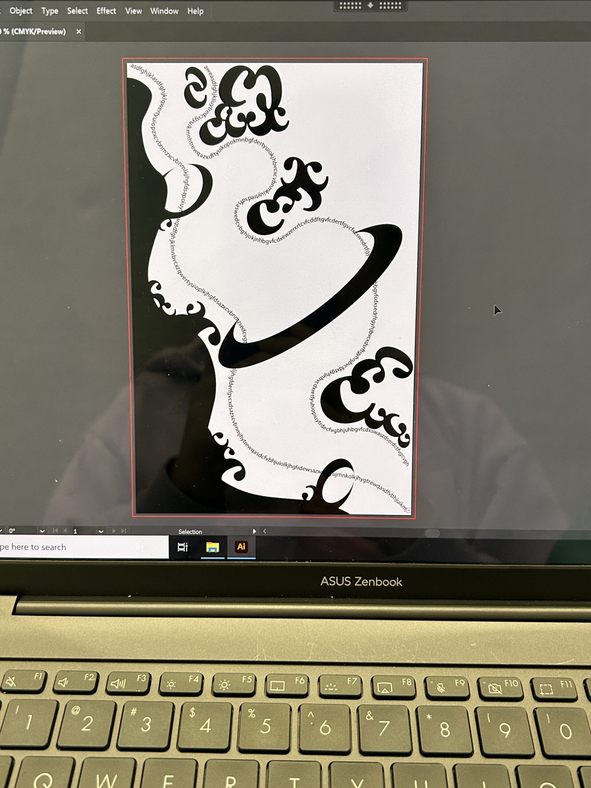
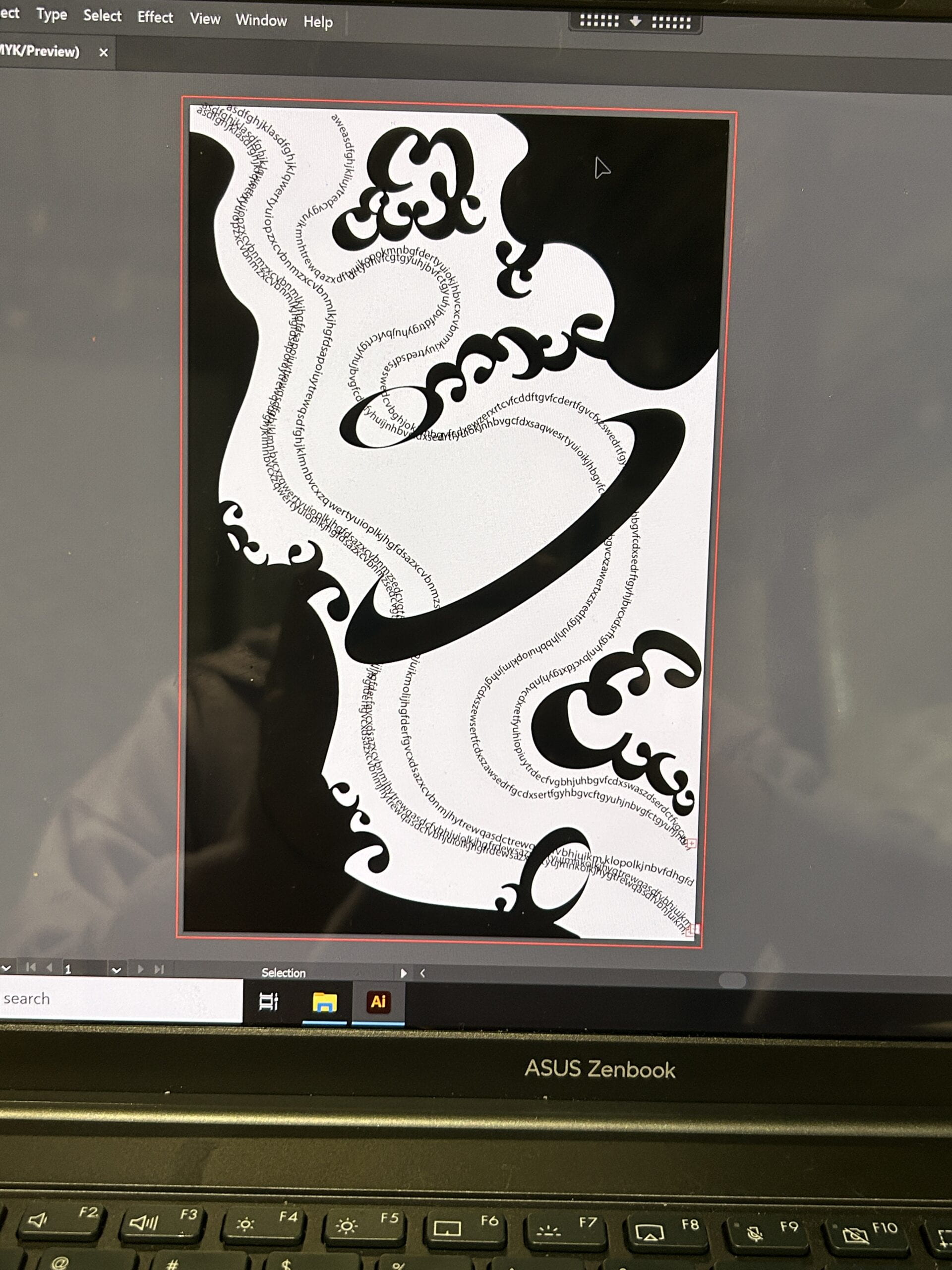
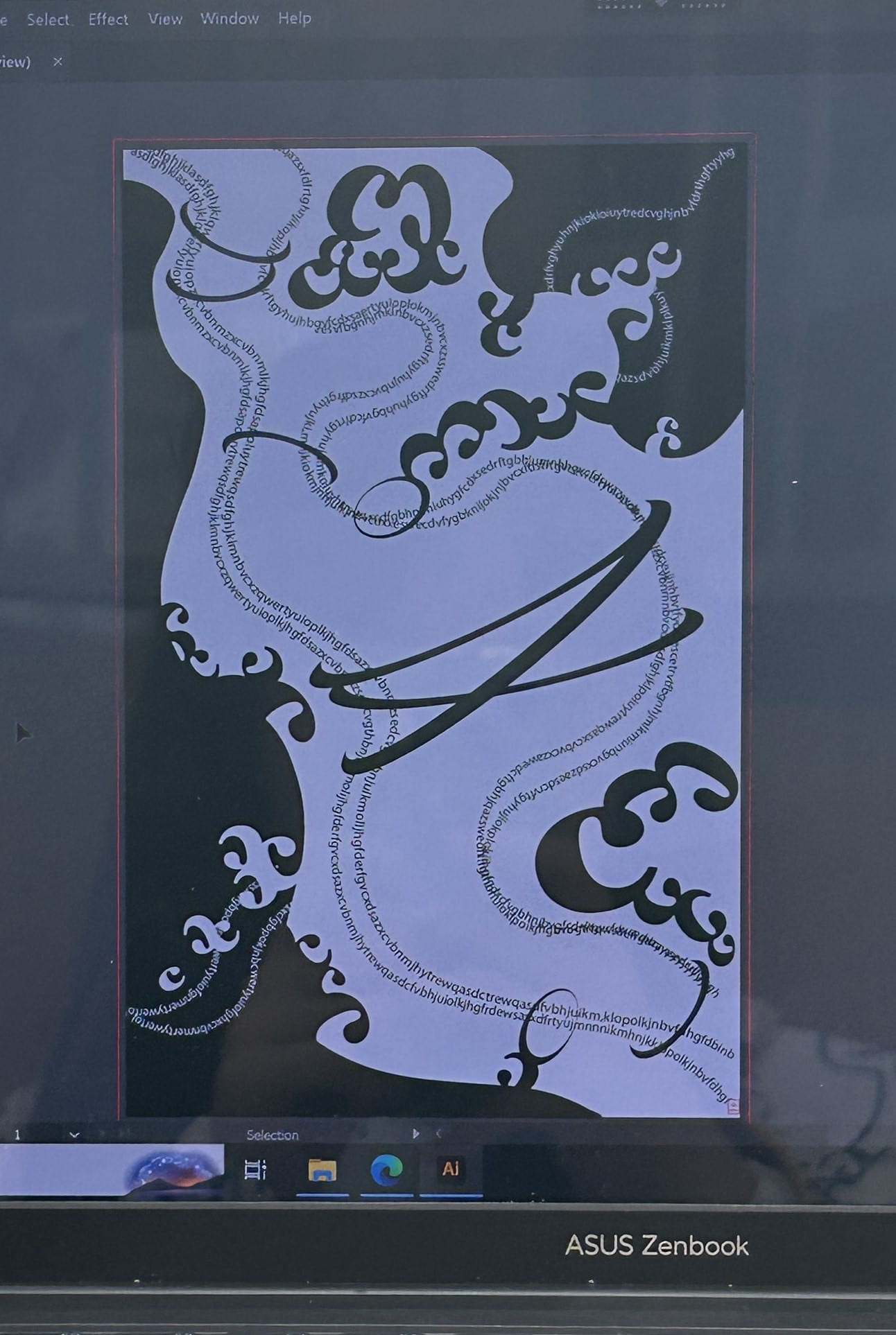
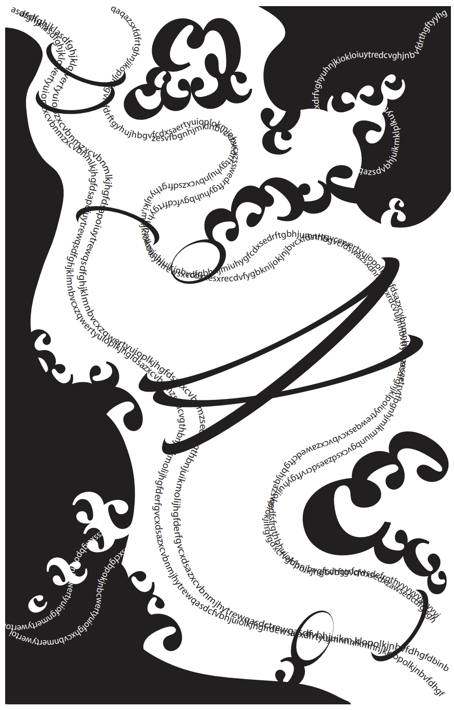
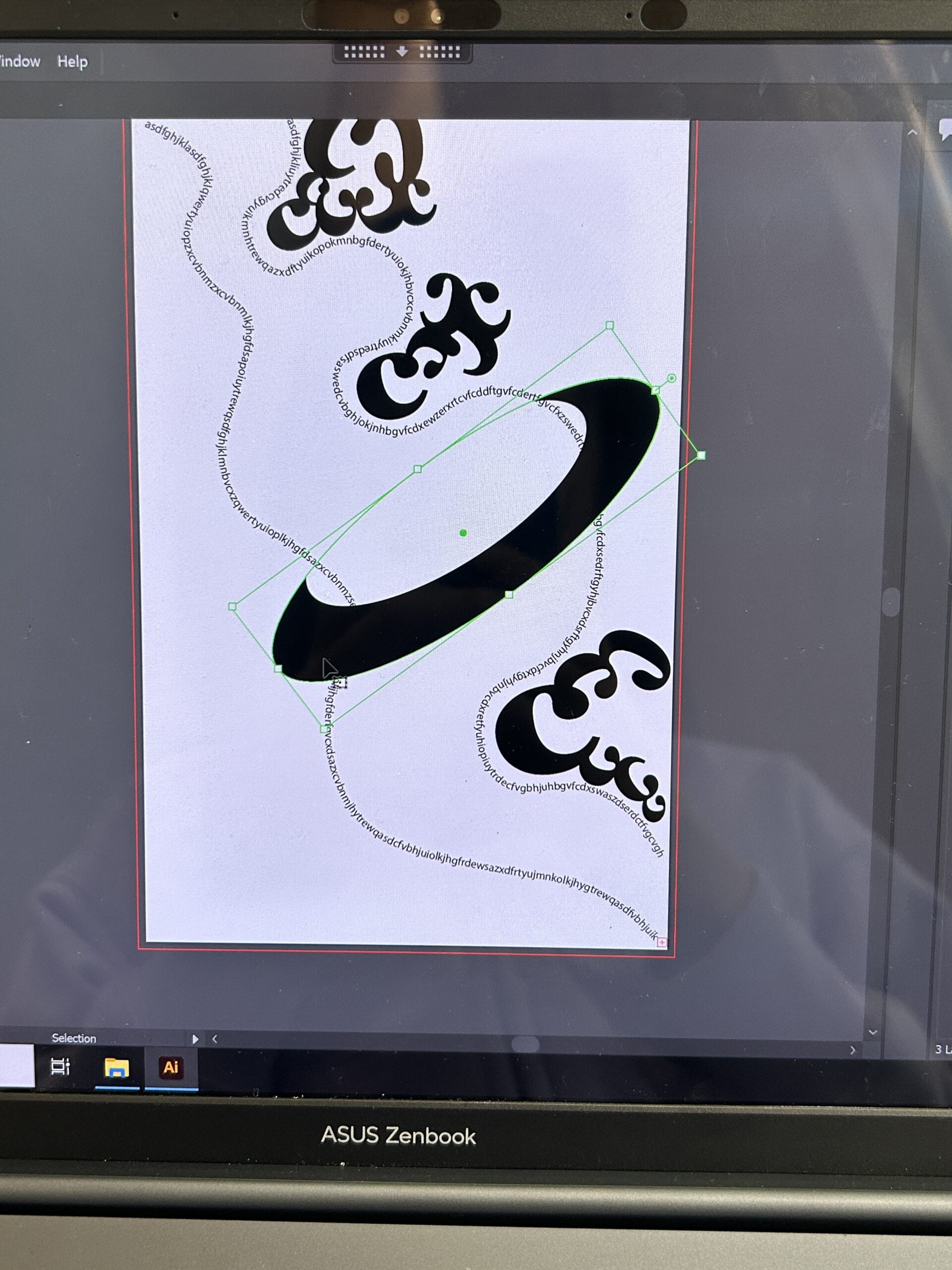
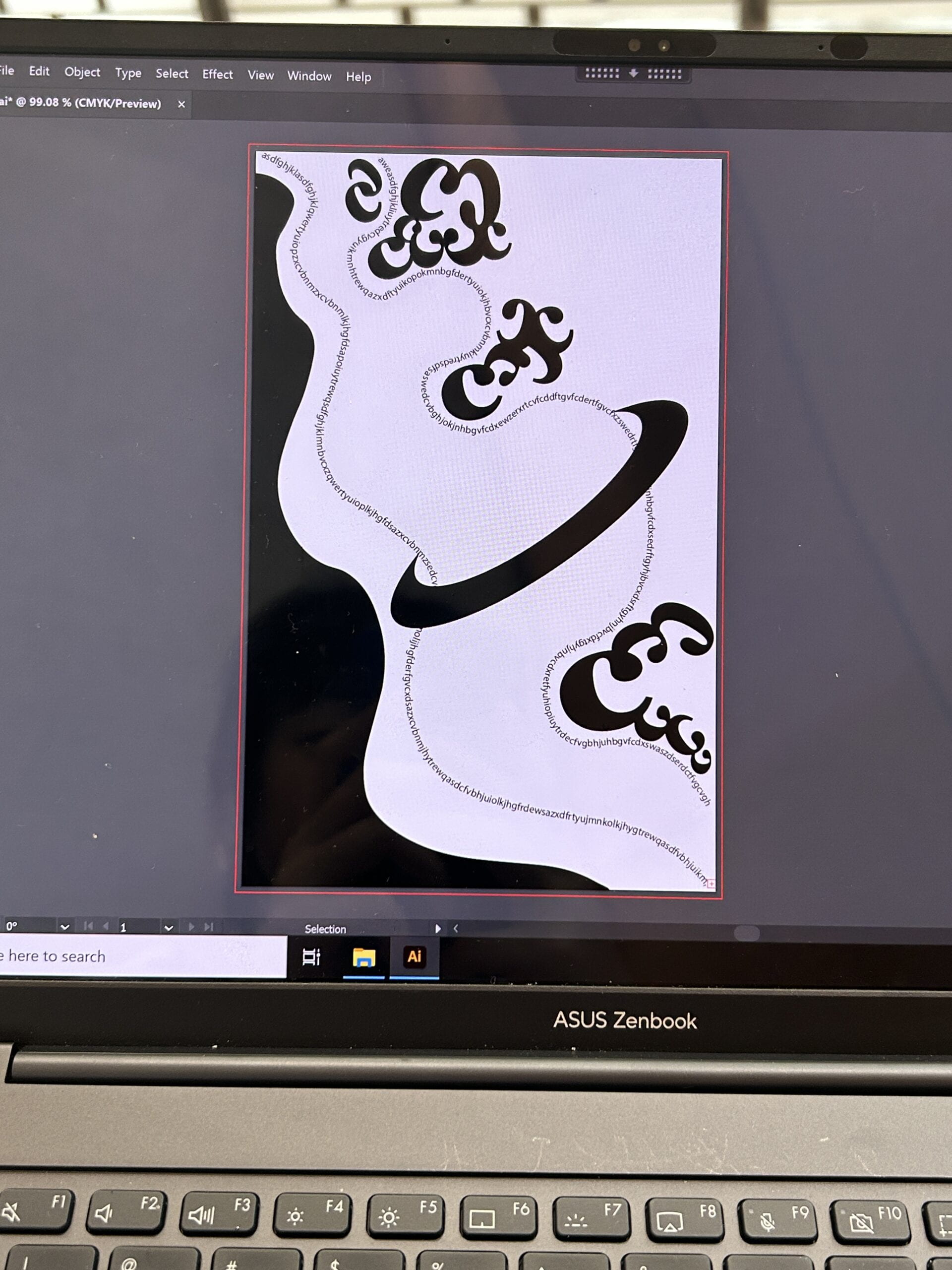
The music begins with a distant voice and gradually crescendos and reveals strong emotions. Therefore, I create some curve lines of random letters from upper left corner to lower right corner to illustrate the direction of the music. The strong harmony reminds me of the wide ocean, so I use letter ‘C’ to create the shape of black waves. To connect the two separate parts divided by the lines, I use some ring-shaped ‘C’ to linked the lines together, which strengthen the changes of thickness between the two lines. What’s more, I add white ‘C’s and white lines of random letters in a direction from upper right corner to lower left corner so that they intertwine with the upper-left-corner-to-lower-right-corner direction. They make the design look more complicated.

The One Black Square helps me get an insight into the relationships between figure and ground, and focus more on how to use shapes to express ideas. I used the lines of random letters to show continuity and make my work look more extensible. I also applied proximity on them so they look like two gray lines from some distances. In addition, the usage of black and white ‘C’s show the waves in two ways: black as ground and white as figures, or white as ground and black as figures.

Process

First, I create two lines of random letters to demonstrate the direction of the music. I experimented the placement of the ‘C’ shapes and the thick ring.

Then, I added a big black color block on the left side to add another layer and create the feeling of waves.

Next, I tried to organize the ‘C’s to create the waves and connect the waves with the lines.

After that, I considered that two lines were too thin, so I added a few more. I also added another black color block on the upper right side to make a balance. I adjusted the ‘C’ shapes according to the black color block.

Finally, I added the white lines and white ‘C’ shapes to create a intertwined direction with the black lines to create another layer. I also changed the thick rings into several thinner ones to make the design look brighter.

Conclusion

My design visualizes the music Wonder by Shawn Mendes. I think I will improve my project by adding more details. It will be better if there are some dot elements to form small blocks by proximity. It will also be better if I can distinguish the relationships between different layers more obviously.

Image of Project

Pioneer Plaque

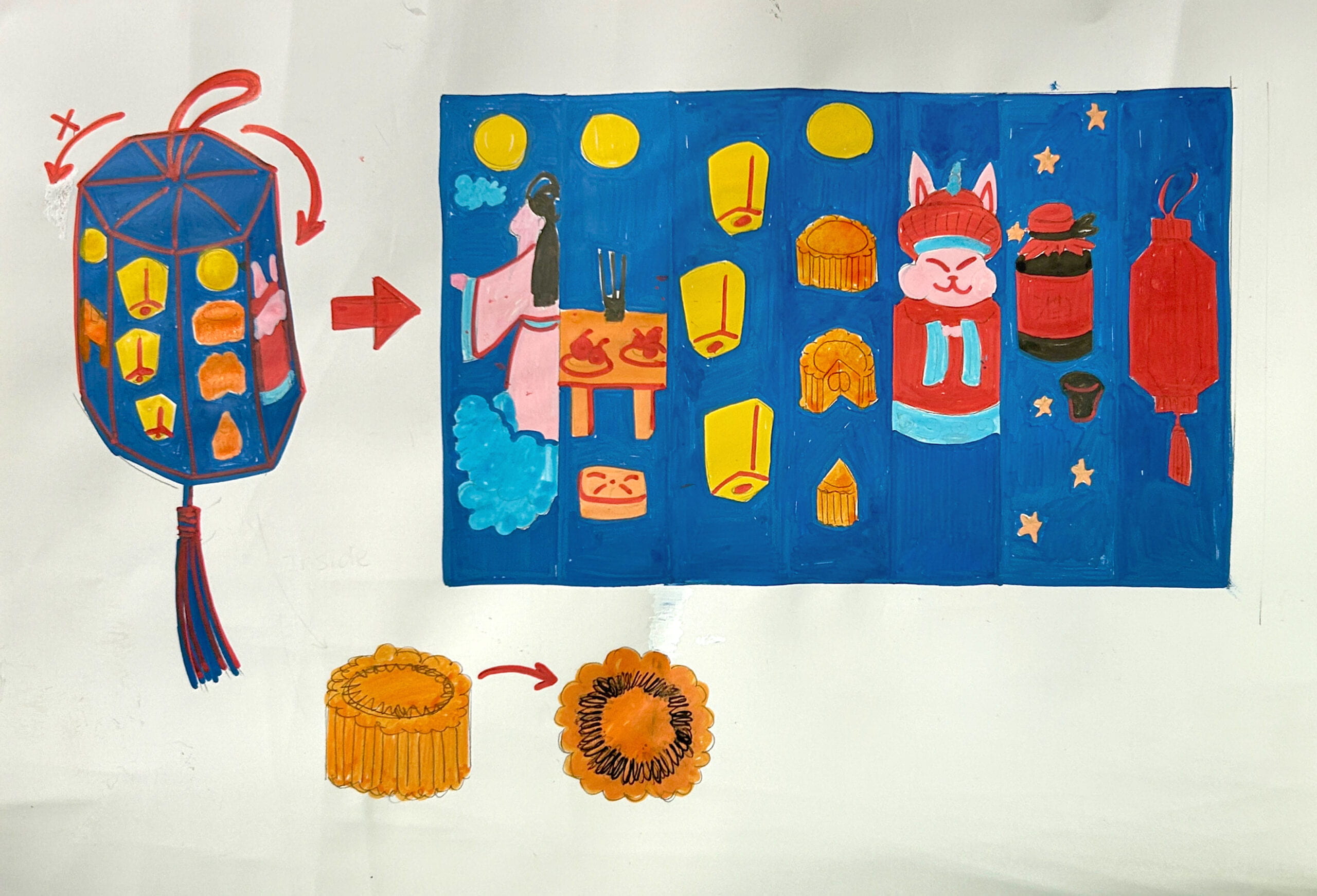
In our drawing, Nuo and Kitty selected the lantern package of mooncakes as a technology to present our Mid-autumn history. The lantern can only rotate in a clockwise direction. We intentionally adopt this direction to make the aliens aware that in our human understanding and language, order is presumably important, which is significantly different from the aliens. Furthermore, the 2D floor plan of the lantern can be divided into 7 parts, because we believe that 7 is a significant number to the alien, given that their body structure can have 7 directions.

As Chiang has suggested, the aliens and our humans have different mindsets to understand how the world functions. “We experienced events in an order and perceived their relationship as cause and effect. They experienced all events at once, and perceived a purpose underlying them all. A minimizing, maximizing purpose (30-31).” Our human beings understand the world in a chronological way, which corresponds to our writing language’s asymmetrical, divisibility and order. However, the aliens can predict how the world is developing and conceive all the possibilities, that correspond to their writing language’s symmetrical, indivisiblity and without an order. In general, we wanted to use asymmetrical images with a clockwise direction to indicate the difference between the alien’s and humans’ communication styles.

We believe that although aliens and humans adopt different language systems, the most vivid way is to present the real things in the world to make them understand better. So we decided to represent the original appearance of things as faithfully as possible, to return to nature. Also, we want to have a core concept that conforms to the alien’s symmetric, so we make the mooncake the focus of the whole picture on the lantern.

More specifically, in the first image, we utilize a symbolic image of a girl, moon, and cloud, indicating that the legend of Chang’e flying to the moon is the origin of the Mid-Autumn Festival. In the second image, we present incense, a table, sacrificial food, and cushions. The table and cushions are uniform with the mid-autumn style, and the cushions look like a mooncake too. It introduces that since the Zhou Dynasty, worshiping the moon has been an important custom. The third painting introduces how the Kongming Lantern has gradually become a Mid-Autumn Festival custom since the Three Kingdoms. The fourth painting indicates that in the Ming Dynasty, eating mooncakes during the Mid-Autumn Festival gradually became popular among the people. In the fifth picture, it indicates that at the end of the Ming Dynasty and the beginning of the Qing Dynasty, people began to like to worship Lord Rabbit. In sixth picture, in about the Qing Dynasty, people began to like to drink osmanthus wine during the Mid-Autumn Festival. In the last picture, we would like to introduce the lantern riddles that were very popular in the late Qing Dynasty. We hope that through rich Chinese folk activities, aliens can feel the changes of time on humans.

Finally, we present an enlarged picture of the mooncakes with the words “Gift to our friends” in the alien’s language. As Chang indicates, the alien’s language “didn’t appear to be writing at all; it looked more like a bunch of intricate graphic designs (12).” We hope through this gift, the aliens can feel the charm of the Mid-autumn Festival.
Reading Response – Story of Your Life

  • How do the aliens’ language and communication styles in the story differ from human language (oral, pictographic, phonetic, etc.)?

Oral: The aliens use Heptapod A to speak. The aliens speak all the words at the same time and the words do not have orders. However, humans speak in order.

Pictographic: The aliens use Heptapod B to write. They write sentences by joining the logograms for the constituent words and sticking together as many logograms as needed. They use a nonlinear system of orthography. They also have a visual syntax for the sentence composition and the inflection system. However, human

Phonetic: The aliens’ language is semasiographic. The sound has no correspondence with any components of writing. However, human written languages are glottographic, which can represent speech.

  • How does the physical structure of our body inform the way we communicate? How about the aliens?

We human-beings: We have vocal cords to speak, and we use body languages such as gestures and facial expressions to help us communicate. We can also write to communicate with others.

The aliens: They have seven limbs and they insert one of the limbs into a large socket in the pedestal to write. In addition, Their bodies are radial symmetry, so their bodies have no ‘forward’ direction. Thus, their writing doesn’t have directions and can be read no matter how they are rotated.

Hello world!

Welcome to Web Publishing @ NYU. This is your first post. Edit or delete it, then start creating your site!

Online help is available via the Web Publishing Knowledge Site (wp.nyu.edu/knowledge) and the ServiceLink knowledge base (www.nyu.edu/servicelink). Through ServiceLink, you can find step-by-step instructions, as well as tutorials.

Digital Accessibility

As content creators who create and publish text, images, video, and audio, you must adhere to the NYU Website Accessibility Policy (https://www.nyu.edu/digitalaccessibility/policy) when creating and publishing digital content.

Web Publishing-specific Digital Accessibility Best Practices and examples of how to ensure your content are compliant are available at https://wp.nyu.edu/digitalaccessibility

If you have additional questions, contact the IT Service Desk for assistance. Support is available 24/7/365. For more details, visit www.nyu.edu/it/servicedesk.