Wanyu Chen, Wonder by Shawn Mendes
Concept and Design
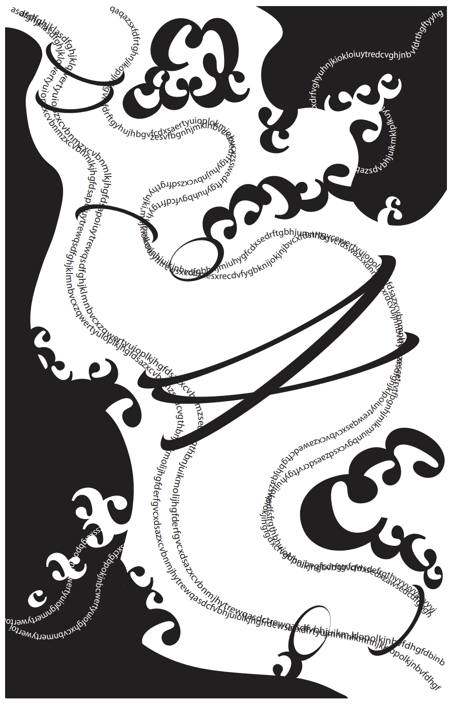
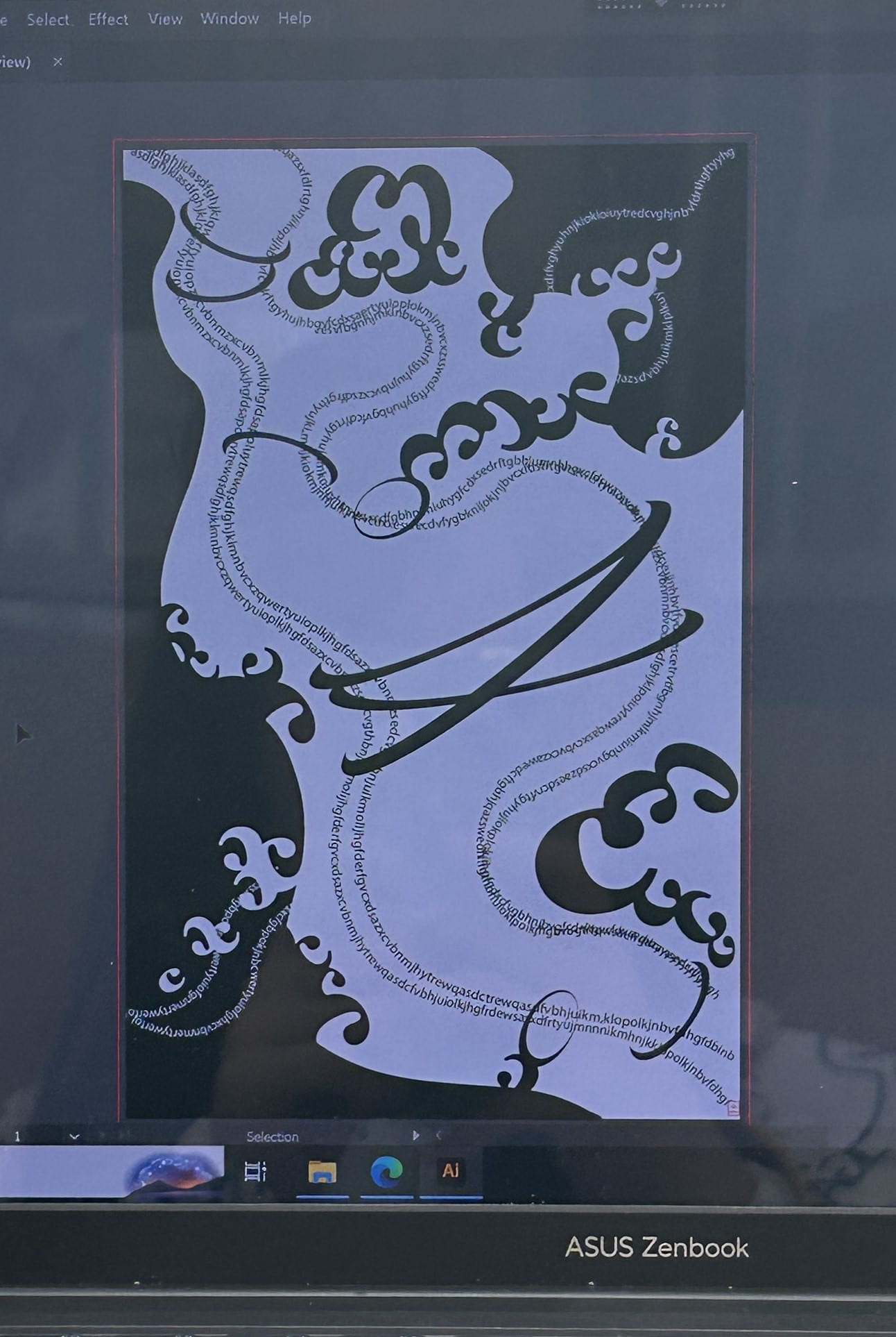
The music begins with a distant voice and gradually crescendos and reveals strong emotions. Therefore, I create some curve lines of random letters from upper left corner to lower right corner to illustrate the direction of the music. The strong harmony reminds me of the wide ocean, so I use letter ‘C’ to create the shape of black waves. To connect the two separate parts divided by the lines, I use some ring-shaped ‘C’ to linked the lines together, which strengthen the changes of thickness between the two lines. What’s more, I add white ‘C’s and white lines of random letters in a direction from upper right corner to lower left corner so that they intertwine with the upper-left-corner-to-lower-right-corner direction. They make the design look more complicated.
The One Black Square helps me get an insight into the relationships between figure and ground, and focus more on how to use shapes to express ideas. I used the lines of random letters to show continuity and make my work look more extensible. I also applied proximity on them so they look like two gray lines from some distances. In addition, the usage of black and white ‘C’s show the waves in two ways: black as ground and white as figures, or white as ground and black as figures.
Process
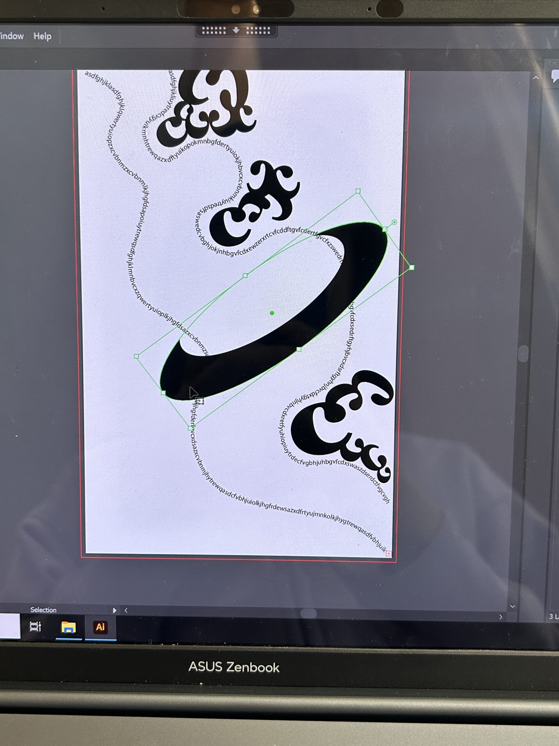
First, I create two lines of random letters to demonstrate the direction of the music. I experimented the placement of the ‘C’ shapes and the thick ring.
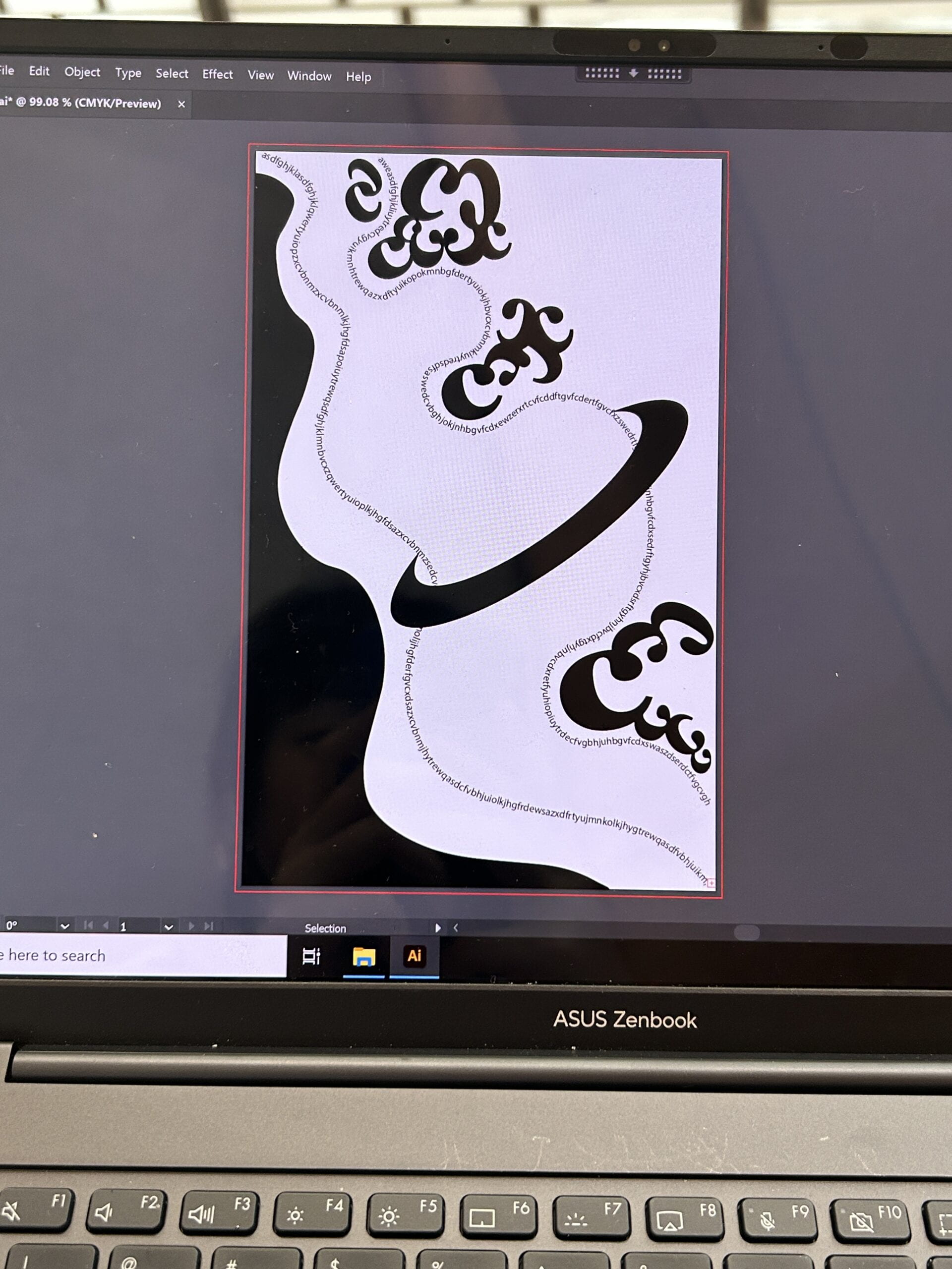
Then, I added a big black color block on the left side to add another layer and create the feeling of waves.
Next, I tried to organize the ‘C’s to create the waves and connect the waves with the lines.
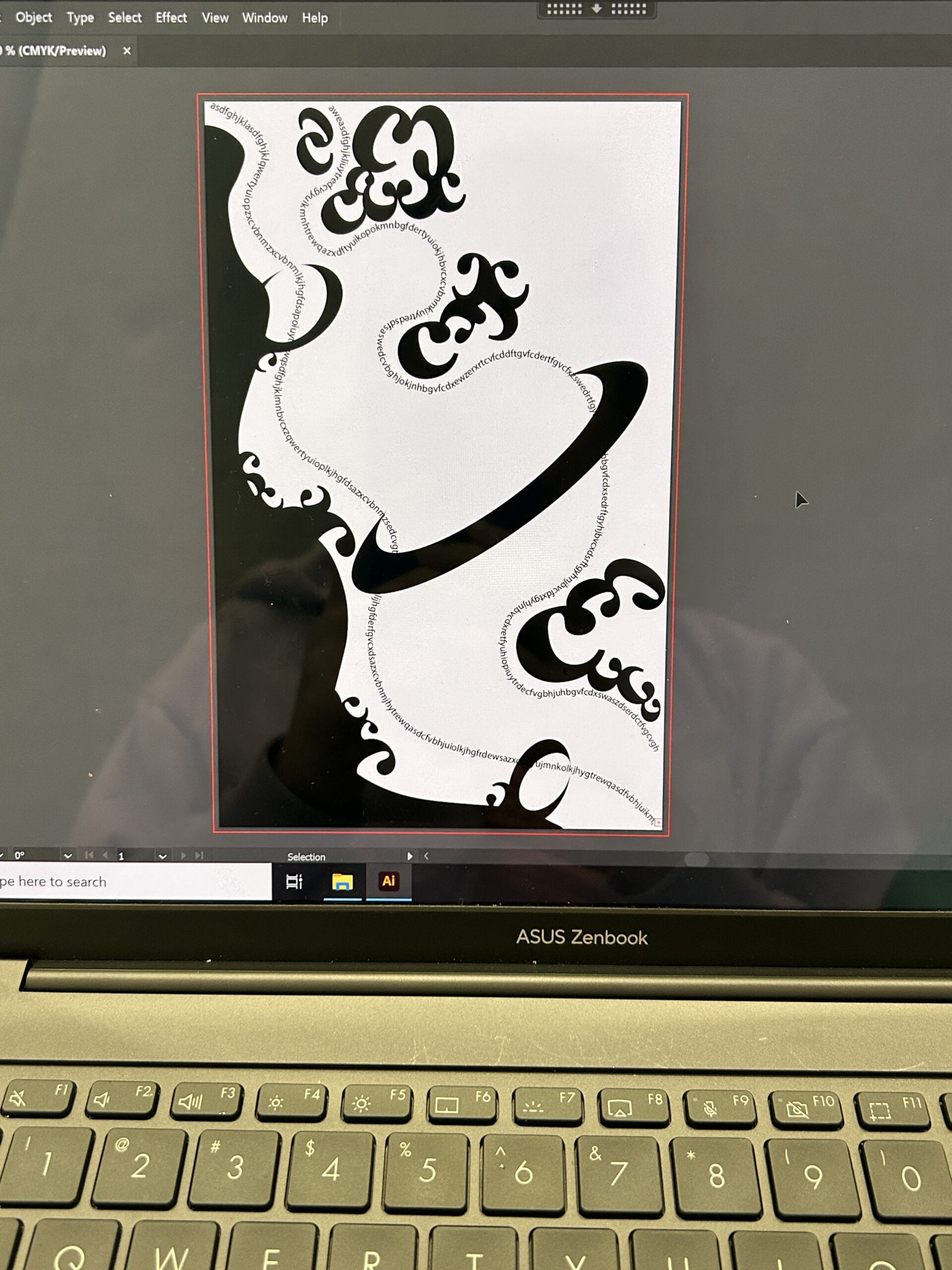
After that, I considered that two lines were too thin, so I added a few more. I also added another black color block on the upper right side to make a balance. I adjusted the ‘C’ shapes according to the black color block.
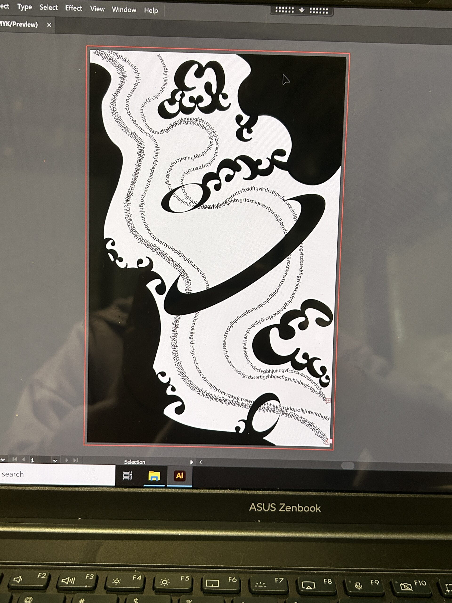
Finally, I added the white lines and white ‘C’ shapes to create a intertwined direction with the black lines to create another layer. I also changed the thick rings into several thinner ones to make the design look brighter.
Conclusion
My design visualizes the music Wonder by Shawn Mendes. I think I will improve my project by adding more details. It will be better if there are some dot elements to form small blocks by proximity. It will also be better if I can distinguish the relationships between different layers more obviously.
Image of Project
