Week2-Assignment
Week2-Case study: Synthesize your own AI postcard.
This week I case study an AI program called “Synthesize AI postcard”. Basically, this is an AI algorithm that utilizes three machine learning models to explore how machine learning algorithms look at the world and how they are able to synthesize images.
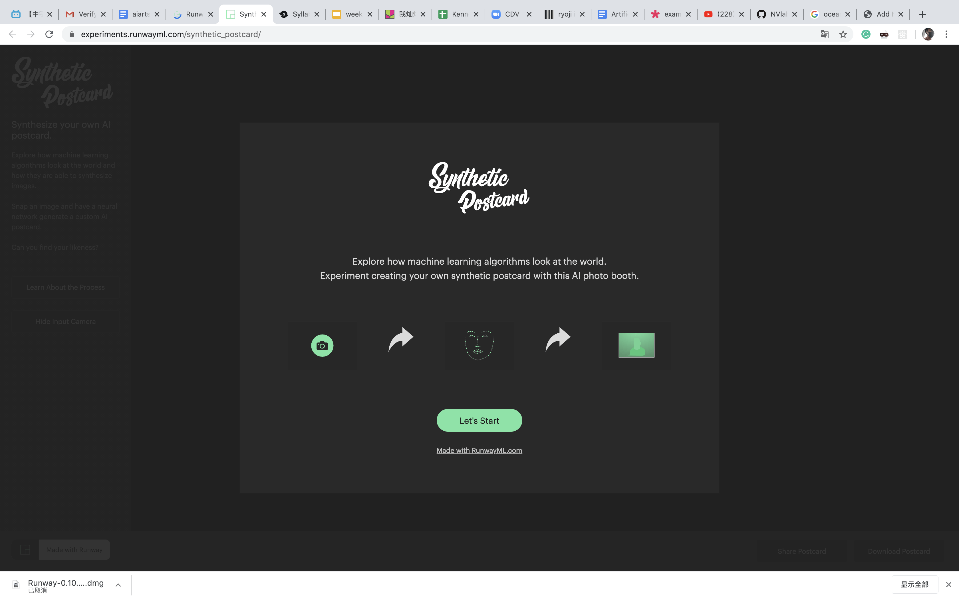
I used the front camera of Macbook pro to snap myself and hand the portrait to the algorithm.
As we can see, it took a long period for algorithms to generate a postcard. After this long process, here is what I got:
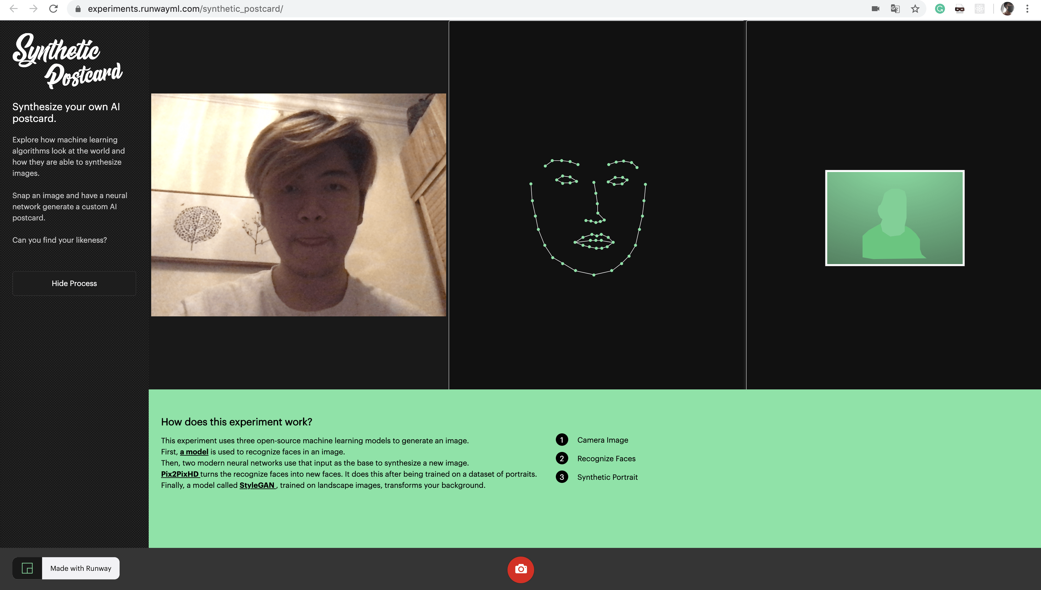
The texts showed at the bottom perfectly explain how the project works:
Firstly, this project uses three machine learning models:
1. Face-Api.js: A model used to recognize faces in an image
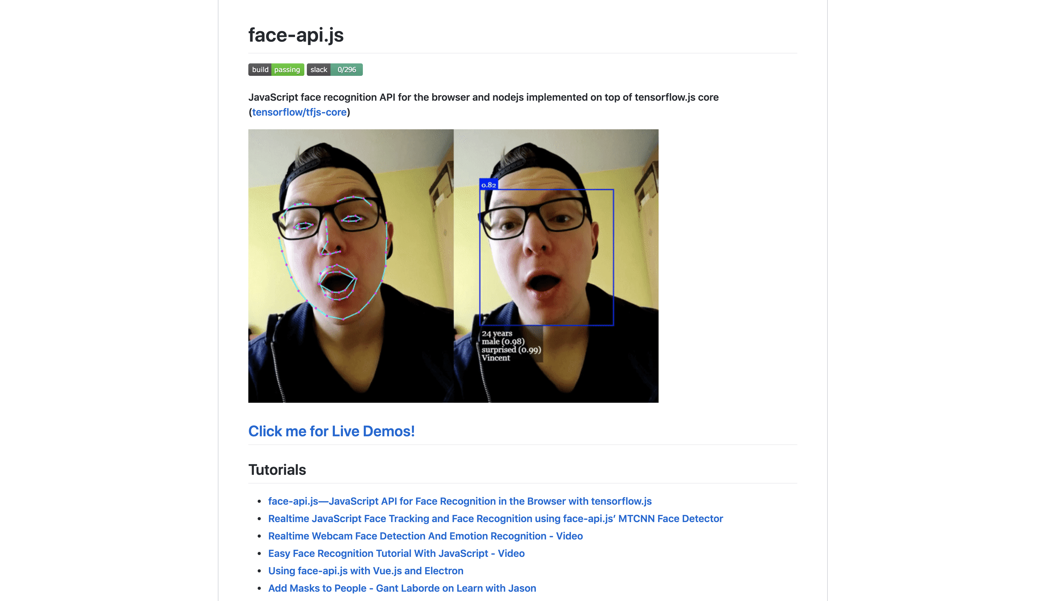
Link: https://github.com/justadudewhohacks/face-api.js
2. Pix2Pix: turns the recognized face into a new image (mentioned in peer’s case study last week)
3. StyleGan: trained on landscape image, transform the background.
General feelings:
I think this project is not complicated in terms of its theory. We can easily understand how it works, but I still cannot understand the code and model after checking the source on Github and the neural networks on runwayMl. I think this project is critical and meaningful. First of all, it reveals how AI algorithms interact with users(humankind). How do algorithms look at us? How do they process us? These questions are really philosophical.
runwayML example
I experience two examples in runwayML: footwear design and oil painting swap.
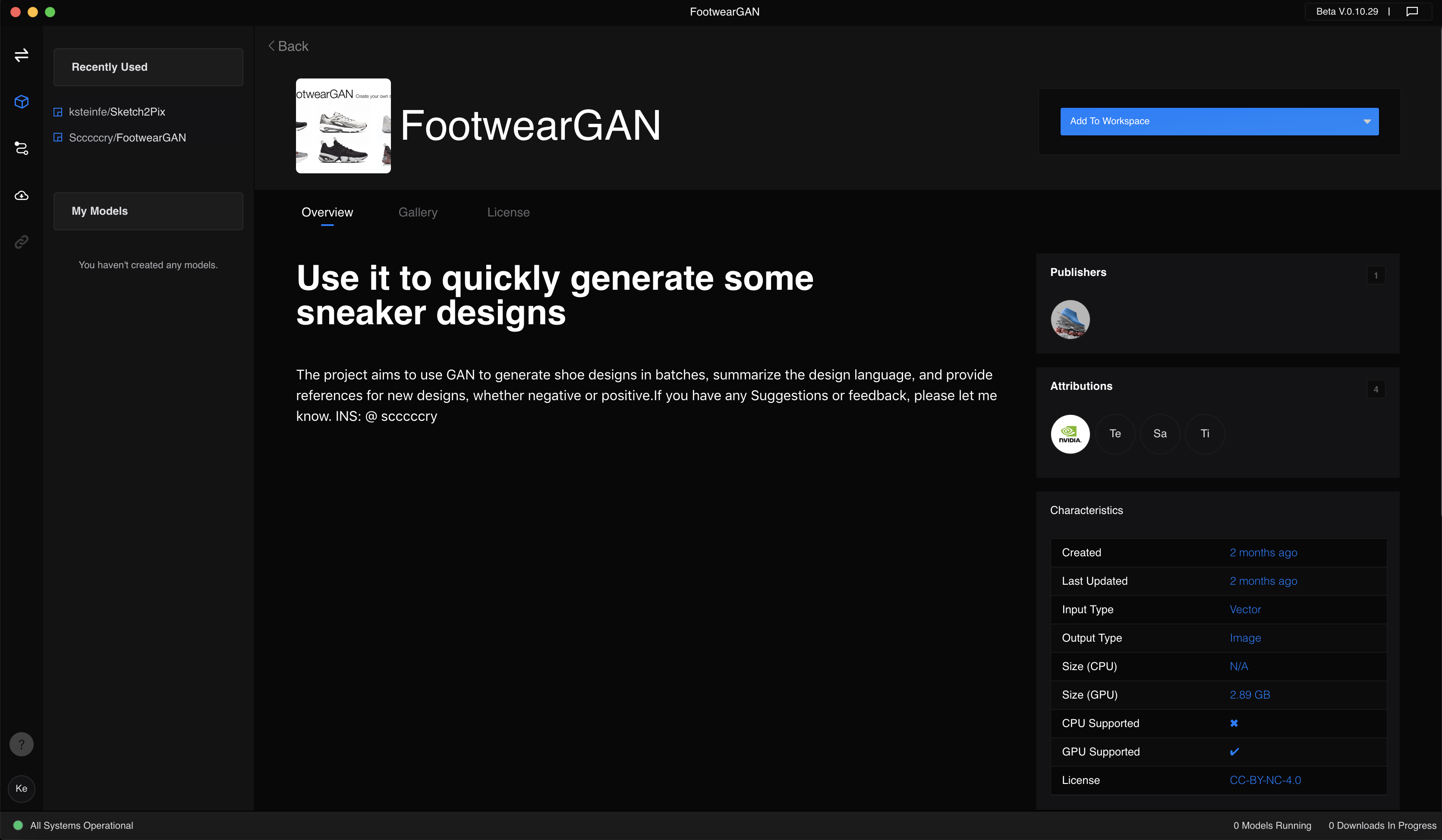
This is the first model that attracts my eyes. I also want to create a similar project. But I don’t know how to set up. The input displayed on the screen is a vector but I don’t know what it is. I try to upload sneakers’ images to the programming, but nothing happens. So I move on to the next model.
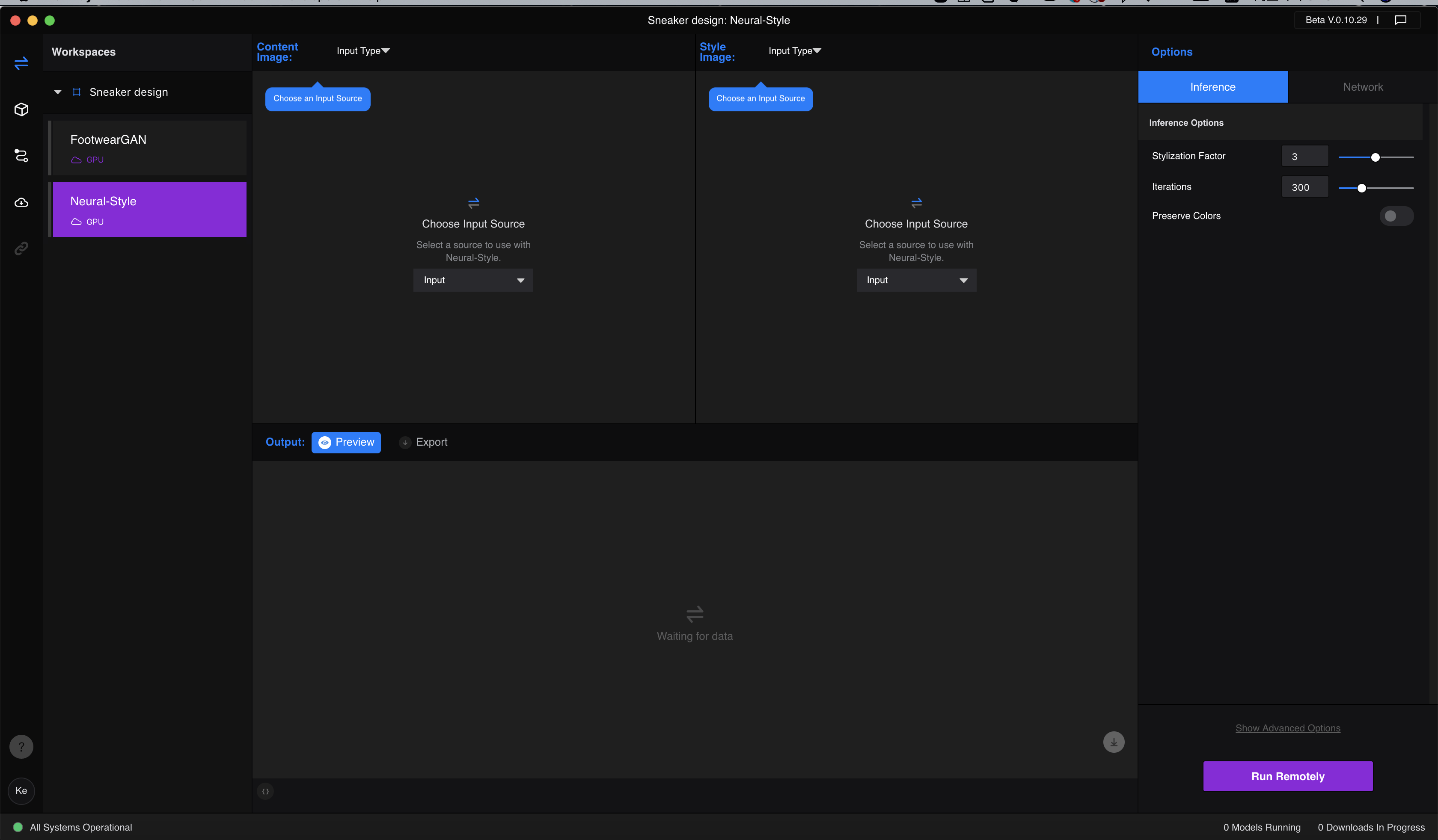
The second model I try is a model that converts an image to the form of an oil painting. In the content image box, we can upload the image we want to transform, and in the style image, we can upload the oil painting which is in the style we want. The model will learn and analyze the style and feature of style image and generate a new oil painting based on the content image.
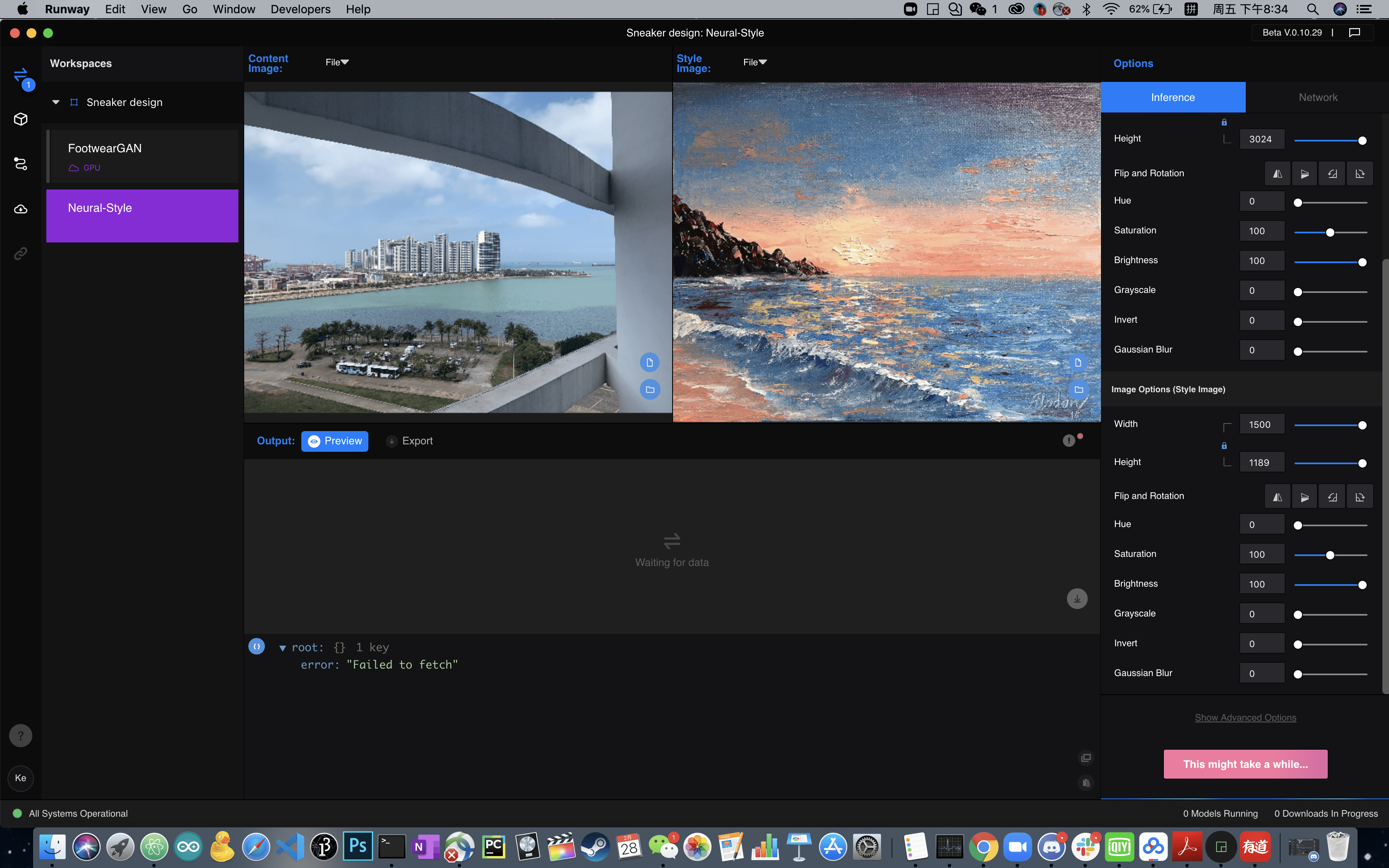
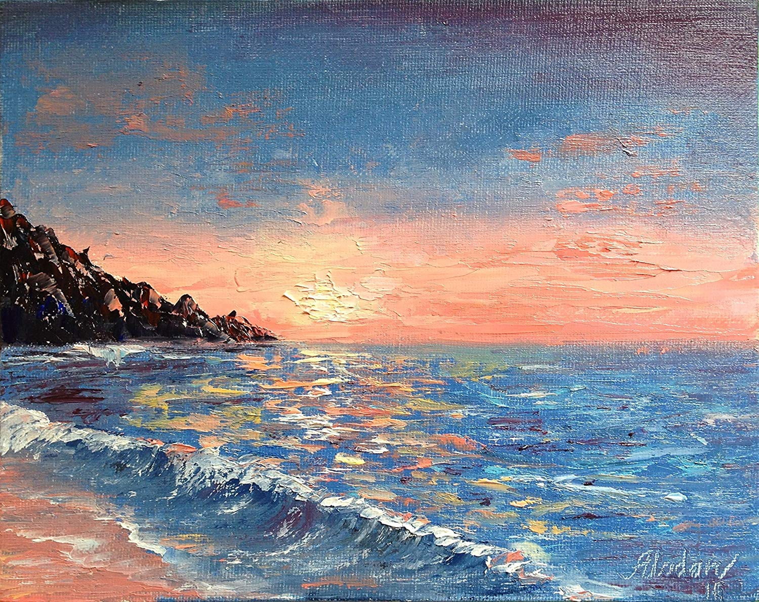
Unfortunately, it took half an hour to processing and I could not reach to a result.
Week1: Concept Story
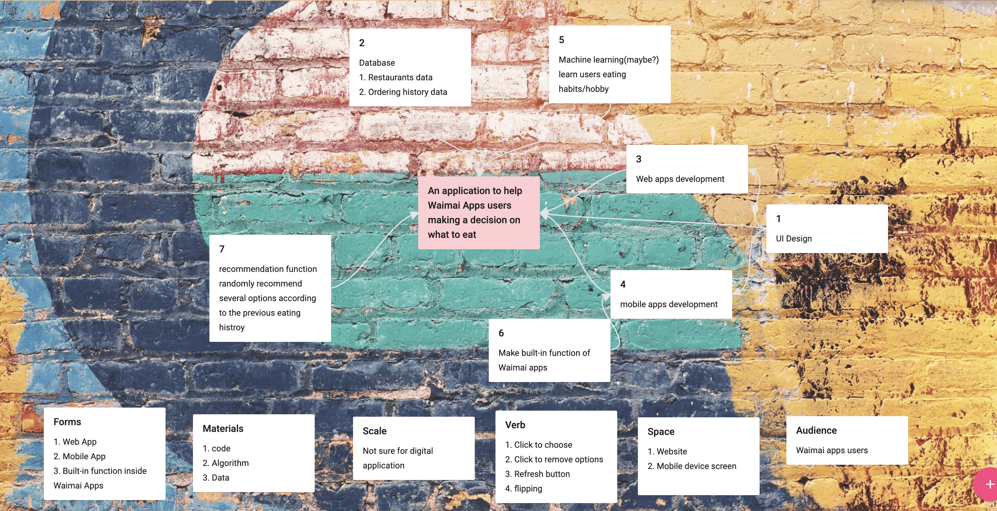
App name: eatWhat
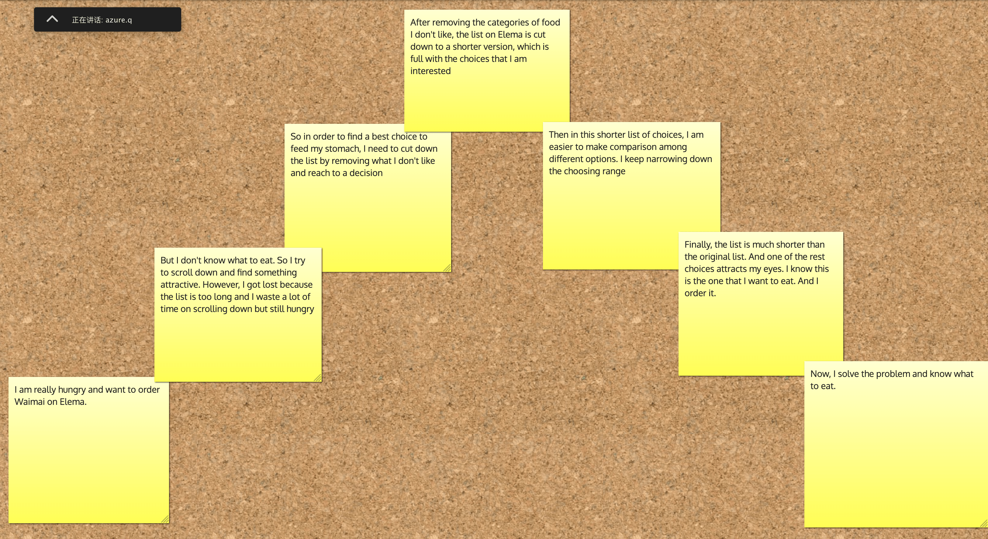
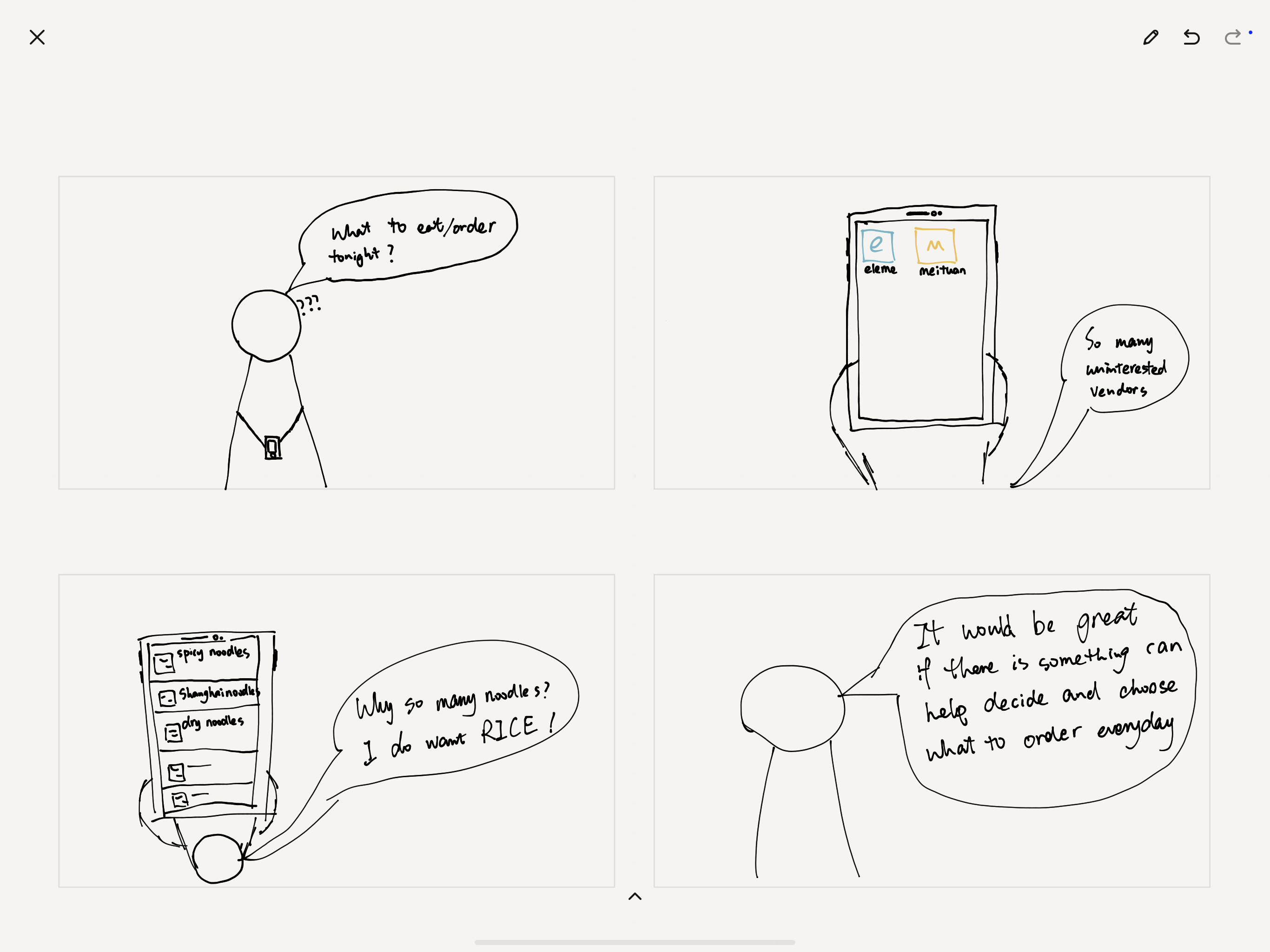
- Exposition:I use eleme and meituan to order waimai. But sometimes I don’t know what to eat. So I always scroll down and hope to find the best choice. It wastes a lot of time and sometimes I have kept scrolling for a long time but still have difficulty in making a decision, and starve. The list on the app is too long, and actually I have seen many similar choices I don’t like.
- Inciting Incident/ Problem: So I always want to create an app to help me make a decision when ordering Waimai. Especially, it can help to filter out what I don’t like so as to narrow down my choosing range.
- Rising Action: My product name, I don’t have an idea yet. But I think eatWhat is good. The current solution for helping make a decision is recommendation function within Waimai apps. You can choose the categories/dishes you want to eat and then the app will recommend choices according to your favor. This function works for the people who knows what to eat, but worthless for the people who don’t know what to eat.
- Climax: when I don’t know what to eat, this app can help me narrow down my choices, hiding the categories I don’t like from the database so that it won’t show up on my screen again.
- Falling Action: My potential choices will keep being reduced until I find something I want to eat.
- End: Enjoy your food!
UX Design-week1-7 design rules
Affordance
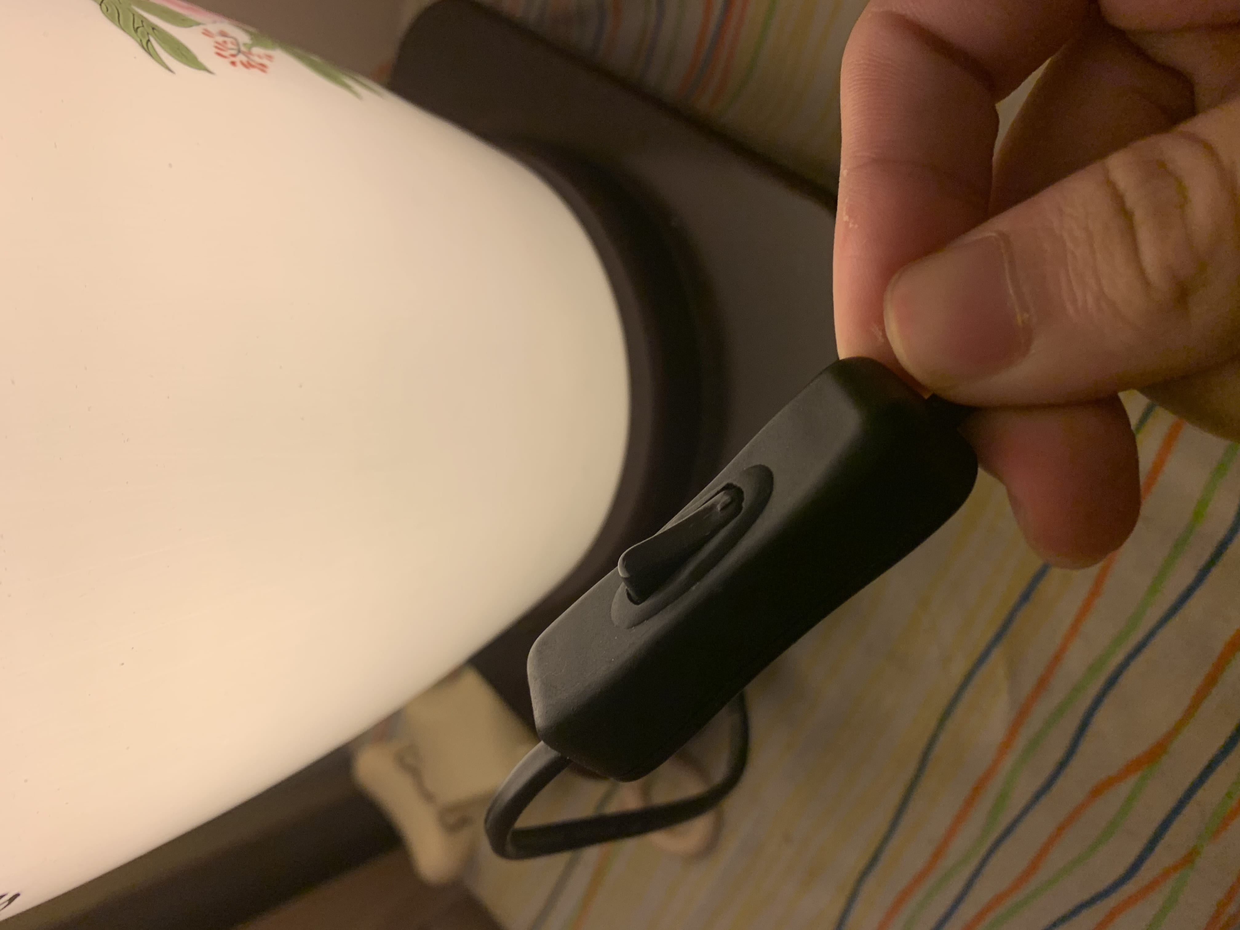
Everyone knows how to open the light with this kind of button.
Feedback

The icon of the Gmail website will show loading animation after you click something(request).
Mapping
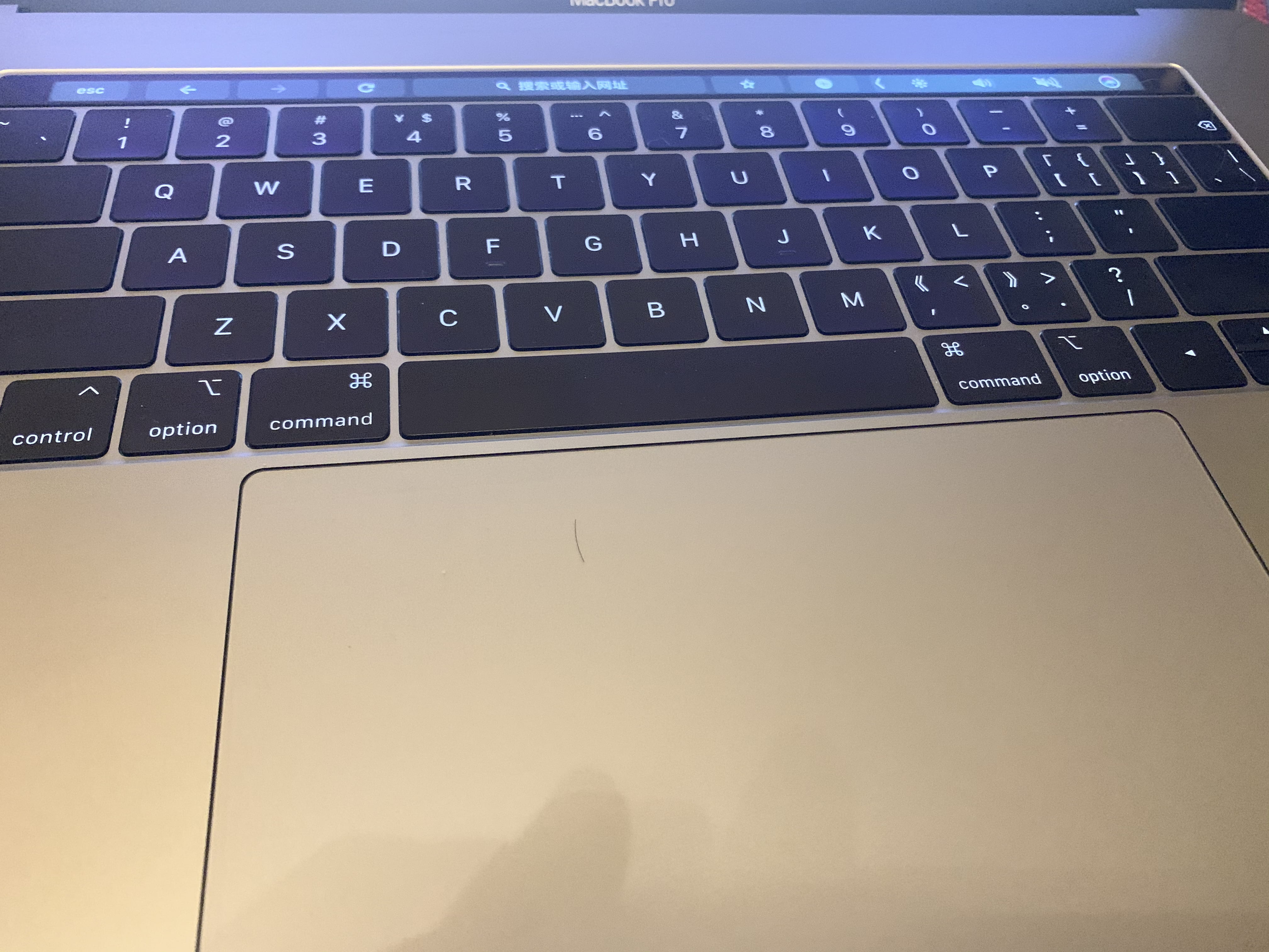
Users can use the touchpad of Macbook pro to scroll up and down on websites. This design perfectly shows the relationship between control and effects.
Group
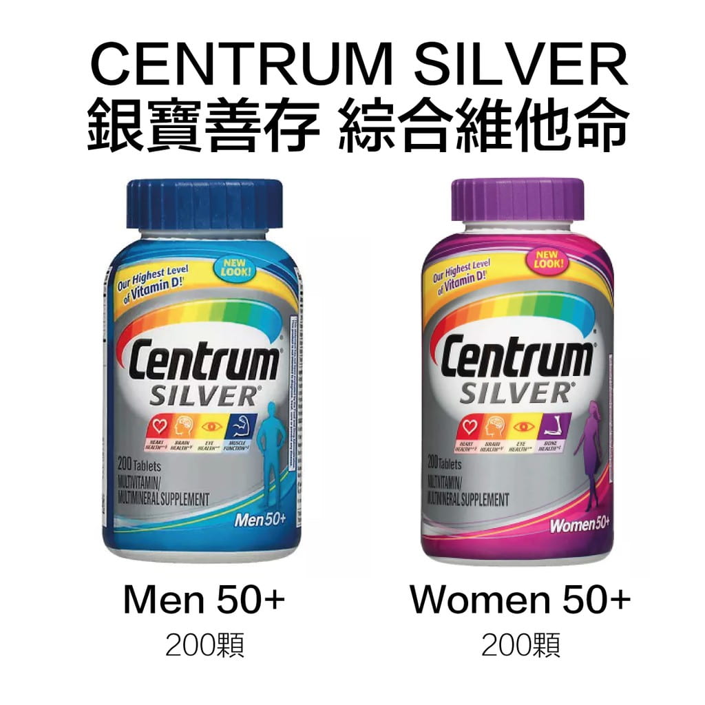
Designers need to design accordingly. For example, centrum design their product for both men and women group.
Conventions
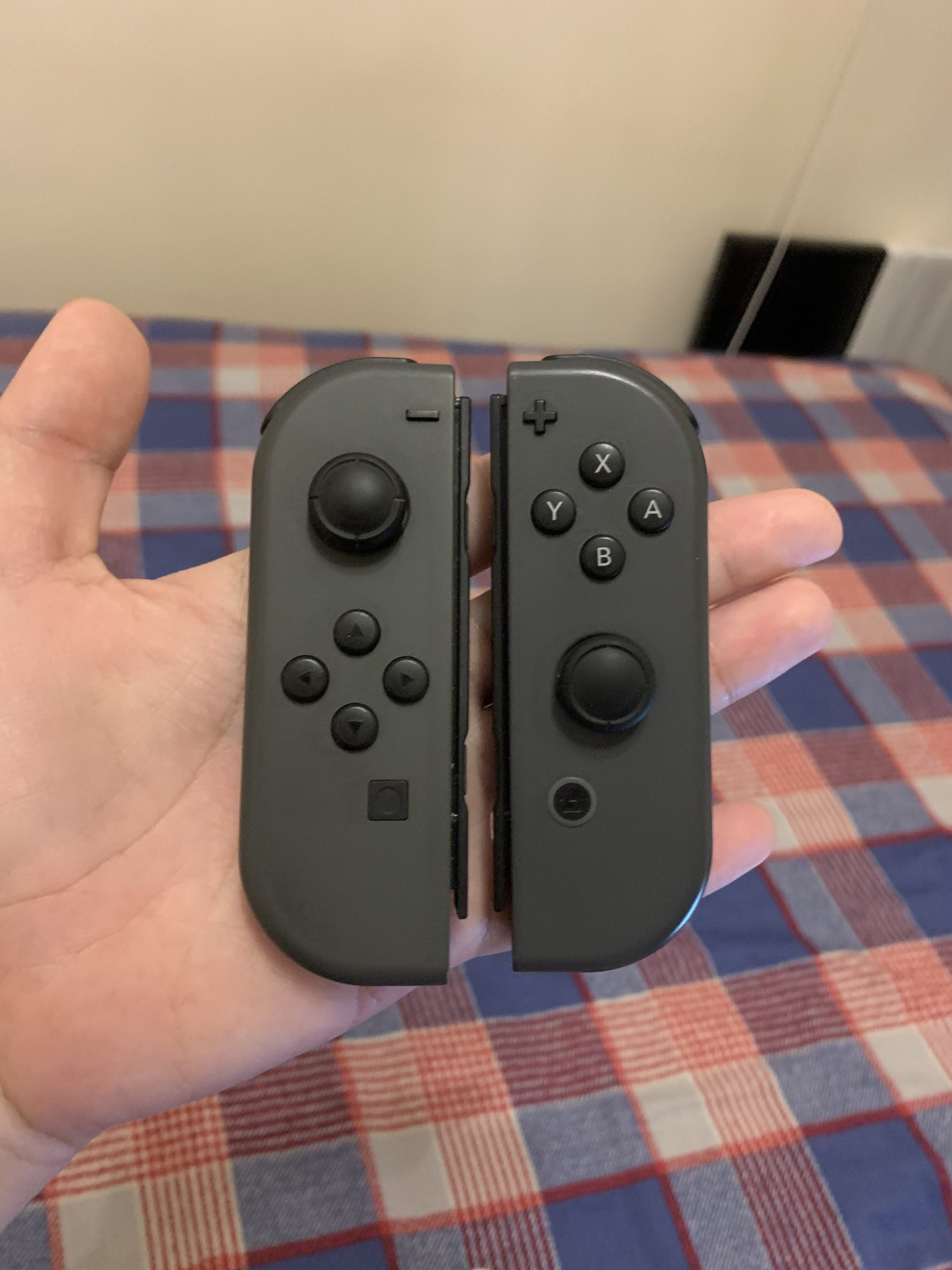
In the game industry, there is a convention in controller design. As the image shows, almost all the companies(except Sony Play Station) follow the certain layout of buttons to design their controllers. The image is my Joy-cons of Switch.
Consistency
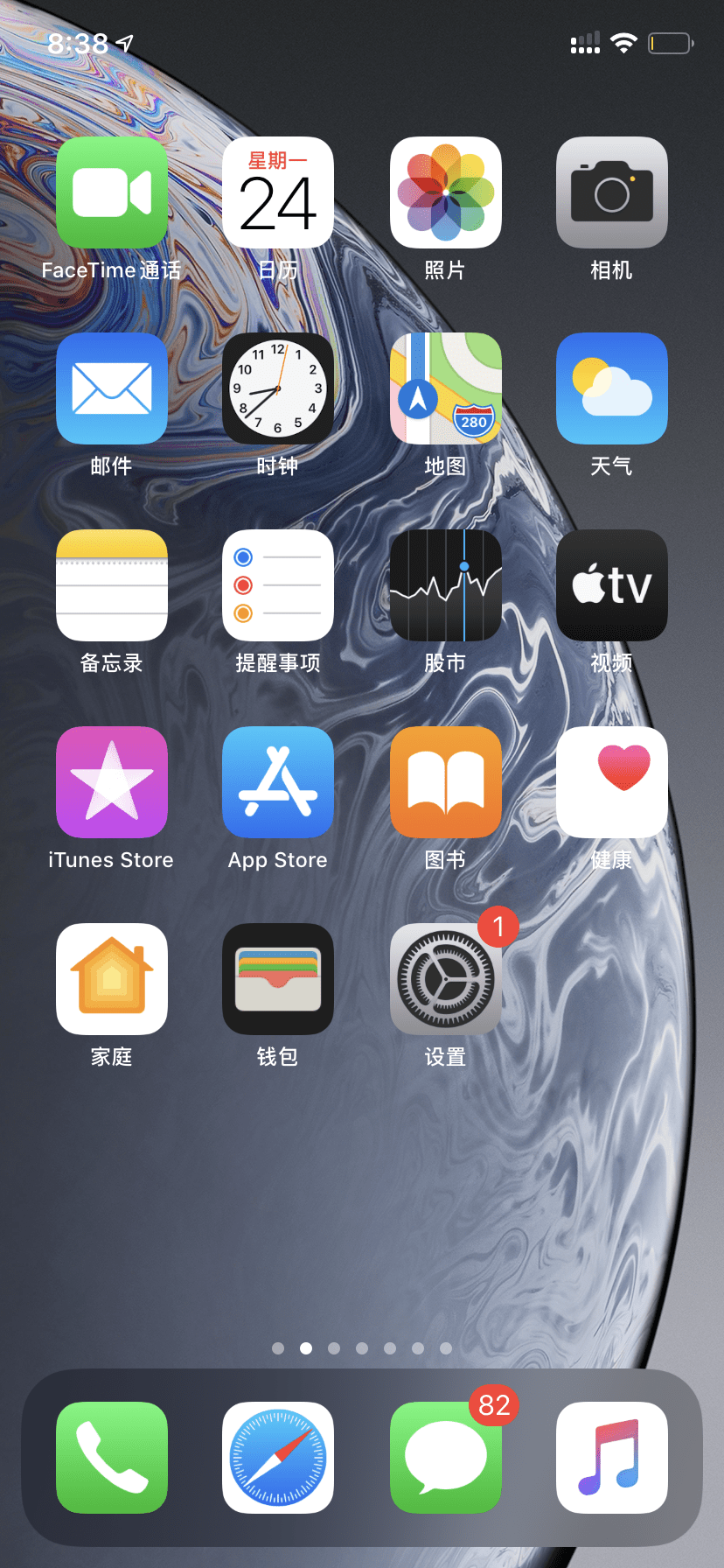
The UI design of IOS follows the rules of consistency. In my memory, the design language of IOS is always a quasi-physical style. As we can see in the above image, the icon of the most function are real physical things in the real world(phone, mail, clock, etc.)
Constraints
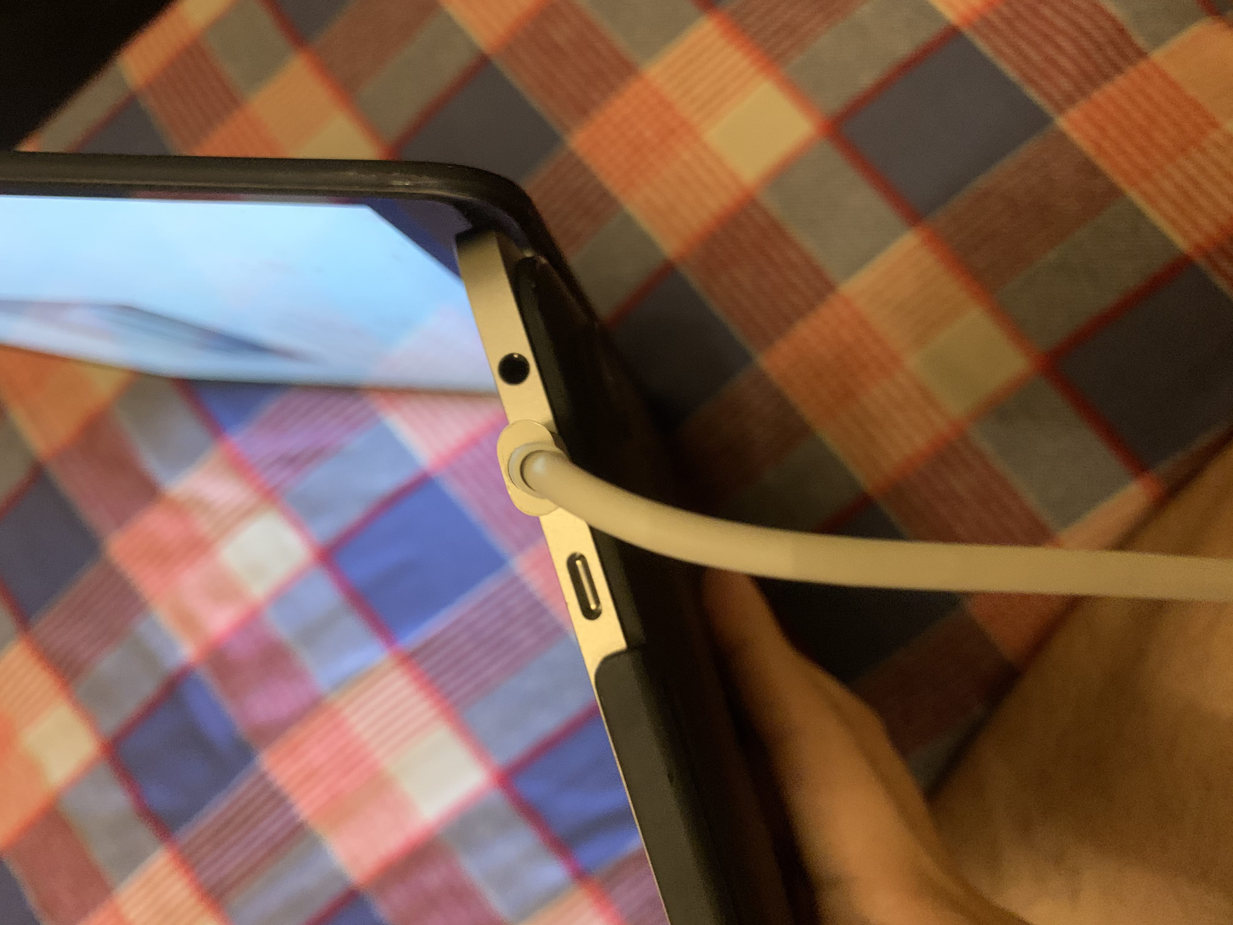
The ports of Macbook pro or other types of a laptop are the result of “constraints”. Users’s choices are limited by the designer and they will naturally know how to use the port.
NOC – Week#1 – P5 Basics
P5 Basics
Functions I use:
frameCount, vertex(), push(), pop(), translate(), rotate(), scale()
Static:
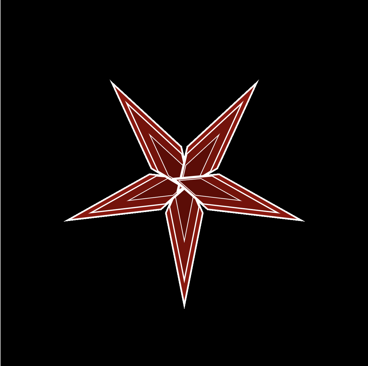
Animation:
Week1-Case Study: Power Portrait by Michael Day
The AI Arts case I choose is “Power Portrait” by Michael Day
Portfolio:
https://www.michaelday.org.uk/
Case Link:
https://computervisionart.com/pieces2019/power-portraits/
Something about Michael Day:
Michael Day is an artist, researcher, and lecturer based in Sheffield, UK. His art practice is focused on digital technologies and the potential implications of their increasing entanglement with all aspects of contemporary experience. As I learned in his portfolio, Michael Day focuses on the interplay of digital technologies and life experiences among people. The project “power portrait” use Google Cloud vision API to collect the facial data from many board members of major tech companies. As the author describes the aim of this project, “This challenges the assumption that board members of tech companies are themselves invisible and inscrutable, appearing only through their mediated image and through the products they are responsible for managing.”
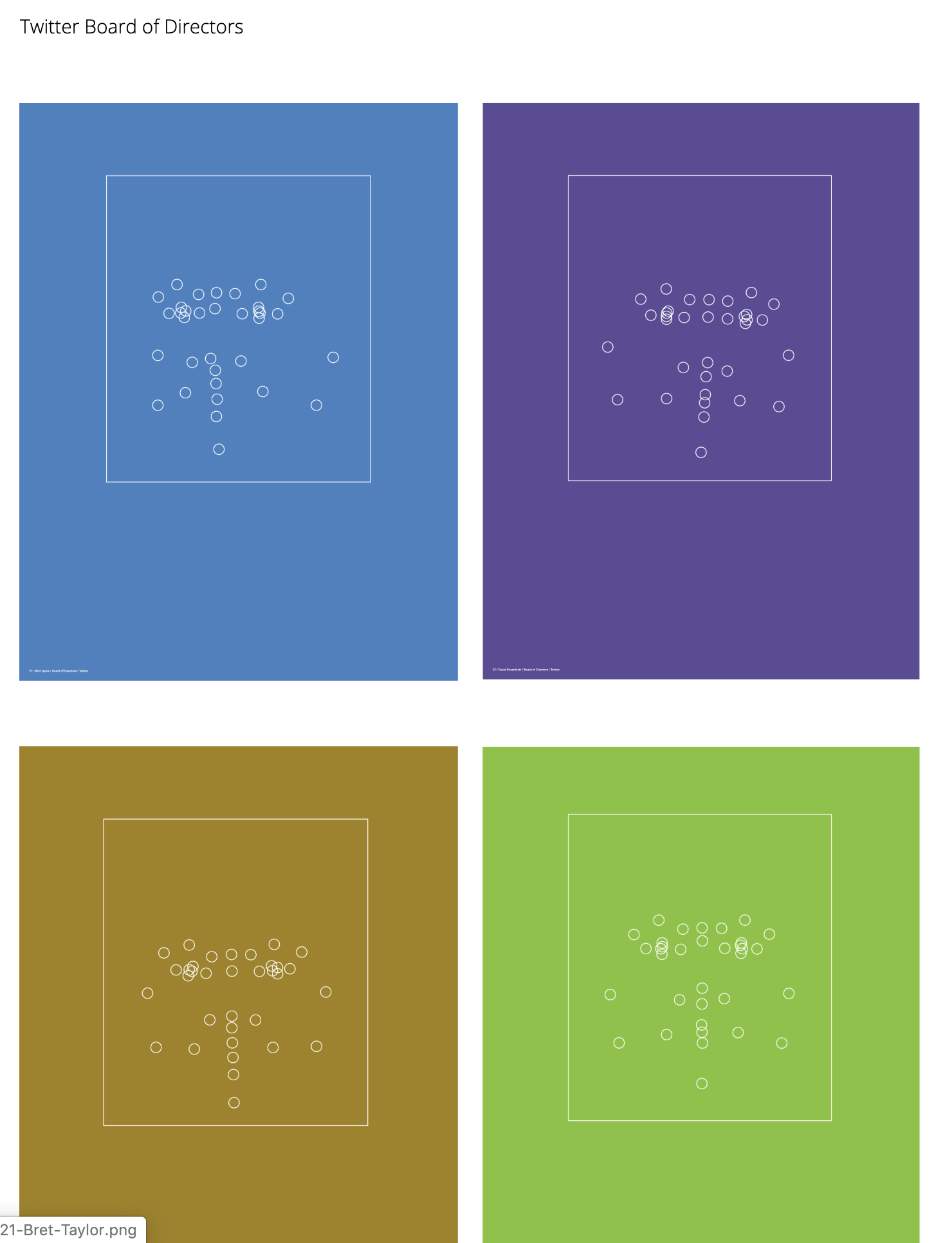
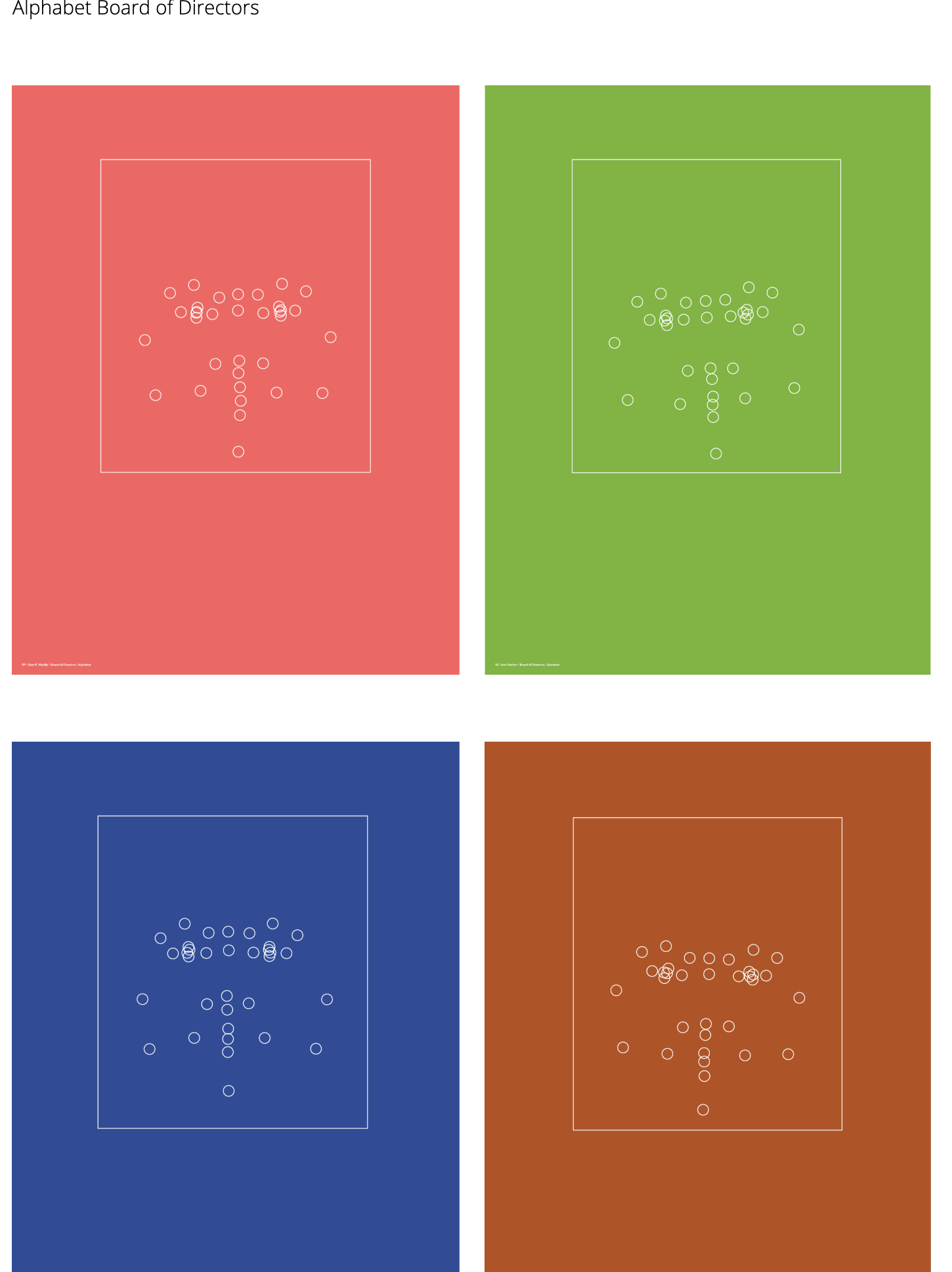
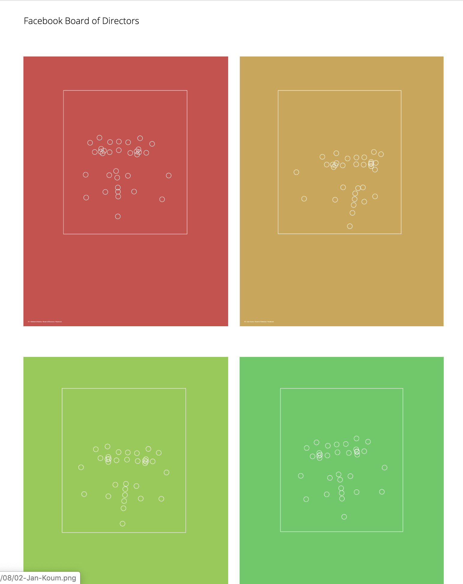
The works of this project are really simple. One of the art pieces above represents the face of one board member. The face landmarks are represented as small circles and the outline boundary of the detected face is shown as a rectangle. It looks pretty abstract and contemporary art style(I like it!). I think this project is meaningful and reveal contemporary life. As I learned about all big companies, the workers have no chance to get in touch with board members who make decisions. This project can disrupt the invisible, inscrutable stereotype from workers towards the bosses in an artistic way. An abstract but vivid image of bosses’ appearance is formed in workers’ minds in a new way.
How it works
I cannot find the live demo and GitHub/Source code of this project. However, as I went through the documentation page of this project, I found the key tech of this project–Google Cloud Vision API. I google it and try the demo function provided on the official website.
“Google Cloud’s Vision API offers powerful pre-trained machine learning models through REST and RPC APIs. Assign labels to images and quickly classify them into millions of predefined categories. Detect objects and faces, read printed and handwritten text, and build valuable metadata into your image catalog.”
Vision API allows users to upload an image like portraits and extract data from them. So I put my official portrait into the testing box :).
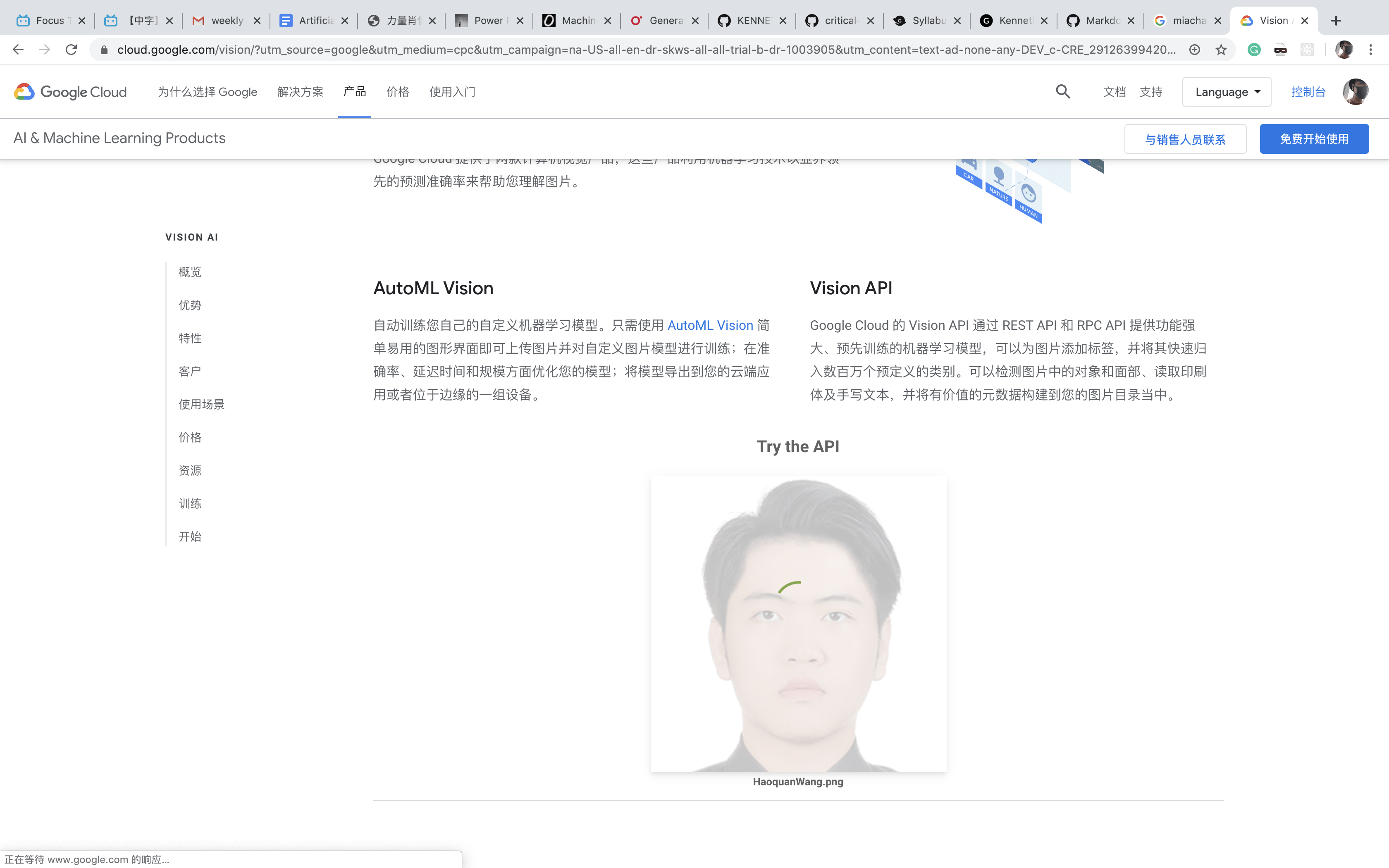
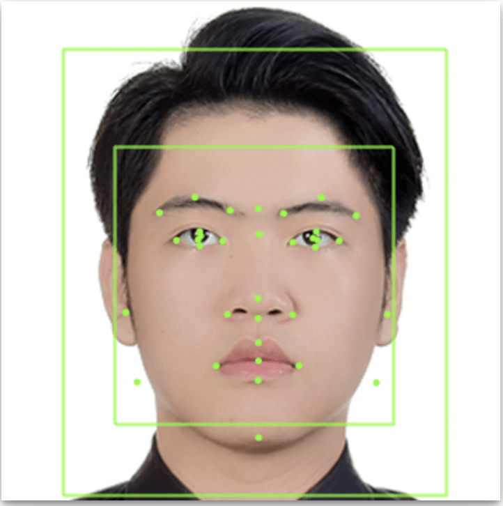
That is cool! And here is what I got from Vision API. It looks similar to Michael Day’s work.
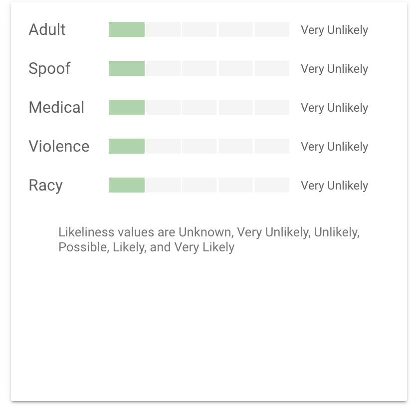
And I got many properties.
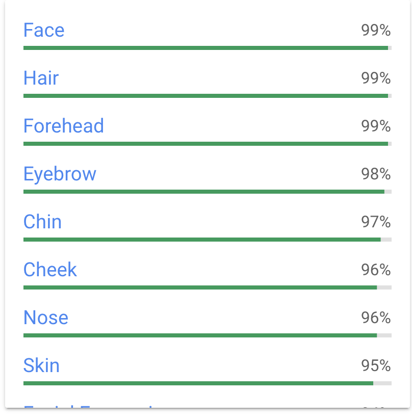
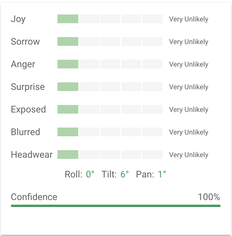
Because Vision API is a pre-trained machine learning model, I think how Michael created this project is: Put profile images of major tech companies’ board members, detecting facial landmarks and profile, getting facial data from Vision API; Then, utilizing those data to generate the abstract profile. The process is a pretty AI way. I think for our class, we can also try to get data from a specific object and train programming with them.
General feeling:
From the perspectives of art, I think this project is a good art piece. There are two reasons: First, the works of this project are in a contemporary art style. There are many of my favorite elements of contemporary art in this project works: lines, geometric figures, colors, the composition of abstract components. The art sense/feelings that the author conveys to me is unique. The way he shows the profile of people is interesting; Secondly, his work reveals the real life. I always believe that art originates from life. A good art piece should come from life and reveal life itself. For “Power Portrait”, the author wants to show the real-life experience in a major tech company to people. He wants to draw attention to the relationship between the highest bosses and the employees. That is a good starting point of art. Through this project, we can have a straightforward feeling about employees’ feelings towards their bosses.
More to do:
If I were the creator of this project, I would say I will try to make innovation with the facial data as I show above. Maybe Michael Day did those kinds of innovation and I don’t know (Because I can’t see the code). Those data like emotion data are really interesting. I am sure there is a huge space for innovating.
Hello world!
Welcome to Web Publishing @ NYU. This is your first post. Edit or delete it, then start creating your site!
Online help is available via the Web Publishing Knowledge Site (wp.nyu.edu/knowledge) and the ServiceLink knowledge base (www.nyu.edu/servicelink). Through ServiceLink, you can find step-by-step instructions, as well as tutorials.
Digital Accessibility
As content creators who create and publish text, images, video, and audio, you must adhere to the NYU Website Accessibility Policy (https://www.nyu.edu/digitalaccessibility/policy) when creating and publishing digital content.
Web Publishing-specific Digital Accessibility Best Practices and examples of how to ensure your content are compliant are available at https://wp.nyu.edu/digitalaccessibility
If you have additional questions, contact the IT Service Desk for assistance. Support is available 24/7/365. For more details, visit www.nyu.edu/it/servicedesk.