Uncategorized
Week1: Concept Story
App name: eatWhat
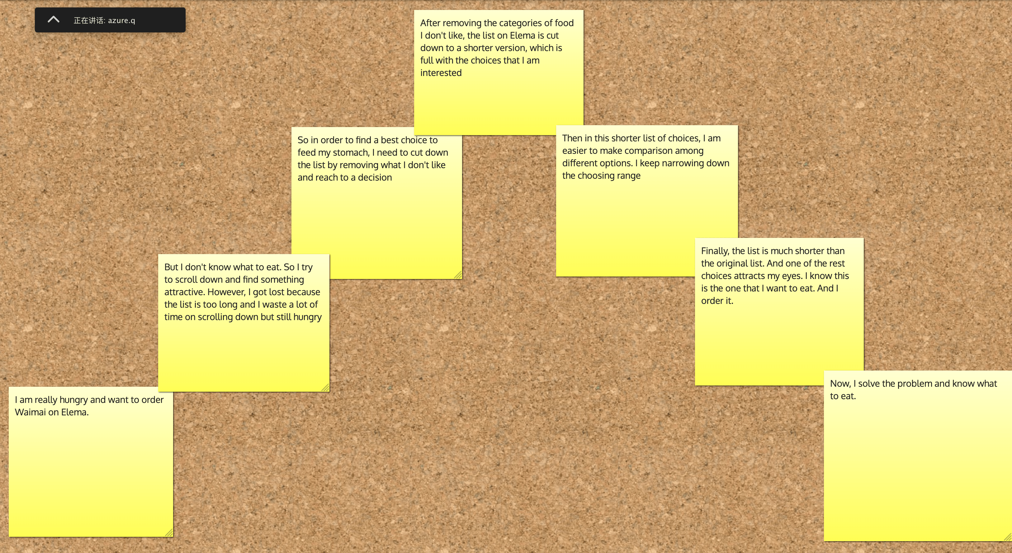
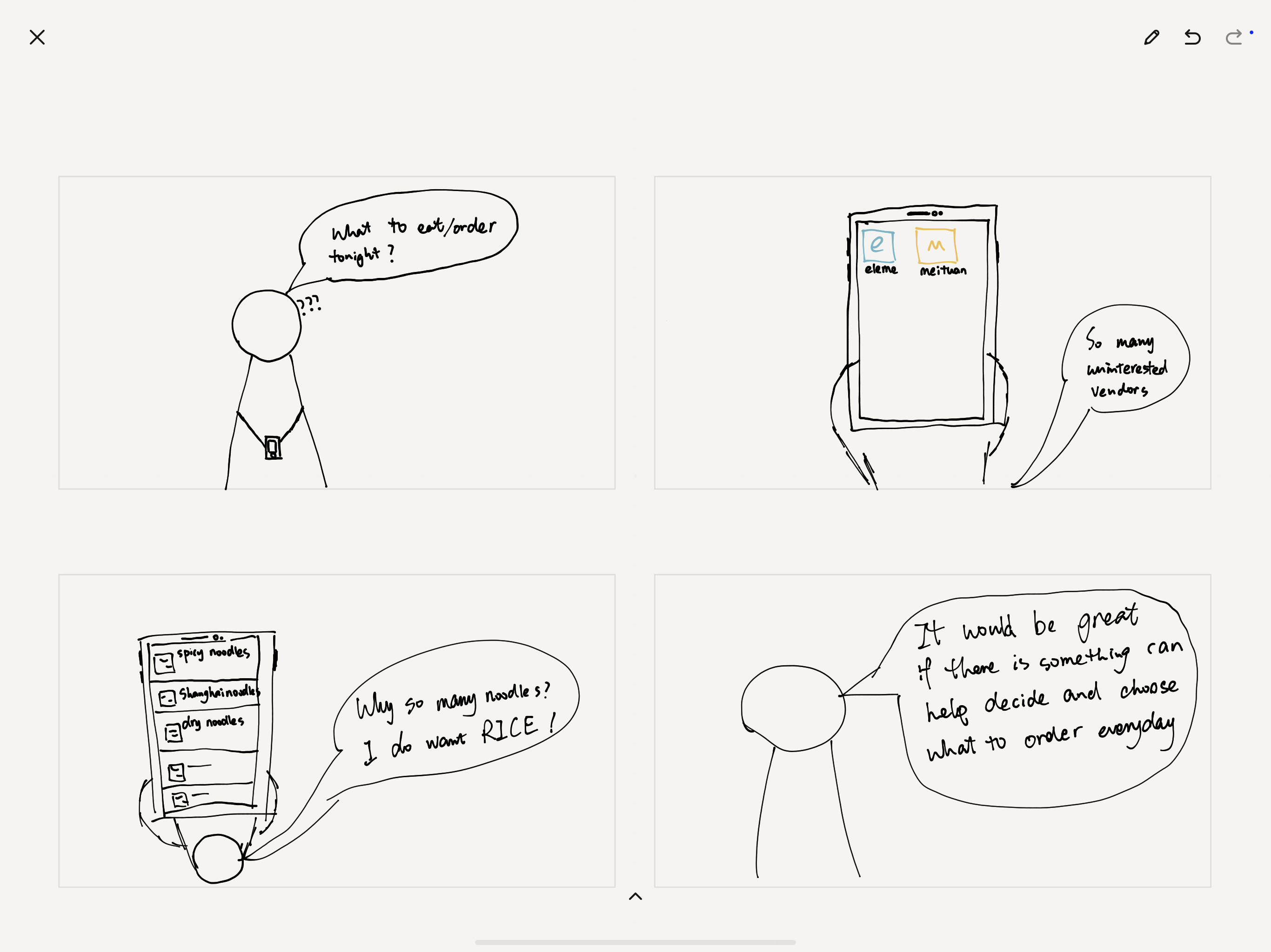
- Exposition:I use eleme and meituan to order waimai. But sometimes I don’t know what to eat. So I always scroll down and hope to find the best choice. It wastes a lot of time and sometimes I have kept scrolling for a long time but still have difficulty in making a decision, and starve. The list on the app is too long, and actually I have seen many similar choices I don’t like.
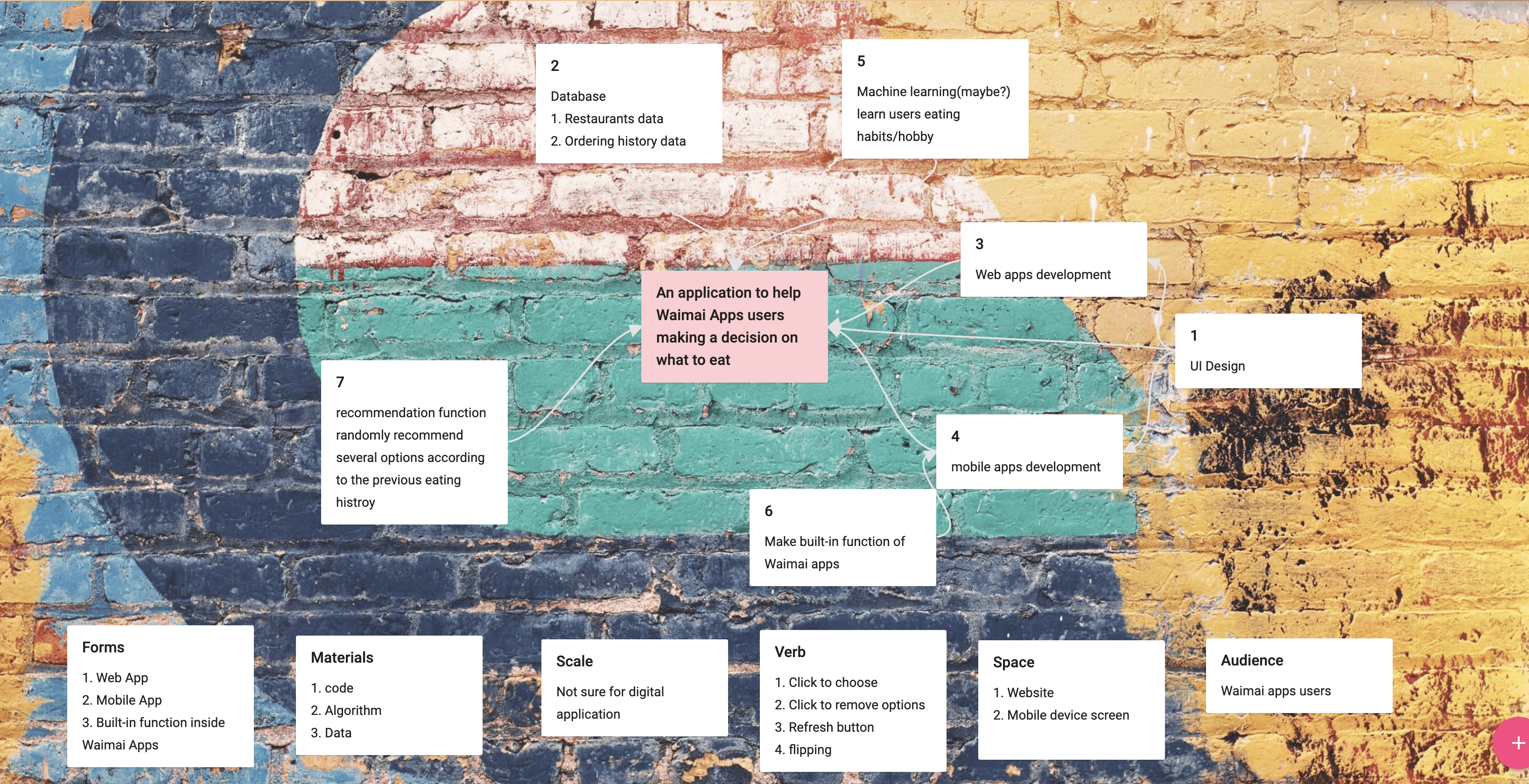
- Inciting Incident/ Problem: So I always want to create an app to help me make a decision when ordering Waimai. Especially, it can help to filter out what I don’t like so as to narrow down my choosing range.
- Rising Action: My product name, I don’t have an idea yet. But I think eatWhat is good. The current solution for helping make a decision is recommendation function within Waimai apps. You can choose the categories/dishes you want to eat and then the app will recommend choices according to your favor. This function works for the people who knows what to eat, but worthless for the people who don’t know what to eat.
- Climax: when I don’t know what to eat, this app can help me narrow down my choices, hiding the categories I don’t like from the database so that it won’t show up on my screen again.
- Falling Action: My potential choices will keep being reduced until I find something I want to eat.
- End: Enjoy your food!
UX Design-week1-7 design rules
Affordance
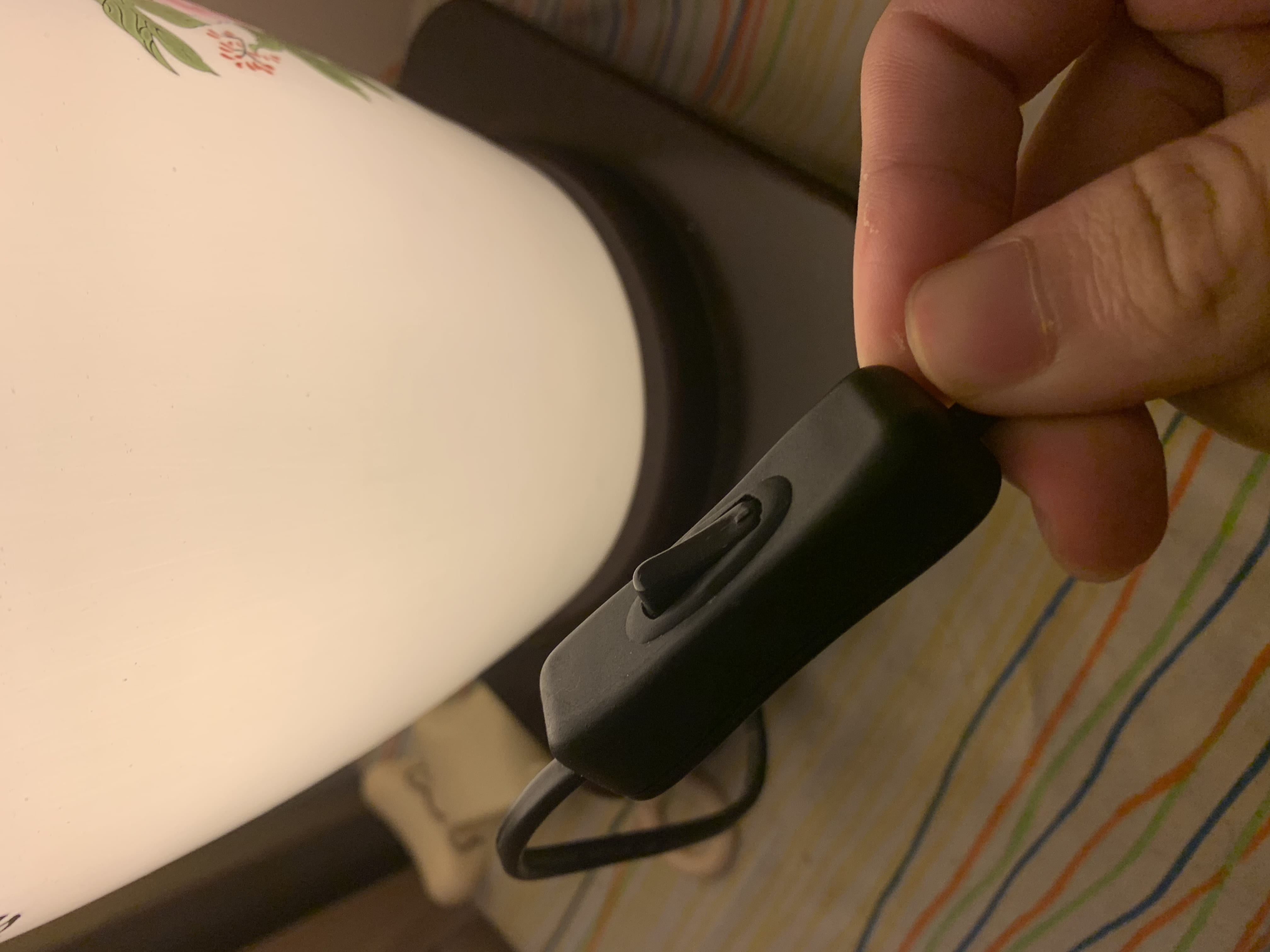
Everyone knows how to open the light with this kind of button.
Feedback

The icon of the Gmail website will show loading animation after you click something(request).
Mapping
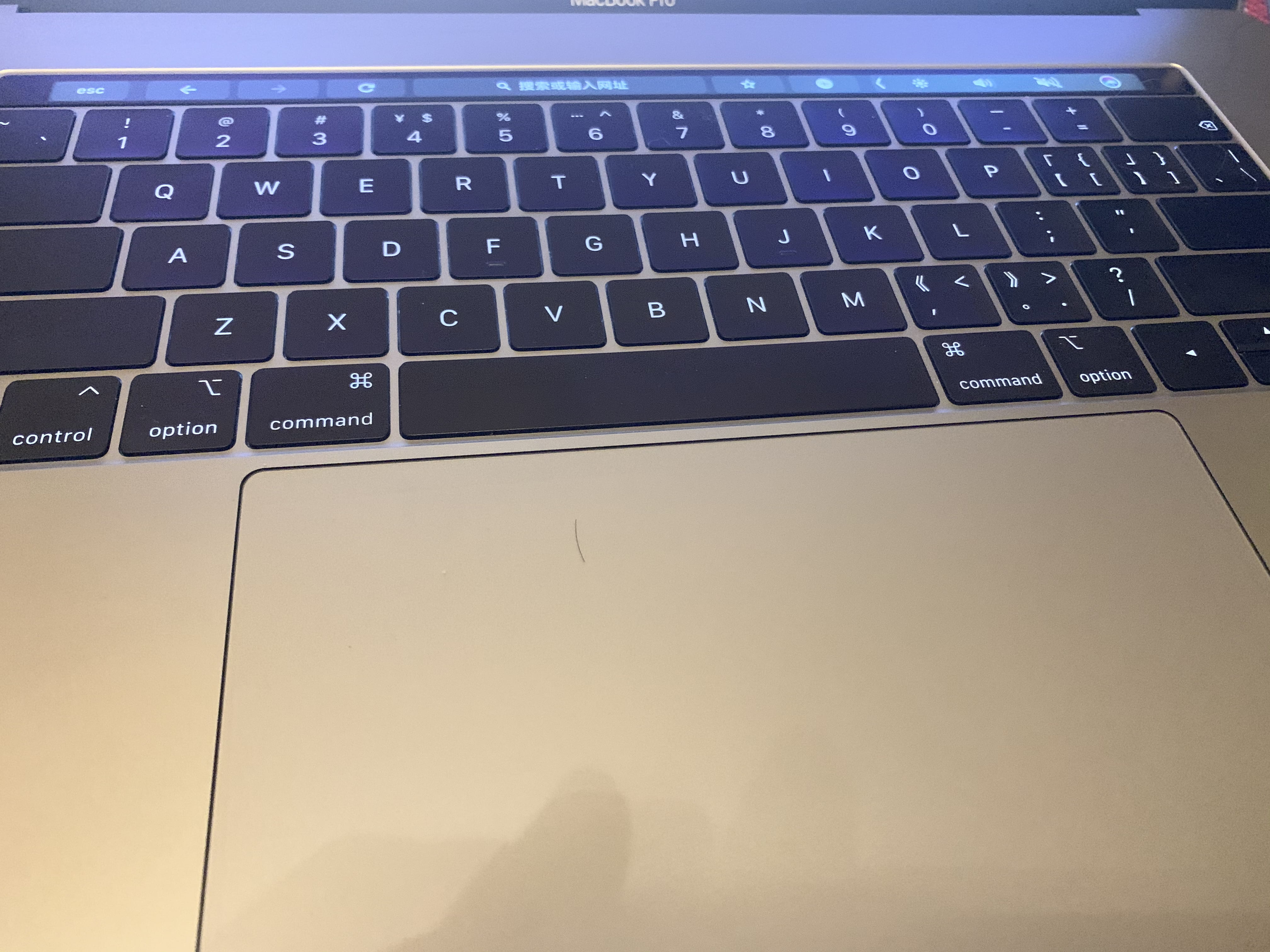
Users can use the touchpad of Macbook pro to scroll up and down on websites. This design perfectly shows the relationship between control and effects.
Group
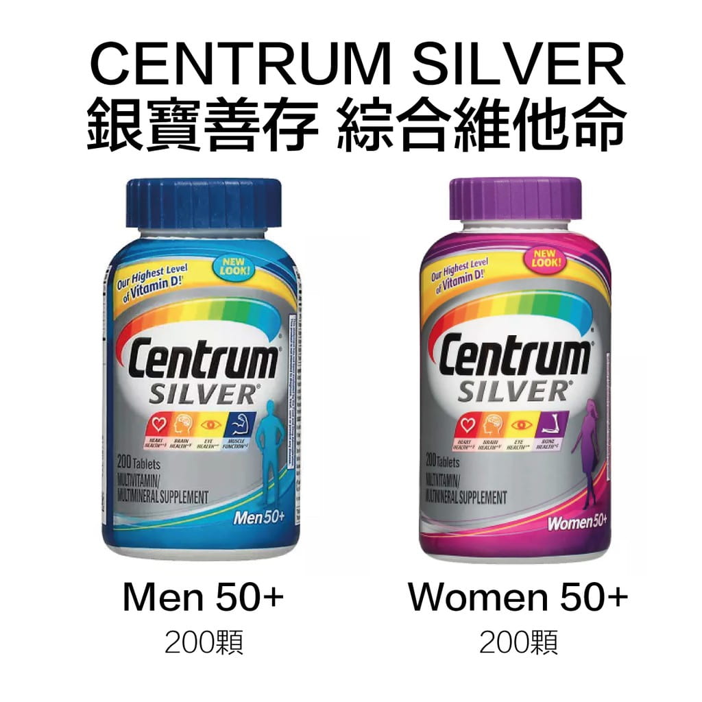
Designers need to design accordingly. For example, centrum design their product for both men and women group.
Conventions
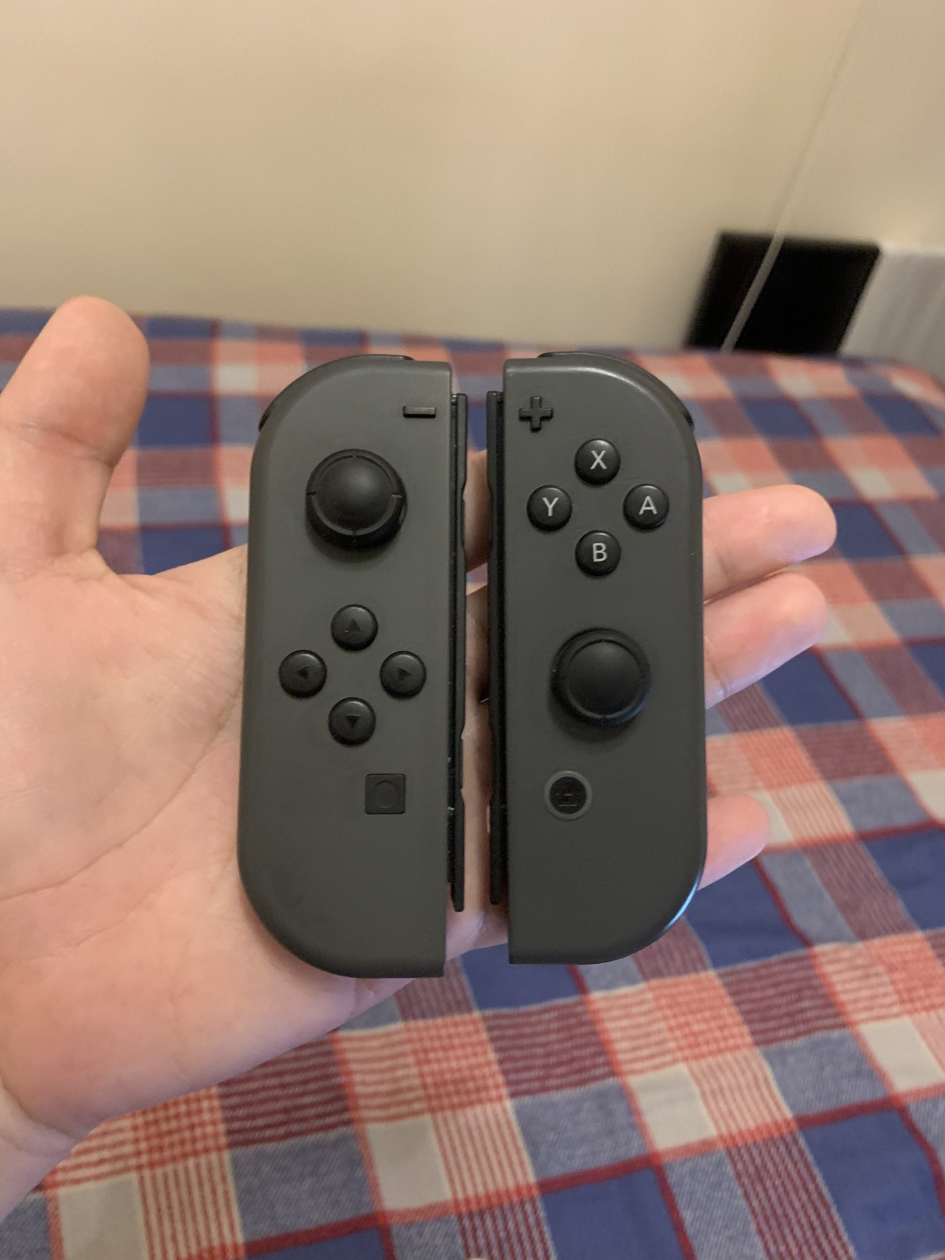
In the game industry, there is a convention in controller design. As the image shows, almost all the companies(except Sony Play Station) follow the certain layout of buttons to design their controllers. The image is my Joy-cons of Switch.
Consistency
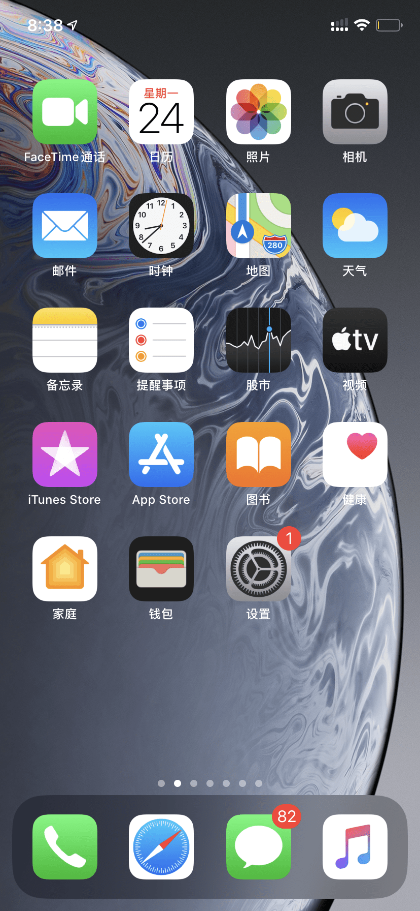
The UI design of IOS follows the rules of consistency. In my memory, the design language of IOS is always a quasi-physical style. As we can see in the above image, the icon of the most function are real physical things in the real world(phone, mail, clock, etc.)
Constraints
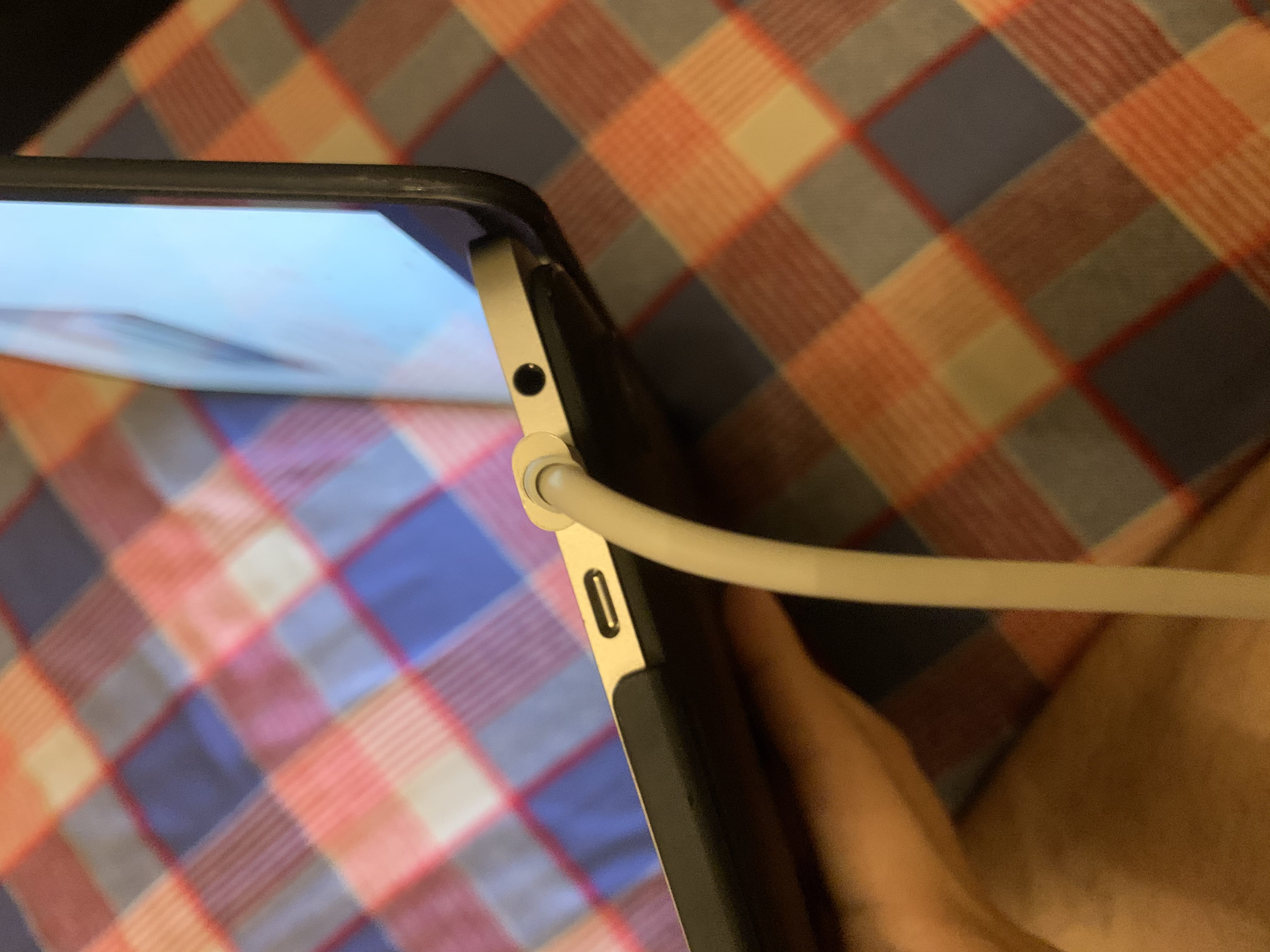
The ports of Macbook pro or other types of a laptop are the result of “constraints”. Users’s choices are limited by the designer and they will naturally know how to use the port.
Hello world!
Welcome to Web Publishing @ NYU. This is your first post. Edit or delete it, then start creating your site!
Online help is available via the Web Publishing Knowledge Site (wp.nyu.edu/knowledge) and the ServiceLink knowledge base (www.nyu.edu/servicelink). Through ServiceLink, you can find step-by-step instructions, as well as tutorials.
Digital Accessibility
As content creators who create and publish text, images, video, and audio, you must adhere to the NYU Website Accessibility Policy (https://www.nyu.edu/digitalaccessibility/policy) when creating and publishing digital content.
Web Publishing-specific Digital Accessibility Best Practices and examples of how to ensure your content are compliant are available at https://wp.nyu.edu/digitalaccessibility
If you have additional questions, contact the IT Service Desk for assistance. Support is available 24/7/365. For more details, visit www.nyu.edu/it/servicedesk.