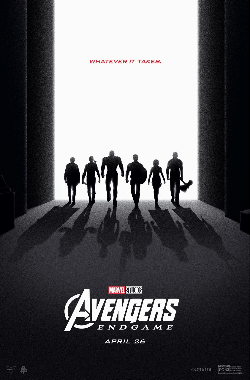
 “WHATEVER IT TAKES”
When we were told to choose a design, my mind went straight to movie and book posters. I am a Marvel fan, so marvel movies were not far from my list.
I chose ‘Avengers: Endgame’ – my best 2019 Marvel movie. I remember the thrill and excitement I felt when I saw the movie for the first time at the cinema. I couldn’t wait to go back to see it again.
I came across the design when I was searching for movie posters on Pinterest. I have actually never seen this poster before. It was my first time seeing this design and I absolutely loved it. I think it portrays exactly what Endgame was all about.
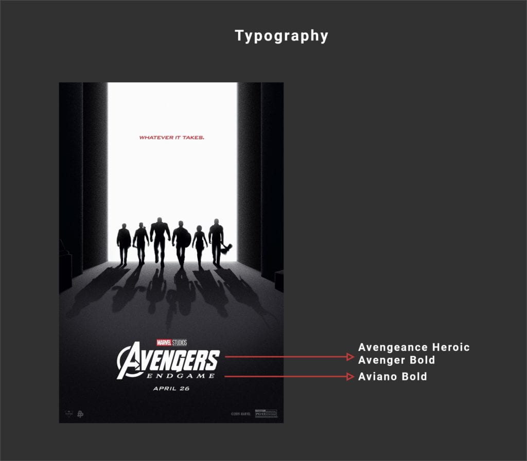
The design is simple and consistent with its use of colors. It uses negative and positive space cleverly, allowing the main elements to stand out. It portrays clarity in the sense that you could get a feel of what the movie is all about by just looking at the design. It looks like a couple of warriors going to war. You’d know it’s an action movie. Even if a person is new to the Marvel universe and sees the poster for the first time, they would a get sense of what kind of movie to expect.
HIERARCHY
When I first looked at the design, my eyes captured the entire design because the major elements are all placed in the center. But the ‘Avengers logo and title’ stood out to me first. This is because the font is bigger than the rest of the texts on the page which I guess is to depict hierarchy. After that, my eyes were instinctively drawn to the text above because it’s strikingly written in red, then the black avengers figures and lastly, their shadows.
NEGATIVE SPACE
The negative space is used effectively in such a way that it allows each element on the design poster to stand on their own. First, it allows the other text, ‘whatever it takes’ which is written in red to stand out. It draws the attention away from the Avengers logo and the black figures of the heroes which I know is intentional. Even though the text is small compared to the logo, because of the negative white space and its color, it stands out.
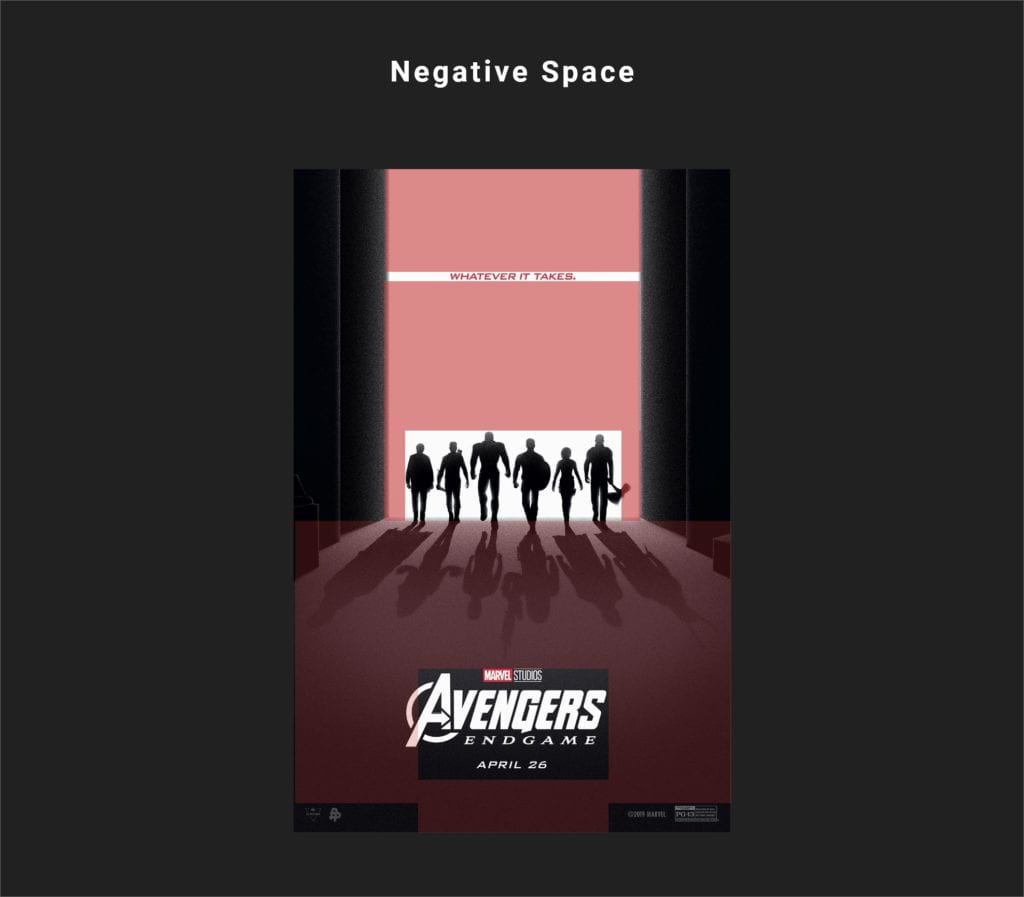
Apart from allowing the red text, ‘whatever it takes’ to stand out, the colors (black, gray and white) are used in opposite of each other to allow other elements on the design to stand out. For instance, the white backdrop allows the black figures of each avenger to stand out. Likewise, at the bottom of the design, the mixture of black and gray color contrast allowed the white Avengers logo and title to stand out.
In addition, the white space is used excellently well as a backdrop. It distinctly allows for the depiction of the avengers through the black figures and created an obvious, expected reflection of the avengers resulting in shadowy figures of the avengers, which if you look closely are another set of avengers.
THE GRID-SYSTEM
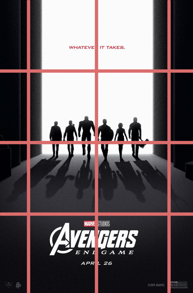
I used an 4 by 4 grid system because I think it perfectly depicts the positions of the elements on the page, and there is enough space to allow those elements to individually stand out. It is very organized, giving space for each element of design on the page to breathe.
TYPOGRAPHY AND COLOR PALETTE
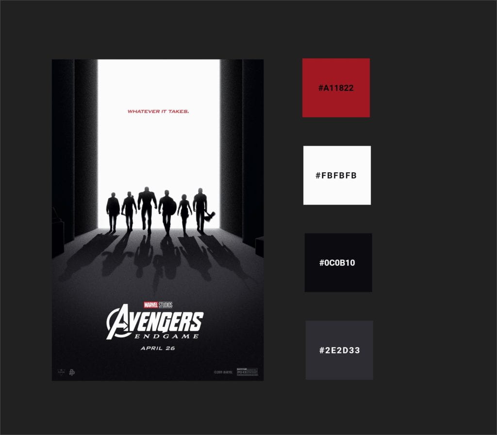
The major color system used for the design were in the family of red, white and black.
‘Avengeance Heroic Avenger‘ was the font used to build the logo while ‘Aviano Bold‘ was used for the ‘Endgame’ title. The font that I found that was similar to what was used to write, ‘Whatever it takes’ is Clonoid.
