1. Airline Ticket Redesign
During the second week of class, we were given an assignment to redesign the airline ticket to practice our knowledge of hierarchy and typography in design. It was an interesting task because the former airline ticket was really a piece of work.
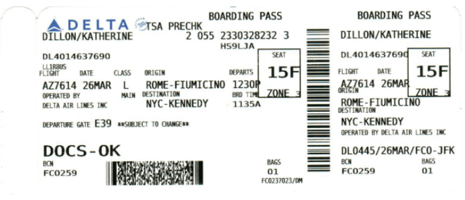
My first thought was to arrange the elements on the ticket in a way that is pleasing to the eyes and will be easy for anyone to follow. I also thought to group the information according to the category that they fell under. For example, 26 March falls under ‘Date’, L Main falls under ‘Class’ and so forth.
This were the text elements that was provided for the design:
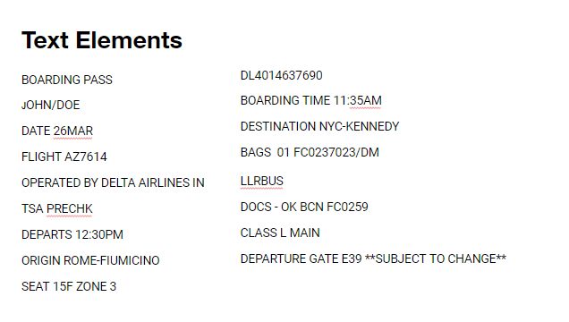
I kept most of the ideas on this already existing airline ticket, all I did was re-arrange, change the typefaces and added a little bit of color. Also, I spaced the elements out to allow for negative space. I particularly kept their idea of boxing the seat number because I think it’s an important information that should stand apart. It would be stressful for anyone to have to search for their seat numbers on their ticket, so I figured if it stands apart, it wouldn’t be difficult for the user to see it.
My First Design
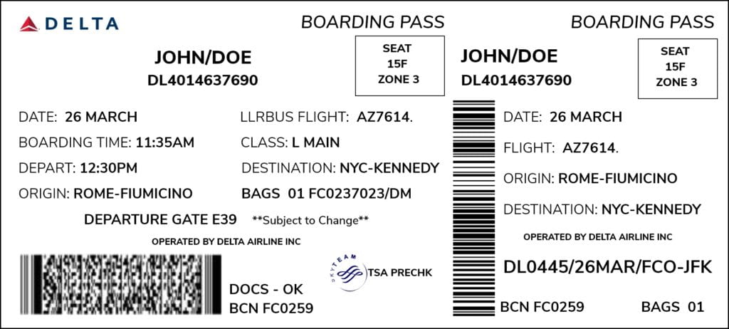
I kept it in black and white and all the fonts in all caps. I used the font type, ‘Nunito Sans‘ all through because I wanted to be consistent and it’s one of my favorite fonts. After seeing this prototype, I decided to add colors and adjust some of the typefaces on the design. We were restricted to using, red, blue and white.
My Final Design:
For my final design, my goal was simplicity and clarity. It’s an airline ticket, I didn’t want anyone that was in a hurry or even a child to miss a single detail or an important information. So, I made the font bigger for the information that I considered to be more important and focused more on organization, spacing and highlighting. I had prior information that humans read from left to right, I used that knowledge to arrange my elements, such as Boarding time to depart, origin to destination, etc. I wanted it to be easy to read and easy for the eyes to follow. For emphasis, I colored the seat number because I know it will automatically draw the eyes of the user.
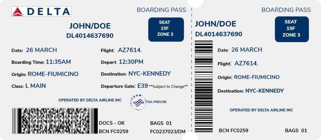
Overall, it was an exciting challenge and I think I achieved my goal in making the ticket simple and consistent.
2. Expressive Words
Our second assignment was to create 3 expressive words. An expressive word is one that manipulates the word’s letterforms to communicate the meaning of the word.
A lot of words came to mind, but I settled with Globe, Crown and Pencil. I admit that my designs were simple and straightforward but I had the challenge of being new to Adobe softwares like Illustrator and Photoshop.
Globe: When I hear the word globe, I think of the world – an ellipse moving earth. The close thing to a circle in the word was the letter ‘O’, so I decided to replace it with an icon of the globe.

Crown: I approached crown the same way I approached the word, ‘Globe’. When I hear the word crown, I envision a diadem or a tiara or an actual crown. And the only thing close to looking like a crown in the word is the letter ‘W’. Therefore, I replaced the ‘W’ with an icon of a crown.

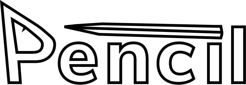
Pencil: Pencil was the last word that came to my mind. It’s funny because I use a pencil everyday. When I thought about pencil, I envision the sharp triangular edge of a pencil. And the closest letter that could represent pencil is the word ‘i’. My first idea of expressing a pencil was to turn the dot on the letter ‘i’ to a pencil in such a way that it is facing the letter ‘e’ in an horizontal direction.
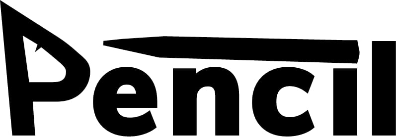
Notice the sharp edges of the letter ‘P’. That all happened by accident when I was tweaking the letters. I decided to leave it because the sharp edges represented how sharp a pencil must always be in order to use it. As I was playing with the words, I decided to remove the fill and highlight the borders of the pencil.
