Ingenium App

prototyping | graphic design | ux

About this project

As part of a graphic design technical skills class, I was tasked with designing hi-fi prototypes for a learning application specifically an opening menu, content screen, and quiz/assignment screen. My design for this project is a mobile learning app called Ingenium (Latin for “talent”) centered around guiding employee development through different challenges which I hope to eventually use as the basis for my thesis project.

Developing a mood board and design standards

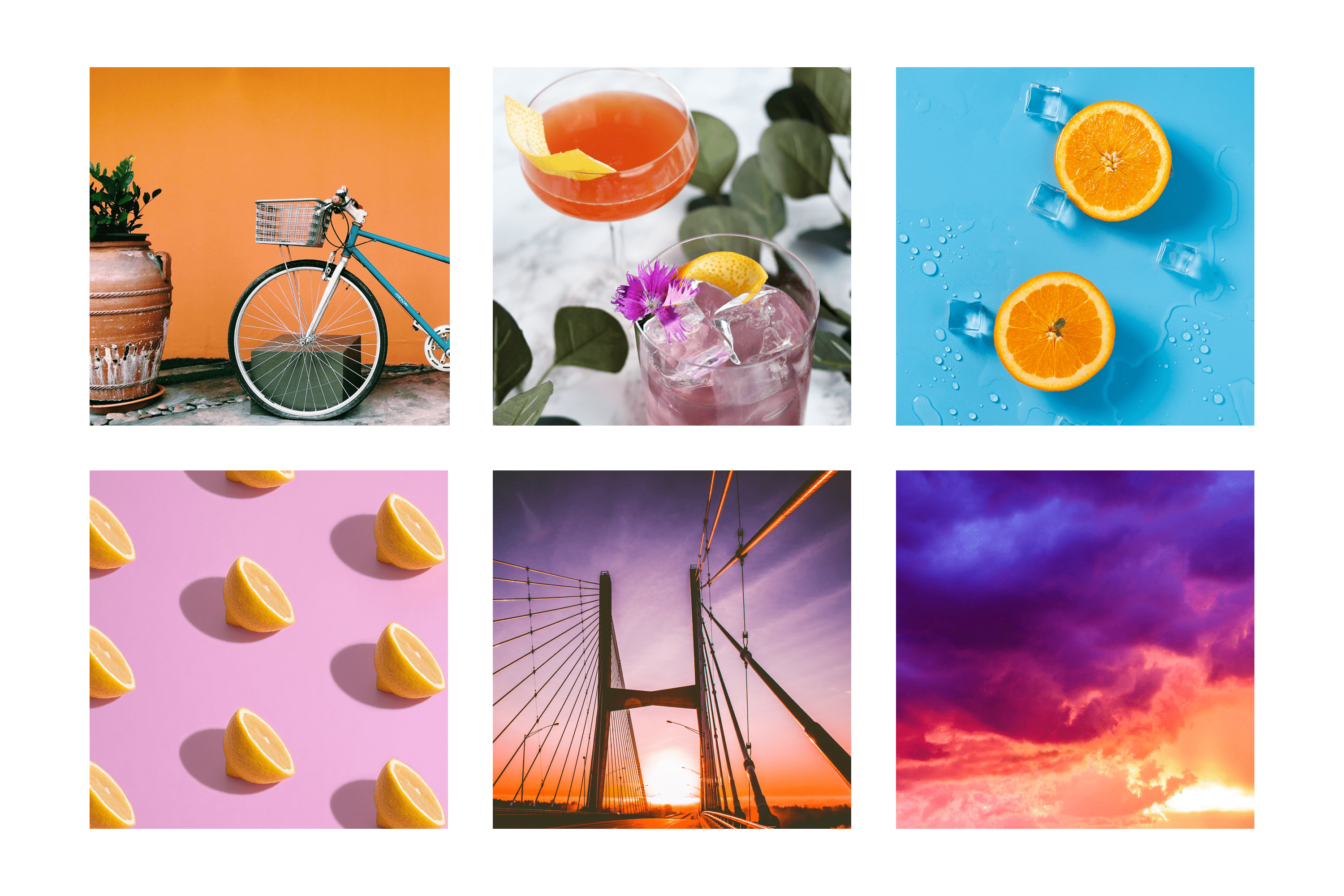
I created a mood board using some colors and images that inspired me during this project. Keywords I’d use to describe my mood board are bright, refreshing, and inspiring. To create a color palette for my app, I uploaded the first image (bicycle and plant) into Adobe’s color palette generator. I then took those hex values and ran them through multiple accessibility checkers to determine which colors would be suitable for text color with different backgrounds, as well as which colors could safely appear side by side.

I created a mood board that represented the colors, styles, and feelings that inspired me during this project.
#DC7B1D
#F5DA5A
#9664A5
#008296
#054009

For fonts, I chose the script font Lobster Two to use for my main app title and subheading as it’s both elegant and playful. I also chose to use the San Francisco family of fonts, a sans serif font created by Apple and provided for free to developers. Variations of SF Font are used for my main headings, paragraph text, and labels throughout the app. By using a font many users would already be familiar with, I wanted to create a sense of familiarity with users and built trust with the app.

I also wanted to make sure I was using correct and consistent padding across each screen so that, were this to be a real app, they would fit appropriately within Apple’s iOS guidelines. I did research on optimal padding to ensure accurate placement of both the navigation (top bar with title) and tab (bottom navigation bar) bars. Apple provides developers iOS device frames they can use to create content, so I’ve also incorporated some of their content in my designs (e.g., the system provided status bar that contains the time and device battery life).

Designing the learning app

My intention behind designing this app was to have a fun way for users to own their professional development. Users would select a specific skill they want to improve, explore various challenges to help build that skill, and then complete a self-reflection about that experience.

Main menu screen

Immediately after logging in, users are presented with a dashboard of their current challenges, suggested challenges, and development resources. In a future, and more comprehensive, design of this app, I envision users completing a onboarding survey to customize the content they’re presented with.

Challenge screen

When thinking of the user journey, I imagine a user clicking on the “Public Speaking” option on the main menu would be taken to the “Challenges” section of the app, specifically the challenge for this topic. In future designs, there would likely be an additional screen to go through if a user to click directly on the “Challenges” icon in the tab bar.

Journal screen

After a user completes a challenge, they can navigate to a self-reflection area for that topic from one of two routes: they either click through from the specific challenge they’re working on or click on the “Journal” icon in the tab bar to select which challenge they need to complete their assessment on. While not included in the final design prototype, the self-reflection users complete would also include open response areas.
Log In Screen
Home Screen
Challenge Screen
Journal Screen