LINKS AND SCREENSHOTS
Inspiration: https://www.pinterest.com/pin/519673244506377265/
Data Source: https://stockx.com/nike-air-force-1-low-travis-scott-sail
Glitch: https://glitch.com/~ccl-jyoti-project3

DOCUMENTATION
- GENERAL INTRO:
Throughout the past two weeks, we’ve been learning data iteration and parsing processes, JSON datasets employment, etc. As for this Data Visualization project, it indeed consists three micro projects, that are, Create and Visualize JSON Data, Case Study and an individual data visualization project. Given that the first two are already documented in previous posts, this documentation is more about the last project and further about my personal reflections on the data visualization learning experience.
- INSPIRATION:
https://www.pinterest.com/pin/519673244506377265/
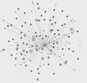
Based on the previous case study and the impression on the Creative Data Visualization course’s projects showed on last year’s IMA show, what I thought about a data visualization project is a plentiful website with much work on both data processes and data visualization. Therefore I was quite struggled on Friday, not sure what data to research on and what effect to apply accordingly. Realizing that I wouldn’t be able to conduct a deep-researched and well-polished project in less than two days, I searched “data visualization” on Pinterest and surprisingly found many seemingly simple yet visually pleasing images demonstrating one set of data. To my great surprise, I found the one linked above, and was immediately reminded of my previous small project. It was really a sense of amazement to find similar ideas from someone else, and even get highly inspired. I therefore decided to further explore and develop it.


- DATA:
https://stockx.com/nike-air-force-1-low-travis-scott-sail
What data to research and demonstrate was another great struggle for me before really starting to code. I searched for quite a long time ranging from national GDP to numbers of American cinemas, yet either of them was lack of meaning or fun to display; let alone most of the given data were already visualized for the purposes of business, management or academic researches. I therefore tried to start from my personal interest, and eventually decided to research a little bit on sales and selling prices on sneakers on a well-known sneaker stats website, StockX.
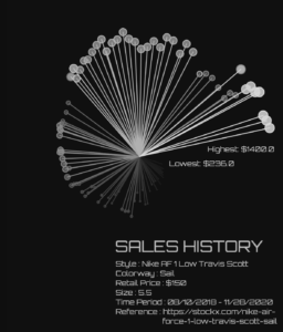
Inspired by a column article writing about Travis Scott, who in some sense dominates the sneaker game during the past two years, I was intended to make a project visualizing and quantifying the exact “impact” he caused, that is, to first present the increase on selling prices and sales of each of his sneakers and to compare them with other brands, products, celebrities if possible.
Yet there seemed to be still quite much work to do on data. Some of the challenges I met include: (1) I was not able to get data directly from StockX. (2) Neither could I find the ideal data I expected for this project. (3) Trying to find data in the browser Inspection, the code was too complicated to analyze… Eventually, I could only get the coordinates data of the chart displayed on the website from the browser Inspection. Realizing the heavy work supposed to be done and due to the time limit, I had to give up the expected idea and focused on the coordinate data to explore. Though the statistics are not the exact selling price for one certain item of sneakers, it does reveal the exact variation trend since its release in 2018.
- VISUALIZATION:
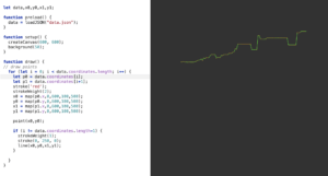
Since the data I found from the browser Inspection was the coordinate of a given chart, I first wrote the JSON file on my own, and then employed it to draw a similar chart in javascript. Besides, based on the inspiration and my previous project, the spiral effect was not that hard to realize. I employed the map() function many times to use the data not only to demonstrate the variation trend of the selling price, but also to change the size of the points, the color format and transparency in order to make it more aseptically pleasing and statistically reasonable. The greatest pity was that I could not add more manipulations or enrichment to visualize due to the lack of data. Also, thanks for the professor, I’ve learned many different ways to find the maximum/minimum value in the datasets. Yet since the data was not the exact numbers, i.e, the selling prices I need, I eventually didn’t apply the function learned in professor’s tutorial. But I do understand the logic to iterate through the data array and then update the maximum/minimum whenever a bigger/smaller value came.

REFLECTIONS
As for this project, it was not as satisfying as my previous ones at least to me, since there were many ideas that I failed to realize due to the time limit and, more importantly, the technical challenges. Nonetheless, I appreciate it very much since I learned more than I expected during the whole process — which won’t make me regretted on not choosing another given yet boring datasets:D. Especially as a student who is also exploring the field of Data Science, although challenging, I do learn much about browser Inspection, data manipulation via MS Excels and even writing and utilizing Python functions to transform website data into JSON file (though failed:((. Anyway, the visualization of data is far more interesting and I do expect to conduct a complete data vis project one day:)
Leave a Reply