INSPIRATIONS
As for this case study, I browsed many kinds of data-visualization related projects that vary from not only ways of visualization but also types and themes of data. Below are some of the projects that attract me very much:
https://pudding.cool/2018/08/wiki-death/
https://pudding.cool/2018/09/wiki-billboard/
https://observablehq.com/@codingwithfire/livecoding-election-night-visualizations
https://flowingdata.com/2020/08/14/2020-progress-bars/
https://informationisbeautiful.net/visualizations/colours-in-cultures/
ONE SPECIFIC CASE
Link: https://pudding.cool/2018/08/wiki-death/
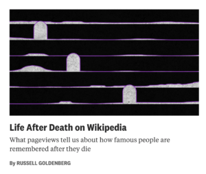
One of them that impressed me was the one about the Internet reaction when a famous person dies, made by Russell Goldenberg. What caught my eyes at the very first beginning was the topic: “When a famous person dies, …. It’s a big deal”. What does he mean by “big deal” and what indeed would the author like to express? Keeping scrolling down, I was gradually obsessed and was highly inspired by both the aesthetic and informative qualities of this project.

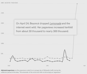
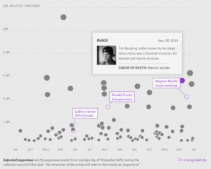
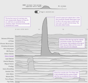
Generally speaking, the overall project elaborates the differences in public reaction on the death of celebrities on the Internet (to be more specific, Wikipedia). To be more specific, the project starts from two well-known cases, that is, Beyonce and Prince, to directly visualize the change of pageviews on Wikipedia when big things happened. Later he introduces the main targets of the project, the chosen 84 celebrities, and goes deeper into the analysis of the certain phenomenon, like giving assumed reasons, visualizing data focused on certain aspects and differences, etc. It even bolds some of the leading sentences every time in order to step forward deeper analysis.


On the other hand, speaking of the aesthetic qualities of this project, I appreciate it very much since it applies various ways of visualization and the whole project is quite visually pleasing to me. Below are some of the effects the author applies to visualize data. Personally, I was quite impressed and highly inspired by the last one since it looks quite similar to one of my previous projects using the noise() function. I’m more than expected to explore the code for further development.


To sum up, I was very much inspired by this case study and have already got a basic understanding of what a data visualization project should look like. I can see that a complete project includes not only techniques but also full research as well as data collection (as for the above case, there are already some seeable improvements that can be done on the informative aspect). Anyway, I would be more than willing to explore more about data visualization (like taking a related course next semester:).
Leave a Reply