Midterm Project Documentation
Lizzard Sitter 9000,
Jeeho Kim,
Professor Inmi Lee.
CONTEXT AND SIGNIFICANCE
Throughout this semester, I’ve been gaining a deeper understanding of what “interaction” is. In particular, analyzing “The Art of Interactive Design” by Crawford, the reading at the beginning of the semester, and “Drumming MIDI Glove” and in-class practices such as “Spinning Bow Tie” (made with Eddy and Curran in our 4th recitation) brought me one step closer to answering the question of ‘What is interactive art.’ I believe that interactive artwork should convey not only simple responses to the user’s input but also meanings through the experience of the work. For example, the “Spinning Bow Tie”, a kinetic wearable where pressing a sensor causes the bow tie to spin, was designed to express the user’s emotions in a new way, however, we received feedback from classmates during the presentation that this new approach of saying hi could contribute to relieving nervousness when meeting a person for the first time. So, Eddy and I wanted to make something that users can find new meaning through the experience of our work, just like the “Spinning Bow Tie.” We got inspiration from Tamagochi. As the original Tamagotchi pets are shown only by pixels on a digital screen, we decided to make a realistic and tangible version of it. Our “Lizzard Sitter 9000” is intended to give users the feeling of actually raising a pet by having a physical form of it. We aimed to satisfy the needs of people who want to raise pets but are unable to do so due to their conditions (e.g. students living in dorms). At the same time, we wanted to emphasize how difficult and responsible it is to raise a pet in the real world. And, we chose our direction to entertaining so that users could more comfortably and easily understand our purpose of this project.
CONCEPTION AND DESIGN
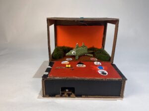
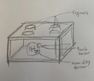
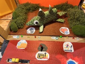
To visually communicate to users that our project has entertainment features, we chose the form of a gaming machine. Due to limited material resources for making a large-size gaming machine, we had no option but to use cardboard for construction. However, we believed that this unconventional material choice for the gaming machine, might make users feel more comfortable and allow users to participate in the game more easily. To make our lizard look more realistic, we printed skin patterns and pasted them on. We also placed grass and rocks around it. Additionally, to allow users to feel that they can interact with the lizard, we placed two controllers (sensors) at the front. These controllers (potentiometer and push-button) were selected to visually imply actions of washing and exercising the lizard. In the user testing session, it was suggested to consider choosing a different sensor for exercising as it did not visually imply the action of exercising. However, we believed that the push button was the most crucial element reminding the image of a gaming machine so we were concerned that replacing the button would also remove the visual representation of the entertainment function. Therefore, we decided to keep it as it was. Users need to keep sliding the potentiometer and press the button to prevent the “Wash Need Value” and “Play Need Value” of the lizard from falling to 0. If both values approach 100, the level goes up and the values decrease faster. There are a total of 3 levels in our project. Considering this game system, we expected that the front part where the sensors are positioned would have significant damage. Therefore, we built it with double-layered boxes. Finally, for visual emphasis on the sensors, we painted only the front part red.
FABRICATION AND PRODUCTION
The most important aspects of our production process were writing codes for the game operation and modifying visual elements for a smooth gaming experience for users. Eddy covered the overall code writing and modifications, while I focused on code review and the fabrication of the game machine. For instance, if Eddy wrote the codes to decrease the “Wash Need Value” over time, we tested it together to check if it worked properly, We, then, discussed any necessary changes or any additional elements for the next steps. And, Eddy made modifications to the code and I searched for codes for Eddy and made adjustments to the shape of the gaming machine. We repeated this process throughout the project. With this process, we were able to complete most of the steps as we intended.
In the user testing, most of the feedback was related to the visual aspect. Through the feedback, we discovered that 1) the visual elements did not sufficiently explain how to start and operate the game, and 2) the game lacked a clear ending and became boring over time. These feedbacks were very helpful for the entertainment feature of our project. Through discussion with Eddy, we decided to add sounds and a level system. The sound played a role in indicating the start and end of the game, as well as signaling level-ups. Additionally, to clearly show the reason for the lizard’s movement, we added three LEDs (red, yellow, green) in front of each sensor to tell the status of each value.
Lastly, we also discussed visual elements to ensure a smooth experience for users in the game. However, we ended up adding symbols such as a start button, arrow, and bubble would be the most effective and straightforward solution.

(Video Link)
CONCLUSIONS
We aimed for entertainment, and we saw that users enjoyed it while experiencing our project. However, some users expressed doubts about the purpose of this project or questioned the operation system of the game. Therefore, from my point of view of “interactive art”, I believe our project was 50% successful. Considering these user responses, I think additional elements are needed to more successfully convey our purposes and the meaning.
As a result of our discussion, Eddy and I identified adding numeric indicators to display values and changing the positions of the sensors (As Prof. Gottfried’s suggestions) could lead to improvements in the future. We believe that these changes will help users understand the game’s system and discover hidden meanings.
Through this project, I’ve learned that, first, users often don’t follow what creators/ artists expect them to do. Second, the user’s background (such as major, age and gaming experience) makes huge differences in responses. Third, more user feedback leads to fairer growth of the work. I think this project was a practice for creating true interactive artwork in the future. If we accept more feedback next time, I believe we can create a more successful interactive work that appropriately combines the purpose of the creators with the feedback from users
DISASSEMBLY
APPENDIX