Five Obstructions

The first obstruction was that 1)no single edit may be longer than 12 frames 2)all the questions had to be answered 3)the film needed to be shot in Cuba 4) no set. Hence, Jorgen invited a real hombre cubano and a local woman to shoot the film. Affected by the frame restriction, there were many repetitive parts and some parts were stuck and stopped and then moved on to the next frame. The overall effect was that it made the film more artistic and even a little bit humorous due to the incoherence. Since there was no set and it was shot in Cuba, the scene was more natural. For answering the questions, it may hinder the audiences from thinking freely. But I think this kind of obstruction on frame edit can be used in contemporary art design nowadays.

The second obstruction was that 1)Jorgen would be sent to a miserable place 2)Go close to a few really harrowing things like dramas from real life that Jorgen usually refrained from filming, but don’t show it 3)Jorgen would act as the perfect human 4) The woman character was no longer necessary but the meal was still required. Thus, Jorgen chose a red light district in Mumbay but only partially hided the miserable place and people behind a transparent screen. The overall effect was that the screen was like a boundary that divided between the modern world and the old world so it was ironic and hillarious. But after all Jorgen was not a professional actor so I was drawn out of play at some certain points.

The third obstruction was that Jorgen should either go back to Bombay to shoot again while following the rules or remake the original film in the way he wanted. Then Jorgen started to shoot the film in Brussels. I found two big changes he made: one is that he used parallel editing which added more interactions and conversations between the two screens. He also isolated places and objects that he wanted to examine precisely. For example, when the man took out his money and the woman stood up, it might indicate something related to sex. The other change was that he used way more moving scenes and arrangements than the original one, which added more dynamics and energies to the film. From my point of view, it was a successful revision.

The fourth obstruction was that the work had to be a cartoon and Jorgen was not allowed to use clever artistic devices. With the help of a specialist in rotoscoping called Bob Sabiston, the cartoon film was shot. Since there were many filters and effects add on the original scene, it looks more imaginary. For me, it’s more of an animation in the game but I think Jorgen achieved the goals in some way.

The last obstruction was that Jorgen would be credited as the director but he would do nothing except for reading a narration script from Lars von Trier. The film was about the reflection of the shooting process and the task setting so I can feel some sincere conversations between Lars and Jorgen, especially because the words were written by Lars but then spoken by Jorgen, which is innovative. I like the phrase “You only saw what you wanted to see” and I think we need to view artworks from different perspectives to have a better understanding.
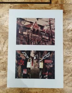
Photo Diptych

Jack—Trace of time

Concept

My concept was about the trace of time and I chose objects or scenes that could witness or reflect the elapse of time. When I first came up with the topic, I did a few reseaches on the internet to search for places in Shanghai that matched the idea. Then I noticed the “Ti Lan Qiao” area where the Jewish people once lived when they were under the threat of Nazi German. I found the architecture of that area combined elements of the West and East and had been built for decades. The photo in the upper part of the diptych is one of the representing buildings. Broken bricks and old windows of the building witnessed the changing times. What made the picture more interesting was that dense wires and tree branches blocked part of the buiding, which made the whole photo more layered. It could also be understood as a trend that the new things covered old ones. The idea that old buildings were visible but inaccessible to us was also demonstrated in the collage below. I split a locked door to create the feeling of peeking through the cracks in an old house. In the middle was an image of an old house that was not clear whether it was still inhabited. The two pictures were not only structurally consistent, but also conceptually.

Process

For staging and photographing part I, I firstly used high aperture, high shutter speed and middle ISO because it was in the afternoon and I needed the whole background to be clearly included in the photo. Other photo settings were transformed according to the transformation of light and the size of the object. When I uploaded these photos to the computer, I noticed that the pictures were all featured with cold color so that they didn’t match with the collage’s warm color. To solve this problem, I chose “Photo filter”(warming filter and red) to adjust the temperature of the photo. Then I used”Selective color” to subtly change the red,yellow and blue colors to create a nostalgic atmosphere.

In collage, I split the photo of a locked door at first and put another photo in the middle. The first problem I had was that the transition of middle and the sides were not natural since there were clear edge. Hence, I added layer masks to the two sides and used gradient tool to make the transition look better. After that, I used quick selection tool to move the old objects into the collage. However, I found that some objects didn‘t match the overall picture. So I made adjustments to the layer style, such as adding inner shadow, inner glow, or drop shadow. I also adjusted the item’s brightness, contrast, color threshold, etc. For objects like milk box and wine bottle that required leaning, perspective tool was my ideal solution. After continuous adjustment, the overall sense of the picture was enhanced.

Conclusion

I think my artifact showed what I wanted to express: many old buildings and objects keep vanishing in our sights and we should cherish and try our best to protect them because they have great value in witnessing the changes of history and the development of the city. Still, I thought that there were parts that needed improvement. For example, the split of the lock could be more natural because this cutting wouldn’t happen in real life. What’s more, the red words and picture on the door could also lean a little bit. The blurring of the two doors could also be a new attempt.

Image of Diptych&Contact sheet

Pick my memory

My topic for memory soundscape is “Way back home”. Since I have lived in Shanghai since I was a kid, the streets and subways in Shanghai carry the memories of me returning home from school every day. I still remember them vividly, whether it is the sound of bicycles passing the street accompanied by the voices of passers-by, the sound of subway arriving and leaving, or the sound of my parents cooking at home. Hence, I think it is necessary and interesting to record these sounds and to remind me of that period of time.

From my point of view, the memory has great potential to be changed into sound and the process is feasible. Firstly, all of the sounds can be directly collected and it doesn’t need much editing work. Secondly, many people can relate to these familiar sounds. I hope to capture some sounds that represents daily life. What’s more, I would like to keep switching between the sounds of street and the sounds of cooking to indicate that the process of me going back home and my parents cooking at home were happening at the same time. The whole work will be full of warm feeling and will be ended with a funny door closing sound.

Diptych Concept

My overall diptych concept is called “Traces of Time”. I would like to focus on something that exists but people often tend to ignore so as to record and review the passage of time.

The photo taken by the camera is likely to be a specific object existed in the reality while the collage is more of a artwork that consists of small pieces in daily life. The first one is more documentary while the second one is more imaginary but they are closely related in both time and space.

I plan to take pictures of the old buildings in Tilanqiao area in Shanghai where the jewish people once lived on their ways out of Nazi German’s massacre. The remains and the people live there nowadays are also included the range of shooting.

I plan to adjust brightness and contrast of the photos and then use crop and slice tools to build an artwork in the collage. Retouching and painting tools may also be useful.

Reflection on “In Our Own Image”

In the book “In Our Own Image” by Fred Ritchin, he describes the concept of “fluidity of the digital” that digital photography is much more flexible compared with previous imaging forms. This is mainly reflected in two aspects: firstly, just as Ritchin states, “photographs have long been decontextualized, misdirected, cynically relied upon to confirm certain values by those who control their use”(Ritchin, 125). In other words, the identities, positions, and intentions of the photo users and photographers will all affect the photos. For example, Time magazine made the cover of O.J.Simpson’s image darker and out of focus to indicate that he was the criminal. However, later it turned out that he wasn’t guilty. Therefore, photographs may misrepresent the truth. Secondly, the evolving technology has also greatly improved the fludity of the digital. Digital photography is more closely connected to media such as virtual reality environments. Since I’m studying Adobe Photoshop at the moment, I come to understand how convenient it is to revise the digital photograph with only a click on the mouse. In a sense, these techniques also reduce the authenticity of the photo.

As Ritchin argues “We will not be stopping time but tracking it,not fragmenting space but enlarging it. This will be “digital photography, ’ one which starts with the fragmentation of things and synthesizes it in interesting andunusual ways”(Ritchin, xx). In terms of photography itself, it captures a moment so that the focus is clear and it takes the role of documentary (proving sth does exist). For digital photography, it actually provides us with more possibilities to think outside the box, especially when it comes to a collaged series of composites rather than a single photo. For instance, what’s the context of the photo? What will happen next after the moment captured in the photo? In comparison, books are more detailed but they are not as intuitive and clear as photography. Videos are the combination of constant visual images so that the focus is on a period of time instead of one moment. Since virtual reality uses multiple senses, they may give users a better experience under the effect of synaesthesia.

Work Cited

1.Ritchin, Fred, Steve Dietz, and Phyllis Thompson Reid. In our own image. Aperture Foundation, Incorporated, 1999.